What is JacketFlap

  • JacketFlap connects you to the work of more than 200,000 authors, illustrators, publishers and other creators of books for Children and Young Adults. The site is updated daily with information about every book, author, illustrator, and publisher in the children's / young adult book industry. Members include published authors and illustrators, librarians, agents, editors, publicists, booksellers, publishers and fans.
    Join now (it's free).

Sort Blog Posts

Sort Posts by:

  • in
    from   

Suggest a Blog

Enter a Blog's Feed URL below and click Submit:

Most Commented Posts

In the past 7 days

Recent Posts

(tagged with 'Robert')

Recent Comments

Recently Viewed

JacketFlap Sponsors

Spread the word about books.
Put this Widget on your blog!
  • Powered by JacketFlap.com

Are you a book Publisher?
Learn about Widgets now!

Advertise on JacketFlap

MyJacketFlap Blogs

  • Login or Register for free to create your own customized page of blog posts from your favorite blogs. You can also add blogs by clicking the "Add to MyJacketFlap" links next to the blog name in each post.

Blog Posts by Tag

In the past 7 days

Blog Posts by Date

Click days in this calendar to see posts by day or month
new posts in all blogs
Viewing: Blog Posts Tagged with: Robert, Most Recent at Top [Help]
Results 1 - 25 of 76
1. Review – Fallout by Sadie Jones

9780701188511I am a massive Sadie Jones fan. The Outcast was a debut from a writer of the highest calibre that could easily stand up to comparisons to Ian McEwan. Small Wars only confirmed this but The Uninvited Guests didn’t connect with me. So there was a little trepidation before I started reading her new book. Completely unnecessary trepidation because not only was this the Sadie Jones I loved, this was Sadie Jones at her absolute best.

The novel is set in and around the world of London theatre in the early 1970s. Luke Kanowski is a young playwright destined for big things. Big things not possible until he meets Paul Driscoll and Leigh Radley. Their friendship allows Luke to put his turbulent past behind him and introduces him to the fringes of the London theatre scene. Together they look set to change the world.

Interspersed with Luke, Paul and Leigh’s story is Nina Jacobs. The daughter of a failed actress she is bullied into the same career. Her marriage to a producer supplements her mother’s cruelty. When her life intersects with Luke their affair threatens to consume everything and everyone.  And the world Luke is set to change threatens to shatter completely

This is a wonderfully constructed novel that unfolds like a play. Each character is so vividly drawn especially Luke whose internal and external emotional confusion ricochets around everybody he meets. It is an intense novel of friendship and a deeply passionate love story. But it is also deceptively volatile keeping you enthralled until the very last words on the page.

Sadie Jones is an author like no other. The Outcast reminded me a mot of Ian McEwan but she is well beyond that now. I may not have liked her last book but that means nothing. Great writers should always strive to be different and take their craft where they see fit and The Uninvited Guestsresonated with many other readers. Her new novel though is simply sublime and I am over the moon that she has reaffirmed, for me, her immense talent.

Buy the book here…

Add a Comment
2. Mourning and praising Colony Records

By Liz Wollman


Colony Records, which will close on Saturday, September 15th after 64 years of business, is no mere record store. A cavernous, crowded, and never particularly tidy place, Colony has kept one foot firmly in its Tin Pan Alley past, and the other in its media-saturated present. The largest and easily most famous provider of sheet music in New York City, Colony also houses cassettes, CDs, DVDs, karaoke recordings, an absolutely enormous collection of records, and all kinds of memorabilia: pop music action figures and Beatles mousepads; signed, fading photographs of A-, B-, and C-list celebrities from every decade that the store has been open; novelty key chains and promotional buttons from countless Broadway musicals; old concert programs, playbills, and t-shirts; Ramones coffee mugs and “Glee” lunchboxes; and locked shrines in dank corners, filled with dusty Frank Sinatra, Marilyn Monroe, and Elvis Presley collectibles. The staff, depending on whom you talk to, is comprised either of snobbish, standoffish jerks or brilliant, walking encyclopedias who can help you locate a piece of sheet music within seconds of your humming a few notes from the song in question, no matter how obscure. I suppose that genius and churlishness, just like Tin Pan Alley and rock and roll, are hardly mutually exclusive; the owners’ understanding of this is, in the end, likely why Colony managed to last as long as it did.

Photo by William Ruben Helms. Used with permission.

Colony Sporting Goods became Colony Records when its owners, Harold S. (“Nappy”) Grossbardt and Sidney Turk, took it over in 1948. Their sons, Michael Grossbardt and Richard Turk, are the current and will be the last owners. Initially located at 52nd Street and Broadway, Colony moved in 1970 to the Brill Building, at Broadway and 49th Street, where it has remained. On a typical day, visitors to the store include tourists from all over the world, members of the theater industry, professional and amateur musicians, and record and memorabilia collectors. Countless celebrities have patronized Colony in its six decades: Benny Goodman, Miles Davis, Frank Sinatra, John Lennon, Elton John, Neil Diamond, and Jimi Hendrix. The bizarrely image-conscious Michael Jackson used to make furtive visits via a back entrance, specifically to buy up enormous amounts of his own memorabilia. According to lore, both Bernadette Peters and Dusty Springfield decided to become entertainers after merely walking by the store and hearing music emanating from it. When James Brown visited, he apparently exclaimed, “This smells like a music store!”

He’s right; it does. And before paying my last visit to Colony this past week, I’d completely forgotten what a music store smells like. Also, what one looks like and feels like.

I am no stranger to Colony. I’ve bought plenty of sheet music from them in the 25 years that I’ve called myself a New Yorker. In that stretch of time, I have been, at various times and sometimes simultaneously, a reasonably good vocalist, a truly terrible pianist, a middling guitar player, and a music scholar who writes frequently about the post-1960 stage musical. I’m not an atypical patron, I think. In the weeks since news of Colony’s closing broke, I’ve heard plenty of people mention that they used to go there regularly when they dabbled in trumpet or in cello, or taught guitar or voice lessons, or before they decided to quit pursuing a career in the theater, or before Amazon started carrying everything they needed.

Yet despite how much it has served us New Yorkers — not to mention the millions of tourists who stroll, sometimes maddeningly slowly, through Times Square at some point during their visit here — I wasn’t terribly surprised by the news that Colony had fallen prey to declining sales, the Internet, and (the final straw) a landlord who plans to quintuple the rent of the store. None of this is shocking, especially when it comes to commercial real estate in Manhattan, which at this point heavily favors conglomerates. Really, the big news to me, at least initially, was not that Colony was closing. It is that Colony has managed to stay open for so very long.

Think about it: Colony opened in 1948. During the 1950s, rock and roll arrived, purportedly to destroy Tin Pan Alley in one fell swoop. During the 1960s, again purportedly, young people en masse abruptly turned their backs on the musical tastes of their elders. During these decades, Colony only grew in size — —so large, in fact, that its owners had to relocate. Its move, in 1970, coincided with one of the darkest periods in New York City’s history. Mired in financial crisis, and inching dangerously close to bankruptcy, New York was hardly a happy place in the 1970s. Times Square, Colony Records’ new home, had become internationally notorious — a sleazy, crime-ridden example of everything that had gone wrong with the urban jungle.

And yet Colony survived it all. It outlasted Beatlemania, psychedelia, disco, punk, hair metal, and hip-hop, MTV, VH1 and the first two decades of the Internet. It outlasted Napster and the dot-com boom. It outlasted Tower Records, HMV, Patelson’s, and Footlight Records. Arguably, it even outlasted, for a while at least, the neighborhood around it; Times Square was given a Disneyfied “facelift” in the early 1990s, which has resulted in a more tourist-friendly and seemingly safer, if also increasingly generic and corporate urban environment. Since it first opened in the postwar era, Colony has grown with and adapted to the times in ways that none of its past competitors managed. My initial reaction, then, was merely to praise Colony — not to mourn it for a second — because in the end, sixty years is a pretty impressive run for a family-owned business in the middle of Times Square.

But then I went to visit, and my logic gave way to a surprisingly emotional wave of nostalgia.

James Brown was right: it’s the smell of the place that gets you first — a mix of old, comfortably dusty things; of vinyl and paper and cool, musty formica. The sounds, too: a mix of Beatles songs blasted through the speaker, competing with several languages being spoken by as many tourists. “Look, honey, a Lady Gaga backpack!” a woman with a thick Long Island accent shouted down the aisle at her absolutely mortified pre-teen son. A man in a suit and sunglasses paced back and forth through the brass section while he talked shop on his phone. “We need to give them more bang for the buck this year,” he said. “Maybe we could get another few animals up on the stage this time around?” As “Strawberry Fields” came on over the speakers, I wandered through the aisle of picked-over cassette tapes, passed a group of Italian women looking at Beatles memorabilia, and found a huge basket of promotional pins from past Broadway musicals. I grabbed three, almost at random, from shows that all flopped at least a decade ago: Nick and Nora, Mayor, James Clavell’s Shogun: The Musical. The producers of those shows would have killed for even a fraction of the run that Colony has had.

Photo by William Ruben Helms. Used with permission.

I was about to leave, but then I started rifling through music books for the sake of rifling through music books. New ones, used ones, ones for woodwinds, piano, violin, voice, and guitar. They are, I am sure, all available online should I ever decide to become a terrible violinist or a horrible oboeist. But wandering through so much sheet music, being able to reach out and touch it, page through it, admire the quality of the paper is — much like spending an hour or two in a store flipping through records, or cassettes, or CDs — something I’d completely forgotten the pleasure of. I’ve spent a great deal of my life killing time in stores like these. I miss them, even as I understand that times change and modes of commerce with them. The automats are gone, too, from Times Square. So are the dime museums, the grindhouses, the arcades and the penny restaurants, and yes, the notorious if occasionally hilarious XXX theaters (a favorite marquis post from the early 1980s: “Hot As Hell! A Potent Groin Grabber!!”). I am sure that whatever chain store opens up in the place of Colony — be it a Gap, an Urban Outfitters, or a particularly snazzy Applebees — will, someday, also eventually close up shop.

I ended up purchasing the three pins, along with two used books of classic rock and pop songs “for very easy guitar,” which is about my speed these days. Warren, the longtime Colony employee who rang me up, gave me one of the pins for free, and then called my attention to the song that had come on over the speakers. “Man, this is the Beatles before they even sounded like the Beatles, you know?”

“Sure,” I replied, snapping out of my fog of nostalgia to focus on his. “Because it wasn’t their song, right? It was one of the songs they covered. It was originally by — by –”

“It’s ‘Matchbox,’” he said. “Carl Perkins. 1955? No. 1956.”

I chuckled. “Thanks.” I said, taking my bag and preparing to leave Colony for the last time, and realizing that my eyes were welling up. “For everything. I’ll miss you.”

He didn’t look surprised at all. “I know,” he said, gently. “We’ll miss you, too.”

Elizabeth L. Wollman is Assistant Professor of Music at Baruch College in New York City, and author of Hard Times: The Adult Musical in 1970s New York City and The Theater Will Rock: A History of the Rock Musical, from Hair to Hedwig. She also contributes to the Show Showdown blog.

Subscribe to the OUPblog via email or RSS.
Subscribe to only music articles on the OUPblog via email or RSS.
View more about this book on the  

0 Comments on Mourning and praising Colony Records as of 9/6/2012 7:45:00 AM
Add a Comment
3. Alexander Girard by Todd Oldham & Kiera Coffee

alexander girard

Todd Oldham who put together an excellent monograph on Charles Harper and Kiera Coffee recently released an exciting new book chronicling the work of the late Alexander Girard. This 672-page beast published by Ammo covers virtually every aspect of Girard’s distinctive career. As one of the most prolific and versatile mid-20th century designers, Girard’s work spanned many disciplines, including textile design, graphic design, typography, illustration, furniture design, interior design, product design, exhibit design, and architecture. Exhaustively researched and lovingly assembled by Oldham, this tome is a must-have book on Girard’s oeuvre.

alexander girard

alexander girard book

alexander girard

alexander girard

Details:
Alexander Girard
By Todd Oldham & Kiera Coffee
16 x 12 inches / 672 pages
You can pick up a copy here.

In addition, Ammo is releasing several other products related to Girard.

alexander girard

Alexander Girard Memory Game
7.5 x 7.5 inches / 36 pairs/72 cards total

alexander girard

Alexander Girard Floor Puzzle
24-piece jigsaw puzzle / completed puzzle size: 24 x 36 inches

alexander girard

Alexander Girard Color Board
6 x 6 inche

Add a Comment
4. Cuba Expo 70 Stamps

expo 70

Fresh stamps from our good friend Wes, this time from Cuba commemorating the 1970 World Expo in Osaka, Japan.


cuba stamps

Towards better understanding

cuba stamps

To the better enjoyment of life

cuba stamps

Planning a more satisfying life

Also worth viewing…
1962 Denmark Christmas Seals
Portugal 1981 Census Stamps
Hong Kong Festivals 1975 Stamps

Like what you see?
Sign up for our Grain Edit RSS feed. It’s free and yummy! YUM!

No Tags

Congrats to our winners in the Bike Print giveaway: Gianluigi Farnetti, Brian_HF, brianjbarron, Adrienne Wu


Grain Edit recommends: Karel Martens: Printed Matter. Check it out here.


©2009 Grain Edit - catch us on Facebook and twitter

Add a Comment
5. Book Gems from the South of France

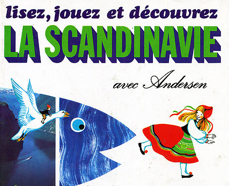
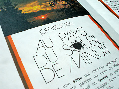
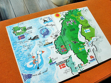
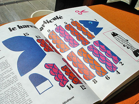
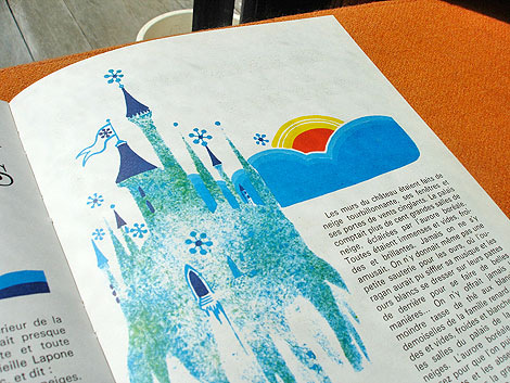
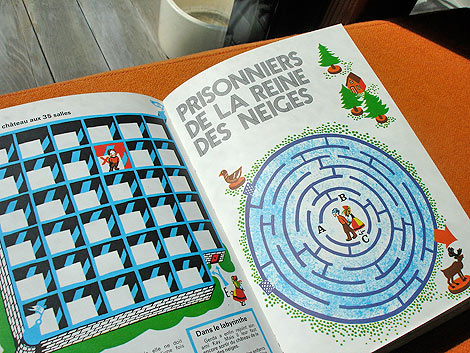
On a recent and most adventurous trip to the South of France, I had the pleasure of visiting the small village of Montolieu. Known as the “Village of Books,” Montolieu has a grand array of artisans that specialize in book binding and printing as well as antiquarian bookstores specializing in everything from vintage periodicals and antiquities to comics, art and kids books.

Today’s post will unearth some of my favorite finds from my trip, including books illustrated by J.P. Miller, Charley Harper, and Alain Gree.

I went with a few other folks to Montolieu during the awkward hour of 11:30A, which is right before all shops close up for lunch. I was on a time crunch, and the first (and only) bookstore I visited was La Rose Des Vents, which translates to “The Compass” in English. The shop was fairly small and had two rooms, with regional and history books in the front and children’s books in the back.

While there, I was able to find a few neat books, including a drawing book titled Voyage a Travers Le Monde (Journey Through the World), c. 1974. The book provides instructions on how to draw various cultures from around the world, not by any means accurately by the way.

J.P. Miller

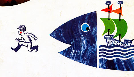
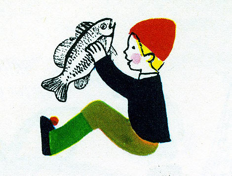
In addition to that book, I was able to find Le Manege Vivant (c. 1950), which is the French edition of The Marvelous Merry-Go-Round, written by Jane Werner and illustrated by J.P. Miller. I had not seen the book before, and the hippo alone on the cover  was enough reason to hold onto it! Upon opening the book, I was pleased to see so many whimsical and colorful illustrations, trademark of Miller’s style.

J.P. Miller

J.P. Miller

Add a Comment
6. Top 10 Underappreciated Children’s Books 2/3

Here’s part two. You may notice that the formatting is unbelieveably horrible. I tried to fix it, but I’ve given up now.

7. The Trumpet of the Swan, by E.B. White

The dust jacket on my copy is long since lost.

So, here’s an unpopular opinion for you: this is the best E.B. White book. Charlotte’s Web is pretty good. I like it a lot. Stuart Little coasts on the fact that tiny things are cute. The Trumpet of the Swan is better than either of them. When I was little, I also thought it was completely hilarious — I would reread bits and sit there giggling to myself — but it’s probably only moderately funny. That’s okay, though, because it’s clever and thoughtful and enormously weird, and when it comes to children’s books, that’s what I want most.

The Trumpet of the Swan, for those of you unlucky enough not to have read it, is about a mute trumpeter swan named Louis. He can’t attract a mate without being able to make trumpet-y noises at her, so his father goes off and steals him a trumpet, and the rest of the book is all about people being wowed by his excellent trumpet-playing skills, which makes me happy because one of my favorite things in books is characters who are really good at what they do (cf. Carry On, Mr. Bowditch, two of the three books in the final section of this list, and that post I will someday write on Trustee from the Toolrom). Anyway, it’s a wonderful book all around, and a deeply satisfying one. Most books that I like leave me wanting to know more, but I think it’s actually better when a book gives you exactly as much as you need, and this is one of those.

***

6. Carry On, Mr. Bowditch, by Jean Lee Latham

I think this cover is gorgeous.

Okay, here’s one I read several times when I was, oh, maybe twelve? I ran across it at a used bookstore last summer, and thought, “I adored that book. Why haven’t I thought about it for the last dozen years?” And then I reread it, and, as it turns out, I still adore it.

This is a fictional take on the life of Nathaniel Bowditch, who revolutionized navigation in the late 18th century. Latham introduces us to Nat as a kid about to be apprenticed to a ship chandlery in Salem in the 1770s, and from there we follow his struggles to educate himself and others. It’s a sad book, because massive numbers of people die, but it helps to know that they’re real people who died, rather than characters the author is gratuitously killing off. And also, it’s an incredibly moving book, and I think it owes some of that to the historical environment. Nat’s family is very poor, and a career at sea includes the possibility of death, and Latham doesn’t minimize those things.

And then there’s the people-being-really-good-at-what-they-do thing. It’s fun to see Nat surprising people with his surreptitiously acquired book-learning, and it’s even better to see him winning over his shipmates with his expertise on practical matters. Especially
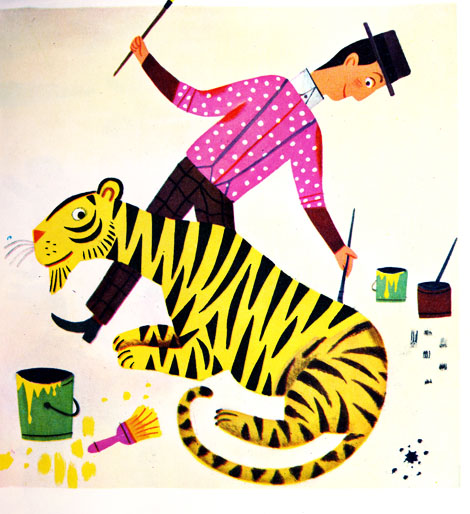
0 Comments on Top 10 Underappreciated Children’s Books 2/3 as of 1/1/1900
Add a Comment
7. Jeremy Pettis

Jeremy Pettis

Jeremy Pettis is a Milwaukee, Wisconsin-based designer who creates some really amazing throwback typographical treatments. You may be familiar with his “26 Types Of Animals” project, in which he creates unique bespoke treatments through an alphabetical list of animal types. Jeremy’s website is dedicated mostly to that project, but you can find more real gems of work by digging through his flickr.

Jeremy Pettis

Jeremy Pettis

Jeremy Pettis

Jeremy Pettis

Jeremy Pettis

——————–

Also worth viewing:
Harry Murphy & Friends

Mimmo Castellano: Posters & Packaging
Trademark Tim Lahan

Not signed up for the Grain Edit RSS Feed yet? Give it a try. Its free and yummy.
——————–

No Tags

Grain Edit recommends: Karel Martens: Printed Matter. Check it out here.


©2009 Grain Edit - catch us on Facebook and twitter

8. Wim Crouwel: A Graphic Odyssey

wim crouwel

If you’re unable to visit the Wim Crouwel retrospective at London’s Design Museum, you can still pick up the exhibition catalog. Designed and published by Unit Editions the catalog contains Crouwel’s posters, documents, manuals - even his stamps and personal photographs -  presented in the raw, bare-concrete setting of the Crouwel archive. Also included is an interview with Wim conducted by Tony Brook, the exhibition’s curator and the book’s co-editor.

Available now at Unit Editions.

wim crouwel

wim crouwel

Details
152 x 230mm
144 pages
Paperback (3 different covers)
ISBN 978-0-9562071-3-5
Editors: Tony Brook & Adrian Shaughnessy

(Via Aisle One)

——————–
Also worth viewing:
Total Design and its pioneering role in graphic design
Wim Crouwel Archive
6th Biennale of Graphic Design

Not signed up for the Grain Edit RSS Feed yet? Give it a try. Its free and yummy.
——————–

No Tags

Grain Edit recommends: Karel Martens: Printed Matter. Check it out here.


©2009 Grain Edit - catch us on Facebook and twitter

9. Center of Attention - Vintage 7″ Labels

Simon Foster

Center of Attention is an online collection of vintage record center labels by designer Simon Foster. Simon’s collection contains some real colorful gems of labels, which seem to be mostly from the 60’s and 70’s, although he has a few more antique examples. Although the aging crisp graphics, imperfect printing, and retro typefaces are super intriguing, my favorite thing about these old labels are the classic song titles; with such great hits as “I’m Gonna Miss You (Like the Devil),” “T-R-A-M-P,” “The Machine Demands a Sacrifice,” and “Fattie Bum Bum.”

Simon Foster

Simon Foster

Simon Foster

Simon Foster

Simon Foster

Simon Foster

Simon Foster

Simon also just added to the site a collection of record sleeves, in case you’ve already had too many donuts this morning.

——————–
Also worth viewing:
Project Thirty Three: Vintage Album Covers

Vintage Cassette Tape Covers

The Jazz Loft Project

Harry Murphy & Friends

Not signed up for the Grain Edit RSS Feed yet? Give it a try. Its free and yummy.
——————–

No Tags

Grain Edit recommends: Karel Martens: Printed Matter. Che

Add a Comment
10. Keating & Keating

keating & keating

Taking another look back into San Francisco design studios as they stood in the late 70s, I bring you the second in a series of posts from the book “Graphic Design San Francisco“. Today we’ll take a look at Keating & Keating, who in present day is known as Kate Keating Associates, Inc., a heavy hitting SF corporate design firm.

“Keating & Keating have an attitude toward their work that can be stated in a definition of graphic design as ‘the architecture of visual communication.’ They believe that a project should entail not just applied cosmetics, but rather must be approached from a thorough problem-solving process in order to be successful.”

keating & keating

keating & keating

keating & keating

keating & keating

Images:

1. 1977 Annual Report. Systron-Donner Corporation.
2. Poster for an Art Directors Club event. San Francisco Society of Communicating Arts.
3. Product catalog for an outdoor manufacturer. Alpine Products, Inc. Photography: Peter Thompson
4. Poster for a ski competition. International Ski Trials. Sandy Liman Associates.
5. Trade Mark for a ski area. Alpine Meadows of Lake Tahoe.
6. Trade Mark for a retail store. McIntosh’s Sports Cottage.
7. Trade Mark for a recreational resort. LodgeWood.

——————–

Also worth viewing:
Harry Murphy + Friends
Vintage Travel Posters
Vintage Cassette Tape Covers

Not signed up for the Grain Edit RSS Feed yet? Give it a try. Its free and yummy.

——————–

No Tags

Congrats to our giveaway winners! Alan S (Cranston, RI), Emily S (Denton, TX), amluke and Anna M (Ithaca, NY)


Add a Comment
11. Kazumasa Nagai Posters

Kazumasa Nagai Posters

Pink Tentacle digs up an impressive collection of posters by Japanese artist and designer Kazumasa Nagai. Enjoy!

Kazumasa Nagai

Kazumasa Nagai

Kazumasa Nagai

(Thanks to @iconomaque for the link!)

——————–

Also worth viewing:
Ayao Yamana: Graphic Design
Japanese Graphic Design in the 1950s
Japanese Book Covers

Related Books:
Kazumasa Nagai: Design life
The Works of Kazumasa Nagai

Not signed up for the Grain Edit RSS Feed yet? Give it a try. Its free and yummy.

——————–

No Tags

Only a few grain edit shirts left.Get yours now!

Grain Edit recommends: Born Modern: The Life and Design of Alvin Lustig. Check it out here.


©2009 Grain Edit - catch us on Facebook and twitter

12. The Ultimate Swissair Fansite

swissair posters

Patrick Eberhard has amassed an amazing collection of Swissair-related material. His website, Sr692 which is named after the flight number from Zürich to Lisbon, is filled with vintage posters, flyers, logos, stamps, route maps, tickets and books, as well as a detailed history of the airline. This is an absolute goldmine for those interested in Swiss design.

A hat tip to Shelby at Wanken for discovering this amazing resource.

swissair posters

swissair posters

swissair timetables

(via iso50 + Delicious Industries)

——————–

Recommended Reading:
Airworld: Design And Architecture For Air Travel
- Published by Vitra
This book focuses on the corporate design of airlines, uniform fashion, the graphics of air travel posters and the significant role that aviation played as an inspiration for architecture, design and art up to the present day.

Copies are available at Amazon.

——————–

Also worth viewing: Swiss Graphic Design by Geigy, Jorg Hamburger, Publicity and Graphic Design in the Chemical Industry.

Not signed up for the Grain Edit RSS Feed yet? Give it a try. Its free and yummy.

——————–

No Tags

Only a few grain edit shirts left.Get yours now!

Grain Edit recommends: Born Modern: The Life and Design of Alvin Lustig. Check it out here.


©2009 Grain Edit - catch us on Facebook and twitter

Add a Comment
13. Gottschalk + Ash

Fritz Gottschalk

Poster for the Theatre Company at the St. Lawrence Centre

Gottschalk + Ash was founded in Montreal in 1966 by Swiss-born Fritz Gottschalk and Canadian native Stuart Ash. Independently and collaboratively, the two have racked up numerous design awards and honors over the last 40 years, with highlights that include identity work for Ciba and a re-design of the Swiss passport. Their work shown above is a great example of Swiss precision and a playful, more humanized take on design.

Gottschalk Ash

Galileo poster for the Theatre Company at the St. Lawrence Centre

Gottschalk Ash

Poster for the Theatre Company at the St. Lawrence Centre

Gottschalk Ash

Polypropylene booklet for Shell

Fritz Gottschalk

Four Seasons annual report 1970

Further Reading:
Stuart Ash at Aqua-Velvet, Fritz Gottschalk at Aisle One, Gottschalk + Ash at the Canadian Design Resource

——————–

Also worth viewing: Jacques Charette

Not signed up for the Grain Edit RSS Feed yet? Give it a try. Its free and yummy.

——————–

No Tags

Only a few grain edit shirts left.Get yours now!

Grain Edit recommends: Born Modern: The Life and Design of Alvin Lustig. Check it out here.


©2009 Grain Edit - catch us on Facebook and twitter

Add a Comment
14. Jacques Charette

jacques charette

Booklet cover for Librax Roche Recipe

Jacques Charette attended schools in Ottawa and Brussels (Belgium) as well as the Ecole des Beaux-Arts de Montreal. Before establishing his own firm in 1970, he worked on various materials for Expo 67. He is also responsible for designing the logo for the Society of Graphic Designers of Canada (GDC).

jacques charette

Poster for Unit Masonry Awards Exhibition 1972

jacques charette

“The Future of the Forest” booklet cover for Canadian Pulp and Paper Association

———————

Also worth checking: Swiss Graphic Design by Geigy

———————

Not signed up for the Grain Edit RSS yet? Give it a try. Its free and yummy.

No Tags

Only a few grain edit shirts left.Get yours now!

Grain Edit recommends Buffet Script A font designed by Sudtipos. Check it out here.


©2009 Grain Edit - catch us on Facebook and twitter

Add a Comment
15. Dear Time Traveller

I think my time travel short story might be done... Shush! We don't want to disturb it. I'm going to let it stew for another day and have a final read before submitting.

On the subject of time travel, if a hole opened up in the sky above me right about now, I'd instruct it to hoover me back to 1974 so that I could buy 'Rowntrees Tiger Tots', I have a curious craving for them and they disappeared from stores in the late 1970s. Not magically disappeared at least I don't think they did... Ooh, I wonder if future-me went back and emptied the stores.

For the unintiated, Tiger Tots were like Dolly Mixtures (see picture above) mixed with Liquorice Allsorts without the coconut.

A note to the people of the future: (and no I don't mean 'you' next Sunday)

If you ever invent time travel and happen to stumble upon my little blog (I'm assuming it's archived in a Hall of Fame because in your world my books are more popular than JK Rowling's - I know, who's she???) could you please head back to 1974, get me some Tiger Tots, and drop them at my desk (you should have my address - there'll be a blue plaque on it) Friday 2nd July at 3:30 pm. Much appreciated

11 Comments on Dear Time Traveller, last added: 7/2/2010
Display Comments Add a Comment
16. Miguel Calatayud: 70s Comic Book Illustration

miguel calatayud

Los doce trabajos de Hercules - Illustrated by Miguel Calatayud c1973

Miguel Calatayud is a Spanish illustrator and is best known for his work in the world of comics.  I dug up a couple of his books, both of which were published in the 70s by Editorial Doncel as part of their Trinca collection. If your a fan of the early work by Push Pin Studios and the bold styling of Peter Max, I think you will really dig Miguel.

I have a couple extra copies of each book. If you like what you see you can pick up a copy of either Los doce trabajos de Hercules or Peter Petrake in the grain edit shop.

miguel calatayud

miguel calatayud

miguel calatayud

miguel calatayud

Peter Petrake c1970

miguel calatayud

miguel calatayud

miguel calatayud

miguel calatayud

miguel calatayud

miguel calatayud

For more info check Lambiek, So Much Pileup,

Add a Comment
17. Uruguay Stamps

uruguay stamps

Beautiful stamps from Uruguay via Mike at So Much Pileup.

uruguay stamps

—–

Also worth checking: Denmark Stamps

Portugal Census Stamps

Enjoy this story? Sign up for our tasty free grain edit RSS feed.

—–

No Tags

Vintage kids book Mi Diccionario is in the Grain Edit Shop

Grain Edit recommends Colo Pro A font designed by Font Fabric. Check it out here.


©2009 Grain Edit - catch us on Facebook and twitter

Add a Comment
18. La Boca Design

la boca design, uk, west london, record covers

La Boca is a London based design firm specializing in transporting its viewers to places of the future by means of the past. This record sleeve, created for Arcadion, has a nice composition with the symmetry of the two magnetic looking objects on the edge of what seems like a portal into space. The warm gradient behind the bold text nicely juxtaposes the cool waves of the galactic landscape. This is where I’d like to be today.

la boca design, uk, west london, record covers

la boca design, uk, west london, record covers

la boca design, uk, west london, record covers

la boca design, uk, west london, record covers

la boca design, uk, west london, record covers

la boca design, uk, west london, record covers

la boca design, uk, west london, record covers

la boca design, uk, west london, record covers

In addition to creating record sleeves, La Boca has also created some out of this world shirts for Sixpack France. To see more of their work, check out their website. Be sure to read their blog for some neat video picks, like Len Lye’s Kaleidoscope.

———–

Also worth checking: Vintage Arcade Game Graphics

Not signed up for the Grain Edit RSS Feed yet? Give it a try. Its free and yummy.

———–

No Tags

Add a Comment
19. Tom Eckersley

Tom Eckersley, Graphic Design, Illustration, 1960s, 1980s

Pakistani International Airlines poster (1960)

English artist and designer, Tom Eckersley (1914-1997), created numerous posters from the 1940s to the 1980s. Eckersley’s work communicates strong messages by employing bold overlaid colors, simplified forms, and informative text.

This poster, created for Pakistan International Airlines, depicts a dapper looking gentleman in Swiss garb. His playful image is simple, clean, bright and colorful; a stark contrast from the dark turquoise background. The composition is pleasing to the eye; as the figure gazes at the distant aircraft, we too are gazing at his cheerful image. Let’s all go to Geneva!

Tom Eckersley, Graphic Design, Illustration, 1960s, 1980s

UNICEF [United Nations Children’s Fund] appeal poster (1977)

Tom Eckersley, Graphic Design, Illustration, 1960s, 1980s

Wildscreen 1986

Tom Eckersley, Graphic Design, Illustration, 1960s, 1980s

International Tourist Year poster (1967)

Tom Eckersley, Graphic Design, Illustration, 1960s, 1980s

The Decline and Fall of the Roman Empire book cover (1963)

Tom Eckersley, Graphic Design, Illustration, 1960s, 1980s

Keep Britain Tidy Campaign poster (1963)

Eckersley’s work proves that good design is timeless and even iconic. His work is archived at the University of Arts London Archives and Special Collections Center, and may be viewed at their online resource for visual arts site.

—–

Also worth checking: David Klein — Vintage TWA Posters

Not signed up for the Grain Edit RSS Feed yet? Give it a try. Its free and yummy.

—–

No Tags

Congrats to our 2009 Grain Edit Holiday Giveaway Bash Winners - /Grand Prize - Christopher E from Fe

Add a Comment
20. Paul Rudolph Drawings

paul rudolph drawings

Callahan Residence, Birmingham, Alabama 1965 - Rendering by Paul Rudolph

Architect Paul Rudolph (1918-1997) was known for his much-loved (and loathed) Brutalist yet spatially complex buildings. As one of the pioneering figures of the ‘Sarasota School of Architecture’ in the late 1940s, Rudolph gained a worldwide audience with his innovative design for the modern American home. His best known architectural masterpieces are the Yale School of Architecture, the Boston Government Center and the Crawford Manor. By the late 70’s and into the 90’s, Rudolph who was unmoved by the Post-modern dominance in architecture, steadfastly continued to design powerful Modernist structures now gracing the urban skylines of the Far East.

paul rudolph drawing

Burroughs Wellcome Company, Research Triangle Park, North Carolina, 1969-1972

Aside from his built works, Paul Rudolph was also a master renderer known for his dynamic graphic presentations drawn with incredible precision much like a Victorian etching; from the building elements to the texture of the materials realistically amplified with light and shadows. His trademark presentation technique involves a black-and-white rendering of a building’s cross-section which is drawn to a large scale on a single-point perspective. Such accuracy enabled him to illustrate and investigate the realities of his buildings and their spaces, and thus allowing his designs to evolve as he further refined his rendering techniques.

paul rudolph

Walker Residence, Sanibel Island 1952-1953

paul rudolph

Resort Community, Stafford Harbor, Virgina 1966

architectural drawings

Study of Lower Manhattan Expressway, Ford Foundation, NY, NY 1967-1972

For more information about Paul Rudolph and his works, check out The Paul Rudolph Foundation and the blog.

——————–
Elizabeth Surya is the editor of Pleatfarm: an informational blog about folds in design.

——————

Also worth checking: Mid Century Modern Home Plans.

Not signed up for the Grain Edit RSS Feed yet? Give it a try. Its free and yummy.

——————

No Tags

Add a Comment
21. Kurokawa Nakagin Capsule Hotel

nakagin capsule

Nakagin Capsule Tower (AKA The BC25 Capsule) designed by Kisho Kurokawa

The 60s and 70s were an exciting period for Japanese architecture. In particular, the Metabolist Movement which was founded by a group of futuristic visionaries, including late architect Kisho Kurokawa, puts forth ideas of “large scale, flexible and extensible structures that facilitate an organic growth process”. Perhaps the most exemplary metabolist building is the Nakagin Capsule Tower built to accommodate bachelor salarymen in downtown Tokyo.

kurokawa nakagin capsule

Completed in 1972, Kisho Kurokawa designed the 14-story tower which consists of 140 pre-assembled individual capsules hoisted by a crane and bolted to the concrete core shaft. Functioning as apartments and business offices, each capsule unit comes complete with appliances and furniture for a single dweller, and by connecting additional units, can accommodate a single family. The Nakagin tower is designed to be adaptable and sustainable, with the capsules’ ability to be removed and replaced for upgrades, and thus minimizing construction waste in the process.

kurokawa capsule

japanese capsule hotel

The Nakagin Capsule Tower has been short-listed for the World Heritage by the International Committee of Docomomo International since 1996. However it is currently at the mercy of the wrecking ball, and efforts are still being made to preserve this masterpiece.

images 1. via my future me 2. via found 3. via Daily Contributor 4. via URBZOO

More info over at Apartment Therapy.

——————–

Also worth checking: The architecture of La Vele di Scampia + Frederic Chaubin - Photographs of Space Age Soviet Architecture.

Not signed up for the Grain Edit RSS Feed yet? Give it a try. Its free and yummy.

——————–

No TagsAdd a Comment
22. Lisez, Jouez et Decouvrez La Scandinavie avec Andersen

lisez jouez et decouvrez la scandinavie

lisez, jouez et decouvrez La Scandinavie avec Andersen -by Paul de Roujoux, Pamela Labonnelie and Mireille Ballero. Illustrations by Martine Bourre c1975 editions des deux coqs d’or

La Scandinavie avec Andersen is a beautiful children’s book about Scandinavian culture. The book is filled with stories, games and activities.  Just think, your child could be making his/her very own Nils Holgersson costume right now! For the budding young history buff, there’s a section on the Drakkars and Vikings. If your child is too scared to look at tough guys with helmets, head straight to the fuzzy Nordic animals in chapter one. Have a four year old that’s into logging? No problem, this book has you covered. There’s a section on the Scandinavian timber industry in the middle of the book. Soon your young one will be able to turn raw material into fine Danish furniture!

More pictures after the jump.

lisez jouez et decouvrez la scandinavie

lisez jouez et decouvrez la scandinavie

la scandinavie avec andersen

lisez jouez et decouvrez la scandinavie

la scandinavie avec andersen

la scandinavie avec andersen

lisez jouez et decouvrez la scandinavie

la scandinavie avec andersen

lisez jouez et decouvrez la scandinavie

la scandinavie avec andersen

la scandinavie avec andersen

la scandinavie avec andersen

——————–

Also worth checking: Alain Gree - L’Electricite.

Not signed up for the Grain Edit RSS Feed yet? Give it a try. Its free and yummy.

——————–

No Tags

Congrats to B. Rane! She is the winner in the Photo-Lettering giveaway.


Grain Edit recommended reading: A Russian Diary


©2009 Grain Edit - catch us on Facebook and twitter

Add a Comment
23. Cult + Classic Film Stills From the Hot Dog!

classic film stills

A Colt is My Passport (1967) - Directed by Takashi Nomura

If your into classic + cult films it would be worth your while to check Shannon Maldonado’s I Love Hot Dogs.  Several times a week Shannon curates a selection of stills from a particular movie. I appreciate her selection process as she sometimes includes typographic/design details that can easily go unnoticed (think street signs, window lettering, etc.). For fans of the art of film title design, there’s plenty of that stuff as well.

classic film stills

Made in U.S.A (1966) - Directed by Jean Luc Godard

classic film stills

La Femme Nikita (1990) - Directed by Luc Besson

 movie film stills

The Warriors (1979) - Directed by Walter Hill

 film stills from

Airplane! (1980) - Directed by Jim Abrahams, David Zucker

cult film stills

Une Femme est Femme (A Woman is a Woman) -1961 - Direct by Jean Luc Godard

American classics, Japanese Nikkatsu films, French New Wave, Cult horror flicks etc. Yep it’s there. Check it!

For the Twitter peeps, catch them at @ihearthotdogs.

——————–

Also worth checking: Nikkatsu Films.

Not signed up for the Grain Edit RSS Feed yet? Give it a try. Its free and yummy.

——————–

No Tags

Congrats to B. Rane! She is the winner in the Photo-Lettering giveaway.


Grain Edit recommended reading: A Russian Diary


©2009 Grain Edit - catch us on Facebook and twitter

Add a Comment
24. Vintage Travel Posters

vintage travel posters

1. Come to Africa - Designed by Gerard van de Voort - c1975

How about virtual tour around the world to start off the week?  I dug up a handful of travel related posters from 1950s -1970s for all the desk jockeys that are itching to get out of town. Enjoy!

vintage travel posters

2.

vintage travel posters

3.

vintage travel posters

4.

vintage travel posters

5.

vintage travel posters

6.

vintage travel posters

7.

vintage travel posters

8.

vintage travel posters

9.

vintage travel posters

10.

vintage travel posters

11.

vintage travel posters

12.

vintage travel posters

13.

vintage travel posters

14.

vintage travel posters

15/16.

vintage travel posters

17/18.

2. Argentina c1950 -Poster artist - Cesareo  3. Beieren c1960- Designed by Herman Verbaere 4. Paris-Orly for Air France c1962- Design & Illustration by Jaques Nathan Garamond 5. Air Afrique c1965- Designed and illustrated by Jacques Auriac 6. Finland print for Finnair c1958  - Design by Erik Bruun   7. Rainbow poster for EL AL Israel Airlines - Design by Dan Reisinger 8. Switzerland c1967 - Design by Herbert Leupin  9. Turku Abo - Tourist poster for the Finnish town of Turku c1966?- Design by Marti Mykkanen 10. Hunting in Poland c1961 - Design by Wiktor Gorka 11. Switzerland poster for EL AL Israel Airlines - Design by Dan Reisinger  12. Poster for Belgian Railways c1966 - Design by Wictor Langer 13. Wengen Switzerland poster c1965 - Design by Martin Lauterburg + Fritz Lauener 14. Austria poster for Pan Am Airlines c1971 - Design by Chermayeff & Geismar 15/16. Israel: The land of the Bible produced for the State of Israel Tourist Centre - Design by Jean David 17. Travel Royal Blue c195? - Design & illustration by Daphne Padden 18. Great Canadian North -Pacific Western Airlines - Anonymous c1960

(images 1,2,3 via Van Sabben auctions) image #12 via grid studio , image #14 via the excellent Container List, image #17 via Larking About

——————–

Also worth checking: David Klein TWA posters.

Not signed up for the Grain Edit RSS Feed yet? Give it a try. Its free and yummy.

——————–

No Tags

Congrats to B. Rane! She is the winner in the Photo-Lettering giveaway.


Grain Edit recommended reading: A Russian Diary


©2009 Grain Edit - catch us on Facebook and twitter

Add a Comment
25. You Need the Plate

1972 Munich olympics plate

1972 Munich Olympics Plate : Pictograms designed by Otl Aicher

Now all your favorite 70’s stick figures can hide underneath your food. Spotted this gem on Ebay a few days back.

——————–

Also worth checking: Otl Aicher on Flickr.

Not signed up for the Grain Edit RSS Feed yet? Give it a try. Its free and yummy.

——————–

No Tags

Congrats to B. Rane! She is the winner in the Photo-Lettering giveaway.


Grain Edit recommended reading: A Russian Diary


©2009 Grain Edit - catch us on Facebook and twitter

Add a Comment

View Next 25 Posts