new posts in all blogs
Viewing: Blog Posts Tagged with: Robert, Most Recent at Top [Help]
Results 26 - 50 of 76
How to use this Page
You are viewing the most recent posts tagged with the words: Robert in the JacketFlap blog reader. What is a tag? Think of a tag as a keyword or category label. Tags can both help you find posts on JacketFlap.com as well as provide an easy way for you to "remember" and classify posts for later recall. Try adding a tag yourself by clicking "Add a tag" below a post's header. Scroll down through the list of Recent Posts in the left column and click on a post title that sounds interesting. You can view all posts from a specific blog by clicking the Blog name in the right column, or you can click a 'More Posts from this Blog' link in any individual post.
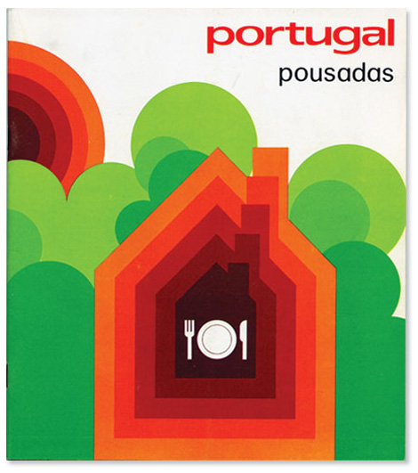
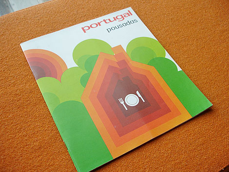
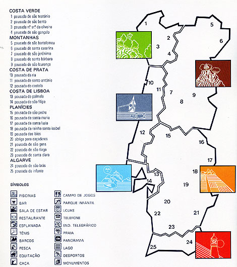
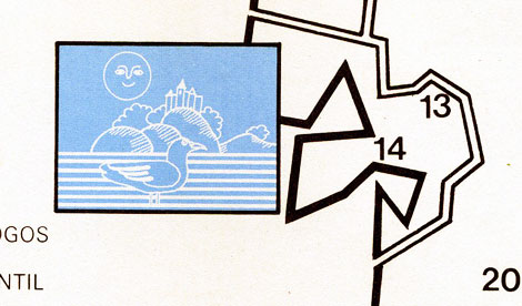
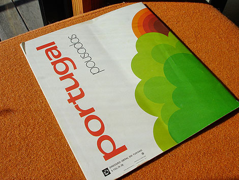
Beautiful brochure for a chain of hotels in Portugal.
From the inside of the brochure: “From the oldest times, “pousada” in Portuguese has meant “resting place”"inn”. Quiet isolated situations by the sea shore, in the mountains or on the plains. Lovely views, wealth of history, traditional culture.
The Pousadas make up a network of hotel establishments built by the state, housed in historic buildings, castles, palaces, and monasteries or specially built.”
——————–
Also worth checking: Portugal 1981 Census Stamps.
Not signed up for the Grain Edit RSS Feed yet? Give it a try. Its free and yummy.
——————–
No Tags
Share This
Congrats to B. Rane! She is the winner in the Photo-Lettering giveaway.
Grain Edit recommended reading: A Russian Diary
©2009 Grain Edit - catch us on Facebook and twitter

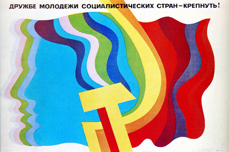
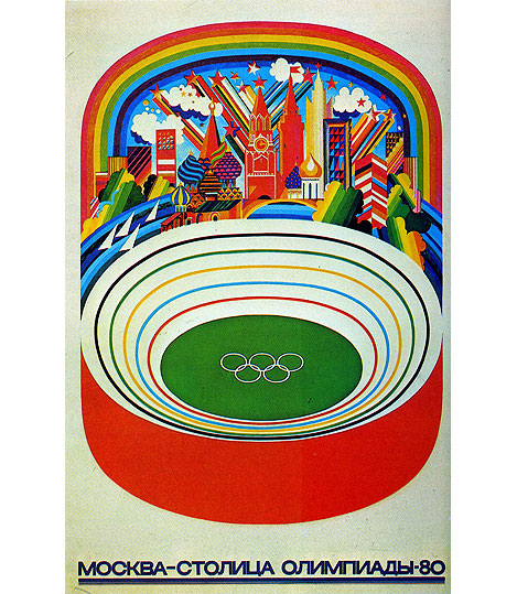
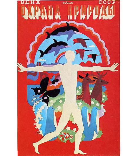
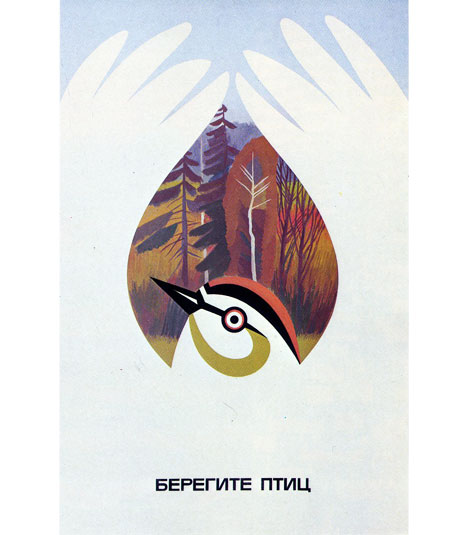
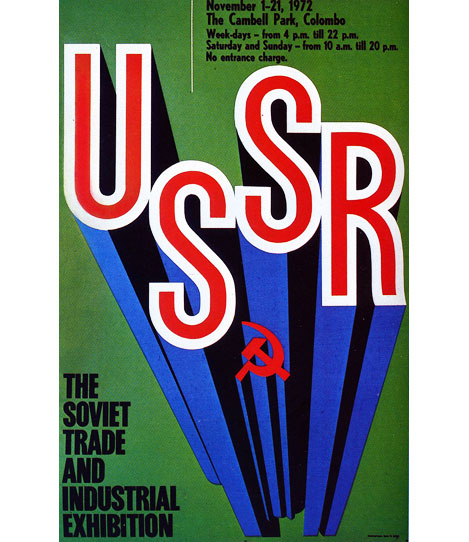
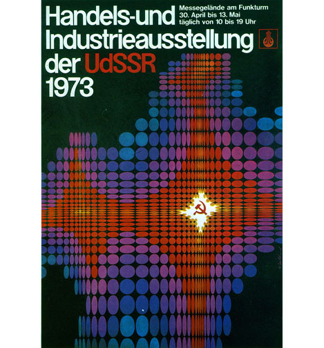
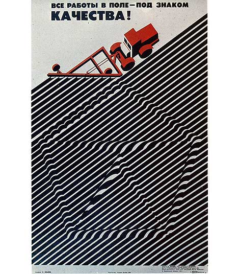
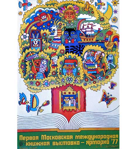
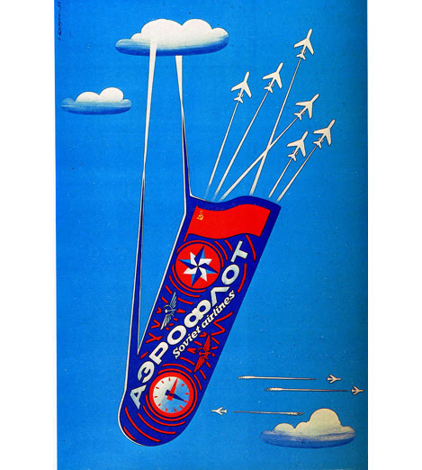
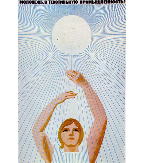
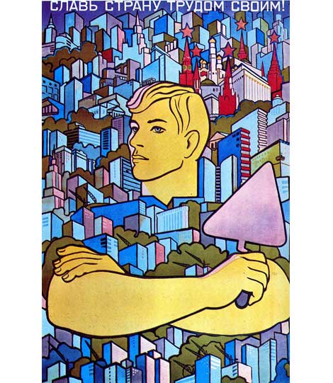
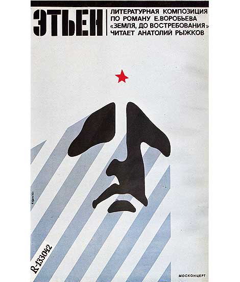
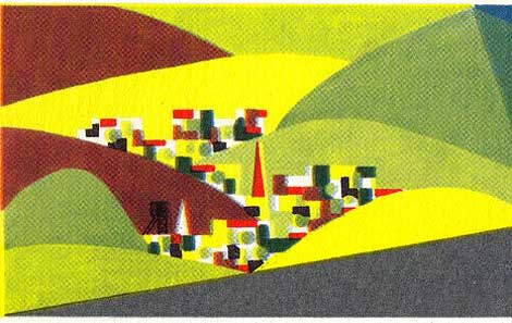
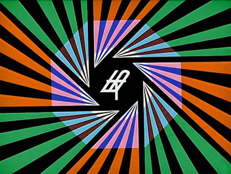
Most articles I see related to Russian poster design tend to focus on the film and propaganda posters of the 1920s and 30s. Works by Alexander Rodchenko and El Lissitzky as well the Stenberg brothers often come to mind. This post is dedicated to an era of Russian poster design that seems to get less coverage. The 1970s.
Don’t miss this one!
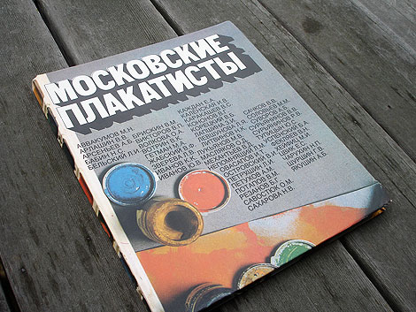
All the posters in this post come from this bad boy seen above (could someone translate the title? ). I discovered the book at the annual San Francisco Book sale back in September. I must of passed it two or three times. I thought it was some cheesy art text book. Let’s face it, that cover sucks. I finally decided to open it, because I thought it would be good for a couple of laughs. Little did I know this beast was hiding a motherlode of poster gems. Here for your viewing pleasure are a few of my favorites.
——————–
Also worth checking: Stefan Kanchev Logo Design, Stamps & TV Graphics.
Not signed up for the Grain Edit RSS Feed yet? Give it a try. Its free and yummy.
——————–
No Tags
Share This
Congrats to B. Rane! She is the winner in the Photo-Lettering giveaway.
Grain Edit recommended reading: A Russian Diary
©2009 Grain Edit - catch us on Facebook and twitter

Will over at the excellent Journey Round My Skull posted an amazing collection of Polish book covers. There is some seriously wacky stuff going on these book jackets. Whats up with beard face?
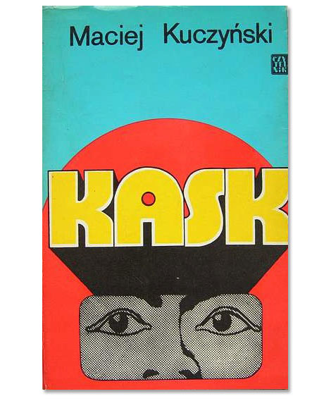
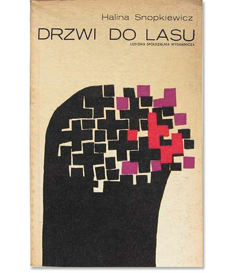
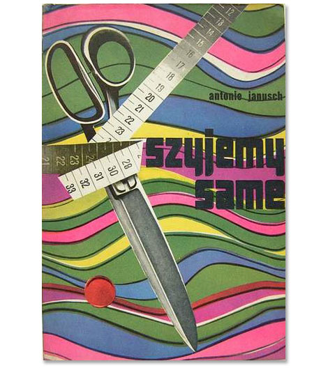
(via delicious industries)
——————–
Also worth checking: Dick Bruna Book Covers.
Not signed up for the Grain Edit RSS Feed yet? Give it a try. Its free and yummy.
——————–
No Tags
Share This
Congrats to MCHL of Sacramento. You are the winner of the Incase HunterGatherer laptop sleeve.
Grain Edit recommended reading: A Russian Diary
©2009 Grain Edit - catch us on Facebook and twitter

By: Dave,
on 10/1/2009
Blog:
inspiration from vintage kids books and timeless modern graphic design
(
Login to Add to MyJacketFlap)
JacketFlap tags:
BOOKS,
illustration,
germany,
Off our book shelves,
vintage,
1960s,
1970s,
swiss,
switzerland,
graphic-design,
Add a tag
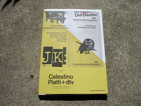
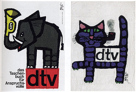
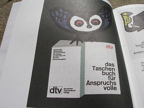
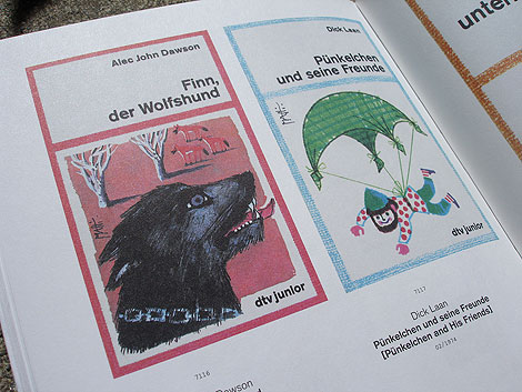
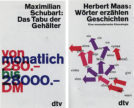
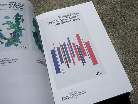
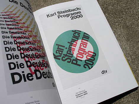
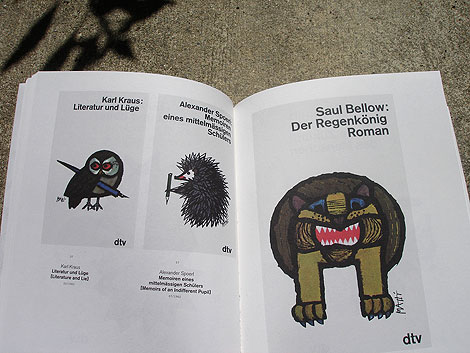
Celestino Piatti + dtv: The Unity of the program - Edited by Jens Muller
Two weeks ago we featured the Philips-Twen book from Lars Muller’s new A5 series. Celestino Piatti + dtv is the third title to be released in the series and my favorite of the bunch.
Celestino Piatti was born in the little Swiss village of Dietlikon on January 5,1922. Early on his parents recognized his talent and secured him training at the Kunstgewerbeschule (School of Applied Arts) in Zurich and later a graphic design internship with fellow Swiss designer Fritz Buhler. After four years with Buhler he left to start his own studio and eventually landed the job of a lifetime. In 1961 Deutscher Taschenbuch Verlag (dtv) hired Piatti to design their bookjackets. A comission that lasted up to his death in 2007. For over thirty years, he endowed the books published by dtv with a singular and unique look. He became the most productive book designer of all times, producing covers for over 6300 books that sold in a total print run of over 200 million copies.
——————–
Also worth checking: Corporate Diversity: Swiss Graphic Design by Geigy.
Not signed up for the Grain Edit RSS Feed yet? Give it a try. Its free and yummy.
——————–
No Tags
Share This
Congrats to MCHL of Sacramento. You are the winner of the Incase HunterGatherer laptop sleeve.
Grain Edit recommended reading: A Russian Diary
©2009 Grain Edit - catch us on Facebook and twitter


K.P. Jorgensen & Son Logo - Part of 1960s & 70s Scandinavian Logos Set
This made my day. Vancouver based designer Oliver Tomas uploaded an amazing collection of Scandinavian logos from the 1960s & 70s to his flickr account. Thanks Oliver!

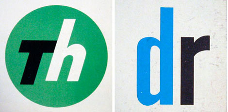
You can catch Oliver on twitter as well @olivertomas.
(via iso50 & AisleOne)
——————
Also worth checking: 60 Years of Finnish Book Design.
Not signed up for the Grain Edit RSS Feed yet? Give it a try. Its free and yummy.
——————
No Tags
Share This
Congrats to MCHL of Sacramento. You are the winner of the Incase HunterGatherer laptop sleeve.
Grain Edit recommended reading: A Russian Diary
©2009 Grain Edit - catch us on Facebook and twitter

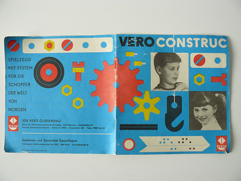

Nuts, bolts, and sprockets! These are the makings of fine toys, as well as these awesome vintage booklets!
Created for the East German toy company Vero in 1975, these colorful booklets itemize all of the pieces included in the “Construc” construction kit and instructs children in building a stop light. The back cover reads, “Toys With System for the Creators of Tomorrow’s World.” How inspiring!
(Via toxi & dobdes.com)
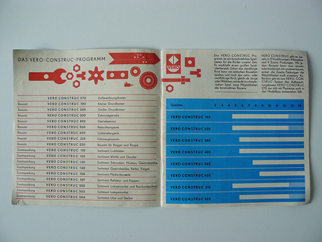
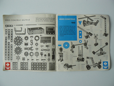
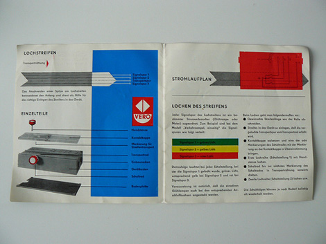

Both the catalog and manual are well designed, offering clean lines, neat diagrams, a simple color palette, and drool-worthy type. Interested in seeing more from the Vero Construc booklets? Visit toxi’s flickr!
No Tags
Share This
Congrats to MCHL of Sacramento. You are the winner of the Incase HunterGatherer laptop sleeve.
Grain Edit recommended reading: A Russian Diary
©2009 Grain Edit - catch us on Facebook and twitter

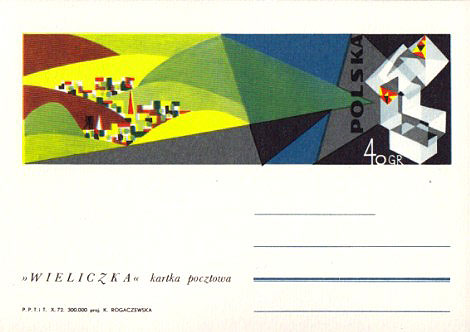
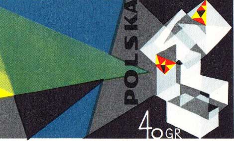
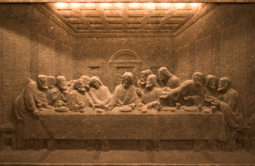
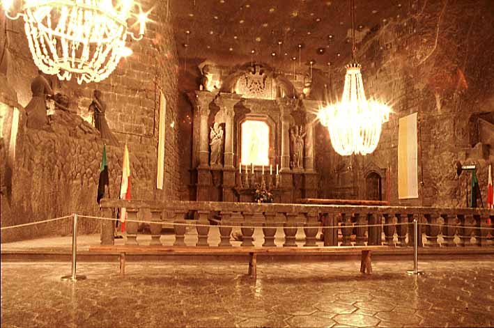
1972 Poland Wieliczka salt mine postcard designed by K. Rogaczewska.
Poland’s Wieliczka Salt Mine, in the suburbs of Kraków, produced table salt continuously for over 700 years. Although operation ceased in 2007, visitors can still tour the mine, where they can see statues and artwork carved entirely out of salt (including a chapel, complete with salt chandeliers!). In 1972, K. Rogaczewska designed this postcard, which depicts the hillside town of Wieliczka and the salt crystals of its mine.
——————–
Also worth checking: Modern Polish maps and sharp stinking teeth.
Not signed up for the Grain Edit RSS Feed yet? Give it a try. Its free and yummy.
——————–
No Tags
Share This
Congrats to MCHL of Sacramento. You are the winner of the Incase HunterGatherer laptop sleeve.
Grain Edit recommended reading: A Russian Diary
©2009 Grain Edit - catch us on Facebook and twitter

By: Dave,
on 8/24/2009
Blog:
inspiration from vintage kids books and timeless modern graphic design
(
Login to Add to MyJacketFlap)
JacketFlap tags:
illustration,
stamps,
1950s,
1960s,
1970s,
logos,
Found design,
ephemera,
graphic-design,
Bulgaria,
Add a tag

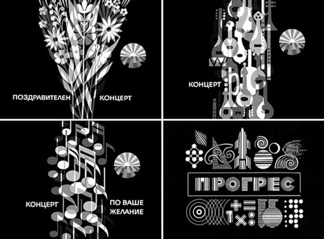
Television graphics
Absolutely stunning work from Stefan Kanchev (1915-2001) who was a Bulgarian graphic artist. During his prolific career he designed hundreds of logos, posters, stamps, book covers, labels as well as graphics for TV. Much of his work is inspired by Bulgarian folklore and traditions.
In 1994 Stefan Kanchev was recognized as one of the top ten designers of trade marks in the world along with Paul Rand, Saul Bass and etc. The title was awarded by the International trademark centre in Ostend, Belgium. His logo work will blow your wig back. I highly suggest you spend a few minutes browsing his archives.
Television graphics
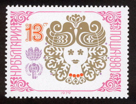
New Year 1980 stamp
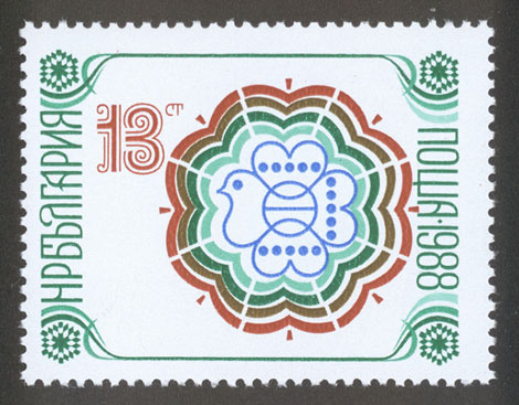
New year 1988 stamp
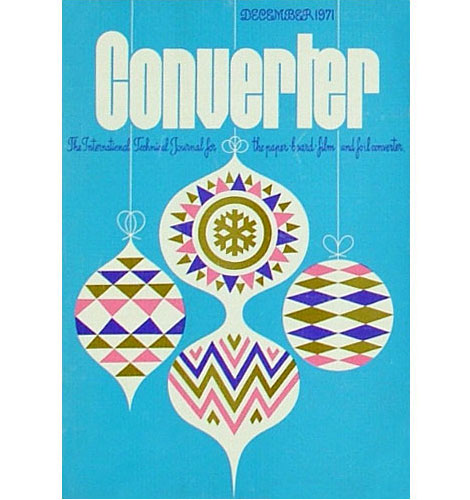
Converter Magazine Cover 1971
(via designboom and delicious industries)
——————
Also worth checking: Modern Stamps From Israel.
Not signed up for the Grain Edit RSS Feed yet? Give it a try. Its free and yummy.
——————
No Tags
Share This
Congrats to MCHL of Sacramento. You are the winner of the Incase HunterGatherer laptop sleeve.
Grain Edit recommended reading: IDEA magazine - The Max Huber issue
©2009 Grain Edit - catch us on Facebook and twitter

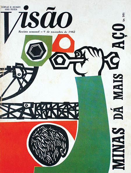
Brazilian designer, Odiléa Toscano, illustrated delightful magazine covers and book jackets in the 1960s and 1970s. This particular illustration, created as the cover of Visão Magazine in 1962, omits a handful of energy as it uses bright complementary colors and geometric heavy forms and type. I really enjoy the intricate cutouts of the subject’s hair and the shapes he’s about to twist with his wrench!
(Via Design Diário)
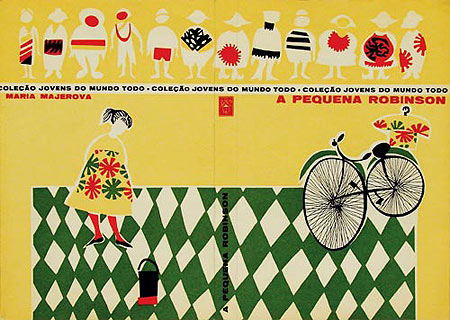
Book jacket from the collection Jovens Do Mundo Todo (1960)

Textbook Criatividade em língua portuguesa (1978)
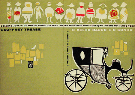
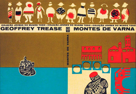
Book jacket cover from Jovens Do Mundo Todo (1961)
In 1961, Odiléa won a prize at the 1st International Biennial of Book and Graphic Arts of São Paulo and some international recognition in design magazines for her work on the book jackets for the collection Jovens Do Mundo Todo (Youth from Around the World). These book jackets feature a row of children, whose clothing feature brightly colored patterned layers, as well as images pertaining to the subject matter of the book. To achieve such colorful effects, Odiléa used art supplies that were relatively new for 1960s, such as Letraset, Pantone films, and markers.
To find out more information about Odiléa Toscano, check out Design Diário’s article on her. It includes a wealth of interesting facts; and be sure to check out other fascinating articles on the site as well!
——————
Also worth checking: Brazilian book covers by Gian Calvi.
Not signed up for the Grain Edit RSS Feed yet? Give it a try. Its free and yummy.
——————
No Tags
Share This
Grain Edit recommended reading: IDEA magazine - The Max Huber issue
©2009 Grain Edit - catch us on Facebook and twitter

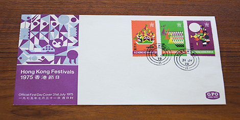
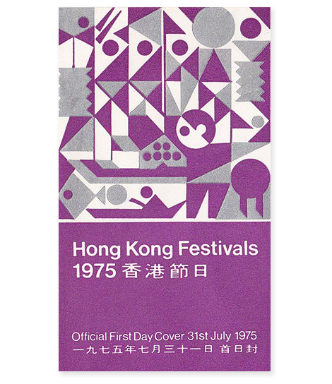
1975 Hong Kong festivals - official first day cover and stamp set designed by Tao Ho
Tao Ho is a Hong Kong-based architect, designer, teacher, and writer. He studied under Sigfried Giedion and Josep Lluís Sert at Harvard’s Graduate School of Design and worked with Bauhaus founder Walter Gropius at the Architects Collaborative. In 1975, Tao Ho designed this first day cover and stamp set to commemorate Hong Kong’s Tin Hau, Dragon Boat, and Mid-Autumn festivals.
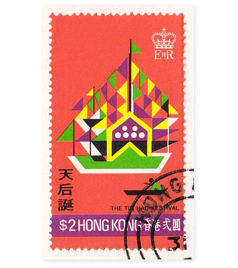
Tin Hau, Goddess of the Sea, is celebrated as the protector of fishermen and sailors. During the Tin Hau festival, fishing boats covered with colored streamers and flags sail through Joss House Bay in Sai Kung.
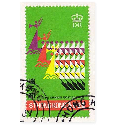
The Dragon Boat festival features teams of up to eighty oarsmen who race against one another in long wooden ships.
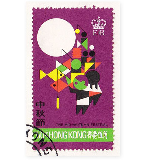
In the 14th century, a Chinese man named Liu Bowen planned to rebel against the Mongol overlords. Liu organized this uprising by concealing the message, “Rise against the Tartars on the 15th day of the 8th moon,” inside mooncakes (pastries with a lotus seed paste filling and a crust made with salted duck egg yolks). Mongols didn’t eat mooncakes, so Liu’s secret message was spread across the land and the rebellion was a success. The Mid-Autumn festival, which falls on the autumn equinox, when the moon is at its brightest, celebrates Liu’s uprising. Traditional festival activities include eating mooncakes outside under the moon, wearing pomelo rinds on one’s head, and carrying brightly lit lanterns.
——————
Also worth checking: 1966 Norway first day cover.
Not signed up for the Grain Edit RSS Feed yet? Give it a try. Its free and yummy.
——————
No Tags
Share This
Congrats to Jenny Eng. She is the winner of the Kevin Dart giveaway.
©2009 Grain Edit

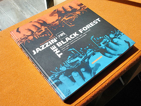
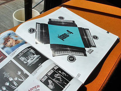
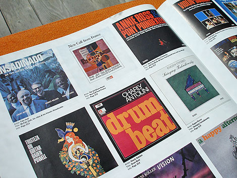
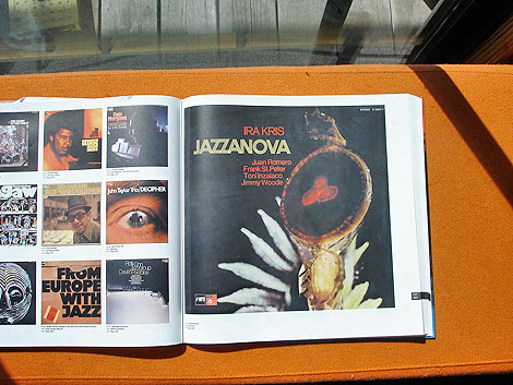
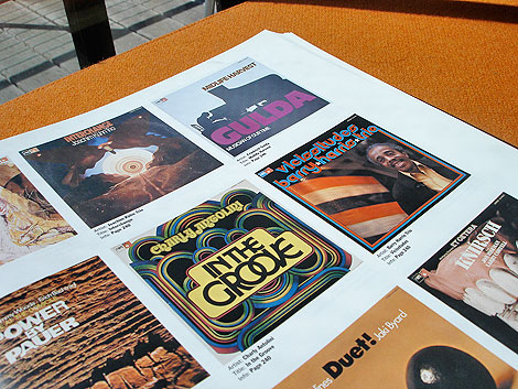
Jazzin the Black Forest - The Complete Guide to Saba/MPS Jazz Records -Published by Crippled Library c1999
Jazzin´the Black Forest is the story of the SABA/MPS jazz label. It was established during the early 1960s and is considered to be Germany´s first independent label. From the label’s beginnings up to its sale to Polygram in 1983, SABA/MPS released over 700 LPs. This book features full color images of all the LPs, a complete index as well as poster reproductions.
Saba/MPS played host to an impressive list of artists including: Albert Mangelsdorff, Joachim Kühn, Volker Kriegel, Wolfgang Dauner, Baden Powell, Oscar Peterson, Duke Ellington, Jean Luc Ponty, Monty Alexander just to name a few.

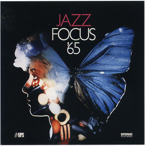
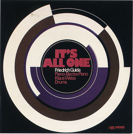
According to the amazing Birka Jazz website “Joachim-Ernst Berendt produced a large number of records, especially live recordings and recordings in studios outside Villingen. Berendt, and his wife Gigi, also contributed to the label’s visual look. Their interest in modern art led to that MPS frequently brought in artists to adorn the covers. Gigi Berendt also designed album covers herself.”
The book is currently out of print, but maybe if enough people contact the publisher they would consider republishing this gem.
———————-
Also worth checking: Mike Cina Jazz Mix
Album covers from the Groove Merchant
———————-
Not signed up for the Grain Edit RSS Feed yet? Give it a try. Its free and yummy.
No Tags
Share This
Congrats to Jenny Eng. She is the winner of the Kevin Dart giveaway.
©2009 Grain Edit


“Druzhba Holiday Center Hall” (Yalta, Ukraine, designed by Igor Vasilevsky 1984)© Frederic Chaubin
Fascinating photos from Frederic Chaubin. Many of his images feature strange buildings from the former Soviet Union. Most of the structures were built during the 1970s and 80s and look like something straight out of Sci-fi movie.

“Roads Ministry” (Tbilisi, Georgia, 1975) © Frederic Chaubin
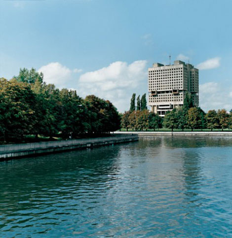
Soviet Palace (Kalinigrad, Russia, 1975) © Frederic Chaubin
via iso50 and Pingmag
———————-
Also worth checking: Saul Bass Case Study House #20 and Hotel Aranyhomok
Not signed up for the Grain Edit RSS yet? Give it a try. Its free and yummy.
———————-
No Tags
Share This
Congrats to our winners in the Alexander Girard/ House Industries Giveaway!.
Grand Prize goes to MidcenturyMaude 2nd Prize goes to Abby S
©2009 Grain Edit

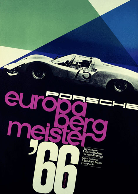
Europa-Bergmeister 1966 designed by Volz
Typography at 200mph. Amazing Porsche posters designed by Erich Strenger and Volz.
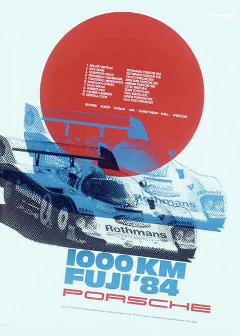
1000 km Fuji ‘84 - Designer: Gruppe C Conception und Graphic Design GmbH
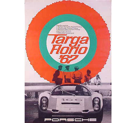
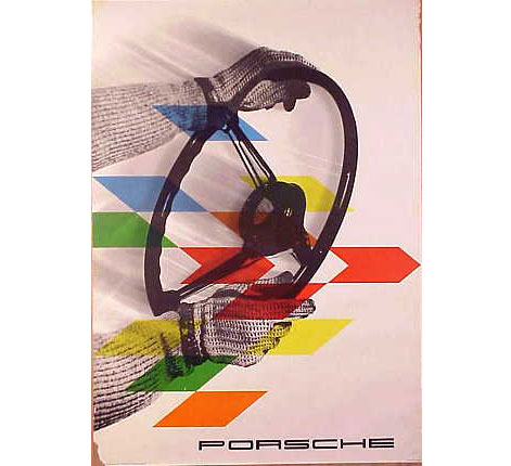
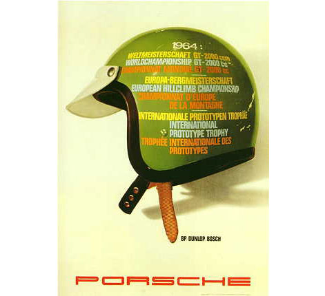
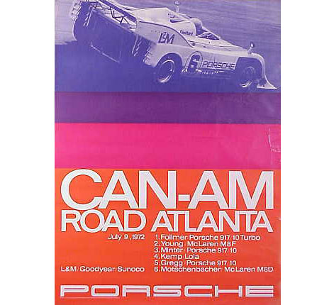
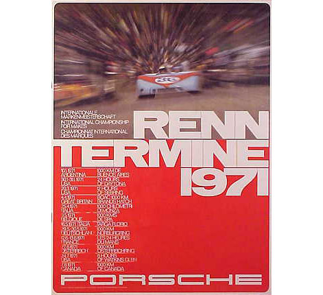
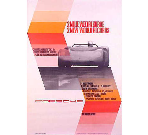
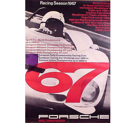
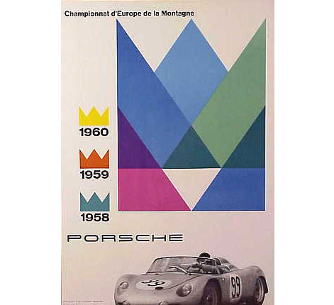
1. see above 2. see above 3. Targa Florio 1967 - design by Volz .4. Gloved Hands on Wheel c1961 -Designed by Erich Strenger 5. Meisterschaften 1964 6. Can-Am Road Atlanta - design by Erich Strenger 7. Renn Termine 1971 8. Two New World Records c1965- design by Atelier (studio) Strenger 9. Rennsportyahr 1967 - design by Volz 10. Championnat d’Europe de la Montagne 1960
Top 2 images via AUSmotive.com via Auto kopen. The rest of the images via VP Racing.com.
Also I found this book of Porsche posters. Looks like it might be good.
———————–
Not signed up for the Grain Edit RSS yet? Give it a try. Its free and yummy.
No Tags
Share This
Congratulations to our winners in the Grain Edit Design Stimulus Giveaway!.
Grand Prize goes to Tim Kim - 1st pick of the 4 prize options goes to Vertigo Andy - 2nd pick of prizes goes to Jory Dayne- 3rd pick of prizes goes to Tim Kim - 4th prize goes to Celiajoy our winner from twitter - We will contact all of you directly.
©2009 Grain Edit


So, I’m hanging out my with friend and fellow book nerd Sean Flores a while ago and he’s breaks out these incredible posters designed for Bally in the 1980s. My jaw drops! He tells me they were created by French designer Jacques Auriac. Who the heck is Jacques Auriac? I’m thinking. Then Sean mentions that a Paris based publisher produced a catalog of his work. Ahh crap!! just what I need, another expensive import book to track down. A year later and a trip to Tokyo I finally got my hands on this thing.
It’s a beautiful book filled with full color reproductions of Auriac’s poster work from the 1950s up till when he died in 2003. He was a profilic designer/ illustrator and produced posters for a broad range of clients includng Middle East Airlines, Air Afrique, Gitanes and Bally. His earlier work reminds slightly of Raymond Savignac, Herve Morvan and Jacques Nathan Garamond.
You might be able to order a copy this book directly though the publisher if it’s not already out of print.


Bally poster c1981 designed by Jacques Auriac

Air Afrique Poster c1965

Groupement de l’industrie chimque 1965 + 1966

Syndicat national des graphistes publicitaires c1970

Salon international de l’agriculture c1970

Foire internationale de Bordeaux c1968

Berliet c1964


cards for Issy 2002

Societe Generale c1970 Grand Prix de l’Affiche 1970

Societe Generale c1971

Loto c1983
In addition, Daily motion has a great video of an Auriac exhibtion from 2007. View it here (In French)
Not signed up for the Grain Edit RSS yet? Give it a try. Its free and yummy..
No Tags
Share This
Congratulations to our winners in the Grain Edit Design Stimulus Giveaway!.
Grand Prize goes to Tim Kim - 1st pick of the 4 prize options goes to Vertigo Andy - 2nd pick of prizes goes to Jory Dayne- 3rd pick of prizes goes to Tim Kim - 4th prize goes to Celiajoy our winner from twitter - We will contact all of you directly.
©2009 Grain Edit


Designer Music #1 - A Special Music Mix for Grain Edit Readers
Once a week I look forward to receiving a hot dj mix from my friend Freddy over at Props Radio. Sometimes it’s funk, other times it’s Soul, Disco, Jazz or Hip Hop. Two weeks ago, he blew my mind with his 3 FEET HIGH AND RISING turns 20 mix. The mix paid tribute to this classic De La Soul album (easily in my top top 5 Hip Hop albums of all time) and included many original songs that Prince Paul sampled to create this masterpiece. This week Freddy serves up not one, but 2 special mixes especially for Grain Edit readers!
“Designer Music,” compiles eight tracks from records highlighting the artists, designers and illustrators who visualize the music. This first edition showcases designers Bob Gill, B & B Wojirsch for ECM Records, Milton Glaser, Bob Ciano for CTI Records, Herb Lubalin, Reid Miles for Blue Note Records, Niklaus Troxler and Robert Brownjohn.
Visit the record gallery and listen to Designer Music 1 here.

Designer Music #2
Designer Music 2 focuses on artists and illustrators. Includes cover art by Jean-Michel Basquiat, Mati Klarwein, Roger Dean, Corky McCoy, Overton Loyd, Victor Moscoso, Stanislaw Zagorski and Pedro Bell. Music by Rammelzee, Parliament, Gil Scott-Heron, Herbie Hancock, Earth, Wind & Fire, Babe Ruth and Herbie Hancock.
Visit the record gallery and listen to Designer Music 2 here.
++Note++ When your in the gallery click “enjoy” to listen to the mix.
———————–

About Freddy
Freddy Anzures digs graphics and music. His eyes, ears and hands got dirty during high school summers at the print department at Howard University in Washington DC, being exposed to pre-desktop era graphics and pre-CD era music. Twenty years ago, in the summer of 1989, Freddy’s life changed when he played the brothers he was workin’ with the Beastie Boy’s Paul’s Boutique on cassette…he got hipped to the original samples that made up the now classic album. De La Soul’s 3 Feet High And Rising and Public Enemy’s It Takes A Nation Of Millions To Hold Us Back soon entered the fray and were put under a microscope. It was the cut-n-paste, collage style of the Dust Brothers, Prince Paul and the Bomb Squad, respectively, that informs much of Freddy’s graphic work. Designwise, lettering and drawing styles like Ed Benguiat’s hand drawn type for Superfly or Milton Glaser’s Dylan poster, as well as typographic experiments like Robert Brownjohn’s Watching Words Move or Herb Lubalin’s Avant Garde magazine are constant sources of inspiration, though he is most influenced by the thoughts of Paul Rand, George Lois and Bob Gill in the realm of communication.
Freddy designs record sleeves and flyers for Groove Merchant Records, redesigned Wax Poetics magazine and is a designer in the Human Interface group at Apple that designed the iPhone. His extracurricular creative outlet is called “props” (http://www.p-r-o-p-s.com) where you can find samples of his graphic work as well as propsRadio, a weekly podcast you can subscribe to in iTunes featuring eight tracks put together from records. He also djs on special occasions too.
———————–
Many thanks to Freddy for putting these mixes together!
Not signed up for the Grain Edit RSS yet? Give it a try. Its free and yummy.
No Tags
Share This
Enter the Grain Edit Design Stimulus Giveaway! featuring goodies from Steven Harrington, Aesthetic Apparatus, 2K Gingham and many more! We're giving away over $1000 worth of goods. Enter now!©2009 Grain Edit


Dan Reisinger: Zurich - 125 years Perpetual Calendar.
I’m drooling over these pictures of the Perpetual Calendar that Barry of the Studio Smith blog just sent me. The calendar was designed by Dan Reisinger for the Museum of the Modern Art in New York. Great score mate!


“Inspired by Tomorrow” Love it.
Not signed up for the Grain Edit RSS yet? Give it a try. Its free and yummy.
No Tags
Share This
Join our new Grain Edit Fan Page on Face Book©2008 Grain Edit

Dan Reisinger: Zurich - 125 years Perpetual Calendar.
I’m drooling over these pictures of the Perpetual Calendar that Barry of the Studio Smith blog just sent me. The calendar was designed by Dan Reisinger for the Museum of the Modern Art in New York. Great score mate!
“Inspired by Tomorrow” Love it.
Not signed up for the Grain Edit RSS yet? Give it a try. Its free and yummy.
No Tags
Share This
Join our new Grain Edit Fan Page on Face Book©2008 Grain Edit

By: Dave,
on 2/5/2009
Blog:
inspiration from vintage kids books and timeless modern graphic design
(
Login to Add to MyJacketFlap)
JacketFlap tags:
Uncategorized,
Typography,
vintage,
1970s,
Found design,
ephemera,
czechoslovakia,
graphic-design,
matchbox-labels,
Add a tag

Grain Edit reader Dan Chamberlain sent in this rad safety match label from the 1970s. He discovered it on a recent trip back to his hometown in Essex where he stumbled upon his Grandfather’s collection of matchboxes.
You can see some of the other labels from his grandfather’s collection here.
No Tags
Share This
New giveaways coming soon at Grain Edit ©2008 Grain Edit


By:
Garden Painter Art,
on 1/29/2009
Blog:
Garden Painter Art
(
Login to Add to MyJacketFlap)
JacketFlap tags:
Musty Boxes Ephemera,
Kimberly Wlassak,
Garden Painter Art,
1970s,
collectible vintage photos,
wishniks,
collage,
mixed media,
Etsy,
Add a tag
Good Day All:
With the sun shining and a touch of early Spring in the air, I was more than happy to head to the park for my morning walk. I've noticed in the last few days, the rabbit's are stirring and the squirrels are scampering across the walking path. Soon, there will be tiny bunnies playing chase in the park! I took my camera with me today in the hopes of snapping a picture of a rabbit or two for my blog, but alas, as Murphy's Law would have it, not a single rabbit was to be found today. So, I took a stroll in my garden and snapped a picture of my own rabbit:

I am slowly but surely cleaning my art desk. Bit by bit, I am breaking through the dust and clutter of the last year. Unfortunately, I admit, my desk has been used as a catch-all rather than an artist's desk. With my heart a-twitter to start some new projects, I am committed to a complete clean up! While browsing through the stacks of paper and books that have collected on my desk over the last year, I found my second grade poetry folder. I've kept it in quite good condition all these years. Here is an example of my second grade poetry and artwork:
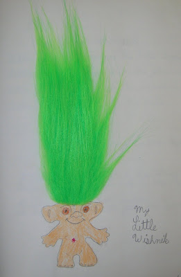

For those of you who are too young to remember the 1970s, "Wishniks" were the same as what are now called "Trolls". Evidentally, I loved my Wishnik so much that I dedicated a poem to him.
Well, I'm off for the day. I have countless invoices to run and photos to pull and package for my Musty Boxes Ephemera shop.
Until Next Time:
Kim
Garden Painter Art

Italia Modern Design - Published by PIE Books c2007
Japanese publisher PIE Books has put together some excellent design related books over the past couple years including Book Design of Graphic Designers in the World, Olle Eksell and Book Design of Graphic Designers in Japan. I picked up Italia Modern Design recently and it doesn’t disappoint. The book focuses on Italian graphic design from the 1950s-1970s and includes many of the heavyweights like Bruno Munari, Giovanni Pintori, Max Huber, Enzo Mari, Pino Tovaglia, Albe Steiner etc. It also includes a fair amount of work from Olivetti and Pirelli.
The people at PIE Books do a great job of sourcing and presenting the materials. They always dig up a few posters/books/magazines that I’ve never seen before. I just wish they would include an English translation (all the text is in Japanese) so, I can follow along with the notes.


No Tags
Share This
New giveaways coming soon at Grain Edit ©2008 Grain Edit


Bag for Polish handicraft store Cepelia 1970s?
Breaking out that case of premium rooster loot. Found this a while back at the local dirt mall. The type is nice, but really its all about that rooster tail. Even the rooster can’t get his eyes off it. I’d be having a how ya doing all day too if I had a tail like that.
The bag comes from Cepelia, which is a chain of stores in Poland that promotes and preserves the traditional art forms and craftmanship of the Polish peasantry. I stopped by their website and it looks like they have some really interesting stuff. Paper cut outs, ceramics, textiles etc. It’s like the OG Etsy. Cepelia has been around for over 50 years and hopefully will be around for 50 more.

No Tags
Share This
New giveaways coming soon at Grain Edit ©2008 Grain Edit

By: Dave,
on 10/28/2008
Blog:
inspiration from vintage kids books and timeless modern graphic design
(
Login to Add to MyJacketFlap)
JacketFlap tags:
modern,
vintage,
posters,
1960s,
1970s,
graphic-design,
Uncategorized,
France,
out-of-print,
Add a tag
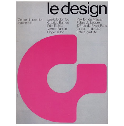
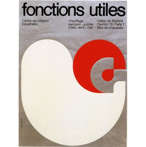
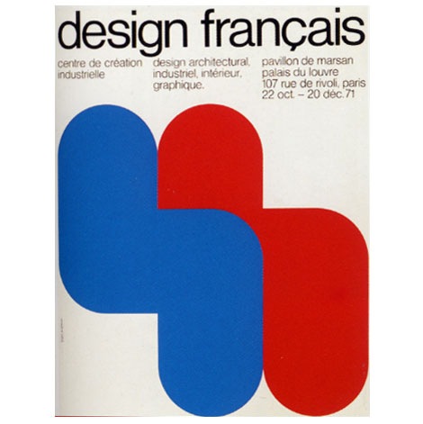
Posters for Centre de Creation Industrielle 1969-1972
Beautiful work form the highly underrated French designer Jean Widmer. These posters were created for the Centre de Creation Industrielle. Jean designed the logo as well as all the exhibition posters for the Centre until 1975. He’s mentioned in interviews that his work was influenced by some of the Swiss modernists including Josef Muller Brockmann and Max Bill. You can easily see that influence in this poster series.
also worth checking:
Publicity and Graphic Design in the Chemical Industry by Hans Neuburg
No Tags
Share This
New giveaways coming soon at Grain Edit ©2008 Grain Edit

By: Dave,
on 10/3/2008
Blog:
inspiration from vintage kids books and timeless modern graphic design
(
Login to Add to MyJacketFlap)
JacketFlap tags:
japan,
birds,
out-of-print,
Off our book shelves,
posters,
1970s,
graphic-design,
rare,
illustration,
Add a tag
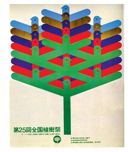
This is every cat’s nightmare.
Very similar in style to this 70s Japanese poster. Has to be the same designer.

Can someone translate this?

Is this the designers name?
Also worth checking:
1960s Japanese graphic design magazine
No Tags
Share This
Drop a comment and enter to win lots of cool prizes in the Grain Edit 1 Year Anniversary Giveaway Shindig thing! ©2008 Grain Edit

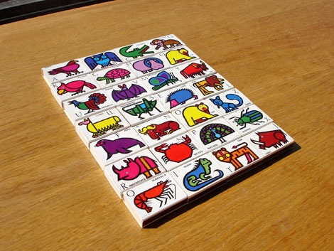
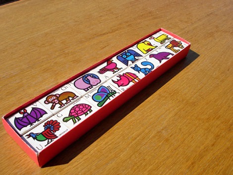
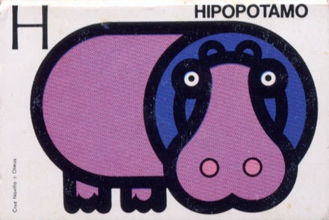
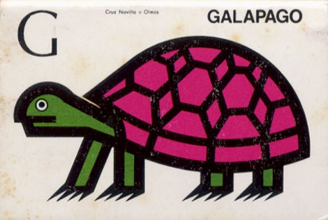
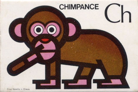
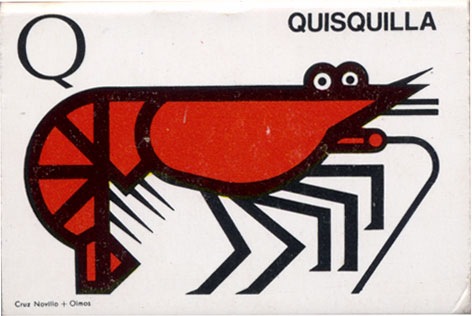
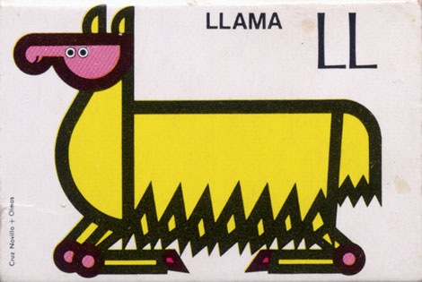
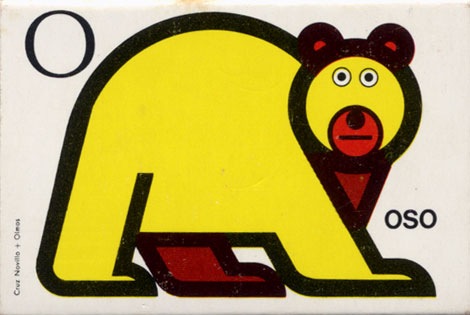
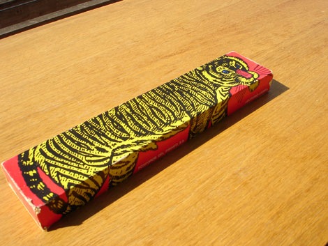
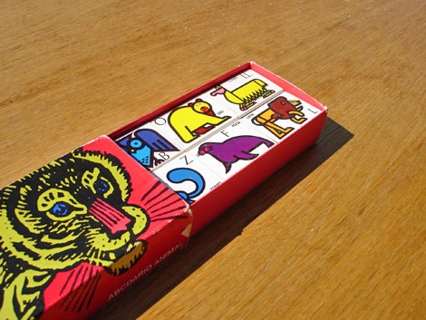
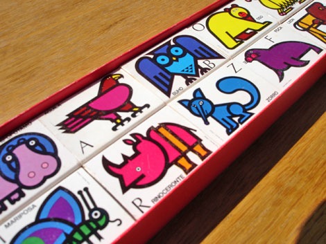
Fosforos Del Pirineo - Abccdario Animal (Animal Alphabet) Spain 1970s?
I found these recently. Super cool matchbox covers designed by Cruz Novillo + Olmos. The matchboxes feature an illustration of an animal for each letter of the alphabet. Hard to pick a favorite, but I think I have to go with the yellow oso (bear) loco. I think he cloned himself, because I notice I have two of the letter “O”.


Also worth checking:
Spanish modern advertising
No Tags
Share This
Congrats to JAN D you won the Raymond Savignac poster. Please email us to claim your prize. ©2008 -Visit us at Grain Edit.com for more goodies.

By: Dave,
on 9/15/2008
Blog:
inspiration from vintage kids books and timeless modern graphic design
(
Login to Add to MyJacketFlap)
JacketFlap tags:
BOOKS,
illustration,
labels,
out-of-print,
retro,
vintage,
1960s,
1970s,
Found design,
ephemera,
sweden,
graphic-design,
czechoslavakia,
Add a tag
This is turning out to be Maraid day. She has an amazing collection of photography and ephemera, plus she always posts beautiful labels to our Mid Century Modern Sticker, Label and Stamp Club.
Get lost in her collection.
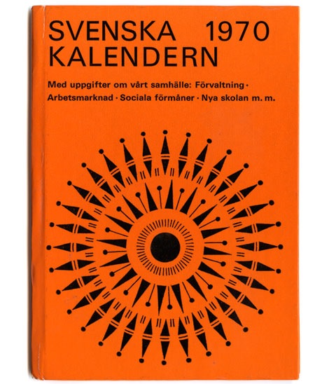
Swedish Almanac 1970
Thanks to Michael Murphy for reminding me just how awesome her collection is.
Also worth checking:
70s Czech Matchbox Label
70s Czech Matchbox Label part 2
No Tags
Share This
Congrats to JAN D you won the Raymond Savignac poster. Please email us to claim your prize. ©2008 -Visit us at Grain Edit.com for more goodies.

View Next 25 Posts


