JacketFlap connects you to the work of more than 200,000 authors, illustrators, publishers and other creators of books for Children and Young Adults. The site is updated daily with information about every book, author, illustrator, and publisher in the children's / young adult book industry. Members include published authors and illustrators, librarians, agents, editors, publicists, booksellers, publishers and fans. Join now (it's free).
Login or Register for free to create your own customized page of blog posts from your favorite blogs. You can also add blogs by clicking the "Add to MyJacketFlap" links next to the blog name in each post.
Blog Posts by Tag
In the past 7 days
Blog Posts by Date
Click days in this calendar to see posts by day or month
Viewing: Blog Posts Tagged with: out of print, Most Recent at Top [Help]
Results 1 - 25 of 37
How to use this Page
You are viewing the most recent posts tagged with the words: out of print in the JacketFlap blog reader. What is a tag? Think of a tag as a keyword or category label. Tags can both help you find posts on JacketFlap.com as well as provide an easy way for you to "remember" and classify posts for later recall. Try adding a tag yourself by clicking "Add a tag" below a post's header. Scroll down through the list of Recent Posts in the left column and click on a post title that sounds interesting. You can view all posts from a specific blog by clicking the Blog name in the right column, or you can click a 'More Posts from this Blog' link in any individual post.
For the first time since 1991 The Abandoned (aka Jennie) by Paul Gallico is coming back into print in the United States. The book has been featured on the BookFinder.com Report, for the most sought after out-of-print books in America, 5 times including each of the last 3 years.
The novel is about a young London boy who is hit by a large truck while attempting to save a stray cat. When he comes to he realizes that he has been transformed into a feline himself, and with the help of a savvy stray, Jennie, learns to navigate the tough city of London on four paws.
The latest publisher of the book is The New York Review of Books, and I got a
chance to ask their publishing Editor, Edwin Frank, why he decided to bring the
book back into print after so many years.
“When I was a kid I had a friend who
loved Gallico, and remembering that I read "The Abandoned" around the
time we started the kids book series. I didn't acquire it right then,
but it stuck in mind--it's a memorable book--and it kept coming up in
surprising ways in conversations with different people, always an interesting
indication. So I bought it....”
Have you ever forgotten a really good book? One that's out of print now? And then suddenly you come across it, maybe in a library, or a used bookstore, or even (in my case) on your own very crowded bookshelves, and you say, OH! That book!
That was my reaction when weeding out my bookcases recently to try to squeeze in more acquisitions, and my eyes lit upon this:
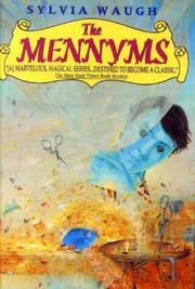
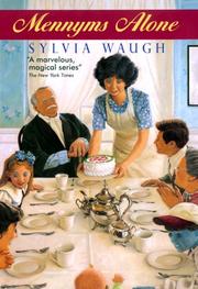
The Mennyms by Sylvia Waugh (first published in the UK in 1993; US edition published by Harper, 1996, for ages 8 to 12). First in a sequence of five books which includes:
(And if these titles remind you of The Borrowers, you're close!)
I nearly cried when I learned these books were going out of print, soon after I started working at the bookstore ten years ago. I purchased all of them in paperback, read them several times and put them away on a shelf.
Who are the Mennyms? They're a family of life-size dolls created by a lonely British woman, and when she dies... they come to life. But they still have button eyes (take that, Neil Gaiman!) and they look, well, like dolls. Soobie, the teenaged son, is blue. The rest are more realistic, but they're still dolls, so they must stay close to home and not go out unless wrapped up in enough clothing to disguise themselves. They never age, they don't eat or drink, but they can communicate with the rest of the world by telephone or by writing letters (keep in mind, these books were written before computers and cell phones). They're even clever enough to earn a living (Vinetta sews dresses, for instance, and Granpa, also known as Sir Magnus, writes articles for the Times).
But trouble arrives in the form of a letter from their new landlord, who lives in Australia, and who has decided to pay a visit...
Wish I could tell you to go out and buy these books, but they're all out of print. You know by now that I don't own an e-reader (and I'll resist as long as possible), but I can see that these are great candidates for e-books, if only to keep them from disappearing forever.
What out of print treasures do you wish would come back into print?
these books looks so sweet! thanks for highlighting them. i'm not sure what books i loved as a kid are not in print anymore. the thought does make me a little sad!!
I haven't heard of these (but the button eyes creep me out). I wish books never wouldn't go out of print. Maybe they're on Ebay for hundreds of dollars? :-)
This sounds like a good series! It's sad when books are out of print, but sometimes you can still find them :) I wonder if I can find these - maybe at the library!
I, too, love the Mennyms, but they are an increasingly hard sell in my library. Waugh's Space Race was hot for a few years, but again has lagged. I am fortunate that my school library has most of the books I deem essential, but from time to time a student loses one and I have to stalk half.com until I find a reasonable price. I was glad for Image Cascade republishing Dinny Gordon-- I'd forgotten how the series ended and the copies were hideously expensive until they were brought back.
Story and drawings by Mervyn Peake
Originally published in Country Life magazine 1939
Macmillian 1967 reprinted by Candlewick 2001
The Captain and his oddball crew settle in on an uncharted island where they encounter a creature the color of butter and then... do nothing?
The good Captain is a bruiser who has run through his share of crew. His ship, The Black Tiger, has lost many a men to
0 Comments on Captain Slaughterboard Drops Anchor as of 1/1/1900
A customer walks into a bookstore and asks for a book. Only it's not on the shelf. "We'll order it for you," the clerk says.
"No thanks," says the customer, and instead ends up ordering the book from Amazon.
Now bookstores might be able to print the book, using an Espresso Book Machine.
According to Shelf Awareness: The bookstores will be able to offer trade paperbacks from the HarperCollins catalogue through a mix of traditionally printed books and print on demand, with the latter sold on an agency model. HarperCollins trade paperback books, including adult and children's titles, will be available on Espresso Book Machines starting in November. Titles from Zondervan and HarperCollins Canada will be available early next year."
And the article adds: Harvard Bookstore owner Jeffrey Mayersohn noted that the "ability to have available any book that our customers could possibly ask for is key to our vision of how to thrive in this challenging environment.
1. How will a book be considered "out-of-print"? As an author who has made some decent money putting my out-of-print books out as ebooks, that's of concern. Or take an author who hits it big and then has the chance to go back and put out his old books with a different publisher for more money. How the out-of-print clause is defined is going to be important. Speaking as someone who made a few dollars putting her out-of-print backlist on the Kindle ( April's books on the Kindle), that's important.
2. One thing the article doesn't mention is how much those Espresso print-on-demand books will cost. A POD version of a traditional mass market paperback or trade paperback can much more.
As Seattle Mystery Books noted on its blog a year ago: We needed to reorder David Rosenfelt's Sudden Death. This was a regular 'ol mass market paperback, $7.99 from Warner. (Warner no longer exists as a publisher - it is now Hachette). But at some point, the book was switched to this POD system. What arrived was a trade paperback edition priced at $20.99 AND with a much lower discount. So now the book is far more expensive to put on the shelf and nearly impossible to sell at that price.
Leslie Silbert's Intelligencer is a book that Fran sells (guess I should say 'sold) continually. It is a dual-time thriller, set in the past and the present, a private eye story and a bibliomystery. Since 2005 when it came out as a $14 trade paperback from Simon & Schuster, we sold 82 copies. Now it is a POD from Ingram priced at $22.99.
by Helen Palmer
with photographs by Lynn Fayman
Random House / Beginner Books 1964
A boy trades up from a turtle to increasing larger pets, building and modifying homes for them, until finally he has a house big enough for a Boogle. (What's a Boogle?)
It starts with a turtle, a pet this boy has always wanted. He builds a house for it to live in out of wood. The next day the turtle has run
1 Comments on Why I Built the Boogle House, last added: 4/5/2011
Reading Theodora Keoghlastyear, I was amazed not so much that I’d never heard of her, but that it seemed almost no one had. More recently, Blake Bailey’s comprehensive biography of John Cheever underscored how many writers, acclaimed in one decade, end up forgotten.
In 1997, having little experience with contemporary fiction and not much idea where to start, I found the finalists for Granta’sLet the Dog Drive (1994; out of print) and Bunny Modern (1998), whose writing is original and bizarre and stylistically reminiscent of some of our finest writers, and yet I can’t find out anything about him, rarely encounter other readers who have heard of his work.
Let the Dog Drive gives us glimpses of Bowman’s wonderful imagination. The genre-melding novel focuses on a road trip between the narrator, a strange, eighteen-year-old boy named Bud Salem, and a strange, forty-five-year-old housewife, Sylvia Cushman. Bud is running away from his mother, an unhinged televangelist (“My mother told her congregation that the face of an angel named Mupiel had appeared in the window of our dryer one morning.”), and Sylvia is obsessed with Emily Dickinson (“Emily Dickinson was a frail weed. A plain woman. The only beauty among the kangaroos.”). It’s impossible to provide a synopsis of the novel without getting dizzy; within the first ten pages of the novel, when Bud discovers Sylvia on the side of the highway, pitching oranges into the desert, we learn that Bud has just shot a man, that his mother “proclaimed that God’s supplement to the Bible — The Third Testament — had been placed in our Mercury’s glove compartment,” and that his father was “killed by a hippopotamus.” So, yes, it gets a little weird. And while there is a kitchen-sink approach to the weirdness that sometimes gets in the way of the narrative, it’s an entertaining read and serves as a primer for the even stranger book that would follow, Bunny Modern.
The jacket copy for the novel calls Bunny Modern “a hard-boiled comedy about love, abduction, and child-care set in a future where electricity has disappeared and fertility is on the wane.” This, strangely enough, does not even begin to accurately describe the book. The main character is a former child star turned private eye who is able to read women’s minds. He is in love with a woman named Claire, a nanny who, because of the low birth rate, is forced to carry a Glock to protect the baby from kidnappers. She snorts lines of Vengeance, a drug that simulates the mother-animal instinct, in order to recover the kidnapped baby by any means necessary. Crazy, crazy shit happens. And it is so much fun to read.
If I had to compare Bowman to other contemporary writers, it’s easy enough to draw connections between the sci-fi/pulp-detective genre mashing of Bunny Modern with Jonathan Lethem’s Gun with Occasional Music, and the Bowman’s strange, dystopian future with David Foster Wallace’s Organization of North American Nations in Infinite Jest. And while I don’t think Bunny Modern is as good as the best of Lethem and Wallace, I certainly think it’s close enough that I want more people to read Bowman’s work. There’s something to be said for the strange thrill of having absolutely no idea where you’re going, understanding that the author might not have any idea as well, and not caring.
Since Bunny Modern in 1998, Bowman has yet to publish another novel, though he did write a book about the Talking Heads. A 2007 contributor’s bio for the New York Times Book Review stated that he had “recently completed his third novel, The History of Naked Women.” I’m waiting.
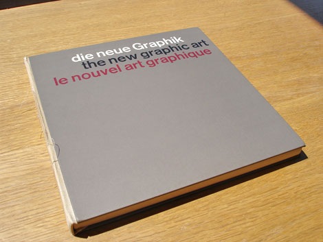
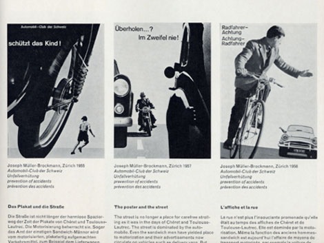
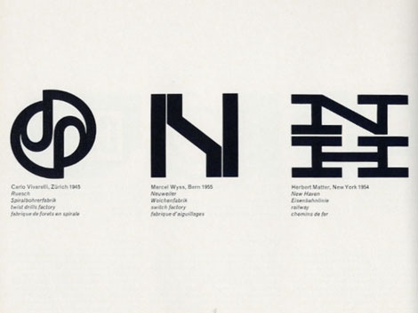
Karl Gerstner and Markus Kutter - the new graphic art - c1959 published by Arthur Niggli Ltd.
Classic book that surveys modern graphic design from its origins up till the late 1950s. Filled with advertisements, posters, packages, lettering, logos and displays. Lots of Swiss design to drool over. I just wish there were more color images.
I love the clean type and the 3 column grid on the cover. The modern day remake of the cover would be exactly the same except someone would replace the header “die neue graphik” with “this is a design book”. Ha
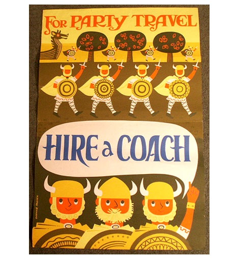
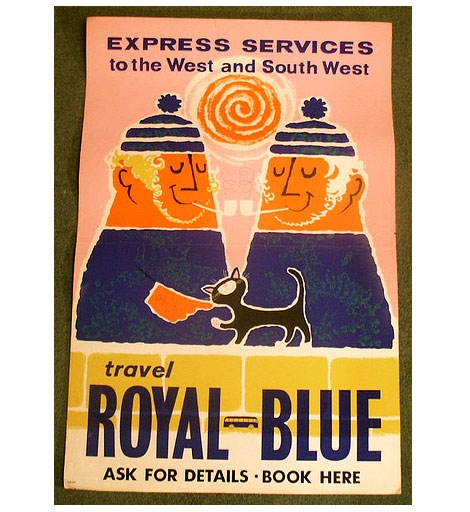
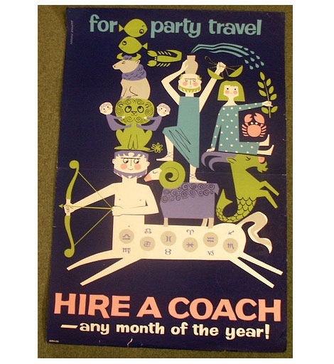
Allison at The Lark posted an amazing collection of vintage travel posters by British artist and illustrator Daphne Padden. Most of the posters in the collection were created for Royal Blue Coach Services (A Bus company located in the UK) during the1950s and 1960s. Her work is fun and filled with little men with big beards! The illustration style reminds me of Tom Eckersley and Abram Games.
Daphne was born in 1927. Her father was Percy Padden, a famous poster artist of the 1920s-1940s.
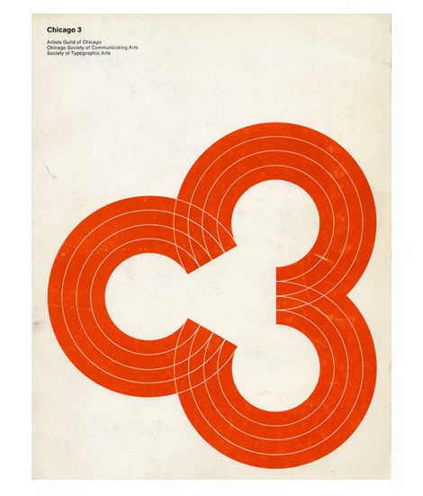
Cool cover for the 1969 Chicago 3 design annual. Consists of three “C’s” or if you look from left to right, the letter “C” and the #” 3″. The annual is a catalog of work from the Artists Guild of Chicago, Chicago Society of Communicating Arts and the Society if Typographic Arts.
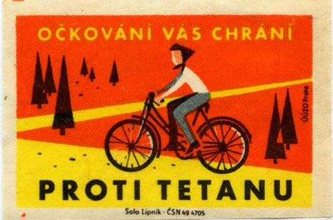
Solo Lipnik - UUZO Praha - Pronti Tetanu label - 1960s?
Super cool matchbox label from Czechoslovakia. Pretty intense colors. Nothing like taking a bike ride through a field of ketchup. Can anyone translate the text?
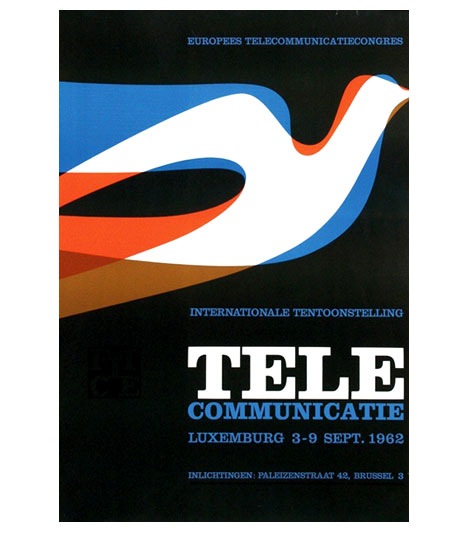
Tele Communicate poster for an event in Luxembourg, 1962
I love the layering of color within the bird. If you were to isolate the blue shape, the bird would look similar to Alexander Girard’s design for the Braniff Airlines logo in 1965.
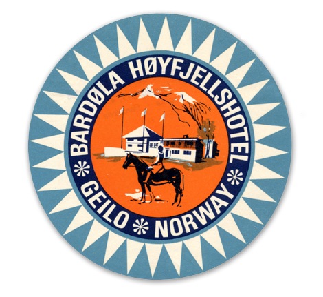
Label from Bardola Hoyfjellshotel in Geilo, Norway - c1960s?
I think I’m obsessed with modern Scandinavian design from the 1950s- 1960s. First it was furniture and kids books, then Ceramics and now luggage labels! Where does it end? What’s in that Nordic water?
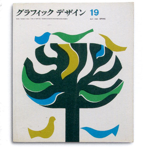
Running with a Japanese theme today. Can’t stop thinking about those flicks I caught this past weekend. Great cover for a Japanese graphic design magazine from the sixties.
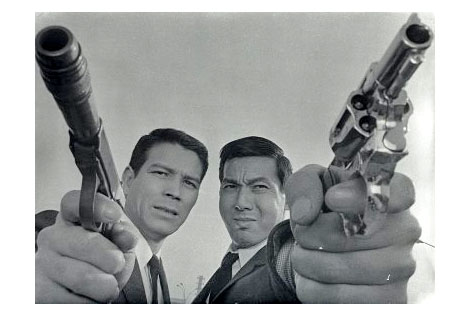
Jerry Fujio and Jo Shishido in A Colt is my Passport c1967
I had a chance to check out a few films from the No Borders, No Limits: 1960s Nikkatsu Action Cinema series this weekend. These super stylized films produced by the Nikkatsu film studio were heavily influenced by Hollywood and the French New Wave. The Seijun Suzuki films re-released by Criterion are part of the Nikkatsu catalog. If you’ve seen any of Suzuki’s films, it will give you an idea of the films featured in the No Borders, No Limits series.
The series focused on some of the more obscure films to come out of the Nikkatsu studio. All 3 films I saw were great. I just wish I could of seen the other 3. You can find out more about these films at Outcast Cinema.
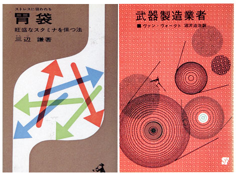
I don’t know much about the company that published the book on the right, but the book on the left was published by Kappa in 1963. Keep your eyes out for Kappa, they have other cool covers.
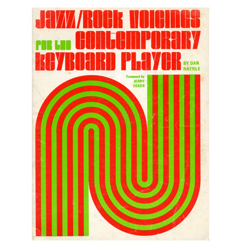
(t) Jazz/ Rock voicings for the contemporary keyboard player c1974
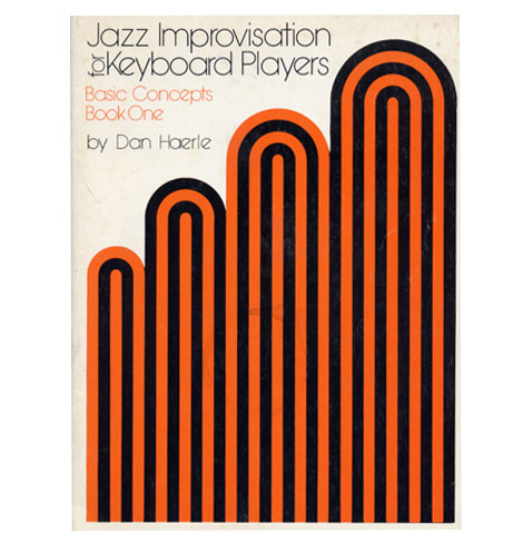
(b) Jazz Improvisation for keyboard players c1978
I picked up these two books over the weekend. They are part of an instructional jazz book series produced in the 1970s for Studio publications and recordings. I’m not sure who responsible for the cover design but, I like how he limited it to a few simple shapes and the type. Both books are written by Dan Haerle, but there are others in the series by Rufus Reid and Ramon Ricker.
From the book - Jacqueline S Casey Thirty years of design at MIT
Beautiful work from graphic designer Jacqueline Casey. It mentions in the book she was inspired by Karl Gerstner, Kurt Wirth and Anton Stankowski.
“In the early 1950s, John Matill, a writer and editor, founded the MIT office of publications. He was joined in 1952 by Muriel Cooper. Cooper was among the first designers ever hired by a university to represent it graphically. She and Matill hired Jacqueline Casey to design summer session materials in 1955.” Casey continued to work for MIT until her retirement in 1989. (Taken from the introduction of the book.)
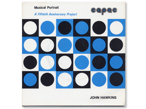
The Asian American Film Festival is in San Francisco now, so I had a chance to check out “Blood Brothers” which is one of the more recent films produced by John Woo. Anyone else seen this? Overall I thought it was pretty cheesy, but the ending wasn’t too bad. On the way to the theater I stopped by my friend Cool Chris’s record shop. Chris runs Groove Merchant which is notorious amongst beat diggers and record collectors as the place to go if you want to find rare jazz, funk and library lps. While I was there Chris hit me off with a copy of the record above.
The John Hawkins lp seen above is part of a series of 45s (the little records..7″) initiated by CAPAC (Composers, Authors and Publishers Association of Canada Limited). I’m less concerned with the music on this album as I am with the design of the logo. The rounded letters take form as records with the lines of different weights creating the grooves. It wasn’t uncommon to see logo treatments like this in the 1970s but in this case it works for me.


.jpg?picon=139)


 Reading
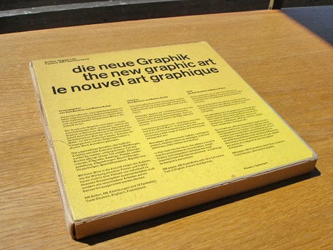

I love the covers. I can't think of any that I loved that went out of print. Maybe because I don't have the book anymore.
Have a great break!
these books looks so sweet! thanks for highlighting them. i'm not sure what books i loved as a kid are not in print anymore. the thought does make me a little sad!!
I haven't heard of these (but the button eyes creep me out). I wish books never wouldn't go out of print. Maybe they're on Ebay for hundreds of dollars? :-)
The button eyes are a little creepy, but I think it's interesting that she thought of it before Neil Gaiman wrote CORALINE.
Ah, if these are on Ebay for that much money, then I'm in great shape!
Hi Gina! They are sweet stories, so it's a shame they went out of print so quickly.
Thanks, Natalie.
The first cover is a little odd, but I love the rest of them.
This sounds like a good series! It's sad when books are out of print, but sometimes you can still find them :) I wonder if I can find these - maybe at the library!
There you go, Erik! That's what libraries are for. Good luck!
How fun that you found the books again! :) Have a nice break!
Thanks, Jennifer!
I've never seen these. It's so fun to find books from childhood. It's too bad books have to go out of print.
I, too, love the Mennyms, but they are an increasingly hard sell in my library. Waugh's Space Race was hot for a few years, but again has lagged. I am fortunate that my school library has most of the books I deem essential, but from time to time a student loses one and I have to stalk half.com until I find a reasonable price. I was glad for Image Cascade republishing Dinny Gordon-- I'd forgotten how the series ended and the copies were hideously expensive until they were brought back.
Great minds ... I blogged about my favorite out of print board book just last week ... Max's First Word.
So true, Andrea!
Oh, yay! Glad to hear you've read The Mennyms. But sorry to hear the students aren't that interested.
And it's wonderful that you try to keep your library so well stocked.
Hi Linda! Haven't heard from you in ages. How funny that we both talked about out of print books recently.
What a fabulous feature! Now I want to go looking for these books.
Excellent! That's the whole point! Thanks.
I've never heard of these books so thank you for introducing them to me. I wish they weren't out of print though. :(
That makes two of us, Akoss!