new posts in all blogs
Viewing: Blog Posts Tagged with: hot tips, Most Recent at Top [Help]
Results 26 - 50 of 72
How to use this Page
You are viewing the most recent posts tagged with the words: hot tips in the JacketFlap blog reader. What is a tag? Think of a tag as a keyword or category label. Tags can both help you find posts on JacketFlap.com as well as provide an easy way for you to "remember" and classify posts for later recall. Try adding a tag yourself by clicking "Add a tag" below a post's header. Scroll down through the list of Recent Posts in the left column and click on a post title that sounds interesting. You can view all posts from a specific blog by clicking the Blog name in the right column, or you can click a 'More Posts from this Blog' link in any individual post.
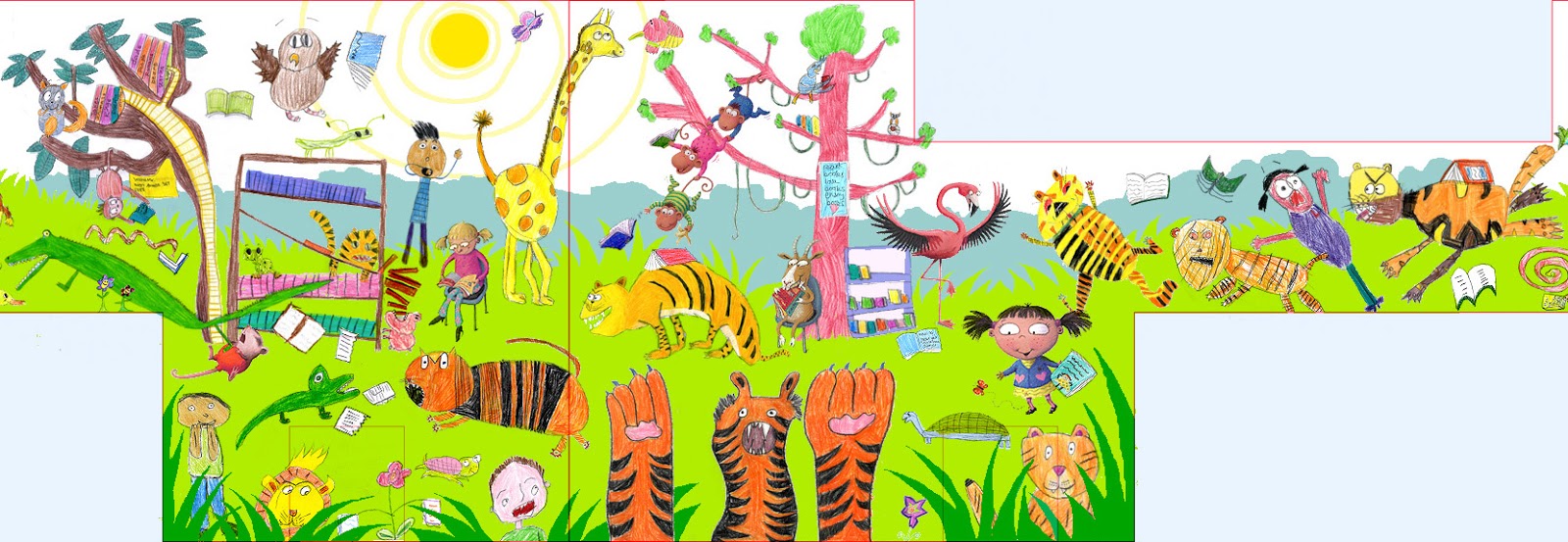
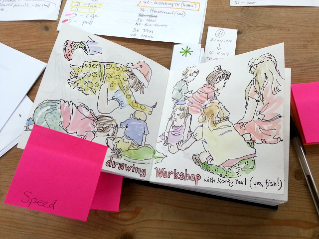
On Friday afternoon, I emailed my mural design to Wakefield Libraries - hurrah! It's looking really fun, as the children's drawings were even better this time around. This is a section from the middle:
The drawings weren't all finished and some were a bit wishy-washy, but I found it rather soothing, spending a whole day touching them up, colouring-in with my big tin of Derwent pencils. Then John helped me out by scanning everything (just low-res for now).
I abandoned my original plan of designing it in 3 sections: I needed to see the whole thing as one, with all 4 walls strung together into a long, thin template. I used the plans I drew a couple of weeks ago.
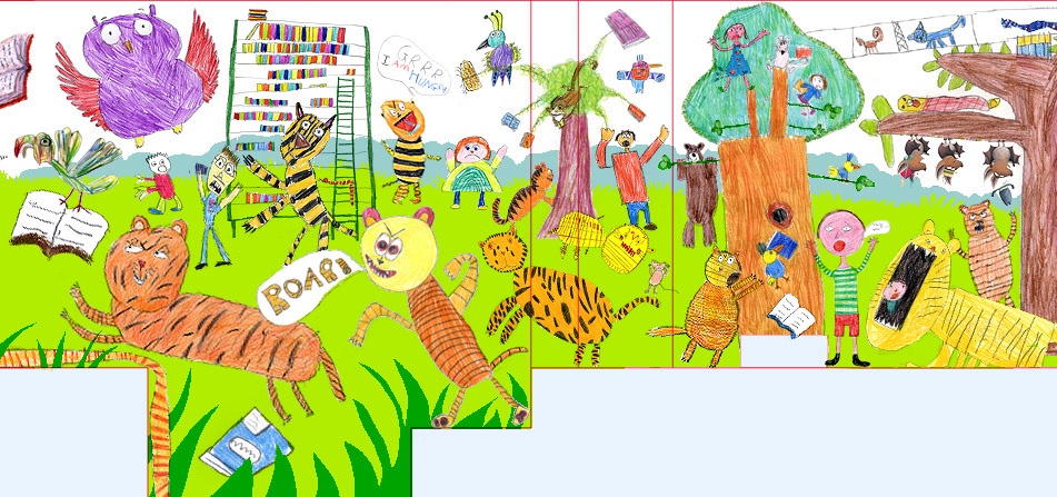
With over 100 drawings, it was hard to know where to begin. I had calm, library-like details as well as crazy, tiger-infested ones. This gave me the idea for the layout: the tigers could be bursting in from one end, so the other end would still be normal, for contrast. This is the far left, the calm end (with just the odd hint of tiger-trouble):
I established a horizon line early on, to stop things floating, and started to import the drawings, creating little groups and gradually building it up. It didn't look enough like a jungle though, so I introduced big fern-like shapes and tree-covered hills in the distance. Here are the first 2 stages:
I did my best to include everyone's work, though it got fuller and fuller! I did have to admit defeat before I fitted in every drawing, but I squeezed the vast majority in there. This is the tiger end, with my tiger from Open Wide, starting things off:
As with the first mural, in Wakefield Central Library, I was asked if I could pop some of my own characters in amongst the children's. There are quite a few dotted through this one.
Here is the section which joins onto the one above, as the tigers work their way into the library. My little trio of bats-in-hats are from When You're Not Looking! of course. I love some of the detailed and surreal shelving systems the children devised:
I hope you are impressed at how I managed to shoe-horn the Romans in. This was a requirement, because Castleford is an important archaeological site. In the end, it was a fun addition to have them bursting from the history shelves:
It was such a massive job that I had to spend all week glued to the computer, working it all out, but it was good fun and John had to virtually drag me from my chair at about 7 o'clock each evening.
I haven't yet included Henry Moore (Castleford was his place of birth), for want of a copyright-free image, but my idea was to add a hill in the background, with one of his massive sculptures on it. If necessary, I have a couple of sketchbook paintings I have done at the Yorkshire Sculpture Park.
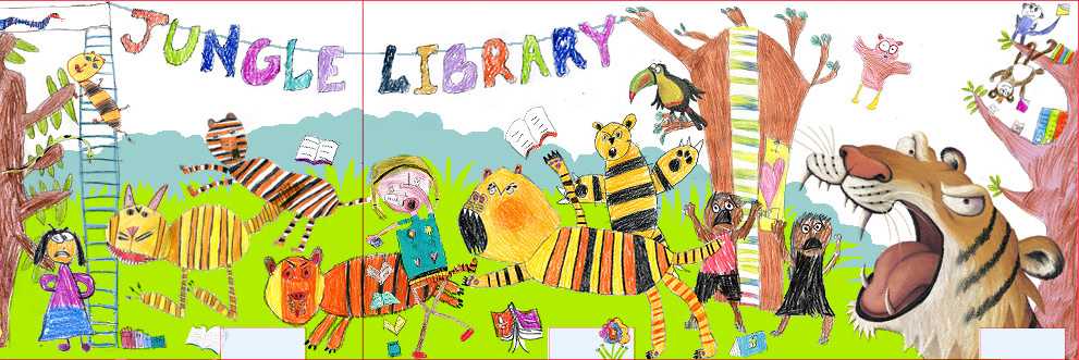
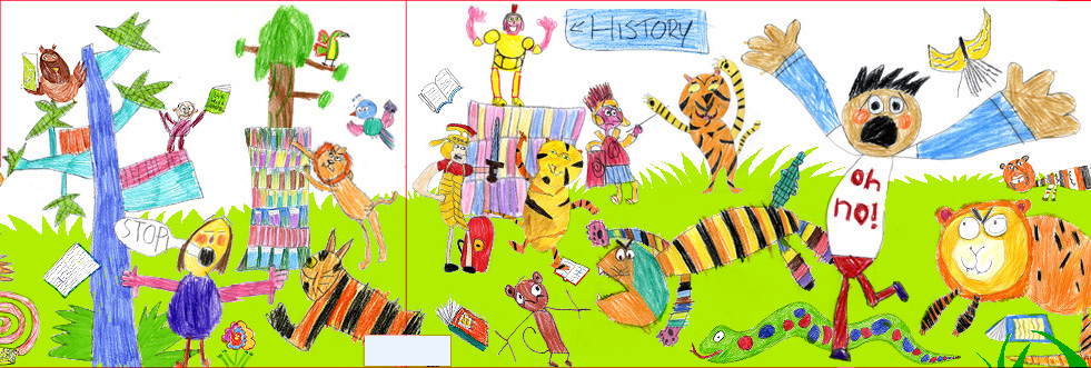
Here's the whole thing. It should enlarge to a size you can see properly:
Cross-fingers that they like it, after all that work! I'll let you know.
Regular readers will remember the excitement of the 13m long mural I created for the shiny, new Wakefield Library, working with local school kids. To be completely honest, I was really apprehensive about taking on the project, as I had never done anything at all like it before, but the results far exceeded my expectations, so I'm really glad now that I took the plunge.
Wakefield have had such amazing feedback (hurrah!) that they want me to do another mural, this time in Castleford Library, which is having a refurb. Again, I am a little nervous. This time it is even more complicated, as it is a whole room. Also, instead of a simple (albeit BIG) panel, I have to work on the whole space, designing around bookshelves and windows etc.
How to begin?!
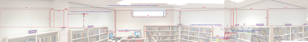
Well, I started by taking photos of the various walls in the space then, with a bit of jiggery-pokery in Photoshop, montaged them together to create a single flattened-out view:
So far so good.
I then asked the caretaker at the library to take his tape measure and note down every dimension. This was more complex than you might think, as I needed to know the exact size of obvious things like windows and bookshelves, but also the exact positions of objects like the alarm on the wall, the depth and width of the wall pillars, the height of the book-bag rail, the desk...
To organise that information into something that made sense, and thereby minimise the number of mistakes I was likely to make, I plotted all this information on top of the photo in Photoshop:
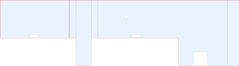
Then the even more fun job: I had to create a scale drawing of the space to act as a template: the shape to design the illustration into.
This is where it gets complicated, because the space is obviously VERY big. Eventually, I will create the high-res, digital artwork at 25%, but that's still going to mean working with massive files and, to stop the computer taking it's ball home, I will chop it up into 6 sections. Designing something in 6 bits is near impossible, so I am doing the designing at 10th size, so I only have to work in 3 sections.
This is what the template for section 1 looks like (the left third). You can see the pillar between the first 2 bookcases, the alarm and the first computer desk:
The next step is a bit more fun - a couple of illustration workshops with Y4 classes from local schools, to generate the children's drawings which I am going to build the design around. The workshops are tomorrow and the theme is: tigers loose in the library!
I am still writing my book for most of the working day at the moment, taking advantage of the opportunity to focus on one task, while I can. It's a bit like writing this blog actually, in that I am sharing tips and hints about how I work, but with a slightly different focus and format.
I'm enjoying the opportunity to talk about other people's work sometimes as well, but for the most part I am analysing what I do when I am drawing people in various situations, which of course makes me think differently about things which I have learned to take for granted.
This week, I decided to go back to basics and talk about how a fluid line is so much more useful that straight lines, when it come to sketching people, because basically, people are curvy. Straight lines tend to make them look stiff and lifeless. So, a couple of spreads in the book are dedicated to looking at how you can develop a more instinctive, fresh line, which will bring your characters to life and help communicate the sense that you have captured them mid-movement.
For the more hesitant sketchers amongst you, those who tend to twitch their pencil back and forth, barely moving, I talk about drawing from your wrist, elbow and even shoulders because, if you don't move your arm, you can't move your pencil expressively.
I demonstrate blind-contour drawing too, which is a great way to get your line loosened up, and I show how contour drawing helps you to hang onto the principles of instinctive eye-to-pencil sketching on an everyday basis.
Not forgetting of course, how a quick, linear sketch can be done with a paintbrush too - what a gorgeous, expressive line watercolour can give you if you keep your hand fluid!
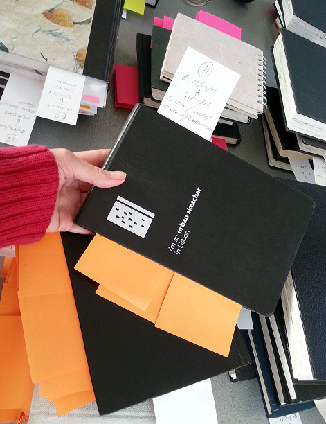
We have a title now by the way. It's going to be Sketching People, with the subtitle, an Urban Sketcher's Manual to Drawing Figures and Faces.
Happy New Year! Are you all having a lovely holiday? Looking forward to getting back to work tomorrow?
Actually, I am. I'm really enjoying writing my book on sketching people and it's coming on really well. I am well ahead of schedule, which is good news, because I won't have much time once the work for the new children's library mural kicks in, not to mention all the school visits I have lined up between now and mid March.
My deadline for delivering the text is staggered. It's divided into 5 stages. I have to upload 20% of the content each month, between February and June. Since the spring will be tricky, I uploaded my first 20% just before Christmas. Because of the holidays, I've not had any feedback yet.
As well as the Drawing Strangers is Scary chapter I was telling you about last time, I have now completed the book's final chapter, called Capturing the Moment (if you remember, I am not taking them in order). After all the sections with more specific tips about how to draw people, which I've mostly yet to write, I finish up by sharing techniques for getting more out of your sketches.
This section talks briefly about the difference between an urban sketch of a person and a portrait. Urban sketching is not so much about getting a likeness when you draw someone, as presenting a snapshot of them: a person as part of a time and place. That's why I never ask permission when I sketch people - it has to be natural, because I want to catch someone going about their life, not posing.
I talk about ways to soak up all sorts of peripheral information, to help place your sketch in-the-moment: bits of conversation, things that happen while you are drawing, observations about the weather etc, so that your sketchbooks don't only paint a very rich picture, but always take you straight back to where you were, like a visual diary.
As you know, I love incorporating this extra information, so I share techniques for adding text and having fun with the way you arrange things on a page, because the contents of your sketchbook does not have to match what's out there: you are free to experiment and play.
I think next, I might tackle the section which talks about how to cope with the fact that people move. It's very inconvenient, but inescapable: they do it all the time. But fear not - I have lots of tips to share!
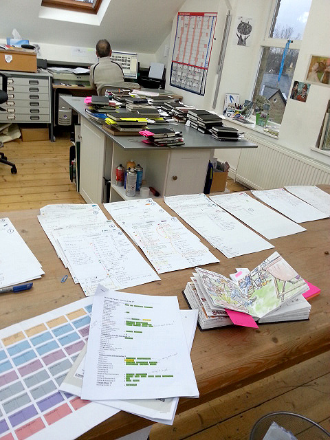
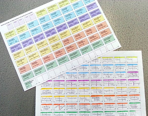
Now that the basic structure of my sketching book is sorted, I have to go back to all the piles of sketchbooks which John and I waded through when I first got started on the project in the summer. Of course, there are a few new ones now too.
Back then, I had a rough idea of the categories I was trying to illustrate, and used colour-coded bookmarks to help with that. Now the book's structure has been fine-tuned, I'm ready to make the selections, but I have to find a way of shortlisting from the hundreds of possible sketches, buried in nearly 90 books.
The plan we hatched was to work through the images we bookmarked last time, taking quick snaps on my phone, so I can see them all together. I used post-it notes to tag drawings against the sections of the book I had in mind. Trouble is, the tags needed transferring to the photos I'd taken, or I'd just end up with a bucketful of meaningless snaps, which wouldn't be much better than the piles of sketchbooks! Then there was the complication that most sketches could potentially work in various sections of the book. Oh dear...
There were so many images in play, I had to find a system that would be efficient, without being too time-consuming. John came to the rescue and downloaded Picasa: photo-album software, which lets you tag your images.
I have been working through the sketchbooks, numbering each sketch as I photograph it and logging it in a book, along with the number of the sketchbook (so we can find the sketch again when it comes to scanning), and any tags which might apply. The photos are then uploaded to the computer in batches and quickly renamed with the two reference numbers.
While I am snapping the next batch and scribbling in my book, poor John has the unenviable task of adding all the tags in Picasa. I'm still using the post-it notes, to speed up finding specific sketches if they make the grade and we need to scan them in:
The system is not as time-consuming as it sounds and we did the lot in a few days (though an emergency-dash to Staples had to be made half way through, for more post-its).
The tagging system is brilliant, as I can now pull together all the sketches of noses, or contour-drawing, or speed-sketching at the touch of a button. It's going to make the next stage much, much easier. Phew.
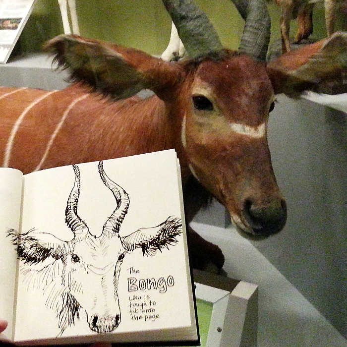
As you can see, I have been sketching stuffed animals:
But more of that later...
It's been a week since my trip to see the publisher of my latest project, the 'Sketching People' book. I have been pretty full-on with it ever since.
The meeting went really well. Everyone in the team was very friendly and easy to get on with. It was good to finally meet the designer, who I worked with on all the presentation spreads. Five of us sat round a table with proper coffee and very nice chocolate biscuits (their regular treat for author visits) and my editor sat me at the head of the table: I felt very important.
Once we got down to business, we really hammered away at the project. They were great at listening to my take on things and good at explaining what I needed to know, so all very positive.
I love that my editor is a straight-talker, like myself, so we got loads sorted in just a couple of hours. There were some tweakings needed to the flat plan and synopsis I had created, but luckily it was basically sound: the changes were mainly a structuring issue that I hadn't realised and a bit of streamlining, all of which was a great improvement.
A new flat plan has been created out of the meeting, although it is apparently still very fluid: the idea is that the structure is there to hang all my work on, but it can adjust to accommodate more or less space needed in the different sections, as I go along.After the meeting, I had a few hours to kill before my train home. It was bitterly cold and no good for sketching outside unfortunately, so I took myself and my sketchbook to the warmth of Natural History Museum, as I enjoyed it so much
the last time. Which is where our stuffed friends above come in.
The rest of last week was mostly spent choosing guest contributors for various sections of the book. We have to do that early on, to give plenty of time for people to sign the paperwork and get their artwork scanned. I need guests because there are some aspects of sketching people which I am pretty rubbish at - crowd scenes for one - so I have collected examples from people like
Caroline Johnson, who are great at it:
It's good to have a variety of approaches in other sections too, so I had my head in Flickr and Pinterest for days, searching people out, and got quite bug-eyed!
I have tried to mix it up a bit: some well-known
Urban Sketchers correspondents, whose work often appears in similar publications, but also some less known sketchers, as the book seems a great way to showcase talent. I sent a list of possibilities to the publisher today, and am waiting to hear what they think. Keep you posted!
Now I have the go-ahead for my Urban Sketching book on sketching people, the next job has been to convert the detailed synopsis I created earlier, into what's called a 'flat plan'. This is a way of ensuring that the chapter sections divide appropriately into the amount of pages I have at my disposal, and that the flow of the book works properly.
My editor sent me this template to work on. The idea is to fill it in with section-headings for each page and colour-coding for the chapters, to give a complete over-view of the book, at a glance.
It's been a really interesting process. It immediately pointed up certain problems with the plan as I had it, mostly because, as with picture books, you have to be very aware of how your material works as spreads and of course can't have random single pages. So, I have been re-jigging things, nipping and tucking my content. I did a rough flat plan with coloured pencils first then, once it was working properly, did a posh version in Photoshop:
Today, I am going down to London, where I will meet the rest of the team for the first time. Together we will go through my flat plan and make any changes necessary to fit with what they think will work best. As ever, although I am the author, a book is a team project. I might have a lot of experience in designing children's books, but this is a very different kind of project, so I am happy to be educated as we go along.
I'm excited to meet my editor and keen to get started! I'll let you know how it goes.
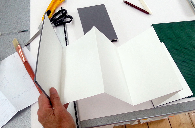
Concertina-format sketchbooks are a bit intimidating: I had one on my shelf for a whole year before I finally got up the courage to use it at last year's Urban Sketcher's symposium in Barcelona:
The trick is just to start. Once I did, I was away. I have filled two, on both sides, and am keen to keep going. There's something really exciting about the ability to create an on-going image - maybe one long landscape like the one at the top, done in Wales last summer, or combining sketches in creative ways like the Manchester one I did recently:
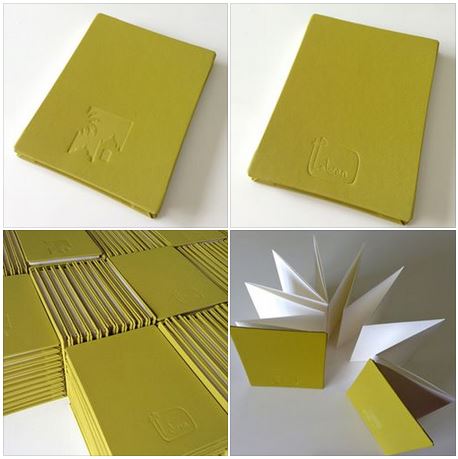
Trouble is, the nice watercolour paper ones are hard to come by and a bit pricey. So, I decided to try my hand at making my own to take with me to this year's symposium. How hard could it be? Well, a wee bit trickier than I thought, to be honest, but I got there.
I cut 2 big sheets of watercolour paper into 3 strips each, enough for 3 books: one slightly smaller one, like the Manchester one, and two medium, Moleskin-sized books. Working out the best page width was the first tricky bit. I then scored across the paper strips with a special device, ready for folding (you get it from book-binder's outlets):
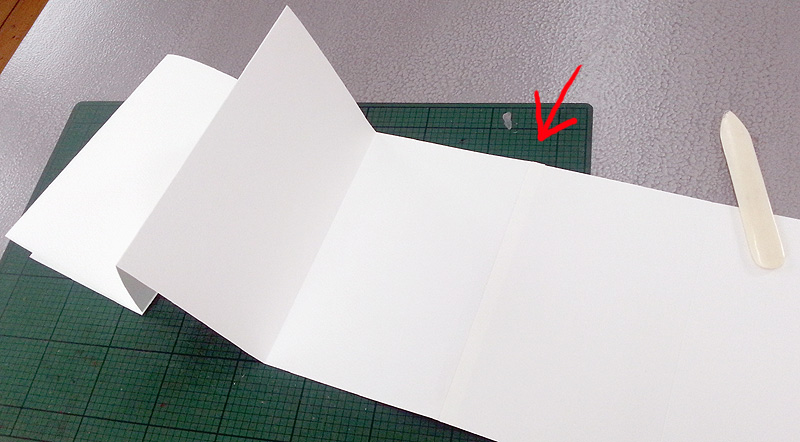
The width of one paper sheet wasn't enough on its own: there had to be a join to get a decent length of concertina. This was the next tricky bit - if you don't get the two strips exactly in line, the error accumulates with each fold. My first attempt was a bit wonky, because I didn't realise that. You can just make out the fold below. I allowed a 10mm overlap and joined the the 2 strips with double-sided tape:
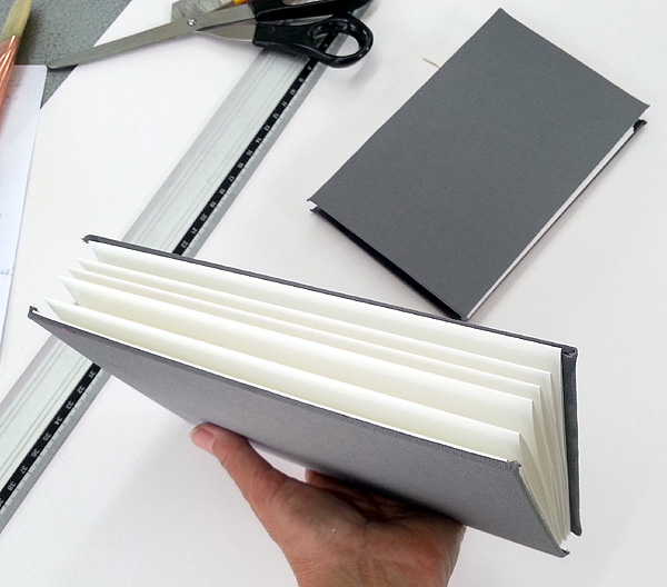
The really exciting bit is the binding. The little book I took to Manchester has no binding at all - no, really - just a board attached at each end. No sewing or making covers with spines: easy-peasy (ish).
The finished book folds up into itself and all you need is a rubber band to stop it unfolding. It's the perfect method. I covered the end boards with fabric from a dead pair of walking trousers, stuck on with PVA. The fabric didn't want to do what it was told, so the corners are a bit dodgy, but, all in all, it looks very smart and cost very little. Have a go!
I don't know about you, but when I am bombarded with new ideas and things to remember, I tend to boggle-over (technical term). If past years are anything to go by, the Urban Sketchers symposium in Paraty will be amazingly stimulating for all concerned, but for those taking all the workshops and going to all the lectures and demos, there's going to be a lot for the head to hold.
So, it's good practice for instructors to create a handout to go with their workshops. It makes things easier to take in on the day (especially for all those for whom English is a 2nd language), but it's also really handy for taking home as a record, to try again later.
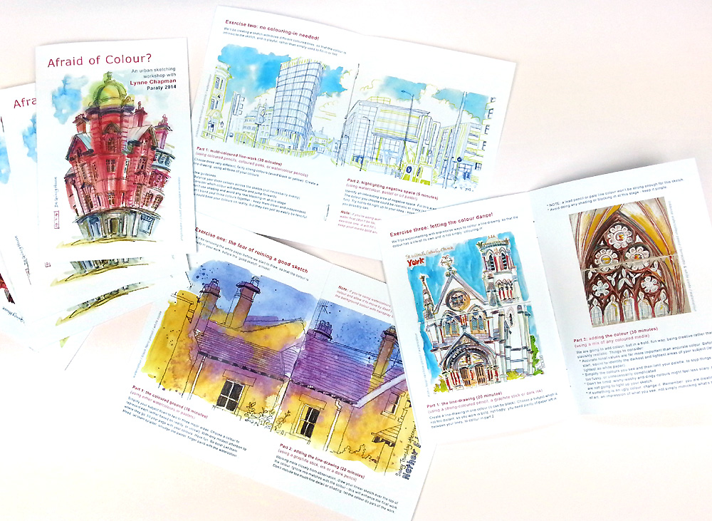
Last year I printed them myself at home, but it took forever and cost a fortune in ink and special thick paper (so I could print images on both sides without it showing through). So this year I thought I would pay to have them properly printed. Of course, it still took me ages to design them: I am too much of a perfectionist and wanted them to be a lovely keepsake as well as an instructional leaflet.
Each hand-out goes through the three exercises we are going to do in detail, with examples of my sketches, to demonstrate what I'm talking about. I waited until after my dry-run to create my handouts, so I could tweak things if necessary but, in the end, I didn't change much at all.
They came back from the printers a couple of days ago and they have done a grand job. They look great! They also weigh quite a lot, because there are 50 copies, each one consisting of 2 folded A4 sheets. But I (as usual) had tons to say and show, so wanted to give myself 8 sides to do it. At least I won't be bringing them back, which means the weight can be replaced by all the lovely, freebie sketchbooks we always get from our sponsors (yippee).
This year we are getting a slinky concertina book from Loloran, which looks similar to the one I used in Manchester recently:
...and a Strathmore book, like the one we got last year, which I LOVE:
We are getting all sorts of other bits too. It's really fun - like being a kid again, with a lucky-dip! I notice Moleskin is a sponsor, so cross-fingers we'll be getting a Moleskin watercolour book...
A big thank you to all the sponsors :-)
It's less than 2 weeks before I am off to Brazil (yippee), to run some street-sketching workshops in the sunshine, as part of the Urban Sketchers annual symposium.
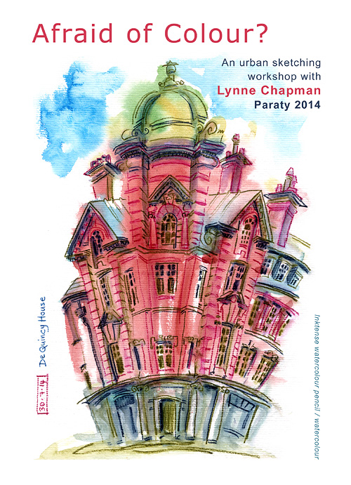
My workshop is called Afraid of Colour?. I've noticed that a lot of sketchers are great in black and white, but totally intimidated by colour. I used to mainly use a 3B pencil myself, but since I got into watercolour and discovered my Inktense pencils, I am having so much more fun.
With that in mind, I designed my workshop to share some ideas and pointers, to help others make that transition too. I have 3 identical workshops to run, each of 3.5 hours, which sounds a lot, but there's so much I want to do, it's been a struggle fitting it in. I was a bit worried that things might feel too rushed, so I thought I'd do a dry-run in Sheffield. I did the same thing the very first time I was selected to run a symposium workshop, in Santo Domingo (my speed-sketching workshop Quick-on-the-Draw). It's really useful to test that everything works in advance.
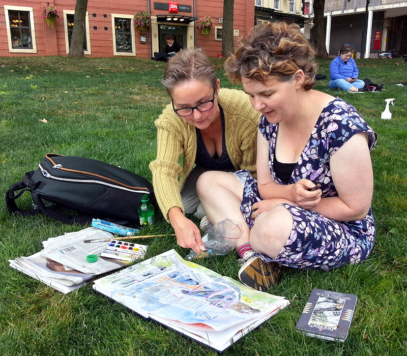
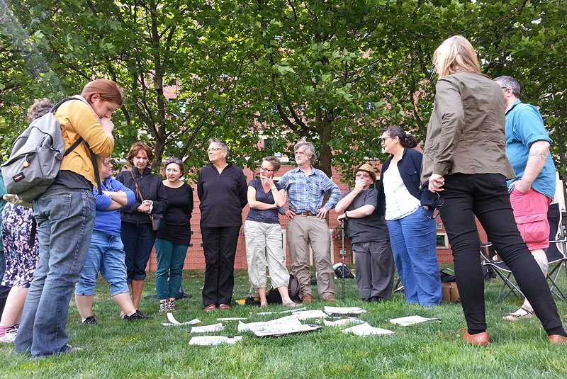
I offered it as a freebie to my Urban Sketchers Yorkshire team and put together a group of a dozen guinea-pig sketchers. I chose a spot in the centre of Sheffield, where there is a grassy area surrounded on all sides by a good variety of architecture. I was a bit nervous about the UK weather though - Sheffield is not quite Brazil - but we were very lucky: it was a perfect day.
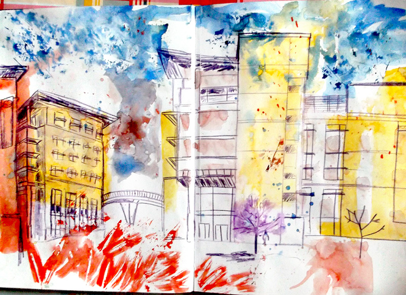
John told me that his main worry, when it comes to colour, is the likelihood of ruining a good sketch, so we started with a workshop aimed at getting lots of colour down on the page before we started any drawing. I created the sketch at the top a little while ago, to use as an example. Below is one of the sketches done on the day for this exercise, by Abi Goodman, and the one above was done by Peter Wadsworth. Good eh?
We followed that up with another slightly lateral idea: using coloured line-work. My idea was to make the colour intrinsic to the sketch, rather than just a way of tinting an existing drawing.
I asked the group to choose 3 different colours for the line, based on the try-out I did a couple of weeks back. This is a sketch done by Lucie Golton:
The final exercise allowed people to start with a standard black and white line-drawing, but I asked them to use expressive methods to colour it up, in a variety of art materials. I did a little demo to give them some tips, using Inktense pencil, watercolour and oil pastels:
To help people further, I had also printed out a selection of my sketches and created a little folder of examples to give them ideas of different ways to tackle the different challenges:
One of the main secrets to success is having the confidence to be bold with both your colour choices and mark-making. Wishy-washy or dingy colours tend to feel safer, but they are not going to light up your sketch.
Between each exercise, we gathered to look at the results, laying the books out on the grass to give each other feedback, then I briefed in the next task. People worked really hard and, as you can see, some exciting sketching was done. It's hard to believe that these were done by people who are uncomfortable using colour.
At the end we went for a coffee and I asked for feedback. Despite my worries, people seemed quite happy with the timings. Everyone said that they had found it challenging to be pushed so far out of their comfort-zone, but that is had been extremely useful and very interesting. Most importantly, they all enjoyed themselves. Phew.
A week later, at our Derbyshire SketchCrawl last weekend (more of which later), I noticed that Andrea Joseph, who usually works in biro, did a beautiful, loose and joyful watercolour - in full colour:
Job done. Paraty, here I come...
As well as using my own work to demonstrate techniques for drawing and painting people, my book will be showcasing other sketchers whose work I admire.
Once we get the go-ahead (crossing fingers) after the Frankfurt International Book Fair, I will be working with my publisher to select possible contributors and we will then approach individuals, to ask if they would be interested in having sketches in the book.
It's a bit premature to contact most people yet though as, at this stage, all I need is 4 or 5 pieces for the presentation, to make it clear that other sketchers will be featured. I am using the 'colour before line' section to do this. There is one spread featuring examples of my work and my step-by-step demo, but a second spread which features other people's work.
I used Urban Sketchers on Flickr and the main Urban Sketchers blog to source sketches where I thought people had probably used the colour-first technique and collected them in a Pinterest folder. From there I selected a handful that demonstrated different things of note and sent them to my art director. She created a lovely layout and I then wrote copy for each image.
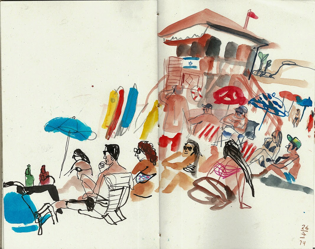
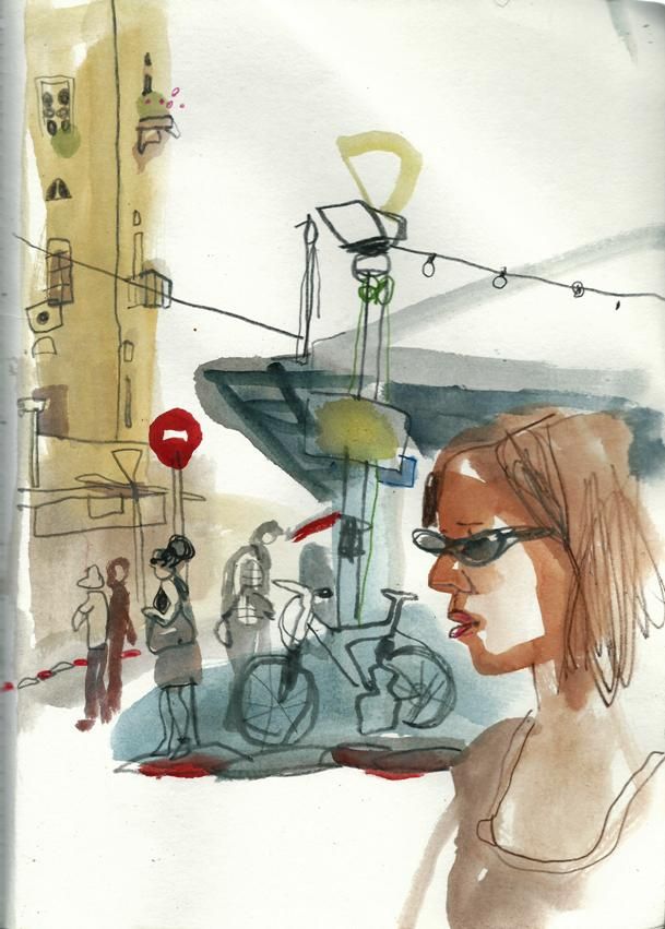
The images I'm showing here are not ones I've chosen, just examples, although I hope to be able to use both these artists, if they are up for it. The top two sketches are by one of my all-time fave sketchers, Marina Grechanik, who lives in Israel. The one above is by the fantastic Rolf Schroeter from Berlin.
In the next day or two, my art director and I will be getting in touch with all the contributors I have chosen so far, to ask their permission to present their work in the sample spreads for my book, at Frankfurt. Crossing fingers they want to be a part of the project!
My people-sketching book project has been a bit drawn out. I am still creating the presentation spreads, but it's going well. My art director is working on lots of projects at the same time, so I have to do things in stages and wait for feedback, but we are getting there and the spread layouts she is sending back are looking great.
I've been working on the 'how to draw eyes' spread.
As well as my step-by-step for the 'colour before line' spread, I also needed to do a step-by-step for the spread about drawing eyes. Guess who was my model? At least this demonstration piece was more straight forward, as it was a basic pencil sketch. I still had to keep stopping to scan in what I had done so far, but it was nothing like as stressful, because it was more like portrait drawing than speed-sketching. This is the finished drawing:
The rest of the spread is made up of eyes I have selected from existing sketches, which demonstrate various different things to be aware of, which I can talk around, like the distance between a person's eyes (more or less the width of another eye), the structure beneath, how glasses relate to eyes, the way shapes change when people are tired, where to shade to get the sculptural quality right etc, etc...
Before the spread is designed, it's hard to know how much material I am going to need, so I did plenty and let my art director choose which to use and which to drop. I have just had the layouts back for this spread, so I now know which of my eye sketches she could fit in.
I sent them originally at low resolution, cropped from people sketches from my website. Now I have to create high res scans, so... it's scanning time for John again!
Generally speaking, authors and illustrators don't get together to chat through new book projects. I get the text from the publisher, not the author and, as I work on my illustrations, I talk with the art director and designer, not the author, sending my ideas, roughs and eventually my artwork to the publisher, never once having had any contact with the author. It surprises people, but that's quite normal.
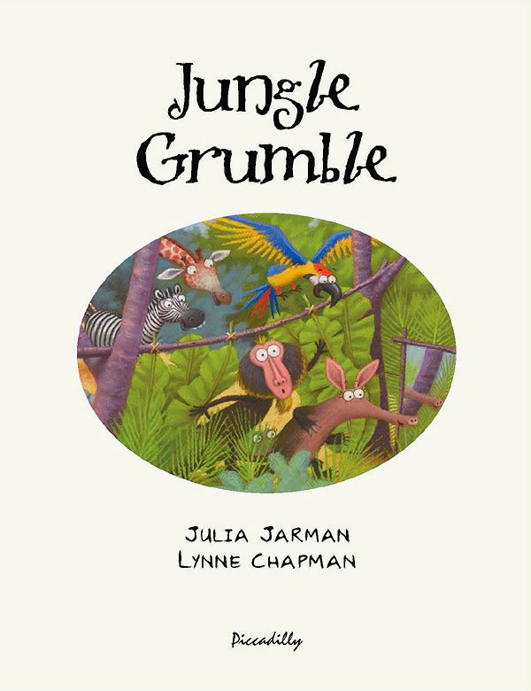
It's a bit different though with Julia Jarman. When an author and illustrator team up for several books, they can become friends and often start to work more closely, certainly at the start of a project. Julia and I have done 5 books together now and are a good match - we think alike and we laugh at the same things. Which is why we work so easily together and why we get on so well too.
Julia often emails me stories she is working on and would like me to illustrate, asking for my input. Julia's writing is very visual: as I read one of her texts, I can immediately see illustrations in my head. This gives me a slightly different perspective to Julia and my take on things can help her to fine-tune the wording, before she sends it to the publisher.
We were working on a new story last week and several drafts of it went back and forth between us by email. I'm not actually drawing anything at this stage, but Julia knows my work so well, it only takes a few words for me to paint a picture for her of what's in my head.
I can't tell you anything specific, but I think it's going to be a good one and am really crossing my fingers that the publisher takes it.
The publisher is now setting up the final designs. My designer at Piccadilly sent me low-res versions of how the spreads will look with text. Now she has my finished digital illustrations, she will be fine-tuning the designs and placing all the text into position, ready for proofing. This is how the first spread is going to look:
They have also created designs for the 'extras', like the back cover and the title page, using sections from the existing illustrations. This is the title page design:
It's all perfect timing, because of course I am out of the studio most days at the moment, visiting schools. Today I am actually in a school in Sheffield, so nice and close for a change, but sadly no chance for train sketching.
Last week, the scans of my Jungle Grumble illustrations came back from the repro-house. Things have been a bit fast and furious: I've had just a few days to get all the 'finishing work' done, then Dropbox the final digital artwork back to the publisher, ready for everything to be put together and sent off to the printer. Phew. There were three 'finishing' jobs for me to do in Photoshop / Painter:
1 - text overlays
Children's illustrators never draw text onto their actual artwork, because of translations. All text, even wording that is part of the actual picture, is added afterwards, digitally. Unfortunately, because of the pastel texture of my work, ordinary, typed text 'floats', so I make my own text overlays, using Painter, which look like they are drawn in black pastel. Luckily there wasn't much intrinsic text in Jungle Grumble, only one lion roar and the Swap Shop sign, though that does appear a few times:
2 - legibility issues
To keep things as clear as possible, it's easiest when a story's main text falls over areas of sky. That wasn't always possible in Jungle Grumble: in several places I had to use trees or bushes as backgrounds for text. But it was tricky to be sure precisely where specific lines of text would need to sit and, because of my style, it was hard not to include undergrowth textures which might be visually distracting behind the words. Once my designer got the scans, she was able to layer the two together so we could spot any places where things were slightly too busy or too dark to be sure of maximum visibility. I then used Photoshop to make subtle changes. Spot the differences to the bush bottom right:
3 - vignettes
Not all my illustrations are full spreads with illustrated backgrounds. Some pages feature smaller vignettes: characters against a plain background. My biggest digital job is cutting vignette characters off my pink paper. It takes ages because of the pastel edge, especially where the pastel colour is close to the pink of the paper, like Lion's roar:
He looks so much better on green, don't you think? For anyone who wants to know how I do the cutting out, here's a detailed 'masterclass' (though my version of Photoshop is old, so many things may be slightly different on up-to-date editions).
Most illustrators don't do this digital stuff themselves, but I prefer to, as the pastels make it quite a bit more tricky than usual. It's possible that I'm being a bit of a control freak, as usual, but after all that time spent getting the drawings done, I like to be sure that these final alterations are exactly right.
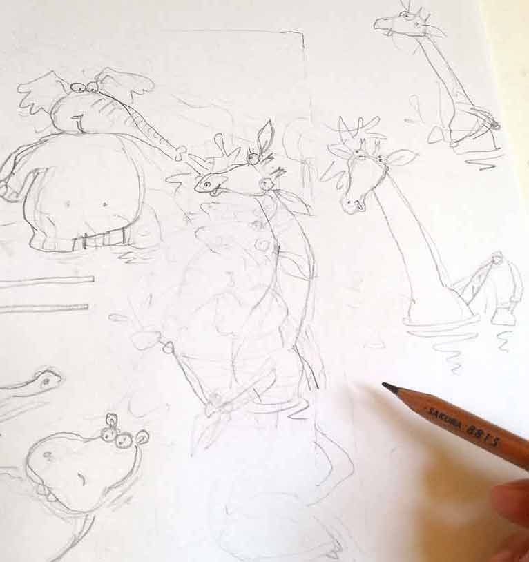
I have started my pastel artwork for The Jungle Grumble. I am only doing 2 pieces of artwork at this stage, to be taken to the Frankfurt Book Fair by my publisher. I have just enough time to get it done. Because things are tight, John has been helping me with jobs, like cutting my pastel paper to size:
I generally work larger than the actual size. On this book I am doing my drawings at 120%, although one of the 2 images the publisher has chosen for their Frankfurt presentation is the very complex 8th spread, so I'l be doing that at 140%, so I can manage the detail:
Another job is getting the prints-outs of the roughs ready for me to trace. We only have an A4 printer. By the time the line-work is enlarged to the scale I am going to work at, the image is pretty big, so we have to print it out in several bits and then stick them back together again. The image above was in 6 pieces! To get them to line up accurately, we use the light-box:
I then have the extremely tedious job of tracing the illustrations up onto my pastel paper, again on the lightbox. I have to turn out the lights and pull the blinds, to make it dark enough to see through the pink pastel paper, which is about as thick as watercolour paper. If you want to know why I use pink, read this post, from when I was at the same stage with Dragon's Dinner.
I had a bit more trouble with one of my Jungle Grumble spreads that the others and I thought it offered a good opportunity to talk about issues around composition.
It was the penultimate page: the animals have all swapped back and decided that they are much better off that way (of course). My original thumbnail looked like this:
But Julia Jarman's text begins, 'Later that night, Lion listened to the animals as they gathered at the waterhole.' then it follows on with their comments. I realised that Lion needed to be on the left. So I flipped it:
I wasn't happy though - giraffe didn't fit (she needs to be standing in the water to squeeze her legs in), Hippo was too close to the gutter but, if I moved her, it left poor Zebra out on a limb on his own.
So I shrunk Giraffe a bit and shuffled things around. I moved Parrot from Elephant's head to Croc's, for more humour, moved Monkey to Zebra's page, but it just didn't hang together and was all a bit dull:
There was also the issue of whether to draw naturalistic or non naturalistic poses, now the animals are all back to normal. As you can see, I tried mainly naturalistic, but it was proving hard to make that fun.
The biggest issue though, was the relative sizes of the animals. When you have a cast of very different characters, it's a logistical nightmare fitting them all in so the smallest aren't visually dominated by the largest. Which is why Giraffe and Elephant are at the back. But to make Giraffe fit, she was getting so small that she felt detached from the action. I thought about having her sitting on her bottom at the water's edge, but when I sketched it, it just looked weird - too unnaturalistic!
As I added the characterisation, things at least started to look a bit more happy:
I got the idea of putting Giraffe waist deep in the water, so I could bring her forward, but she needed to be doing something fun. I thought I could have her being spurted by Elephant and splashing him back, but this also proved tricky. Her arms were too long to look right splashing. I tried many times without real success:
Over lunch, I showed my problems to John. He didn't like the splashing sketches either, but suggested drawing Giraffe drinking, like they do, with their legs splayed. I'd used this pose earlier in the book, so had disregarded it as a possibility, but things were getting desperate: I tried it...
Hey presto! Thank goodness (and thanks John).
Not only did this fit her in, it also brought her head down to everyone else's level, so she's part of the fun. And the splayed front legs draw your eye in a circle around the ring of animals, joining together the disparate elements in the composition, which was otherwise in danger of looking 'bitty'.
Let's pray my publisher likes it and I don't have to start again!!
Hurrah - all done in time and emailed off to the publisher!
All those very tiny thumbnails I showed you earlier were scanned and enlarged in Photoshop to 75% of the actual book size:
I then used print-outs of these as a guide, to help me draw everything again, reworking the compositions and correcting mistakes where needed. You can just see the enlarged thumbnail showing through my layout paper:
It was also at this stage that I was adding the new characterisation to each animal, as I went along.
The finished pencil drawings were then re-scanned and enlarged to actual size, then taken back into Photoshop for last-minute tweaks and scale adjustments, as well as the fine-tuning of the text placement.
When I was doing the original thumbnails, this was the spread I was most nervous about. I left it to the very end, because there were so many animals to try and fit in it: not just the 10 featured ones, but sundry others to act as the audience:
I had to find a way, not just to squeeze everyone in, but also to show off their various 'swaps' in a way that let you see everything clearly, to avoid visual confusion (whilst still remembering not to put anyone's face anywhere near the page gutter). Nightmare! Only, actually, when it came to it, I managed okay. Maybe because I had warmed up on the rest of the book.
The one that was redrawn the most in the end, was this one, which at first glance looks the most straight-forward:
I'll tell you why next time - you'll just have to wait!
I thought it might be interesting to use my work on Jungle Grumble to talk about how I design around text. One common error made by would-be children's book illustrators, is forgetting that quite a lot of space needs to be created in your illustration for the words. This can be a challenge if the illustrations need to be busy. Though ideally the text is evenly spread through the book, this is not always possible, depending on the action. Some spreads can end up very 'text-heavy'. Others have lots of dialogue and all those new lines make the text expand down the page:
Before I put pencil to paper, I always ask my publishers to set the book's text in the chosen font, at actual size, so I know exactly how much space is needed. I then create blank templates for each spread in Photoshop (as above, with the gutter clearly marked), into which I place the text.
Obviously, until I have drawn the illustrations, nobody knows where the text needs to be positioned, so I am okay to move it around, as long as I follow basic design rules (like keeping an appropriate distance from the top / edges / gutter).
Mostly I keep the specified text on the particular spreads suggested by the publisher although, with Jungle Grumble, I did make a couple of changes. For instance, in my brief, this text at the very beginning of the story was split across 2 spreads:
Which seemed an unnecessarily slow start and, by combining both sets of text into one illustration, I freed up an extra spread for later in the book, which was very handy when we were in the thick of the action.
While doing the first thumbnails, I estimated the text area needed:
I then enlarged all the thumbnails and popped each into one of my Photoshop spread-templates. Dragging the bits of text into the positions my illustration idea demanded, I was able to see where more space was needed and rearrange the compositional elements accordingly.
Below is the spread that fits the template at the top of this post. You can see how I have divided the block of text into 3 sections, to make it more palatable to the reader and also easier to draw around. I have then placed the proper text in position on the enlarged thumbnail, replacing my estimated, hand-drawn text. This one fitted the actual text really well:
Using layout paper over the thumbnail print-out (which is translucent, allowing me to see enough of the thumbnail to guide me, but not too much, so no visual distraction as I redraw), I reworked the illustration, making sure I didn't get too close to the text.
My new drawing was re-united with the text when it was scanned and placed back into the Photoshop template, in place of the thumbnail:
Of course, the designer will now rework the text layout - mine is just a suggestion for how I think it best fits my illustrations. Sometimes it stays as is, other times they have ideas to make it funkier.

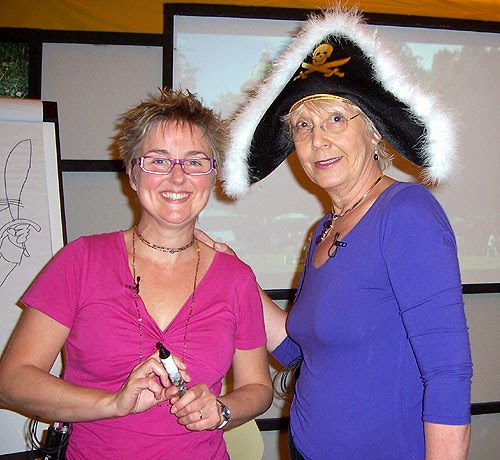
By:
Lynne Chapman,
on 4/17/2013
Blog:
An Illustrator's Life For Me!
(
Login to Add to MyJacketFlap)
JacketFlap tags:
Photoshop,
digital,
Corel Painter,
Swap,
artwork,
scans,
text overlays,
hot tips,
illustration,
Add a tag
When it comes to the digital 'finishing' work on my books, it's the cutting out that's the real chore but, once that's done, I feel as though I have finished. Not so! There's the final, fussy job of doing the text overlays. Sigh...
All text has to be created separately from the main artwork, because of translations: you can't have English words embedded in the illustration and then hope to sell the book for foreign editions. This goes for all wording, but I am not talking about the regular text you can see above, but the little, incidental details: can you see the word 'DOG' on the bowl?
There are quite a few more on the spread below:
Most illustrators don't have to worry about the text overlays - the design team at the publishers sort out all that, when they place the other text. However, because I am daft enough to create my artwork in pastels, the bits of text which are intrinsic to the images don't work very well if they too are not in pastels: the wording sort of floats above the illustration.
It's not practical to do the text overlays in actual pastels, so I do it digitally, in 'pretend' pastels, using an old version on Corel Painter, which does a pretty good job of emulating the marks of my pastels, particularly after I have scanned in a sample of the actual paper I draw onto, so the texture matches. This is the text from the classroom door.
It's a boring and fiddly job, but looks much better. Of course, when it comes to the foreign translations, I have no control, so they just bung on ordinary text. Hey-ho - there are times when you just have to let go...
For the children's dance studio below, I've done the whole sign as an overlay, including the little drawings of the kids, because foreign translations can take up more space than English text. This way, it allows for the little figures to be removed if necessary, to fit in a more wordy name - clever eh?!
Anyway, I am now done, done, done (hurrah!) and a DVD of all the finished artwork has been sent back to my Art Director, who will be busy this week, dropping all the text into its final position and sorting out the final bits of design work (spine, title page, dedications, blurb, bar codes...).
The next stage should be the colour proof. That's the truly exciting bit, when it all looks real!
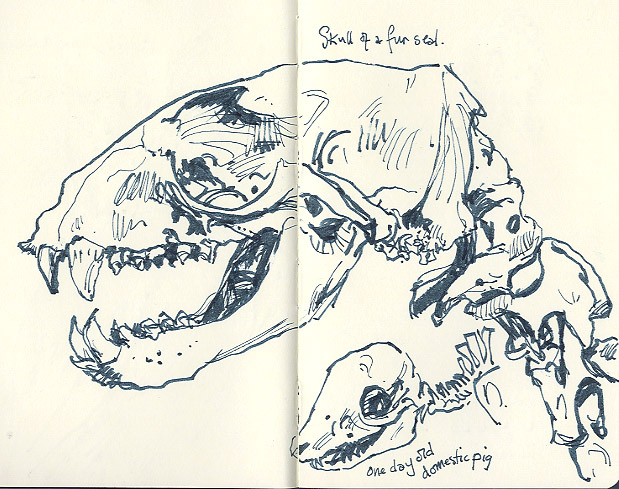
Last month, Sheffield University began allowing the public limited access to a secret, little, teaching museum, which was created in 1905 for the Department of Animal and Plant Sciences: the Alfred Denny Museum.
It's just one room, but full of wonderfully traditional, wooden-framed display cases and slender, wooden drawers, all of which are crammed with skeletons, taxidermy and odd things floating in jars. Sketching heaven. Unfortunately, we were only allowed 1 hour, and that included the very interesting 20 minute talk by a 3rd year student, about the acquisition of some of the stranger creatures.
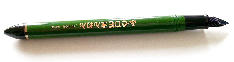
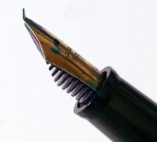
I whizzed round with my sketchbook and captured specimens as they caught my eye. I was using my brand new Sailor pen for the first time:
It's designed for Japanese calligraphy, but it is just the ticket for on-location sketching as, though it's a fountain pen, it allows for extreme variations in line width, and glides really smoothly across the page, because of its curiously bent nib:
The sketch below is only about a 3rd of the massive python skeleton mounted on the wall in the university foyer:
Some interesting news: the museum's curator likes the sound of SketchCrawling and it looks like we might get back in soon, for a longer session this time, just for sketchers. Can't wait!!
The other nice thing, was that I got 2 new recruits to SketchCrawl North while I was drawing. That's what I love about sketching in public: people just come up and chat, so you make all sorts of new connections.
We've tried a few times to film my workshops and lectures, but the events which have granted us permission to film, have all taken place in a shared space, like in a library, which means too much background noise. The recording John made at the Hallam University lecture was the same: there were students in an adjacent studio, chatting, laughing, coughing or just walking about, which on the film made it sound like my audience was bored!
So, we decided to try something different - a film of me sketching out on location. We went for a walk up into the Limb Valley and John filmed over my shoulder at I painted.
It was weird though: I had thought, after all these years of sketching in public, that being filmed would be no problem at all but, for some reason, I found it incredibly off-putting. The camera, which needed to be right beside my face, to provide the best view of the sketchbook, felt really oppressive. The pressure to do something 'good' meant, of course, I was convinced I was creating rubbish from the very outset. Despite my smiles at the end of the film, I was very grumpy (poor John)! It's a good thing we decided to go for a voice-over, otherwise you'd have had to listen to all my grumbling and swearing.
Hopefully you can't tell that from the film though. I still think I've done better sketches, but I'm hoping it's interesting to watch it evolve on the page and hear why I am making various creative decision during the process.
If you do enjoy it, please share it with your friends. Plus, if you like this one and haven't yet seen any of the others, take a look at the film page on my website or subscribe to my YouTube channel.
Just before Christmas, I had an email from a librarian working in Barnsley Children's Centre. She told me she was planning a course for local parents, teaching them how to create story sacks. She wanted my permission to use one of her favourite books, Class Two at the Zoo, to base the course around. How lovely! 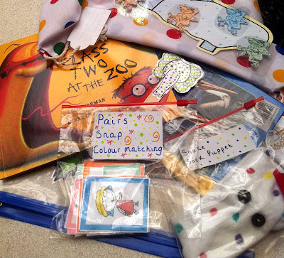
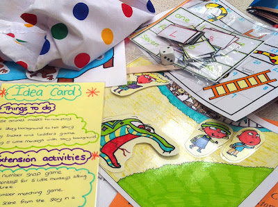
For those who don't know, a story sack is a bag you fill with all sorts of little props and ideas, relating to a favourite book, to help you to add value to storytime with your child. The bag might include a simple puppet to help you read the story, or activities that pick up immediately after finishing the book, like games or songs with a related theme, or props to help you retell the story together. It's basically the same kind of thing I use when I am doing a
storytelling with a school group.
I have come across libraries that make story sacks and lend them out with the books, but Jane in Barnsely wanted to empower parents to create their own - a great idea and good fun I should think.
The parents made sock puppets, bingo games, snap cards, laminated puppet masks and games of snakes and ladders. They also made copies of my illustrations, which they cut out and coloured in, re-creating background settings from the book with Velcro-on characters, to animate the story with their children.
All the parents ended up with a lovely story sack to take home and share with their child, as well as a certificate to say they had completed the course. Fantastic stuff.
If you have young children or grand children, why don't you have a go at creating a story sack? As long as you are not selling what you create, you are free to use any of the illustrations or ready-made activities, colouring sheets, step-by-step drawings you find on my website, either to creare props to add to one of my books, or someone elses.
Having seen my Inktense sketches on this blog, my Mum said she fancied having a play with watercolour pencils. But she needed advice on where to start, so I wrote her some tips and ideas about how to get the feel for them. Having done it, I realised that some of you guys might also be interested.
A general bit of advice when trying out a new medium, is to allow yourself some time to 'play' before you try a finished piece of work. You need to build confidence and learn what will happen when you do certain things: with watercolour pencils, that might be establishing how hard to press, how much water you need, what colours look good together, what kind of marks work best etc.
So, here are some specific ideas to help you play effectively, some general pointers and some things to think about when you're doing your first drawings:
1 - It's best to use the pencils dry first, then brush on water near the end (you'll find the pencil marks are very different when used on damp paper).
2 - Draw quite boldly with the pencils, rather then 'tickling' the paper, so you get enough colour down: you don't want things to be too wishy-washy, however it's also important to leave some areas of clean white paper here and there, to give contrast.
3 - Experiment with different kinds of line work, like 'hatching' or 'scribbling': shading doesn't always have to be invisibly blended and linear marks can be exciting.
4 - Try using 2, or even 3 quite different colours together, so you get interesting effects when the water is added. Try laying the different coloured marks side by side, rather than shading them together. The water can be used to blend them, but your eye will help blend them too.
5 - Experiment with a limited palette (I often use only 3 or 4 colours in one sketch). It's usually more important to describe areas of shade and highlight, rather than worry about faithful colour.
6 - Avoid too much 'outlining' or, where you do need to outline, experiment with using different coloured outlines for different parts of the same object.
7 - Put water on in simple strokes with a brush that's not too fine. Don't scrub or keep going back over the same place, or your colours will get muddy and your 'paint' marks fussy.
8 - When sketching, try drawing instinctively rather than accurately, then using the water to paint up to where the outline should be: this can be a more subtle way of showing the edges of things too.
9 - Try keeping your brush marks visible, so they are not always blended away to nothing: they too can be visually interesting.
10 - Experiment with brushing on water so it overlaps and compliments the drawing marks, rather than just using water to 'fill in'.
Hopes that helps. I've found my Inktense watercolour pencils a really fun medium and perfect for drawing out and about, when I want bold colour but don't want to carry lots of painting gear. By the way, a waterbrush is another very handy piece of kit, as you really can paint anywhere with no water to carry (about £5):
You can see more examples of my Inktense sketches here (scroll down).
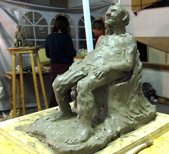
Anyone remember that I started having a bash a clay modelling? Although I've not posted about it since that first sesson, I've been going every Thursday evening - it's great fun. John comes with me too.
This was my first attempt: Gerald, just one session in:
We are supposed to have the same model and pose for 5 weeks in a row, so you get about 8 or 9 hours on each piece. Unfortunately, after that first session with Gerald, he had a stroke and went into hospital. Rather selfish of him, I thought (only joking).
Everyone tucked up their Gerald sculptures into bin-bags, to keep them moist, and began on something new with another model. This is the one John did next (looking very nymph-like in our garden):
We kept asking after Gerald, who fortunately was fine. Eventually, he was well enough to come back and we got to carry on.
I brought my Gerald home to hollow out (which makes him much lighter, plus potentially fireable), then let him out of his bin-bag prison to dry. You have to wrap any slender sections with cling-film, to stop them drying more quickly then the rest, otherwise you get cracks.
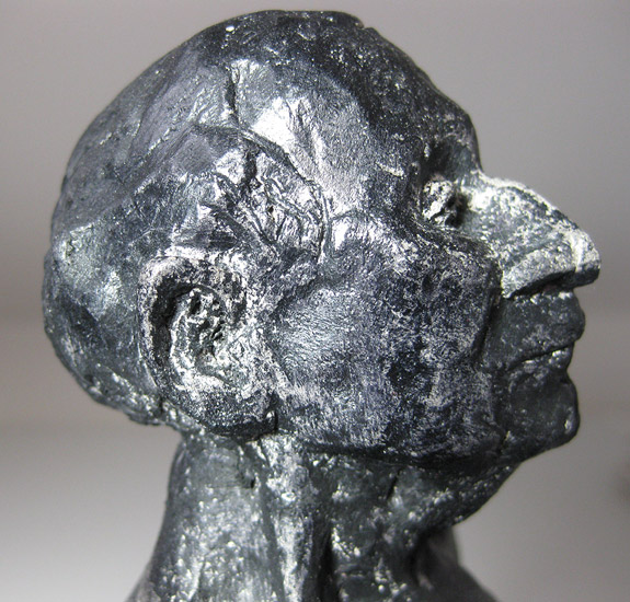
I wasn't really bothered about firing him in a kiln: it's the doing of it that's important to me. After so much effort though, I couldn't face just throwing him out, so I thought I would experiment with shoe-polishing him, to make him look a bit like darkened bronze, then just pop him on a shelf.
But unfortunately, because unfired clay is so very brittle, while I was buffing him up with the shoe-brush, I managed to knock off his nose - oh no!!
I only touched him with the wood of the brush back, but that was enough. Ah well. The shoe polish wasn't the best idea anyway, as the dustier nooks and crannies in between fingers, toes and in his ears etc proved impossible to colour:
I'll try something else next time.
View Next 21 Posts


I'm encouraged to know that I'm not the only one combining sections of images manually and tracing the enlarged image on a lightbox. Thank you for sharing your process.
What a fascinating insight into the publishing process. I had no idea it was so fiddly and time consuming! I love your animal art it is so funny and cute.
Good to see your hard at work. I'm excited to see the end result. Stay active, best wishes,
Benjamin
It's great to see the publishing process:) What a great idea the pink paper,great post:)
Thank you. Glad to hear that the background information is still interesting.
:-)
That there's craft, that is!