
I have this habit of buying vintage for a bargain (because pieces are damaged, ill-fitting, etc.) and taking forever to getting around to making repairs and thus wearing said items. But I’ve made the commitment to change this bad habit into a good one and I’m working my way through my to do pile. This is the first post of my vintage dress parade and I’ll detail the fixes and tweaks I’ve made for each one. I’ll try to remember to include “before” shots next time, hee hee.
The above late 1930s or early ’40s dress was quite the steal as it was falling apart in various places, had a motley crew of ugly buttons and was an unflattering mid-calf length. My fixes:
- Changed the buttons to clear glass ones with faceted edges; I figured this would work well both in the light-colored printed (and flocked!) fabric as well as the navy blue organza. (My camera died before I could get any close up shots.)
- Added bust darts for a better fit.
- Trimmed the flutter sleeves for a little bit more modern look. (I felt like I would fly away before I narrowed them down!)
- Hemmed the skirt by a few inches. Each tier in the skirt was a little bit wider (taller?) than the proceeding one, from waist to hem. Instead of hemming just the bottom tier (and messing up the sequence) or hemming each tier (too much work!), I hemmed the second navy blue tier to match the width of the first one. This way there is still some order/design to the width of the tiers.
- Used the piece I trimmed off the skirt and turned it into a sash (original belt was missing). I can see here that the sash could stand to be shortened (that’s the beauty of taking photos of your projects - you see things you might miss in the mirror!).
- Made other minor repairs like loose seams, wonky tiers, etc.
Next: I love wearing this ’50s dress. I found it soon after seeing (500) Days of Summer and thought it looked like something Zooey’s character might wear. I bought a pale grey-blue crinoline just for this dress. I’m also wearing the same pale blue slip I’m wearing under the dress above. I considered going dark but then you wouldn’t be able to see the print on the sheer fabric very well. Anyway, here’s what I did:

- Removed the sleeves: this dress had half sleeves with quick and dirty hems that were not so great. Since I don’t like fixing/sewing sleeves I just took them off and finished the openings by simply folding under the edges (which doesn’t always work due to the curves but luckily it did in this case).
- Let the waist out: the wearer before me had a tiny waist and had taken it in in several spots around the ruched waist panel.
- Hemmed the skirt. (I will almost always do this!)
- Repaired little holes and opened seams.
- (I thought about pinning on that dark blue rose that I’m holding at the waist along with a ribbon sash but the flower is a bit dark and I think the dress looks nice unadorned.)

Hope you enjoyed this little dress tour!
(By the way, thanks for the Lucy love from the last post - it made her blush!)
 Countdown
 by Deborah Wiles. Scholastic Press. 2010. Copy provided for review.
The Plot: Franny Chapman, eleven, is a fifth grader at Camp Springs Elementary School in October 1962. Her father is a pilot at nearby Andrews Air Force Base.
Franny's life is in upheaval. Her great uncle Otts, who lives with the family, is acting weird, almost as if he's back in World War I, and the whole neighborhood knows. Her best friend Margie is treating her like a competitor and enemy. Older sister Jo Ellen, a freshman in college, disappears with new friends and unshared secrets.
At school they are taught to "duck and cover" to protect themselves in case of a nuclear attack. It's scary; made scarier when Uncle Otts goes even crazier and tries to turn the front yard into a fallout shelter. Life continues to spin out of control with the news reports that Communist Russia is sending nuclear weapons to Cuba.
The Good: Before Chapter One even begins, before Franny informs us that "I am eleven years old, and I am invisible," Wiles immerses us in the world of the early 1960s. Photographs, quotations, advertisements, the price of gas; and most about politics, the Soviet Union, Kennedy, "duck and cover".
I was born in 1966; I never had "duck and cover" drills, though we saw the dusty faded Fallout Shelter signs on buildings. By the time I was in school, it was with the knowledge that if we were attacked, we'd all die. Squatting by a wall, pulling a newspaper over you, having canned foods in your basement was not going to save you. So, just like the young reader of Countdown, I don't know first hand about America in the early 60s. Wiles's use of primary documents woven throughout the book creates a "you are there" feel for the book, so when Franny hears the drill we, like Franny, have seen the illustration of how to "duck and cover" when you're outside.
This "documentary novel" shows the reader, throughout the book, life in the 60s, life Franny experiences. The careful reader will put together some of the clues, such as the mentions of the Student Nonviolent Coordinating Committee in the documentary sections and then the abbreviation SNCC showing up in the story. The documents do more than show life as of October 1962: the biography of Harry S Truman relates his death in 1972, and President Kennedy's assassination in 1963 is included. While the documents may give a "1962" flavor and depth to the reader, these references acknowledge that the reader, unlike Franny and her friends and family, is in the present.
Early in the book, in a short biography of President Truman, the reader is told that Russia was an ally during World War II and an enemy after. Franny's and Margie's friendship reflects this in a personal way; one day they are friends, the next Margie is conspiring against her. When Margie needs Franny's help towards the end of the book, what should Franny do?
I loved this book; I'm pretty proud of the fact that I'm not turning this into a gushing "love love love" post (because that wouldn't tell you much about the book, would i
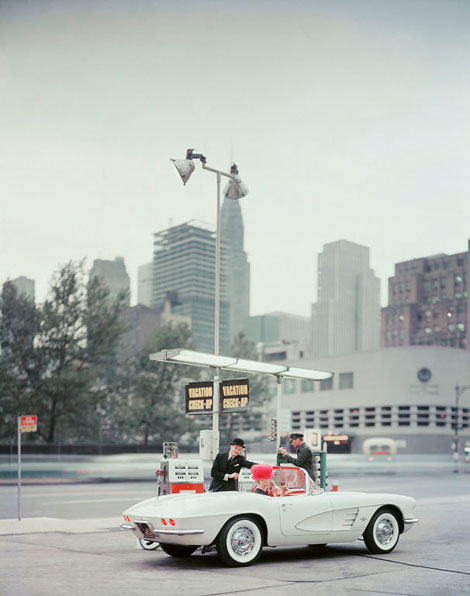
Photo for Chevrolet/”New Yorker” magazine c1960
Svenska Mobler has a beautiful collection of photos from famed photographer Mark Shaw. Mark is best known for his photographs of Jacqueline and John F. Kennedy and his work in capturing couture fashion from the middle of the century. During the 1950s and early 1960s Mark shot the European fashion collections for LIFE magazine. It’s interesting to note that he was one of the first photographers to shoot fashion on the runways and backstage at shows.
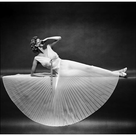
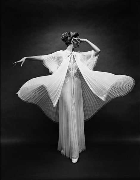
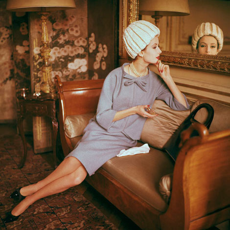
(via Matthew Lyons via Ultra Swank)
—–
Also worth checking: Tom Palumbo photography
Enjoy this story? Sign up for our tasty free grain edit RSS feed.
—–
No Tags
Share This
Vintage kids book Mi Diccionario is in the Grain Edit Shop
Grain Edit recommends Colo Pro A font designed by Font Fabric. Check it out here.
©2009 Grain Edit - catch us on Facebook and twitter

By: Rebecca,
on 4/13/2010
Blog:
OUPblog
(
Login to Add to MyJacketFlap)
JacketFlap tags:
Music,
History,
A-Featured,
Beatles,
1960s,
pop,
British rock,
Eddie Cochran,
twenty-flight rock,
Add a tag
Gordon Thompson is Professor of Music at Skidmore College. His book, Please Please Me: Sixties British Pop, Inside Out, offers an  insider’s view of the British pop-music recording industry. In the post below he looks at April 1960 and Eddie Cochran’s influence on the Beatles. Check out Thompson’s other posts here.
One of the most remarkable developments in sixties pop culture came with the emergence of British rock ‘n’ roll. On the western side of the Atlantic, the genre had evolved from numerous sources, blending and diverging to produce a myriad of styles. British youth in the fifties gazed on the music of American performers like Little Richard, Bill Haley, Chuck Berry, and Elvis Presley with a combination of wonder and envy. The first British attempts came in the resurrection of American folk blues, which musician Lonnie Donegan called “skiffle,” but which increasingly included music hall ditties. It would take American mentors to help the Brits find their mojo. Of the various candidates eligible for that status, few can rival Eddie Cochran.
Cochran was a natural: good-looking, creative, talented, and ambitious. In addition to writing some of the most memorable rock tunes of the era, including the classic, “Summer Time Blues” (with manager Jerry Capehart in 1958), he appeared in the seminal rock film of the era, The Girl Can’t Help It (1956). In that film, he sings “Twenty-flight Rock,” the core of which was written by Nelda Fairchild, one of the few women writing this kind of material at the time.
Cochran’s particular significance for the British came during his tour with Gene Vincent in 1960. Performing with them, Marty Wilde and the Wildcats boasted several future notable British musicians, including guitarists Big Jim Sullivan and Tony Belcher, bassist Liquorice Locking, and drummer Brian Bennett. The Wildcats accompanied Cochran on most of the gigs and Sullivan remembers the American as a multi-instrumentalist who could show all of them on their own instruments what he wanted them to play. These musicians all went on to prominence in the explosion of British rock and pop in the mid sixties either as session musicians or as members of Cliff Richard’s influential Shadows and carried the lessons they learned from Cochran.
On the night of 16 April 1962, as Cochran and Vincent traveled in a taxi with another American, songwriter Sharon Sheeley, the car went off the road near Bath, England. The others survived with serious injuries, but Cochran would die the next day. His death, and that of Buddy Holly the year before, set off a flurry of posthumous record releases over the next three years, whetting the British appetite for American rockabilly. Performers like Heinz (“Just Like Eddie,” 1963) tried to capture the spirit; however, as the supply of unreleased disks dwindled and the imitations became less convincing, one British band in particular stepped in to fill the void.
The nucleus of the Beatles had formed around Cochran’s recording of “Twenty-flight Rock” when Paul McCartney dazzled John
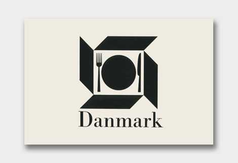
Danish Giftparcels | Denmark |
Some of you might remember when World of Logotypes made the rounds on the design blog circuit last year. If you missed out, Amy over at the excellent Aqua-Velvet blog has highlighted a few of her favorite logos from the book. View Part 1, Part 2, Part 3.
You can pick up a copy of World of Logotypes at Alibris.
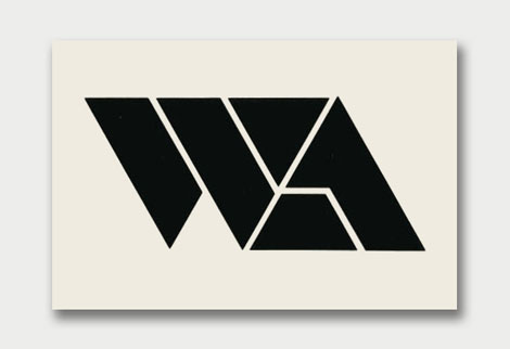
Warsaw Agency | USA | Designed by Anita Soos

Quirra S.p.A. | Milano, Italy | Designed by Patrizia Pattacini

Leidschenhge | Holland | Designed by Benno Wissing
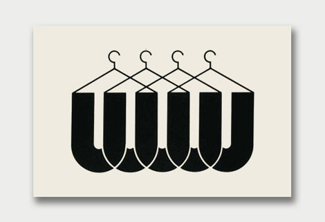
Uniforms Unlimited Inc. | USA | Designed by Thomas A. Rigsby
(via the Silver Lining)
———–
Also worth checking: Scandinavian Logos of the 1960s + 70s
Stefan Kanchev Logos
Not signed up for the Grain Edit RSS Feed yet? Give it a try. Its free and yummy.
———–
No Tags
Share This
Vintage kids book Mi Diccionario is in the Grain Edit Shop
Grain Edit recommends Colo Pro A font designed by Font Fabric. Check it out here.
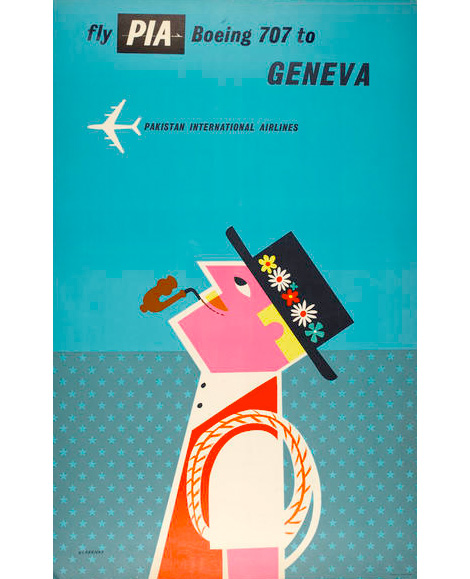
Pakistani International Airlines poster (1960)
English artist and designer, Tom Eckersley (1914-1997), created numerous posters from the 1940s to the 1980s. Eckersley’s work communicates strong messages by employing bold overlaid colors, simplified forms, and informative text.
This poster, created for Pakistan International Airlines, depicts a dapper looking gentleman in Swiss garb. His playful image is simple, clean, bright and colorful; a stark contrast from the dark turquoise background. The composition is pleasing to the eye; as the figure gazes at the distant aircraft, we too are gazing at his cheerful image. Let’s all go to Geneva!
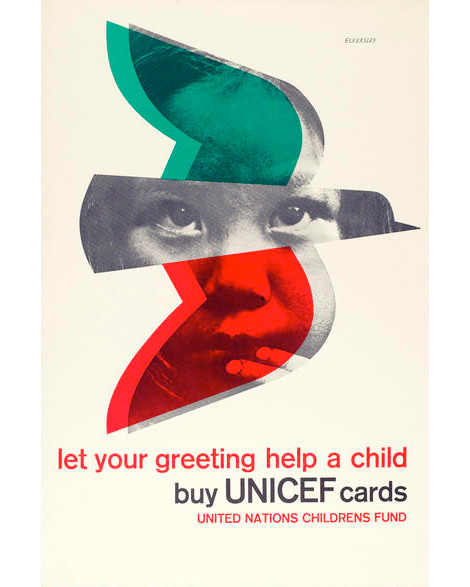
UNICEF [United Nations Children’s Fund] appeal poster (1977)
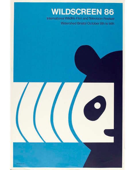
Wildscreen 1986
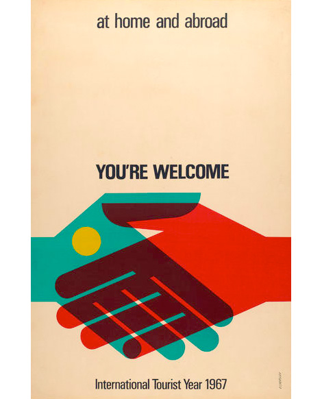
International Tourist Year poster (1967)
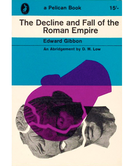
The Decline and Fall of the Roman Empire book cover (1963)
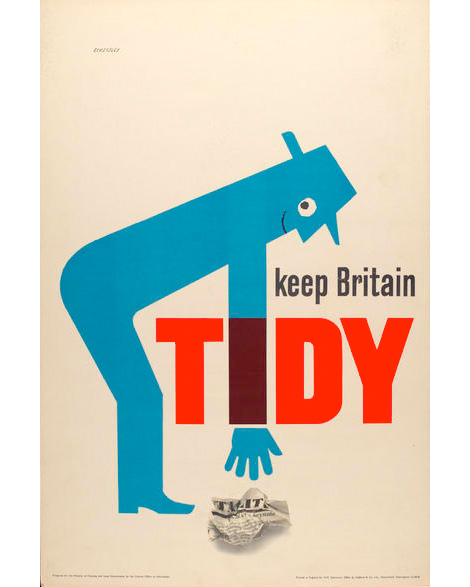
Keep Britain Tidy Campaign poster (1963)
Eckersley’s work proves that good design is timeless and even iconic. His work is archived at the University of Arts London Archives and Special Collections Center, and may be viewed at their online resource for visual arts site.
—–
Also worth checking: David Klein — Vintage TWA Posters
Not signed up for the Grain Edit RSS Feed yet? Give it a try. Its free and yummy.
—–
No Tags
Share This
Congrats to our 2009 Grain Edit Holiday Giveaway Bash Winners - /Grand Prize - Christopher E from Fe
By: Dave,
on 2/3/2010
Blog:
inspiration from vintage kids books and timeless modern graphic design
(
Login to Add to MyJacketFlap)
JacketFlap tags:
illustration,
1950s,
modern,
architecture,
1960s,
1970s,
Found design,
USA,
paulrudolph,
Add a tag

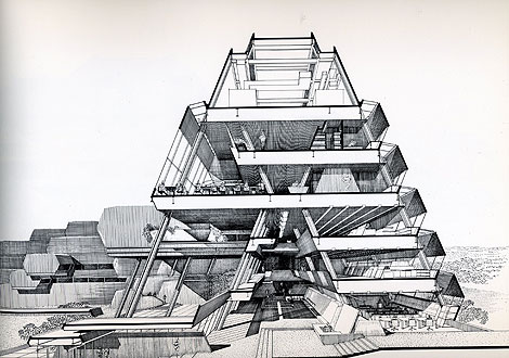
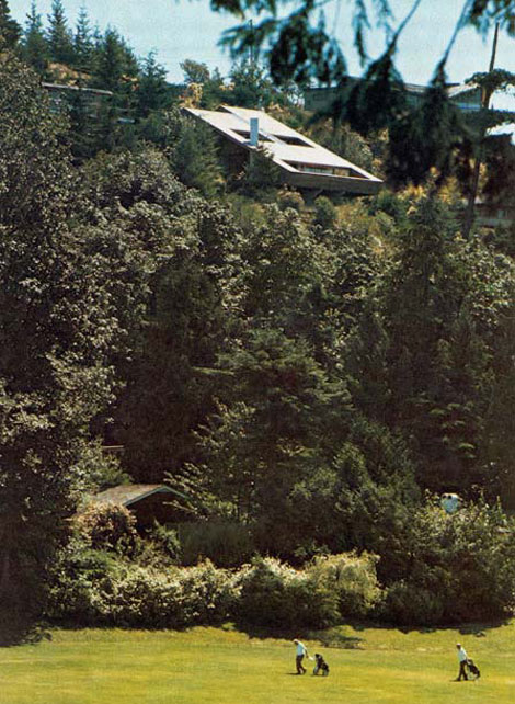
Callahan Residence, Birmingham, Alabama 1965 - Rendering by Paul Rudolph
Architect Paul Rudolph (1918-1997) was known for his much-loved (and loathed) Brutalist yet spatially complex buildings. As one of the pioneering figures of the ‘Sarasota School of Architecture’ in the late 1940s, Rudolph gained a worldwide audience with his innovative design for the modern American home. His best known architectural masterpieces are the Yale School of Architecture, the Boston Government Center and the Crawford Manor. By the late 70’s and into the 90’s, Rudolph who was unmoved by the Post-modern dominance in architecture, steadfastly continued to design powerful Modernist structures now gracing the urban skylines of the Far East.
Burroughs Wellcome Company, Research Triangle Park, North Carolina, 1969-1972
Aside from his built works, Paul Rudolph was also a master renderer known for his dynamic graphic presentations drawn with incredible precision much like a Victorian etching; from the building elements to the texture of the materials realistically amplified with light and shadows. His trademark presentation technique involves a black-and-white rendering of a building’s cross-section which is drawn to a large scale on a single-point perspective. Such accuracy enabled him to illustrate and investigate the realities of his buildings and their spaces, and thus allowing his designs to evolve as he further refined his rendering techniques.
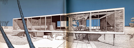
Walker Residence, Sanibel Island 1952-1953

Resort Community, Stafford Harbor, Virgina 1966
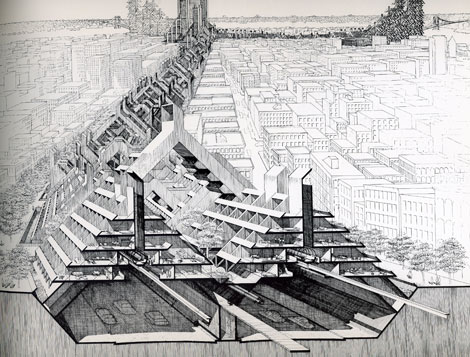
Study of Lower Manhattan Expressway, Ford Foundation, NY, NY 1967-1972
For more information about Paul Rudolph and his works, check out The Paul Rudolph Foundation and the blog.
——————–
Elizabeth Surya is the editor of Pleatfarm: an informational blog about folds in design.
——————
Also worth checking: Mid Century Modern Home Plans.
Not signed up for the Grain Edit RSS Feed yet? Give it a try. Its free and yummy.
——————
No Tags
Share This
I just received some sad news. Edie Harper, the wife of the late Charles Harper passed away last week. Edie, a talented artist in her own right, was known for her beautiful illustrations of biblical stories.
The official announcement from the Harper Estate after the jump
Below is the official announcement from the Harper Estate:
Edith Riley McKee was an only child born in 1922 in Kansas City, Kansas. A dreamy child, she moved with her parents to Liberty, Missouri, when her father chose to open a short-order restaurant. On trips to see relatives on their farms and small ranches in the Sand Hills of Nebraska, she developed a lifelong love for animals and the vast, lonely expanses of the Middle West.
The family moved again, to Cincinnati, in the 1930s when Edie’s father landed a position with Procter & Gamble. They lived in an apartment on Springfield Pike while Edie attended Wyoming High School (graduating in 1939), all the while creating art at a level beyond her actual years. The desire for formal art training burned in her heart. So in 1940 the respected Art Academy of Cincinnati welcomed Edie as one of its most eager new admissions.
On the first day of the program, on the steps of the administration building, Edie met an equally earnest young man from West Virginia, Charley Harper. In classes and conversations, she learned that he shared her admiration of painters such as Miro and Klee. They studied printmaking with the Stampers and were fortunate enough to spend a semester with legendary Josef Albers, visiting to teach his Color Theory course. For several years afterwards Albers sent Edie his hand-screened Christmas cards.
When Charley was drafted for service in World War II, Edie interrupted her classes to aid the war effort in a civilian capacity. She photographed hydro dams and cement test samples and processed the film in the lab for the Corps of Engineers. Later, she would receive critical acclaim for the black and white photographs she took with her 8 x 10 camera employing her own imaginative subject matter. This resulted in an exhibition at the Cincinnati Contemporary Art Center.
Soon after the war, Edie and Charley resumed their studies at the Academy. Following graduation in 1947, they embarked on a six-month camping honeymoon throughout America. Edie kept an illustrated journal. Every day they sketched and painted, occasionally the same natural setting, and compared the results.
Upon their return from the honeymoon, Edie and Charley maintained separate studios in the basement of Edie’s parents’ home in Roselawn. The young couple helped care for Edie’s father, who had multiple sclerosis, and were able to save Charley’s earnings from his day job at Schaten Studio. In 1953 Edie gave birth to their son, Brett, named after California photographer Brett Weston. Throughout the 1950s Edie continued painting, supplemented by a rich output of jewelry, contemporary photography, enameling, sculpture, and silkscreen prints.
In the 1960s Edie added weaving to the roster of media she had mastered. During this decade she converted to acrylic paint and completed a series of grid-centric images. Toward the end of th

The Catton house designed by Arthur Erickson and Geoffrey Massey in 1967
More amazing work from the late great Arthur Erickson.
(via ffffound!)
——————–
Also worth checking: Ferri Bueller House.
Not signed up for the Grain Edit RSS Feed yet? Give it a try. Its free and yummy.
——————–
No Tags
Share This
Congrats to our 2009 Grain Edit Holiday Giveaway Bash Winners - /Grand Prize - Christopher E from Ferndale, Mi/ 1st Prize - Kristina M - Oakland, CA/ 3rd Prize - Samantha W - North Vernon, IN/ 4th Prize - Nicholas L. - Brooklyn,NY/ 5th Prize - Barbra - Brooklyn,NY
Grain Edit recommends Colo Pro A font designed by Font Fabric. Check it out here.
©2009 Grain Edit - catch us on Facebook and twitter

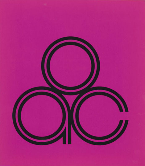
Identity for Ohio Arts Council designed by Noel Martin
Noel Martin was a self taught graphic designer who taught at the Art Academy of Cincinnati and served as the in-house designer for the Cincinnati Art Museum for many years. He was one of the first to modernize art museum exhibition catalogs. In an article at the New York times Steven Heller also notes, “With the ubiquitous branding and expert merchandizing of museums today, it is easy to forget that graphic design was once a low priority for them. In 1947, when Mr. Martin became the Cincinnati Art Museum’s first graphic designer, most museum publications were staid and musty.”
The Container list has a nice post on a self-promotional piece titled, Identity Programs, that presents some of Noel’s iconic minimalist logos.
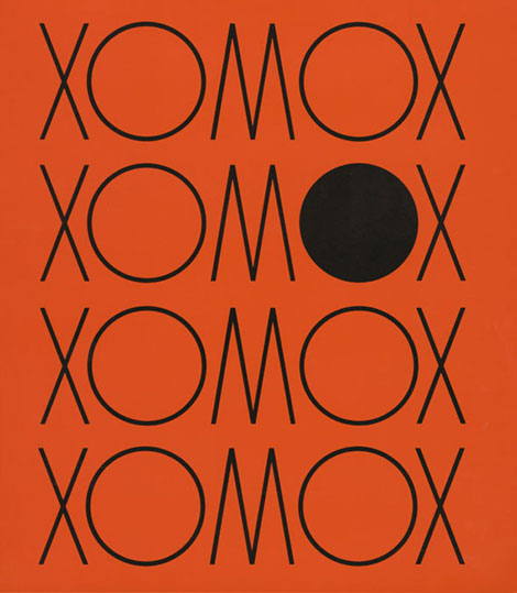
Identity for Xomox Corporation, manufacturers of valves, actuators and surgical implants
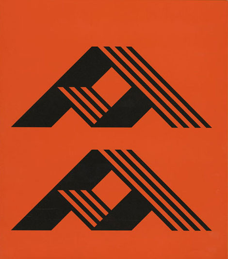
Identity for Advance Mortgage Corporation, Detroit
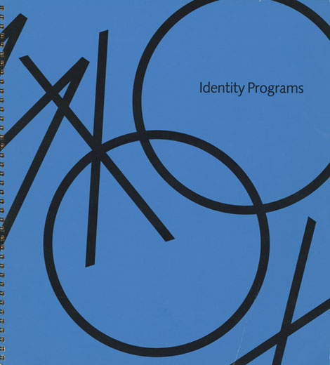
Steven Heller Collection: Identity Programs by Noel Martin – cover
(via thesilverlining)
——————–
Also worth checking: Design Coordination and Corporate Image by FHK Henrion.
Not signed up for the Grain Edit RSS Feed yet? Give it a try. Its free and yummy.
——————–
No Tags
Share This
Congrats to our 2009 Grain Edit Holiday Giveaway Bash Winners - /Grand Prize - Christopher E from Ferndale, Mi/ 1st Prize - Kristina M - Oakland, CA/ 3rd Prize - Samantha W - North Vernon, IN/ 4th Prize - Nicholas L. - Brooklyn,NY/ 5th Prize - Barbra - Brooklyn,NY
Grain Edit recommends Colo Pro A font designed by Font Fabric. Check it out here.
©2009 Grain Edit - catch us on
By: Diana,
on 1/3/2010
Blog:
inspiration from vintage kids books and timeless modern graphic design
(
Login to Add to MyJacketFlap)
JacketFlap tags:
interviews,
UK,
Typography,
Designers,
graphic design,
Features,
posters,
1960s,
graphic-design,
Add a tag

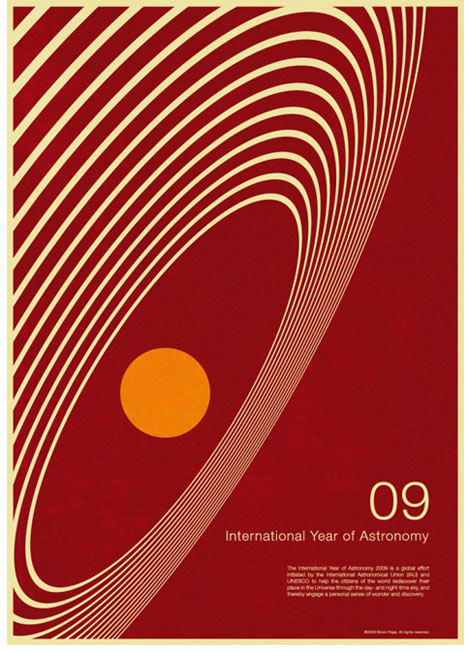
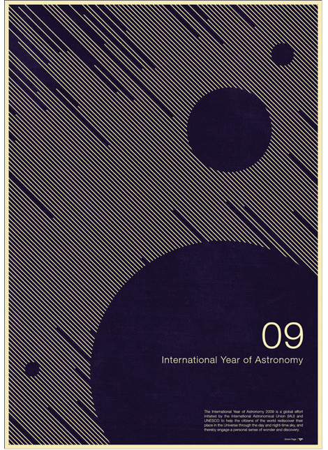
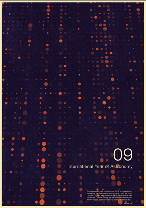
2009 International Year of Astronomy Poster designed by Simon C Page
Simon Page is a self-taught graphic design whiz with a mathematics background. He takes shapes and morphs them into cerebral abstractions. His style shifts around futuristic digital designs and 1960s minimalism, trotting the delicate line between simplicity and detail. His International Year of Astronomy 2009 poster designs caught the eyes of discerning design writers, including the New York Times and Creative Review. It may be the year for Astronomy but its equally a big year for Page, his posters got a boost in sales from all the acknowledgment he’s been getting in print and on the web.
Where are you from originally?
From the UK - born and breed.
When and how did you come to be interested in graphic design?
I’ve been interested in it since I was a kid. I think the first experience of really being blown away by graphic design was when I first saw some record covers from Yes albums - which I still love to this day. I have only really got involved in promoting myself and creating my own self-initiated design pieces this year - having got into to it through designing corporate presentations as part of my full-time job.
Tell me what you were doing before doing graphic design.
I left university with a degree in applied mathematics and this landed me in a good job working in the City. I then got quite involved in programming and database development which then progressed to having to create corporate presentations which is where I first got involved in graphic design, just over a year ago now.
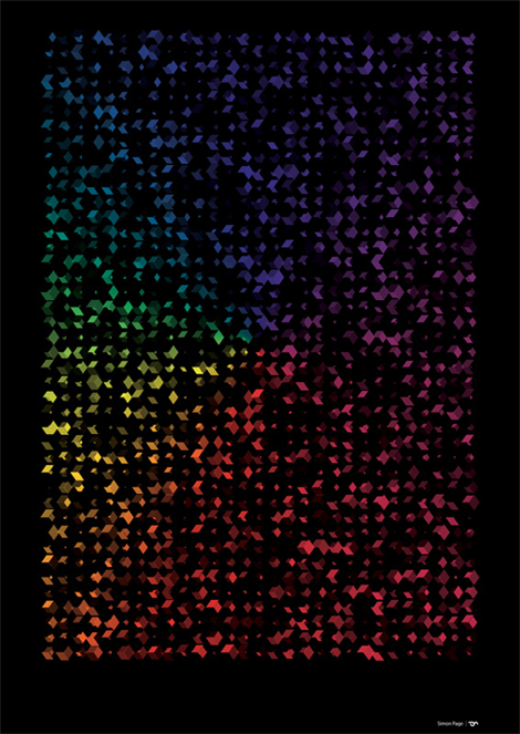

How does your math background influence your designs?
I think maths has inspired me hugely and influenced more geometric designs than I probably would of created otherwise. I also think a lot of artists, like myself, subliminally use mathematics in their creations - such as the golden ratio for creating eye candy layout designs.
I find it very satisfying getting mathematically correct proportions when designing something like a logo, for example. But for me the main connection between math and design is pure and simple, it’s geometry. The golden ratio is probably one of the most popular examples of math and design coming together but look back at the works of Leonardo Da Vinci, for instance, he used mathematics all the time in his art. I also believe some of the best designers work with math, in a number of aspects, even though they probably do it completely subconsciously.
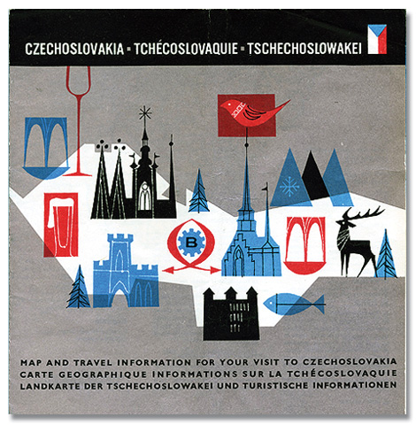
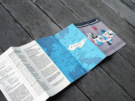
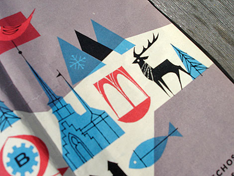
Beautiful tourist map from Czechoslovakia (now the Czech Republic) dating back 1966. I love the bold colors and simple line work. I’m guessing that the illustration inside the red square on the left side is a beer. Look at that foamy top! Sweet mother of beverages!
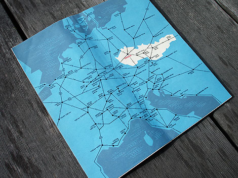
The inside of the map includes info on transportation, Czechoslovak Travel Bureau (CEDOK), natural resources and mountain ranges. No info on that giant beer though.
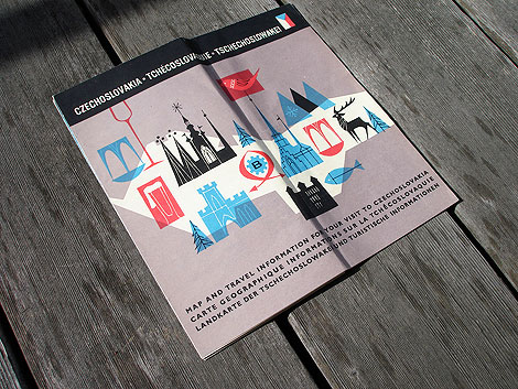
This post was inspired by a post I found at Amy Cartwright’s awesome Stickers and Stuff blog. She found an image of this map in Bonito club’s wonderful Flickr account. The post was missing images of the inside of the map, so I decided to grab some photos from the copy I own.
——————–
Also worth checking: Czech street map & Designers bookshelf with Amy Cartwright.
Not signed up for the Grain Edit RSS Feed yet? Give it a try. Its free and yummy.
——————–
No Tags
Share This
Congrats to B. Rane! She is the winner in the Photo-Lettering giveaway.
Grain Edit recommends Annonce. A font designed by Canada Type. Check it out here.
©2009 Grain Edit - catch us on Facebook and twitter
View Next 25 Posts


 2 Comments on Snobbery with Violence, last added: 10/28/2010


.jpeg?picon=2420)
.jpg?picon=107)

[...] This post was mentioned on Twitter by NightsEmbrace, Melody B.. Melody B. said: Snobbery with Violence: http://wp.me/p3wLO-op [...]
Aw…I’m sorry you didn’t like it. Mind you, it’s been quite a while since I’ve read it, and I might be in agreement on a re-read.