Untitled painting casually referred to as White Block Quadrupeds
Jim Flora was a fine artist/illustrator best known for his album cover art for RCA Victor and Columbia Records, as well as his illustrations for children’s books. In this uncirculated and untitled early 1940s painting, he presents us with a (literally) twisted cast of characters. As mentioned on the Jim Flora website, the work “depicts an inscrutable panorama of disconnected facial features, headless quadrupeds, and someone’s nightmare of a fanged horse”. This piece along with select paintings from the Jim Flora collection are now available as limited edition prints for purchase over at the Poster Cabaret.

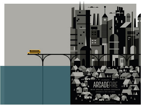
Manhattan

The Big Bank Robbery
Related Books:
The Sweetly Diabolic Art of Jim Flora
The Curiously Sinister Art of Jim Flora
——————–
Also worth viewing: Sigrid and Hans Lammle
Not signed up for the Grain Edit RSS Feed yet? Give it a try. Its free and yummy.
——————–
No Tags
Share This
Only a few grain edit shirts left.Get yours now!
Grain Edit recommends: Born Modern: The Life and Design of Alvin Lustig. Check it out here.
©2009 Grain Edit - catch us on Facebook and twitter


Inspired by pop surrealism and alternative cartoons, Alberto Cerriteno’s work is filled with rich textures and fantastically imagery. This print entitled Recuerdos is no exception. We see a small group of birds perching on branches sprouting from a somewhat distinguished gentleman’s head. The man appears to be crying and I hope they’re tears of joy. Recuerdos was originally created for the latest album of Mexican indie band Hello Seahorse, but is now available for purchase here.
—–
Also available for your viewing pleasure: Matte Stephens Interview
Enjoy this post? Sign up for our tasty free grain edit RSS feed.
—–
No Tags
Share This
Only a few grain edit shirts left.Get yours now!
Grain Edit recommends Creative, inc.: The Ultimate Guide to Running a Successful Freelance Business. Check it out here.
©2009 Grain Edit - catch us on Facebook and twitter


Octoberama by Charley Harper / 30 inches x 30 inches
The Poster Cabaret is now carrying select pieces by the late Charley Harper, including this print entitled Octoberama: a fitting title for the approaching Fall season. Harper was a master in his use of color and ability to reduce elements to their simplest form. These are reflected in the warm, subdued shades of orange, yellow and red seen in the leaves above.
—–
Also available for your viewing pleasure: Charles Harper: Giant Golden Book of Biology
Enjoy this post? Sign up for our tasty free grain edit RSS feed.
—–
No Tags
Share This
Only a few grain edit shirts left.Get yours now!
Grain Edit recommends Buffet Script A font designed by Sudtipos. Check it out here.
©2009 Grain Edit - catch us on Facebook and twitter


The National at Massey Hall / 18″ x 24″ print
Doublenaut serves up a haunting piece of imagery for this concert poster created for the National’s recent show in Toronto. The artwork was inspired by “Anyone’s Ghost” and “Terrible Love”, two songs found on the group’s latest release. The poster sold out fairly quickly at Doublenaut’s shop, but there are still a few available over at the Poster Cabaret.
——————–
Also worth viewing: Doublenaut: Toronto Based Desgn Studio
Not signed up for the Grain Edit RSS Feed yet? Give it a try. Its free and yummy.
——————–
No Tags
Share This
Only a few grain edit shirts left.Get yours now!
Grain Edit recommends Buffet Script A font designed by Sudtipos. Check it out here.
©2009 Grain Edit - catch us on Facebook and twitter

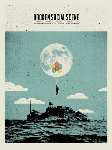
Broken Social Scene Concert Poster by Concepcion Studios
This week’s poster pick was designed by Concepcion Studios for a recent Broken Social Scene concert in San Francisco. The grainy dots used throughout this poster add a nice vintage feel. The fluffy clouds in the background are not as realistic as the rest of this scene, but happen to work well with the overall playfulness. I can’t think of a better way to escape from Alcatraz than with a fistful of brightly colored balloons. Get carried away here.
——————–
Also worth checking: Jim Brair Poster Design
Not signed up for the Grain Edit RSS Feed yet? Give it a try. Its free and yummy.
——————–
No Tags
Share This
Vintage kids book Mi Diccionario is in the Grain Edit Shop
Grain Edit recommends Buffet Script A font designed by Sudtipos. Check it out here.
©2009 Grain Edit - catch us on Facebook and twitter

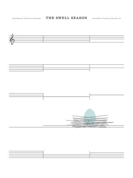
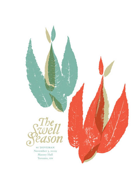
The Swell Season Concert Poster by The Small Stakes
This week’s poster pick was created by Jason Munn of The Small Stakes. It’s incredibly simple and yet so clever. I like how Jason used the the bars from the sheet music to form a bird’s nest. If you’re interested in purchasing this poster, you can pick up a copy here.
No Tags
Share This
Vintage kids book Mi Diccionario is in the Grain Edit Shop
Grain Edit recommends Colo Pro A font designed by Font Fabric. Check it out here.
©2009 Grain Edit - catch us on Facebook and twitter

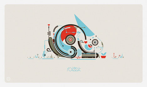
This week we’re excited to feature this Rabbit print by Leandro Castelao as our poster pick. Castelao is based in Buenos Aires and has previously been featured on grain edit. Rabbit is presented in Castelao’s signature style and I must say that I am once again blown away. The lines look like wires creating some sort of robo bunny with a CD drive on steroids. Good stuff. You can pick up a Rabbit print here.
—–
Also worth checking: Leandro Castelao design work
Enjoy this story? Sign up for our tasty free grain edit RSS feed.
—–
No Tags
Share This
Vintage kids book Mi Diccionario is in the Grain Edit Shop
Grain Edit recommends Colo Pro A font designed by Font Fabric. Check it out here.
©2009 Grain Edit - catch us on Facebook and twitter

This week we’re excited to feature Rabbit by Leandro Castelao as our poster pick. So much to admire and so much to appreciate in this wonderful print. Castelao is based in Buenos Aires and has previously been featured on GrainEdit for obvious reasons. Rabbit is presented in Castelao’s signature, dynamic style and I must say that I am once again blown away. The colors, the shapes, and minimal use of type help form a stunning composition. You can purchases Rabbit here.
No Tags
Share This
Vintage kids book Mi Diccionario is in the Grain Edit Shop
Grain Edit recommends Colo Pro A font designed by Font Fabric. Check it out here.
©2009 Grain Edit - catch us on Facebook and twitter

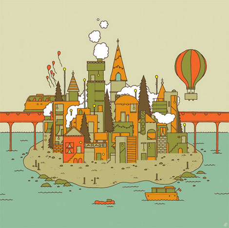
Isle of This Town by Invisible Creature. Meas. 17″ x 17″There is so much to enjoy in this week’s poster pick by
Invisible Creature. Everywhere your eyes go there is something to delight in. I want to live in this poster and I honestly can’t decide which element is my favorite. The color scheme is perfect and really lets your imagination soar. There is a lot to be said for work like this that inspires you and takes you away to another world. You but it
here.
No Tags
Share This
Vintage kids book Mi Diccionario is in the Grain Edit Shop
Grain Edit recommends Colo Pro A font designed by Font Fabric. Check it out here.
©2009 Grain Edit - catch us on Facebook and twitter

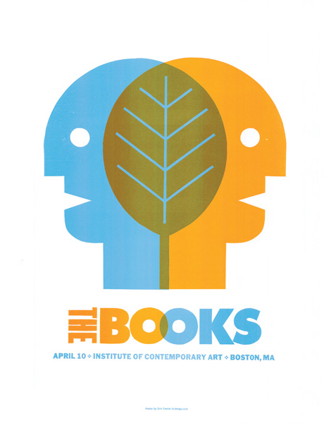
This Week’s Poster Pick is The Books/ Boston, MA poster designed by Dirk Fowler.
You can pick up a print at the Poster Cabaret.
——————
Also worth checking: The Small Stakes/ Jason Munn interview.
Not signed up for the Grain Edit RSS Feed yet? Give it a try. Its free and yummy.
——————
No Tags
Share This
Congrats to our 2009 Grain Edit Holiday Giveaway Bash Winners - /Grand Prize - Christopher E from Ferndale, Mi/ 1st Prize - Kristina M - Oakland, CA/ 3rd Prize - Samantha W - North Vernon, IN/ 4th Prize - Nicholas L. - Brooklyn,NY/ 5th Prize - Barbra - Brooklyn,NY
Grain Edit recommends Colo Pro A font designed by Font Fabric. Check it out here.
©2009 Grain Edit - catch us on Facebook and twitter

The Swell Season Concert Poster by Doublenaut
This week’s poster pick was made possible by the creative minds that make up Doublenaut. Doublenaut is stationed in Toronto, Canada and is made up of brothers Andrew and Matt McCracken.
This is a swell season (totally intended) to admire the beauty around us and in this poster. I’m looking forward to seeing more work from these guys.
You can purchase this week’s poster pick at the Poster Cabaret.
——————–
Also worth checking: Doublenaut
Not signed up for the Grain Edit RSS Feed yet? Give it a try. Its free and yummy.
——————–
No Tags
Share This
Congrats to B. Rane! She is the winner in the Photo-Lettering giveaway.
Grain Edit recommends Annonce. A font designed by Canada Type. Check it out here.
©2009 Grain Edit - catch us on Facebook and twitter


Sasquatch Music Festival Poster (Bubbles) - Designed by Invisible Creature
This week our poster pick(s) are a series of posters designed by Invisible Creature for the Sasquatch Music Festival. The series presents a host of characters that we’re certain you’ll enjoy. A limited color palette was employed throughout this series that is filled with whimsy and sure to please. I am especially fond of Sigmund and Blanche. If I had enough wall space they could all live with me.
The entire series is available at the Poster Cabaret.
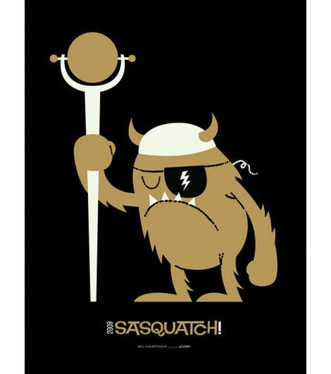
(El Captain)
——————–
Also worth checking: Invisible Creature Interview.
Not signed up for the Grain Edit RSS Feed yet? Give it a try. Its free and yummy.
——————–
contemporary,
posters,
USShare This
Congrats to B. Rane! She is the winner in the Photo-Lettering giveaway.
Grain Edit recommended reading: A Russian Diary
©2009 Grain Edit - catch us on Facebook and twitter


Cutie Bear by Delicious Design League. 18″ x 24″
The best part about bringing you the poster pick series is reading your responses to our selections. This week can’t disappoint because it is virtually impossible to see the work of the designers at Delicious Design League and not be smitten.
Delicious Design League is based in Chicago and commandeered by Billy Baumann and Jason Teegarden-Downs. The firm focuses on designing for the music industry but leaves room for all things design. ‘Cutie Bear’ feels right at home here at Grain Edit. Clean lines and smart color combos never go out of style. The trick is to make it look effortless, but it’s obvious a great deal of thought goes into something so, well, cute.
Cutie Bear is available for purchase here.
——————–
Also worth checking: Delicious Design League - Posters, Design and Illustration.
Not signed up for the Grain Edit RSS Feed yet? Give it a try. Its free and yummy.
——————–
No Tags
Share This
Congrats to MCHL of Sacramento. You are the winner of the Incase HunterGatherer laptop sleeve.
Grain Edit recommended reading: A Russian Diary
©2009 Grain Edit - catch us on Facebook and twitter

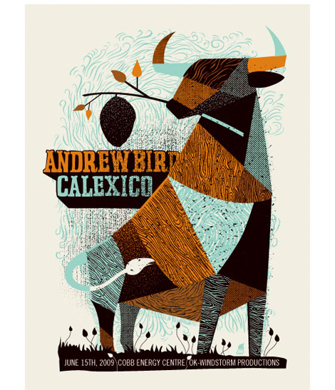
Andrew Bird Poster by Methane Studios. 18″ x 24″
There is so much to love and appreciate about this week’s poster pick by Methane Studios. Let me begin by pointing out the color combinations which I happen to think are perfect. This awesome beast is impressive with its geometric body, patterns, and textures. It’s great seeing how the patterns take on new life with different coloring. As always, the type use and positioning is very well done.
The Andrew Bird poster is available for purchase here.
No Tags
Share This
Congrats to MCHL of Sacramento. You are the winner of the Incase HunterGatherer laptop sleeve.
Grain Edit recommended reading: A Russian Diary
©2009 Grain Edit - catch us on Facebook and twitter

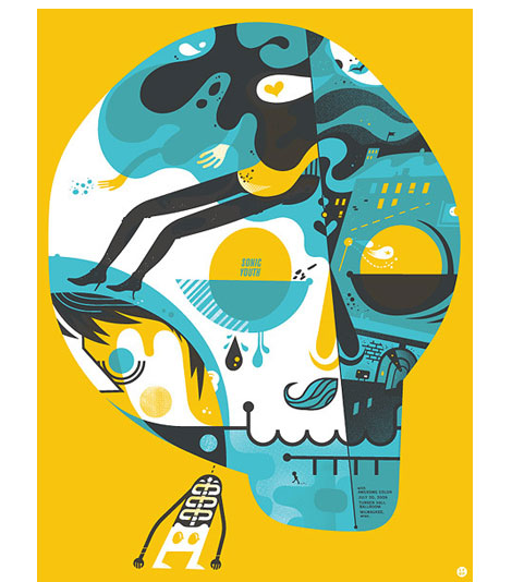
Sonic Youth Concert Poster designed by the Little Friends of Printmaking
After our interview with the Little Friends of Printmaking we decided to make their Sonic Youth print our Poster Pick of the week. If you haven’t seen the interview yet, it’s worth checking out. Melissa and JW break down the process of creating the Sonic Youth poster from the initial concept to the finished product.
You can purchase the Sonic Youth - Milwaukee concert poster at Poster Cabaret.
No Tags
Share This
Congrats to MCHL of Sacramento. You are the winner of the Incase HunterGatherer laptop sleeve.
Grain Edit recommended reading: A Russian Diary
©2009 Grain Edit - catch us on Facebook and twitter


Doom Flower Mini Print by Aesthetic Apparatus - 6″ x 6″.
Many of you are familiar with the distinctive works of Aesthetic Apparatus and this week we’re happy to add their ‘Doom Flower’ to our growing list of poster picks. This design studio continues to please us with their creative choices and prints like this. The colors used here stay true to their Doom series which is well worth browsing. The flow relies heavily on color and shape in the creation of the energetic flower pattern. The skull in the center adds an interesting balance and helps break things up a bit. I think this demonstrates great use of color and pattern. Those guys make it look so easy!
This print is available at www.postercabaret.com
——————
Also worth checking: Aesthetic Apparatus updates.
Not signed up for the Grain Edit RSS Feed yet? Give it a try. Its free and yummy.
——————
No Tags
Share This
Grain Edit recommended reading: IDEA magazine - The Max Huber issue
©2009 Grain Edit - catch us on Facebook and twitter

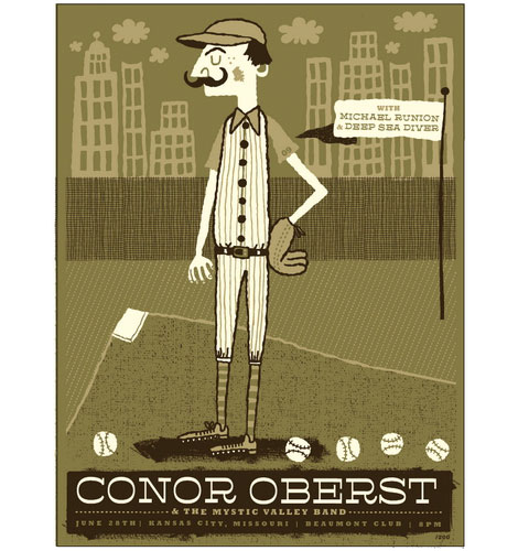
Conor Oberst Concert Poster by Vahalla Studios. Handmade three color silkscreen measures 18″x 24″.
The poster pick series presses on with a piece by Tad Carpenter of Vahalla Studios. I like the limited color palette used in this poster and think that it compliments the scene perfectly. It is quiet yet delightful. The use of pattern throughout the poster is as terrific as the type choices. Plus, I’m a sucker for buildings in a background.
You can purchase the Conor Oberst poster at www.postercabaret.com
——————
Also worth checking: Tad Carpenter.
Not signed up for the Grain Edit RSS Feed yet? Give it a try. Its free and yummy.
——————
No Tags
Share This
Grain Edit recommended reading: Otto Neurath - The Language of The Polls
©2009 Grain Edit

By: alvaro,
on 7/16/2009
Blog:
inspiration from vintage kids books and timeless modern graphic design
(
Login to Add to MyJacketFlap)
JacketFlap tags:
illustration,
US,
poster,
prints,
contemporary,
posters,
USA,
graphic-design,
poster picks,
Add a tag
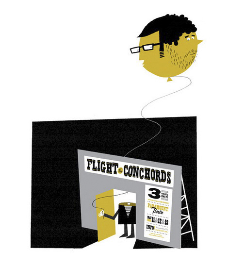
Flight of the Conchords Concert Poster designed by Jesse LeDoux of Patent Pending. 18″ x 24″.
This week we have our sights on a Flight of the Conchords Concert Poster by Patent Pending. Based in Seattle and headed by Jeff Kleinsmith and Jesse LeDoux, Patent Pending was established by the design duo in 1999.
My favorite thing about viewing the work of other designers is seeing how they approach details in their design. I’m impressed with several parts of this poster and I enjoy that it is understated and relaxed. The typographic work is smart and attention grabbing without too much visual info to distract from it. As a fan of FoTC I think it captures their vibe really well.
This poster is available for purchase at www.postercabaret.com
contemporary,
poster,
USShare This
Congrats to Jenny Eng. She is the winner of the Kevin Dart giveaway.
©2009 Grain Edit