new posts in all blogs
Viewing Blog: Sergio Ruzzier, Most Recent at Top
Results 1 - 25 of 147

A Picture Book Blog
Statistics for Sergio Ruzzier
Number of Readers that added this blog to their MyJacketFlap: 1
Teachers! Librarians! Bookstore event coordinators! Parents! Kids!
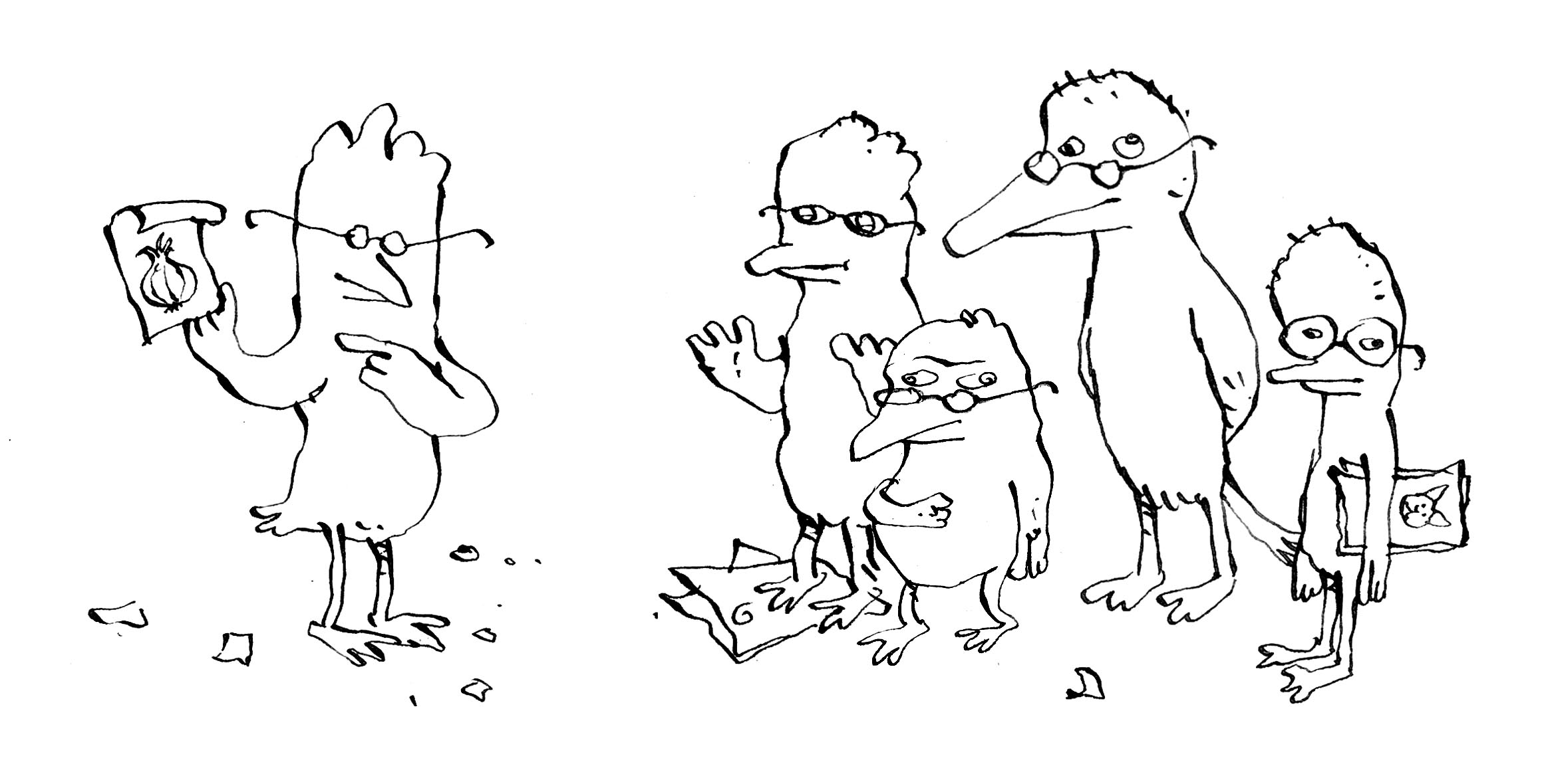
Here’s a little bundle of ideas for your drawings. Click on the image below to download the PDF, and enjoy!
This year I was one of the five jurors of the Bologna Children’s Book Fair Illustrators Exhibition. In the beautiful catalogue published by Corraini, I was asked a few questions on creating picture books and more.

The five jurors: Klaus Humann, Nathan Fox, Francine Bouchet, myself, and Taro Miura.
You have said in the past that there are so many obstacles and taboos when creating children’s books, that you run the risk of censoring yourself. How do you avoid self-censorship?
I was specifically referring to the U.S. market, where all my children’s books so far have been originally published.
I consider myself fortunate to have found such a fertile ground for my ideas and my style, and I doubt that I would have been able elsewhere to make my passion for picture books into an actual profession. I am very grateful to the editors who saw potential in my work, beginning with the unforgettable Frances Foster.
There is, of course, the other side of the coin. Compared to what gets published in other Western countries (Germany, for example, or France, or, perhaps to a minor degree, Italy), American books for children tend to be very tame. There are glaring exceptions, of course, but generally speaking you don’t see books that deal with issues that are considered too mature for the audience: death, sex, war, violence, depression, and so on. When books on such themes do get published, they tend to be heavily weighed down by a predictable message, and illustrated incompetently. There is the widespread belief that children need to be shielded from the reality of life. That, in my opinion, is a huge mistake, and is akin to lying. Of course I’m not suggesting that children’s books should include pornography or gratuitous violence, but if a story calls for it, one shouldn’t shy away from showing unpleasant situations. The risk of self-censorship I was talking about is always looming, and can be difficult to detect.
When writing a story, or drawing a picture, you do feel the pressure to deliver something free of possible controversy, or to make choices based on specific political agendas. But in order to produce the best possible work, the only pressure you should feel is the pressure to be true to your own voice.
When creating a children’s book, do you ever have a precise image of your ideal reader in mind?
Absolutely not. I don’t think of the reader at all. I believe that when writers think too much about who’s going to read their book, the result will be formulaic at best.
Which illustrated book would you have liked to have authored? Why?
There are so many authors and illustrators I worship and whose books I hold dear. In general, I’m drawn to unusual stories that are beautifully illustrated without trying to impress. I can’t stand authors who follow a trend and illustrators who want to show off without even possessing the appropriate skills. Warmth, sincerity, and irony are the main qualities I always look for in a book.
Arnold Lobel’s Frog and Toad stories are among the most profound, funny, endearing books I’ve ever read. The drawings perfectly match the tone of the text, at the same time melancholic and reassuring. William Steig, Maurice Sendak, Tomi Ungerer, Edward Gorey: they all have created wonderful books that keep inspiring and humbling me.
But if I have to pick one single book, it would probably be Wolf Erlbruch’s Duck, Death, and the Tulip. I’ve never seen anything like it. It’s a death dance for children. It’s original, powerful, sweet, compassionate, sad, comforting. It’s done with such measure and good taste. I would be happy if I could produce something comparable to that book.
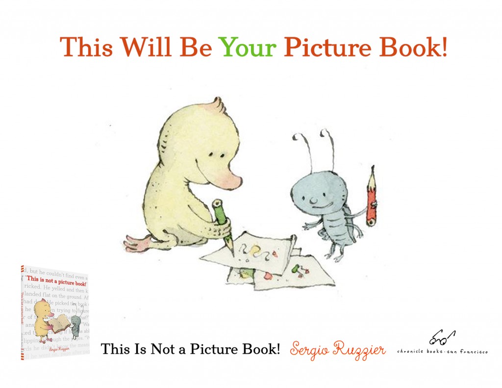
Reviews for This Is Not a Picture Book! are starting to appear. As usual, Publishers Weekly and Kirkus are the first ones, and they both gave my new book (my first with Chronicle) wonderful, starred reviews.
PW writes:
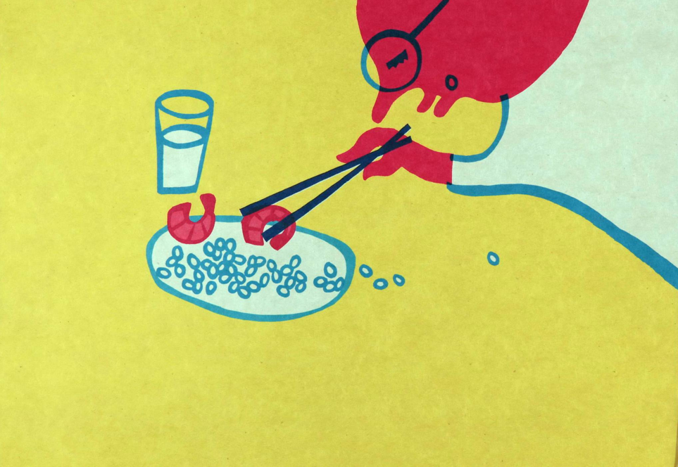
This isn’t a book about books; it’s a book about learning to read. A duckling with a pink beak picks up a fat volume and discovers, in the irritated comment of the title, that it has no pictures. “Can you read it?” asks his sidekick, a bug. “I’m not sure,” says the duckling. “Words are so difficult.” In luminous watercolors, Ruzzier (Two Mice) shows the duckling and bug crossing into a strange, many-colored world, where unfamiliar words are represented as odd machines, blobby shapes, and bizarre creatures. When the duckling stumbles on a word he knows (“bee,” “flower”), its recognizable image pops up among the mysterious ones. Duckling and bug wander through the ever-changing landscape of reading—“There are wild words… and peaceful words”—before landing cozily in bed. Ruzzier’s story offers gentle empathy for kids tackling this intimidating task. Observant readers will note that the endpapers represent learning to read, too; the initial pair retells the story as a beginner might see it, with most of the words scrambled, while the words of the final endpapers read clearly—and no pictures there, either.
And here’s what they think at Kirkus:
A metafictive delight of a picture book.
Alice would be pleased: despite Ruzzier’s title, there are plenty of pictures and ample conversation in this picture book. The titular book within the book, however, is illustration-free. This initially causes distress for the duckling protagonist (who oddly has a bellybutton, but that’s beside the point) who finds the book in the spreads before the title page. When a bug appears and asks, “Can you read it?” the duckling gives it a try. In a brilliant feat of page layout, the recto depicts a green landscape encroaching on the verso, with a log laid across a chasm as a bridge to the white space on which the duckling and bug stand. Their walk across the log is a visual metaphor for the duckling’s successful decoding of the text in its pictureless book. Whole worlds open up to them as the duckling reads aloud. Illustrations depict these worlds evoked by “wild words… / and peaceful words,” and the duckling ultimately declares that “All these words carry you away.” The satisfying conclusion is an affirmation of the transformative power of reading. In one outstanding design touch, the front endpapers tell the not-a-picture-book text in garbled type with transposed letters that one must strain to decode, while the text is clear in its entirety on the back ones.
I can’t wait to know what the others think!
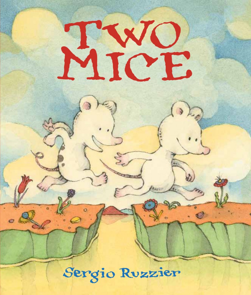
Two Mice
Since it came out last September, Two Mice has received a lot of attention, including the inclusion in three prestigious best-books-of-the-year lists:
The Horn Book Fanfare
The Washington Post
Kirkus Reviews
And here’s what people think of the book (click on the links for the full reviews):
“There’s a lot of drama for a book about counting, but that’s not the only stunner. The world Ruzzier creates with his illustrations is so singular, so extraterrestrial that the pictures give the story a sci-fi vibe.” –The Boston Globe
“What a cute, clever way into number sense.” –The New York Times
“Expressive, mildly mischievous pen-and-ink illustrations in soft colors develop details and drama that the words leave out. (…) The book’s creative focus on pattern in plot leaves plenty of room for readers’ imaginations to play a strong role.” –The Horn Book (Starred review.)
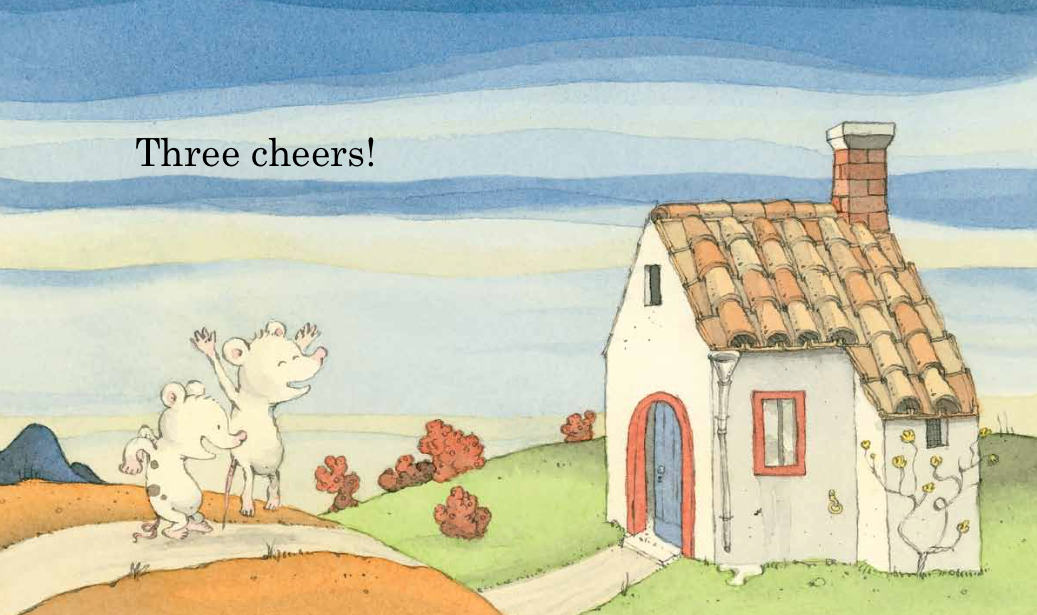
“The simplicity of the text means that the earliest readers will soon be able to pick it up and will return to it over and over. One story. Two mice. Three cheers. Lots to love.” –Kirkus (Starred review.)
“A scintillating combination of danger and comfort.” –Publishers Weekly
“Sweetly satisfying.” —School Library Journal
“Two Mice is a brief master class in the picture book form.” –Nine Kinds of Pie
“The inventively undulating narrative structure, the sherbet-like color palette, fantastic tile floors, countless tiny visual surprises–and last but not least, the comfortingly resilient mouse friendship–make Two Mice a standout.” –Shelf Awareness
“A simple and simply lovely book. A sort-o- counting (well, one to three and back again) book and a tiny adventure story too. Absolutely charming.” –Monica Edinger
“Ruzzier’s counting book is a gem.” –Waking Brain Cells
“Using pen and ink and watercolors, Sergio Ruzzier assures a place on the Caldecott list this year (well, I think that should happen).” –Sal’s Fiction Addiction
“Two Mice is a tiny treasure waiting to be found over and over by readers.” –Librarian’s Quest
Two Mice made it into three best-books-of-the-year lists!
The Horn Book Fanfare
The Washington Post
Kirkus Reviews


Julie Roach writes on the Horn Book:
Using only two-word phrases (“One house / Two mice / Three cookies”) and a simple repeating number pattern (one, two, three; three, two, one; one, two, three), this clever book (with an extra-small, preschooler-perfect trim size) creates a fast-paced adventure for listeners and new readers alike. Expressive, mildly mischievous pen-and-ink illustrations in soft colors develop details and drama that the words leave out. For instance, in the pictures, when the two mice “share” three cookies, the spotted mouse gets two cookies, while the plain mouse, miffed, gets only one. Before long, the mice venture out to sea (“Three boats / Two oars / One rower”), and this time it’s spotted mouse who does all the work, while plain mouse takes it easy in the boat’s stern. Soon the situation grows dire — “Three rocks / Two holes / One shipwreck.” They nearly become a raptor’s dinner before managing “One escape.” The two work together as a team after this near-
disaster, and “Three carrots / Two onions” lead to a final nourishing “One soup” that both mice are happy to share — equally. Sometimes the pattern leaves the reader with practical questions: how did “One nest / Two eggs” hatch into “Three ducklings,” for instance? But trying to fit together all the pieces is part of the fun, and the book’s creative focus on pattern in plot leaves plenty of room for readers’ imaginations to play a strong role.
My new picture book Two Mice is coming out in September. It is already making quite an impression among the international intelligentsia.
Here are some early comments, and I’ll keep updating as more will come by:
“TWO MICE are better than one.“—Walter E. Disney
“Sergio Ruzzier’s TWO MICE is mousetastic.” —Beatrix Potter
“I just ♥ how in TWO MICE Mr. Ruzzier lets the pictures tell the story.” —Randolph Caldecott
“TWO MICE is, like, wow. Just… wow.” —J.M. Barrie
“No man remains quite what he was when he reads TWO MICE.“ —Thomas Mann
“Within the covers of TWO MICE are the answers for all the problems men face.” ―Ronald Reagan
“1, 2, 3, 3, 2, 1… That’s insane! TWO MICE is blowing my mind!“ —Leonardo Fibonacci
“There was a good book called Two Mice,
That offered this piece of advice:
When leaping o’er cracks
You should never be lax—
Lest you wind up with less than two mice.” —Edward Lear
Kirkus says:
The deceptively simple counting story of two mice, their adventure, and friendship. One morning in Ruzzier’s imaginative and colorful world, two mice wake to explore. The tiny window above the bed beckons: water, mountains, and sky are waiting for these two. Starting before the title and ending on the copyright page, minimal text says all that is needed: “One house / Two mice / Three cookies. / Three boats / Two oars / One rower. / One nest / Two eggs / Three ducklings.” New readers will soon notice the number pattern and slow down to see how the droll illustrations extend the story. For instance, the mouse with one cookie has an angry expression and a rather tightly curled tail, while the loose-tailed mouse looks gleeful as it chows down on two cookies. The sunny rowboat scene is not so sunny for the mouse who has to manage the two oars. By the time the two buddies return to their home, all is forgiven when the delicious soup is served. (And, in a visual nod to Sendak, it is clearly “still hot.”) The small trim size and careful attention to details give this book enormous appeal; the decorative floor tiles, ornamental feet on the kitchen table, and mismatched stools fit right in with the red hills and ever changing sky. The simplicity of the text means that the earliest readers will soon be able to pick it up and will return to it over and over. One story. Two mice. Three cheers. Lots to love.

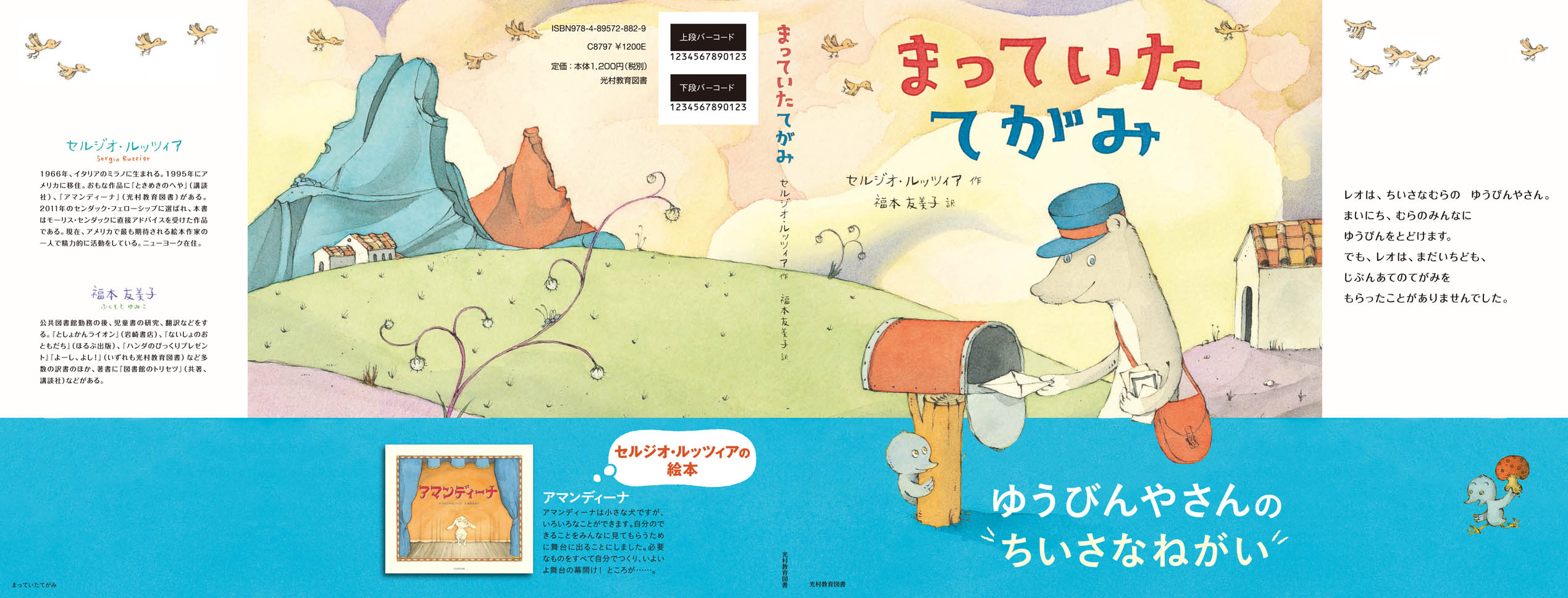
Here’s the jacket of the forthcoming Japanese edition of A Letter for Leo, published by Mitsumura (which already published my Amandina a few years ago). The blue band is the obi, the traditional paper strip that wraps the book jacket. Yumiko Fukumoto translated the text, as she did for Amandina and The Room of Wonders. (Click on the image to enlarge it.)

I wrote this piece for this year’s illustration issue of The Horn Book. They graciously let me post it here as well.
I don’t like to experiment.
I know it sounds pusillanimous, but I’m just being honest: I don’t like to experiment because I am afraid of failure.
But at least two times in my life – at the very beginning of my artistic life – I found enough courage and determination to take risks. I was a fearless teenager then.
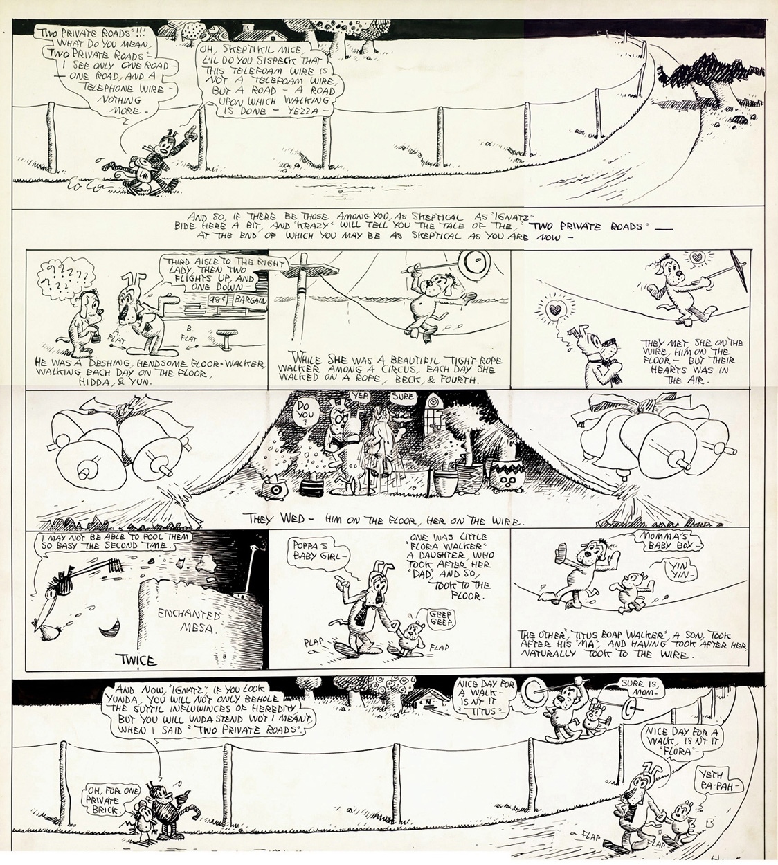
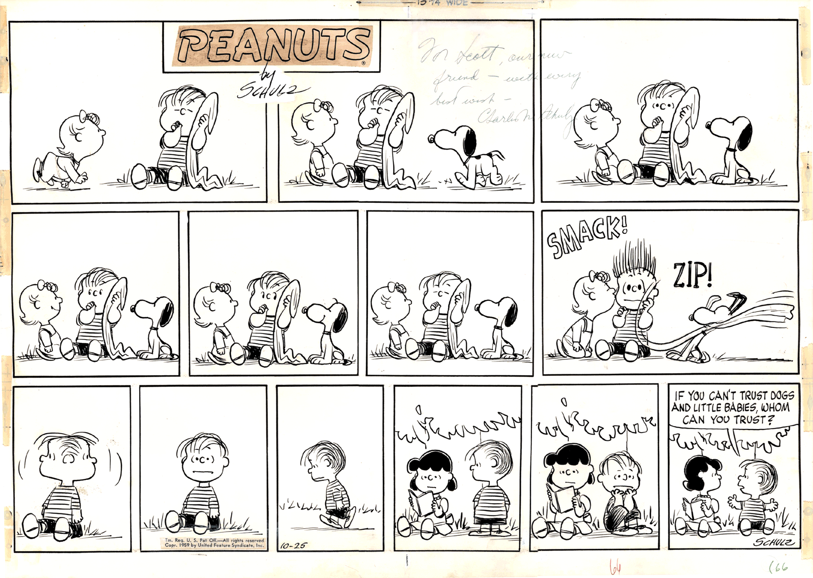
Being already passionate about picture books and comic strips – in particular those of Maurice Sendak, George Herriman, Elzie C. Segar, and Charles Schulz – it was clear to me how important would be to master pen and ink, if I wanted to be in that business.

Maurice Sendak
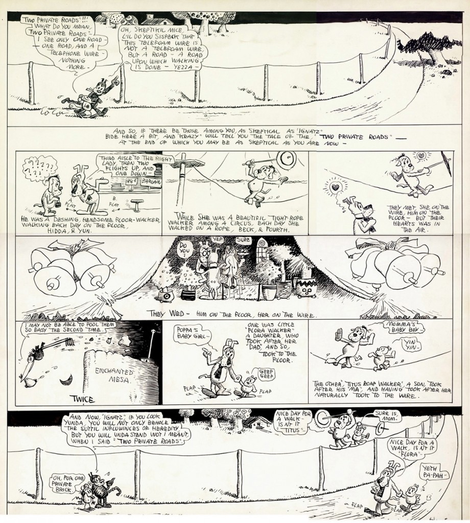
George Herriman
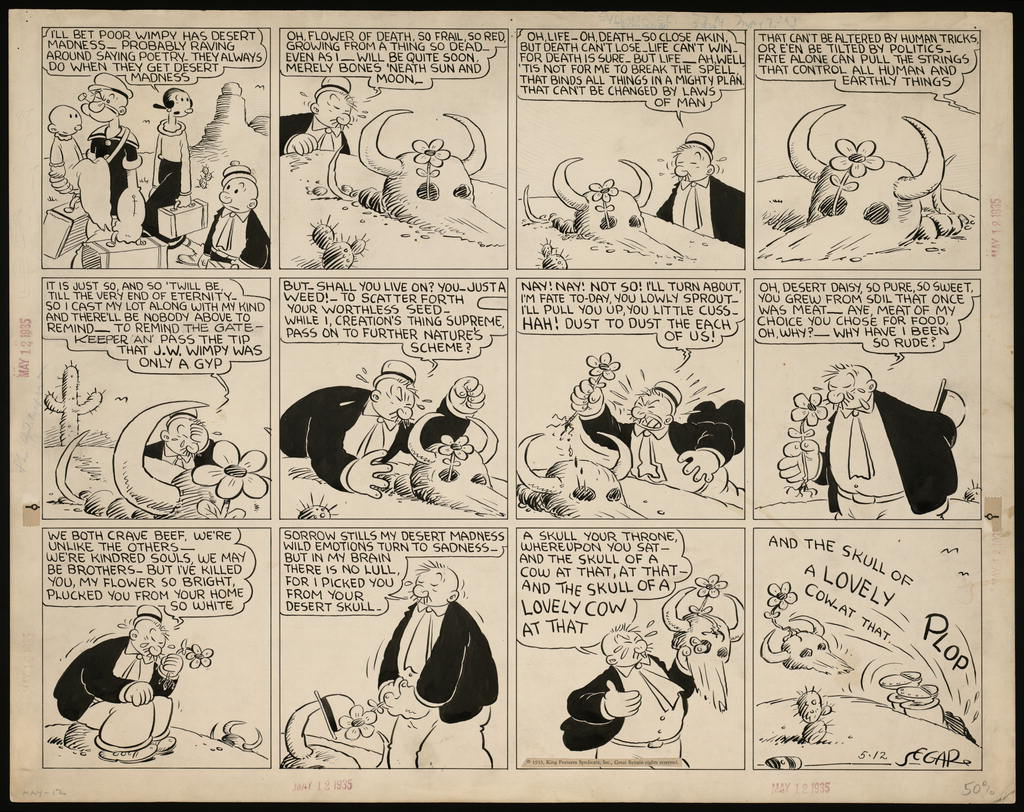
Elzie C. Segar
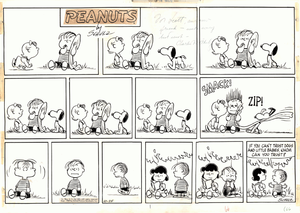
Charles Schulz
Each of those artists had a very sophisticated and personal way of using the pen, and I wanted to find my own.
I remember going to the stationary store to buy my first two nibs, one very flexible and the other stiffer; then returning home and try them on the paper, keeping my hand from trembling; realizing I had to go from upper left to lower right to avoid; understanding how different pressures produce different lines; learning what kind of paper had the best surface for the kind of line I wanted to make.
In time, I did find my own way with pen and ink, which became my favorite and, for a few years, my only way of drawing. Most comic strips, at least the dailies, were in black and white, and I knew that even Sendak’s illustrations for Little Bear – a crucial source of inspiration for me – were colored mechanically. Because of all this, I didn’t think the lack of color in my drawings would be an obstacle in my future career as an illustrator.
Of course there was a hidden reason why I didn’t use color: the fear of failure. I had a fascination for Hieronymus Bosch, medieval frescoes and illuminations, so how could I not realize how important color can be for an artist? In fact, I had timidly attempted one or two small acrylic and a few oil pastel paintings, with very disappointing results, at least according to my overpowering superego. Those painful experiences kept me from seriously trying for years.
Once I became more conscious of the necessities of a professional illustrator, I couldn’t hide anymore, and had to face the challenging task of finding myself a method to add color to my pen drawings.
The most natural way to do that is watercolor, and so one day I went to an art store, bought a few half-pans of Schmincke watercolors, a brush or two, some Arches paper, and began testing the technique and my own resilience. For what concerned the techniques, I was set.
Maybe one day I will venture into buying a new kind of nib, or a new brand of watercolors, or even be audacious enough to try a paper with a slightly smoother surface. Who knows. For now, more than twenty-five years later, I’m still recovering from that initial double stress.
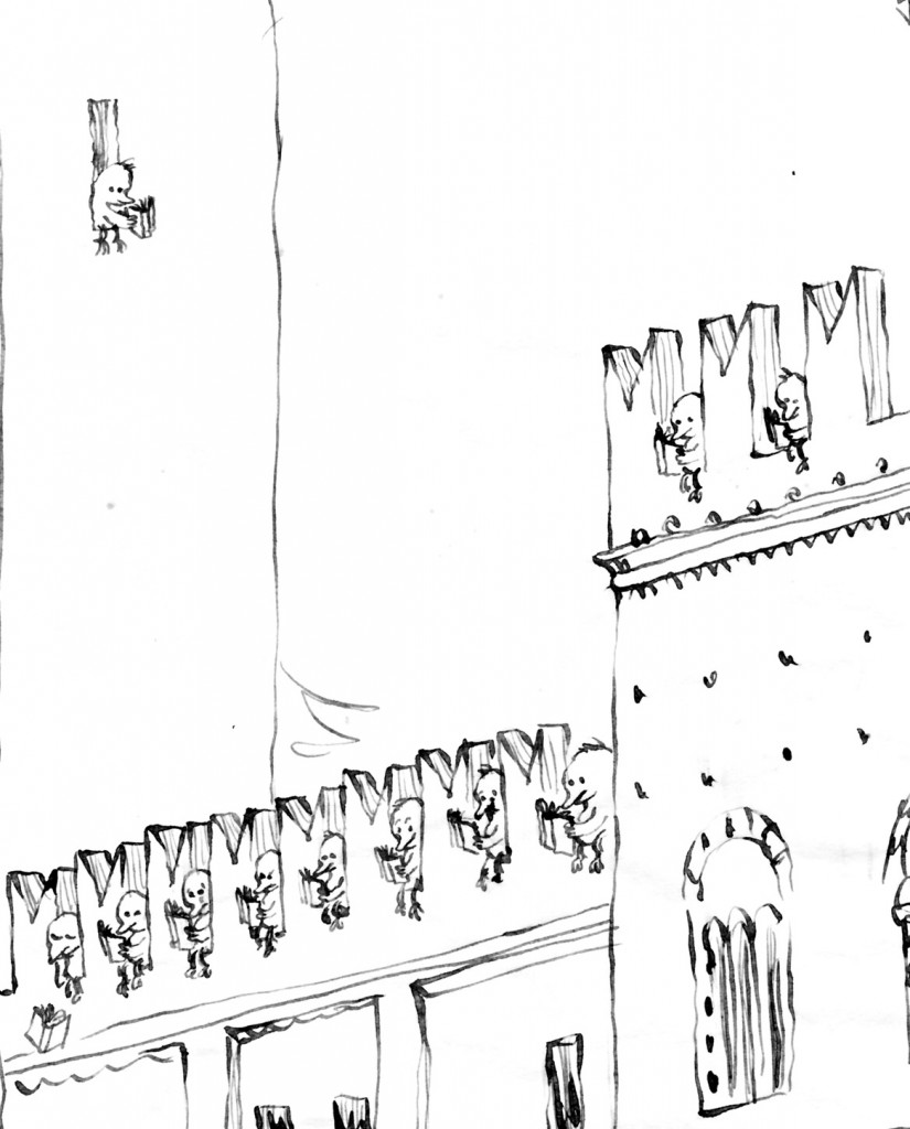
Please click on the image to enlarge.

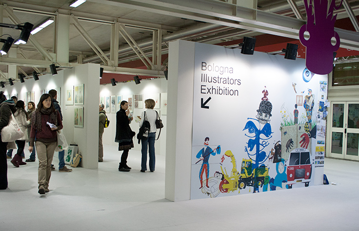
Here are my five drawings that were selected for the upcoming 2014 Bologna Children’s Book Fair’s Illustrators Exhibition. The show will be at the Fair, and then travel to Japan for a museum tour.
The Bologna Children’s Book Fair’s website just posted one image for each of the illustrators selected for this year’s edition.
Here are a few of my personal favorites:
Rebecca Palmer, U.K.
Min Jee Kim, Korea
Michio Watanabe, Japan
Marco Somà, Italy
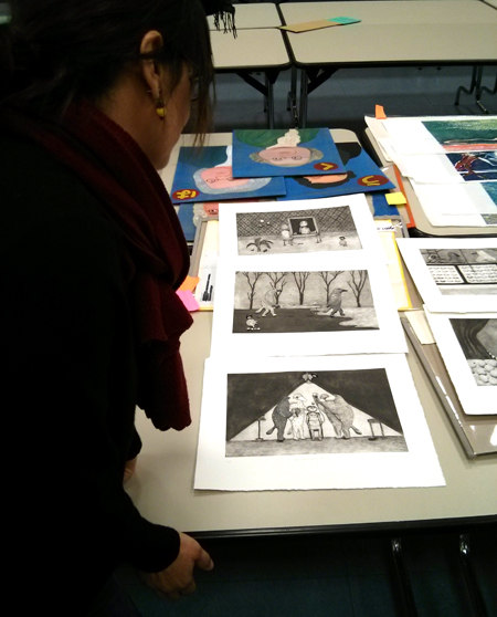
Here’s Anna Castagnoli‘s third post on her experience on being a judge for the Bologna Children’s Book Fair’s Illustrators Exhibition. I apologize for any shortcomings in the translation, which would be solely my fault.
If you want to see the original post in Italian, go to Anna’s blog, “Le figure dei libri.”
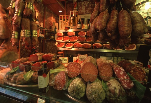
Salumeria Tamburini in Bologna
Day 3
The large hall was changing appearance; we were now moving around fewer tables. Some had been cleared to leave room for the final selection. In the back, staff members were carefully placing in folders the works discarded the previous days.
The exhibition was to include about eighty illustrators. Among the 160 piles survived from the earlier selections, we had to choose roughly seventy (ten, the ones with four stickers on, had already been put aside). We began with the discussions: the job of a judge is not to have opinions, but rather to translate into clear language every little thought, taste, or feeling.
The level of the discussion was very high. We had persuasive arguments, which we were sharing with passion. We were all so good at defending our ideas, that we ran the risk of getting stuck. After discussing the third work, we decided to take a break. Isabel Minhos found the right words to get us started again: our goal was not make one’s opinion prevail over the others’, and it was not a tragedy if we eventually had to leave out one judge’s favorite illustrator. We could not have our personal dream show.
That’s when I understood that we were a group, and that we were to select the show as a group, in a way putting aside our selves. The exhibition would have been precious because it would mirror something that none of us could have predicted before our getting together. And that’s how it went.
An illustration changes when paired with a text
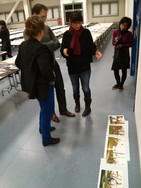
We started to spread the drawings on the floor and make up stories based on them, to see if those images would have worked in a kids’ book, knowing that a text changes considerably the perception of an image. Sometimes there was no way to see what story would have worked with the the images: “They’re too much like postcards,” one of us would say, “rather than moments of a possible story.” “Could they be paired with a poem?” another would ask, without being too convinced. “What if we moved these to the non-fiction category?” “No, they’re not descriptive enough. We can’t. Let’s go to the next.”
An illustration is not a poster nor a painting to be hung on a wall.
The images had to have the right qualities that make an illustration an illustration: not a poster, or a painting for a museum, or a picture for a trendy magazine. In a book, each single image is a moment of the story. In a way, a book illustration needs to be an incomplete passage (the rest of the illustrations in the book will complete it).
Of course, the language of the children’s book is changing. The “new wave” style about which many have complained in the past years was not solely the jurors’ fault. It was really difficult to find, among those thousands of images, a traditional narrative style. We had to find these characteristics trying to decipher new languages. We also had to evaluate illustrations expressed in “languages” we were not familiar with (in works from Iran, Japan, Korea, China, Argentina…)
We had to take the time to understand all that, and we did. Sometimes we would read the title on the back of the drawing, to get some help. We discussed a lot. There was one quality that we all considered essential: an image had to “invite you in.”
There were images one had the feeling of entering into (or falling into, since we were looking from above). Even when they had flat field of color and no perspective, they called us in and get us involved.
The world represented had its own rules: they may have been absurd, but they were coherent. Other images stayed on the paper, without creating any world. More than anything, we didn’t feel they had a soul, to use Kitty Crowther’s expression. From a stylistic point of you, it is difficult to pinpoint such mysterious quality in a drawing, but here are a few focal points singled out by Kitty, Isabel, and Errol:
- Quality of the technique
- Stylistic consistency
- Richness and diversity of the composition
- Honesty (one thing is being inspired by other artists’ work; another is copying. We would get rid of anything we would consider “already seen,” or cliché)
- Ability to experiment and research new languages
- Storytelling
- Ability to capture the reader: freshness, energy; ability to surprise, involve, even disturb the reader
- Ability to see the world from a child’s point of view and his or her need of adventure, exaggeration, deep feelings, with a specific regard to gender; we asked ourselves if there is a difference in the way a boy and a girl perceive illustration: do boys need more adventurous, less embellished images? [I don't think so! S.R.]
- A sound content: one that doesn’t try to hide or edulcorate the truth
- Attention to the relationships between the characters
We had decided that each of us could use one wild card, which we could use in order to have one illustrator in the show, even if the other three judges didn’t like the work. We saved it for the right occasion. It was more fun to explain one’s reasoning and try and make the others change their minds. Often, we would succeed. Once one found the right words, that’s it! we would all get it. The very way we looked at an image would change. It was incredible, for me, to learn so much. The other judges as well had the same feeling of growing and learn to shift one’s point of view.
It was good to present the “yeses” to the organizers or to Deanna, who were always waiting behind us. “Is this a yes?,” they would ask, with hope. “Yes, it is a yes!” we’d answer, with great relief, almost as we had just helped a baby be born. Little by little, the table for the accepted works was getting filled with images.
Something that never tires you; that slips away…
Many images to which we eventually said “yes” to had this quality: we never grew tired of looking at them. We would gladly go back to them, again and again, to wonder about them. They were not necessarily perfect, or beautiful. They could even have flaws. Sometimes, we didn’t even really like them. But they had something that we couldn’t quite grasp, that gave them a vibration, an intensity, a strength that never wore out; in that case, we would say “yes.”
Plagiarism
One ground for exclusion was when the presence of another known illustrator was too obvious in the image. We found: 3 fake Géraldine Alibeu, 1 fake Maurizio Quarello, 1 fake Quentin Blake (for a moment we thought it was Blake himself who sent those drawings in in order to test us), 2 fake Beatrice Alemagna, 1 fake Isabelle Arsenault, 1 fake Jockum Nordström, and 2 fake Wolf Erlbruch from Germany.
For what concerns other continents, it’s possible that some plagiarists passed through. But for the Europeans, we felt quite secure.
But… Suddenly, five giant little girls pop in front of our eyes. They are dancing, or more simply put, they stand there. They have one eye, like cyclops. They are sweet, nice, enigmatic. The technique used to create them is very similar to Beatrice Alemagna’s: similar collage method, similar colors, similar style. But in those little figures there was something original and new. We decide we want them in the show. Soon after, we ask each other: who’s going to tell Beatrice? The thing is, we thought that it was not too bad to copy a little, if what you are able to say is new and original.
Digital illustrations
The percentage of digital images was quite low, maybe 10%. For the next editions of the show, keep in mind that the Fair prefers original works, since the primary goal of the selection is an exhibition. Obviously, if the quality was high enough, we didn’t discriminate. The problem was that most of the work was poorly printed, on cheap, thin paper. If you want to submit digital pictures, print your pieces on good, matte paper, from high-res files. And do include your preparatory drawings or sketches.
Previously selected illustrators
There were a number of illustrators who had been selected in the past editions. In a few cases, they won us over. In other cases, we wanted to make sure their work had evolved since the last time: if it didn’t, we wouldn’t select them, leaving room for new artists.
We skipped lunch, eating only a few chips from a tray. There was too much work to be done. I felt like I was bursting with joy: the critical work I was doing, the debate around the language of children’s book illustration is what I most love in my job. For once, I forgot that I get weak when I don’t eat.
In the next and last post I will tell you specifically of some of the work we chose and why we found that work innovative.
And that will be it.
Anna Castagnoli
By Anna Castagnoli
One juror’s diary
Day 2: our criteria
(Click here to go to the original post in Italian.)
Second day
At five in the morning, in my hotel room, a thought woke me up: I was so excited to have been invited to Bologna, that I had completely forgotten what it really meant, for me, being the juror in such a prestigious exhibition. I tried to go back to sleep: no way. I was thinking about what illustration meant for me, and my blog, and everything that had brought me there. Thought after thought, I went back to 7-year-old me, as I was flipping through an illustrated book. That primitive, absolute marvel to have in those pages a world all for me, a world where I could live in, and go back to visit if I had missed something. The illustrated books had helped me. Childhood is not that happy kingdom that many people think. That was it: the real reason for me to be there was to defend precious images.
At 8 I went downstairs for breakfast. Kitty was already there, and I immediately started to talk to her about the importance of giving the children a true and profound culture (I was saying that to Kitty Crowther!, one of the most courageous illustrators in the world, the winner of the “Noble prize” for illustration…) and how big a responsibility we had as judges. I was sure that she was thinking, while staring at me, “this girl is nuts.”
Instead, she waited for me to finish, and then she began telling me her dream: she dreamed that it was us who were going to be judged as pastry chefs (!).
When Isabel and Errol joined us, we went on with the conversation. Isabel suddenly said, more or less: “We have to tell the kids about the things that are important to us; we should not create a culture that is custom-tailored.” Errol, pragmatically, talked about the importance of teaching the children how crucial it is to be able
to change point of view: this is the essence of creativity. The world of tomorrow will be saved by creative people, who are able to face the problems from different angles.
We were going back and forth between French and English. I was delighted by our harmony: I couldn’t hope for more exquisite colleagues.
We looked at the time: it was late, and the driver was waiting for us.
When we arrived to the Fair, we finished working the tables that were left from the day before. By now, the big hall felt familiar to me. The idea of spending another long work day made me feel that happy tiredness that you feel in your arms after doing physical work outside. But now with the knowledge of being better able to control gestures and emotions.
The definition of the criteria
When we were done with the tables, it was already 11 o’clock. The directors invited us to sit down, and take an hour to define the criteria by which we would judge the work. We were free to create our Exhibition, with no obligations or restrictions.
We looked at each other and we smiled: we practically already had our criteria. One word summed it all up: honesty.
We would favor the illustrations in which it was clear that the artists challenged themselves, trying to say something important for them. Something honest, personal, detached from any trend.
Errol pointed out how difficult it is to compare illustrations that were taken from books with others that were unpublished or done on purpose for the competition. We then decided to act as if we were editors, who receive mountains of different images: we would evaluate whether the images could give life to an illustrated book for children.
Roberta Chinni, the Book Fair’s director
Roberta Chinni, the Fair’s director, explained to us that the Fair is for publishers of books for children aged 0 to 16. So, we would choose the best images for children aged 0 to 16, based on the honesty with which they were made and the level of innovation they brought to the international landscape. (If you think that we rejected an illustrator who created five astounding illustrations, but practically identical to what a 19th century illustrator would have done, you’ll understand the importance of the criteria.)
Another criterion was that the technique had to be good, but not overrefined at the expense of the message’s spontaneity.
Lastly, we would favor, above a level of quality that was clear to us all, images in which we felt that the illustrator had taken a risk.
We would define more criteria during the actual selection.
Before lunch, we answered a few questions posed by the students of MiMaster, the illustration school based in Milan.
At lunch, we had the pleasant surprised of being joined by Satoe Tone, who was there to work on a book with the Fundación SM (the SM award gives 30,000 Euros and the possibility to create a book that is presented at the next year’s Fair. Satoe won the prize in 2013). She is delightful.
After lunch, the organizers gave us a bunch of Post-Its of four different colors, one color for each of us.
The first survey over the 200 plus illustrators still in the run was do be done solo, expressing our judgement placing a full sticker if we were 100% sure; half a sticker if we had doubts; and no sticker if we were no longer convinced by the work.
At the end, we would see which images had four full stickers and hence already chosen for the exhibition; which ones we would have a conversation about; and which none of us felt like discussing.
With my great surprise, having the criteria now clear in my mind changed the way I looked at them. It was no longer “I like it,” but: “Was the illustrator honest, or he just wanted to please?” and: “Would have I liked this when I was eight, or thirteen?” and: “Is there something new in this work?”
It was important, and difficult, to try to identify sincerity in languages and styles that were so far away from the European way, since there were 191 countries represented.
About ten illustrators, or maybe fewer, received four full stickers. Those were images that convinced us without hesitation from day one.
We laid them on two long empty tables. How depressing! It was the smallest ever illustration exhibition! We felt better when we took a look at all the piles with three Post-Its: another ten or so. Only twenty illustrators we all quite agreed on. And the others? How could we get to eighty? But it was 7 P.M. and we were exhausted. I was dreaming of a hot shower and dinner. Who knows me knows how my face looks like when I’m hungry. For my joy, we were treated as royalty: as soon as I was about to turn pale, Deanna Belluti would arrive with a tray, asking casually: “who wants a pastry?”
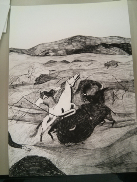
One of the illustrations selected, by Arianna Vairo
If I have to choose one illustration among the ones that got four Post-Its, as an example of our unanimity, I’d pick this one by Arianna Vairo, which you’ll see at the show. The power and the freshness of her work is impeccable; her courage and honesty, out of discussion.
In my next piece, I will tell you about the third day, which was the most fascinating: that’s when we had to start seriously and passionately discussing the “why yes” and “why no” for each group of illustrations.
Everybody in the world of children’s books knows what the Bologna Children’s Book Fair is, and how important it is in the publishing business. Every year, in the spring, publishers and agents come from all over the world to meet, talk, and buy and sell book rights.
But during the four days of activities, there are so many other interesting things going on on the fair’s ground and in the city: debates, presentations, exhibitions, award ceremonies… One can just take a brief look at last year’s program to get an idea. What I like the most when I manage to be there, is just walking around the booths and browse the thousands of new books on display. It’s an exhilarating, if intoxicating, experience.
One event that is of particularly great interest for all children’s book artists, is the Illustrators Exhibition. I know that most U.S. illustrators have no idea of what I’m talking about, which is unfortunate. Every year, thousands of illustrators from all continents send their work hoping to be selected for the show. Only seventy or eighty artists get to be chosen each edition, and their works are hung in a gallery at the fair, and featured in a nicely produced catalogue. The show, once the fair is over, travels to other countries during the following months. As an aspiring illustrators, in my late teens, I used to send my submissions every year, until, too much hurt in my self-esteem by the continuous rejections, I ended that masochistic game. For some reason I am not aware of, this year I decided to try again, more than twenty five years after my last attempt. I got in. I am obviously very happy about it, but I can’t help wishing that my 19-year-old self could be with me now to celebrate.
Anyway, one of this year’s jurors, Anna Castagnoli (an excellent blogger and artist), has written an insightful diary of her experience judging the show. With her permission, I am translating her four posts and will publish them here, beginning just below. The pictures are also taken from her blog.
Just one more note for who’s planning to go to the Fair: in Bologna, I have experienced some of the most delicious food and friendliest hospitality of my life. It’s difficult to find a restaurant that will disappoint you, with the exception, in my experience, of the Drogheria della Rosa: I would suggest to avoid it.
Judging the 2014 Bologna Children’s Book Fair’s Illustrators Exhibition.
By Anna Castagnoli
(A preamble for all the illustrators who were not selected. A jury expresses a verdict that is only its own: it’s not an absolute judgement. A different jury might have made different choices. What follows is an account of our decisions: I share it because I find it to contain useful thoughts on illustration and its language.)
One juror’s diary
Day 1: the jurors get to know each other
January 21, 2014
We should have been five, as it’s usually the case at the Book Fair, but unfortunately Nadine Touma, from Libano, was denied the visa. In the evening of our first meeting, on the 12th of January, we had dinner with the Book Fair directors. The selection was to begin the day after, to last three long days.
The judges were:
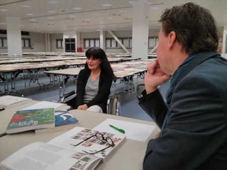
Kitty Crowther, who in 2010 won the Astrid Lindgren Memorial Award, the “World’s Largest Children’s Literature Award.” She was still excited as she told us about the day she received the 500,000 Euros prize.
Isabel Minhos, publisher of Planeta Tangerina, the Portuguese house that last year won the Fair’s award as the best European publisher: quiet, with piercing eyes hidden behind dark-framed glasses.
Errol van der Werdt, director of the Dutch museum TextielMuseum, where art and technical research in the textile field are combined in order to create original designs of various nature. He is a man with a humanistic and artistic culture of immense refinement who was approaching the illustration world for the first time.
And myself, Anna Castagnoli: I suppose I was chosen for this prestigious invitation thanks to my work through all these years on the illustration blog Le Figure dei Libri (“the pictures in the books”).
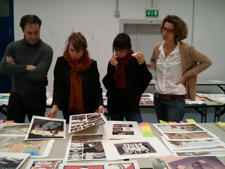
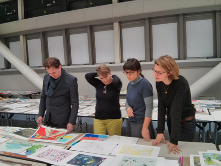
Errol van der Werdt, Kitty Crowther, Isabel Minhos, Anna Castagnoli
It was an explosive combination, in a good way, but it became clear to us how thin the border between tension and constructive collaboration can be. Luckily, we were all in agreement on what the real values were; so flaws, personalities, and individual strains were left behind.
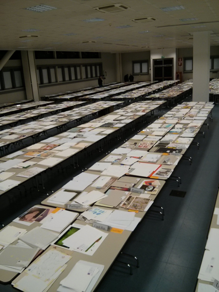
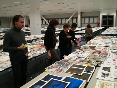
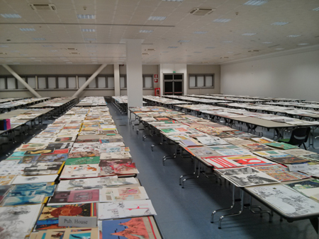
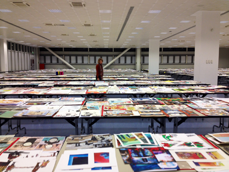
But let’s start from the beginning. The morning of the 13th of January, the doors of one of the Bologna Fair’s pavilions opened to offer us a breathtaking view: an enormous hangar full of endless tables buried by illustrations. To be precise: 15,940 original illustrations, for a total of 3188 illustrators from 191 countries. We were astounded: how could we judge all that in merely three days?
Fortunately, the Book Fair organizers’ experience, embodied by Deanna Belluti, assisted us. She is an elegant, kind, resolute French-Italian lady: without her firm and knowing hand we would never had made it.
9 A.M.: observing in solitude
The first piece of advice was for each of us to take some solitary time – one and a half hour – to walk around the tables and get a personal idea of the works submitted. I started immediately for my adventure. The tables were divided by country, by school, and by the works being published or unpublished. I thought that the general level of the works was high and full of surprises. I felt the same feeling one experiences when one is in love: an absolute happiness to be in that ocean of images. It was as if I were swimming among fragments of light and color. I know very well how an illustration, for the artist who created it, is a fragment of herself. How many emotions were rising from those tables!
There were four long tables where drawings deemed not worthy had been grouped: a pre-selection done by the Book Fair’s graphic designers in order to help us with the screening. You shouldn’t think that those works were dismissed: they were in good display like the others, and we were invited to carefully examine them as well, to make sure no good work ended up there by mistake.
The pre-selection had been done with great care. Many images were not even illustrations: a number of tattoos, daubs, amateurish portraits. Right away, Kitty, Isabel, and I felt the eagerness to “save” the illustrators who ended up in that group. We found about ten, but it was more the enthusiasm of the rescue more than a good eye, as, if I remember correctly, none of those pieces made it to the final selection. The solitary journey lasted almost two hours. We then took a coffee break and they told us all about the second step.
11 A.M.: the team meets for the first selection
After coffee, we were invited to begin with the team work. Together, we were to walk around the tables and, for each of the groups of images that we didn’t deem deserving (each candidate submits five images), turn the first drawing of the stack face down: that meant for that illustrator to be out. We had agreed that a tiny bit of doubt was enough to keep a work in the game. Otherwise, face down. From this stage there was no going back, which made us especially cautious. Taking turns, we would spread the five images out, and if nobody said anything, we would put them back in their pile with the first image turned over. There was a minimal quality expectation that was clear to all, and we didn’t even have to discuss it.
Kitty and I were the most visibly eager to open the pile and touch the illustrations. Isabel would make punctual and precise comments. Errol was following us without saying a word: he had told us in advance that during this first day he’d prefer to just listen to us.
One of us would ask: Should I turn this over? And the other would answer: Yes. Sometimes one would say: Wait! I have a doubt, I think we should take another look. In which case, we we would move along without turning it over. After a few hours, Errol began to speak up as well, asking to keep in the running a few illustrators he had noticed. I was glad to see that his eyesight for illustration was much keener that I had feared.
At 6 in the evening, after many hours of work, we hadn’t finished all the tables yet. We took a look around us: overwhelming.
At the end of the evening, out of 3188 illustrators, about 260 were still in the game. Of these 260, only about eighty would have reached the final goal.
At night, in my hotel room, I felt bad for all those images that had been turned over. In many one could see some potential, but it was not enough. Maybe one image of the five was good, but not the remaining four. Sometimes, we wanted to paste a note on some of those drawings, with written: don’t give up!
As I was examining many drawings, I saw myself, many years back, disappointed and gloomy, going to pick up my rejected works at the Fair’s booth. I thought they were good, those drawings of mine. Why hadn’t they won? Now, after many years spent among books and illustrations, I knew why: they didn’t pass the minimum level of quality. They were amateurish, immature, pretentious, anatomically inaccurate, technically poorly accomplished, illiterate in the language of children’s book illustration, which needs to be digested and understood. It was just a beginning.
(I take advantage of this post to tell you this: do not give up! We have seen beautiful things that only lacked a bit of work and experience!)
In the next post, I will talk about the criteria we used for the second selection.
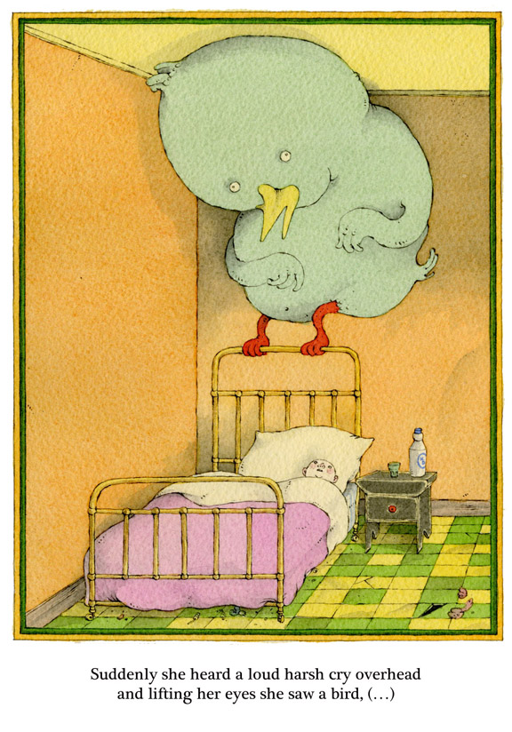
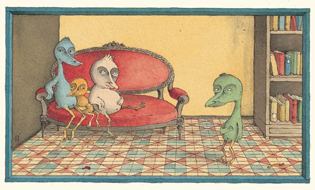
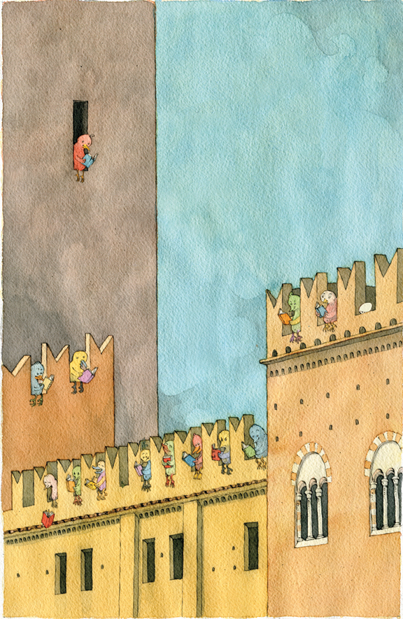
The Birds (Gli Uccelli) is a picture book I published with the now dormant publishing house Despina, based in Milan. Two printings were issued, which are both sold out. So, I’ve decided to put the whole book online, with a couple minor changes.
I hope you like it, and if you do, feel free to spread the word.
Thank you.
Sergio
Click here to open the PDF file: TheBirds
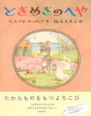
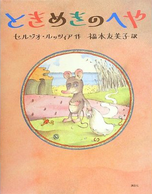
Many thanks to Yumiko Fukumoto for the translation and the big help in getting The Room of Wonders published in the Land of the Rising Sun!
Here is the cover, with and without the typical band over the jacket.
I am very happy (if a bit bashful) to post Paul Zelinsky‘s list.
Note: Paul is usually not this blurry.
S.R.
I’m glad this isn’t a list of my ten favorite picture books, but a list of ten of my favorite picture books, because I have tremendous trouble choosing favorites of anything, and I couldn’t bear making a list that would omit the hundreds of other choices that I could have, and probably should have, made.
It wouldn’t be too hard to come up with a list of ten great classics that belong in any list of ten, such as (in alphabetical order):
Ludwig Bemelmans’ Madeline
Margaret Wise Brown’s Goodnight, Moon
Eric Carle’s The Very Hungry Caterpillar
Wanda Gag’s Millions of Cats
Ezra Jack Keats’ The Snowy Day
Beatrix Potter’s Peter Rabbit
Maurice Sendak’s Where the Wild Things Are
Esphyr Slobodkina’s Caps for Sale
William Steig’s Sylvester and the Magic Pebble
(of course part of what defines a great classic is that it is older than the person calling it that. Some of these above are actually younger than I am, but not by a lot).
Instead, I’m going to go for some other books that may be obscure but have meant a lot to me, or impressed me in some way, and might be interesting for people to take a look at. I’ll put them in antialphabetical order, by title.
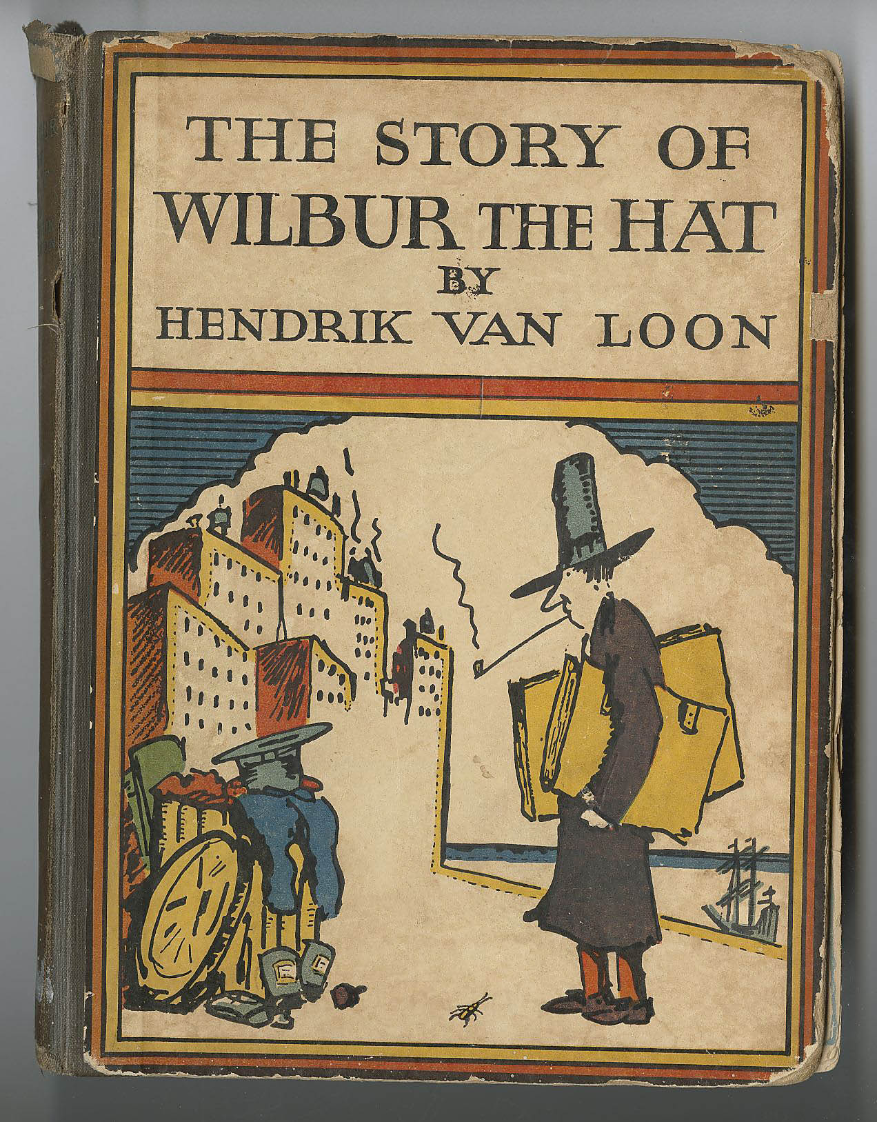
The most obscure of the lot is:
Wilbur the Hat
by Hendrik Van Loon
which I only know because I have my mother’s childhood copy of it.
This 1925 tome is weird in more ways than I can count. It’s the story of Wilbur, a fedora from a men’s shop in Boston, who is so snobbish and awful to the other haberdashery on his owner’s dresser that Zeus in Olympus can’t take it anymore and blasts Wilbur to Kingdom-Come. There he floats down a river through the Part of the World that Does Not Exist, where a cricket named Cedrick climbs on board, appointed by the Gods to expose Wilbur to a series of amazing wonders– natural, historical, philosophical, et al., in hopes that he might acquire a fitting respect for that which deserves respect, and the humility to go with it. The wonders are amazing, funny, and absurd; the illustrations are crazy; the tone of the book is lofty and deadpan. Best of all, the undeserving Wilbur remains cluelessly obnoxious, and unwittingly creates great havoc in Olympus. He ends up back in the States, gets sold for a dime to a young Sophomore and lives happily ever after. Most of this book sailed way over my head, but that’s no reason not to love it. On the contrary.


Why Mole Shouted and More Mole Stories
by Lore Segal and Sergio Ruzzier
Segal’s Mole stories seem too simple to feel so rich, and Sergio, your idiosyncratic illustrations show them to be the extreme opposite of generic. Little Mole does childlike but not necessarily laudable things that children do, such as yell loudly for no good reason, eat the cookies he was asked not to, or play badly with Little Gopher, and where a generic children’s story would express opposition to these incorrect behaviors, there they become reasons for Grandmother Mole to love Mole more. In the same way that our culture wants to make the standard for, say, femaleness, be a thin, perfectly Caucasian-featured blonde woman, we are always being fed the expectation that little children should resemble the Gerber baby; we are supposed to say “oh, this is beautiful” when pictures show beautiful people according to the standard model. This is what the Mole illustrations don’t do. Noses and ears are not small; bellies protrude and eyelids sag. The moles don’t even look a whole lot like moles. But these are creatures overflowing with personality, where simply the turn of an ankle, or a slightly twisted smile makes you understand everything there is to know about them. In physics, larger particles such as protons have properties like charge and mass. But the smallest particles, quarks, have charm and strangeness. Ruzzier illustrates quarks.
Two Old Potatoes and Me
by John Coy and Carolyn Fisher
This is a very lovely text about a girl and her father planting potatoes and tending them until harvest. The illustrations explode it into a visual extravaganza that fits it so perfectly it is had to imagine the story having been illustrated in any other way. This is, I think, the first digitally illustrated picture book where it struck me that the digital nature of the illustrations was not a hindrance but an actual boon. It’s amazing to look at.
Tell Me a Mitzi
by Lore Segal and Harriet Pincus
Three separate stories told in a captivating, sort-of-childlike way, and illustrated in a similarly sort-of-childlike style. Pincus’ drawings are enchanting; beautifully composed and colored and a bit stilted in a comical way that fits the text perfectly. Harriet Pincus was a talented newcomer when she illustrated this 1970 book ; I believe that Maurice Sendak had something to do with her getting published. She illustrated perhaps six books, and then stopped; I don’t know anybody who knows what became of her. I see that in 1973 all of her original work was donated to the DeGrummond Collection in Louisiana.
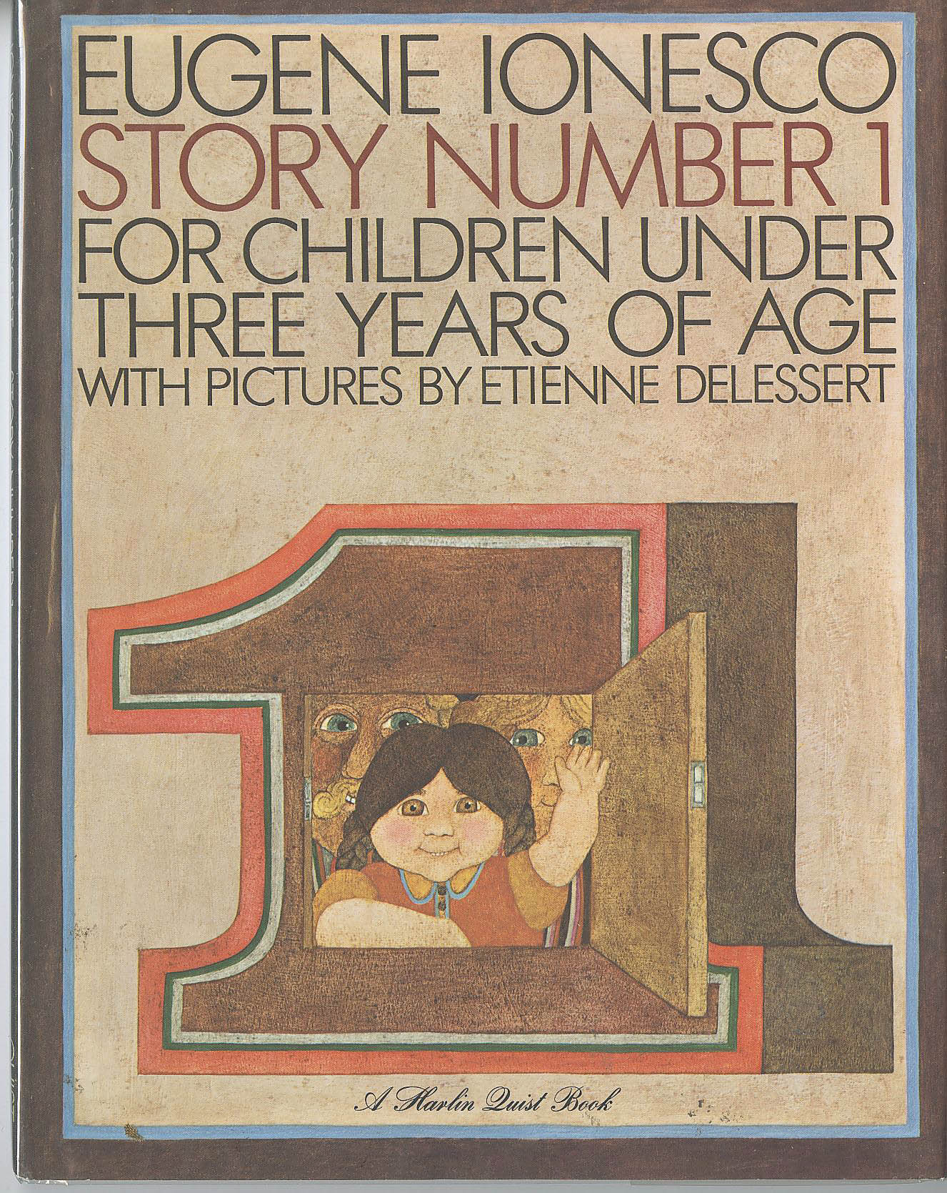
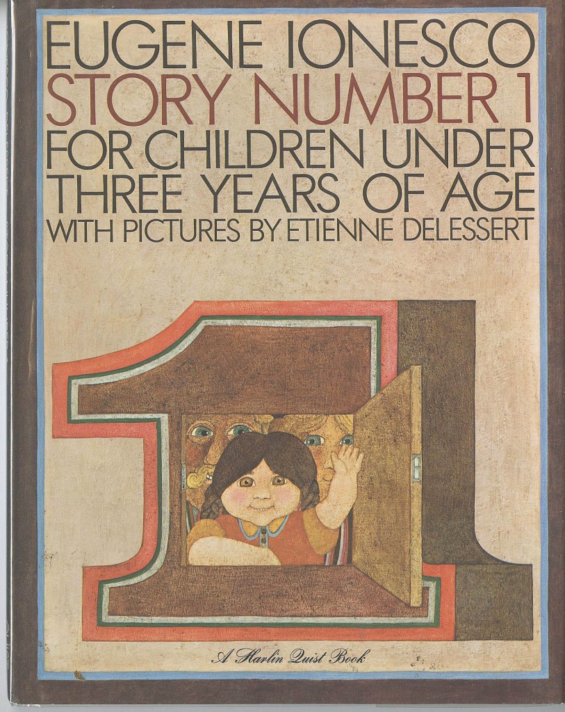
Story Number 1
by Eugene Ionesco and Etienne Delessert
I had enjoyed a number of Ionesco’s absurdist plays in high school English (and French) and was delighted to see in my college bookstore three big picture books for children: Stories number 1, 2 and 3. In Story Number 1, a little girl named Josette torments her parents with her tale of the previous days’ goings-on involving the maid Jacqeline,. In Josette’s telling, everyone and everything was called Jacqueline. Delessert’s surreal pictures are bold and elegant. I think he used wax in some way with his paint. I met Delessert for the first time about ten years ago; he told me that it was he who convinced Ionesco to write these stories, and he organized their illustration, doing the first one himself. He has subsequently reillustrated all of them. I didn’t care for Story #3 but loved the other two. #2 was beautifully illustrated in watercolor by Philippe Corentin; it is a similarly endearing and nonsensical story.
The Philharmonic Gets Dressed
by Karla Kuskin and Marc Simont
This low-key, small-sized, three-color book sails above all the limitations of its format. It’s about putting clothes on, with poetic attention to detail, but builds to a musical crescendo that is as exhilarating as its premise is unlikely. A triumph of pictures and words working in tandem, and leaving space for each other. I think it’s too bad it didn’t win the Caldecott Medal.
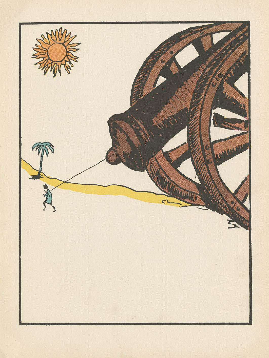
Locomotive
by Brian Floca
I only recently saw this big book and was so impressed that I’m putting it in this list. It’s got all you could want of technical train information, and it’s a travelogue and a poem as well. And there’s a freedom to the execution of it that allows all the grandeur in, but keeps it feeling close and familiar.
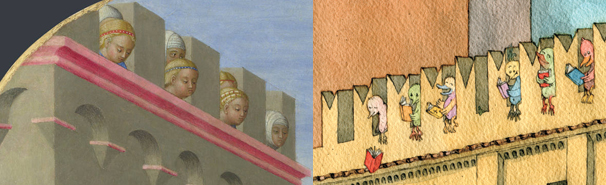
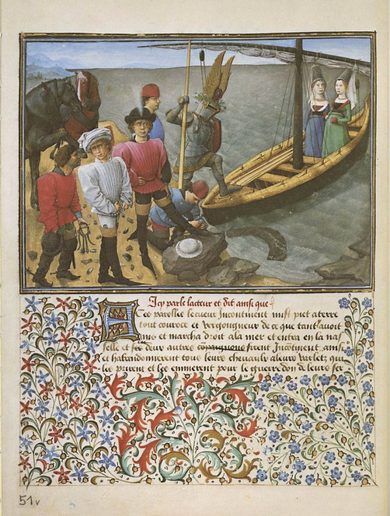
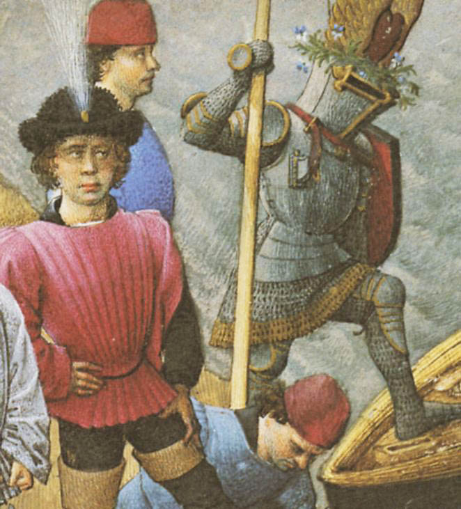
King René’s Book of Love
by René, duke of Anjou and King of Sicily; illustrator unknown
Not a children’s book, this is an allegorical romance, a French illuminated manuscript from the mid-1400′s, written and some say illustrated by one René, Duc d’Anjou. I would love someday to see the real thing, which resides in the Austrian National Library in Vienna, but a book published by Braziller in 1975 contains beautifully reproduced facsimiles of the illustrated pages. I fell in love with the pictures. With an amazing sense of light and color and rounded form, these pictures exhibit an even more amazing presentation of personality and character, with a pointillist precision that makes you want to bury your nose in the images, or at least bring a magnifying glass to them. It’s over 500 years old but feels like a wonderful children’s book. And I hate the word “fresh,” but I’d be inclined to use it in this case.
Harold and the Purple Crayon
by Crockett Johnson
This book should really have gone in my theoretical list of ten books above. Since I left it out, I’m putting it in here. I don’t always believe that less is more, or I wouldn’t have made elaborate books of my own like Rapunzel, but sometimes the best results come from a minimalist presentation and that’s the case here. Weston Woods made an animated version of this book that is well worth looking at. And if you can find something on the making of that animation, that would be worth looking at, too.
The Color Kittens
by Margaret Wise Brown and Alice and Martin Provensen
Another one of my childhood favorites. I can’t really express the excitement I would feel with each new color that the color kittens mixed up. Except for brown; as a child I was no fan of brown. Margaret Wise ones excepted.
Paul Zelinsky
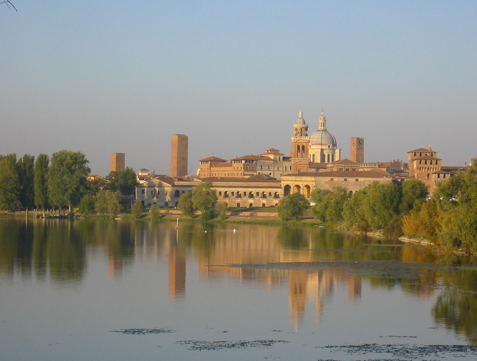
Festivaletteratura is a book festival of great importance in the Italian literary world. Every year, at the beginning of September, thousands of people invade, mostly pacifically, the beautiful city of Mantua to hear authors speak about their books, participate in public debates, take workshops, etc.

http://www.visitsitaly.com/images/lombardia-im/mantova-im/mantova_view.jpg
Every year, a different illustrator is asked to provide an original illustration to decorate the posters, the programs, the t-shirts, and I don’t know what else. Past editions showcased the artwork of, among others, Alessandro Sanna and Federico Maggioni.
This year, the organizing committee, through designer Pietro Corraini, picked me. Very nice of them.
Here’s my drawing:
And here’s the sketch:
Bob Shea reveals his secret obsessions!
This is tough because Sergio straight up told me I couldn’t stick my own books in here or he’d swap them out with his.
That kind of screws me because I am only familiar with my catalog.
So it’s on to plan B – a trip to the local library to see what I can dig up.
Some quick googling should tell me if my town has a library or not. Wish me luck.
Good news. It’s like a block away. I found some promising titles. Here they are.
1. The Stinky Cheese Man and other Fairly Stupid Tales.
Jon Scieszka and Lane Smith. Designed by Molly Leach (very important)
This is the one that started it all for me. Picking it up in the bookstore I thought,
“There’s no way the inside can pay off the cover.”
Boy did it ever. It’s hilarious, great illustrations and the typography is freaking amazing.
A perfect, thoughtful package. I was doing graphic design at the time and I couldn’t get over how well the type supported and enhanced the story.
It was eye opening to see something so funny taken so seriously.
2. I Want my Hat Back
Jon Klassen
I’m just glad to bring this book from the shadows into the light of day, even for a
moment.
This was the same experience as Stinky Cheese. I saw this in the bookstore and immediately had a design crush.
The simple, confident layout, the bear staring off into the middle distance too preoccupied by a missing hat to pose for the cover of his own book.
“Don’t judge it by that.” I told myself.
Then I foolishly opened it. That thing is so perfect it could melt the face off a Nazi.
The character design, the palette, the typography, the understated layouts. Gorgeous.
Oh, and it’s funny. Not “BLAH! LOOK AT ME!” funny. Smart funny.
Halfway through I was pretty envious and tried to talk myself down.
“It’ll be okay,” I thought, “there’s no way he can pay this off. They’ll hug it out at the end, or come up with an elaborate schedule to share the hat, you’ll see.”
At the satisfying conclusion I whispered a tiny, defeated “f-me” in the kids section of my local bookstore.
So you think I could at least harbor some life-affirming petty resentment against the guy, right? Well, turns out Jon is pretty nice in real life. He’s stolen that joy from me too.
3. Arnie the Doughnut/Scrambled States of America
Laurie Keller
I love Laurie Keller.
I am grouping two titles together because I love them both for the same reason. They are super funny and charming. My son is nine and he still pulls them off the shelf at night. One reason he likes them so much is that his Dad cracks up every time. Plus they are jam packed with jokes. I am still finding little gems in there.
Both of these are Laurie Keller’s lovely, funny personality in concentrated book form.
4. When Randolph Turned Rotten
Charise Mericle Harper
Charise is a genius.
The reason I love this book is really simple. Randolph is a jerk. Not only does he fall prey to petty jealously, he acts on his feelings. Randolph’s friend Ivy gets invited to a sleepover and he doesn’t. So he’s like, “Okay cool, maybe next time.” Right?
WRONG! He fills her bag with logs! Oh, he’s a beaver I forgot to tell you.
Charise is great about not handing the reader the story they expect. It’s like a bait and switch scam where you get something better than you came for.
5. Frog and Toad are Friends
Arnold Lobel
Do I really have to explain this one?
I remember these as a kid but forgot how clever and dry they are. Of course at the time I was probably like, “Talking frog. Cool. Can we go see Star Wars again?”
I love these books.
6. Sparkle and Spin
Ann and Paul Rand
Yum.
Don’t know why? Google it. I’ll wait.
Now view by images.
See?
7. Monkey Business/Mr. Lunch series
Vivian Walsh J. Otto Seibold
Okay, this is many books, I am not following the rules. Again, I love these books for the same reasons. Vivian Walsh’s playful, absurd, matter-of-fact text and
J. Otto’s modern fever dream illustrations.
Monkey Business is almost twenty years old and it feels like it could come out in like, I dunno, five years.
8. Supposing…
Alastair Reid and Bob Gill
This book is so fantastic. Every page starts with the word “Supposing” then launches into a bizarre scenario.
“Supposing a funny old fortune teller told me I was going on a journey and just to bamboozle her I stayed home for the rest of my life…”
Stuff like that.
Oh wait, here’s another one.
“Supposing I telephoned people I didn’t know in the middle of the night and practiced my horrible sounds over the phone…”
Ha!
9. The Animal Fair
Alice and Martin Provensen
Honestly, I don’t know if I have actually ever read it. I sure do look at it all the time though.
10. The very Persistent Gappers of Frip
George Saunders and Lane Smith
Did you read that? George Saunders and Lane Smith.
Again a perfect package. A modern fable and some of my favorite Lane Smith illustrations ever. Luckily I picked it up when it came out, so I have the beautiful translucent cover that Molly Leach designed.
It’s beautiful.
I think I’ll read it right now…
This is also against the rules, but I think these illustrators are doing fantastic work.
Two years. That’s how long Zach Ohora will keep answering my emails before he figures out “the riffraff” is holding him back. Greg Pizzoli? Six months.
Do you guys know Peter Brown? Didn’t think so. Google him, you’ll be pleasantly surprised.
If Lucy Cousins makes it, I want it. Also, Lauren Child. Oh and Delphine Durand.
Ice cream. I like ice cream. I like when they pour espresso over it.
Sorry. Now I’m just listing things I like.
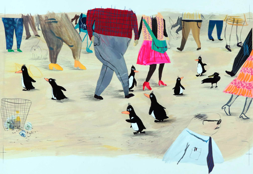
The picture book lists are back! Melissa Guion starts the new series, and she’ll be followed very soon by Bob Shea.
Melissa is the author-illustrator of BABY PENGUINS EVERYWHERE! and the upcoming BABY PENGUINS LOVE THEIR MAMA! She lives in Brooklyn with her daughter and a few guinea pigs. You can see her work at www.melissaguion.com and www.facebook.com/BabyPenguinsEverywhere .

Here is her list:
FROG AND TOAD ARE FRIENDS: Arnold Lobel did many great books but this was the first one I owned. This book and Cricket Magazine sowed the idea of making books in my head, back in the 70s.
GEORGE AND MARTHA: George Marshall was a master of concision and is one of my favorite artists. Everything about this book is funny. Even his line is funny. Incidentally, a teacher of mine once said “the square (format) is deadly.” This book is a perfect counterexample. Now my first two books have square pages — this book may be the unconscious reason.
OUR ANIMAL FRIENDS AT MAPLE HILL FARM: I could list all the Provensens’s books. This is one of the liveliest ones, but I also love the lyrical ones like SHAKER LANE and A VISIT TO WILLIAM BLAKE’S INN. Alice Provensen’s PUNCH IN NEW YORK is great, too.
IN THE NIGHT KITCHEN: I had this book as a little girl, and can honestly say I didn’t think much about Mickey’s penis. I did obsess about how good it would feel to sink down in warm dough, or swim in cool milk, naked, all the time.
THE STRAY DOG: I lived two blocks from the George Washington Bridge when this book came out, and it’s set all around where I lived. I love the combination of looseness and design. And the sweetness of the humor – not many books today are so free of snark, knowingness, or cynicism. Also, Marc Simont almost 100 and still working? I can only hope.
THE STORY OF MRS LOVEWRIGHT AND PURRLESS HER CAT: I once told myself if I ever met Paul O. Zelinsky, I would tell him how much I loved his art for this book, but the first time I met him I was so excited I forgot. I told him the second time, and was happy to learn that it’s going back into print. This book is not about anything easy to describe. It’s full of humor and pathos, and I bet it leaves children thinking about everything Mrs. Lovewright doesn’t understand. It’s like empathy boot camp.
ELIZABETH IMAGINED AN ICEBERG: I love Chris Raschka’s work. I’d like to meet him in person. He doesn’t seem to go on the internet much, so he probably won’t know I’ve said that. Oh well. This is another book that’s not simple to explain. It’s about knowing when a situation is not right and protecting yourself. We all know someone — or something — like Madame Uff Da.
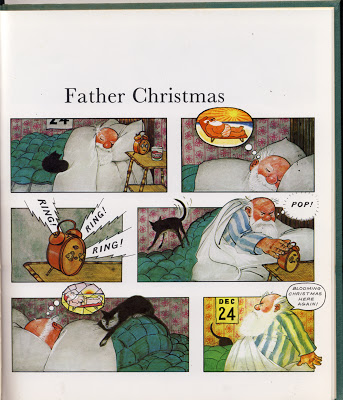
FATHER CHRISTMAS, by Raymond Briggs: This was one of my first picture books. My parents gave it to me when I was three. When I was little I loved looking at all the gorgeous details. As I got older I appreciated the dark humor. I can be very grumpy, but I hope I’m a somewhat likable grump, like Father Christmas.
THE THREE ROBBERS: I don’t know if there’s an illustrator stronger than Tomi Ungerer. I don’t know what else to say. That he could bring his sensibilities to bear in children’s books is a miracle.
CHOCOLATE: THE CONSUMING PASSION, by Sandra Boynton. I got this book for Christmas or something in 1982 because I loved chocolate. It’s hilarious, charming, and quite informative. And I’ll never forget the acknowledgement: “There are many without whom this book would have been impossible. There are many others without whom it would have been a heck of a lot easier.”
View Next 25 Posts