After looking at hundreds of 2008 children’s and YA fiction book covers, I’ve narrowed it down to my ten favorites. Here are the first three, in no particular order.
Each time I saw the cover of Triskellion by Will Peterson [Mark Billingham & Peter Cocks] (Candlewick) this year, it caught my attention and intrigued me.
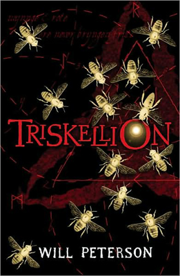
The white-gold bee silhouettes are beautiful by themselves (I’m a sucker for insect shapes). They stand out against the black and red background, circling and drawn to a light focused nicely in the “O” of the title. The off-center triangle and surrounding red dashed lines, the trillium shape, and the perfectly selected font… Each adds to the whole. Candlewick doesn’t credit the designer, on the flap, but they should!
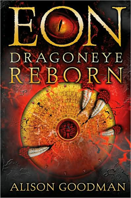 Eon: Dragoneye Reborn
 by
Alison Goodman (Viking) made my top ten first time I saw it. The exciting, mysterious art is just what a book needs to grab hold of potential readers. And I’m not the only one who loved this cover. Many of the reviews linked below mentioned the cover draw.
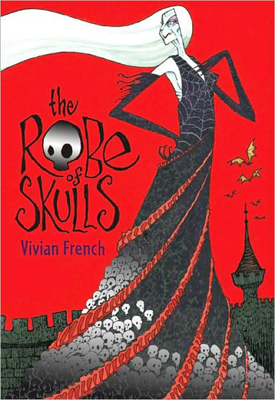
Silver foil can be overused, but it’s perfect on
The Robe of Skulls by Vivian French (Candlewick). Only the skulls are silver. The skull in place of the “O” in Robe is a nice touch.
All of these titles have meshed the art beautifully with the title and author fonts and placement. Triskellion and Robe of Skulls both have great spines as well. I haven’t had a copy of Eon in my hands yet. Don’t know the designer and haven’t seen the spine.
Triskellion: When fourteen-year-old twins Adam and Rachel go to visit their grandmother in an unwelcoming and ancient English village, they realize that there is something unnatural about it and are swept up in an archaeological mystery. Age 13+. Reviews, 1, 2, 3.
Eon : Dragoneye Reborn: Sixteen-year-old Eon hopes to become an apprentice to one of the twelve energy dragons of good fortune and learn to be its main interpreter, but to do so will require much, including keeping secret that she is a girl. Age 12+. Reviews, 1, 2, 3, 4, 5, 6, 7, 8, 9, 10, 11, 12. Book Trailer.
Robe of Skulls: The sorceress Lady Lamorna has her heart set on a very expensive new robe, and she will stop at nothing–including kidnapping and black magic–to get the money to pay for it. Age 6-10. Reviews, 1, 2, 3, 4.


I have been thinking about which book jackets will make my top ten list this year. One of the big trends that has come along with the huge increase in the publishing output of young adult titles, has been book covers that look less distinguishable from those that are designed for books published for adults. This fits firmly in that category, and I’m still thinking about where I stand on that.
Still, Planet Pregnancy by Linda Oatman High (Front Street, October 2008) has a real standout cover design. Black and white jackets seem to work pretty well in general, and this one is simpler than most. Without the title, I’m not entirely sure it would be as obvious. But the title says everything. The simple line created with the white and black shapes is startling in how clearly it says “pregnant.” Yet it’s all so understated. For me, this is a real winner. I wonder if it will attract teens as well?
Is the change in how YA books are represented visually a conscious effort to make books that are cross-marketed? This one targets “Ages 14-17″ according to Front Street - but I’m guessing bookstores could shelve it in an adult section and browsers wouldn’t suspect it was published for the teen market.
(My apologies, if you are looking at this right on the blog. I haven’t figured out how to put a line around a black book to break it away from the blog’s black background.)

Planet Pregnancy: Sixteen-year-old Sahara struggles with an unplanned pregnancy, and all its conflicting emotions, in this novel told in free verse.


 Many bloggers have posted great collections of “best covers” – but this is the best set I’ve ever seen (the cover to the right is only one of the “86 Beautiful Book Covers“). They are adult book covers, not YA.


 The white-gold bee silhouettes are beautiful by themselves (I’m a sucker for insect shapes). They stand out against the black and red background, circling and drawn to a light focused nicely in the “O” of the title. The off-center triangle and surrounding red dashed lines, the trillium shape, and the perfectly selected font… Each adds to the whole. Candlewick doesn’t credit the designer, on the flap, but they should!
 Silver foil can be overused, but it’s perfect on


The example you chose is lovely. And I totally agree–they should not assume that all teen readers were created equally.
Wonderful bunch of covers – wow! And notice how few of them are photographs, and of those that are photos, not one of a face (well, the lips on Lolita come close to this face/partial-body-shot obsession that YA covers have, but since Lolita herself is a YA character, that’s fitting….)
Wonderful list in and of itself (made me want to read several of these books!). AND, it taught me that Chip Kidd wrote another novel! (I love his first and didn’t know about the second. It’s going on my list.)