What is JacketFlap

  • JacketFlap connects you to the work of more than 200,000 authors, illustrators, publishers and other creators of books for Children and Young Adults. The site is updated daily with information about every book, author, illustrator, and publisher in the children's / young adult book industry. Members include published authors and illustrators, librarians, agents, editors, publicists, booksellers, publishers and fans.
    Join now (it's free).

Sort Blog Posts

Sort Posts by:

  • in
    from   

Suggest a Blog

Enter a Blog's Feed URL below and click Submit:

Most Commented Posts

In the past 7 days

Recent Posts

(tagged with 'book spines')

Recent Comments

Recently Viewed

JacketFlap Sponsors

Spread the word about books.
Put this Widget on your blog!
  • Powered by JacketFlap.com

Are you a book Publisher?
Learn about Widgets now!

Advertise on JacketFlap

MyJacketFlap Blogs

  • Login or Register for free to create your own customized page of blog posts from your favorite blogs. You can also add blogs by clicking the "Add to MyJacketFlap" links next to the blog name in each post.

Blog Posts by Tag

In the past 7 days

Blog Posts by Date

Click days in this calendar to see posts by day or month
new posts in all blogs
Viewing: Blog Posts Tagged with: book spines, Most Recent at Top [Help]
Results 1 - 6 of 6
1. Book Spine Design - You're So Fine

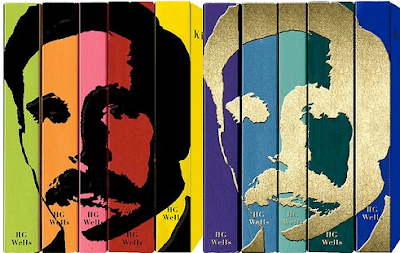
Our first view (and first impression) of a book can be it's spine. Sitting on a bookshelf with much competition and little real estate, first impressions need to be good, especially if you're a newcomer. These books fill all those requirements, beautifully.
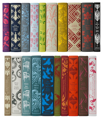
Penguin Classics
Jonathan Boarini

If you can make economic books look like these, then I think you have a pretty creative mind and bright future.

Letterology


Letterology

0 Comments on Book Spine Design - You're So Fine as of 11/29/2011 10:22:00 PM
Add a Comment
2. Scarlett and the Velour Wallpaper


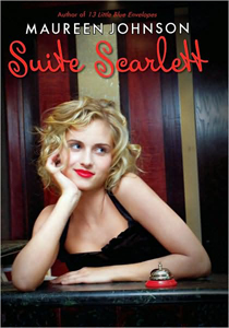
I remember thinking “yuck, chicklit” when I first saw the cover of  Suite Scarlett by Maureen Johnson (Point 2008). Nothing against people who like it, but it doesn’t draw me in unless there’s so much buzz about the book that I need to be in the know.
By now, my readers know that I’m not a big fan of girl (or woman as the case may be) photos on book covers unless it’s done exceptionally well.
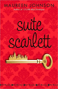
I’ve been working on purchasing 2008 books for our extensive YA paperback collection, and found the paperback cover for Suite Scarlett. This, while not too far up in the “wow”-factor scale, is one I might pick up. So what makes it more interesting to me?
Things I like: The wallpaper background gives the impression of an upscale room. The darker red looks like velour, and I can imagine what it feels like. The setting-clue intrigues me.
It has the simplicity of the one centralized object which people tend to like (or at least I surmised that in this post). I agree with my web-designer son, simplicity is everything (almost).
The idea of a city-scape on a key is great. It’s probably been done before, but it’s novel to me. I don’t like the line of keys at the bottom (overkill), but it’s minimal, so it doesn’t take too much away.
Though I haven’t seen the spine, I’m guessing it’s red, so it may stand out on the shelf (if it’s not in a sea of other red books).

2008 - Johnson - Suite Scarlett2008 - Johnson - Suite Scarlett pbk

I love background stories for book covers, and on her blog, Maureen Johnson gives some backstory in response to someone who expressed dislike of the hardcover cover:

MJ, I’m sorry, but that cover is AWFUL. The girl looks like she ducked her head in peroxide and proceeded attempt to put her hair in curls.

Johnson responds:

While people might have varying opinions on the model and pose, a lot of work went into getting the basic facts straight. Scarlett is blonde, has curly hair of exactly the length described, and both that black dress and red lipstick play a part in the story. It may not look exactly as it does in my head, or how it might in yours . . . but it’s RIGHT!

She adds cover commentary:

Obviously, I want a nice cover, but the truth is . . . the cover has very little to do with what’s inside. In fact, it has nothing to do with what’s inside. I get annoyed by some covers too. Honestly, I just take them off. Feel free to replace them with the cover of another book. Or, even better, feel free to make your own!

I agree with her – many covers have absolutely nothing to do with what’s inside. STILL t

0 Comments on Scarlett and the Velour Wallpaper as of 1/1/1900
Add a Comment
3. Spinal Talk


I find book spines to be much more difficult to critique than the book faceout. It’s harder to define elements that attract, when space is so limited and so much has to fit.
So what elements can we consider here? I can identify a few.
1) Background color – looking at shelves of books in my library, I found that color was a great attractor. But there’s a trick that cannot be controlled by the designer: it matters what other books surround. I saw hot pink books that jumped right out at me – and hot pink books that disappeared in a crowd of other brightly colored spines. Metallic stands out – but only if there are not too many metallic inks nearby.
2) Fonts, their color and orientation – If the title is horizontal, the font may have to be smaller and more compact (unless it’s a very short title, or a very thick book).  I would have said the only other choice is vertical, usually running from top to bottom. But (see bottom photo) this past weekend I was visiting my father, an avid reader. There was a stack of books near his TV that kept drawing my eye over and over. Eventually it occurred to me that the reason why was because one of them had a feature I’d never seen on a book spine before – a diagonal title. Very difficult to do – but this works!
3) Graphic elements – A photo, a drawing, a design, lines – just something in addition to the author and title text that is there to assist in drawing attention to the book.
4) Multiples – I don’t know how else to say it. Multiple copies of a title on the shelf just catches my eye. I can’t explain it. Along with that, however, is the series effect. Series books will differ from book to book, but there’s a format that helps it to have that repeating effect.

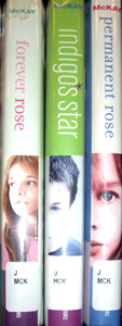
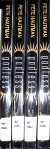
CIMG0698McKaygodless

With these defined elements in mind, I snapped a few pictures of spines that I thought succeeded in jumping out and saying “look at me!”
The McKay books above, Forever Rose, Indigo’s Star and Permanent Rose have an element that works every time for me. There’s something about a face (or just an eye) looking out from a spine. I can’t ignore it in a sea of letters and words.
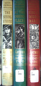
The Crossley-Holland books really have that series effect, and the drawings almost do the eye/face thing.
I include Godless because the starring effect around the title, combined with the fact that there were four of them on the shelf… worked like a marquee.

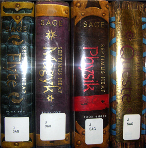
sage

The Septimus Heap series by Angie Sage has a lot to work with because the books are so fat! But the designer did a lot with the faux old book look, foiled fonts, graphic elements and standout background colors. Love these!
And below, my father’s pile of books. I just love the diagonal look here. It’s so different and the slant is bound to attract any shelf-browsing eye. I have not seen any YA books that do this (hint, hint).

Slant Font

4 Comments on Spinal Talk, last added: 9/24/2009
Display Comments Add a Comment
4. Spine Challenge!


Whoa, life intervenes and sometimes it’s hard to get a post together. In the meantime, check out this interview with Coralie Bickford-Smith, book designer for Penguin books (not YA, but still…).
What was especially interesting in this post were the pictures of the book spines. There are 2 – one at the top of the post, and a better one way down toward the bottom.
What strikes me about this – something that never occurred to me before – is that what makes them so appealing is how they play against one another. But in real life, in the library and perhaps the bookstore, standard order dictates how your spines go together.

A challenge for you! Look at your shelves with a critical eye toward spines. Send me a photo of a particularly pleasing serendipitous collection of spines. I’ll display them here with your commentary and/or mine.

0 Comments on Spine Challenge! as of 1/1/1900
Add a Comment
5. Crime Tape


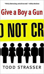
Crime tape seems to me like a perfect graphic image, and it’s surprising that  it’s not used more often.  The book covers below are the only ones I could track down, and three of the first four are from Simon & Schuster. Usually when I’ve put together a group like this, I find that all are from different publishers. So this is an unsual grouping on that count.
Give a Boy a Gun by Todd Strasser (Simon & Schuster 2000) and Shooter by Walter Dean Myers (Amistad 2004) are similar in the orientation of the crime tape and the colors used. With these two, the crime tape says what crime tape usually says, and the title is separate. Both used red to make the title stand out.

Book Cover - Give a BoyBook Cover - Shooter

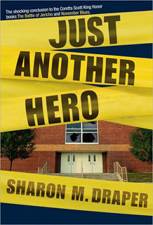
The Year of the Bomb by Ronald Kidd and Just Another Hero by Sharon M. Draper are both new this year and both from Simon & Schuster. These differ from the above two in that the title text is what appears on the tape.
People have talked about great book spines, and I’ve included the spines here, because they are really striking. I’ve had these two books sitting on a cart of books in my office, and my eye is drawn to them over and over again.

year of the bomb spine Book Cover - Year of the Bomb

just another hero spine Book Cover - Just Another Hero

Three of the above are about guns brought to school. The image makes sense for the subject.
I just have to add a peak at this adult title, The Years of Talking Dangerously by Geoffrey Nunberg (PublicAffairs 2009). Unlike the titles above, this is about language, not crime.

Book Cover - Years of Talking

Give a Boy a Gun: Events leading up to a night of terror at a high school dance are told from the point of view of various people involved. Ages . Reviews 1, 2, 3, 4.
Shooter: Written in the form of interviews, reports, and journal entries, the story of three troubled teenagers ends in a tragic school shooting. Ages . Reviews 1, 2, 3,
Year of the Bomb: In 1955 California, as “Invasion of the Body Snatchers” is filmed in their hometown, thirteen-year-old Arnie discovers a real enemy when he and three friends go against a young government agent determined to find communists at a neaby university or on the movie set. Jacket design by Lucy Ruth Cummins. Jacket illustrations by Matthew Laznicka. Ages 12+.
Just Another Hero: As Kofi, Arielle, Dana, November, and Jericho face personal challenges during their last year of high school, a misunderstood student brings a gun to class and demands to be taken seriously. Jacket design by Sonia Chaghatzbanian. Jacket photographs by Getty Images. Ages 12+. Reviews 1, 2.
Years of Talking Dangerously: Adult. Reviews 1, 2.

1 Comments on Crime Tape, last added: 7/16/2009
Display Comments Add a Comment
6. Best Covers of 2008 - Part 1


After looking at hundreds of 2008 children’s and YA fiction book covers, I’ve narrowed it down to my ten favorites. Here are the first three, in no particular order.

Each time I saw the cover of Triskellion by Will Peterson [Mark Billingham & Peter Cocks] (Candlewick) this year, it caught my attention and intrigued me.
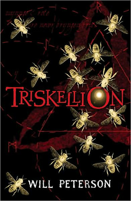
triskellionThe white-gold bee silhouettes are beautiful by themselves (I’m a sucker for insect shapes). They stand out against the black and red background, circling and drawn to a light focused nicely in the “O” of the title. The off-center triangle and surrounding red dashed lines, the trillium shape, and the perfectly selected font… Each adds to the whole. Candlewick doesn’t credit the designer, on the flap, but they should!
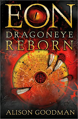
dragoneyeEon: Dragoneye Reborn by Alison Goodman (Viking) made my top ten first time I saw it. The exciting, mysterious art is just what a book needs to grab hold of potential readers. And I’m not the only one who loved this cover. Many of the reviews linked below mentioned the cover draw.
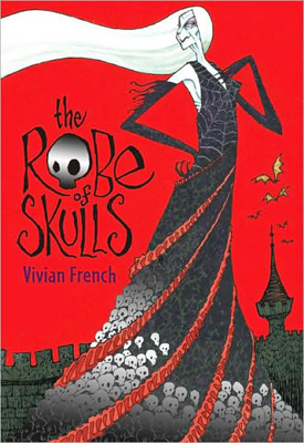
robeSilver foil can be overused, but it’s perfect on The Robe of Skulls by Vivian French (Candlewick). Only the skulls are silver. The skull in place of the “O” in Robe is a nice touch.

All of these titles have meshed the art beautifully with the title and author fonts and placement. Triskellion and Robe of Skulls both have great spines as well. I haven’t had a copy of Eon in my hands yet. Don’t know the designer and haven’t seen the spine.

Triskellion: When fourteen-year-old twins Adam and Rachel go to visit their grandmother in an unwelcoming and ancient English village, they realize that there is something unnatural about it and are swept up in an archaeological mystery. Age 13+. Reviews, 1, 2, 3.
Eon : Dragoneye Reborn: Sixteen-year-old Eon hopes to become an apprentice to one of the twelve energy dragons of good fortune and learn to be its main interpreter, but to do so will require much, including keeping secret that she is a girl. Age 12+. Reviews, 1, 2, 3, 4, 5, 6, 7, 8, 9, 10, 11, 12. Book Trailer.
Robe of Skulls: The sorceress Lady Lamorna has her heart set on a very expensive new robe, and she will stop at nothing–including kidnapping and black magic–to get the money to pay for it. Age 6-10. Reviews, 1, 2, 3, 4.


7 Comments on Best Covers of 2008 - Part 1, last added: 2/2/2009
Display Comments Add a Comment