new posts in all blogs
Viewing: Blog Posts Tagged with: social explorer, Most Recent at Top [Help]
Results 1 - 12 of 12
How to use this Page
You are viewing the most recent posts tagged with the words: social explorer in the JacketFlap blog reader. What is a tag? Think of a tag as a keyword or category label. Tags can both help you find posts on JacketFlap.com as well as provide an easy way for you to "remember" and classify posts for later recall. Try adding a tag yourself by clicking "Add a tag" below a post's header. Scroll down through the list of Recent Posts in the left column and click on a post title that sounds interesting. You can view all posts from a specific blog by clicking the Blog name in the right column, or you can click a 'More Posts from this Blog' link in any individual post.

By: Samantha Zimbler,
on 12/3/2014
Blog:
OUPblog
(
Login to Add to MyJacketFlap)
JacketFlap tags:
Andrew Beveridge,
social explorer,
Online products,
travel,
Sociology,
Videos,
Geography,
workplace,
census data,
commuting,
Demographics,
Social Sciences,
SE,
*Featured,
Add a tag
Ever wonder how Americans are getting to work? In this short video, Andrew Beveridge, Co-Founder and CEO of census data mapping program Social Explorer, discusses the demographics of American commuting patterns for workers ages sixteen and above.
Using census survey data from the past five years, Social Explorer allows you to explore different categories of American demographics through time. Here, Beveridge walks viewers through the functionality of the “Transportation” category, revealing the hard truth of Americans’ car dependency, as well as the true scope of the bike-to-work trend gaining speed across college towns and urban areas. Want to see how your travel time stacks up to the rest of the population’s workers? Use the “Travel Time to Work” category to explore other American commuting trends, or explore the various additional categories and surveys Social Explorer has to offer.
Whether it is the speed, assumed efficiency and control, or the status-marker of the automobile that makes it so ubiquitous, the numbers don’t lie – for most Americans, “going green” may be only secondary to “catching green” (lights, that is).
Featured image credit: Charles O’Rear, 1941-, Photographer (NARA record: 3403717) (U.S. National Archives and Records Administration). Public domain via Wikimedia Commons
The post Is your commute normal? appeared first on OUPblog.

By: Samantha Zimbler,
on 12/2/2014
Blog:
OUPblog
(
Login to Add to MyJacketFlap)
JacketFlap tags:
Sociology,
Videos,
Geography,
World,
America,
world war I,
wwi,
first world war,
SE,
*Featured,
Andrew Beveridge,
social explorer,
Online products,
US immigration,
1917 immigration act,
Add a tag
Where did the first Chinatown originate, and how many exist across the country? Where do the majority of the country’s immigrant populations currently reside? Andrew Beveridge, Co-Founder and CEO of census data mapping program Social Explorer, discusses the effects of the First World War on American nativity demographics. Analyzing native and foreign-born populations both during and after the War, particularly around the time of the 1917 Immigration Act, Beveridge shows how you can follow immigration trends over time up to the present day.
Featured image credit: Jacob Lawrence, 1917-2000, Artist (NARA record: 1981548) (U.S. National Archives and Records Administration). Public domain via Wikimedia Commons
The post How has World War I impacted United States immigration trends? appeared first on OUPblog.

By: Samantha Zimbler,
on 11/30/2014
Blog:
OUPblog
(
Login to Add to MyJacketFlap)
JacketFlap tags:
census income,
income demographic,
income disparity united states,
Sociology,
Videos,
Politics,
Geography,
Social Sciences,
SE,
*Featured,
Business & Economics,
Andrew Beveridge,
social explorer,
economic inequality,
Online products,
Add a tag
How has the average American income shifted since the US Census bureau began collecting data in the 1950s? Are median wages rising or falling? Andrew Beveridge, Co-Founder and CEO of census data mapping program Social Explorer, gives us the hard data on income inequality in the United States. In the short video below, Beveridge analyzes decades of income data from the American census to illuminate the factors causing this economic disparity, which has increased significantly over the past four decades. Exploring median average income and wages through time, along with the implications behind these changes, allows for a more complete picture of the increasing wealth gap among modern-day Americans.
Featured image credit: A man sleeping under a luxury condo sign on the street of The Bowery in Manhattan. Photo by David Shankbone. CC-BY-SA-3.0 via Wikimedia Commons
The post Income inequality in the United States appeared first on OUPblog.

By: Elyse Turr,
on 3/11/2014
Blog:
OUPblog
(
Login to Add to MyJacketFlap)
JacketFlap tags:
Books,
History,
San Francisco,
America,
John Muir,
Oxford Reference,
muir,
Muir Woods,
oxford bibliographies online,
*Featured,
social explorer,
Earth & Life Sciences,
American Society for Environmental History,
ASEH,
cecilia tsu,
Citizen Explorer,
donald worster,
Environmental History,
garden of the world,
kendra smith-howards,
Oxford Scholarship Online,
pure and modern milk,
Zebulon Pike,
muir,
worster,
turr,
elyse,
—elyse,
Add a tag

By Elyse Turr
San Francisco, here we come.
Oxford is excited for the upcoming annual conference of the American Society for Environmental History in San Francisco this week: 12-16 March 2014. The theme of the conference is “Crossing Divides,” reflecting the mixed history of the discipline and California itself.
We’ll be at the Opening Reception, co-sponsored by Oxford University Press, MIT, University of Delaware, and the Winslow Foundation on Wednesday, 12 March 2014 from 6:00-8:00 p.m. in the Cyril Magnin Ballroom.
Stop by Oxford’s display in the Exhibit hall. We’ll have hundreds of books on display, including several hot off the presses like Jared Orsi’s Citizen Explorer: The Life of Zebulon Pike, Cecilia M. Tsu’s Garden of the World: Asian Immigrants and the Making of Agriculture in California’s Santa Clara Valley, and Kendra Smith-Howard’s Pure and Modern Milk: An Environmental History since 1900.
 Pick up a complimentary copy of Environmental History and other key Oxford journals at the booth. The most current issue features new articles on the environmental history of work, environmental politics and corporate real estate development, the shift to steam power in water reservoirs, and how skiing transformed the Alps. The editors have also compiled a special conference-companion virtual issue that draws on the theme of “Crossing Divides.” And for your teaching and research needs we’re offering free trials of Oxford’s online resources. Check out census data going back to 1790 with Social Explorer or assign sections, chapters, or full texts of books with Oxford Scholarship Online. Pick up a free trial access card at the booth.
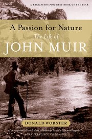 ASEH 2014 is offering a number of field trips, but the one we’re fired up about is a field trip to Muir Woods on Friday, 14 March 2014. In 2008 Oxford was proud to publish Donald Worster’s biography of John Muir, A Passion for Nature: The Life of John Muir. Worster discusses Muir’s appreciation for and belief in the power of the forest in this passage:
“Nature, particularly its forests, offered an ideal of harmony to a nation torn apart by conflict between capital and labor, country and city, imperialists and anti-imperialists. That harmony was first and foremost one of beauty; nothing in nature was ugly or discordant, a lesson that could be learned by hiking a trail into the Sierra or standing at the rail of a steamer along the Alaskan coast. The challenge was how to help American society achieve that same degree of moral and aesthetic unity.
“Violent confrontation was not the way to achieve ecological harmony, a beautiful landscape, or a decent civilization. One must start by resolving to conserve the natural world for the sake of human beings and other forms of life. Conservation offered both an economic and aesthetic program of social reform—learning to use natural resources more carefully, for long-term renewability, and learning to preserve wild places where humans could go to learn about how nature constructs harmony. Muir tried, as other green men did, to push conservation in both directions. Achieve these reforms, he believed, and a truer, better democracy would evolve in which people of diverse origins, abilities, and needs would live in greater peace and mutuality, just as all the elements of nature did. If a forest could thrill the sense and still the troubled heart with its harmonies, then society could become like that forest. Such was the hope of the green men.”
—Donald Worster, A Passion for Nature: The Life of John Muir
My own first experience in Muir Woods:
I grew up in the Northeast –I’ve tapped maples looking for sap, hiked portions of the Appalachian Trail and spent enormous chunks of my childhood climbing the pine tree in our front yard–I thought I knew trees. Last Spring, while visiting friends in San Francisco, we toured Muir woods and I very quickly realized that any of the previous trees I knew were mere twigs by comparison to the majestic redwoods. It was both powerful and humbling to be among these giants, feeling dizzy trying to find their tops and small trying to wrap my arms around one and not even getting half-way. Never before had I been able to step inside a fire-charred redwood or run my hands across the hundreds of rings in a fallen tree. Muir Woods is a beautiful, peaceful place and I am very glad I was able to experience it; it was an experience I will always remember.
—Elyse Turr, History Marketing
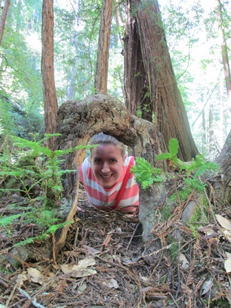
Elyse Turr in Muir Woods
See you in San Francisco!
Elyse Turr is an Assistant Marketing Manager for history titles for Oxford University Press.
Subscribe to the OUPblog via email or RSS.
Subscribe to only American history articles on the OUPblog via email or RSS.
The post Preparing for ASEH 2014 in San Francisco appeared first on OUPblog.

By: Alice,
on 2/28/2014
Blog:
OUPblog
(
Login to Add to MyJacketFlap)
JacketFlap tags:
explorer,
infographic,
African Americans,
novices,
Social Sciences,
*Featured,
Images & Slideshows,
social explorer,
demography,
Online products,
employment rates,
household ownership,
per capita income,
demographic,
interface,
History,
interactive,
black history month,
Current Affairs,
Geography,
America,
census,
Add a tag
In celebration of Black History Month, Social Explorer has put together an interactive infographic with statistics from the most recent Census and American Community Survey. Dig into the data to find out about current African American household ownership, employment rates, per capita income, and more demographic information.
Take a sneak peak below and visit Social Explorer Presents Black History Month for the full, interactive infographic.
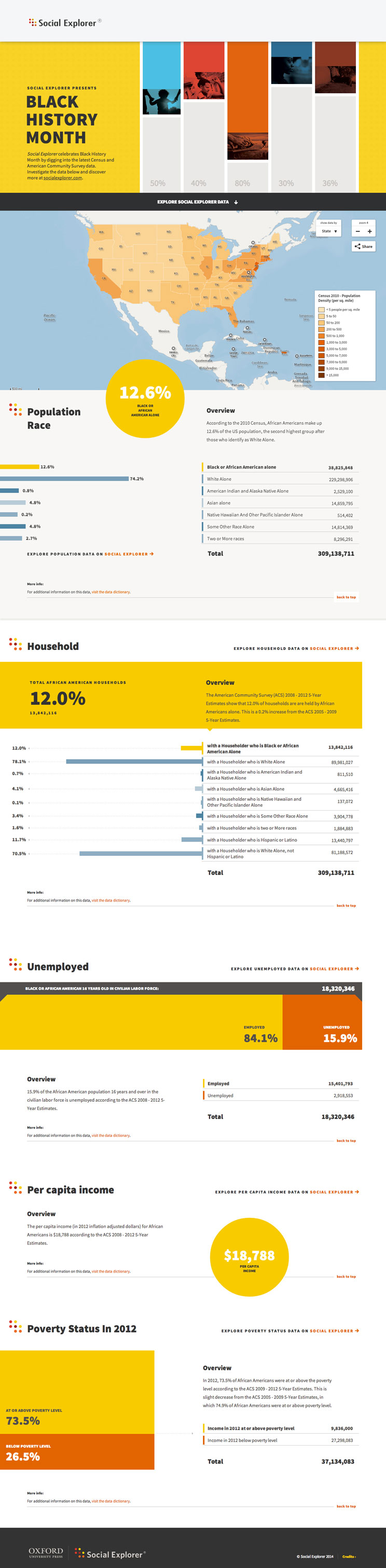
Social Explorer provides quick and easy access to current and historical census data and demographic information. The easy-to-use web interface lets users create maps and reports to illustrate, analyze, and understand demography and social change. In addition to its comprehensive data resources, Social Explorer offers features and tools to meet the needs of demography experts and novices alike. From research libraries to classrooms to government agencies to corporations to the front page of the New York Times, Social Explorer helps the public engage with society and science.
Subscribe to the OUPblog via email or RSS.
Subscribe to only social sciences articles on the OUPblog via email or RSS.
The post African American demography [infographic] appeared first on OUPblog.

By: ErinF,
on 2/2/2013
Blog:
OUPblog
(
Login to Add to MyJacketFlap)
JacketFlap tags:
History,
US,
groundhog day,
Sociology,
groundhog,
Pennsylvania,
Multimedia,
jefferson,
census,
Research Tools,
imbolc,
punxsutawney phil,
Social Sciences,
*Featured,
candlemas,
punxsutawney,
social explorer,
Sydney Beveridge,
hibernating,
demography,
Online Products,
Jefferson County,
‘groundhog,
examining census,
our mapping,
Add a tag
In the United States, a German belief about the badger (applied in Switzerland to the wolf) has been transferred to the woodchuck, better known as the groundhog: on Candlemas he breaks his hibernation in order to observe the weather; if he can see his shadow he returns to his slumbers for six weeks, but if it rains he stays up and about, since winter will soon be over. This has earned Candlemas the name of ‘Groundhog Day’. In Quarryville, Lancaster County, Pa., a Slumbering Groundhog Lodge was formed, whose members, wearing silk hats and carrying canes, went out in search of a groundhog burrow; on finding one they watched its inhabitant’s conduct and reported back. Of twenty observations recorded, eight prognostications proved true, seven false, and five were indeterminate. The ritual is now carried on at Punxsutawney, Pa., where the weather prophet has been named Punxsutawney Phil. (The Oxford Companion to the Year)
By Sydney Beveridge

Every February Second, people across Pennsylvania and the world look to a famous rodent to answer the question—when will spring come?
For over 120 years, Punxsutawney Phil Soweby (Punxsutawney Phil for short) has offered his predictions, based on whether he sees his shadow (more winter) or not (an early spring).
The first official Groundhog Day celebration took place in 1887 and Phil has gone on to star in a blockbuster film, dominate the early February news cycle, and even appear on Oprah. (He also has his own Beanie Baby and his own flower.)
In addition to weather predictions, Phil also loves data, and while people think he is hibernating, he is actually conducting demographic analysis. As a Social Explorer subscriber, he used the site’s mapping and reporting tools to look at the composition of his hometown.
Click here to view the embedded video.
Punxsutawney, PA, located outside of Pittsburgh, is part of Jefferson County. Examining Census data from 1890, Phil learned that the population was 44,405 around the time of his first predictions. While the rest of the nation was becoming more urban, Jefferson County remained more rural with only one eighth of the population living in places with 2,500 people or more (compared to nearly half statewide and more than a third in the US).
Many Jefferson residents worked in the farming industry. Back then, there were 3.2 families for every farm in Jefferson County — higher than the rest of the state with 5.0 families per farm.
Less than three decades after the Civil War, the county (located in a northern state) was 99.9 percent white, which was a little higher than statewide (97.9 percent) and also higher than nationwide 87.8 percent. (The Census also noted that there was one Chinese resident of Jefferson County in 1890.)
Groundhog Day was originally called Candlemas, a day that Germans said the hibernating groundhog took a break from slumbering to check the weather. (According to the Oxford Companion to the Year.) If the creature sees its shadow, and is frightened, winter will hold on and hibernating will continue, but if not, the groundhog will stay awake and spring will come early. Back in 1890, there were 703 Germans living in Jefferson County (representing 1.6 percent of the county population and 11.3 percent of the foreign born), making Germany the fourth most common foreign born place of birth behind England, Scotland, and Austria. Groundhog Day is also said to be Celtic in its roots, so perhaps the 623 Irish residents (representing 1.4 percent of the county population and 10.1 percent of the foreign born) helped to establish the tradition in Pennsylvania.
Looking to today’s numbers, Phil was astonished to learn from the 2010 Census that Jefferson County has just 795 more people than it did 120 years ago. While Jefferson grew by 1.8 percent, the state grew by 141.6 percent and the nation grew by 393.0 percent.
2010 Census Jefferson County, PA, Population Density (click to explore)
Phil dug deeper. The 2008-10 American Community Survey data reveal that the once-prominent farming industry had shrunk considerably. (Because it is a small group, “agriculture” is now grouped with other industries including forestry, fishing and hunting, and mining.) While Jefferson residents are more likely to work in the industry than other Pennsylvanians, that share represents just 4.4 percent of the employed civilian workforce.
According to the Census, Jefferson is still predominately white (98.3 percent), while the rest of the state and nation have become somewhat more diverse (81.9 percent white in Pennsylvania and 72.4 percent nationwide). Today there are 24 Chinese residents (out of a total of 92 Asian residents).
As Phil rises from his burrow this February second, he will survey the shadows with new insight into his community and audience. To learn more about Punxsutawney Phil’s hometown burrow (and your own borough), please visit our mapping and reporting tools.
Sydney Beveridge is the Media and Content Editor for Social Explorer, where she works on the blog, curriculum materials, how-to-videos, social media outreach, presentations and strategic planning. She is a graduate of Swarthmore College and the Columbia University Graduate School of Journalism. A version of this article originally appeared on the Social Explorer blog. You can use Social Explorer’s mapping and reporting tools to investigate dreams, freedoms, and equality further.
Social Explorer is an online research tool designed to provide quick and easy access to current and historical census data and demographic information. The easy-to-use web interface lets users create maps and reports to better illustrate, analyze and understand demography and social change. From research libraries to classrooms to the front page of the New York Times, Social Explorer is helping people engage with society and science.
Subscribe to the OUPblog via email or RSS.
Subscribe to only American history articles on the OUPblog via email or RSS.
The post Burrowing into Punxsutawney Phil’s hometown data appeared first on OUPblog.

By: ErinF,
on 1/21/2013
Blog:
OUPblog
(
Login to Add to MyJacketFlap)
JacketFlap tags:
fulton,
Online Products,
fulton county,
Georgia,
History,
statistics,
US,
Sociology,
Data,
african american,
African American Studies,
census,
Martin Luther King Jr. Day,
Research Tools,
martin luther king jr,
county,
Editor's Picks,
*Featured,
social explorer,
Sydney Beveridge,
demography,
Add a tag
By Sydney Beveridge
Martin Luther King, Jr. was the legendary civil rights leader whose strong calls to end racial segregation and discrimination were central to many of the victories of the Civil Rights movement. Every January, the United States celebrates Martin Luther King, Jr. Day to honor the activist who made so many strides towards equality.
Let’s take a look at the demographics of the legendary man’s hometown then and now to see how it has (and has not) changed. King was born in 1929, so we’ll examine Census data from 1930, 1940, and the latest Census and American Community Survey data.
His boyhood home is now a historic site, situated at 450 Auburn Avenue Northeast, in Fulton County (part of Atlanta). In 1930, Fulton County had a population of 318,587 residents. A little over two thirds of the population was white (68.1 percent) and almost one third of the population was African American (31.9 percent). Today, the 920,581-member population split is nearly even at 44.5 percent white and 44.1 percent African American, according to 2010 Census data. Fulton’s population is more African American than the United States as a whole (12.6 percent), but not as as much as Atlanta (54.0 percent).
A closer look at 1940s Census data of the Atlanta area offers more detail about where the black and white populations lived. The following map shows the distribution of the black population in the Atlanta of King’s youth. Plainly, African Americans lived together, largely apart from whites.
African American Population in Fulton County, GA, and Surroundings, 1940 (click map to explore)

For comparison, the following map shows where the black population lives today. Now the black population has expanded in the metro area, but still seems to be quite segregated.
African American Population in Fulton County, GA, and Surroundings, 2010 (click map to explore)

Reflecting on a century after the end of slavery, King said in his famous “I Have a Dream” speech of 1963:
But one hundred years later, the Negro still is not free. One hundred years later, the life of the Negro is still sadly crippled by the manacles of segregation and the chains of discrimination. One hundred years later, the Negro lives on a lonely island of poverty in the midst of a vast ocean of material prosperity. One hundred years later, the Negro is still languished in the corners of American society and finds himself an exile in his own land. And so we’ve come here today to dramatize a shameful condition.
The quest for equal rights and freedoms made up part of a larger vision. In 1967, he spoke of aspiring for full equality at a speech at the Victory Baptist Church in Los Angeles:
Our struggle in the first phase was a struggle for decency. Now we are in the phase where there is a struggle for genuine equality. This is much more difficult. We aren’t merely struggling to integrate the lunch counter now. We’re struggling to get some money to be able to buy a hamburger or a steak when we get to the counter…
He went on to say that this would require a commitment of not only political initiative but also money: “It didn’t cost the nation one penny to integrate lunch counters. It didn’t cost the nation one penny to guarantee the right to vote. The problems that we are facing today will cost the nation billions of dollars.”
In 1968, King and other activists launched the Poor People’s Campaign, advocating for economic justice to address these imbalances in opportunity and resources. A few months later, he was assassinated.
We can look at different socioeconomic indicators to measure the country’s progress towards equality. According to 1940 Census data, more than a third (36.5 percent) of housing units in Fulton County where whites lived were owner occupied, compared to less than a seventh (14.0 percent) of the housing units where African Americans lived.
Today, home ownership increased for both groups, but the gap remains. Two thirds (66.6 percent) of white households are owner-occupied, compared to two fifths (41.7 percent) of all black households.
Home Ownership Comparison in Fulton, GA, by Race

Let’s examine other measures of equality to see examples of additional gaps.
The unemployment rate is nearly twice as high among African Americans (17.9 percent) compared to among whites nationwide (9.5 percent). That gap is even more pronounced in Fulton County, where the unemployment rate for whites is 7.7 percent, while the unemployment rate for African Americans is 20.4 percent.
The percent of those living below poverty is also higher in the black community (27.2 percent) than in the white community (12.5 percent). While both groups are better off in Fulton County than the rest of the US, the poverty rate gap is even larger (8.2 percent among whites and 26.6 percent among African Americans in Fulton).
Similarly, while both groups are better educated in Fulton County compared to the rest of the US, nearly two thirds (62.4 percent) of white adults in the county have BA degrees or more, while just one quarter (25.3 percent) of the black population have the same level of education. The college attainment gap is 11.6 percentage points nationwide, but 37.1 percentage points in Fulton County.
While much progress towards freedom and equality has been made since King’s time, chronic gaps persist, even in his own backyard. The data show that 50 years after the “I Have a Dream Speech,” equal opportunity and socioeconomic status continue to lag behind equal rights.
Sydney Beveridge is the Media and Content Editor for Social Explorer, where she works on the blog, curriculum materials, how-to-videos, social media outreach, presentations and strategic planning. She is a graduate of Swarthmore College and the Columbia University Graduate School of Journalism. A version of this article originally appeared on the Social Explorer blog. You can use Social Explorer’s mapping and reporting tools to investigate dreams, freedoms, and equality further.
Social Explorer is an online research tool designed to provide quick and easy access to current and historical census data and demographic information. The easy-to-use web interface lets users create maps and reports to better illustrate, analyze and understand demography and social change. From research libraries to classrooms to the front page of the New York Times, Social Explorer is helping people engage with society and science.
Subscribe to the OUPblog via email or RSS.
Subscribe to only American history articles on the OUPblog via email or RSS.
The post Checking in on Martin Luther King, Jr.’s dream, with data appeared first on OUPblog.

By: Alice,
on 3/16/2012
Blog:
OUPblog
(
Login to Add to MyJacketFlap)
JacketFlap tags:
Minnesota,
Geography,
Finland,
Multimedia,
Wisconsin,
grasshopper,
Finnish,
Research Tools,
Social Sciences,
*Featured,
patrick’s,
social explorer,
Sydney Beveridge,
Finns,
St. Urho’s Day,
urho’s,
“heinäsirkka,
heinäsirkka,
urho,
Add a tag
By Sydney Beveridge
 While Irish eyes are smiling on St. Patrick’s Day, many Finns are already celebrating St. Urho’s Day. The holiday was first celebrated in Minnesota on March 16th, which happens to be just before St. Patrick’s Day.
It honors the legendary Urho, the patron saint of vineyard workers. As the story goes, he saved the grape crop from a grasshopper infestation with his horrible breath as he yelled, “Heinäsirkka, heinäsirkka, mene täältä hiiteen!” (Grasshopper, grasshopper, go away!)
Soon after the first St. Urho’s Day was celebrated, the 1960 census reported that there were 240,827 people in the US born in Finland, representing 0.1 percent of the total population.
Over 15 percent of them resided in Minnesota, where St. Urho celebrations first originated.
According to the 2010 American Community Survey, there are now 647,697 residents of Finnish ancestry, making up about 0.2 percent of the total population.
Some St. Urho’s Day revelers dress up as grasshoppers and grapes to celebrate. As you can see, Finns are especially concentrated in northern Minnesota and Wisconsin. Explore the map to see where you should plan your next St. Urho’s Day outing, or if you are a grasshopper, where to avoid.
Map of Finnish Residents in the US (2006-10 Census)

Happy St. Urho’s Day from Social Explorer!
Sydney Beveridge is the Media and Content Editor for Social Explorer, where she works on the blog, curriculum materials, how-to-videos, social media outreach, presentations and strategic planning. She is a graduate of Swarthmore College and the Columbia University Graduate School of Journalism.
Subscribe to the OUPblog via email or RSS.

By: Alice,
on 2/14/2012
Blog:
OUPblog
(
Login to Add to MyJacketFlap)
JacketFlap tags:
explorer,
Social Sciences,
*Featured,
social explorer,
Sydney Beveridge,
bachelorettes,
bachelors,
Valentine’s Day,
“sex,
valentine’s,
explorer’s,
beveridge,
Sociology,
sydney,
Data,
survey,
table,
Demographics,
Add a tag
By Sydney Beveridge
 Cupid scours a trove of demographic data to guide his arrows. This Valentine’s Day, let Social Explorer help you map your way to love.
Look up information on the 59.7 million available men and 67.4 million available women across the nation (available meaning unmarried, divorced, separated or widowed). These bachelors and bachelorettes can be sorted by age group, geography and more as you develop your demographic dating plan.
Map of 2010 American Community Survey Never Married Population

 For instance, Donald Demographics wants to know where the single ladies are. Using the data sorted by city, he can identify where lots of available women dwell. Since he has a thing for women with accents, he can refer to the “Sex By Place Of Birth By Year Of Entry For The Foreign-Born Population” table to help find an international lady.
Debbie Data is looking for a smart, financially stable man. She can use Social Explorer’s “Median Earnings By Sex By Educational Attainment (In 2010 Inflation Adjusted Dollars) (For Population Age 25+)” table to see which neighborhoods she should hang out in to find more of such guys.
She can even target neighborhoods where more people have health insurance — a really hot trait — by using the “Health Insurance Coverage Status By Sex By Age” table.
She also has a thing for arty types, and can keep an eye out for areas with more men in that occupation by consulting the “Sex by Industry” table. More into an outdoorsy crowd? Try areas with larger numbers of men or women in farming, fishing and forestry.
Check out Social Explorer’s maps and reports for more information on dating possibilities in your neighborhood and beyond. It’s the perfect opportunity to try out our custom colors in pink, red and more.
Happy Valentine’s Day from Social Explorer!
 Sydney Beveridge is the Media and Content Editor for Social Explorer, where she works on the blog, curriculum materials, how-to-videos, social media outreach, presentations and strategic planning. She is a graduate of Swarthmore College and the Columbia University Graduate School of Journalism.
By: Lauren,
on 9/20/2011
Blog:
OUPblog
(
Login to Add to MyJacketFlap)
JacketFlap tags:
gender,
back to school,
census,
Research Tools,
explorer,
catching,
genders,
*Featured,
social explorer,
Sydney Beveridge,
college degree,
attainment,
degrees,
high school degree,
enrolled,
censuses,
Education,
Add a tag
By Sydney Beveridge
Some of the earliest detailed census data on education came from 1850 when the census reported information about school attendance. For many decades, the census focused on literacy rates, which we discussed in part two of the back to school series.
By the mid-1900s, data on educational attainment emerged (elementary school, high school, college, etc.), adding new insight into education

By: Lauren,
on 8/30/2011
Blog:
OUPblog
(
Login to Add to MyJacketFlap)
JacketFlap tags:
*Featured,
Sociology,
Education,
employment,
educational,
unemployment,
lesson,
Research Tools,
salary,
earnings,
ethnicity,
explorer,
wage gap,
Images & Slideshows,
social explorer,
Sydney Beveridge,
attainment,
degrees,
Add a tag
By Sydney Beveridge, Social Explorer
With the new school year approaching, Social Explorer is taking a closer look at education data today and over the years.
The most recent available data (from the 2009 American Community Survey) reveal education levels and distinctions among groups, as well as the correlations between educational attainment, income and employment.

By: Lauren,
on 6/20/2011
Blog:
OUPblog
(
Login to Add to MyJacketFlap)
JacketFlap tags:
census,
1990,
*Featured,
wages,
median,
Images & Slideshows,
Andrew Beveridge,
social explorer,
Sydney Beveridge,
ipums,
librarian,
ala,
US,
librarians,
Education,
american library association,
Add a tag
An analysis using 120 years of census data
By Sydney Beveridge, Susan Weber and Andrew A. Beveridge, Social Explorer
The U.S. Census first collected data on librarians in 1880, a year after the founding of the American Library Association. They only counted 636 librarians nationwide. Indeed, one respondent reported on his census form that he was the “Librarian of Congress.” The U.S. Census, which became organized as a permanent Bureau in 1902, can be used to track the growth of the library profession. The number of librarians grew over the next hundred years, peaking at 307,273 in 1990. Then, the profession began to shrink, and as of 2009, it had dropped by nearly a third to 212,742. The data enable us to measure the growth, the gender split in this profession known to be mostly female, and to explore other divides in income and education, as they changed over time.
We examined a number of socioeconomic trends over the duration, and focused in on 1950 the first year that detailed wage data were recorded, 1990 at the peak of the profession and 2009 the most currently available data.1 We looked at data within the profession and made comparisons across the work world.

For the first 110 years of data, the number of librarians increased, especially after World War II. In 1990, the trend reversed. Over the past 20 years, the number of librarians has dropped by 31 percent, though the decline has slowed.
Considering the nation today, the states with the largest librarian populations are: Pennsylvania, Illinois, New York, Texas and California. Meanwhile, the states with the highest concentrations of librarians (or librarians per capita) are: Vermont, D.C., Rhode Island, Alabama, New Hampshire. Table 1 in the appendix gives the count and proportion of librarians by state in 2009.
Median Earnings
 The Census Bureau has kept records of librarian wages since 1940. Median2 Librarian wages (whether full-time or part-time) increased until 1980, though they were a lower percentage of the median wages of all workers. Indeed, between 1970 and 1980 librarian wages declined nearly $4,000—more than twice the drop of median wages across all professions. (This wage drop was in the context of the Oil Embargo in the mid-1970s, and the economic fall-out that that caused.) In 1990 Librarian median wages declined further and were the same as those for all workers, but by 2009 they had gained in relative terms, and reached their peak of $40,000. (All these figures are adjusted for inflation.) By 2009 the typical librarian earned over one-third more than a typical US worker. According to the Census results, Librarians have enjoyed consistently high employment rates. For instance in 2009, the unemployment rate among librarians was just two percent–one-fifth the national rate.
A Feminine Profession
Today, 83 percent of librarians are women, but in the 1880s men had the edge, making up 52 percent of the 636 librarians enumerated. In 1930, male librarians were truly rare, making up just 8 percent of the librarian population.


