A 24hr. head start! Élena Nazarro writes: “I’m starting up “Every Day In May” again, where I (and others who join in) are committing to paint/sew/write/create for 31 straight days. We’d love to have you join, especially if you think you need a kickstart. Goodness knows I do!”

More info at her blog, French Toast Girl, and a Flickr group too!

Front
If you are an indie music fan like myself, no doubt you already own Red Hot + Blue’s latest compilation, “Dark Was The Night.” As a visual artist it is highly likely that you also fell in love with this brilliant double CD’s packaging as I did. Not only is it gorgeously-designed, but it features classic illustrations from 19th century french engraver Gustave Doré’s “Paradise Lost.”

Inner panel
Upon scanning the liner notes I found the cover packaging was designed by NYC illustrator/designer Ryan Feerer, and the inner booklet by John Giordani. The common thread between Ryan, John, Red Hot + Blue and “Dark Was The Night” is interactive agency Funny Garbage, which was started by Red Hot’s founder John Carlin, and designer Peter Girardi. In following this chain of hot creative links I landed on Ryan’s website and poked around his portfolio. Inspired, I contacted Ryan and picked his brain, and was rewarded with bits of news and interesting facts about his solo and agency work.

Illustration by Ryan Feerer
First off, Ryan shared that he is currently churning out a series of illustrations that will grace the walls of NYC’s Ace Hotel. This musician-friendly location not only features original illustration in all its rooms, but it also provides guests with unusual sonic bonuses such as turntables, guitars and amps. How cool is that?

Ryan's hand-hewn typography from "Dark Was The Night" in one of the hotel rooms.
Ryan’s design work is very illustrative, and his illustration work well-composed by design—something I admire and have been trying to achieve in my own work. I asked for his thoughts on the marriage of the two:
“I often have difficulty separating illustration from design. They work together in most of my work so combining them becomes second nature to me. For example, while creating the design for Red Hot’s Dark Was The Night compilation I was given Gustave Doré’s image of the fallen angel from Milton’s Paradise Lost. This was the one image the packaging had to revolve around. If you’re familiar with this image you know how beautiful and powerful it is. The mysterious winged figure floating down past stars and clouds through space towards what seems to be earth. When you have to design around such a magnificent piece of art, you have to take precautions. You can’t just slap some type onto the illustration because the original piece of art is so much more beautiful than anything you could possibly do, most likely. Keeping this in mind, I created the cover image and typography using Doré’s illustration as texture and detail. This was an introduction to the rest of the packaging. As you open the packaging the (almost) full Doré illustration is revealed. I think that is where the whole wow factor comes in. You’re able to make the visual connection with the cover without compromising the powerful and original artwork from the interior. Taking details from the existing artwork and using them as accents throughout the design created a strong consistency throughout the packaging. I think its a good example of how to create designs and illustrations using existing illustrations.”

On his illustration background:
“I’ve been drawing as far back as I can remember. My father is a preacher so I grew up going to church several times a week. I was stuck on a church pew for hours at a time with nothing but blank membership cards and pencils attached to the back of the pew in front of me. So, I did what most children do, I picked up the pencil and cards and started doodling. I would draw Biblical characters or other religious imagery pertaining to my father’s sermons. There are only so many Biblical figures a kid can draw, so when I was tired of drawing religious imagery I would start to pull things from my own imagination and draw, and draw, and draw. Although my passion for illustration started long ago, still to this day, when I sit down at church on Sunday morning I have to have my sketchbook and pen in hand. “

Illustration by Ryan Feerer
On his work space:
“I’m sure there are a thousand people that have a more interesting or quirky work-style, but I guess everyone is unique in their own way. In an ideal world I’d do all my work in a small wooden shack of a studio floating in the middle of a foggy lake surrounded by a thick forest. Unfortunately I don’t have that option. Most of my work is done in a small office space in my New York City apartment with a tiny window behind me facing a brick wall which voids my desk of any natural light. It’s definitely not an ideal situation, but its nothing a little Will Oldham and a cold beverage can’t fix.
On his process:
Although my designs and illustrations work together in most of my work, the process of starting a design is quite different than starting an illustration. Design is a lot more structured for me. There are a lot more restrictions and particular problems to solve. I love everything design encompasses but its nice to be able to escape and do what makes me happy. When it comes to illustration, I like to let my mood and music guide my hands. I tend to draw places where wish I could be, a situation I wish I could be in, or a person or thing I wish I could be. I’m obsessed with some of the things that linger in my mind. The stories within it and the things I see have always kept me entertained.
When I was a kid I used to imagine this fantasy world that I could only get to through a small door hidden in my bathroom closet. The world inside was dark and strange. Humid and cold. It resembled what seemed to be a rainforest and inside that forest was a village where strange creatures lurked. That little world that lay within the depths of my bathroom closet has become an ongoing project I started back in grad school called Thy Old Murkville Forest. Murkville encompasses pictures, stories, music, as well as it’s own language. It is my dream world. Throughout the process of creating that imaginary world [I have been able to] view things from a different perspective. It’s like seeing my work from the inside which helps me create something thats more appropriate for what I’m doing. There is so much freedom in illustration. I can delve into my own world and live there as I create my work. It’s a wonderful place to be.”

Thy Old Murkville Forest
Follow Ryan Feerer on Twitter. Vote for his tee design on Threadless.
(Thanks, Ryan!)
Penelope’s baby has arrived, and her husband Colin introduces us to little Veda over at Penelope’s blog. Congratulations, Penelope and Colin!!

A page from Ellen Donovan's scrapbook, with calling cards
From BoingBoing I discovered a sweet link to The Daily Scrapbook “a book and website by Jessica Helfland of Winterhouse Studio“. The book in question is called Scrapbooks: An American History and the posts on the Daily Scrapbook blog give us an amazing glimpse into this 425 page volume (as well as the collected ephemera of American lives over two hundred years).
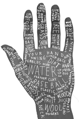
Keri Smith asks what if your hand could tell stories?

need a little birdie in your artistic ear? check out this video (via TED) of maira kalman.
thanks to christine for the pick-me-up!

hidden in a recent American Elf comic is an easy recipe for yummy tortillas!

Here’s another fantastic art project: “The Campaign for Drawing’s aim is simple: to encourage everyone to draw. Its annual showpiece, The Big Draw, proves that drawing can be a public activity as well as a private passion.” The ninth Big Draw will run from throughout October 2008 but I mention it now so that you have plenty of time to register.
This Campaign for Drawing illustration is by Quentin Blake.

I can read your mind. You’re thinking “Making art is so great! But who cares? I want to make a difference in the world!” Well…
Art With Heart, an organization devoted to “healing youth through creativity,” is offering free training in their Art Buddy program on Saturday, March 29th, from 9:30am – 1pm. (RSVP is required and donations are welcome.)

Rebecca OUP-US
Depictions of nature often reflect the mood in Tess of the D’Urbervilles. For example as Tess sits listening to Angel play the harp, “The floating pollen seemed to be in his notes made visible, and the dampness of the garden the weeping of the garden’s sensibility. Though near nightfall, the rank-smelling weed-flowers glowed as if they would not close, for intentness, and the waves of colour mixed with the waves of sound” (page 139). (more…)
Share This


