Ever wonder what I work with?
I am always curious to see other artists' studios, the tools they use, even down to how they brush the paint on. It fascinates me.
I'm working on a project right now that has forced me to look closer at what I work with and why I work with it.
You can find commentaries on blogs, forums, and Facebook about how one artist will voice their favorite pencil, while another artist in the same field will swear by another brand. Call it the sport of art if you like
(I'm sure there's an artist out there with a rabbit's foot).
Most of my tools have a story or memory attached to them. The oldest tool I've used every day in the studio is my
kneaded eraser.
My dad is an art teacher most of my life, so I grew up with this wonderful tool laying around his art studio coiled up or made into small pyramids. Something to do while thinking or working. I was introduced to it very young.
The next tool oldest to me is a retractable Tuff Stuff! The moment I discovered this eraser years ago I fell in love and haven't gone back. It gets into the little spots and is always a clean erase. I don't go anywhere without it!
 My pencils are newer to me.
 I have worked with mechanical pencils for at least 15 years now, but the one I used as a teenager...well....was great for a teenager.
Two years ago I did some research and tried
Pentel GraphGear 500 on a whim. Love them! Great body weight, good lead selection, amazingly priced! The green Pentel is their most standard.
Pentel P205...still a great drawing pencil!
Sketchbooks are personal, in every sense, like a diary. I have always favored the large
Strathmore or
Canson spiralbounds, 9x12 inch. I have several moleskines too that are smaller....and I adore them, but I like space for my hand when I draw, this allows it.
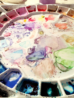
Color Theory wasn't around in the beginning for me, so I just picked colors that worked to my eye. This did not help in finding the best palette for me, or how to lay it out even.
All of my palettes up to several years ago were rectangle and felt rough to me. Nothing progressed fluidly for me, only manageable.
There was a teacher of watercolor where I work
(The Des Moines Art Center) who had a round palette out during one of her classes, and I was introduced to the
Stephen Quiller Palette.
A circle! Imagine color on a wheel!I took her class, several times, and have since learned how to better use my palette effectively.
The paints I use are a blend of
Daniel Smith and
Winsor Newton. I always have a messy palette, it's cleaned maybe once every two months. I also paint on primarily
Arches Hot Press and Cold Press 140lbs. It's a comfortable inbetween weight and their brand is one of the oldest. I'm open to other papers, but I'm a snob about Arches. The brushes?
Cotman series 666.If you know my work you'll notice my use of white. This started in the phase of trying to keep the white of the paper and failing. I taught myself watercolor, so I turned to problem-solving (an illustrator's best trait).
First it was
FW liquid acrylic. I would brush it on, but it cakes easily. Nowadays I usually water it down.
The other partner in crime is the white gel pen. Discovered this while watching watercolor videos on YouTube. Genius! I don't think I use the best one, your basic
Gelly Roll, but will be ordering a
UniBall gel pen and I'm looking forward to seeing how it works!
Last but not least, the infamous indigo colored pencil. I started using this prominently last year while working on
Tangerine. I was first introduced to
Verithin Colored Pencils by Prismacolor a couple of years back. They're fantastic because of the harder lead with less wax. Because I'm not a colored pencil artist, this worked great for sketching!
The indigo was an accident. I was sketching with it, and as I added color (without thinking of the muddiness it could create) I noticed how it's more dulled tone worked. After
Tangerine I continued to sketch with it. The hue is attractive to me, mixed with graphite or color. It helps to provide me my shadows.
Although indigo can create mud very quickly (it's not for the inexperienced), it does create a more earthy visual of color hues in the painting. I trust it so much I paint with indigo as well.
I try to sharpen always with a blade so that I don't go through the pencil as fast (taught by my dad), and the electric eraser was a gift to me. Never knew I would have a need of it until I discovered it erases the indigo colored pencil wonderfully!
Do you have a favorite pen or material that you use a bit religiously?
"ta-da!" (as the waitress at the coffee shop I go to always says when she brings the food)
Usually I do things with a white background.
I guess I felt I had something to prove.
This is 8 x 8 inches (20 x 20 cm), Prismacolors and Polychromos on Stonehenge paper.
I've started on the castle itself, after lingering over the sky.
This is an old stone castle, so its scruffy and uneven and has irregular color patterns.
Its tricky sometimes to keep the colors and values in check, and describe the form accurately. What I mean is, you have values that describe the form, like the light and dark sides of the building. Then you have the changes in color in the stonework, which sometimes fight with the light/dark pattern. You might have dark stone on the light side of the building, for example, which goes against the ideal 'light to dark' way of rendering something.
To add to it all, there are also cool and warm colors of stone, which ideally would be placed to enhance your picture; but since this is real life, those are usually uncooperative as well. Cool colors would be in shadows, whereas the warm tones would be out front. So here we're dealing with a good range of greys, which are all over the place, and I'm doing my best to make them work, and still have it look like the place its supposed to be (which is Enniskillen Castle in Ulster).
I'm using lots of greys (French Greys and both Cool and Warm greys) as well as one pass of Ginger Root to start giving it a bit of life. I'll continue on from here until I get it just right!
Another thing that can help or hinder your drawing experience are the photos you have to work from. Sometimes you get great photos, but more often than not, you don't. Either some nice person who has commissioned your drawing has gone out and taken photos that are: too sunny, too dark, out of focus, while its raining, with cars blocking half the building, etc. etc etc. Or you get photos that have been tarted up with Photoshop filters to look all glowy and warm in the sun, when in fact the building is as grey as old dishwater. And on it goes. So the challenge is to find the truth in there somewhere, and do the best you can to make an accurate rendering. It can be a challenge! Here I'm splitting the difference between all my reference and making the best interpretation I can.
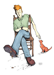
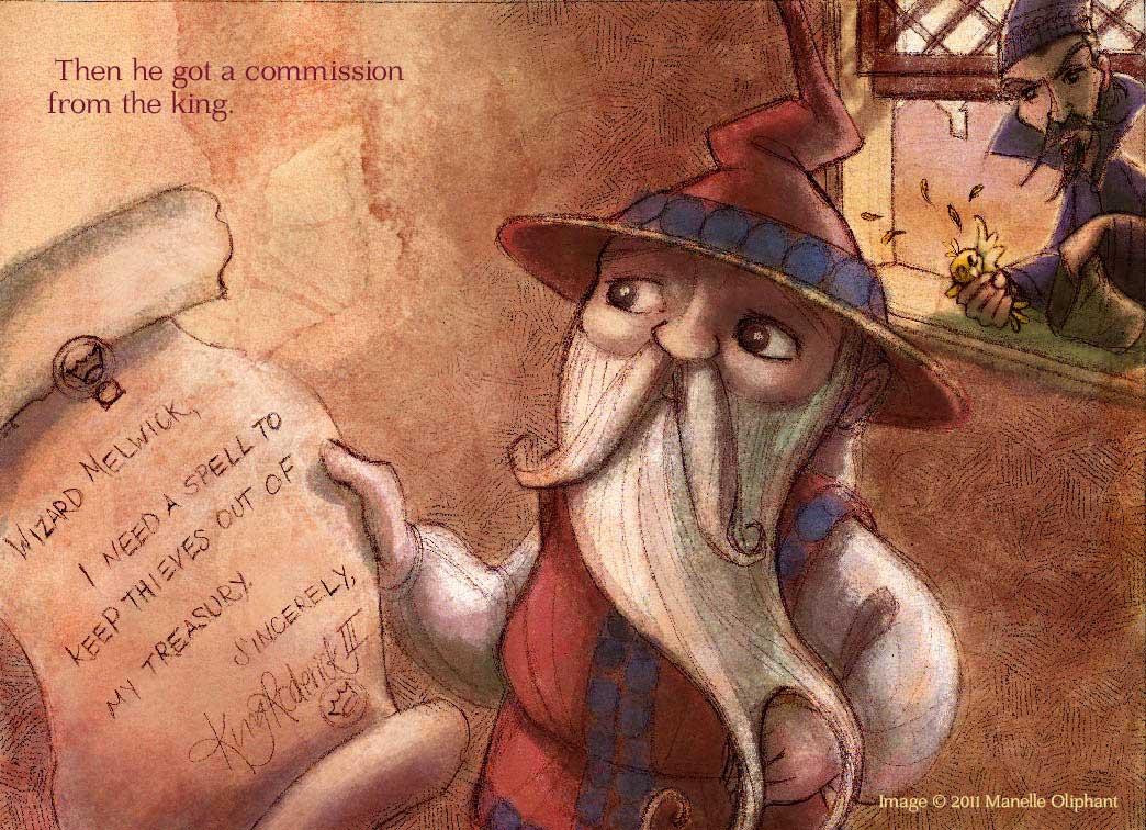
It's Tuesday and that means that I'm supposed to post
Melwick. He's going to be up tomorrow. Sorry for the delay. To hold you over until then here is another illustration I just finished and wanted to share.
This image is also the newest update on my newly updated
website. I'd love to hear what you think about it. (meaning the website, but you can tell me what you think of the image as well)
And, last week I received this:
Which was super nice of
PZ desigs to find my blog and award it to me. I am finally finding time to pass it on. But first I have to tell you all seven things about me. Here we go:
1. In the very near future you may see me dressed up like Tinkerbell at a
birthday party near you (if you live in Utah). I'm working on the ol' costume and will soon be attending parties as Tinkerbell.
2. Cooking is my new favorite Hobby. I just made some awesome bread and can't wait to eat it for dinner tonight.
3. Jeeves and Whooster is a really funny show. Doctor Who is my favorite show.
4. Going off of that last one, I have a crush on BBC drama's.
5. I didn't think I would like Twitter, but I really do. I've been a tweeter for a couple months now, and I have been avoiding Facebook as much as possible. It sucks away your time if your not careful.
6. I'm currently reading
Linchpin. It's fantastic. My favorite of Seth Godin's books (that I've read) so far. I just have to apply it to life now... and I will so there.
7. I believe
families can be together forever.
Ok, there are some things about me.
Now here are some of my favorite creative blogs for you to look at, and for me to pass on the award to:
Illustrators
Sherry MeidellShawna TenneySam RicksNasan HardcastleFood
ErikEatsHome Decor
Color Me Happyok so that's not 15 but, and I do follow a lot more than 15 awesome blogs but... well that's all I'm posting for you. Have a great day!
If one of those blogs is yours and you want to accept the award this is what you do:
1. Put a picture of the Stylish Blogger Award in your blog.
2. Thank and link back to the person who awarded it to you.
3. Share 7 things about yourself.
4. Pass this award to 15 other creative bloggers!
I love letting the watercolor do what it wants. I think it worked well in this piece.
Previous Page -- Next Page

By:
Paula Pertile,
on 12/23/2009
Blog:
Drawing a Fine Line
(
Login to Add to MyJacketFlap)
JacketFlap tags:
children's book illustration,
Prismacolor,
Polychromos,
colored pencils,
fancy homes in Sacramento,
organic food is better than Tater Tots,
Fabulous 40s,
The Forgotten Brush,
Sierra Oaks,
Add a tag
 © me, colored pencils on bristol board
Not new, but fitting for the season. I sure wish there was such a thing as "healthy" candy. I mean that also tastes good. Like this stuff.
I think one of my new resolutions (no, not a new year's thing, I don't like those) is to start eating healthier. I mean, I love my Tater Tots, but I get lazy and eat that stuff too much. Organic veggies and fruits are so lovely, and even though they may pinch the pocket book a bit, in the end they're so much better. I was reading an article last night by a man who had cancer and eschewed chemo or radiation treatments, and instead went on a complete organic diet to get his body to heal itself,
and it did. He's cancer free. That's impressive.
I'm also trying to get my cats back on a healthier food plan after struggling with my Isabella and her digestive troubles which I think stem partly from eating too many people treats for too long. So I'm on a mission.
Sorry, I know I'm supposed to be wishing everyone a Merry Christmas, and instead I'm writing about healthy eating. I've just had a few days to slow down and not be so stressed and to kind of let the spirit of the holiday and season and universe and all of that in, in a way that usually doesn't happen in our day to day hurried lives. And that's the message I'm getting from 'somewhere', so just thought I'd share.
I had a nice email from
Laura at The Forgotten Brush who included the above ribbon candy piece in her list of
etsy Christmas things she liked. How nice. Thanks Laura! I really do love perusing etsy and seeing all the wonderfully creative and inspired and quality things that people make. I often think "ooh, I wish I'd thought of that!". If you sign up for their updates you can get inspired collections they put together on their 'front page' delivered directly to your email box. This year I sold one of my braided scarves to someone who was giving it as a gift, which was nice. I also a few other pieces to different people, not on etsy, which felt good too. Its always nice when someone actually wants what you create!
On the art front, I'm working on some new simpler children's book pieces, like this:
 © me, colored pencils on Stonehenge
I'm trying to work faster, but still using my colored pencils. I've gone back to using Prismacolors after not using them for a long time. They do go on faster than Polychromos, and some of the colors are brighter. But they break more often in the sharpener because they're softer. I've been using the old old
old mixed up set I've had for over 20 years, which also includes other odd pencils in other brands like Venus and some that don't even have a label! A motley bunch of colored pencils, for sure. I even have some of the now
 This is a commission I completed today but the colors are completely different in the image shown here. This is a color test using a combination of Prismacolor and Copic markers. I like this one better than the one paid for. Oh well. Enjoy.
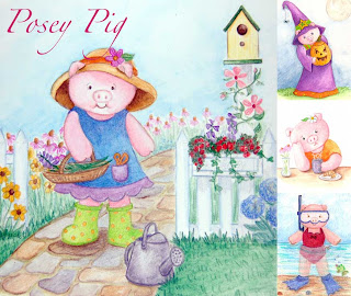
Here is a four panel collection of Posey Pig.
By:
Paula Pertile,
on 2/13/2008
Blog:
Drawing a Fine Line
(
Login to Add to MyJacketFlap)
JacketFlap tags:
Edward Woodward,
Prismacolor,
safety pin,
The Wicker Man,
Britt Eckland,
Scotland,
yarn,
yarn,
Prismacolor,
safety pin,
Add a tag
2.5 x 3.5
Prismacolor! on board
ebay
Well well well. Prismacolors, what a surprise. This was done with a French Grey 90%.
I've never liked Prismacolors all that much. They're too soft. This one broke twice while I was doing this piece (it broke in the sharpener) and I ended up using almost one whole pencil just on this little illustration. I mean, c'mon.
I've come to the conclusion that nothing on earth will ever 'do it' for me like my Polychromos, but I'm still glad to know what's out there.
I do like this color though for a warmer alternative to black.
And I don't know what this bondage thing is I have going on. I don't think I'll analyze it.
To see all the Yarn pieces in this series side-by-side, please go here. Or visit my ebay store to see which are available for sale.
All images and content herein are © Paula Pertile and may not be used or reproduced without permission.
I was a facilitator at a session of the Internet and Society conference put on by the Berkman Center yesterday. I had a great time. It was a little overwhelming. My working group was called, appropriately enough UNIVERSITY and its library and I led the session with David Weinberger and Cathy Norton from the Woods Hole Institute Library. I must admit I felt a little out of my league (library director! author & technologist! um…. Jessamyn!) but I’ve never let that stop me before. I also learned that being the youngest and greenest member of a facilitating team means that you get the full-on “why don’t YOU do the introductions?” offer which I trepidatiously accepted. Of course, since I’m stuck somewhere between the digital native and digital immigrant personas, I also followed the IRC backchannel, my IM buddy list, Twitter, wrote on the chalkboard, took a few pictures, and tried to pay attention to things like the schedule and the pre-set list of tasks. I think it went well, but I felt like I had been river rafting by the end of it. A few people told me they thought it went well. You can see the list of what we came up with, in these Flickr photos (oooh very 1.0!).
The rest of the day was lunch [getting to talk to the head of network security at Harvard and his very very fascinating job] a second session [UNIVERSITY vs. RIAA with Wendy Selzer and Doc Searls and Lewis Hyde which turned into a few hothead professors and one or two industry/network guys and a few Free Culture students really just talking past each other in ways that were interesting but somewhat frustrating to listen to in an unstructured environment] and then dinner with a good friend of mine who works for One Laptop Per Child his friend just in from Oxford and a super interesting guy from Connexions. We ate pizza and messed around with the OLPC laptops and rehashed some of the “knowledge beyond authority” concepts that washed over us during the day.
It was neat to be at an academic conference where the speakers could toss around some fairly high-level vocabulary and jargon and be pretty sure that people in the audience could keep up. It was great to be someplace where all the technology just worked. It was fun to sit next to Dan Gillmor at the wrap-up and realize that he multitasks pretty much just like I do, but his inbox is fuller. I didn’t do a lot of actual blogging at the conference — well none really — but I did write a few things down. A lot of the pithy sayings that stuck with me were things that David Weinberger said. He’s great to be in a room with, very self-effacing, very friendly, very “hey I’m just like you” but also extremely well-spoken on many society and technology topics that I think a lot of us have trouble putting effectively into words. A few random notes from me, sorry they are a little stream-of-consciousness. I didn’t really have time to both attend the conference and blog the conference. In some ways I’m amazed that people can actually do that. I’m typing this up from my Mom’s house, with a cat in my lap and a cup of coffee, really feeling that I need thirty minutes or so of downtime to effectively rehash a day of solid uptime.
The general gist: knowledge beyond authority, truth beyond power, what is university’s responsiblity?
What about university as client?
What about teachers? is their digital identy as “digital immigrants”
DW: “Do libraries succeed by being where people go? Or, do libraries succeed by going where people are?”
DW (about the import of having a PhD): ending a conversation with saying ‘I have a PhD’ never worked well and it REALLY doesn’t work now
From a speaker at the wrap-up: The elephant in the room that limited the conversation was profit, there is an assumption that there is something primary and supreme about business that must be assumed to be given prominence and deference in the discussion about how to effect change (many people mentioned this)
DW from the wrap-up, about community knowledge and mailing lists: “The knowledge is in the list, the knowledge is smarter than every person on the list!”
I also got to shake hands and say hi to a few more people I’ve known sort of just through the Internet including Ethan Zuckerman (go start reading his blog right now please) and Matthew Battles who has written one of my favorite books about libraries.
berkmancenter,
conference,
internetandsociety,
is2k7,
me


.png.jpg?picon=3640)


 My pencils are newer to me. I have worked with mechanical pencils for at least 15 years now, but the one I used as a teenager...well....was great for a teenager.
 Color Theory wasn't around in the beginning for me, so I just picked colors that worked to my eye. This did not help in finding the best palette for me, or how to lay it out even.


These tools are very useful to understand the pattern of trading very easily. Some of these tools are really very efficient & even i was not aware from them. Good Stuff !
Thanks
Commodity Trading Tips
you've listed so many great tools though I don't know most of them. for me, I like mechanical pencils, water soluble colored pencils and my laptop. but I think the best tool is really yourself and your hands.
thanks for sharing this, have a great day.
you are so right, i love seeing and hearing about what artists like to use. I loved reading your post.
i enjoy most the things you have mentioned. Go through spurts with different materials. For a long time it was Derwent Inktense pencils or prismacolor pencils. Now i am learning a bit about watercolors.
Thank you for being so candid about what you use. I often look at art work and wonder what they have used to create it. Sometimes I can guess. Sometimes I am clueless! I love your work and your sense of color. I know I want my art work (which is mostly colored pencil) to be more vibrant and your post has really convinced me that I need a color theory class and a watercolor class would be nice.
Thank you everyone for such wonderful comments. I am beaming with joy knowing that I shared something new and something helpful!
Lissa, I couldn't agree more, that you yourself is the best tool. Thank you for sharing that, because I teach it so often in my classrooms.
Tammie Lee, I think exploring or switching out your mediums from time to time is such a healthy thing! I got so wrapped up in being a watercolor purest I forgot that I was an illustrator! And in essence almost lost what kind of artist I am internally. I have some Derwent watercolor pencils that I haven't really dived into. Waiting for that special day when I'm up for that challenge!! ;) Watercolors are fun if you keep them fun, hope you enjoy all that you learn!
Laura, thank you for your comment about being candid. We're told so often in business to be professional in how we speak, I'm the opposite. How I talk here is how I teach and talk with my clients. I really hope you do take some color theory and watercolor classes! Dig around and find some, or ask community schools if they know of any private tutors. Totally worth a few workshops!
Sara, Thanks for the great tips. What fun! I feel like I've taken a tour inside your studio. I love rapidographs, for softer looks and colors I use a soft brown ink and for the softest looks, I use a number 2 pencil. (funny, isn't it- it is so simple) I love watercolor paper with a cotton feel and slight texture. Sometimes it looks dirty when reproduced. I try to compensate for that in photoshop when it is scanned. My dad was a watercolor artist and used to rip the paper to add clear clean white sparkles. Thanks for sharing, you have amazing talent. bk