Most people point their cameras up when there taking photos. Lately I’ve been pointing mine down. I find the best textures live on or near the ground. I’m sure my neighbors think I’ve lost it when they see me taking pictures of my driveway but I don’t care because I know it’s going to make an excellent texture for my next piece of art.
There are lots of different ways to add visual interest to a digital file. I’ve been inspired by the some of the unique art I’ve been seeing on Instagram lately. Lots of textures and lots of originality. It seems as though the pendulum has begun to swing in the direction of a more organic look these days. Adding texture is a great way to great way to add visual interest and create a unique signature. The trick is figuring out how some of it is done and that’s the focus right now.
I’ve worked with adding simple textures in the past but I feel like I’ve barely scratched the surface when I look at some of the artists I’ve been following. This month I plan to dig in a little deeper and see if I can come up with some solutions of my own. At the same time I’ll be attempting to solve some of the problems I ran into earlier with my textures. I noticed some of the blending modes I used earlier made my art skew a little darker than I would have liked. I’d also like to see if I can find a way to add more vibrant colors to my textures at the same time.
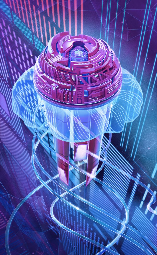
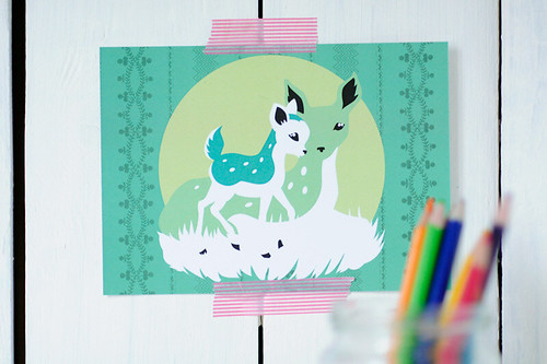
My early attempts focused mainly on Photoshop but now I’m looking into Illustrator. The technique is slightly more complicated with Illustrator because, as you know, Photoshop offers the ease of using clipping masks where Illustrator does not. The art shown here involves two different textures placed on top of the original art using different blending mode for each. I’m pretty happy with whats going on in this illustration but for my next attempt I’d like to try and push the envelope a little further. Stay tuned for more updates.

This art was created in Adobe Illustrator using two different texture placed on top of the original image each with a different blending mode.
If you’d like to see a demo of the Photoshop techniques I use just check out this video:
The post Working with Textures in Adobe Illustrator appeared first on Bob Ostrom Studio - 919-809-6178.
This is a little cartooning tutorial I wrote a few years back about creating an illustration using Adobe Illustrator and Photoshop. You’ll notice I begin my drawing in pencil, then move to illustrator for line work and finally Photoshop for color. Although the tutorial is a little old and the programs have advanced since then it’s still pretty useful and works just as well now as when I wrote it (assuming the you’re familiar with the basic functions of both programs). For more advanced students you may want to try adding actions to speed things up a bit.
If this tutorial is beyond your skill level take heart I’m working on a new series that will delve a little deeper focusing on individual tools, how they work and more importantly how to get them to work for you. Many of my first time students are tentative about using these programs to their full potential because they sometimes feel overwhelmed. My advice is always the same. Don’t let your inexperience dictate the scope of your project. Try things that are slightly out of reach and a little ABOVE your skill level. Step outside of your comfort zone and allow yourself to learn some of the tools you’ve been avoiding. If you get stuck don’t panic there are tons of resources available everywhere. The best places I’ve found for quick easy answers (in no particular order) are:
Using the help button built into the program
Posting a question on Twitter, Facebook, or LinkedIn
YouTube
Google
Adobe website
Lynda.com (if you have an account)
On the other hand if you’re just not the adventurous type and you really want to learn the program once and for all consider taking a course. It will cut your learning time in half. There are few substitutes for having a knowledgable instructor to help you gain a clear understanding and get you through those areas you don’t understand.
Bob Ostrom is a children’s book illustrator and instructor of Adobe Illustrator, InDesign and Photoshop at Wake Tech Community College and the State Personnel Development Center in Raleigh NC.
The post Cartooning Tutorial – Adobe Illustrator and Adobe Photoshop. appeared first on Illustration.
Vectorlicious is our vector group on flickr. It's loaded with super talented vector artists. If you're a vector artist and you haven't joined the group, then shoot on over to flickr and join. Isn't it time you got vectorlicious?

Beautiful, simple vector illustrations by Javier Arce over at Silly Inc.

Do you feel this way? Feel free to share this image if you do.
Illustrator Jerrod Maruyama is one of the talented artists that post to the
Illustration Pages Flickr group,
Vectorlicious. The illustrations he posts on Flickr he does for fun and many he describes as "Kawaii style". Kawaii is a Japanese aesthetic describing the a quality of cuteness. Jerrod works full time as a freelance illustrator from his home in Sacramento, California. Below are some favorites from his Flickr collection.
Contributed by Lou Simeone
This time I contributed one of my own. I couldn't resist. And then I figured - Why should I try?
Vectorlicious is also a growing community of vector artists on Flickr. Come join us...
Contagion,” the extraordinary film portraying the outbreak of lethal virus that spreads rapidly around the world, may seem eerily familiar: from the medieval plague to the Spanish flu of 1918-19 to more recent fears of avian influenza, SARS, and H1N1 “swine flu”, contagions have long characterized the human condition. The film captures almost perfectly what a contemporary worst-case scenario might look like, and is eerily familiar because it trades on realistic fears. Contagion, the transmission of communicable infectious disease from one person to another (either by direct contact, as in this film — sneezing or coughing or touching one’s nose or mouth, then a surface like a tabletop or doorknob that someone else then touches

Contributed by Lou Simeone
Being a vector artist myself, I have a real appreciation for the time and effort that goes into creating vector based artwork. I decided that today we would showcase some hot vector art that's circulating out there in the world of Bézier curves and anchor points. So polish off your peepers and get ready to have your mind blown with these tasty eyeball poppers.
If you're also a vector artist, or simply have a love for vector art, let me hear from you in the comments below. If there's a big enough response to this post, we'll do additional posts showcasing more vector art and artists.

By: Marty Qatani,
on 7/5/2011
Blog:
A Cartoonist Rambles- Humorous Illustrations and Cartoons Designs from Marty Qatani
(
Login to Add to MyJacketFlap)
JacketFlap tags:
tommy gun,
scarface,
vector,
Funny,
humorous,
bad,
cockroach,
spooky,
bug,
shooting,
gangster,
menacing,
cartoon character,
Marty Qatani,
Martytoons,
Humorus Illustration,
Add a tag

Several projects have kept me from posting in awhile, but this idea has been kicking around for awhile. Sometimes I hear a phrase or certain words and they just conjure a picture in my head. One Saturday afternoon, not too long ago, I had the pleasure of watching the original Scarface on TV, starring Paul Muni. I was actually surprised at how similar it was to Pacino's version. It seems when remakes are made, they take alot of liberties with plotlines, but this seemed almost identical. But I digress... while watching the Muni original, I started to picture the same scenes in my head as played by Pacino... and then I got to the scene where Muni kills his boss Frank... and played back Pacino's Tony Montana calling Frank a COCK A ROACH in my head and it stuck. After an initial sketch that I was very unhappy with, I came up with this, which I'm pretty happy with.
I sketched this in pencil and went over it with my trusted Sharpie, then imported it into Photoshop and colored it. Lately I've been into stippling, so I decided to give the character a little texture on his skin. I also experiemented with the lettering a bit. I was trying to capture that spooky monster slime effect that was popular in the 60's. Those are two techniques I want to play around with and master alittle bit more.
Hope you enjoy it. Let me know what you think. Thanks - Marty

By: Lauren,
on 4/8/2011
Blog:
OUPblog
(
Login to Add to MyJacketFlap)
JacketFlap tags:
yale university press,
damages,
linked up,
*Featured,
harvard university press,
columbia university press,
mit press,
new york university press,
princeton university press,
university of california press,
university of north carolina press,
hummus,
bugles,
blog,
Literature,
cartooning,
vector,
Media,
Leisure,
coal,
root,
birding,
Add a tag
In the name of giving credit where it’s due, I’d like to do something a little different today and highlight some quality content on other university press blogs. Long live academic publishing!
From Columbia University Press: Judith Butler – Implicated and Enraged
From Harvard University Press: Killing for Coal, in Prime-Time
From MIT Press: And it’s root, root, root for the vector!
From New York University Press: Finding Faith on the Internet
From Princeton University Press: Birding in the City
From University of North Carolina Press: Hummus and Bugles
From Yale University Press: Cartooning is an Art
From University of California Press: How Climate Change Damages Our Health

This is a commissioned illustration I did for a new social networking company called Barkles. It's a place to share your opinions and get rewarded. The site is launching soon and this illustration is for their 503 error page. It's the page that tells the user that the web site's server is simply not available at the moment. This is usually due to a temporary overloading or maintenance of the server. So their idea was to have their mascot tearing the page to expose the server.
My Blog:
artbyandy.blogspot.comPosted by Andy Bauer.

This an idea I have been toying with for a long time. I did this illustration for my own enjoyment but decided to submit it to Threadless just for the fun of it.
If you feel so inclined please check out the link:

I have not been to MondayArtday for a while and I am glad to see it is still going strong. I look forward to seeing more great work, from all of you, in the future.

Recent illustrations...
Happy Monday!
Jutta

By:
Nina Mata,
on 10/25/2010
Blog:
Beautifique
(
Login to Add to MyJacketFlap)
JacketFlap tags:
spot illustration,
digital illustration,
racing,
beautifique illustrations,
illustration by nina mata,
kids racing,
sore loser,
photoshop,
illustration friday,
winning,
Illustrations,
children's illustration,
vector,
textures,
Add a tag
 There’s nothing worse than losing a pretend race…
Oh how I love to play with textures and different patterns. Here’s a quickie for this week. A scene based on my childhood. For some reason I would always lose in these sofa races my cousin would make me play…she was really good ..
HAPPY MONDAY!

The gorgeous Ipad, very desirable but not cheap. If you want one (which I am not ashamed to say I do) you have to be prepared to only eat beans on toast for a while.
Snow White and the Queen. Inspired by the Adam and Eve Gustav Klimt artwork.
http://arwassa.com/

just sent in my submission to the colt 45/beautiful decay art competition. to see more of my work check out my website.
I showed a couple of these designs in an older post. Here is the finished set. I decided to keep them 100% vector as I like the clean lines.


Visit my blog and website.

...and no, I do not mean Christmas in France.

By: John,
on 11/29/2009
Blog:
DRAWN!
(
Login to Add to MyJacketFlap)
JacketFlap tags:
Steffi Schütze,
Illustration,
Comics,
Blogs,
Cartooning,
vector,
germany,
Digital art,
Colour,
fashion illustration,
Clothing,
Add a tag
Steffi Schütze, AKA “Miss Matzenbatzen” is a vector artist with a passion for fashion. On her blog she takes designs by Moschino, Versace and many others and dresses ladies of her own creation in them.

Steffi is one half of the Berlin art studio “nusillu!”, where she and partner Christian Nauck work both alone or together as a team to provide clients with a wide range of styles.

I love Steffi’s fun illustrations in cheerful colour schemes – especially her images of women in all shapes and sizes. Be sure to take a long, loving look at her (mostly) plus-size “ladies of burlesque” series on Flickr — they’re absolutely delightful!

Steffi Schütze’s blog and website
Posted by Leif Peng on Drawn! The Illustration and Cartooning Blog |
Permalink |
One comment
Tags: Digital art, fashion illustration, germany, Steffi Schütze, vector

View Next 25 Posts


 0 Comments on Vectorlicious Artwork - Round 3 as of 1/1/1900


We promise that every oil paintings that you buy from our store is 100% hand-made, which shows rich color and strong stereoscopic feeling. The quality of paint pigment is stable and the color is not easy to change, which is up to the international detection standard of environmentally friendly materials. We pursue high quality of the painting and precise control of the detail.