new posts in all blogs
Viewing: Blog Posts Tagged with: Plein Air Painting, Most Recent at Top [Help]
Results 1 - 20 of 20
How to use this Page
You are viewing the most recent posts tagged with the words: Plein Air Painting in the JacketFlap blog reader. What is a tag? Think of a tag as a keyword or category label. Tags can both help you find posts on JacketFlap.com as well as provide an easy way for you to "remember" and classify posts for later recall. Try adding a tag yourself by clicking "Add a tag" below a post's header. Scroll down through the list of Recent Posts in the left column and click on a post title that sounds interesting. You can view all posts from a specific blog by clicking the Blog name in the right column, or you can click a 'More Posts from this Blog' link in any individual post.
Before electricity, there were basically two colors of light at night: blue-grey moonlight (or twilight), and orange lamplight. Below is a painting by the French boulevard painter Edouard Cortes (1882-1969), who specialized in Paris by lamplight.
 As electric lighting replaced flame-based light, new colors entered the nightscape. Fluorescent light has a yellow-green cast. Sodium vapor gives off a harshly monochromatic orange. Mercury vapor’s blue-green color drains the blood out of flesh tones. Other kinds of lights: metal halide, LED, neon, and arc lamps, each have their own color qualities. You’ve probably noticed the variety when flying over a city at night.
 I painted this little oil sketch from observation while balancing on a hotel balcony in the predawn light in Anaheim, California. The technique is fairly crude—and a bit smudged from when I accidentally dropped it. What interested me was the contrast between the orange sodium vapor (foreground) and the green mercury vapor (middle ground).

I originally did this 8x10 inch oil sketch in 1995 as a concept for a Dinotopia theme park. Recently I reworked the central boat and reused the image in Dinotopia: Journey to Chandara. It has three different regions of colored light: blue in the foreground, red-orange across the canal, and blue-green through the arch. The colors are arbitrary; I don't know what kind of lights Dinotopians are using.

Syd Mead, the “visual futurist” who helped design Blade Runner, is an inventive colorist who orchestrates colored light in many of his science fiction paintings. In this futuristic street scene, yellow, green, and blue light each occupy different spatial regions.
 In this concept sketch by Mead, a mechanical creature stands above a circle of warm light, while a saturated, monochromatic cyan illumination infuses the rest of the scene. The effect is magical and otherworldly.

Japanese artist Teppei Sasakura also specializes in colored illumination, which he uses here to create a playful, exotic, kaleidoscopic effect.
Here are some tips if you want to experiment with colored light:
- Try painting a plaster cast, a figure, or a still life lit by two or three contrasting gel-covered lights. Try to shield the motif from all other light influences.
- Keep in mind that mixtures of colored light are different from paint mixtures. For example red plus green equals yellow.
- Try some urban night painting, using a portable LED light to illuminate your palette.
- Set your camera to daylight (rather than white balance) and photograph a color wheel under different street lights; then compare the digital photos side by side to see how the colors are skewed.
- Start a scrap file of magazine photos that show modern cityscapes at night.
Wikipedia/History of Streetlighting,
Link.Sky and Telescope article with a spectral output chart,
Link.Joe Maurath's gallery of vintage streetlighting,
LinkMore boulevard scenes by Edouard Cortes at ARC,
linkMore on Syd Mead,
link.For more on Teppei Sasakura,
link.
Tomorrow: Art by Committee
Most of the time we think of shadows as blue. Surfaces in shadows do tend toward blue if they are facing upward beneath an open stretch of sky. We can make a general rule if we hedge it a bit: “Upfacing planes in shadow are relatively blue on a sunny day.”
 In the sketch of the library in Millbrook, New York, I observed plenty of bluish color in the cast shadows on the sidewalk, for example.
 But planes in shadow that face downward are different because they pick up the warm reflected color of illuminated surfaces below them. You can see this effect in the white pediment. Where the projecting forms faced downward, they’re distinctly orange, not blue at all.
 So let’s revise that quick rule of thumb about the color of shadows: “In shadows, upfacing planes are cool, and downfacing planes are warm.“ If you click on the photo above, taken at Bryce Canyon by Tobey Sanford, you can see the cool upfacing planes (1), and the warm downfacing planes (2). What you can't see is my knees shaking.
Tomorrow: Baseball Cap Space Helmet
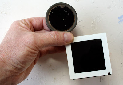
For centuries artist have used darkened mirrors and smoked lenses to help them view a real landscape in simplified tonal values.
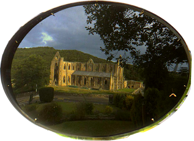
By the nineteenth century these optical devices became widely known as “Lorrain mirrors” or “Claude glasses.” Their darkened reflections suggested the work of landscape painter Claude Lorrain (1604?-1682). Lorrain himself, though, probably never used them. The name appeared long after his death, and for a time the devices were associated with the English poet, Thomas Gray (1716-1771).
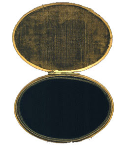
Antique Lorrain mirrors were usually elliptical and slightly convex to allow the viewer to see the entire scene in miniature.
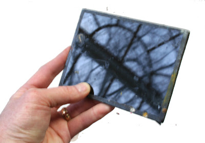 Here’s a simple homemade Lorrain mirror fashioned out of an ordinary piece of glass painted black on one side. The backside and edges were then protected with tape. In a pinch you could get the same effect by looking at the reflection in a lens of your sunglasses cupped in your hand.
For artists nowadays, the benefit of studying a darkened reflection is that it desaturates the colors, reduces the detail, and organizes the tones. By grouping the darks together into large masses, the vista takes on a romantic or picturesque aura. You can immediately see how to proceed with your tonal design. It’s easier to compare the relative brightness of light values—such as clouds compared to white buildings.
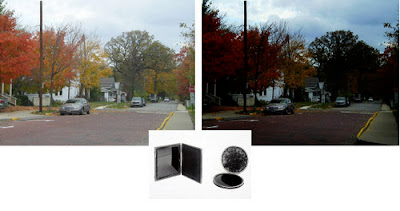
Here’s a photo manipulated with Photoshop to simulate the effect. I occasionally use Lorrain mirrors to help me choose a motif, or study it before commencing to paint. They’re also helpful for a mid-course check during the painting. They guard against the tendency we all have to lighten the values of the shadows, which results from our eyes adjusting to the dark areas and seeing too much detail in them.
If you prefer looking through a transparent viewer rather than seeing a reflection in a mirror, you can improvise your own Lorrain glass using a dark gray filter, a welding goggle, or an unexposed piece of film.
In an era before photography, both artists and tourists enjoyed the novelty of looking at real landscapes through gold- or blue-tinted Lorrain glasses. A heroine from an English play dating from 1798 said, as she peered through her warm-tinted glass: “How gorgeously glowing.” Then switching to a dark glass, she said, “How gloomily glaring.” Finally, looking through a cobalt-tinted glass, she exclaimed, “How frigidly frozen.”
Final quote from Spectacles and Other Vision Aids: A History and Guide to Collecting, by J. William Rosenthal. p. 276,
Tomorrow: Color Wheel Masking
We take it for granted that all landscape painting in oil should be undertaken “alla prima,” that is, starting with a blank canvas and completing the entire statement in one session, keeping all the adjacent areas wet together. Below is a tree that I painted in this way.

Alla prima is a great way to work if you want a soft, painterly handling, but it can be a problem if you want to describe intricate details against a light sky, because the wet paint of the sky interferes with the dark strokes that you want to place on top.

Earlier painters generally didn’t work alla prima, at least not in the studio. Painters before the advent of Impressionism would typically paint a sky first, let it dry, and then paint the trees and other foreground elements over dry passages.

I have experimented with applying this idea to plein air painting and I can recommend it to you as an option. The tree study above was done in this way. It’s useful in situations where your chief interest is in the complex middle-ground tracery: road signs, telephone poles, sailing ships, trees, or intricate cloud formations.
The cloud study (detail, below) which I showed in an earlier post, was painted over a cloud-free sky panel.
 Since clear skies are fairly standard and predictable, you can prepare a set of “sky panels” a few days in advance of an outdoor painting session. Cover the sky panel with a typical gradation of sky-colored pigments, and let it dry completely.

Later in the field you can rub the surface with a thin layer oil painting medium to make it receptive. You can then paint the foreground details of trees or foliage without any danger of the sky color lifting up and mixing with the dark colors of the branches or leaves.
Tomorrow: L’Art Pompier
How much did the Hudson River School painters alter what they saw? Did they move mountains and trees around to make a better landscape composition?
 The quick answer is that they moved rocks and trees, but not mountains.
 Thanks to the work of John J. Henderson and Roger E. Belson of the White Mountain Art and Artists organization of New Hampshire, you can see for yourself. Mr. Henderson has taken photos from the same vantage points that the 19th Century artists used, giving us a remarkable chance to compare each painting with the scene that inspired it.
 It’s hard to be exactly sure what foregrounds the artists were looking at 150 years ago, but it’s clear that they drew the mountain contours very carefully. They may have increased the height a bit, but they were faithful to the silhouette.
 The issue of mountain contours was a hot topic among 19th Century landscape painters. Asher B. Durand (1796-1886), one of the co-founders of the Hudson River School, and its most influential writer, addressed the subject in his Letters on Landscape Painting (1855). The artist, he said, may:
“…displace a tree, for instance, if disagreeable, or render it a more perfect one of its kind if retained, but the elevations and depressions of the earth’s surface composing the middle ground and distance, the magnitude of objects, and extent of space presented in the view, characteristic outline, undulating or angular, of all the great divisions, may not be changed in the least perceptible degree, most especially the mountain and hill forms. On these God has set his signet, and Art may not remove it when the picture professes to represent the scene.”

I would warrant that these very words were ringing in the ears of each of the artists who painted these pictures. (Click on pictures to enlarge.)
Thanks,
Chris.
For 12 more examples, visit http://whitemountainart.com/PhotoComparisons.htm.
For more about Durand, visit http://www.outdoorpainting.com/History/Asher-Durand.php
Full text of "Letters on Landscape Painting" appears in the book Kindred Spirits, by Linda Ferber, 2007
Tomorrow: Sky Panels
Here are two plein-air paintings I made during of the last hour of the same day, as the sun was setting over the Hudson River. I painted them about 15 minutes apart.
 In the second painting, on the right, the sun was sinking into a bank of clouds. The air was full of haze and mist, which reduced the intensity of the sun, allowing me to look safely directly towards it.
Photographers call this time of day the golden hour, or magic hour. The sun is so low in the sky that its light travels almost parallel to the surface of the earth. Or to put it more another way, the rays of light are intersecting the sphere of the earth on a line of tangent, like a needle pushed into an orange peel at a very shallow angle. Sunlight travels through much more atmosphere at this angle than when it’s coming steeply down to earth at noontime.
 Because of this greater distance traveled through the air, more bluish wavelengths are scattered out of each parcel of light. This makes the sky above a richer blue. The remaining sunlight is weaker in overall brightness, and more orange or red in color.
In the sky itself, there’s a noticeable progression of color from the blue above to the soft yellows and dull reds near the horizon.

If you face away from the sun, the sunlight shines on forms with a golden color, and the shadows are relatively bluish. In this painting from Dinotopia: First Flight (1999), I chose to light the scene with this warm golden hour light. The bottom half of the forms are beginning to be covered with a soft-edged cast shadow. Note that light hitting the top of the clouds behind the figures remains relatively white compared to the light that’s closer to the ground.
In fact whenever there are several layers of clouds at various altitudes, the higher clouds are always whiter because the light touching them has traveled through less atmosphere and therefore has had less blue light removed from it.
 I painted these plein air sketches after the sun had set. But it’s still during that golden hour. If you face toward the spot where the sun set, there’s a bold red-orange glow in the sky. The ground below is dark and cool.
Here’s where a painter can beat the camera. Our eyes can see so much more color than the camera can see because they can accommodate to huge range of brilliance.
Gradually a grey layer rises up from the horizon opposite from the sun. This is the plane of the cast shadow of the earth itself.
When you’re painting golden hour colors from life, it helps to premix the colors before the moment arrives, anticipating the effect you want to capture. Then, as the light fades, you can work almost from memory as you look at the darkening colors on your palette. Or you can use a little fluorescent flashlight to illuminate your work area.
 Eventually the warm colors drain out of the sky entirely. Sometimes a soft violet glow is all that remains. At this point of dusk, artificial lights begin to stand out, like these streetlights in the small town of Corofin in Ireland. From the doorway of a little pub behind me, the sound of accordion and fiddle was just starting up for the night.
During the first hour of morning, these color progressions are reversed.
I'm usually sleeping in, but the early riser is lucky enough to behold what Wordsworth called the “vision splendid” before the colors “fade into the light of common day.”
Tomorrow: Pizza Dreams
Yesterday we looked at how the French academic masters used overcast light to orchestrate complex scenes. Those artists are a tough act to follow, but I thought you might like to see how I’ve tried to put these lessons to work in my own paintings.
To get the hang of it, I’ve done some plein air sketches in overcast weather. An example is White Church, which I showed in an earlier post.
 Here’s an 8x12 inch sketch I did at a boatyard with the overcast sky just beginning to break up. I love painting in this light because it doesn’t change much, even in four or five hours. This is not the case with direct sunlight, where in the span of two hours the light completely changes.
 When it came to inventing a complicated fantasy panorama like Dinosaur Parade, (1989, detail above) I used overcast light. I was also influenced by Sir Lawrence Alma-Tadema, who loved to set his scenes in indirect light, (in his case, usually open shade).
I used it again on Dinosaur Boulevard, shown in a detail below. Link for full composition. This light made it easier to show the patterns of the costumes and to render most of their forms close to their true local colors. I put a lot of haze in the air to push back the background planes.

In art school you don’t often get a chance to paint overcast light conditions because there’s no way to simulate it perfectly indoors. A very large north-facing window comes close, but studio north light is still quite directional compared to actual overcast light. Even a bank of fluorescent fixtures across the ceiling doesn’t match it exactly because the light needs to be coming equally and evenly from above.
Lighting experts in the CGI animation field told me recently that overcast light is one of the hardest light conditions to simulate on the computer because it involves such a vast number of mathematical calculations.
P.S. Thanks to Grant Butler of the Oregonian for naming Dinotopia “one of the 10 great moments in dinosaur pop culture.” Link.
Tomorrow: The Golden Hour
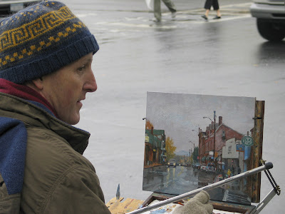
 With the thermometer over 50 degrees and the snow rapidly melting, Jeanette and I headed over to the nearby town of Rhinecliff today to paint a streetscape. In Rhinecliff, everyone gets their mail at the Post Office, so a lot of people walked by with their little kids, and you could hear the faraway sounds of hammers and radial saws.

Here's the pochade box, with what's left of the colors: ultra blue, white, naples yellow, cadmium yellow light, burnt sienna, burnt umber, and Winsor red. Because the whole scene consisted mainly of warm and cool greys, I premixed a warm string and cool string in the center of the mixing surface and worked mostly from those colors.
Every Sunday I’ve been sharing some thoughts about color, and today I want to touch on limited palettes.
 When we were in grade school we all envied the other kid who owned the giant-size Crayola set. In the art store we still ogle the all the delicious colors.
But it’s a good idea to limit the range of color pigments or the “palette” that you use on any particular painting. There are at least four good reasons to limit your palette.
 1. If you have all the colors squeezed out around the edges of your mixing surface, you might tend to use them all in a single picture. I present my own book cover illustration, called “Glory Lane,” as a negative example. I did this painting as an experiment in bad taste. This is what happens if you use every color in the spectrum and fill the whole canvas with details. Visual cacophony!
 2. If you construct a picture out of fewer colors, the resulting mixtures are more likely to be unified and harmonious—and more interesting. Every color you mix is automatically related. It’s easier to convey a mood or to explore strange realms you wouldn’t normally choose. Magazine illustrators in the 1920s and 30s were often required to paint in two-color palettes, like the black and orange painting above by Mead Schaeffer. The two-color discipline made those old illustrators into very resourceful colorists.
 I painted this head study in a sketch group with just a blue and black and just a hint of warm. I wouldn’t have tried this color scheme if I weren’t forced to by a limited palette. Below is the actual color of her forehead, the warmest the colors ever get in this scheme:
 3. The third reason to limit the palette is to force yourself away of color mixing habits. If you have colors called “flesh tone” and “grass green,” you’ll probably reach for them when you’re painting skin or a lawn.
It’s a good idea every once in a while to leave of all your browns and greens in the cabinet and mix them from the primary colors instead. The legendary background painter of museum dioramas, James Perry Wilson, never used browns or black because he wanted to keep his mixtures more pure. There’s nothing wrong with black or brown or green, but you should know how to mix color without them, too.
 You can make color wheel tests to preview the range of possibilities with limited palettes. Click to enlarge and see their component colors. Painting from one of these limited sets is like writing music for a string quartet instead of for a symphony orchestra.
4. The final reason to consider limited palettes is that they’re portable and you can save money. In fact you can paint almost anything in nature with just four or five colors. There are a lot of limited palettes that still give you a full range of mixtures. Below: a plein-air painting I did in Windham, New York.
 One simplified palette that I particularly like for landscape painting in oil is from John Stobart in his excellent book, “The Pleasures of Painting Outdoors.” He recommends:
Cadmium Yellow Light, Winsor Red, Burnt Sienna, Ultramarine Blue Deep, Permanent Green (optional), and Titanium White.
You can get a good “black” from Burnt Sienna and Ultramarine. This is a good palette to use in miniature plein air kits, like thumb boxes. You can paint almost anything in nature with Stobart’s six colors.
 Sometimes, like a madman on a crash diet, I like to jettison even more colors from this already spartan palette. Here’s a painting that I did with just White, Ultramarine Blue, Burnt Sienna, and Winsor Red. Doing without green or yellow was a challenge, but I enjoyed pushing the limits.
 Here’s another painting with just black, white, and burnt sienna. I starved myself from blue, yellow, and red. The reason was that I just wanted to think about form, not color.
There are lots of other formulations for limited palettes, both for oils and watercolors, but that’s enough from me. Your turn. Please chime in.
Yesterday we took a look at how light tones are reflected in still water. The dark tones in the scene—trees and such—are a different story.
The way they reflect in water depends on two factors. One is the amount of silt or sediment in the water, and the other is the amount of light shining into the water.

If the water is dirty, and if that dirty water is directly illuminated, the darks will get progressively lighter (and usually browner), as they did in this on-the-spot oil sketch of the River Suir in Limerick, Ireland, after a heavy rain. Reflections are at their purest only at dusk, when no direct light is touching the water. Muddy water in those conditions will reflect just as well as clear water.
The reflections differ from the source in another way. In the reflection, the image is distorted by the wavelets on the water. Even if the wind is very light, tiny waves break up the reflection, and dissolve horizontal lines. Vertical lines, though, are still preserved in the reflection.
 For example, this detail is from a scene in Journey to Chandara. It shows a lake in the desert at dusk reflecting a seated statue. The horizontal lines of the base of the statue are not reflected, but the verticals appear quite clearly.
 Let's do a reality check on that last point. In this photo of fishing boats in a harbor, you can see how reflections favor verticals over horizontals. In the reflection the lines of the gunwales quickly become indistinct, while even the finest masts and poles are still crisp and sharp.
In the words of John Ruskin, who wrote eloquently on this subject in the early 19th Century, "All motion in water elongates reflections, and throws them into confused vertical lines."
On Monday, in the final installment on water reflections, we’ll take a look at how reflections break up images in water that's a little more disturbed.
When a scene is reflected in water, it appears almost like an inverted mirror image.
Almost. But the reflection is different in a few important ways. First off, the light tones that you see in the scene above the water will appear a little darker in the reflection. These light tones might be clouds in the sky, a white house, or light-colored leaves on riverside plants.
 The reason these light tones appear a little darker in the reflection is that some of the light penetrates into the water, rather than bouncing off the surface. This light is the very same light that you would see if you were snorkeling under the surface. If water were a perfect mirror, fish would live in pitch darkness! Because each parcel of light is reduced by the amount of light that is diverted into the water, the amount of light reflected is also reduced.

Note how the colors of both the blue sky and the orange bush darken when they're reflected in this wintry stream.
Water approaches the reflectivity of a perfect mirror only when you’re looking straight across it at a very shallow angle. As the steepness of the angle of reflection increases, the percentage of light entering the water also increases. If you are looking steeply down onto the surface of the water, not much light from the sky will be reflected. Think how dark the water in a lake or ocean appears when you look straight down into it from the side of a boat.

This light-eating phenomenon (called refraction, as opposed to reflection) came into play in this painting of a white resort perched above a lake. I was looking downward on the water, and was surprised how poorly the water reflected the white rocks along the lake's edge and the light stones on the building. I painted it the way I saw it, but it still looks strange to me.
 As a reality check, here's a photo of the same place, shot with a steep downward angle. It shows the same effect, with most of the light tones disappearing into the water, rather than reflecting off its surface..
Now that winter is here, only the crazy people go out to paint.
I learned how to survive winter painting from one of my crazy friends, Jim Cramer. He’s far more intrepid than I am. He does all his paintings outdoors, year round. You’ll find him out there in the teeth of a gale or beside a frozen river down to about ten degrees above zero.
I wimp out below about 25 or 30 degrees Fahrenheit or about minus 4 degrees Celsius. But I love painting snow because the colors of light and shadow are much more obvious, especially around the “golden hour.”
 Here are a few tips, mainly on what not to do:
--Fingerless gloves keep your hands warm without losing your grip on the brush. Put your non-painting hand in a warmer glove.
--Don’t use a metal mahlstick like I’m doing here. A wooden one is much better.
 --The glare of full sun on snow makes it hard to judge color. Try painting late in the day when the shadows lengthen.
--If you’re painting in watercolor in subfreezing temperatures, don’t replace the water with white wine, because that freezes, too. Use vodka instead.
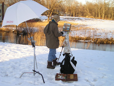 --That white umbrella on the C-Stand is meant to cut direct sunlight from behind. If the wind picks up, the C-Stand should be weighted with a sandbag.
--Your feet and your fingers are the first to freeze. Wear insulated boots, and try standing on a carpet sample instead of directly on the snow.
“You can’t cast a shadow over deep water,” says an old law of landscape painting. It’s usually true, but only when the water is clear. If the water is murky you can see cast shadows, but their edges are more diffuse than shadows cast over on land because the light transmits throughout the medium of the diffused particles.
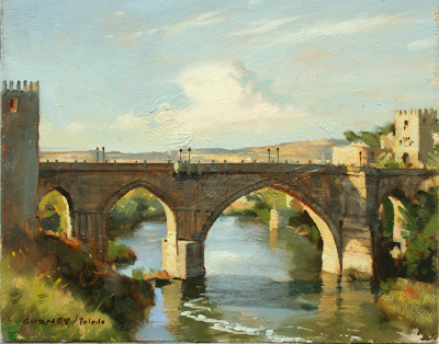 What happens when a cast shadow on water crosses a reflection? That’s what I was trying to capture in this 8x10 oil sketch, painted on location of the bridge leading into Toledo, Spain. It was a mind-bending challenge of color mixing.
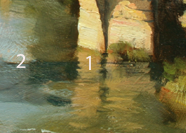 The simple answer is that the reflection “wins,” as you can see in the closeup. The light colors reflected from the stone piers (1) don’t get any darker where they cross into the shadow. But to the left, I observed the weaker reflections of the sky and the trees (2) became influenced by the deeper colors of the water in the cast shadow.
 I used the light, color, and basic composition of this plein-air study as my source for the painting “Ruined Bridge,” in Journey to Chandara. The main change was to add a half-collapsed tower covered with vines and a makeshift house.
--------
By the way, let me express my regards and thanks to all at Rhythm & Hues, Art Center, LA Public Library, DreamWorks, Imageworks, and Sony Pictures Animation. I'm very grateful for your welcome. Meeting all of you fellow artists—and seeing your incredible work has been so inspiring to me that I have been walking on air. And to my readers, please be patient for the blog posts about those visits, because with all the travel it may take quite a while to catch up.
Here’s a 16x20 inch oil study of thunderheads on a warm July day.
I was amazed as I worked over a two hour period how fast the scene changed from minute to minute. Watch this time lapse video of a similar cloud formation boiling away. As soon as you have the shapes established, you have to paint the details from memory. But you can keep studying the scene for the overall color relationships.
 The brightest whites and the sharpest details are reserved for the emerging billows at the top. The purer white colors of the closer clouds transition more toward warm pink or dull orange as the clouds go back in space. Light that has traveled farther has lost more of its cool wavelengths through scattering.
Whenever you paint these attention-grabbing "cumulus castellanus" thunderheads, look also for the shreds of old clouds sheared off by wind currents and dissolving back into the air. These often-overlooked “fractus” or “scud” clouds are the other side of the cloud’s life cycle of growth and decay. They lack the compact density of the billowing clouds, and are never as white.
To celebrate autumn, here’s a step-by-step painting demo from a local farmstand.
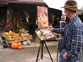
The pochade box is set up on a camera tripod, with the white umbrella mounted on a C-stand nearby. It’s an overcast day, so the umbrella isn’t really necessary as a light diffuser, but it protects against occasional sprinkles of rain.

To speed up the painting, I spent about 15 minutes premixing little piles of the main colors of the scene: dull yellow, orange, red, and cool gray. For each hue, there are about four or five separate steps of tone or value. The palette cups hold Grumtine turpentine and Liquin. The brushes and palette knife hang off the board on the left.
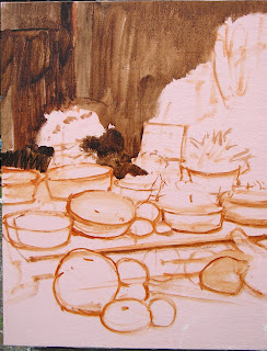
Here are the basic shapes sketched in with a bristle brush using burnt sienna and raw umber thinned down with turpentine.
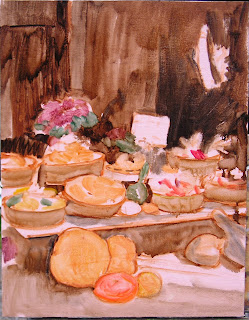
Now the tones are lightly washed in transparently, just to cover the whiteness of the canvas.
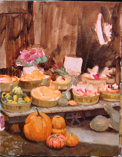
Here it is about an hour and a half along, with the pumpkins in the foreground and the basket of ornamental gourds at left finished. Time is racing by, and customers keep coming up and trying to buy the gourds.
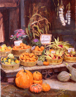
Here’s the finished painting after about four hours of work time. This was a "paint out" day, so it had to be auctioned off as a wet painting later that afternoon.
This amount of painting would have taken about four days in the studio. There’s something about the urgency of being on the spot that speeds up painting decisions. But the real secret to painting fast either in the studio or on the spot is premixing pools of color, because otherwise most of the time is wasted with color mixing.
When sunlight travels through a semi-transparent material, the light becomes richly colored. Light that just bounces off the surface is fairly dull by comparison.
This “stained-glass-window effect" is called transmitted light, and you often see it when the sun shines through the green or yellow leaves of a tree. You might also see transmitted light when the sun backlights colored balloons, a sailboat’s spinnaker, or a translucent nylon awning.
 This on-the-spot oil painting of a skunk cabbage plant is a study of transmitted light. The bright yellow-green area is much more intense than the other greens.
Here’s the picture again, with numbers superimposed in each area of the foliage to analyze what’s going on with the light and color:

1. Transmitted light, with intense chroma or saturation in the yellow-green range.
2. The leaf in shadow, facing downward. This is the darkest green, and would be even darker if it wasn't picking up reflected light from the adjacent leaf seen edge-on.
3. The leaf in shadow, facing upward. These ‘up-facing planes’ are blue-green, because they are picking up the blue light from the sky.
4. Sunlight reflecting off the top surface of the leaf. This is the highest tone or value, and the most textural, especially where it transitions to shadow. But the chroma is not very intense, because most of the light bounces off the waxy cuticle of the leaf.
When you are painting a faraway tree backlit by sunlight, it’s good to keep in mind these four conditions: transmitted, downfacing shadow, upfacing shadow and sunlit. These colors, visible in the skunk cabbage up close on a micro scale, are present here, too, mixed together like tiny pixels even if you can’t really see the component leaves.

The distant foliage is a composite of all four color elements, blended with the atmospheric effects. As you can see in this faraway view of autumn maples, there are more leaves shining with transmitted light at the lower left margin of the tree. The leaves in the central area are darker and duller because they’re lit by the cool skylight.
Blog reader J. Fullmer asked about the disaster I referred to a while ago on the posts called From Endor to Chelsea and White Umbrellas. To recap, my artist friend Chris Evans and my wife and I were up in the Catskills doing some plein air painting.
We staggered down the rocky banks of Kaaterskill Clove in search of a waterfall called Fawn’s Leap, a favorite motif of the early Hudson River School Painters. I found a good vista from the middle of the stream, where a flat rock the size of a kitchen table provided just enough space to set up my tripod, pochade box, and white umbrella.

As I worked, the water surged around me from several days of heavy rain. The painting was finished in time for lunch. I left everything set up and hopped across the boulders to join Chris and Jeanette for a sandwich and coffee.
Suddenly there came a blast of cold wind down the clove. I heard a shout: “It’s going over!”
I looked up to see the umbrella fill like a sail and carry the whole rig—tripod, brushes, palette, and painting— into the rapids. Thinking quickly, Jeanette grabbed the umbrella, which had broken free and was floating upside down, circling like a leaf in one of the side eddies. I stood astraddle two boulders to rescue a couple of the brushes as they drifted by. The rest of them had entered the main current and disappeared into the next set of rapids.

Chris fished out the tripod and intercepted the painting as it floated downstream. It was cruising half-submerged with the wet oil palette stuck against the backside of it. Amazingly, the painting suffered only minor damage from the water, and only a few thumb prints and scrapes where it had bounced against some boulders.
The only moral to this story is to take down the umbrella when you break for lunch!
Christopher Evans headed up the matte painting department at Lucasfilm during Return of the Jedi. He later rendered dozens of computer-generated illusions for Matte World Digital. But it was always his dream to have a one-man show of his oil paintings at a top gallery in New York City.
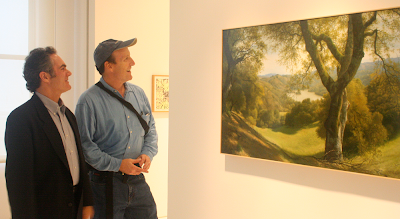
Yesterday Jeanette and I arrived from the pouring rain for the unveiling of “Open Space,” an exhibition of a dozen large landscape panoramas at the Fischbach Gallery in Chelsea. Mr. Evans’s mastery of light, air, and atmosphere were in full display here, with fleecy cumulus cloud forms and rolling California hillsides stepping back into luminous distances.
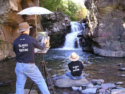
Mr. Evans, it may be revealed, is a founding member of the Slaves to Nature, seen here painting Fawn’s Leap along Kaaterskill Creek. I was working behind him in what appears here to be a tranquil section of the stream, little suspecting that disaster was about to strike. But that’s another story for another post.


.jpg?picon=1009)
 As electric lighting replaced flame-based light, new colors entered the nightscape. Fluorescent light has a yellow-green cast. Sodium vapor gives off a harshly monochromatic orange. Mercury vapor’s blue-green color drains the blood out of flesh tones. Other kinds of lights: metal halide, LED, neon, and arc lamps, each have their own color qualities. You’ve probably noticed the variety when flying over a city at night.
 I painted this little oil sketch from observation while balancing on a hotel balcony in the predawn light in Anaheim, California. The technique is fairly crude—and a bit smudged from when I accidentally dropped it. What interested me was the contrast between the orange sodium vapor (foreground) and the green mercury vapor (middle ground).

 In this concept sketch by Mead, a mechanical creature stands above a circle of warm light, while a saturated, monochromatic cyan illumination infuses the rest of the scene. The effect is magical and otherworldly.


There's something strange about the first painting.
Something I learned in optica class : our eyes tend to 'white-balance' themselves.
This means that during the 'twilight hour' grey clouds will appear blueish under yellowish street light.
This is because the yellow street light is our 'reference' neutral colour, and thus everything 'to the left' of this center will appear blue : including grey.
Sorry, this probably isn't clear enough, but I guess this is a topic by itself.
Rule of thumb is that a landscape background tends to have a complementary coloured cast in respect to the artificial lighting of the foreground.
But the first painting doesn't comply. The sky is still grey. It should be blue-green (compl. of orange).
Why is it still grey ?
The street lights in those days weren't bright enough to 'dominate' a scene, and also, daylight was still too bright at the given hour of the painting.
So the 'grey light' remained dominant and thus also the 'neutral center'.
The painting shows a special moment within the twilight-hour, that we hardly ever get to see nowadays with those strong dominating streetlights.
Hey, you can test this yourself on a grey evening. Look outside through the window. Once the grey sky appears blue, turn of the lights in the room (hopefully there's not too much street light) and you will see the clouds turn grey again after a dozen seconds.
Put on the light again, look a bit around the room first to adjust and the grey clouds turns to blue again.
I just love the twilight hour !
Soory to be spamming with even a second post after such a long one, but I got scared after the first post.
I'm slightly colour-blind, so maybe I got the first painting all wrong !
I checked with the color picker tool in Photoshop.
Phewww...I was right : street light is orange, very red-ish orange actually.
And the background is indeed grey BUT...(and reason for this second post) :
It DOES have a blue-green cast, but only so slightly that it's hardly noticable (for me at least).
Great points, Erik. That Cortes really is grey, and a bit atypical for him, maybe because he was trying to evoke rainy weather. You're absolutely right about the dimness of real lamplight and the white balance of the eye. The same grey sky would look red violet the moment you leave a room lit by fluorescent.
In fact you anticipated a future post that I was planning about my theory for the intense "Maxfield Parrish blue." It's the color you see outdoors at dusk for about two minutes after you leave a room lit by incandescent light. Both Parrish and Cortes grew up in the lamplight era and conveyed a nostalgia for it into the electric age.
Illumination other than sunlight is a fascinating topic. Of special interest to me is night painting; I just finished writing an article for The Artist's Magazine on painting the nocturne en plein air. (It'll be out in October, I think.)
One key element you mention that I had forgotten is that mixing light is different from mixing pigment. (Mixing pigment color is a subtractive process; mixing light color is additive.) It's not such an issue when you're painting under moonlight and that's your only source of illumination, but it can be critical when you have different types of illumination shining on an object, as you mention. This is where painting from life helps; you'll observe that a red light and a green light will make yellow rather than a (theoretically) neutral grey.
Thanks, Michael,
I can't wait to read your article in Artist's Magazine.
Everyone should also check out the blog of Craig Stephens, who just posted a new streetlight nocturne at craigstephens.blogspot.com/