


 By: Chris Whetzel,
on 5/10/2011
By: Chris Whetzel,
on 5/10/2011
Blog: Chris Whetzel Illustration (Login to Add to MyJacketFlap)
JacketFlap tags: sports, advertising, landscape, editorial, interior illo, Add a tag
By: Chris Whetzel,
on 5/2/2011
Blog: Chris Whetzel Illustration (Login to Add to MyJacketFlap)
JacketFlap tags: Add a tag
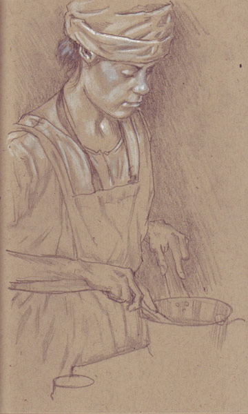
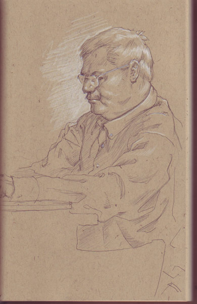
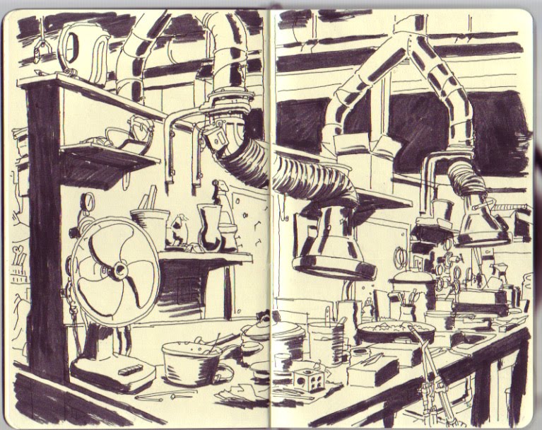
Doodles in a toned sketchbook. Obviously, I have yet to figure out working on toned paper, but here is the progress while I'm "in the trough."


 By: Chris Whetzel,
on 4/25/2011
By: Chris Whetzel,
on 4/25/2011
Blog: Chris Whetzel Illustration (Login to Add to MyJacketFlap)
JacketFlap tags: Add a tag

Its Nascar month here at chris-whetzel.com! After recently completing the previously posted Dale Earnhardt portrait, I was thrilled when Karen at Sports Illustrated requested another portrait-approach for their Sports Illustrated Presents: Nascar 2010-2011 issue. This one was to be a bit trickier though as the article made predictions about future Hall of Fame inductees along with an estimated date of induction. Karen asked that I stick to particular racers; she wanted to focus on the "young guns" featured in the article: Kyle Busch, Joey Logano, and Denny Hamlin. The art direction from Karen and Craig requested I keep it pretty straightforward with easily recognizable headshots.
Sketches:
#1: Straightforward portrait of the trio
#2: Wearing cool shades is quite common in Nascar so I tried reflecting their years of induction
#3: Along with sunglasses, sponsor-hats are also predominant among racers in the sports; luckily all three liked to wear glasses and hats :)
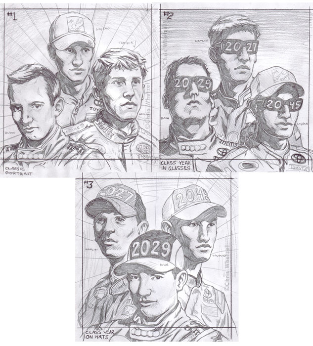
The Ads like sketch #2 with the following email quote: "The drivers look very heroic and we thought to make them into a bronze plaque with the words 'Hall of Fame' behind them. We want them with out goggles and without years."
That was fine with me. My only issue was drawing Kyle Busch from that viewpoint proved difficult: I just couldn't get it to look like him! So I finally just p'shopped him from another sketch since I liked that drawing more anyway. Karen was fine with it, and the revision was approved to be rendered as "bronze" with a new border and the words below:

Final image:
By: Chris Whetzel,
on 3/20/2011
Blog: Chris Whetzel Illustration (Login to Add to MyJacketFlap)
JacketFlap tags: editorial, conceptual, interior illo, Add a tag
Howdy folks!
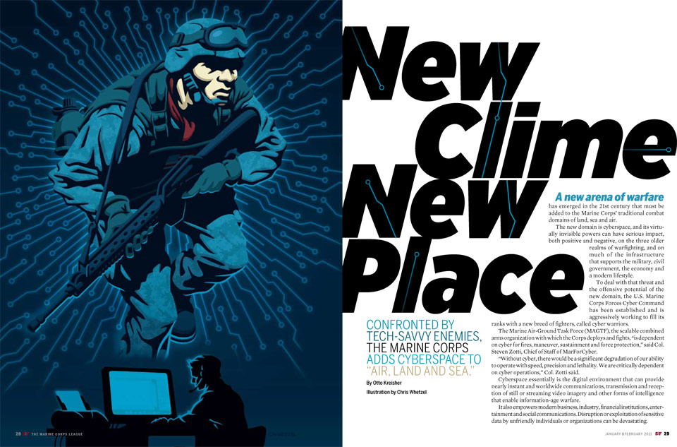
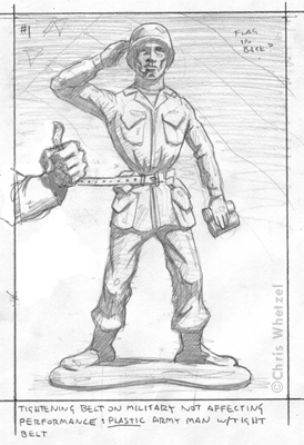
The Washington Post is a paper that I've unfortunately had to turn down for work on a few occasions due to a full schedule. It was always a bummer, and I always felt guilty doing so since I the topics were always of interest to me. So I was very happy when Kristin the AD called with a project just as I was wrapping up a few projects! The assignment was perfect for me as it was a great opportunity to draw some soldiers which I was hoping to do after recently watching the documentary Restrepo. I have mad respect for soldiers, and I always take great pride in creating artwork depicting these everyday heroes.
The subject of the article is about how the U.S. can remain a superpower while retaining a smaller wallet. With Congress looking to make drastic budget cuts, the article analyzes how military cuts would be beneficial to our economy as well as how the military could continue to operate at a high performance without unnecessary excess.
Sketches:

 By: Chris Whetzel,
on 3/10/2011
By: Chris Whetzel,
on 3/10/2011
Blog: Chris Whetzel Illustration (Login to Add to MyJacketFlap)
JacketFlap tags: landscape, editorial, conceptual, interior illo, cover illo, Add a tag


Now some folks might ask if I supported the Republican or Democratic side of the election. I will just say that I try to keep my personal viewpoints on the back burner in situations like this. I think it is more professional to be objective with assignments like this unless the article has a certain slant to it.
Enjoy the Day,
By: Chris Whetzel,
on 3/3/2011
Blog: Chris Whetzel Illustration (Login to Add to MyJacketFlap)
JacketFlap tags: Add a tag
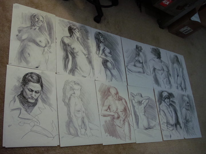
I set up an old pc that was gathering dust bunnies in the closet, loaded it up with nude photos from the internet and art model cds, and I have been doing an odd approach to figure drawing. Now obviously, this is no where near as good as a live model, but the sessions in Philly are hard to attend with my schedule so I gotta make do:
 By: Chris Whetzel,
on 2/9/2011
By: Chris Whetzel,
on 2/9/2011
Blog: Chris Whetzel Illustration (Login to Add to MyJacketFlap)
JacketFlap tags: Add a tag
Howdy! Wow, I am re-opening this blog! Hooray!
I decided to start using this blog as a place to not only post recent art but also as a place to just wax intellect and perhaps mount a soapbox every now and then about whatever crosses my mind. I'll try to limit such outbursts to art and illustration, but i make no promises :)
So I guess we can do the art first. Here is a piece I recently did for John at Barron's; the premise of the article was how the U.S. economy may be following in Greece's recent financial footsteps; Greece is dealing with a massive amount of dept in the wake of the world's recent economic turmoil.
Sketches:
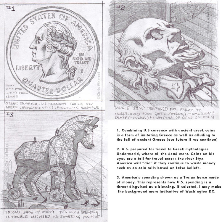
I was glad that John went with the Trojan horse-concept as his choice for a final:

My apologies for the lack of recent posts; it has been pretty busy around here. In addition to assignments, I have started up an impromptu weekly figure drawing session where each artist takes a turn or two posing; its saving us money and its a fun time. Also, I'm working alongside my brother on a project I hope to devote more time to in the future; I think self-initiated projects are the best! Uh, no offense to art and design directors! ...awkward silence...
Uh yeah, so I've also decided to take on some additional reading on creativity and artistic viewpoint in an effort to expand my horizons, so to speak. I hope to share any discoveries and thoughts in future posts; similar to the sketchbook posts, perhaps I'll try to start a regular series of posts devoted to recent reading. In various discussions, I have come to realize that I can confidently say that I have learned SO much more about art and illustration AFTER graduating from college. Now, I'm not saying that college did not teach me anything; I am saying:
1. My desire to learn actually grew after school. Upon graduation, I was drawing for myself more often (and continue to do so); more recently, I have developed this hunger to read any book, blog, or article about making art in the hope of improving myself and the work. Perhaps its just me growing up or maybe I'm at the point where I just want to expand as an artist and not pump out the same art for the next 50 years. Or maybe I'm just confused about what I should do next because I've found myself doing what was always the ultimate goal with my life: supporting myself by making art. I think everyone hits a point in their life where they realize no one has ever prepared them for what is next; you've progressed beyond what you've been taught and the knowledge you amassed isn't answering new question you are asking yourself.
So oddly enough, I'm actually re-reading books assigned in college because:
2. College can be a bit crazy. I'm not talking about binge-drinking frat parties but rather a very demanding workload mixed with artistic confusion and trying to figure out a future for yourself. With so much going on, it was a bit hard for me to retain much of the knowledge I was meant to acquire; the focus was on learning the material in order to write that paper or to ace that midterm. Focusing on those goals resulted in my not taking readings to heart and thus eventually forgetting to apply them to my thought processes.
By: Chris Whetzel,
on 5/11/2010
Blog: Chris Whetzel Illustration (Login to Add to MyJacketFlap)
JacketFlap tags: people, portrait, editorial, conceptual, cover illo, Add a tag
Hello, all. Here is a new post of artwork. Also, please take note that this will be the last post for this blog. For some time, I have been running this blog as well as a second blog that feeds to chris-whetzel.com. Initially, this was more of an self-motivation blog to keep myself on track. But now, seeing as they are basically the same, I will not be posting to this blog from here on. Please update any feeds or following by switching over to: http://whetzelnews.blogspot.com/.
Now I know the other blog isn't pretty, but it feeds directly to my website where it does not need a header and such. No frills; simple simon. Sorry!
And now for some art. As I mentioned a few posts back, an assignment from Forward Magazine involved a cover and an interior assignment. For your enjoyment, here is the second installment of sketches and artwork from that commission. As a brief refresher, the artwork was for an article addressing concerns that the United States is still in economic trouble despite the stimulus package and the bank bailouts.
Sketches: Heh, I really liked this sketch! I think it was the lighting; seems like it would have been fun to take to final. However, I think it was a bit too much for the art director; also, my girlfriend said it was a little over the top. Well, you should have seen it before I photoshopped out the blood. I have yet to illustrate a piece with a snake! This has to happen at some point.
 And the same could be said for this sketch. I was really happy with my body language on this one as well as the hanky in his pocket. Was a bit too violent? But it's metaphorical violence! No? Ok...
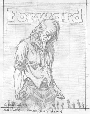 This is the sketch that the art director chose, and I can understand why. In the previous post about this article, I cited how the art director thought I had a way of delivering concepts in a dramatic but palpable manner. This sketch is subtle and still dramatic, an approach I think is often best. As such, I try to offer a sketch of this type in every assignment.
Initially, the sketch was just Sam, and I added the reaching hands at the end as I felt it just needed something to represent the middle class victims (you and me) of the economic storm. I also like the play of scale between such small figures and a giant Uncle Sam that cannot help them.
Just to be clear, I was happy to illustrate any of the above sketches; I think all illustrators have their favorites when submitting concepts, and I am always happy to take any of my ideas to finish!
Final Artwork:
By: Chris Whetzel,
on 4/30/2010
Blog: Chris Whetzel Illustration (Login to Add to MyJacketFlap)
JacketFlap tags: advertising, people, portrait, interior illo, Add a tag
Sorry for the brevity today; it seems every time I plan to blog, I have multiple projects going. I did not blog last week because...I forgot. So this week you get two pieces of art that most likely will never be on the website :)
The first piece was done for USAA's customer magazine. USAA sponsors the Army/NAvy football game, and they wanted an opening image to celebrate 10 years of sponsorship. The AD requested a combination of the two uniforms on one victorious player.
Newly Nike-designed uniforms. Not much reference to work from as they had just unveiled the uniforms a few weeks before the assignment:
Sketch in provided layout:
The AD requested a sketch revision with the arm lowered so that the figure could be larger:
Final art in layout: Looking at the layout, I can't help but mention how much it changed from what I was provided to work with; I think my initial sketch could have worked in this layout nicely.
Here is an alternate design I submitted using the official colors of the Army/Navy game while still incorporating elements form both uniforms (number and lettering of Navy, camo of Army):
And completely unrelated, here is a 30-something homemaker I drew up for a deign studio to be used on a pinball game promoting the use of anti-depressants (there is no joke here, folks):
By: Chris Whetzel,
on 4/14/2010
Blog: Chris Whetzel Illustration (Login to Add to MyJacketFlap)
JacketFlap tags: Add a tag
A few posts back I mentioned the Haiti Poster Project. I took this opportunity to do an experimental piece. Its pretty far removed from my illustration work in terms of medium, but I think its closer to my sketchbook which is quite interesting.
*UPDATE: As a member of the Visual Literacy Program, I submitted this image to a contest, and the very gracious administration has offered to float the printing costs of the posters! Thanks so much, guys!
Enjoy the Day,
Chris
By: Chris Whetzel,
on 4/14/2010
Blog: Chris Whetzel Illustration (Login to Add to MyJacketFlap)
JacketFlap tags: Add a tag
Here is some new artwork from a great client, Forward Magazine.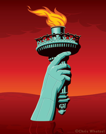
From the art director's lips (or rather, the email): "This story is simply about the great debt our nation is in. I think we want to depict the “gruesome” aspect of this topic, and really drive home the point that our debt is ruinous. Your style struck a chord with me because you’ve done several pieces that are sort of dramatic in manner, but can deliver the message in a palpable way. I’ve attached a cover template so you can also get an idea of where things fall in placement. I’d like to get 3-5 different sketches, and then we’ll choose one for cover, one for inside."
In order to milk this assignment for two blog posts, I will post some of the sketches and the interior illustration today; then I will post the rest of the sketches and the cover art later :)
I had a pretty confident idea that a certain sketch (not shown) would be chosen for the cover, so I explored a wide variety of subject matter for the other concepts. The first 3 of the 6 sketches:
Lady Liberty drowning in red ink (quote from article) explored in two sketches:

And a bank picked clean: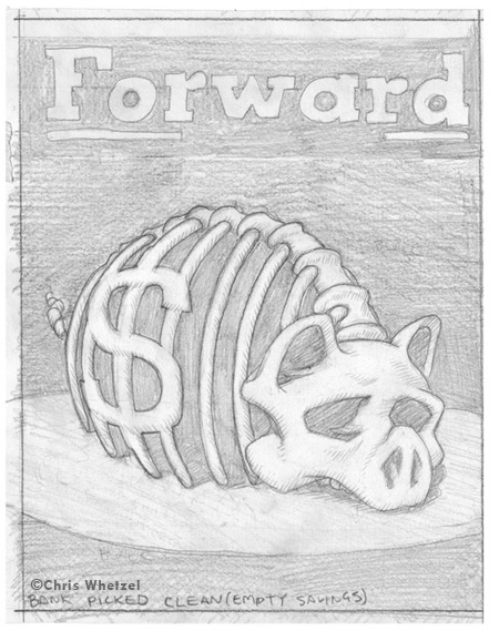
In the end, the art director went with the torch as the interior image:
Read the article here.
Enjoy the Day,
Chris
By: Chris Whetzel,
on 4/5/2010
Blog: Chris Whetzel Illustration (Login to Add to MyJacketFlap)
JacketFlap tags: sketchbook, Add a tag


Enjoy the Day,
Chris
By: Chris Whetzel,
on 3/30/2010
Blog: Chris Whetzel Illustration (Login to Add to MyJacketFlap)
JacketFlap tags: landscape, editorial, conceptual, interior illo, cover illo, Add a tag
Hi guys! I won't be chatting much as I have a busy day. So here is a quick rundown of a recent commission from Connecticut Magazine. The article was their annual "Rating the small towns," in which the towns of Connecticut are judged on crime, culture, education, etc. Cover sketches:
The article also had a spot illustration. Note how these spots tie-in with the cover themes, and yet the art director also has a choice of mixing up themes if need be. Sketches:
The art director decided that she like the first cover sketch and the gauge-theme spot illo, but she wanted to place the cover sketch's #1 on something rather than it be a giant object itself. She asked for a hot-air balloon, and I did a quick revision. The art director tried it out with the text, and she liked it. After approval, I provided the refined drawing on the right to give her a better idea of the final art:
Final artwork:
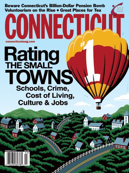 I mocked up this cover based on the text the art director tested on the sketch; I think its pretty close to the actual cover. I'll find out when the issue arrives!
Enjoy the Day,
Chris
By: Chris Whetzel,
on 3/22/2010
Blog: Chris Whetzel Illustration (Login to Add to MyJacketFlap)
JacketFlap tags: editorial, experimentation, conceptual, interior illo, Add a tag
Hello all! I apologize for not posting last week's tidbit on Friday, but it was a busy deadline day so blogging had to be pushed back. Also, I am going to be switching up the posts (basically reversing them) as I feel some people just want to skip my chatter and get to the art.
So here we go.
A few posts back I mentioned the Haiti Poster Project. I took this opportunity to do an experimental piece. Its pretty far removed from my illustration work in terms of medium, but I think its closer to my sketchbook which is quite interesting:
In mid-January, Ode Magazine contacted me seeking an illustration for an article about valuing green spaces. The article was mostly about how we are not assigning value to open spaces; we clearcut and destroy beautiful scenery for strip malls and housing.
The sketches: The final artwork:
And what else is going on? Well, its warm outside. So needless to say I cut back my work hours over the weekend to enjoy the sun. But now its back to it. I am retooling the website, and will most likely be uploading it in April or May.
Enjoy the Day,
Chris
By: Chris Whetzel,
on 3/12/2010
Blog: Chris Whetzel Illustration (Login to Add to MyJacketFlap)
JacketFlap tags: Add a tag
Hello! Welcome to another of my illustration case files!
I was very lucky to get a repeat commission from The CRISIS magazine in January. Wayne was looking for a bold image for the cover of their Hollywood issue. The main push of the issue is how there are not many African Americans in the film industry, and he wanted to work with a portrait of a film-industry African American calling others to action. The sketches: The first sketch was a spoof of the popular Rodchenko poster that was imitated for many album covers including Franz Ferdinand. Next was a Moses-type figure with film reels. Basically, with this image I was communicating that film is a way for African Americans to deliver a message by having a figure "delivering" the film to us, the viewer. Sketch 3 is pretty straightforward, and it depicts an African American man with dreadlocks that morph into rolls of film. The last sketch is of a figure calling for action through a microphone; this sketch operates on two levels by not only calling to action but also alluding to a film director using a megaphone on set.
 Wayne decided to go with the last sketch, and he requested that I incorporate the word "Action!" into the image. I tried doing so in several ways including overlaying it and using a speech balloon to isolate what I thought would be the main article. However, it turned out that it was not an article headline, but simply text to accompany the image so he chose the overlay. Final art:
 Among several color mocks, we originally decided to go with a red background and lots of bleed as he had a large amount of text to work with, but then we decided to use the figure against white. Above is the submitted final art and the final cover after the revision. I'm happy to say that we managed to stay very close to my original composition; I felt bleeding the megaphone off the right side was an invitation to the reader to open the cover. Thanks to Wayne for a great assignment!
-Enjoy the Day,
Chris
By: Chris Whetzel,
on 3/5/2010
Blog: Chris Whetzel Illustration (Login to Add to MyJacketFlap)
JacketFlap tags: cover illo, people, editorial, conceptual, Add a tag
Hi! Sorry I forgot to blog last week! I need to start putting my blog on the work schedule :)
Jake at California Lawyer contacted me at the end of 2009 with a pretty moody cover subject: the plotting behind California's Proposition #8. The gist of the story is that "for months the people backing the case had been operating in stealth mode because they wanted the federal complaint to be the lawsuit challenging the constitutionality of Proposition 8, the successful 2008 initiative that had declared, 'Only marriage between a man and a woman is valid and recognized in California.' "
The art direction of the article was to focus on the secretive planning aspect as if this is a movie scene when the bank heist plan is being planned. The sketches:
 I looked at a lot of old movie stills to get that moody, deceptive atmosphere. The second sketch was originally not seen through a door, and that was added after Jake's great suggestion. It really helped the image. The finished artwork with text I mocked over the image:
 I never received a tearsheet or saw the cover, so I faked this text to place the illustration in context; this is one of those images that looks weird without type due to the large black shape on the right. I made a few adjustments to facilitate the text such as removing the window frame, making the background into the shadow of the lamp on the yellow wall.
Enjoy the Day,
Chris
By: Chris Whetzel,
on 2/19/2010
Blog: Chris Whetzel Illustration (Login to Add to MyJacketFlap)
JacketFlap tags: editorial, conceptual, action, interior illo, Add a tag
Hi and hello!
Hooray for Friday; the new day for blogposts in my schedule! So what are the current happenings? This week featured a very nice break from a heavy workload, but I am now back at nose-to-the-grindstone (before and after this post, of course). Regardless, I got some time in on some really rewarding experiment results, and I am eager to start working those outcomes into some artwork. I am planning out a summer (and beyond) project that will be artwork in a different vein from the illustration work; I am becoming very interested in working in a more narrative manner as opposed to my usual abstract-concept approach. Basically, with this summer project I hope to explore storytelling rather than conceptual communication. As Aliyah would say, it will be artwork of "content" rather than "concept." I guess this has spawned from the return of my reading interests.
But that will all be coming down the line eventually.
And now for some art. Here is a new editorial recently completed for Carli at Macworld. the subject of the article was about unexpected uses for the Esc key. Apparently, that key can be a lifesaver! Apparently, its more than just...escape.
Sketches: Sketch #1 was ato show how powerful the key can be; its exploding off of the keyboard. Sketch #2 was a play on the multi-function aspect of the key. Sketch #3 was a exploration of the key's helpfulness; I portrayed it as air-dropped relief. Carli chose the third sketch, and I went to finish.
Completed Artwork: I wanted to keep this artwork very warm and bright. I stayed away from a blue sky as I was simply using blue skies in several pieces during that time. This illo also ran in the same issue as the IMAP mailbox image from a few post back. That image was mostly blue as well so I wanted to make the two image look completely different since they would be in the same issue.
As I said before, it was a pleasure working with Carli and I even got a compliment from another AD at Macworld on the images. Good stuff!
Until next week!
Enjoy the Day,
Chris
By: Chris Whetzel,
on 2/10/2010
Blog: Chris Whetzel Illustration (Login to Add to MyJacketFlap)
JacketFlap tags: people, editorial, conceptual, interior illo, Add a tag
Hello, hello! My apologies for the brief hiatus in posts, but I have been very busy lately! The good news is there will be lots of art to share in March and April!
I was recently contacted by Vanessa at Education Week for another back page commentary. These are always enjoyable assignments as she gives me a lot of freedom with concepts as well as image format and composition. The assignment concerning gathering data on tutor performance was very similar to a previous commission, and so I had to find new creative ways to show "investigating education." The sketches: The first sketch features a Sam Spade-like detective doing some recon.
 Sketch #2 continued the spying theme with our detective using some binoculars to gather info from a distance.
 The third sketch was a step in another direction with a literal grading of an educator. Vanessa said this sketch "made her laugh out loud," but I think it was too humorous for the article.
 Vanessa went with the first sketch, and I worked up a final that I am very pleased with. I rarely work on white, and I rarely work with green! Thanks to Vanessa for a fun assignment; it always makes me feel good to do work for a good cause.
Speaking of which, I urge fellow artists to contribute to The Haiti Poster Project, a charity in which selected poster will be sold to benefit those dealing with hardships due the earthquake and aftershocks.
Enjoy the Day,
Chris
By: Chris Whetzel,
on 1/19/2010
Blog: Chris Whetzel Illustration (Login to Add to MyJacketFlap)
JacketFlap tags: Add a tag


 1 Comments on Recent Sketches, last added: 1/20/2010
By: Chris Whetzel,
on 1/19/2010
1 Comments on Recent Sketches, last added: 1/20/2010
By: Chris Whetzel,
on 1/19/2010
Blog: Chris Whetzel Illustration (Login to Add to MyJacketFlap)
JacketFlap tags: interview, nonslick, Add a tag

Enjoy the Day,
Chris
By: Chris Whetzel,
on 1/14/2010
Blog: Chris Whetzel Illustration (Login to Add to MyJacketFlap)
JacketFlap tags: email, editorial, mailbox, imap, macworld, Add a tag
Hello!
So far, January has been a very exciting month! After the holidays, a plethora of great books are arriving from amazon.com, and I have been flying through graphic novels and trades such as Invincible, the Goon, Joe Mad's Ultimates 3, and Jim Lee's Superman run (hey, I am a fan of the last two. I don't care what other think). I also picked up two volumes of Drawn to Life, a series of books showcasing the teaching materials of Disney animator Walt Stanchfield. Its a real "back to roots" type of approach from what I've skimmed so far. And I just finished Outliers by Malcolm Gladwell; its a very interesting read and really inspiring. I recently read Gladwell's Blink, and I also recommend it if you are interested in how you make unconscious decisions. I think both of Gladwell's book have helped me with my previous post about how I am reading up on why we draw, how the brain works for artists, etc.
Wow, when do I have time to work with so many books?!? Well, honestly, I'm sleeping less to fit everything in!
Also, as a holiday treat, I purchased the new imac to replace this slowly eroding G4. Its so cool. Sadly, I have not had time to set everything up on it so I am still working on the ol' battle-axe until I turn in some projects on Monday. So once final art is approved I will allow this sleek new technology to seduce me.
What else is going on? Well, I just started an illustrator collective called Illostop. We are a group of young illustrators with similar interests and goals. Check out our blog featuring art and sketches here. We are also on facebook and twitter if you would like to be updated regularly on new work.
Speaking of blogs, I also want to share fellow illustrator Pete Ryan's blog, nonslick. Pete is a smart conceptual illustrator, and nonslick is a blog where he interviews art ditectors and illustrators. Its definitely a worthwhile place to spend your time!
And now for some art. Here is a new editorial recently completed for Carli at Macworld. The article's focus was using IMAP to link all of your email accounts/locations so that you can access any of your email from anywhere. Whoa, technology. I can't wait for the future beyond 2010. the final art:
And here are the sketches: The article spoke about how one would be able to access desktop email remotely via iphone.
 0 Comments on 2010: The Future! (?) as of 1/1/1900


 2 Comments on Open Space Print Process, last added: 12/9/2009


An excellent graphic. Well done.