Hello! So I just realized I completely missed my blog post for last week. Sorry! I'll try to make it up at some point by posting some embarrassing reference or something along those lines.
This blog post features artwork I did for Kerri at MYBusiness magazine. I have been very fortunate to work with Kerri on many occasions, and it is always a pleasure. In this instance, Kerri was looking for some eye-catching artwork for their cover. It had not been decided which article was going to grace the cover, so we worked on ideas for the two possibilities. One feature was about Unions/Big Labor and the other is about the military heroes of Small Business. Here are the sketches: The first sketch for the "small business soldier" was a very simple man-in-suit with stars on his lapels and a striped tie, looking heroic and patriotic. Although I enjoy the sketch as a drawing, I feel this was too subtle.
 The second sketch has a better feel. Kerri wanted a superhero-type image similar to the Blue-collar football image I had done a few months back. I feel that a patriotic superhero costume has been perfected, so I alluded the the amazing Captain America.
 The second article dealt with the effect of labor unions on small business owners. In today's tough economy, some already suffering businesses are on thin ice because of union-enforced regulations that may or may not relate to their business and employees. For the first, sketch I went with a laborer's gloved hand squeezing a small businessman.
 My second sketch played off a "boxing in" phrase used in the article in reference to government and labor unions trying to make small businesses fit a generic mold of what all businesses should be and how they should perform, waht they should provide, etc.
0 Comments on Unions: the negative effect as of 1/1/1900
Viewing Blog: Chris Whetzel Illustration, Most Recent at Top
Results 26 - 50 of 93

The Illustration of Chris Whetzel
Statistics for Chris Whetzel Illustration
Number of Readers that added this blog to their MyJacketFlap: 13
Blog: Chris Whetzel Illustration (Login to Add to MyJacketFlap)
JacketFlap tags: conceptual, unions. labor, illustration mybusiness, Add a tag
Blog: Chris Whetzel Illustration (Login to Add to MyJacketFlap)
JacketFlap tags: Add a tag
Hello, all! Hope all is well. I've been juggling a few plates lately while trying some new things. I'm still trying to get the hang of a wacom tablet, and lately I've also been attending SUNY New Paltz's figure drawing every week; it's a great free-model Monday night. Perhaps I'll post some drawings from the sessions eventually, but for now you'll have to settle for another illustration installment!
I was recently contacted by Jesse at Philadelphia Magazine with a very interesting assignment: a portrait of Philip Berg. Now you may ask: "who is Philip Berg?" That was my initial response when I first read Jesse's email. It turns out that Philip Berg is the man behind many conspiracy theories including the government's responsibility for 9/11 and the Obama/birth certificate fiasco. Apparently, Berg became obsessed with conspiracies and was once a well-respected lawyer.
Jesse wanted a portrait that would showcase Berg's involvement in the conspiracy movement, but he dd not want Berg to be "too crazy looking." He sent me a few reference photos (neither of us could find much) and I got started:
I decided to nail the likeness down first and try some different backgrounds. I agreed with Jesse about staying away from a "crazy look" as we agreed that the article would let people decide for themselves. My goal with Berg was to show him as he sees himself: as a hero informing people of the facts. I went for a iconic and confident look; he is very proud of himself and what he is doing.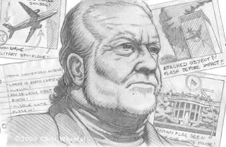 In terms of the backgrounds, the first sketch features polaroids of 9/11 and theories about Obama and the White House; the photos feature handwritten theories. I was going for an "evidence wall" type of feel.
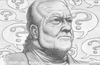 For the second sketch, I went in a different direction and used a technique from a personal drawing I did a year or two ago. I like the visual effect of a figure surrounded by question marks. It works in two ways as they can represent both Berg's questioning everything as well as our questions about Berg: "What happened to this man? Has he lost his mind? etc."
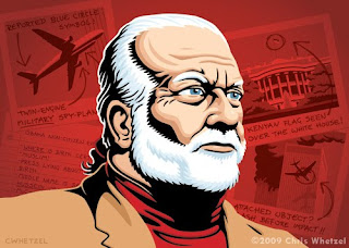 Jesse decided to go with the first sketch, and I was fine with either choice. I worked up two different color versions. One featured a green background and the other was the red background chosen. I tried a few new things on this piece in therms of rendering the figure, and I like some of the subtle things going on.
Jesse seemed very happy with the piece, and I look forward to working with him again. Honestly, working with Philadelphia was a bit of a dream job as I spent my college years and then some in Philly, and I get a kick out of thinking folks I know actually get to see my work in print. And there are still some other Philly publications I would love to work with (hint hint).
On a side note, this assignment sort of sucked me into the whole conspiracy world. I was watching videos of 9/11, reading sketchy blogs, etc. Some of the arguments can be pretty persuasive! Interested in reading about Mr. Berg? Read the article here.
Enjoy the Day,
Chris
Blog: Chris Whetzel Illustration (Login to Add to MyJacketFlap)
JacketFlap tags: voice, angry, graphic, whetzel, mob, village, art talk, artist, illustrator, illustration, Add a tag
Hello, hello. As promised last week, I come bearing art. Its been getting busy around here since the last post, and it has made me almost forget about Halloween! I have to start my costume, and that means brevity in this month's post. Sorry!
Earlier this month, I was very lucky to be contacted by Tom at Riverfront Times. Not only was I glad to receive a job after a break, but it was a cover! Nice! Then Tom dropped the bomb that the article would be national among Village Voice Media publications, and that was awesome!
Tom had an idea of what he wanted so I sent him two quick layouts to choose from (I used a frame from another assignment's sketches as an indicator):
After layout approval, I worked up a tight sketch. While doing so, Tom ran the layout by the other art directors and wrote me with the feedback that it seemed very "farmer" with the pitchforks and such. I made it more urban by replacing them with pikes wrapped in barb wire. I thought it might be too much, but I guess not:
And I submitted two versions of final art. Initially, I was working the piece to emulate images on my website that Tom had mentioned. However, I really wanted to explore this as a two-color image, and Tom responded to that as the direction to move in:

After some discussion, we settled on this final version: The difficult part of this assignment was creating a suitable composition that would work with all of the papers' mastheads. Tom allowed me some leeway and said that overlapping the logos is fine and actually encouraged in some cases. Good news for me!
The artwork is being featured as an interior image in Minneapolis City Pages as well as the cover of Riverfront Times, Village Voice, Houston Press, SF Weekly, Miami New Times, New Times Broward Palm Beach, and Dallas Observer. Needless to say, I am SUPER-PSYCHED to have this artwork coming out this week! It's one of those days where you can't stop smiling and whistling, and people look at your weird.
Many thanks to Tom, Ivylise, Miche, Alex and Alex, Monica, Justin, and Nick for such a great opportunity as well as the great exposure. I hope to work with each of them again in the future!
Enjoy the Day,
Chris
Blog: Chris Whetzel Illustration (Login to Add to MyJacketFlap)
JacketFlap tags: experimentation, whetzel, chris, Add a tag
Hello again. I'm sorry that I don't have any art to share this week. Instead, I wanted to share some work-related stuff that I have going on. To quote Milton Glaser, "Art is Work." But I also think Art is Play. We all started because it was fun, right? Doodles and mark-making were fun. So to keep it as such, I am trying new and old things outside of my usual methods.
I just got a Wacom in hopes of experimenting with Photoshop. It was a gift from my lady friend, and its pretty fun. I went with a tiny one as my desk space is pretty cramped already, and I didn't want to spend too much money in case I didn't like working in this manner. I hope to post some results eventually. The Bamboo is pretty cool as it can also basically replace your mouse. Not only can you use it with a pen, but you can also use your fingers as if it were a mousepad (think scrolling and clicking on you smartphone or itouch).
I have also been experimenting a bit with "analog" work. Aside from the sketchbook, I want to try some media on different papers. Here is a result of inks on a watercolor block; no preliminary drawing here, just putting pen to paper and seeing what happens: I also keep forgetting that I finally got a toned-paper sketchbook! Its in my bag, but I immediately grab ol'trusty. Hopefully, I'll stumble upon it and get some playing done there as well.
Sorry again for the lack of commissioned work this week; I need to spread it out :) Check back next week for a new piece!
Enjoy the Day,
Chris
Blog: Chris Whetzel Illustration (Login to Add to MyJacketFlap)
JacketFlap tags: graphic, whetzel, chris, campaign, dew, artist, illustrator, illustration, film, art, poster, Add a tag
Hello again! I don't have much time to chat today as I have a pretty complex project on hand, so I'll just jump into a brief step-by-step of a recent project I can finally post. I think. Although I do not see anything for the campaign online, I was told that I could start promoting the artwork in October...
Over the summer, I was very lucky to be chosen for a poster campaign. It is for Sidedoor Productions, a film studio that accepts submissions/scripts for movie ideas (think Project: Greenlight). They are teaming up with Mountain Dew to get the word out: you could have your movie made! The design firm handling the promotions was TracyLocke in Connecticut. A special thanks to Kim and Andy for selecting me as well as their friendly demeanor and patience.
The project was originally going to run four posters, but the number was cut down to two due to budget. There may be a third poster in the future if needed. The first two posters were to a pitch/script-themed poster and a generic all occasions poster.
Quick composition layouts that were discussed before sketches:  Round one of sketches:
Round two of sketches (face alterations):
Round three of sketches (additional face alteration):
First round of finished art (too green):
Second round of finished art (more facial detail and new figure, background alteration):
Third round of finished art (face alteration and color changes):
Final posters as produced by TracyLocke:
I decided to show the original artwork on my website so that viewers will see exactly what I delivered. So I placed the needed text on the art and produced these versions for my promotions:
The entire process for these posters took around six weeks due to Andy and Kim waiting for feedback from folks at both Sidedoor and Mountain Dew, folks on vacation, etc. I do hope we continue with the third poster as I greatly enjoy working in a series. I also think I enjoy poster work so much that I am hoping to do more both for clients as well as self-initiated projects.
Enjoy the Day,
Chris
Blog: Chris Whetzel Illustration (Login to Add to MyJacketFlap)
JacketFlap tags: illustrarot, artist, illustration, art, charity, digital, graphic, solomon, representation, Add a tag
Howdy! Welcome back for another weekly post! Wow!
I just added some new work to the site, and I will blog about one piece this week and the other commission next week. Give me a break; I have to spread it out or I'll be writing all day.
In a recent commission from Miami Herald, I was asked to do a section cover illo concerning the economy's effect on Florida charities and non-profits. In a nutshell, donations are down as folks are hesitant to give money. As such, charities are having to try alternative methods of securing enough funds such as directly soliciting and cutting budgets/programs. I won't be showing sketches as I may want to use them for a future assignment. Final artwork: I like the image; its simple and to the point. It changed slightly from the sketch in that I added the spotlight.
 Also, in a great turn of events (and thanks to Scott Brundage showing my portfolio), I am now being represented by Richard Solomon Artists Reps. I won't say much about this as I think Richard and company has some future announcements planned concerning their roster and direction. I look forward to working with them and hopefully bringing in some advertising campaign work as well as any new commissions and collaborations!
Enjoy the Day,
Chris
Blog: Chris Whetzel Illustration (Login to Add to MyJacketFlap)
JacketFlap tags: illustrator, illustration, photoshop, digital, vector, sketchbook, graphic, bloomberg, pension, whetzel, chris, exploration, gm, Add a tag
Hello all. Welcome to another post! All is well in the studio, and I'm in the middle of a little breather. Two possible projects are being sorted out, and I am taking advantage of the downtime to really attack my sketchbook. I'm really trying to feel out why and how I draw while trying to let go of any idea I have of what is "good drawing." I'm also sorry to say that I am adopting a "my eyes only" approach to the sketchbook; the idea is that I will only focus on progress and experimentation instead of making pretty pictures for other folks to see. So there may or may not be additional sketchbook updates.
Although it was poorly made, listening to a documentary about Henry Darger (In the Realms of the Unreal) brought to light how a person can make art only for oneself. Until this time, I felt all artists crave attention, and I often joke that "all artists want to be famous" as we really just want people to view our work; we need to be validated! But there is certainly something to be said for a man who spent his whole life writing and illustrating a 15,000 page manuscript that no one saw until he was close to death. It makes me wonder where the assumption that I have to show my art comes from and that keeping it to myself feels selfish. But hey, keeping it to myself should keep it honest, right? I already find myself drawing differently and drawing subjects I wouldn't otherwise. So its off to a good start.
While exploring the sketchbook, I am also trying to really explore other aspects of drawing by looking at as many drawings as I can and trying to figure out WHY it appeals to me, reading and researching how drawing works from both an artist's and a viewer's perspective, and trying to discover how one moves from drawing to another technique such as painting; they really are two different beasts. Defining such things can be very frustrating and there are always artists and images that counteract any definition one hypothesizes. however, I feel doing so and asking myself such questions will make me more honest with myself and my work.
I am also trying to "step out of the box" within my regular assignments as a loose continuation of this exploration. A good example of this approach is a recent illo for John at Bloomberg Markets. I was very happy to be contacted by John from a referral by Kam, the Bloomberg designer I worked with last summer on a great assignment concerning Asian stock market regulators. John was looking for a metaphorical image to represent the mistreatment of retirement pensions by General Motors. We discussed concepts and such, and I provided the following sketches: John wanted to see a sketch of a "pension" license plate that was beat up and rusty. The plate is a Michigan plate to allude to GM and "motor city."
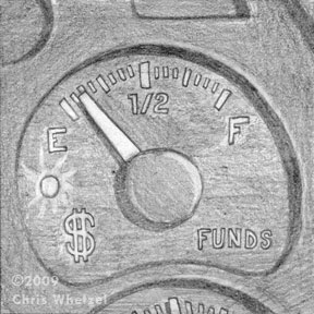 In the other sketches, I wanted to explore the pensions as dwindling. This sketch of an emptying funds gauge fit the bill, but I think it was too static.
 I enjoyed this sketch that worked in both my idea as well as John's license plate request. However, it was decided that the size of the image was going to be small, and certain elements of the sketch would be hard to read. The final art:
 Initially, the image was "too clean," and John asked that the license plate be dirtier. Upon revision, we were both quite happy with the finished product.
This image was a little intimidating for me as I do not usually work with textures, and I do not usually aim for a more realistic representation. However, I was adamant that those two elements were key to this image being successful so I basically jumped in feet first to scanning textures and making brushes in photoshop. I had not worked in this manner for years! Replaying the creation of this art in my head, I have to say that exciting nervousness of not knowing where the image and just trusting yourself is going is a lot of fun; I hope to push it into more work.
Thanks for reading! Look for a new post next week!
Enjoy the Day,
Chris
Blog: Chris Whetzel Illustration (Login to Add to MyJacketFlap)
JacketFlap tags: Add a tag
Hello, again. I'm trying to keep up with blog posting, and I am aiming at a weekly schedule (hopefully). The idea is that posting often will result in shorter posts.
So what's new? Well, I finished up a new promotional mailing effort yesterday, and I am working on a few projects as well. As usual, they are hush-hush until publication. The following illo was published last week so I can share it with you. It is a commentary illo for Education Week. Vanessa emailed me with the assignment details and the title alone piqued my interest: "Failing to Learn." The article is pretty captivating, and I was looking forward to tackling the issue visually as it was definitely going to be a challenge outside of my comfort zone.
The main gist of the commentary is that our education system is repeating the same mistakes, and we are not learning from errors of the past. The sketches: This first sketch was based off the classic tale of William Tell. Vanessa liked the concept, but the editors felt it may be too obscure. I like the image, and I may complete it as a personal piece since the message can be related to by a wide audience.
 Sketch #2 was more situational with Sherlock Holmes "examining" education (in this case, a poorly trained teacher). I liked playing with scale in this sketch. Thanks to Aliyah gold for reference poses, and I was the model for Mr. Holmes.
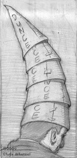 I felt the third sketch was my best concept, but my worst drawing. Maybe I should have "sold" my idea better. To show the repeating of past mistakes, I felt an ambiguous figure that could be either a student or a teacher with a collection of dunce hats would work well. However, Vanessa's editors felt this was too harsh and ma be seen as downright offensive. I could see that as well; its a bit too subjective. So Vanessa and I agreed on using the Sherlock Holmes sketch, and I was off to a finish:
 The image was actually submitted in two versions with both a blackboard and a green chalkboard; Vanessa preferred the black version as it popped in her layout more. There were lots of little challenges in this image that I enjoyed solving, and I tried a few new things that worked out in my favor. Thanks to Vanessa for the kind words and fun assignment. I hop eto work with more non-profits in the future!
Enjoy the day,
Chris
Blog: Chris Whetzel Illustration (Login to Add to MyJacketFlap)
JacketFlap tags: Add a tag
Hello, folks!
I'm pretty loaded with work this month, so let's jump right into the artwork!
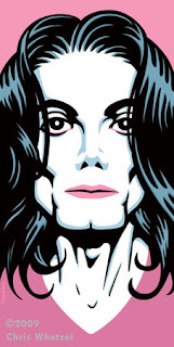
I don't see that I posted this on the blog although many of you have seen it online in various other sites. its a portrait of Michael Jackson done for Drawger's MJ gallery. Check it out; some great stuff in there. Drawger is a one-stop site for illustrator blogs that I hop eto someday be a part of.
Mister Michael Jackson (RIP):
This piece went through SEVERAL stages. Three sketches later, I had something I thought was working. Then I was done, posted, boom. THEN I was critiqued by folks I have alot of respect for, and they helped improve the image. Thanks to John, George, and Sterling for their observations.
In August, James at Financial Planning contacted me with an awesome assignment: the athletic portfolio. I was thinking "what on earth is that?" After James' description and reading the article, I was eager to start. It was to be a full-page action-oriented image based off one man's integration of kickboxing philosophy into investing. James' editors were looking for a kickboxing-based image. I was super-psyched to do this assignment as I was really wanting to do some action-oriented work.
Here are the sketches I provided: A kung-fu image where I was trying to nail down the feel of old kung-fu posters and movie box covers. I was considering a layer of japanese text around the figure but thought it might be too candid.
 I got the phrase in my head "punch up your portfolio." I think the sketch explains itself. POW!
 With the last sketch , I really kind of went nuts and really wanted to push the action. Its kind of like a comic book spread. All of these were really fun to draw, and I was happy taking any of them to finish.
James enjoyed the sketches as well, and he decided to go with the "punch up." I think this was the best choice as well as it can be seen as a representation of either boxing or mixed martial arts; its not as limited as the other two sketches. It was the best choice to represent the general phrase "athletic portfolio."
Final Art, approx. 8x10:
I really enjoyed this piece, and I was happy to add it to the website. It was also feature on the ispot's "news" blog and Altpick's "news" section. Thanks to James for the opportunity to flex my action-drawing muscles!
Enjoy the Day,
Chris
Blog: Chris Whetzel Illustration (Login to Add to MyJacketFlap)
JacketFlap tags: illustration, art, studio, whetzel, chris, artist, Add a tag
Whoops! Found these pictures on my camera that I meant to post a while back. These are some images of the new studio after we moved from Beacon NY to New Paltz. Prior to this, I was working at my desk in the living room. The studio is a small room in our apartment, and is already getting full. The first rule of the new studio was NO CATS! It gets lonely, but it will be warm in the winter and is in the shade during the summer. Its a bummer that we will have to move in a year.Corner 1: Drafting table gifted by Uarts when they decided to replace their studio equipment. My travel-sketch bag is on the table, but I've since replaced it with another. Homemade lightbox under the table (coke crate lined with lights and topped with plexiglass). the empty spot on the wall is for the later mentioned art to be displayed.
Corner 2: Computer and Office Space. I built the table when we moved for about $35. I love the light in the room throughout the day. I must say its very quiet here in New Paltz, and I enjoy it much more than living on Main St in Beacon. to the left of the table are boxes of job files and artwork to hang. Corkboards and a calendar keep me on schedule and serve up reminders. The computer is a mac gifted to me by Scott Brundage. Its doing the job as I don't do much that requires huge processing speed or memory. I'm hoping to replace it someday with a new imac, however, I am very stingy with that type of purchase :)
Corner 3: Books and Supplies. the left shelf contains sofware books, my laptop, and mostly "art books." The stereo doesn't get much use as I usually use headphones throughout the day as our upstairs neighbor is very loud and obnoxious at all hours of the day. Headphones let me concentrate :) The middle shelf is pretty much all comics. Hey, I read a lot of comics. The shelf to the right is all supplies. Up top is an old PC that I don't know what to do with so I keep it around as a "backup" in case something ever happens to my regular computer on a deadline. Paints, inks, recordable media, postcards, portfolios, paper, and office supplies. To see the shelves' contents and book titles, the next images are pretty large:
A larger image of Francis Vallejo's Nas I was lucky enough to win when he auctioned it. I'll hang it eventually, and I hope to get more original art from my peers for studio decor. Peter and Tim's gift paintings are on the living room mantle. Sorry! I also have some James Jean prints I could hang from the Kindling portfolio (not pictured).
And lastly, here are some more books I picked up at a library sale in New Paltz. Great deals; I think I paid $8 for the lot plus an old RSVP that was pretty disappointing. Shown are two Rockwell books, a collection of Little Nemo strips, a book on Michelangelo's sculpture, and a winslow Homer portfolio. Good stuff.
And that's that. Thanks for looking!
Enjoy the Day,
Chris
Blog: Chris Whetzel Illustration (Login to Add to MyJacketFlap)
JacketFlap tags: artist, art, drawing, sketchbook, whetzel, chris, Add a tag
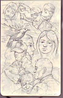
Hello, all. Here are some new sketch pages for perusal while I am working on projects. Trying some new things in the sketchbook. I am producing lots of ugly pages and poorly drawn faces in the book, but here are some I feel ok about :)
I won't go into the aesthetics or philosophy behind my new sketchbook approach to spare you my whimsical "artsy" mentalities. Thanks for viewing: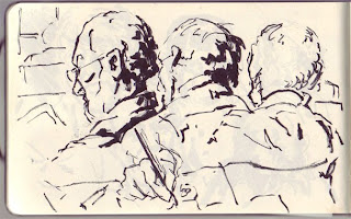

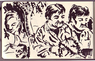

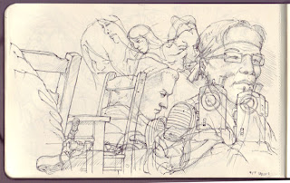
 I'm going to really try updating the blog weekly as I am piling up a backlog of work to share. Also, I hope to share some big news in the coming months. Sorry for the long time between posts!
Enjoy the Day,
Chris
Blog: Chris Whetzel Illustration (Login to Add to MyJacketFlap)
JacketFlap tags: artist, football, illustration, art, painting, sketching, whetzel, chris, imc, cincinnati, Add a tag
Hello, hello! Hooray, its my fortieth blog post!
Today, I'm going to change things up a bit; I'd like to get personal. Come, scootch closer.
After this bit, I'll share a new piece!
I want to talk about an experience I had a while back that has somehow slipped under the blog radar. It was in June that I attended the Illustration Master Class' Open Studio with my buddy Scott Brundage. First off, I really enjoyed hours of car-ride with Scott talking about art and illustration, business practices, and everything else under the sun. Its always nice to have someone to talk to who is in the same boat as you. Anyway, this year's IMC featured Rebecca Guay, Greg Machess, Irene Gallo, Scott Fischer, and Charles Vess. What a lineup. The Open Studio is basically that: after a week of workshop and lecture, the studio is open to the public so that you can see some sweet paintings.
All of the artwork is fantasy-based as that is the focus; I gathered that the faculty gives a choice of assignments and the artists produce a piece within the week. First, let me say that the paintings were really intimidating. Not being a painter, what they do is a magical mystery to me. So many pieces were so impressive and inspirational. However, the most inspirational aspect of the open studio was the first thing I saw upon walking in the door:
Everyone was sketching! Like madmen! IMC provides a complimentary sketchbook to anyone who attends the workshop, and the artists were passing them around getting and giving sketches. Wow. I think I spent most of my time there just watching so many artists sketch! Doing so really opened my eyes; their skills and confidence were amazing. Its really inspired me to just attack my sketchbook as much as possible. I'm really enjoying it, and I think its helping my confidence in my work.
Also, just seeing actual physical paintings by the faculty was also quite inspiring. They really make you want to pick up a brush and join in. Also making you want to be a part of the group is the genuine friendliness of everyone there. All of the faculty and "students," were so familiar and friendly with each other. It was like being in a room filled with a giant group of friends. And they are so welcoming of new faces to the field; there does not seem to be the competitiveness I associate with editorial illustration. Everyone there just shared a passion to make beautiful images.
That really spoke to me. Artists working as illustrators that put creating a beautiful image before a clever concept. Its really something else, and it is very appealing. Its made me want to focus more on that type of imagery with my self-initiated work. I was going to work on a body of fast black/white newspaper editorial work in hope of getting into some of the larger newspapers, but I think I will focus on more poster/book oriented images.
We'll see what happens! And here's the artwork for the post:
Football illustrations during summer? Seems to be a trend for me.
Dennis Huynh, art director of Cincinnati Magazine, emailed me recently with a new illustration challenge. The article was to be about Cincinnati's semi-pro football league. It consists of mostly blue-collar workers volunteering to live out their football dreams. I was very excited about working with Dennis again after our "Nerdcore" collaboration so I readily accepted the challenge. Dennis lined up a blurb for me to work from, and I provided these sketches: The blurb described the league's players as "heroes" for football fans that were tired of watching the NFL's Cincinnati Bengals lose. I latched onto that sentence, and I sketched up this idea of the players as heroes a la Superman/Clark Kent.
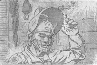 Continuing the "secret identity" motif, this sketch was a play off of helmets. I liked the idea of a welder flipping up his helmet to reveal a football helmet facemask beneath.
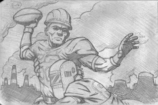 This last sketch is more action-oriented, however, I also felt it was the obvious solution; its the "safe" sketch: the sketch the art director can choose if my other concepts are too abstract.
Luckily, Dennis and I think alike! He chose the first sketch, and I was so excited to render the final art: I provided two versions (a different color background), and Dennis chose the brighter of the two. I was super-psyched to add this piece to my portfolio, and I look forward to working with Dennis and Cincinnati Magazine again in the future!
Enjoy the Day,
Chris
Blog: Chris Whetzel Illustration (Login to Add to MyJacketFlap)
JacketFlap tags: Add a tag
Hello, folks! Just wanted to post a quick link to help promote a friend. I am always supportive of illustrators seeking to express themselves with personal works. Sterling Hundley's gallery show looks to be impressive:
http://sterlingclintonhundley.blogspot.com/
Enjoy the Day,
Chris
Blog: Chris Whetzel Illustration (Login to Add to MyJacketFlap)
JacketFlap tags: artist, illustrator, illustration, industry, art, digital, whetzel, chris, outdoor, Add a tag
Welcome back to the ol’ blog. Whats new? Well, the cycle continues.
New cards went out in July with a pretty good spike in web traffic; hopefully, this will mean some commissions to come. I have also gotten some good web traffic from my emails with several direct responses about the artwork. I even had a commission come from the last set of images, however we were not able to work out a suitable budget for the rights requested. It always sucks to turn down a job, and you get scared that it was a mistake. But if we do not ever say “no,” then we will never re-establish a value to the use of illustration.
You gotta value what you offer; I don’t mean you should be conceited or pompous. Don’t talk down to the client or insult them. Simply offer what you can at their budget and then state what you would need to charge for what they are requesting; this way, the choice is theirs. You aren’t “backing out;” you are providing options, and if neither option works, then the job dies with no one being at fault. I think some artists take offense at a low-budget offer, and then lash out at an art director; what purpose does that serve? Not only does it make you look like a big-headed jerk, but it also make illustrators in general look the same way.
I digressed; I wont rant about etiquette and manners today.
I’ve been a little behind on the blog posts again. Sorry. So this post features the creation of an illo for Matthew Bates, art director of SNEWS. This magazine is a trade-based magazine for folks in the outdoor/recreation field. Matthew is also art director for Backpacker; I had sent him promos aimed at work in Backpacker, and he brought me onto SNEWS, which he was re-tooling with better visuals. Confusing? Sorry!
The article was a profiling of several up-and-coming outdoor industry designers. Matthew wanted something bold and iconic, and he referenced several pieces on my site as well as some poster art that he thought would guide me in the right direction. Matthew was a pleasure to work with; he was really flexible as I was simultaneously working on other projects. We verbally communicated concepts, and we reached a point where only one sketch was needed: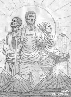 I was working off of the phrase “giants of industry” which came into my mind while reading the article. I brought in specs that one would see on a blueprint or model sheet to re-enforce the industry aspect. I was really motivated by the phrase “outdoor industry,” and I wanted to somehow juxtapose the two words visually.
Matthew approved the sketch and I created two versions as he was not sure if his editors would want the “specs” or not. So I did one without (more of a portrait) and one with (more of a concept). Also, I hated the guy to the left so I re-drew his head: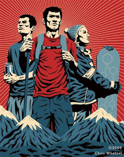
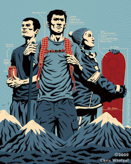 In the end, Matthew used the version with specs, and that was a great relief as I felt the other version felt a little generic.
In the end, I’m not thrilled with what I did with this piece; some of the drawing isn’t my strongest. However, the artwork does what its supposed to do so it is a success. I sometimes think I lose sight of the forest for the trees. However, this piece has also inspired me to try my hand at more “group portraits” in the future. Planning is in progress so hopefully I’ll get to them soon.
Enjoy the Day,
Chris
Blog: Chris Whetzel Illustration (Login to Add to MyJacketFlap)
JacketFlap tags: artist, illustration, art, sketchbook, whetzel, chris, Add a tag
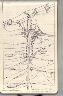
Hello. I have decided to share some pages from my sketchbook:



Enjoy the Day,
Chris
Blog: Chris Whetzel Illustration (Login to Add to MyJacketFlap)
JacketFlap tags: ispot, altpick, news, Add a tag
Thanks to Maria at AltPick and Jami at Ispot for spotlighting my new work in their respective "News" sections. I'm honored!


Enjoy the Day,
Chris
Blog: Chris Whetzel Illustration (Login to Add to MyJacketFlap)
JacketFlap tags: action, whetzel, chris, espn, illustrator, football, illustration, magazine, fantasy, digital, vector, graphic, Add a tag
Hello, reader! Welcome back! I'm happy to say this post will feature ART!
In regards to my last post concerning the field of illustration, I would like to say that after some research and correspondence, I was educated on the Conyers Bill from 2002. Check it out for info on what was almost an illustrators' union as well as info on antitrust laws. Its interesting stuff. I do still think some type of universal creative organization would be beneficial but I will stop talking about it as it appears its been tried before and didnt work out as parties could not agree or act in unison.
No worries, though! Lots of other things to focus on! New cards are coming this week. Maybe you will get one. Six new pieces are finished or in the works for future publication in the coming months. I'm hopefully getting to work in some personal project book covers this summer, and I'm looking for new ways to promote. I am looking for illustration groups and organizations to join as well in order to just have some sense of community as working from home is very solitary.
What else to mention? Currently, I am halfway through a multi-illustration project that I look forward to sharing when published. Its all hush-hush now but hopefully it wont be for long!
So for now, I can only share some artwork that is being published tomorrow:
ESPN the Magazine contacted me back in March with a cool illustration assignment: the defensive line of the Pittsburgh Steelers. The artwork was for ESPN's Fantasy Football 2009 Magazine. I had been wanting to do some sports-related art but I could never find the time; so I was super-psyched to do the job!
I was actually a little intimidated as the magazine is for "SUPER DIE HARD football fans." I was so paranoid (as is always the case) that I would mess up a uniform aspect or a player's name/number. So I did tons of research before even starting sketches to really familiarize myself with the team. Ed Mann, the art director, also sent me some nice high-res reference as well which helped greatly. After Ed and I settled all the details of the project, I sketched up these action-based images for him.
The Sketches: I called this one "the stack." I was really having fun just trying to show the defense as a mass of helmets and uniforms. A swarm, if you will. I liked how this one was a stack of players where you don't notice the ball carrier at first; it focuses on the defense by not even show the carrier's face/front.
I called this one "the wave." In this sketch, I was going for more of a "crashing down" on the ball carrier. Unlike the first sketch, this one features the ball carrier prominently but in a position of weakness. I really enjoyed how the figures are unrealistically stacked to the right; this sketch feels almost like fantasy to me. Perfect for fantasy football! The last sketch was one I called "the wall." I wanted to show the defense as a literal "wall" between the ball carrier and the goal. The aspect I liked of this sketch was the hands obscuring the ball carrier's uniform number; this would help by not singling out any particular player as the victim, and its also a bit metaphoric. I also liked the "back against the wall" aspect that no one would probably ever notice but me :)
Ed chose the third sketch ("the wall"), and I was off to create the final art. I decided to flip the image so that the viewer's eye would travel top left to bottom which made more sense to me. I also altered my use of blacks to focus more on the Steelers' uniforms and less on light and shadow; it worked well in this piece as there is still a healthy pattern of blacks and value.
Final Art: One note I would like to make is the effort put into the logos and uniform numbers. I dont mean to boast, but its all there, even the helmet "Riddels!"
Thanks to Ed for the opportunity to make artwork I really enjoyed! I hope to do more action-oriented artwork in the sports field for future assignments.
Enjoy the Day,
Chris
Blog: Chris Whetzel Illustration (Login to Add to MyJacketFlap)
JacketFlap tags: Add a tag
Hello, friends. I'm really sorry I have not posted in a while. I am quite busy with a multi-illustration project that takes up most of my time. Also, projects from the past few months are just now starting to get published. So in the coming months, there will be more art posts. Again, I apologize. So I'm sorry if this post is a dangling carrot, but I wanted to open a possible forum to discuss a several topics in the field of illustration.
It seems every interview, blog, or podcast dealing with the business of illustration eventually discusses stock. For laymen, "stock" is the term used to describe illustration that an artist sells to a company including all rights; this company in turn sells the publishing rights only to anyone with the money (usually a much lower price) than a custom illustration. Some reports of stock illustration for a $1-50 are common.
What stock does to the illustration field is an attack in two-parts. First, it takes money from an illustrator's pocket by denying someone a commission, i.e instead of commissioning you to do a custom piece, a buyer can go to blank.com and buy an illustration that "sort of" fits the topic. So first, its takes money out of ALL artists pockets and gives it to these companies. Secondly, stock kills the creative process that results in unique and moving art; why pay someone a fee to think and be creative when one can just buy a generic businessman illustration or photo?
We all know stock is harmful. Yet people are still fueling these companies with new artwork. Why? Are schools not teaching students the harm of stock? Are stock companies paying more for work? I doubt it. Maybe some illustrators see it as free money for artwork they already made, but they do not realize that the small fee they get is harming the industry by denying someone a full commission. I honestly do not know why folks are still giving these companies art. I DO know its hard to make ends meet at times when freelancing; I do know its scary out there when the phone isn't ringing and the inbox is empty.
So I've come to the conclusion that many illustrators just may not be educated on the subject. Perhaps these illustrators did not attend a school or perhaps they moved into illustration from another field. It really does not matter where or why. We cant change what has happened or the cause; stock is here, and we must deal with it.
I applaud the efforts of the Graphic Artists Guild, Illustrators' Partnership of America, Illustration Conference, and numerous individuals (too many to name). Please note, I am not a member of any these organizations (although I soon hope to be when funding is available :) But their sites are free to visit so PLEASE DO!
Yes, these guys are working hard to benefit us, however, I see limitations that we must deal with. First, I think those that teach should educate their students THOROUGHLY. It assumed that these students are selling their art after graduating and seeing it as a good deal; they are making money directly from ther art. However, they are selling this art for basically nothing. Repeatedly drive home that stock is competition not opportunity. Cite examples if need be; I 'm sure I'm not the only one who has lost a job to a stock image! Don't just say "stock art is bad" and leave it at that. Even if the students groan and complain, make them aware. Play them podcasts! Read them articles by Brad Holland. Have speakers on the illustration practices and pitfalls from the Guild or even just from working professionals. Maybe make reading book such as "The Education of an Illustrator" mandatory instead of just "suggested." Thinking back I had a professor who did repeatedly attacked stock, and another who just glossed over it. I'm very thankful for that professor who made the extra effort!
I feel the above mentioned organization efforts to fight for illustrators' rights are great. The organizations are batting for all of us. Unfortunately, not all of us realize it. I see this as a big hurdle. The Graphic Artists Guild and Illustrators' partnership are valuable resources, and they are constantly trying to make headway for illustrators through efforts such as fighting the Orphan Works Act. But its "under the radar" so to speak.
Illustration is a career of solitude; we work and live alone for the most part. These organizations have information available but maybe these illustrators and students selling to stock companies don't know that these insightful and helpful organizations have websites and books geared toward helping us. Perhaps more of an effort needs to be made to reach out to the new faces in illustration. I really feel unless one searches out these venues of aid, they will not be aware of the existence of such helpful resources.
I know meetings are held and solutions found at conferences (panels of which I have been fortunate enough to enjoy) or at events, exhibitions, etc but lets face it: kids in school or fresh out cant afford to attend much of anything. Maybe we should have some "no charge" meetings for folks who cannot afford to attend. I feel any information on the subject of proper business practice and ethics should be free as it helps all of us. Heck, lets make pamphlets and hand them out on the streets if need be :) Please realize I dont mean to attack any organization; I just think we can reach more people without fancy parties and such. this may be a stretch but look at Alcoholics Anonymous: a open door, a welcoming group, and people talking and resolving issues; look at how that helps so many people.
That is one reason why I am writing this; I think a number of young illustrators and designers frequent this blog, and I hope this post will get some of them to visit these sites and read some valuable material not only about stock but about all aspects of being an illustrator. I also hope to open up some discussion on the subject by asking people to comment or question. Let's share information and resources!
Maybe organizations should "go guerilla" and aggressively deliver info to schools and illustrators? I don't know, but I DO know we need to get awareness and knowledge out to everyone in the field. WE also need to get illustrators motivated to want to learn. I know I learned a great deal AFTER college by just reading and visiting sites on illustration. And by communicating; I think thats our biggest weakness as an industry: we are so divided be it by geographic region, financial status, or circles within the industry. I have a friend working in film, and it amazing what their union has done for them. Perhaps its time for something like that? I don't know. Any thoughts on anything I've mentioned here are greatly appreciated.
Links:
Illustrators' Partnership: Lots of essays and articles on all aspects of Illustration
Graphic Artists Guild: Publishes the Pricing and Ethical Guidelines Handbook. Features a contract monitor to help understand contracts along with other valuable resources.
AIGA: A huge site with lots of info (link to Orphan Works page)
Freelance Switch: Lots of article of freelancing. Features a podcast on everything illustration including business etiquette, contracts, valuing your work, you name it. Also has a rate calculator and other useful tools.
Starving Artists Law: Info on copyright, trademarks, volunteer lawyers, etc
These are just few. PLEASE feel free to link to more in comments! I hope this helps someone; I just want to make an effort on behalf of the industry.
Books:
The Education of an Illustrator (Heller/Arisman)
The Business of Illustration (Heller/Arisman)
Starting Your Career as a Freelance Illustrator or Graphic Designer
Blog: Chris Whetzel Illustration (Login to Add to MyJacketFlap)
JacketFlap tags: illustration, whetzel, illustrophile, Add a tag
Today I got an email from Charlene Chua letting me know that I would be featured on Illustrophile's homepage for the week! Awesome! Thanks, Charlene! Stop by and check out their blog; there's something for everyone!
Enjoy the day,
Chris
Blog: Chris Whetzel Illustration (Login to Add to MyJacketFlap)
JacketFlap tags: juliet, romeo, illustrator, illustration, shakespeare, poster, digital, cover, hamlet, graphic, conceptual, othello, whetzel, chris, Add a tag
Hello.
Well, here we are. April. The end of this month will mark one year of this new journey. I am very happy to say I have been able to survive as a freelancer for a whole year. Much has changed, and at times I am still uncertain of what to do. There is still much to learn and much to be done. But I do think I'm off to a good start!
To mark this anniversary of sorts, I took it upon myself to re-design chris-whetzel.com(being uploaded tonight). Lately, I had been really unhappy with the website layout so I read up on some coding issues I was having with the site, and fixed it up to look a little better on any size screen. Also, I decided to use clearer thumbnails and add some features to make things easier for art directors after viewing joshuamiddleton.com. Thanks to Scott and Irene for bringing this website and its positive qualities to my attention. Also, thanks to Josh Middleton for amazing art on a well-designed site. I am really happy with the re-design, and I feel it may be around for a while. Of course the artwork will be updated as close to monthly as I can manage!
The time since my last post has been filled with work, thankfully. All are pending publication, so they will eventually be featured here. I have been very lucky to have some children's work to supplement my income! I am considering featuring the kids work on this blog as well as setting up a site for it. Also just completed was artwork for a client I was very excited to work with! Sadly, this artwork will not be released until June, and I can't wait to add it to the portfolio!
Its been a weird period. I have found myself to be very artistically driven as of late. I just added three new self-initiated pieces to the portfolio (which was a project in itself), planned more portfolio work, and provided artwork for three commissions. The odd part is that while being very busy with this work, I have had this yearning to be reading more. These past two weeks I read Robinson Crusoe and Lord of the Flies; I am currently working my way through Walden again. Walden is a very important book for me; a much of the book reflects how I attempt to live my own life (with some allowances :) Anyway, I have found that this rekindling of the desire to read has really inspired my creative side. What a pleasant surprise.
Now shut yer trap, Chris! Its time for the artwork!
This blog post features three new self-initiated pieces based upon Shakespeare's works. I took these on as a vehicle to experiment within my own artistic methods: playing with color, cropping, and composition as concept: I am pretty happy with these, and I hope to get more work along these lines. If not, I'll just keep making them for myself, experimenting along the way!
Enjoy the Day,
Chris
Blog: Chris Whetzel Illustration (Login to Add to MyJacketFlap)
JacketFlap tags: green, statue, mangement, illustrator, illustration, poster, energy, waste, editorial, graphic, liberty, Add a tag
Hi! How ya doin'?
Welcome back! So whats new? Well, two posts back work was very slow and I am very grateful to have had some projects come in these past two weeks. So while working on them, I just got my new postcard out last week, and I am working on some new pdfs for the website. I FINALLY just got all my taxes sorted out and found that my amount due wasn't too bad at all. Nice! What else is going on?
Plenty! I actually wanted to talk a bit in this post about the slow times in freelance. It only took a little slow down to make me panic. I was sure the business was done, and I needed to find another production job. Maybe that will be the case if the economy continues the way it has this past year. But for now, I see the past two months as a great test to my fortitude and desire to really be doing this type of work. No doubt about it, my faith was definitely tested every time I looked at my bank account. Also, when not working, one's self-esteem takes a pretty big hit, too. "Why isn't anyone hiring me? Do I suck?" These questions creep up on you in the quiet times.
I have found the best way to deal with these times is to focus. Focus on one's work. Promote more. Fix anything you don't like about your portfolio; make it stronger. Clean up your website. Go draw. JUST DO SOMETHING so you aren't constantly doubting yourself.
I find this is a great time for personal projects. For me, its hard to make time for them when commissions are on the drafting table. So to utilize the time, and to assuage my doubts, I took on the Joker portrait from the last post, and another personal project. Sometihng I have worked on here and there is a comic concept my brother is tinkering with. I liked it so much I want to draw some stuff for it. We are currently reworking a short script, and here are the non-final character concept sketches: The main character and his father (we are discussing a re-design of the father as I feel his character is wimpy)
 The villain in armor and in robes
 Supporting characters
 A character study to capture a "crazy look"
I also started a little poster campaign for myself concerning our current economic situation and energy needs. It will eventually be a three poster series but for now it just one :)
Sketch:
This was just a sketch in my book. I had been tinkering with the concept for a bit prior instigating the poster project.
Final 11x17: I decided to crop the art to more easily draw attention to the bulb; I felt the sketch had too much info in it. I mocked it up as a Waste Management poster to work my typography muscles, and I sent it to 'em. My contact there forwarded it to the proper channels, but I don't expect to hear anything as WM works with a design studio for all of their materials. But still, I wanted to at least try my hand as pitching an idea to a cold client to exercise those muscles as well. Anyway, the other two posters are looking to be themed around recycling and public transportation while using the term "green thinking." Someday, you'll see them. They are actually on a far back burner for projects I am much more excited about right now, both commissioned and personal.
And that's that. I have sketches for more posters underway, and some work due early next week so I better get back to it.
Enjoy the Day,
Chris
Blog: Chris Whetzel Illustration (Login to Add to MyJacketFlap)
JacketFlap tags: Add a tag
Howdy folks! I just wanted to do a quick post about an upcoming show in Philadelphia. The show takes place at Brave New Worlds in Olde City. It is a themed-group show put on by The Autumn Society.
Exhibition info:
Opening Reception: Friday, April 3rd, 2009 6-9 pm
Brave New Worlds
45 N 2nd st
Philadelphia, PA 19106
I decided to focus on the comic-book Joker as opposed to movie versions as portrayed by Jack Nicholson and Heath Ledger. Also, after seeing much of the art for the show, it seemed to me that much of it was humorous or based on capturing the likeness of Mr. Ledger. I decided I wanted to focus on other aspects of the character. In my diagnosis, he feels completely misunderstood by society. Lacking any constructive means to express himself, he does so with violence. I think he truly enjoy one's suffering, even his own.
Sketch: Final:
 You know, I always like my sketches more. I may explore this in full-color, and I think expanding upon these portraits is a good personal project for me.
Enjoy the Day,
Chris
Blog: Chris Whetzel Illustration (Login to Add to MyJacketFlap)
JacketFlap tags: Add a tag
Hello, hello. What to say? Work has slowed down to a crawl, and I have found I'm not alone. My buddy Scott works at a well-established illustration rep in NYC, and they too are "very sluggish." Also, I follow a very large amount of illustrators' and reps' blogs, and it seems that folks are slowing down in terms of posting published work. But what can you do? Just gotta keep promoting and have a little faith, right?
The stock market seems to be doing better this week, and I am confident that its growth as well as the Recovery Act will instill confidence in illustration commissioners! So with that said, I continue seeking out opportunities online, and I should be getting my next batch of promo cards today. Its hard to make myself spend the money to print/send them when very little money is coming in. Eh, its just money. I can always get a job!
The Zuzu show is coming down next week, and I am working on several projects including a piece for a show in Philadelphia in April. The show is "Joker-themed" and is put on the The Autumn Society.
And that's pretty much it. I am focusing all of my spare time into finding new work opportunities this month as well as putting together my design/production portfolio to possibly seek opportunities in fields outside of illustration.
And now, this post's art section!
Kristin Lipman at Honolulu Magazine emailed me at the end of January with an assignment very different from the usual themes I find art directors requesting I illustrate: an optimistic article depicting how "Main Street" people can handle the economic crisis. The article was titled "Stop the Fear" and is featured in the March edition of Honolulu. She needed an opening image and two smaller illustrations in the first week of February.
Just the upbeat aspect of the article intrigued me, and I looked forward to creating "optimistic art." Kristin chose three sections (the article featured ten sections, each written by a different person with a positive outlook), and I was off to sketch. With time being a factor, I spoke in great detail with Kristin about the concepts I had BEFORE sketching. We agreed on what would be the most powerful, and I was off to sketch.
For the opening image, Kristin had the idea of people climbing/hiking up a hill with mountains in the background, a metaphor for conquering their troubles and hardships placed upon them by our economic situation. To me, this was a good starting point, but I like to take my work a bit farther and work with a more visual concept. So I suggested that we make the hill/mountains out of chart lines. Kristin trusted me so I sketched up this image: Kristin asked the figure feature long hair and dark skin that is common in Hawaii. With that addition, I was approved for a final:
 I actually provided two color versions of the all offinal art as requested by Kristin; she decided to use the gray-on-red version for the opener. I actually decided to feature the full-color version on the website as I wanted to add some variety to the portfolio in terms of color palette.
The second sketch dealt with debt; specifically, the theme was freeing oneself of debt during tough times. Kristin's initial concept was a man climbing out of a whole in the ground (viewed from above). I decided to take this a bit farther and have a heroic figure climbing out of a well, a wishing well if you will. The sketch: Kristin liked the sketch and suggested that all garments in all of the illustrations reflect the casual attire of most Hawaiians. So we decided to drop the business attire, and switch our hero over to what I refer to as "casual beach attire." The final:
 I like how this image turned out; I feel the colors are bright and "optimistic," and the figure is powerful. I'm glad Kristin decided to use full color on the last two illos as the grayscale can look forced with some subject matter (like money).
The last illustration which deals with keeping romance alive during tough financial times. Both Kristin and I were having a little trouble with this concept as most of the ideas we came up with focused more on the financial problem being bothersome and not with it being overcome. As such, we agreed on two concepts to explore, and I supplied two sketches that I thought showed the couple enjoying some romance despite their money woes: For some reason, I was intrigued by the idea of using downward spiraling chart arrows as lightning bolts. This grew into a couple romatically kissing under a stormy cloud in front of a subtle chart background.
 The second sketch was a little more ligh-hearted and subtle. A couple relaxing in a hammock made of bills, overdue notices, mortgages, etc. This idea actually came from the name of another client I was working for at the same time: "Hammock" publishing! Kristin liked both ideas, but she decided to go with the "cloud" sketch. We decided to add more clouds and "bolts" to feel more like a storm before going to the finish:
 I worked up both versions, and we went with the multiple cloud/line version. I actually wish we had kept the simplicity of a single cloud; I now feel it reads easier than the final, but I guess its really personal preference. However, Kristin was happy with the second finish, and it was off to the press!
Kristin sent me an issue this week, and I am really happy with the layout of the images and text! I certainly enjoyed working with her as she really encouraged my ideas and thoughts throughout the entire illustrative process. I hope to work with her again! Thanks, Kristin!
Enjoy the Day,
Chris
Blog: Chris Whetzel Illustration (Login to Add to MyJacketFlap)
JacketFlap tags: Add a tag
Hello again, all. I'm afraid not much is going on right now except for a few self-initiated works and some promotional efforts so I'll jump right in to this post's illustration feature:
Dennis at Cincinnati Magazine emailed me with an awesome assignment for their March issue; an illustration dealing with “nerdcore,” a new type of hip-hop that is becoming very popular. He requested an image that would be exciting and humorous, and to get me started, he sent me some reference as well as a link to a rap duo called “Dualcore” (www.dualcoremusic.com) of which one member was interviewed for the article.
With lyrics ranging from 80s old school to comics/sci-fi to computer hacking, there was plenty of imagery to choose from. Also, I am somewhat of nerd so I had that area covered, but I am a bit of a “newb” to hip-hop so I had to learn a great deal about the genre in a very short time. Much thanks to Josh K and Tim L for helping me bridge these two lifestyles into some clever concepts. As a freelancer working mostly in a bit of a vacuum, its great to have fellow artists with which one can brainstorm and bounce ideas back and forth.
This assignment was so fun that I did more sketches than I probably should have allowed myself. However, I wanted to try a few images without the typical “glasses and pocket protector” nerd.
Sketches: Nerd with gold fronts that say “geeksta” instead of “gangsta.”
 Nerd going “thug” with gold calculator and pacman chains, in front of graffiti wall
 DJ Spock and MC Kirk: hypothetical rap group of “Trekkies”
 “Thug Wars” Hip-Hop posed R2D2 and C3PO who is also throwing Vulcan signs for the Star Trek fans.
Dennis went with the StarTrek-themed sketch, and I was off to a finish: I had a blast with this image! The turntables and equipment were especially fun to create, and I was really happy with the figure gestures. Please note: Spock’s scratching his record with a Vulcan sign ☺ I actually worked up and submitted a second version with a different “warp speed” background, but Dennis felt this one was more powerful. In hindsight, I agree. Thanks, Dennis!
I actually just received the sample issue from Dennis, and its looks great. I was very proud to be featured in a magazine with such a broad array of illustration!
*This blog entry was featured on the ispot's "Art Talk" and blog! Sweet!
Enjoy the Day,
Chris
Blog: Chris Whetzel Illustration (Login to Add to MyJacketFlap)
JacketFlap tags: Add a tag
Hello, hello. “Welcome back,” to quote a friend. Last Saturday was Valentine’s Day, and it was also the opening night of a group show I curated at a small café called Zuzu’s in Beacon, NY. The artist were Doug LaRocca, Peter Wonsowski, Danielle Rizzolo, and drawings by yours truly. The show will be up until March 18th. Doug’s work is a mix of screenprints, digital work, and paintings on various surfaces. Peter Wonsowski is a mixed media artist in the sense that the works in pretty much every medium. Danielle is an oil painter who is currently painting on wood, magnets, and metal surfaces. Here are a few photos of our work (sorry for the poor quality), and if you would like to see more please visit their respective websites.
Doug LaRocca:


Peter Wonsowski:


Danielle Rizzolo:

 (These last two pieces by Danielle feature objects painted on magnets that may be removed to show aspects of the painting beneath and they even allow for rearrangement of the "room.")
Drawings:
 These drawings are not in my typical illustration style, but I see "fine art" as doing whatever I want in whatever style I want; who knows what will be in the next show? 'nuff said. *Update Feb 27: I was notified today that one drawing was sold (girl wearing headphones). Yay!
In other news, I will have some leftover prints from the OpenSpace show of the following pieces, all limited to editions of 12. If interested, please email me. I hope to also set up a “store” section on the website in March:


Sorry folks, no new illustrations for this post as I’m waiting on several things to be published before I can show them. But there should be a good bit of new work hitting the site and blog in March. Stay tuned! Sadly, today a job fell through as they decided to not use illustration for a cover; I blame the economy. So to distract myself from all the economy doom and gloom, I’m working on two self-initiated pieces that I hope to have done before March. And here and there, I’m doing a bit of character sketching for my brother’s comic concept (which is pretty cool).
Enjoy the Day,
Chris
View Next 25 Posts


Great cover piece Chris! I have your cover from the Village Voice pinned up in my studio. Your on fire latily! (no pun intended)
awesome man!!!
Thanks, guys! I'm flattered!
awesome. go get em