


 By: Chris Whetzel,
on 3/10/2011
By: Chris Whetzel,
on 3/10/2011
Blog: Chris Whetzel Illustration (Login to Add to MyJacketFlap)
JacketFlap tags: landscape, editorial, conceptual, interior illo, cover illo, Add a tag


Now some folks might ask if I supported the Republican or Democratic side of the election. I will just say that I try to keep my personal viewpoints on the back burner in situations like this. I think it is more professional to be objective with assignments like this unless the article has a certain slant to it.
Enjoy the Day,
By: Chris Whetzel,
on 5/11/2010
Blog: Chris Whetzel Illustration (Login to Add to MyJacketFlap)
JacketFlap tags: people, portrait, editorial, conceptual, cover illo, Add a tag
Hello, all. Here is a new post of artwork. Also, please take note that this will be the last post for this blog. For some time, I have been running this blog as well as a second blog that feeds to chris-whetzel.com. Initially, this was more of an self-motivation blog to keep myself on track. But now, seeing as they are basically the same, I will not be posting to this blog from here on. Please update any feeds or following by switching over to: http://whetzelnews.blogspot.com/.
Now I know the other blog isn't pretty, but it feeds directly to my website where it does not need a header and such. No frills; simple simon. Sorry!
And now for some art. As I mentioned a few posts back, an assignment from Forward Magazine involved a cover and an interior assignment. For your enjoyment, here is the second installment of sketches and artwork from that commission. As a brief refresher, the artwork was for an article addressing concerns that the United States is still in economic trouble despite the stimulus package and the bank bailouts.
Sketches: Heh, I really liked this sketch! I think it was the lighting; seems like it would have been fun to take to final. However, I think it was a bit too much for the art director; also, my girlfriend said it was a little over the top. Well, you should have seen it before I photoshopped out the blood. I have yet to illustrate a piece with a snake! This has to happen at some point.
 And the same could be said for this sketch. I was really happy with my body language on this one as well as the hanky in his pocket. Was a bit too violent? But it's metaphorical violence! No? Ok...
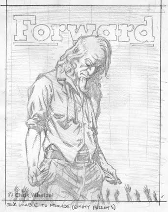 This is the sketch that the art director chose, and I can understand why. In the previous post about this article, I cited how the art director thought I had a way of delivering concepts in a dramatic but palpable manner. This sketch is subtle and still dramatic, an approach I think is often best. As such, I try to offer a sketch of this type in every assignment.
Initially, the sketch was just Sam, and I added the reaching hands at the end as I felt it just needed something to represent the middle class victims (you and me) of the economic storm. I also like the play of scale between such small figures and a giant Uncle Sam that cannot help them.
Just to be clear, I was happy to illustrate any of the above sketches; I think all illustrators have their favorites when submitting concepts, and I am always happy to take any of my ideas to finish!
Final Artwork:
By: Chris Whetzel,
on 3/30/2010
Blog: Chris Whetzel Illustration (Login to Add to MyJacketFlap)
JacketFlap tags: landscape, editorial, conceptual, interior illo, cover illo, Add a tag
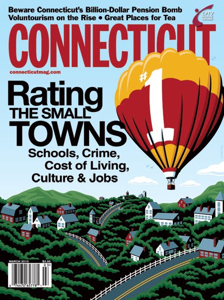
Hi guys! I won't be chatting much as I have a busy day. So here is a quick rundown of a recent commission from Connecticut Magazine. The article was their annual "Rating the small towns," in which the towns of Connecticut are judged on crime, culture, education, etc. Cover sketches:
The article also had a spot illustration. Note how these spots tie-in with the cover themes, and yet the art director also has a choice of mixing up themes if need be. Sketches:
The art director decided that she like the first cover sketch and the gauge-theme spot illo, but she wanted to place the cover sketch's #1 on something rather than it be a giant object itself. She asked for a hot-air balloon, and I did a quick revision. The art director tried it out with the text, and she liked it. After approval, I provided the refined drawing on the right to give her a better idea of the final art:
Final artwork:
 I mocked up this cover based on the text the art director tested on the sketch; I think its pretty close to the actual cover. I'll find out when the issue arrives!
Enjoy the Day,
Chris
By: Chris Whetzel,
on 3/5/2010
Blog: Chris Whetzel Illustration (Login to Add to MyJacketFlap)
JacketFlap tags: cover illo, people, editorial, conceptual, Add a tag
Hi! Sorry I forgot to blog last week! I need to start putting my blog on the work schedule :)
Jake at California Lawyer contacted me at the end of 2009 with a pretty moody cover subject: the plotting behind California's Proposition #8. The gist of the story is that "for months the people backing the case had been operating in stealth mode because they wanted the federal complaint to be the lawsuit challenging the constitutionality of Proposition 8, the successful 2008 initiative that had declared, 'Only marriage between a man and a woman is valid and recognized in California.' "
The art direction of the article was to focus on the secretive planning aspect as if this is a movie scene when the bank heist plan is being planned. The sketches:
 I looked at a lot of old movie stills to get that moody, deceptive atmosphere. The second sketch was originally not seen through a door, and that was added after Jake's great suggestion. It really helped the image. The finished artwork with text I mocked over the image:
 I never received a tearsheet or saw the cover, so I faked this text to place the illustration in context; this is one of those images that looks weird without type due to the large black shape on the right. I made a few adjustments to facilitate the text such as removing the window frame, making the background into the shadow of the lamp on the yellow wall.
Enjoy the Day,
Chris
i remember being introduced to the point of view, especially as it applied to artistic composition, with Norman Rockwell's "Shuffleton's Barbershop" where we get a glimpse at this after hours elderly band playing, through a crack in the door, through the window of the shop. later i would watch the first 5 minutes of "Unbreakable" peering between cushion cracks between seats on a train as though i was a 5 year old annoyance. i love how you've brought that in a bold update and direction, as only the power of the Whetzel iconography could portray.