new posts in all blogs
Viewing: Blog Posts Tagged with: vector, Most Recent at Top [Help]
Results 26 - 50 of 95
How to use this Page
You are viewing the most recent posts tagged with the words: vector in the JacketFlap blog reader. What is a tag? Think of a tag as a keyword or category label. Tags can both help you find posts on JacketFlap.com as well as provide an easy way for you to "remember" and classify posts for later recall. Try adding a tag yourself by clicking "Add a tag" below a post's header. Scroll down through the list of Recent Posts in the left column and click on a post title that sounds interesting. You can view all posts from a specific blog by clicking the Blog name in the right column, or you can click a 'More Posts from this Blog' link in any individual post.

Designer and illustrator Ty Wilkins (founder of Type Theory) has a small (but hopefully growing) collection of animal illustrations made up of a nice mix of vector shapes and hand-painted textures.
Posted by John Martz on Drawn! The Illustration and Cartooning Blog |
Permalink |
No comments
Tags: animals, Ty Wilkins, Typography, vector


Are you mystified by the process of creating vector shapes that don’t suck?
For this week’s Tutorial of the Week, I’m returning to Illustrative Designer Von Glitschka of IllustrationClass.com for an introductory video tutorial called Vector Build Methods.
Von Glitschka is a master of vector Illustration, and he shares his technique for achieving precise vector shapes using the pen tool, selection tools, and an Ai plugin called “Xtream Path” in this two-part series. For those eager to overcome the challenges of vector Illustration, this tutorial is a must-watch. Right now.
Thomas James
Related Tutorial: Artito Bandito by Von Glitschka
Did you find value in this tutorial? Feel free to share your thoughts in the comments section below.
Also feel free to recommend a tutorial for a future Tutorial of the Week.


The lineart for this was created in Inkscape and then colored and shaded in Artweaver 1.0 Overall it took about 2 hours. 2009.
My attempt for a vampire "portrait" pose that was mostly vector created.
I started with a pencil drawing and imported its scan into Inkscape to create a vector version. Then took the png file of the vector version into Paint.NET and colored it. Took in total about 3 hours.

By: Chris Whetzel,
on 9/30/2009
Blog:
Chris Whetzel Illustration
(
Login to Add to MyJacketFlap)
JacketFlap tags:
illustrator,
illustration,
photoshop,
digital,
vector,
sketchbook,
graphic,
bloomberg,
pension,
whetzel,
chris,
exploration,
gm,
Add a tag
Hello all. Welcome to another post! All is well in the studio, and I'm in the middle of a little breather. Two possible projects are being sorted out, and I am taking advantage of the downtime to really attack my sketchbook. I'm really trying to feel out why and how I draw while trying to let go of any idea I have of what is "good drawing." I'm also sorry to say that I am adopting a "my eyes only" approach to the sketchbook; the idea is that I will only focus on progress and experimentation instead of making pretty pictures for other folks to see. So there may or may not be additional sketchbook updates.
Although it was poorly made, listening to a documentary about Henry Darger (In the Realms of the Unreal) brought to light how a person can make art only for oneself. Until this time, I felt all artists crave attention, and I often joke that "all artists want to be famous" as we really just want people to view our work; we need to be validated! But there is certainly something to be said for a man who spent his whole life writing and illustrating a 15,000 page manuscript that no one saw until he was close to death. It makes me wonder where the assumption that I have to show my art comes from and that keeping it to myself feels selfish. But hey, keeping it to myself should keep it honest, right? I already find myself drawing differently and drawing subjects I wouldn't otherwise. So its off to a good start.
While exploring the sketchbook, I am also trying to really explore other aspects of drawing by looking at as many drawings as I can and trying to figure out WHY it appeals to me, reading and researching how drawing works from both an artist's and a viewer's perspective, and trying to discover how one moves from drawing to another technique such as painting; they really are two different beasts. Defining such things can be very frustrating and there are always artists and images that counteract any definition one hypothesizes. however, I feel doing so and asking myself such questions will make me more honest with myself and my work.
I am also trying to "step out of the box" within my regular assignments as a loose continuation of this exploration. A good example of this approach is a recent illo for John at Bloomberg Markets. I was very happy to be contacted by John from a referral by Kam, the Bloomberg designer I worked with last summer on a great assignment concerning Asian stock market regulators. John was looking for a metaphorical image to represent the mistreatment of retirement pensions by General Motors. We discussed concepts and such, and I provided the following sketches:
 John wanted to see a sketch of a "pension" license plate that was beat up and rusty. The plate is a Michigan plate to allude to GM and "motor city."
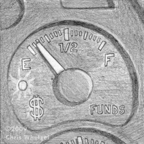 In the other sketches, I wanted to explore the pensions as dwindling. This sketch of an emptying funds gauge fit the bill, but I think it was too static.
 I enjoyed this sketch that worked in both my idea as well as John's license plate request. However, it was decided that the size of the image was going to be small, and certain elements of the sketch would be hard to read. The final art:
 Initially, the image was "too clean," and John asked that the license plate be dirtier. Upon revision, we were both quite happy with the finished product.
This image was a little intimidating for me as I do not usually work with textures, and I do not usually aim for a more realistic representation. However, I was adamant that those two elements were key to this image being successful so I basically jumped in feet first to scanning textures and making brushes in photoshop. I had not worked in this manner for years! Replaying the creation of this art in my head, I have to say that exciting nervousness of not knowing where the image and just trusting yourself is going is a lot of fun; I hope to push it into more work.
Thanks for reading! Look for a new post next week!
Enjoy the Day,
Chris

 Hey all!
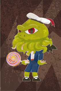
I just finished this up last night, and saw that the Challenge this week was hats, and couldn't resist posting.
This is baby c'hthulu. This is based on a story a friend of mine once told me about a rotund little kid and his trial and travails regarding a strawberry. The kid was apparently, dressed just like C'hthulu here - right down to the hat.
So there you go: hats.
Had a ton of fun with this one. Based on the Lone Wolf and Cub characters (minus Cub). I really like the way this turned out and it was not towards the end until I realized this would look good with an old film reel look. The trick was finding the right texture to get that old film feel. Fortunately, I realized I had one tucked away in my files.
My WebsiteMy Blog

I got a real kick of out of this series of illustrations on Christoph Niemann’s site that describe how his illustrator’s mind works.
By: Chris Whetzel,
on 6/15/2009
Blog:
Chris Whetzel Illustration
(
Login to Add to MyJacketFlap)
JacketFlap tags:
action,
whetzel,
chris,
espn,
illustrator,
football,
illustration,
magazine,
fantasy,
digital,
vector,
graphic,
Add a tag
Hello, reader! Welcome back! I'm happy to say this post will feature ART!
In regards to my last post concerning the field of illustration, I would like to say that after some research and correspondence, I was educated on the Conyers Bill from 2002. Check it out for info on what was almost an illustrators' union as well as info on antitrust laws. Its interesting stuff. I do still think some type of universal creative organization would be beneficial but I will stop talking about it as it appears its been tried before and didnt work out as parties could not agree or act in unison.
No worries, though! Lots of other things to focus on! New cards are coming this week. Maybe you will get one. Six new pieces are finished or in the works for future publication in the coming months. I'm hopefully getting to work in some personal project book covers this summer, and I'm looking for new ways to promote. I am looking for illustration groups and organizations to join as well in order to just have some sense of community as working from home is very solitary.
What else to mention? Currently, I am halfway through a multi-illustration project that I look forward to sharing when published. Its all hush-hush now but hopefully it wont be for long!
So for now, I can only share some artwork that is being published tomorrow:
ESPN the Magazine contacted me back in March with a cool illustration assignment: the defensive line of the Pittsburgh Steelers. The artwork was for ESPN's Fantasy Football 2009 Magazine. I had been wanting to do some sports-related art but I could never find the time; so I was super-psyched to do the job!
I was actually a little intimidated as the magazine is for "SUPER DIE HARD football fans." I was so paranoid (as is always the case) that I would mess up a uniform aspect or a player's name/number. So I did tons of research before even starting sketches to really familiarize myself with the team. Ed Mann, the art director, also sent me some nice high-res reference as well which helped greatly. After Ed and I settled all the details of the project, I sketched up these action-based images for him.
The Sketches:
 I called this one "the stack." I was really having fun just trying to show the defense as a mass of helmets and uniforms. A swarm, if you will. I liked how this one was a stack of players where you don't notice the ball carrier at first; it focuses on the defense by not even show the carrier's face/front.

I called this one "the wave." In this sketch, I was going for more of a "crashing down" on the ball carrier. Unlike the first sketch, this one features the ball carrier prominently but in a position of weakness. I really enjoyed how the figures are unrealistically stacked to the right; this sketch feels almost like fantasy to me. Perfect for fantasy football! The last sketch was one I called "the wall." I wanted to show the defense as a literal "wall" between the ball carrier and the goal. The aspect I liked of this sketch was the hands obscuring the ball carrier's uniform number; this would help by not singling out any particular player as the victim, and its also a bit metaphoric. I also liked the "back against the wall" aspect that no one would probably ever notice but me :)
Ed chose the third sketch ("the wall"), and I was off to create the final art. I decided to flip the image so that the viewer's eye would travel top left to bottom which made more sense to me. I also altered my use of blacks to focus more on the Steelers' uniforms and less on light and shadow; it worked well in this piece as there is still a healthy pattern of blacks and value.
Final Art:
 One note I would like to make is the effort put into the logos and uniform numbers. I dont mean to boast, but its all there, even the helmet "Riddels!"
Thanks to Ed for the opportunity to make artwork I really enjoyed! I hope to do more action-oriented artwork in the sports field for future assignments.
Enjoy the Day,
Chris


By: rodhunt,
on 5/11/2009
Blog:
Sugar Frosted Goodness
(
Login to Add to MyJacketFlap)
JacketFlap tags:
vector,
maps,
map,
Rod Hunt,
isometric,
animal illustration,
pixel art,
theme park map,
theme park,
Add a tag
I recently completed the 2009 visitor's site map for the Chessington World of Adventures theme park. It was pretty labour intensive & challenging involving site visits & lots of photo reference. It had to be an accurate representation of the park & rides, while being easy to use as navigation for the guests.
Rod Hunt www.rodhunt.com
Final map with park information
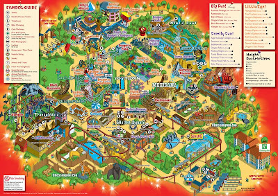
Final artwork


Happy mother’s day to all you moms! /
Feliz día de las madres a todas las mamis del mundo!
This is a doodle in Adobe Illustrator; I’ve been busy lately and had no time to use the program...yesterday I found out that I’ve forgotten the little I had learned! Oops!

By: Rebecca,
on 5/6/2009
Blog:
OUPblog
(
Login to Add to MyJacketFlap)
JacketFlap tags:
Health,
ethics,
Current Events,
Philosophy,
vector,
A-Featured,
victim,
disease,
swine flue,
H1N1,
infection,
Leslie Francis,
Add a tag
Leslie Francis is Professor of Philosophy, Professor of Law, and Adjunct Professor of Internal Medicine in the Division of Medical Ethics and Humanities at the University of  Utah. Together with Margaret P. Battin, Jay A. Jacobson and Charles B. Smith, she wrote The Patient as Victim and Vector: Ethics and Infectious Disease which explores how traditional and new issues in clinical medicine, research, public health, and health policy might look different if infectious disease were treated as central. The authors argue that both practice and policy must recognize that a patient with a communicable infectious disease is not only a victim of that disease, but also a potential vector- someone who may transmit an illness that will sicken or kill others. In the post below Francis looks specifically at the H1N1 outbreak.
The recent outbreak of H1N1 influenza in Mexico has been greeted with great concern to prevent spread. Trips have been cancelled, travelers have been quarantined, schools have been closed, and sporting events will go uncontested. Preventing spread is important, to be sure, especially of a novel agent with unknown infectivity and lethality. But there is a down side to all the worry about spread: it encourages us to think of each other as vectors, sources of disease to be feared.
We are all vectors or potential; that’s a biological fact. But it’s only one side of our biology. We’re “way-station” selves, breeding grounds and launching pads for literally trillions of microorganisms, all the time—but we’re also recipients of them too. In short: we’re all victims,
just as we are vectors. We live in a state of perpetual uncertainty about whether we’re victims, vectors, or both, at any given time.
As we are caught up in the fear of pandemic spread, we need to remember our victim-side, too. There’s been some discussion of this in the press reports: stories of empty hotels, the cancelled U-17 Concacaf tournament, travelers quarantined in airports, workers without
childcare, or pigs slaughtered unnecessarily in Egypt. But there have been no comprehensive reminders that people stricken with the flu or suspected as vectors are victims as well and in need of support: medical care if they are ill, economic consideration if their livelihoods are
lost, and just plain concern when events that are important to them must be cancelled to enforce the social distancing that is hoped to prevent spread.
In pandemic planning, much effort has been devoted to preventing disease spread. We are seeing the importance of these measures in the current situation. As fears wane, or refocus on later, perhaps more virulent phases of an epidemic or on future emergences of new infectious diseases, however, it is equally important for us to plan for victims and to ask what we owe them. Such planning efforts may be particularly important to encourage the sharing of epidemiological data in the future, if the economic impacts on Mexico are dire and left unattended, where data sharing and international cooperation is crucial in disease control. That’s a prudential imperative, but it’s an ethical one, too. After all, we’re all in this together,working together not only to prevent the spread of infectious disease but also to mitigate the impact of disease where it strikes.


By:
David Billings,
on 3/25/2009
Blog:
Sparky Firepants Art Blog
(
Login to Add to MyJacketFlap)
JacketFlap tags:
Product Review,
Software,
lessons,
tech,
how-to,
freelance,
design,
tips,
illustration,
digital,
vector,
adobe,
app,
inkscape,
neooffice,
tweakersoft,
vectordesigner,
Add a tag
So you want to get started creating your art digitally, but somehow that humongous software price tag is holding you back?
Here are two THREE vector app solutions I found just for you:
NeoOffice Draw (FREE): This is part of a family of open-source office apps that work on Windows, Mac, and Linux machines. The drawing application is basic, but it does everything I need to. It’s free to download, but if you like it I highly recommend donating so they can keep developing new versions.
VectorDesigner ($70): This is an excellent value. From a company called Tweakersoft, this app does everything I need to create simple vector graphics. It has some nice effects, too.
InkScape (FREE): I did not have this in the post when I first published it, so I’m correcting the error! InkScape is another open-source app that runs on Mac, Windows, Linux, and there’s even an “unofficial” Fedora version out there.
I work in the Adobe Design Suites on a Mac. I started years ago using CorelDraw on a Windows machine. I sometimes dip my virtual pen into the well of an Ubuntu machine (because I’m geeky like that).
One of the things I’ve learned over the years since is that the tool is not the most important thing in creating artwork.
It’s your imagination. That’s free.
Hello everyone! My name is Guayapisco. I'm from Guayaquil, Ecuador, but currently reside in Philadelphia. Since I'm new here I thought I'd start with some "Watchmen" related art. These are some quick portraits I did of Rorschach, Dr. Manhattan, and the Comedian.
I also did a small run of stickers and gave them out last week before the premiere of the movie.
These portraits and other Watchmen art were exhibited at the Imax by King of Prussia Mall in Philadelphia, to promote the movie. The gallery was put together by the
Philadelphia Cartoonist Society and featured a lot of members from
the Autumn Society of Philadelphia as well.
You can view pictures of the gallery at my brother Chogrin's flickr account here:
WWW.FLICKR.COM/CHOGRINYou can view more of my stuff here:
guayapizco.blogspot.comThank-you for your time and I look forward to posting here often!
~Guayapisco~
By: Chogrin,
on 3/10/2009
Blog:
Sugar Frosted Goodness
(
Login to Add to MyJacketFlap)
JacketFlap tags:
promo,
vector,
postcard,
golden age,
king,
pink,
chogrin,
icecreampeople.org,
brian butler,
ice cream people,
Add a tag
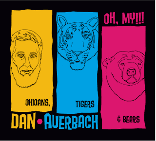 What a coe-inka-dink. This is one of three designs I submitted for "The Black Keys"s Dan Auerbach who just came out with a great new album. If you want to way on your favorite t-shirt designs visit my blog.

Eli, no! is a criminally unpublished children’s book by EightHourDay (Katie Kirk and Nathan Standberg). With definite shades of Charley Harper, the clean, geometric illustrations make for both a very modern and timeless-looking book. You can read the whole thing on Flickr.


I’m currently enjoying the work of Mark Verhaagen. I don’t know if I’ve ever seen vector illustrations appear so lush and atmospheric.
This link courtesy of Jake Parker who discovered Mark’s work by way of his contribution to this attractive wallpaper collection: One Stripe.


Jeez,
I keep getting sidetracked lately....Seems like the Internet has a lot to do with it....Lots of lights, colors, and sounds.....Distracting.
Very Distracting. Sorta like this thing was, when I was growing up.
P

For fans of basketball and vector illustration alike: The Macrophenomenal Pro Baketball Almanac. Designed and illustrated by Jacob Weinstein.

 A short while back I began doing all my "inking" in Adobe Illustrator, and I have to say I've been really pleased with the results. Here's my rendition of Dylan.
See more at my website.
Mark
 Wise little owl I did for Illustration Friday.

By: admin,
on 10/18/2008
Blog:
Illustration Friday Blog
(
Login to Add to MyJacketFlap)
JacketFlap tags:
design,
community,
illustration,
project,
vector,
readers,
celebrate,
contests/projects,
freelance,
submitted,
Add a tag
Here’s some things we (Editors -at- illustrationfriday.com) have been told about recently and enjoyed:
A reminder: If you’re interested in joining the ad rotation over there on the right, we’ll need a “skyscraper” image 160 pixels wide by 600 pixels high. Then we can feature your work (at our entire discretion) occasionally/sporadically in the ad space. (See Brianna’s original idea in this post for more information.)
Happy Weekend!
 My Chemical Romance front-man Gerard Way.
Visit my website.
View Next 25 Posts


so cute! X-]
This guy is AWESOME! Love the flannel, great design. Thanks for the comment on my wolf!
Great character- great style-
Nice job...you seem to be having a lot of luck with inkscape. It's the only program I have (besides Artweaver which have no idea how to use) for computer art.
Sometime when I have a direct question concerning the use of either, I wonder if you'd mind me asking for your help?
@pat:
Sure. I will do my best to help.
Twitter: masternil
Otherwise you can go to my profile page at deviantart.com and post a note there.
Thanks,Nil. Next time I use Inkscape I'm sure I will have a question. I'll go to your profile page. Again, nice work.