

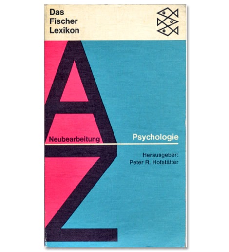
This book cover has all I need, big letters and dagger shaped fishies.
Also worth checking:
450+ examples of German and Swiss Modern Book Design
No Tags©2008 -Visit us at Grain Edit.com for more goodies.

This book cover has all I need, big letters and dagger shaped fishies.
Also worth checking:
450+ examples of German and Swiss Modern Book Design
No Tags©2008 -Visit us at Grain Edit.com for more goodies.
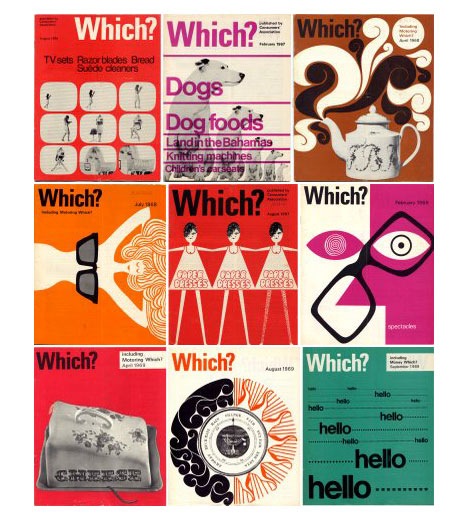
Which? magazine offers reviews and advice for various products and services. It looks like it’s a British version of Consumer Reports magazine. In addition, to the cool cover each issue features interesting information graphics and illustrations. Some of the illustrations remind me of the work of Bill Sokol. Anyone know who the art director for the magazine was?
You can check out some of the issues over at the always yummy Delicious Industries.
No Tags©2008 -Visit us at Grain Edit.com for more goodies.
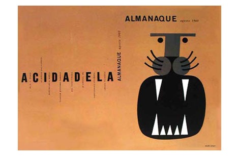
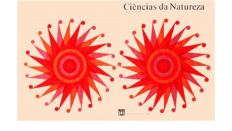
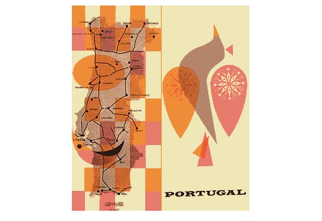
above: Ciências da Natureza book cover (1972), Almanaque magazine august 1960, material for the Secretariado Nacional da Informação - Portugal
Beautiful work by Portuguese designer Sebastio Rodrigues (1929- 1997)
You can see a video of Sebastiao in action here.
I’d love to know more about Sebastiao Rodrigues, so if you have any info please let me know in the comments.
Also worth checking:
Maria Keil : Infante Santo mural
(via nitro design, tipografico)
No Tags
![]()
O Grito logo seen on Brazil’s TV Globo circa 1977/1978
Mike Davis over at Burlesque of North America just dropped a gem on me. He just announced the launching of his new blog So Much Pileup which will feature design artifacts and inspiration from the 1960s-1980s. As you can tell from what I post on grain edit, that I’m love with the design of that era, so I’m really excited to see what Mike will be posting.
Head over to So Much Pileup and check out his first post on the graphics of TV Globo.
Also, if you haven’t already, check out Mike’s exclusive dj mix for grain edit.
No Tags
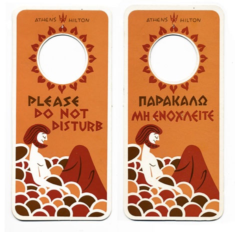
Athens Hotel door hanger + El Al Airlines hanger for sleepy time
Woah, Michael Lebowitz just posted an awesome collection of hotel door hangers.
also worth checking out:
Modern luggage label from Switzerland
No Tags

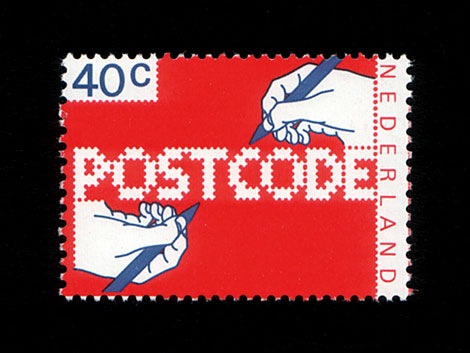
Top: Postcode typeface designed by Christophe Stoll 2008- Bottom: POSTCODE stamp designed by Gert Dumbar in 1978.
Christophe Stoll recently emailed to let me know of a cool typeface he designed called Postcode which is based off a stamp in the Iain Follett Stamp collection we featured. Check out Christophe’s website to hear the story behind Postcode and to download the typeface for FREE.
After you download the typeface, put some time aside to browse Iain Follett’s amazing stamp collection on Flickr.
No Tags
grain edit is proud to announce for your viewing pleasure the second installment in our ongoing record gallery series.
——–
One of the first people I met when I moved to California was Chris Veltri. Chris aka “Cool Chris” owns the world renowned Groove Merchant record store which has become a haven for those looking for obscure jazz, soul, funk and latin records. Chris is one of the nicest guys you’ll ever meet and his knowledge of music is bordering on insane. I couldn’t begin to count the amount of amazing albums he has exposed me to.
On one of my trips to Chris’s house I had a chance to take a few photos of his personal record collection. I only had time to go through a small portion of his collection, so here are a few of the choice album covers.
*Note - sorry for the poor image quality on some of the photos. I was having an issue with my camera.
Also worth checking:
The Record Gallery part 1- Mike the 2600 King
No Tags

If the bomb doesn’t get you maybe the Uzi will.
Have a great 4th of July. We’ll be back on monday.
(vintage firecrackers via crackerpacks)
No Tags
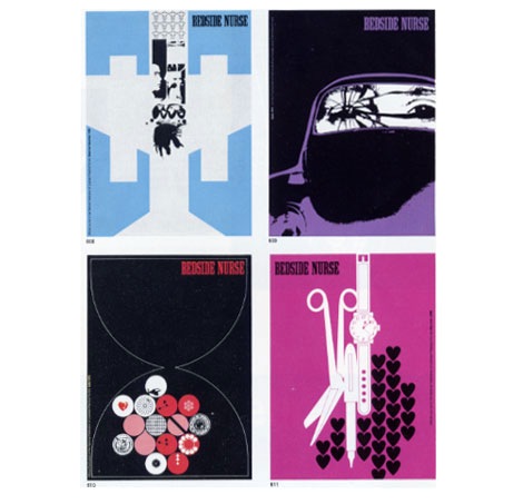
Bedside Nurse magazine design from 1968, 1969 and 1970
Charles Goslin (1932-2007) began his career at Lester Beall’s studio in 1954 and left to pursue work at corporate identity firm Lippincott & Margulies in 1958. Three years later he parted ways again, but this time to begin what would be a lengthy career as a freelance designer and illustrator. During this time he started teaching at Pratt Institute as well, where he became known for unique assignments.
For those interested in learning more about Charles Goslin, former student Scott Santoro has written lovely piece about him here.
Also of interest:
Graphic designer Clarence Lee - He worked at Lester Beall’s studio in 1958, possibly at the same time as Charles Goslin.
No Tags
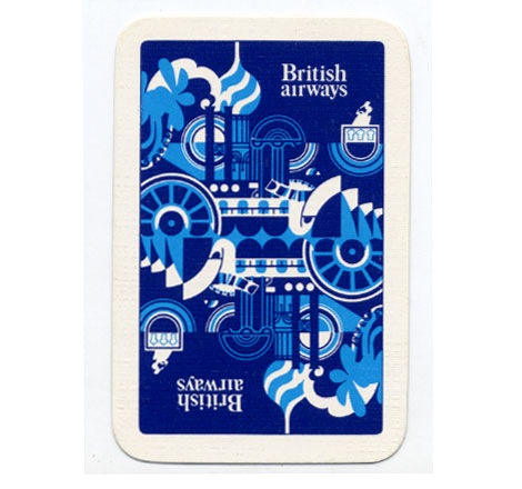
British Airways standard playing cards - 1970
Woah, British airways on acid! Anyone know who designed this deck of cards?
No Tags
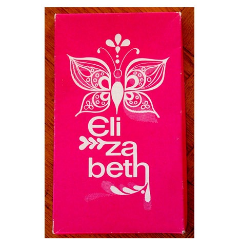
Elizabeth shoes shoebox possibly from the 1970s
I just about flipped when I found this image of an Elizabeth shoe box on flickr. I love the organic lines flowing inside the butterfly wings. Is it me or does it look like the body of the butterfly is rising from a lighter thats created when the letter “L” and letter”i” are placed next to each other? I doubt that was their intention, but its still looks cool. I can’t get enough of those branches that stem from the letters. Has anyone heard of this company? Is this a new company or is this from the 1960s or 1970s?
Many, Many thanks to Fountaineer for posting this.
No Tags
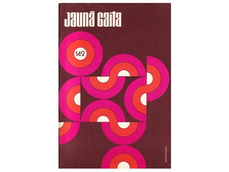
After the second World War many Latvian writers were relocated to different areas of the world. Many ended up in Great Britain, Canada and the USA. Living in these new lands they began their own periodicals and publication houses. A new generation of writers emerged. “Living in foreign lands and surrounded by other cultures, these writers strove to capture the influences of modernism.” * One of the magazines that surfaced during this time period was Jauna Gaita (the new course). Ilmārs Rumpēters who designed many of the covers of Jauna Gaita during the 1950s-1970s, wonderfully captured the spirit of this era.
1950s, 1960s, 1970s, book covers, Latvia, magazines, Mid century, modern
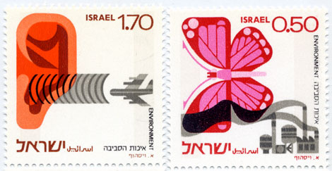
Israeli environment stamps - 1975
Beautiful stamps addressing both noise and industrial pollution.
Be sure to check out this modern stamp from Israel as well.
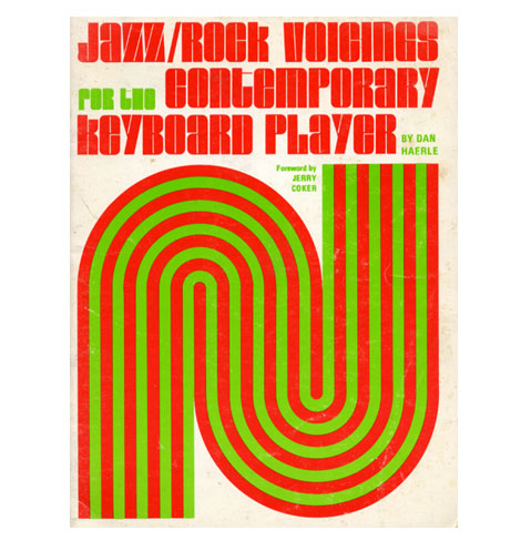
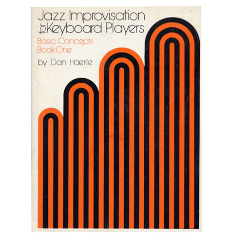
(t) Jazz/ Rock voicings for the contemporary keyboard player c1974
(b) Jazz Improvisation for keyboard players c1978
I picked up these two books over the weekend. They are part of an instructional jazz book series produced in the 1970s for Studio publications and recordings. I’m not sure who responsible for the cover design but, I like how he limited it to a few simple shapes and the type. Both books are written by Dan Haerle, but there are others in the series by Rufus Reid and Ramon Ricker.
1970s, BOOKS, graphic design, Jazz, out of print, USA
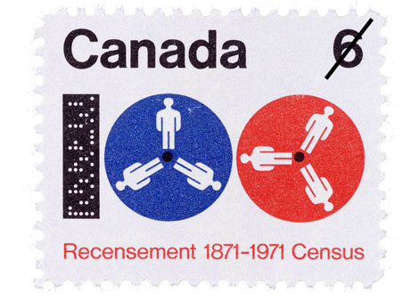
1871-1971 census stamp
Pretty bugged stamp from the Canadian Post.
Designed by Hans Kleefeld.
(via the great Canadian design resource)
1970s, Canada, graphic design, stamps By: Julie Fortenberry,
on 3/31/2008
By: Julie Fortenberry,
on 3/31/2008
Hot Dog: How Do They Make A Baseball Glove? [youtube]
Thanks to Daddy Types
From the book - Jacqueline S Casey Thirty years of design at MIT
Beautiful work from graphic designer Jacqueline Casey. It mentions in the book she was inspired by Karl Gerstner, Kurt Wirth and Anton Stankowski.
“In the early 1950s, John Matill, a writer and editor, founded the MIT office of publications. He was joined in 1952 by Muriel Cooper. Cooper was among the first designers ever hired by a university to represent it graphically. She and Matill hired Jacqueline Casey to design summer session materials in 1955.” Casey continued to work for MIT until her retirement in 1989. (Taken from the introduction of the book.)
1960s, 1970s, 1980s, BOOKS, graphic design, out of print, posters, Typography, USA
![]()
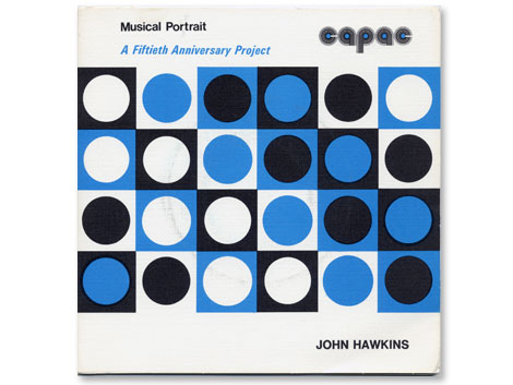
The Asian American Film Festival is in San Francisco now, so I had a chance to check out “Blood Brothers” which is one of the more recent films produced by John Woo. Anyone else seen this? Overall I thought it was pretty cheesy, but the ending wasn’t too bad. On the way to the theater I stopped by my friend Cool Chris’s record shop. Chris runs Groove Merchant which is notorious amongst beat diggers and record collectors as the place to go if you want to find rare jazz, funk and library lps. While I was there Chris hit me off with a copy of the record above.
The John Hawkins lp seen above is part of a series of 45s (the little records..7″) initiated by CAPAC (Composers, Authors and Publishers Association of Canada Limited). I’m less concerned with the music on this album as I am with the design of the logo. The rounded letters take form as records with the lines of different weights creating the grooves. It wasn’t uncommon to see logo treatments like this in the 1970s but in this case it works for me.
1970s, Canada, graphic design, lp covers, music, out of print, records
Pino Tovaglia book - The rule that corrects emotion
In addition to this blog, I own a small design bookstore. As a bookseller, I find it hard to find publishers that consistently produce quality titles. Italian publisher Edizioni Corraini is one of a few publishers that I look forward to their new releases each year. If you own or have seen any Bruno Munari books, you are most likely familiar with their work. They have reproduced dozens of Munari’s books, many of which I own in my personal collection. In addition to the Munari collection, they have produced books on or by Martí Guixé, Enzo Mari, Aoi Huber-Kono (Max Huber’s wife),Taro Miura, Albe Steiner and many others. With this in mind, I was delighted when I received an email from them mentioning that they had been reading Grain Edit and that they would like to send a package my way.
I will cover the contents of the package in several posts. The first being the Pino Tavaglia book seen above.
1960s, 1970s, BOOKS, graphic design, italy, logos, posters, reviews, Typography
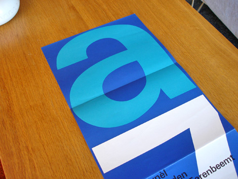
Stedelijk Museum program / poster c1970 - Wim Crouwel - designer
Total Design was responsible for designing many of the catalogs/ programs for the Stedelijk Museum in Amsterdam during the late 1960s and early 1970s. The program above was created by Wim Crouwel and Jolijn van de Wouw (of Total Design) for an exhibition in 1970. The program folds out to a full size poster that reveals a huge letter “A” and the number “7″ which stands for Atelier 7. Atelier translates to “work shop” in English so, this might be referencing a gallery number or possibly the name of the exhibition. On the other side of the poster, it lists the artists and their artwork featured in the gallery.
1970s, dutch, netherlands, out of print, posters, Typography, Wim crouwel
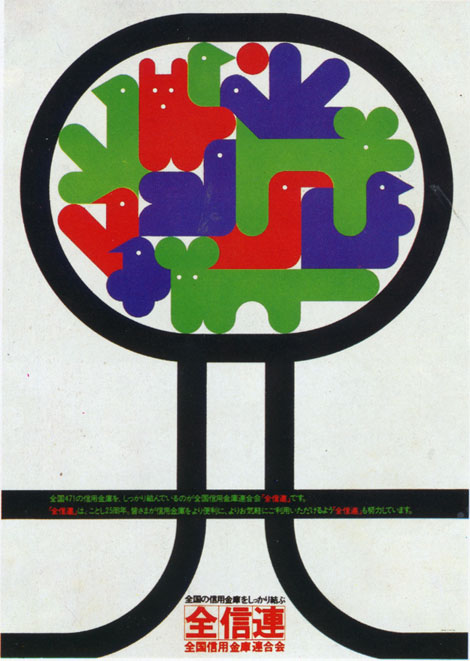
I wish I could tell you more about this one. I pulled this out of a book I have on 70s + 80s Japanese graphic design. All the text is in Japanese so, I have no clue on who designed this. Anyone recognize this work? I have no idea why theres a gaggle of balloon animals chillin in a tree. If someone could translate the text below the animals, that would be great.
1970s, animals, graphic design, japan, out of print, posters, trees By: Rebecca,
on 12/20/2007
By: Rebecca,
on 12/20/2007
Yesterday, Robert Mack, the editor of Sweeney Todd: The Demon Barber of Fleet Street, wrote about Dickens’s Influence. Today Mack looks the many incarnations of the tale. This post first appeared on Powell’s.
It wasn’t long before dramatists saw the potential of the Sweeney Todd story. In the same month that the final episode of the serialized novel was published in The People’s Periodical in March 1847, the first theatrical version appeared on stage under the story’s original title, The String of Pearls. Written by George Dibdin Pitt, it was the first version to use the catchphrase now most associated with Todd – ‘I’ll polish him off’. This was soon followed by another stage version in around 1865, under the title Sweeney Todd, the Barber of Fleet Street: or, the String of Pearls by Frederick Hazleton. Meanwhile various other versions of the story were appearing in print, often either hugely swollen or greatly abridged, all using Sweeney Todd as the title. (more…)
By: Rebecca,
on 12/18/2007
Yesterday, Robert Mack, the editor of Sweeney Todd: The Demon Barber of Fleet Street, wrote about cannibalism. Today Mack questions who the author of Sweeney Todd was. This post first appeared on Powell’s.
If you ask that question today, the answer you’re most likely to receive is ‘Stephen Sondheim’. That’s not sot surprising, since Sondheim’s musical version of the story, first staged in 1979, and now about to hit movie theatres in a Tim Burton-directed film version, has done most to popularize the legend in modern times. In fact no one knows who wrote the original story on which the Sondheim ‘musical thriller’ – and every other stage and screen adaptation – is ultimately based. (more…)
By: Rebecca,
on 12/4/2007
Robert Solomon was the Quincy Lee Professor of Business and Philosophy and Distinguished Teaching Professor at the University of Texas at Austin. He was the author of over 40 books, including The Little Philosophy Handbook which provides a concise look at perennial philosophical questions. Questions everyone asks like “Who are we?” and “Why are we here?”. In the excerpt below Solomon looks at the concept of consciousness.
For many people, the beginning of philosophical curiosity might be summarized in the French exclamation Voilà!—“Here it is!”— a sudden sense of wonder at just being alive and being here. What this means, however, is not easy to spell out. What is, is you, your being here in the world. But in coming to appreciate your being here in the world, something else, even more amazing, has happened. You have become self-conscious, not just in the sense in which you look in the mirror and become aware of the toothpaste on your chin or that you look really good in that green dress but in more of a global sense, that you come to understand and be thankful for the very fact that you are alive here and now. (more…)
By: Rebecca,
on 7/26/2007
On July 26, 1908 Attorney General Charles Bonaparte hired the first 34 FBI employees, 99 years later the Bureau employs over 30,000 people. To be honest, most of what I know about the FBI I learned from movies, so I went to Oxford Reference Online and found the entry excerpted below from A Dictionary of Contemporary World History. Love them, or hate them, the FBI’s goal is to protect the citizens of the United States and OUP wishes them a very happy birthday!