new posts in all blogs
Viewing: Blog Posts Tagged with: shape, Most Recent at Top [Help]
Results 26 - 31 of 31
How to use this Page
You are viewing the most recent posts tagged with the words: shape in the JacketFlap blog reader. What is a tag? Think of a tag as a keyword or category label. Tags can both help you find posts on JacketFlap.com as well as provide an easy way for you to "remember" and classify posts for later recall. Try adding a tag yourself by clicking "Add a tag" below a post's header. Scroll down through the list of Recent Posts in the left column and click on a post title that sounds interesting. You can view all posts from a specific blog by clicking the Blog name in the right column, or you can click a 'More Posts from this Blog' link in any individual post.

By: Carter Higgins,
on 10/1/2013
Blog:
Design of the Picture Book
(
Login to Add to MyJacketFlap)
JacketFlap tags:
design,
harmony,
wordplay,
color,
balance,
pattern,
rhythm,
chronicle,
composition,
layout,
shape,
unity,
paul rand,
ann rand,
sparkle and spin,
Add a tag

By Ann and Paul Rand
{originally published 1957 by Harcourt, Brace, and World. Reprinted 2006 by Chronicle Books.}
 Sometimes pictures are just that: eye-catching and whimsical, without being packed with meaning or message. That spirit dances across the page in Sparkle and Spin, written by Ann Rand and illustrated by her husband Paul.
Paul Rand is an iconic American graphic designer. A problem solver. A storyteller. A communicator.
He said this about design:
“Good design adds value of some kind, gives meaning, and, not incidentally, can be sheer pleasure to behold.”

 His biographer, Steven Heller, said this:
“Paul Rand did not set out to create classic children’s books, he simply wanted to make pictures that were playful. Like the alchemist of old, he transformed unlikely abstract forms into icons that inspired children and adults and laid the foundation for two books that have indeed become children’s classics.”
Maybe he didn’t intend to be a creator of legendary books for kids, but his love for beautiful work shines in this one. That’s the magic of Sparkle and Spin: harmony, wit, and playfulness.

 And Ann’s words are a delightful match to Paul’s pictures. There’s a rhythm, song, and honor to these words that represent the joy of learning. Harmony, captured perfectly.
In graphic design, harmony is the magic that happens when all of the individual elements complement one another. It’s when small parts of pretty make up a more lovely whole. Here’s a detail I really love. This bold, graphic ice cream cone comes at the beginning, and with the inscription: To all children who like ice cream. And at The End, that scoop’s been slurped, chomped, and devoured. That’s what the experience of this book is. Tasty.
The book sparkles and spins. You’ll see what I mean.

Tagged: ann rand, chronicle, color, harmony, pattern, paul rand, shape, sparkle and spin, wordplay 
By: Carter Higgins,
on 9/24/2013
Blog:
Design of the Picture Book
(
Login to Add to MyJacketFlap)
JacketFlap tags:
design,
graphic novel,
picture books,
comics,
color,
concept,
trailers,
wordless,
composition,
shape,
jacques tati,
contrast,
northsouth books,
david merveille,
mr. hulot,
Add a tag
 by David Merveille, based on the character brought to life by Jacques Tati.
{published 2013, by NorthSouth Books}
I was smitten by the looks of this book at first glance. Perhaps it was a bit of that orange and blue thing, and a bit of it just being so spectacular. But first, I had to introduce myself to Monsieur Hulot, the comical character from French cinema, and the spirit and subject of this book.
His trademarks are his raincoat, umbrella, pipe, and sheer ineptitude.
I loved him immediately. Here’s a trailer (love those title graphics!) for Les Vacances de Monsieur Hulot (Mr. Hulot’s Holiday.)
So now that you are entirely delighted and heartwarmed, isn’t it the greatest news ever that a nearly wordless picture book contains this nutty dude? Yes. I know. These endpapers are reminiscent of the title graphics in the trailer as well as the movie poster, so, of course we love that.
 The shapes of his raincoat-suited-self-H and an umbrella-O set you up for the hysterical stories inside. This title pages sets you up for humor, heart, and charm, and the following pages do not disappoint.
Here’s what I mean. It’s a series of stories told through pictures. Two pages contain witty puzzles and a complete visual narrative. This one, French Riviera, is one of my favorites. You think Monsieur Hulot is floating underneath the waves and gallivanting with sea creatures.
But no. He’s just biking next to a fish truck.
Brilliant might be an understatement. The Crossing also had me in stitches, and reminded me a teensy bit of The Other Side. What seems to be true might not be at all!
What a treat to be surprised and delighted by this goofy guy! You’ll never guess what preceded this page.
 And you’ll be shocked by the conclusion of this one.
If you are a picture book writer, be sure to grab this one. It is a master class in the suspense and payoff of the page turn.
Sly, subversive, and completely unexpected. A thrill to read! And perhaps a good pair with Matt Phelan’s Bluffton: My Summers with Buster Keaton?
Review copy provided by NorthSouth Books.
Tagged:
comics,
david merveille,
graphic novel,
jacques tati,
mr. hulot,
northsouth books,
picture books,
wordless 
By: Carter Higgins,
on 9/10/2013
Blog:
Design of the Picture Book
(
Login to Add to MyJacketFlap)
JacketFlap tags:
design,
illustration,
color,
book trailer,
trailers,
composition,
color palette,
shape,
claudia boldt,
northsouth books,
odd dog,
you're a rude pig bertie,
Add a tag
This summer I got to work with the fantastic folks at NorthSouth Books to create a trailer for an upcoming release by Claudia Boldt, You’re a Rude Pig, Bertie!
Bertie is definitely a rude pig, but he’s also irresistible and will endear himself to you the second he reveals his true heart. And I adore Claudia Boldt’s work – a muted and restrained palette, unexpected shapes and proportions, and a charming cast of characters.
(I wrote a teensy bit about her previous book, Odd Dog, over at Design Mom, so what a thrill to create something for a creator you admire!)
Anyway. I love the result, and hope you love it, too!
What do you think? Adorable, right? And super catchy. I guarantee that song will tag along with you the rest of the day – and you’re welcome!
P.S. – I haven’t heard from the winners of the Sassy board books. Are you out there, Olivia De Hamilton and Sara Floyd? I’ll pick new winners on Friday if I don’t hear anything. Stay tuned!
Tagged:
book trailer,
claudia boldt,
design,
illustration,
northsouth books,
odd dog,
you're a rude pig bertie 
By: Carter Higgins,
on 5/20/2013
Blog:
Design of the Picture Book
(
Login to Add to MyJacketFlap)
JacketFlap tags:
color,
nature,
space,
texture,
form,
shape,
design,
scale,
rhythm,
line,
Add a tag
 by Janice Lovoos
{published 1966, by Golden Gate Junior Books}
I was in Seattle a few weeks ago. You remember the library, right?
I went to Pike Place Market, because of course, but also because flying fish and dudes in galoshes are a spectacle worth checking out. And I also wanted to get up close and personal with some bluefin tuna eyeballs.
There’s a real reason for that, trust me. But they didn’t have any tuna, so this happened: 
There’s not a real point to that story except that I adore that tweet (and those two Favoriters) and it’s what I did just before I wandered into Lamplight Books.
It’s like I stole something. Fifteen dollars? Sixty quarters? It still has that magical, musty smell of hidden secrets. And it was mine in a fraction of a split second. That fast.
Because…behold:


 I’m in love. From the texture of a porcupine, to the form of mountains and weeds, to the repetition inside a squash, design is everywhere.


Design is a Dandelion ends like this, with truth and a charge:
Design is everywhere. It is for everyone. All you have to do is to learn to see it. Open your eyes and take a big, long look.
Tagged:
design,
form,
line,
nature,
shape,
space 
By: Carter Higgins,
on 5/13/2013
Blog:
Design of the Picture Book
(
Login to Add to MyJacketFlap)
JacketFlap tags:
color,
book trailer,
concept,
trailers,
texture,
composition,
color palette,
screenprinting,
guest post,
shape,
greg pizzoli,
the watermelon seed,
design,
illustration,
picture book,
Add a tag

by Greg Pizzoli
{published 2013, by Disney Hyperion}
I’ve been looking forward to this book for a long time, mostly because that cover is SPECTAZZLING. But also cause I follow Greg Pizzoli on Twitter, where he is clever and quippy and shares things like THE ENDPAPERS. And then this is what the publisher teased us with, so I was pretty much in love with this book right away:
With perfect comic pacing, Greg Pizzoli introduces us to one funny crocodile who has one big fear: swallowing a watermelon seed. What will he do when his greatest fear is realized? Will vines sprout out his ears? Will his skin turn pink? This crocodile has a wild imagination that kids will love.
Yeah. SO INTO THAT. The Watermelon Seed hits stores TOMORROW, May 14th, so you might want to go ahead and get in line. After you meet Greg, of course.
So I’ve also been looking forward to this post for almost as long. I’m thrilled to have Greg Pizzoli in for a visit. Welcome, Greg!


I call him “Kroc”. Sometimes my editor calls him “K-Roc” or “The Krocster”. Boy, does he hate that. My background is in printmaking, and I built a silkscreen shop in my studio, which is how I generate a lot of my work. I think my preference towards limited and deliberate colors comes from the printmaking. It could be laziness, but I’m going to say printmaking.
Even the first sketches of this book were in just a few colors. It just made sense to make the whole book feel like a watermelon. Plus, he’s a crocodile, so the green is already there.
Everyone at Disney*Hyperion was very supportive of my trying out different inks and paper choices to get the feel just right. We did CMYK v. Spot color tests and there was just no comparison. I think it would be tough to get that pink, and that green with CMYK. At least for me. We tried a few different paper stocks, too. I’m super picky.
 Basically you make a drawing in black and use that to make a stencil on a screen. Doesn’t matter how you make that drawing – by hand on tracing paper, with construction paper, in Photoshop – whatever you can use to get a drawing in black. Your screen, which is a frame of aluminum with a fine mesh stretched across it, is covered in photographic emulsion, and you expose the screen to light. Wherever the light hits the emulsion, it hardens and becomes water resistant.
BUT if you put your black drawing between the screen and the light source, the emulsion that is blocked by your drawing (which remember, is black, thus very light blocking-y), that emulsion stays soft. And you can wash it out with water. So everything that wasn’t blocked by your drawing is water resistant, and your drawing washes out of the screen, making a water resistant stencil in the shape of your drawing. You make one of those for each layer, or usually, color. WATERMELON was offset printed obviously, but I did a lot of screenprinting textures, etc to make it feel very printy. The spot colors definitely help there, too.
I’ve been teaching screenprinting for about 4 years at The University of the Arts in Philly. It’s where I met Brian Biggs. He took a continuing ed class I was teaching in 2009. He introduced me to my agent. I dedicated a book to him, but it hasn’t come out yet. I still owe him big time. I still teach! I love it.


Humor usually keeps me interested in whatever I’m doing.


I like to work with texture for sure, too. And shapes. Shapes, yeah, shapes are good. I know this is great interview material here. Breaking news, Greg Pizzoli “like shapes”. Today on Buzzfeed, 23 shapes Greg Pizzoli likes most.
Anyway . . . I was really into shapes and texture with THE WATERMELON SEED, and the next book I’m doing with Hyperion (NUMBER ONE SAM, Summer 2014) comes from a similar place. We’re doing spot colors for that one, too. But four this time, which opens up a lot of possibilities in terms of overlapping layers and colors.


Like most people, I like lots of stuff. I never get tired of looking at Eduardo Munoz Bachs posters. He obviously had a lot of fun making his work. A lot of people you’d suspect probably, Sendak, Ed Emberly, Tove Jansson, Charles Schultz, etc.

 I’m really lucky to have so many talented buddies in the Philly area, too. I host occasional drink ‘n’ draws at my studio and Zach Ohora, Matt Phelan, Bob Shea, Tim Gough, Amy Ignatow, Brian Biggs, Lee Harper, Gene Baretta, Eric Wight, and several others have come by. It’s a good time. Sometimes we do this thing where we each draw for five minutes and then pass the paper to the right and draw on top of that drawing for five minutes, until we get all the way around the circle or run out of beer. You can imagine just how bad these things look. Joe Strummer, Iggy Pop, David Bowie. They’re my heroes.

No way! I love coffee. I think I quit for a while last year and it just floated around my online profile for a bit. I did stop drinking as much. I am down to like 2-3 cups a day which feels great for me. I was drinking like 8-10. Oh yeah. I’m nicer now.
Greg Pizzoli, people. Is he awesome or what?

So yeah. That’s pretty much my favorite thing on the internet right now. Did you catch the part where the period at the end of the sentence becomes a spotlight for good old K-Roc?! I love that detail.
The Watermelon Seed! Greg Pizzoli! Thanks for hanging out here! We love your book. And you are top notch, too.
Tagged:
book trailer,
color palette,
greg pizzoli,
illustration,
picture book,
screenprinting,
shape,
texture,
the watermelon seed 
It's spring break this week, and it was a goal of mine to try and open the sketchbook if I could. Of course, finding the time is difficult. Well, actually, if I could find a way to set-up the sketchbook in a workable position while nursing the baby, I'd have lots of time (she eats all the time).
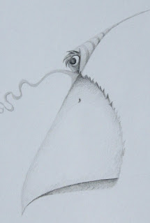
But, I did start a doodle - something I haven't done in a while. I wrote in the past about how birds often come out of these doodles. As you can see by what I've shown here, some sort of bird seems to be coming through...or is it? I definitely was pursuing the beak and eyeball. However, the fun thing about doing these doodles is that - if I just take my time, playing with lines, shapes, and values - other surprises often materialize. I actually started to see other possibilities that I'd like to explore.
So, I will post the finished product as soon as I can string together some drawing time. You'll just have to check back later and see what became of it.


 Sometimes pictures are just that: eye-catching and whimsical, without being packed with meaning or message. That spirit dances across the page in Sparkle and Spin, written by Ann Rand and illustrated by her husband Paul.
 His biographer, Steven Heller, said this:

 And Ann’s words are a delightful match to Paul’s pictures. There’s a rhythm, song, and honor to these words that represent the joy of learning. Harmony, captured perfectly.
 Here’s a detail I really love. This bold, graphic ice cream cone comes at the beginning, and with the inscription: To all children who like ice cream. And at The End, that scoop’s been slurped, chomped, and devoured. That’s what the experience of this book is. Tasty.


.jpg?picon=1621)
well this looks finished to me. I love the look!