What is JacketFlap

  • JacketFlap connects you to the work of more than 200,000 authors, illustrators, publishers and other creators of books for Children and Young Adults. The site is updated daily with information about every book, author, illustrator, and publisher in the children's / young adult book industry. Members include published authors and illustrators, librarians, agents, editors, publicists, booksellers, publishers and fans.
    Join now (it's free).

Sort Blog Posts

Sort Posts by:

  • in
    from   

Suggest a Blog

Enter a Blog's Feed URL below and click Submit:

Most Commented Posts

In the past 7 days

Recent Posts

(tagged with 'posters')

Recent Comments

Recently Viewed

JacketFlap Sponsors

Spread the word about books.
Put this Widget on your blog!
  • Powered by JacketFlap.com

Are you a book Publisher?
Learn about Widgets now!

Advertise on JacketFlap

MyJacketFlap Blogs

  • Login or Register for free to create your own customized page of blog posts from your favorite blogs. You can also add blogs by clicking the "Add to MyJacketFlap" links next to the blog name in each post.

Blog Posts by Tag

In the past 7 days

Blog Posts by Date

Click days in this calendar to see posts by day or month
<<June 2024>>
SuMoTuWeThFrSa
      01
02030405060708
09101112131415
16171819202122
23242526272829
30      
new posts in all blogs
Viewing: Blog Posts Tagged with: posters, Most Recent at Top [Help]
Results 26 - 50 of 164
26. Vintage Children's Book Week Posters

In honor of Children's Book Week, here are some vintage posters for you to peruse. Enjoy!


Helen Sewell, Illustrator, 1941


Elizabeth Orton Jones, Illustrator


1953 Poster


Garth Williams, Illustrator, 1955


Roger Duvoisin, Illustrator, 1952
3 Comments on Vintage Children's Book Week Posters, last added: 11/19/2011
Display Comments Add a Comment
27. READ poster for ALA!

Here is my latest READ poster to benefit the fine folks at ALA: It features Elephant and Piggie reading happy books, and the Pigeon, well, reading. You can get it for your class, library, or home right here!   There are also bookmarks available! And, thanks to you, HAPPY PIG DAY! has returned to the NYTimes Bestseller list at #9!  Thanks, you. Add caption

0 Comments on READ poster for ALA! as of 1/1/1900
Add a Comment
28. Ross Gunter

Holy gridness! Very slick work from Ross Gunter, a London-based designer and music lover. Ross is a co-founder of Bridging the Gap, the music and art collective for which this and the following posters were designed.

I’m a fan of the contrast in Ross’s work — the minimal structure/layout plays nicely with the bold, front-and-center imagery. Color palettes are restrained, which really help give the body of work a consistent feel.

Check out the rest of Mr. Gunter’s portfolio.

Via AisleOne

Also worth viewing:

Erik Marinovich
Simon Walker
Alonzo Felix

Not signed up for the Grain Edit RSS Feed yet? Give it a try. Its free and yummy.

No Tags

Grain Edit recommends: Eli No! by Katie Kirk. Check it out here.


©2011 Grain Edit - catch us on Facebook and twitter

Add a Comment
29. DKNG Studios

DKNG

This Black Keys Radio Flyer inspired poster was made by DKNG, the LA-based design crew. They do great work, and are also (awesomely) the resident poster artists for the world famous Troubadour in Hollywood. What a great gig.

I love the concepts and especially the detail within their work. The posters tend to be bold and straightforward concept-wise, but they really pull everything together with fine-tuned details.

The process video for Explosions in the Sky (pictured below) is quite interesting. In a time when designers employ a lot of Illustrator and vectors, it’s cool to see something executed by hand.

DKNG

DKNG

DKNG

DKNG

DKNG

DKNG

DKNG

No Tags

Grain Edit recommends: Eli No! by Katie Kirk. Check it out here.


©2011 Grain Edit - catch us on Facebook and twitter

Add a Comment
30. Philographics by Genis Carreras

Genis Carreras

Genis Carreras, a Catalonian living and working in London, recently created this wonderful series of posters which attempt to explain complex philosophical theories through basic shapes. The resulting graphics are perfect in their colorful and elegant simplicity. Check out Genis’ site for more great work.

Genis Carrera

Genis Carreras

Genis Carreras

——————–

Also worth viewing:
Timba Smits
Herb Lubalin Archives
Mike Davis Interview

Not signed up for the Grain Edit RSS Feed yet? Give it a try. Its free and yummy.

——————–

No Tags

Grain Edit recommends: Eli No! by Katie Kirk. Check it out here.


©2011 Grain Edit - catch us on Facebook and twitter

Add a Comment
31. Andrew Vastagh

andrew vastagh

Andrew Vastagh is a Nashville based designer who is quite active in the gig poster scene. Over the last five years he’s created work for many well-known bands including the likes of She & Him, Vampire Weekend, Social Distortion and Band of Horses.

For this week’s poster pick we’ve selected Andrew’s design for the 2010 Menomena show at the Mercy Lounge. It features a two colored ribbon spiraling downward to form a cyclinder-esque shape. The combination of the ribbon’s wave-like movement and the transparency seen in the color overlay creates for a mesmerizing and memorable pattern. If you’re a fan of Menomena, ribbons, Andrew Vastagh or all of the above you can pick this piece up at the Poster Cabaret.

andrew vastagh

andrew vastagh

————

Also worth viewing…
Jason Munn interview
Invisble Creature interview
Frank Chimero interview

Like what you see?
Sign up for our Grain Edit RSS feed. It’s free an yummy!

No Tags

Congrats to our winners in the Bike Print giveaway: Gianluigi Farnetti, Brian_HF, brianjbarron, Adrienne Wu


Grain Edit recommends: Karel Martens: Printed Matter. Check it out here.


©2009 Grain Edit - catch us on Facebook and twitter

32. Minimalist Fairy Tale Posters

by Christian Jackson

0 Comments on Minimalist Fairy Tale Posters as of 1/1/1900
Add a Comment
33. Go now, and have your mind blown by the work of Alvaro Tapia...


Go now, and have your mind blown by the work of Alvaro Tapia Hidalgo. I have been bookmarking artists whose work I wish to buy and you can be I’ll be spending a few dollars here. Lovely stuff. 


0 Comments on Go now, and have your mind blown by the work of Alvaro Tapia... as of 1/1/1900
Add a Comment
34. Heartwork: Art Benefit for Target House

heartwork

Heartwork is a project designed to raise money for art supplies within the art room at Target House—this wonderful home-away-from-home for the families of children facing long-term treatment at St. Jude’s Children’s Research Hospital.

The idea is simple. Every year, a group of talented artists will create a series of posters to raise money for the art room. Each of the posters will feature a different interpretation of the Target House elephant mascot, chosen because it represents family, long life, strength and playfulness—attributes with special meaning at a place designed for families to live, play and heal.

Here’s a sample of the posters available in this year’s Heartwork benefit.
christopher lee

Balancing Act by Christopher Lee

michael bartalos

Tuskers Ahoy by Michael Bartalos

katie kirk

Circus by Katie Kirk

invisible creature

Collaboration by Don Clark

wink design

Love to Grow by Scott Thares (wink)

You can make a donation to the cause by purchasing Heartwork prints from the Poster Cabaret. 100% of proceeds, after costs, go directly to the art room within Target House. All prints are signed and limited to an edition of 40.

Follow the Heartwork project on Twitter.

——————–

Also worth viewing:
Invisible Creature Interview
Wink Interview
Naive: Modernism and Folklore in Graphic Design

Not signed

Add a Comment
35. Art for Joplin

Joplin posters

St.Louis Based Moosylvania put together a series of posters to benefit relief efforts in the tornado-stricken city of Joplin, Mo. Each poster is signed by the artist and screen printed by hand to order. All proceeds will be donated to the Southwest Missouri chapter of United Way to aid in the economic reconstruction.

Joplin posters

——————–

Also worth viewing:

Designers for Japan

So-Cal Fire Poster Project
Naive: Modernism and Folklore in Graphic Design

Not signed up for the Grain Edit RSS Feed yet? Give it a try. Its free and yummy.
——————–

No Tags

Congrats to our winners in the Bike Print giveaway: Gianluigi Farnetti, Brian_HF, brianjbarron, Adrienne Wu


Grain Edit recommends: Karel Martens: Printed Matter. Check it out here.


©2009 Grain Edit - catch us on Facebook and twitter

Add a Comment
36. Lucy Knisley


0 Comments on Lucy Knisley as of 1/1/1900
Add a Comment
37. (via Hitchcock Film Series : Daniel Zender) I have a bit of...


(via Hitchcock Film Series : Daniel Zender)

I have a bit of a hate-on for the torrent of minimalist movie posters that seems to have become a tired trend over the last year or two, especially when done poorly, but these smartly designed and illustrated Hitchcock tributes are another story.


0 Comments on (via Hitchcock Film Series : Daniel Zender) I have a bit of... as of 1/1/1900
Add a Comment
38. Wow. My friends and international rock stars of the rock poster...


Wow. My friends and international rock stars of the rock poster scene (not to mention the all the packaging design, identity design, and graphic design in general) have achieved a major milestone. Aesthetic Apparatus has published 500 posters in their twelve years of existence. An amazing accomplishment worthy of hoisting a few celebratory beverages from afar: Here’s to 500 more, Michael and Dan!

(via AESTHETIC APPARATUS: 500 POSTERS)


0 Comments on Wow. My friends and international rock stars of the rock poster... as of 1/1/1900
Add a Comment
39. Designers for Japan

designers for japan
To Japan by Christopher Gray

Designers for Japan is a collective of imagemakers from around the world who were spurred on by the catastrophe of March 11th to do something, anything to help and to express our love for our friends and colleagues in Japan. Thanks to Print-Process & Creative Review, prints are for sale at £30 for A2, £60 for A1 with all proceeds after print, paper and postage going to the The Red Cross / Shelterbox. In addition, there are plans for an upcoming charity auction. If you would like to contribute or help in anyway, please contact them at [email protected].

You can purchase prints here.

designers for japan
For Japan by Martin Venezky

——————–
Also worth viewing:
Japanese Graphic Design in the 1950s
Kurokawa Nakagin Capsule Hotel
Expo 70 Japan

Not signed up for the Grain Edit RSS Feed yet? Give it a try. Its free and yummy.
——————–

No Tags

Grain Edit recommends: Karel Martens: Printed Matter. Check it out here.


©2009 Grain Edit - catch us on Facebook and twitter

40. John Pavlus at Fast Company Co.Design articulates the...


John Pavlus at Fast Company Co.Design articulates the conflicting thoughts running through my own head about this. People have understandably been quick to attack John for this, but I believe it’s still an important conversation to have (although I agree he chose a terrible title). 

Let’s say I did buy one of these posters: what on earth am I supposed to do with it? Hang it in my living room like some overly aestheticized/sanitized symbol of a blindly horrific natural disaster that I had no direct experience of? Or, worse, as some sick, bragging monument to my own willingness to “help”?

(…)

It’s not impugning Signalnoise’s motives to ask these questions, but it does make me wonder if the designer fully thought through everything that the project implied before starting it. If not, we can hardly fault him—the first response to any tragedy is always emotional, for better or worse, and the urge to just dosomethinganythingNOW is a powerful one.

(…)

But then, shouldn’t our desire to donate come from actual compassion, not as a side effect of our fascination with pretty artifacts? Indeed it should. Of course, there are a lot of things we should do out of basic human decency that often go undone. So maybe projects like these are just coldly efficient, making lemonade from lemons. Yes, the actual product is unavoidably, fundamentally grotesque if you look beneath its tasteful surface.

(via Is This Poster to Aid Japan’s Tsunami Victims a Crime Against Design?)


0 Comments on John Pavlus at Fast Company Co.Design articulates the... as of 1/1/1900
Add a Comment
41. Out With The Old And In With The New


You're on the right site. It's still Illustration Pages - with a whole new look - cleaner - and easier to navigate. This is the new 2011 version of Illustration pages. IP's new look makes it easier to focus on the art we feature… once again bringing the art and the artists out into the spotlight. Enjoy the new design. And keep coming back for more great art.

Illustration by J.R. Mounger and available as a free downloadable poster here.

0 Comments on Out With The Old And In With The New as of 1/1/1900
Add a Comment
42. Helms Workshop

grain edit / helms workshop

Helm Workshop, an Austin, Texas based studio, does some gorgeous work. I love the variety of their poster art and typography — alongside their composition and illustrations.

I was reading On the Road recently, so the headline for the Hold Steady poster below is very much appropriate.

grain edit / helms workshop

grain edit / helms workshop

grain edit / helms workshop

grain edit / helms workshop

grain edit / helms workshop

grain edit / helms workshop

grain edit / helms workshop

grain edit / helms workshop

No Tags

Congrats to our giveaway winners! Alan S (Cranston, RI), Emily S (Denton, TX), amluke and Anna M (Ithaca, NY)


Grain Edit recommends: The Vignelli Canon by Massimo Vignelli. Check it out here.


©2009 Grain Edit - catch us on Facebook and twitter

Add a Comment
43. Poster Pick: Arcade Fire at the Key Arena

invisible creature

For this week’s poster pick, Invisible Creature presents us with a cold, ghost-like city, where it’s remaining inhabitants are fleeing in a school bus into an unknown suburban abyss. The artwork was inspired by the equally bleak lyrics of ‘City With No Children’, a song from Arcade Fire’s latest release, ‘The Suburbs‘. I appreciate the selective use of color and asymmetrical layout, which immediately caught my eye. This gets my vote as one of the Creature’s most impressive posters to date.

You can pick up a print at the Poster Cabaret or enter to win a copy in the Grain Edit Holiday Giveaway Bash.

——————–

Also worth viewing:
Invisible Creature interview
Hybrid Design interview
Naive: Modernism and Folklore in Graphic Design

Not signed up for the Grain Edit RSS Feed yet? Give it a try. Its free and yummy.

——————–

No Tags

Only a few grain edit shirts left.Get yours now!

Grain Edit recommends: The Vignelli Canon by Massimo Vignelli. Check it out here.


©2009 Grain Edit - catch us on Facebook and twitter

44. Kazumasa Nagai Posters

Kazumasa Nagai Posters

Pink Tentacle digs up an impressive collection of posters by Japanese artist and designer Kazumasa Nagai. Enjoy!

Kazumasa Nagai

Kazumasa Nagai

Kazumasa Nagai

(Thanks to @iconomaque for the link!)

——————–

Also worth viewing:
Ayao Yamana: Graphic Design
Japanese Graphic Design in the 1950s
Japanese Book Covers

Related Books:
Kazumasa Nagai: Design life
The Works of Kazumasa Nagai

Not signed up for the Grain Edit RSS Feed yet? Give it a try. Its free and yummy.

——————–

No Tags

Only a few grain edit shirts left.Get yours now!

Grain Edit recommends: Born Modern: The Life and Design of Alvin Lustig. Check it out here.


©2009 Grain Edit - catch us on Facebook and twitter

45. Nate Duval

nate duval

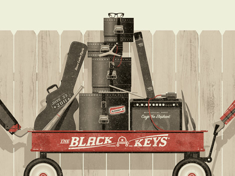
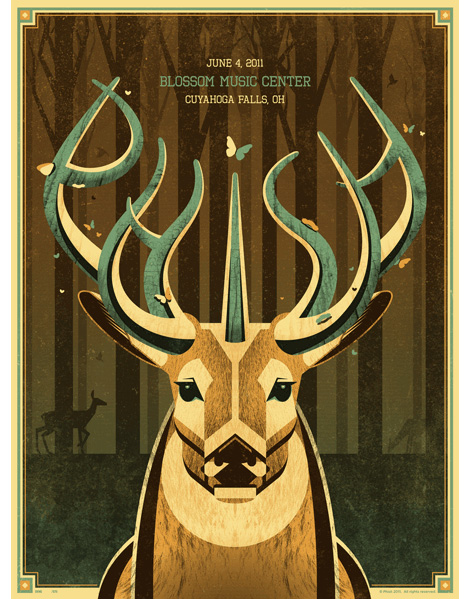
Massachusetts-based illustrator and designer Nate Duval is a busy man. Over the past year he has created concert posters for Phish, Spoon, Wilco, Tortoise and the Black Keys as well as a collaborated with Jen Skelley and Mother NYC on an re-branding campaign for Sweet ‘N Low.  Nate’s work often pairs playful imagery with hand-drawn type as seen in this city skyline poster for M. Ward.  I love how he’s able to present a potentially chaotic situation in a way that looks innocent and fun. This poster as well as others designed by Nate are available for purchase at the Poster Cabaret.

nate duval

nate duval

nate duval

——————–

Also worth viewing:
Miguel Calatayud: 70s Comic Illustrations
Anorak Magazine
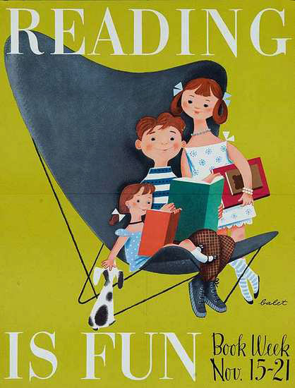
Petit Collage Alphabet Poster

Not signed up for the Grain Edit RSS Feed yet? Give it a try. Its free and yummy.

——————–

No Tags

Only a few grain edit shirts left.Get yours now!

Grain Edit recommends: Born Modern: The Life and Design of Alvin Lustig. Check it out here.


©2009 Grain Edit - catch us on Facebook and twitter

46. Postmammal

postmammal

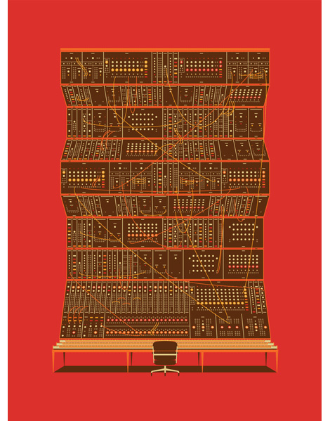
Robert Murdock is Postmammal. As the pseudonym suggests, Robert’s work is sophisticated and evolved — illustrating the efforts of years of experience. Within the portfolio is variety, depth and style. There are large campaigns, small personal projects, identity systems, illustration, custom typography, and more.

To me, the common theme consistent throughout the work isn’t a particular style (there definitely is style), but rather a way of thinking, and a feeling that the work just “fits” or is appropriate for the product. Everything feels effortless, smart, and refined. It’s not often you find a designer’s work that feels this curated or compelling.
postmammal

postmammal

postmammal

postmammal

postmammal

postmammal

Robert is CCO at the very cool Method, in San Francisco. Go to the Postmammal.

——————–

Also worth viewing:
Darren Firth
Wim Crouwel Archive
Hey Studio

Not signed up for the Grain Edit RSS Feed yet? Give it a try. Its free and yummy.

——————–

No Tags

Only a few grain edit shirts left.Get yours now!

Grain Edit recommends: Born Modern: The Life and Design of Alvin Lustig. Check it out here.


Add a Comment
47. The Ultimate Swissair Fansite

swissair posters

Patrick Eberhard has amassed an amazing collection of Swissair-related material. His website, Sr692 which is named after the flight number from Zürich to Lisbon, is filled with vintage posters, flyers, logos, stamps, route maps, tickets and books, as well as a detailed history of the airline. This is an absolute goldmine for those interested in Swiss design.

A hat tip to Shelby at Wanken for discovering this amazing resource.

swissair posters

swissair posters

swissair timetables

(via iso50 + Delicious Industries)

——————–

Recommended Reading:
Airworld: Design And Architecture For Air Travel
- Published by Vitra
This book focuses on the corporate design of airlines, uniform fashion, the graphics of air travel posters and the significant role that aviation played as an inspiration for architecture, design and art up to the present day.

Copies are available at Amazon.

——————–

Also worth viewing: Swiss Graphic Design by Geigy, Jorg Hamburger, Publicity and Graphic Design in the Chemical Industry.

Not signed up for the Grain Edit RSS Feed yet? Give it a try. Its free and yummy.

——————–

No Tags

Only a few grain edit shirts left.Get yours now!

Grain Edit recommends: Born Modern: The Life and Design of Alvin Lustig. Check it out here.


©2009 Grain Edit - catch us on Facebook and twitter

Add a Comment
48. Alberto Cerriteno

alberto cerriteno

Inspired by pop surrealism and alternative cartoons, Alberto Cerriteno’s work is filled with rich textures and fantastically imagery. This print entitled Recuerdos is no exception. We see a small group of birds perching on branches sprouting from a somewhat distinguished gentleman’s head. The man appears to be crying and I hope they’re tears of joy. Recuerdos was originally created for the latest album of Mexican indie band Hello Seahorse, but is now available for purchase here.

—–

Also available for your viewing pleasure: Matte Stephens Interview

Enjoy this post?  Sign up for our tasty free grain edit RSS feed.

—–

No Tags

Only a few grain edit shirts left.Get yours now!

Grain Edit recommends Creative, inc.: The Ultimate Guide to Running a Successful Freelance Business. Check it out here.


©2009 Grain Edit - catch us on Facebook and twitter

Add a Comment
49. The National Concert Poster by Doublenaut

doublenaut poster

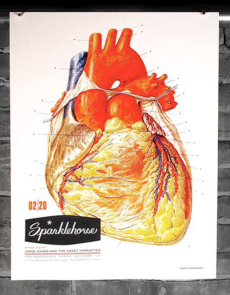
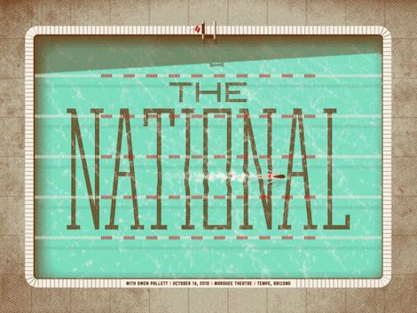
The National at Massey Hall / 18″ x 24″ print

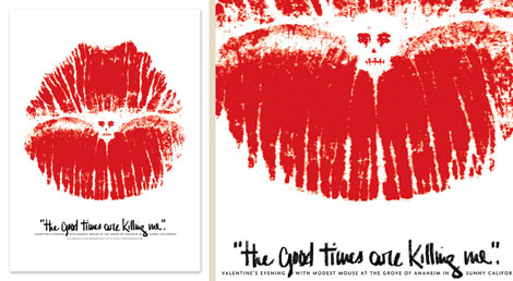
Doublenaut serves up a haunting piece of imagery for this concert poster created for the National’s recent show in Toronto. The artwork was inspired by  “Anyone’s Ghost” and “Terrible Love”, two songs found on the group’s latest release. The poster sold out fairly quickly at Doublenaut’s shop, but there are still a few available over at the Poster Cabaret.

——————–

Also worth viewing: Doublenaut: Toronto Based Desgn Studio

Not signed up for the Grain Edit RSS Feed yet? Give it a try. Its free and yummy.

——————–

No Tags

Only a few grain edit shirts left.Get yours now!

Grain Edit recommends Buffet Script A font designed by Sudtipos. Check it out here.


©2009 Grain Edit - catch us on Facebook and twitter

Add a Comment
50. Curtis Jinkins

grain edit / curtis jinkins

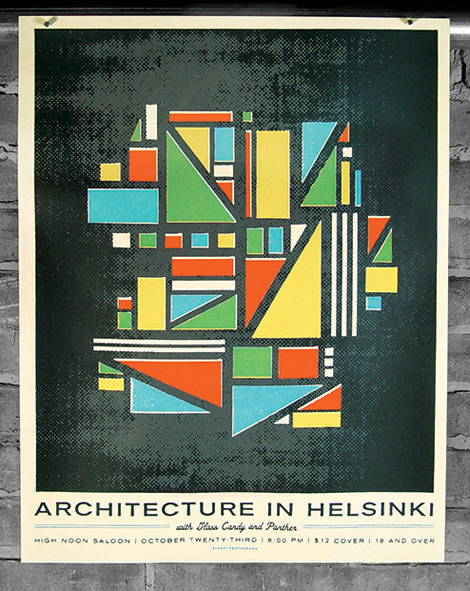
“This is my website. There are many like it. But this one is mine.”

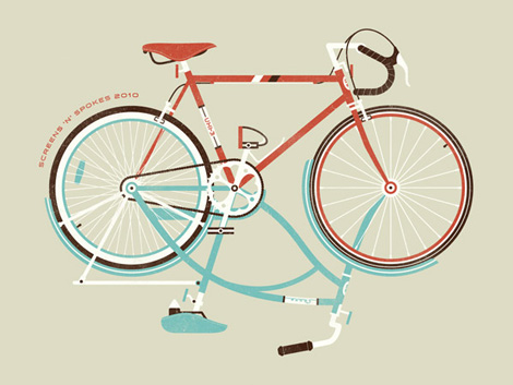
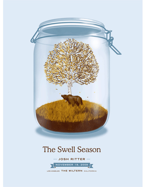
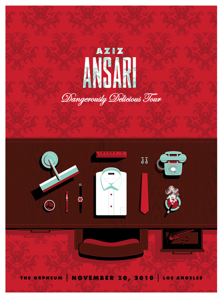
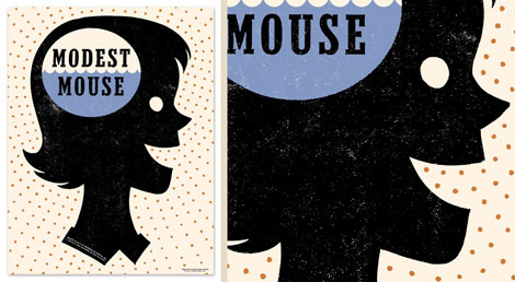
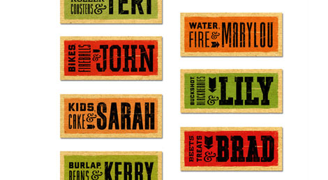
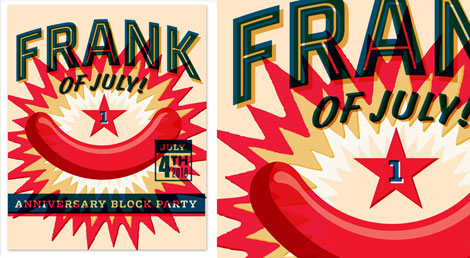
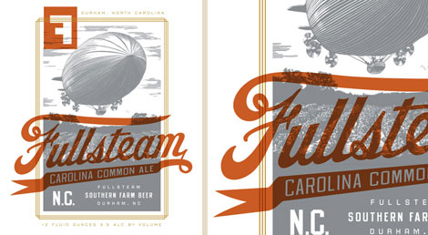
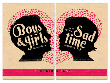
So goes the headline at Curtis Jinkins’s website. Curtis’s website is fairly standard: links to work on the left-hand side, and a lot of white space. What’s unique and nice to see is the repeating logo and background images; they make you look twice at what you’re viewing. It’s a small but subtle touch that adds a bit of dimension to the site.

Curtis’s work also reflects a unique perspective. A lot of people make gig-posters. But it’s nice to see the appreciation to composition, layout, typography, and color choices evident in Curtis’s work. I love when a designer can move freely between between various fields, like poster design, illustration and identity work.

grain edit / curtis jinkins

grain edit / curtis jinkins

grain edit / curtis jinkins

grain edit / curtis jinkins

grain edit / curtis jinkins

grain edit / curtis jinkins

grain edit / curtis jinkins

No Tags

Only a few grain edit shirts left.Get yours now!

Grain Edit recommends Buffet Script A font designed by Sudtipos. Check it out here.


©2009 Grain Edit - catch us on Facebook and twitter


View Next 25 Posts