new posts in all blogs
Viewing: Blog Posts Tagged with: Elvira Wodruff, Most Recent at Top [Help]
Results 26 - 50 of 102
How to use this Page
You are viewing the most recent posts tagged with the words: Elvira Wodruff in the JacketFlap blog reader. What is a tag? Think of a tag as a keyword or category label. Tags can both help you find posts on JacketFlap.com as well as provide an easy way for you to "remember" and classify posts for later recall. Try adding a tag yourself by clicking "Add a tag" below a post's header. Scroll down through the list of Recent Posts in the left column and click on a post title that sounds interesting. You can view all posts from a specific blog by clicking the Blog name in the right column, or you can click a 'More Posts from this Blog' link in any individual post.
Post by Alice Palace
Aless has just set up her own studio label called ‘This is gold’. Based in London, she is available for freelance surface pattern, illustration and childrenswear graphics. I love her characters…


See her New Website
A fat quarter turned out to be enough for a detachable Peter Pan collar. And now I feel like I'm ready to go out and solve a mystery or two myself. Move over, Nancy Drew.

The first time I came across Dinara Mirtalipova’s work, I spent a few days pouring over her website. Her command of patterns, her linework, the worlds she created in her paintings were so captivating, and I was instantly hooked. Her compositions are lush and whimsical. There is a beautiful tension in her pieces that is all at once energetic and quietly meditative.
In addition to children’s magazines such as Storytime and Girls’ World, Dinara’s work has appeared on sleeping bags and rugs for Land of Nod, her own line of dishtowels entitled Mirdinara Kitchen and a fabric collection for Windham Fabrics. She has also hand-painted beads, nesting dolls and clay eggs. Her work is inspired by folklore, fairytales, textiles, and songs her mother used to sing to her.


Be sure to follow Dinara on Instagram where she shares process shots, projects and other little glimpses into her world. You can see the rest of her work on her website, too!
Written by Bryna Shields

Hi there! I’m so thrilled to be the newest contributor here – I hope we’ll become fast friends. I thought I’d tell you just a little bit about myself and then dive right in to my first artist. I’m Bryna – a freelance illustrator, photographer and yoga teacher based in Portland, Oregon. I have a particular love for surface design, and that’s what I’ll cover here on the blog. When I first decided to pursue illustration, I didn’t really know all the potential ways my artwork could be sold and used by other companies. Once I discovered the world of surface design, I felt like the possibilities were truly endless! We are lucky as illustrators, that our work has so many applications. I’m really looking forward to sharing with you some of the most exciting surface design work out there in hopes that it may inspire new dreams for your own work. If you have any comments or suggestions, I’d love to connect with you, so don’t be shy! Feel free to email, instagram or tweet me. Alright, enough about me, let’s dive into the wonderful world of surface design, shall we?

It’s rare, but really exciting, to find an artist who is as prolific as she is passionate about creating patterns. Enter Kendra Dandy, illustrator and pattern designer. Her instagram feed boasts colorful patterns featuring fruit, makeup and girls in fancy hairdos with fun shades. Her distinctive patterns have appeared on lipstick packaging for Anthropologie, beautiful silk scarves, and tote bags for Baba Souk. Any surface she can paint on, she likely has (including a french fry box!). The way she layers patterns together makes her work instantly recognizable and memorable. I can’t wait to see what she’ll do next!
Take a look at her portfolio, and be sure to follow her instagram for more juicy patterns!


Post written by Bryna Shields.
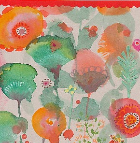
It's 45 and drizzly out, so I'm going to paint anemones instead, m'kay?

By: Petrina Case,
on 11/3/2014
Blog:
Paper Pop-Ups
(
Login to Add to MyJacketFlap)
JacketFlap tags:
taj mahal,
paper engineer,
petrina case,
popup card,
digital download,
paris eiffel tower,
papercut card,
rickenbacker guitar,
half in,
half out card,
harley motorcycle business card sculptur,
pattern,
Add a tag
By:
Floating Lemons,
on 11/1/2014
Blog:
Bit by Bit
(
Login to Add to MyJacketFlap)
JacketFlap tags:
illustration,
Flowers,
laughter,
watercolour,
watercolor,
pattern,
sunshine,
floating lemons,
free printable,
FREE PRINTABLES,
Surface Pattern Design,
TEXT DESIGN & TYPOGRAPHY,
I choose,
Add a tag
As we head into winter I thought it would be good to have a reminder of sunny days and summery good times to keep us warm when the cold finally hits. As I write this the weather is extraordinarily mild (for the UK!), the sun is shining away brightly, I'm not as yet huddled in front of the fire, and am enjoying every moment of light and clarity ... while it lasts. Here's a little print I've made to lift the spirits during the greyer months ahead, or just to provide an extra glow if you're lucky enough to live where it's warm all year long.

I re-coloured my Painted Flowers pattern for this, and cleaned it up further. Seemed perfect for this month, wouldn't you agree?
As always, it's available as a free printable (along with the past 10 monthly designs for 2014) for all subscribers of the Floating Lemons monthly newsletter. If you'd like to sign up, just click here.
Wishing you good humour for the week ahead. Cheers.


By: Rachel Frankel,
on 9/27/2014
Blog:
Illustration Friday Blog
(
Login to Add to MyJacketFlap)
JacketFlap tags:
freelance,
children's illustrators,
abstract,
hand lettering,
freelance illustrator,
abstract painting,
lisa congdon,
pen/brush and ink,
master of the month,
apparel / products,
art inc.,
design,
creativity,
mentor,
typography,
children's art,
digital,
artists,
editorial illustration,
Lettering,
pattern,
san francisco,
surface design,
Add a tag

This Art Crush entry has truly been a long time coming. I first came across Lisa Congdon by way of Meighan O’Toole’s former art blog and podcast, My Love For You (which is post-worthy in its own right–it was an enormous source of inspiration for me during my college years). While I definitely gravitated to Lisa’s work on a visual level, it was her personal story that drew me in. Freelance illustration had been her second career. She didn’t start painting or making art until she was 31, and here she was, participating in museum-level shows, working with clients like Chronicle Books, and just being a genuine, successful badass. Lisa is not only someone I look up to artistically–she’s also a prime example of a human being.
Lisa’s art career was secondary, after she accumulated over a decade of experience in the education and nonprofit industries. By pure chance, she stumbled into a painting class and began making art of all kinds from that day forward–fueled by pure joy instead of the desire to succeed quickly. Having always been an avid collector, her random ephemera would find their way into countless collages as well as a series of photos, drawings and paintings that would eventually make up her A Collection A Day project. As she continued to develop her craft and share it with the ever-expanding Internet, people began to catch on. Today, she is an accomplished and prolific working artist, blogger, illustrator, public speaker and writer. Some of her most notable clients to date include The Land of Nod, The Museum of Modern Art, Harper Collins, 826 Valencia and Martha Stewart Living Magazine.


Lisa unabashedly tackles the subjects she is most passionate about, and that fearlessness is expressed effortlessly in the execution of her work. She describes herself as a “visual junkie,” and is deeply inspired by patterns, travel, architecture and vintage packaging, just to name a few. A faithful blogger, Lisa writes about her own process in addition to other artists whom she admires, as well as her life “outside the studio,” which includes swimming, biking, sewing, and traveling. In other words, she’s just making all of us look bad! (I only kid.)


One of the reasons I relate to Lisa’s work is due to the versatility and ever-evolving nature of her aesthetic. Certain characteristics like neon hues and her penchant for all things Scandinavian are mainstays, but she continues to branch out and explore all kinds of mediums (block printing and calligraphy, to name a few). These explorations fuel her work and expand her direction, which is most recently geared towards abstract painting. She’s a wonderful example of why you don’t need to narrow yourself down to one specific style (something I often grapple with).


Lisa is quite a unique artist in that she is not only a creator, but a mentor as well. Breaking into freelance illustration can be a challenging and solitary undertaking, and she continues to give her generous time to those who wish to pursue and learn more about the field through classes, speaking engagements and conferences around the country. I first met Lisa at her first Freelance Illustration class at Makeshift Society back in December 2012, and it was one of my most pivotal learning experiences to date.

Lisa recently released her new book, “Art, Inc.: The Essential Guide for Building Your Career as an Artist,” which is a revolutionary and timely answer to the starving artist stereotype. It covers all areas of the freelance artist’s domain, such as photographing fine art, finding printing services, copyright, and diversifying income. It sits on the shelf above my working desk (I like to call it my “VIP” shelf) as I reference it constantly.
On that same note, I’m very excited to be taking Lisa’s “Become A Working Artist” class through CreativeLive next week! You can follow along with the class virtually by RSVPing here.

To listen to Meighan’s podcast with Lisa, click here. I also highly recommend her feature in The Great Discontent.
Follow along with Lisa below:
Website
Twitter
Blog
Instagram
Purchase Lisa’s books below:
Art, Inc.
Whatever You Are, Be A Good One
A Collection A Day
More patterns being painted at the moment.

By: Carter Higgins,
on 8/26/2014
Blog:
Design of the Picture Book
(
Login to Add to MyJacketFlap)
JacketFlap tags:
design,
color,
adam rex,
balance,
pattern,
concept,
rhythm,
perspective,
color palette,
repetition,
zack rock,
creative editions,
Add a tag

by Zack Rock (Creative Editions, 2014)
Zack Rock and I haunt some of the same circles on the internet. I have a tshirt with his work on it thanks to Vintage Kids’ Books My Kid Loves (how cool is that header?), and I have long admired his work thanks to some tea time at Seven Impossible Things here and here. And once upon a time in 2012, Zack wrote a hilarious joke for a Hallowtweet contest run by Adam Rex and Steven Malk.
I remember that well, cause in fun-facts-here-at-Design-of-the-Picture-Book both Julie Falatko and I were runners-up in that contest, and the real prize was getting her friendship. Start of an era, for sure. (Although Zack did get an original piece of Adam Rex art, and we’d both admit to coveting that a little. See below!)
So. I’ve had my eye out for this book for years. Years! And I was so happy that Zack spent some time chatting with me about this smorgasbord of stuff and story. He also said he “answered the living daylights” out of these questions, so I sure hope you enjoy the living daylights out of them like I did.
Welcome, Zack! (That jovial picture is from his blog, where he has killer posts like this one on bad drawings and perspective. Check it out!)


One thing I know that’s true of kids is that they love a billion teensy and scrutinize-able details in books. Your book starts out with such cool stuff on the endpapers, that I almost (only almost) don’t want to keep going! Do you have any kind of catalog for these curiosities, or did you just create anything and everything that felt right? Is there a backstory for each of these elements?!
I drew whatever felt right, “right” being subject to how exhausted my imagination was at the time. And though I’d like to leave the history of the curios up to the readers’ interpretation, I carry a backstory for each in my mind—some more convoluted than others.
For instance, in the museum there’s an antique, penny arcade cabinet inspired by the Musée Mécanique, which houses scores of these old contraptions in San Francisco. So to honor them, I fitted my museum’s machine with a tiny, top-hatted automaton of one of SF’s most curious citizens: Norton I, self-proclaimed Emperor of the United States of America (a real guy). So plenty of thought went into that curio.
On the other hand, another curio is an apple with a faucet sticking out of it because I was thirsty when I drew it.
(I love the way this whole book starts. I feel like I’m in really good hands.)
Thanks! I like to consider myself the Allstate of illustrators.
What’s your studio like? Do you have trinkets and tschotskes or a cool window view?
Believe it or not, I’m allergic to collecting stuff, so my studio is bare as a monk’s cell. My mother, however, has a fondness/compulsion for antiquing in bulk; almost none of her massive collection of furniture and doodads got past the door of my childhood home without having first seen several generations of use. It lent the crowded house an air of the same well-worn nostalgia that permeates the pages of my book.
Surely you’ve hidden some easter eggs in these pages. Any hints? Any behind-the-scenes stories?
Now I regret not hiding an actual Easter Egg in the museum. Honestly, nearly everything in the book is an Easter Egg, since there’s a secret story encased in each curio. But instead of cracking those open, I’ll share a behind-the-scenes tour of the book’s present day setting.
I created the book while living in Seattle, and Pacific Northwest references are littered throughout it. The license plate on the VW Bug in the first scene reads “FRMTTRL,” an allusion to the massive concrete Fremont Troll lurking beneath the Seattle’s Aurora Bridge. The museum exterior is based on the old town hall in Bellingham, WA, and the fictional island it crashed on is named for Washington State’s notorious children’s writer, Sherman Alexie. A Washington State ferry, the Olympic Mountains, a totem pole from Pike Place Market, and a handful of other Puget Sound souvenirs also make an appearance in the book.
This book has a real undercurrent of ignored things being a treasure with a story. Are you a treasure hunter or a treasure-leaver-for-somebody-else? (I think that’s what making books is, so you are that one for sure. I guess what I’m asking is why do you think HHH was such a collector of stories, and do you see any parallels in your own life of creative curating?)
Ooo, books as treasures to be discovered, I like that! Makes me sound like a pirate.
Homer is an underdog; nobody would look at him and assume his adventures extend beyond an expedition to the local sushi restaurant. He identifies himself with the object’s he curates, so he surrounds himself with the lost and neglected, and by exhibiting their rich history to the world he literally shares his own biography.
And I’ll leave the parallels with my own life to the armchair psychoanalysts.
What came first to you in this story: words or pictures? Can you talk to being a picture book creator who deals with both parts? (And in case anyone’s wondering, my favorite line is this one: My luggage may be dusty. But my hat still fits.)
Ha, that’s the one line written entirely by my editor Aaron! He suggested it while editing the book, and I thought it was great too, so we kept it in.
Being an author/illustrator isn’t terribly different than being solely a writer, the main distinction is that you have a visual language to express the story as well. So I can employ the duel butterfly nets of text and images to capture the picture book ideas that flutter into view, jotting notes alongside small thumbnail sketches as I try to pin down plot/character/theme details. It becomes a balancing act of seeing which of the two, words or images, best conveys what needs to be communicated.
 What’s your creative process like? Any weird routines? What’s your medium of choice?
My only real habit—creative or otherwise—are the nightly walks I take after work, allowing my legs and mind to wander. In fact, I got the original idea for Homer Henry Hudson during one of these constitutionals.
And for picture books I work almost exclusively in watercolor, though for other projects I work in pen and ink, digitally, or with accidental food stains.
Who are your literary and artistic heroes?
They’re all in the book! Along with Shaun Tan, Maurice Sendak and Lisbeth Zwerger—who I painted into a restaurant scene—there’s references to Søren Kierkegaard, Jorges Luis Borges, Franz Kafka, Renee Magritte, Herman Melville, JD Salinger, George Orwell, Ingmar Bergman, Charles Schulz, and of course, Homer. Even my favorite comedian, Paul F Tompkins, whose podcasts kept me company during the long hours of illustrating the book, has a cameo as a pipe-smoking painting.
Do you have a favorite piece of artwork hanging in your house? Or a favorite tune that feels like art?
A few years ago, Adam Rex held a contest to see who could fit the best Halloween haiku into the constraints of a tweet. To my surprise he picked mine, and to my utter flabbergastination he went on to illustrate it and sent me the original art! It’s incredible. I framed it above my art desk as a reminder that, with hard work and dedication to my craft, I may one day hope to be the poor man’s Adam Rex.
Why books for kids?
One of the most valuable skills to possess is the ability to approach the world and its inhabitants with wonder, curiosity and interest. What’s great about kids is that they do this naturally and without being self-conscious. My hope is that Homer Henry Hudson’s Curio Museum and future books will be something readers carry with them as they grow older and are tempted to lose that wonder, reminders there’s so much more to the world, the things in it, and yourself to discover if you approach life with an open heart.
Plus, I have nothing to say that couldn’t be said by a talking dog. What’s next for you?
Another book for Creative Editions about the power of stories, this time from the perspective of an acrobatic pig.
How can we buy your book?
Through your local struggling independent bookseller. Or Powells.com. Or, sigh, Amazon.com.
What did I miss?
There are humanoid pears hanging in the first illustration of the museum interior, bottom of the page. Look past the table leg and Grecian urn. See that? It’s a butt! I’m pretty sure that’s the first butt mention on this blog. Have any treasure-hunters? Or fans of hidden picture art? Since we all love talking dogs, this book is a great choice for all readers everywhere.

Tagged:
adam rex,
color,
creative editions,
pattern,
repetition,
zack rock 
Sorry for the slow updates. It's been busy here at the moment with work and I'm also trying my darndest to soak up every last bit of Summer. Here's a pattern I drew a few weeks back, inspired by childhood's spent camping up in Northern Maine. I miss listening to loon cries and campfires more than you can possibly imagine.
Something I drew for this week's
Spoonflower challenge, "
Hiking." This week's theme uses a specified color palette that's pretty far removed from anything I'd typically choose. That said, I actually liked dealing with color constraints and enjoyed the challenge.
Full disclosure: I would totally wear a pair of shorts like the below alpine maid is wearing. Mmm hmm.
A new pattern I painted last week, inspired by the tangle of vegetation outside. Summer, you done good.
Other A+ summer highlights: seeing
Pokey LaFarge live. Because it's not everyday you get to see a band that sports fedoras and ties while bringing down the house.


Meg Hunt is a fabulous illustrator and hand-letterer, although her aesthetic is informed by the printmaking process as well. In her own words, she’s inspired by “a sense of delight and the ability to tell stories.” She’s a self-described bookworm, nature buff, and former aspiring Muppeteer.

It’s obvious that Meg has a sincere love of nature and animals, a fondness acquired during childhood and one that flourished once she moved out west. A native of New London, CT, Meg attended the University of Connecticut and received a dual degree in printmaking and illustration. She’s mentioned that attending an interdisciplinary college aided in her own abilities to explore and play within her art–while there are obviously some pros and cons of attending state schools, I definitely agree with her sentiment on this. After finishing up college, Meg moved out to Phoenix, AZ for 4 years, then to settle in Portland, OR.
Meg turns to a variety of literature and comedic podcasts to help her draw out ideas. Her process shifts between analog and digital–she employs different physical tools such as watercolor paint, powdered graphite, mechanical pencils, wax pastels, and many more to add texture to her final compositions.


In addition to her work as a freelance illustrator, Meg has also taught at Portland State University and currently teaches Visual Techniques at Pacific Northwest College of Art. She is represented by Scott Hull Associates and her client list includes Nickelodeon Magazine, Junior Scholastic Magazine, Radiolab, Chronicle Books, and Threadless.


Follow along with Meg on her website, blog, and Twitter.

By: Paula,
on 6/19/2014
Blog:
Illustration for Kids Blog
(
Login to Add to MyJacketFlap)
JacketFlap tags:
children,
Illustration,
comics,
cartoon,
icons,
owl,
pattern,
owls,
paula j. becker,
patterns,
paula becker,
Add a tag
Playing with owls and patterns...

By:
Paula Becker,
on 6/19/2014
Blog:
Whateverings
(
Login to Add to MyJacketFlap)
JacketFlap tags:
owl images,
owl pattern,
General Illustration,
Samples,
pattern,
licensing,
owls,
paula j. becker,
paula becker,
Cartoons & Comics,
Add a tag
There may be more. Fun with patterns & images.

A test swatch of the
terrarium themed fabric I designed a few weeks back just came in the mail. I'm 110% certain I need to sew a skirt from said fabric, pronto.
Happy monday!
This guy is part of some pattern sketches I did earlier this spring. I still like him, but I think I've learned a lot about patterns since then. This week I have some fun stuff to work on and a family trip to the big city (NYC!) to prepare for. I will check back tomorrow though, and show you the process for my piece for this month's
bootcamp gallery (and my exciting Photoshop progress! - exciting to me at least)
I hope you're all off to a good start this morning.
I picked some quince branches the other day -- this pattern was a forgone conclusion as soon as I plunked the flowers next to my drafting table.
By: Carter Higgins,
on 5/5/2014
Blog:
Design of the Picture Book
(
Login to Add to MyJacketFlap)
JacketFlap tags:
color,
space,
pattern,
color theory,
size,
flying eye books,
design,
complementary color scheme,
spot color,
Add a tag
 by Magali Bardos
published 2014 by Flying Eye Books Let me introduce you to Flying Eye Books, if you aren’t already pals with them. Their books are fairly new to me, but are consistently striking and interesting and a different sort of fare than some more commercial offerings.
Case in point: this post by Danielle Davis over at This Picture Book Life (you know her, right? Her posts are a work of art and always a celebration of the picture book form. I’m lucky to know her in real life, not just on the internet.) and this look at their current season (and an interview!) by Travis Jonker.  100 Bears is a counting book with some actual narrative to it. The pace starts off sweetly but then 9 gunshots and an escape leads to a madhouse of 23 knocked over chairs and 37 or 38 bits of confetti. Such trouble a few bears can get into! Some teensy text flaws swim around in that lost-in-translation sea, but there is some real satisfaction in a circular counting story with 100 moving parts. The smile you’ll get from the first and last pages alone is one of the true joys of story.
 A design technique shown off so spectacularly here is spot color. That’s when a single color is printed at a time, and so the process gets layered (and tricky!) by rolling down the building blocks of a print on the same lithograph. You won’t see gradients or blended color, just blocks of hue. (Here’s a little more about the process, from author/illustrator Greg Pizzoli.)
And why does the cover catch your eye? It’s more than a circus style balancing act of big old bears and their blocky numbers. It’s that complementary color scheme. Blue and orange. With a splash of pink for some oh, yes.
And so what is this thing? I’m not too sure, and I don’t really care! It’s like a coffee table book for the sippy cup set. Enjoy it, for sure. P.S. – Crazy for spot color? Stay tuned and hear again from the master himself, Greg Pizzoli. Coming up soon on Design of the Picture Book!
Tagged:
color theory,
complementary color scheme,
flying eye books,
spot color 
Playing with watercolors and collage. I like some of the shapes and textures I ended up with, and the color scheme is different for me.
Have a nice weekend friends!
Hello all, fun busy times over here. I'm working full tilt on a project I can't show, and playing with patterns (rather amateurishly by hand) for the class I'm taking. Here's a quick peek:
When my schedule clears up I am ready to learn some computer skills; until then I'll continue to muddle through :)
By: Carter Higgins,
on 3/31/2014
Blog:
Design of the Picture Book
(
Login to Add to MyJacketFlap)
JacketFlap tags:
balance,
pattern,
rhythm,
black and white,
value,
texture,
composition,
line,
repetition,
perception,
contrast,
who needs donuts?,
mark allen stamaty,
design,
color,
Add a tag
 By Mark Alan Stamaty
Published 1973 by Dial Press, reprinted 2003 by Alfred A. Knopf, an imprint of Random House Children’s Books.
At first glance, the answer to this book’s title is pretty clear. Because, everybody. But do you know this book? When I mention it to someone, I either hear about their favorite jelly donut (the one with strawberry), or they lose their sprinkles over the magnificence of this screwy tale.
The simplicity of the setup:
Sam lived with his family in a nice house.
He had a big yard and lots of friends.
But he wanted donuts, not just a few but hundreds and thousands and millions — more donuts than his mother and father could ever buy him.
Finally one day he hopped on his tricycle and rode away to a big city to look for donuts.
The scattered spectacle of the scene, a commotion in black and white. On those initial pages alone:
A bird in swim trunks
A roof-mowing man
A chimney blowing ribbons
A man in the window reading a newspaper with the headline, Person Opens Picture Book Tries to Read the Fineprint
Two donuts
And a cinematic, get-ready-for-your-close-up page turn. (Be sure to look closely in the blades of grass.) There’s almost a calm in the chaos. It’s regular and rhythmic and pandemonium and patterned all at once. Perfect for a story that’s a little bit bonkers and a whole lot of comfort.
So. Then what? The relative calm of Sam’s neighborhood yields to an even madder and mayhem-ier sight.

 Then Mr. Bikferd and his wagon of donuts shows up.
And a Sad Old Woman. And Pretzel Annie.
Sam continues to collect donuts. Stocks and piles of donuts.
 A wagon breaks. A repairman helps. A love story. Abandonment.
(A fried orange vendor. A bathing zebra. Rollerskates. A Sad Old Woman.)
Who needs donuts when you’ve got love? When Sam rides home, the words that began his story are on the sidewalk. I get the shivers about that.
The starts of stories are carved in concrete.
P.S. – These pictures remind me a little of what I’m seeing for Steve Light’s new book, Have You Seen My Dragon? Check out this review where Betsy Bird notices the same, and this post at Seven Impossible Things Before Breakfast, because it’s always a treat. I also think of the hours I’d spend as a kid studying each square centimeter of The Ultimate Alphabet. Like Waldo, but weirder.
Tagged:
black and white,
color,
line,
mark allen stamaty,
pattern,
repetition,
rhythm,
texture,
who needs donuts? 
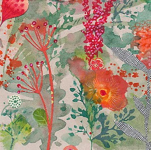
I'm ignoring the snow, choosing to paint poppies instead. I tried growing Icelandic poppies last year and it was a spectacular failure, but I'm going to give it another go this year.
So in the meantime, I'm making
prints (and pillows) while I wait for the real thing.
By: Carter Higgins,
on 10/22/2013
Blog:
Design of the Picture Book
(
Login to Add to MyJacketFlap)
JacketFlap tags:
design,
color,
balance,
pattern,
texture,
composition,
layout,
paul thurlby,
unity,
Add a tag
 by Paul Thurlby
{published 2013, by Templar}
You know you have a book problem when you forget what lives in your piles. I bought this book when it pubbed back in March, and that tiger’s binocular’d glare stared me down the other day. I snatched it from the pile with the furious preying eyes of the creatures bound in this book.
(Dramatic? Sorry. You must not have heard Carmina Burana playing in the background of my opening monologue. Do you hear it now?!) In the early days of this blog (almost two years ago!), I wrote about Paul Thurlby’s Alphabet. I made lame jokes about Thanksgiving (‘if you’re stuffed, feast your eyes on this!’), so as you can see my wit and humor hasn’t improved much since.
Good thing Paul Thurlby has.  And that statement is a stretch as commentary on his genius, but I do think I might like this one even more than his last. This is a mashup of pictures and words in the most clever of ways.
 Each page shows us an animal bursting with personality. Look at that rat! (Reminds me of these rodents a little bit!) And each is captioned with a quirky fact which explains just what the heck is happening in the illustration. Here, it’s:
Keeping their skin moist by showering is important for elephants’ health.
and
Rats spend a third of their lives washing themselves.
Dolphins sleep with one eye open, while resting one half of their brain at a time.
Lions hunt at night, thanks to their ability to see well in the dark.
 Because the factoids lean toward kooky, the pictures’ silliness both shine and remain surprising.
 When I talked about Paul Thurlby before, I mentioned unity. Still holds. Still a package wrapped up in perfect pictures and words. But what I am most drawn to in his work are his textures.
  The grid, the distressed edges, the scratches, tape, and imperfections – all of those design decisions add a layer of warmth and grit to a bunch of terrifying but desperately adorable creatures.
Watch out for giraffes if you’re on stilts and run across them in the wild. They have 21-inch tongues!
Tagged:
color,
paul thurlby,
texture 
View Next 25 Posts


 Illustrator & Writer Lisa Congdon
 Artist :: Lan Truong
 Artist :: Fuchsia MacAree
 To the creative overthinker …
  Kate Moross is THE coolest.
  Illustrator :: Lieke van der Vorst
 Tugboat Printshop
 Ashley Percival’s quirky imagination…
 Lisa Martin – All Things Bright and Quirky
 Artist Kevin Waldron
 Sweet & Whimsical Work from Artist Jen Skelley
 Artist :: Tabitha Bianca Brown


 Eiffel Tower
 Rickenbacker Guitar
 Taj Mahal Pop-Up Card
 Camero Business Card Sculpture
 Rickenbacker Guitar -Papercut Card - Half In, half Out Card
 Harley Motorcycle Business Card Sculpture