Did you fall in love with the Narnia books as a child?
A rare first edition of The Lion, the Witch and the Wardrobe is up for auction later this week. It is expected to make around £12,000 because it is signed
with love from Jack Lewis - a name that the great man only used with his family and small circle of close friends. The owner was the son of a very good friend and he was given it Christmas 1950.
One thing's for sure and that is book covers have improved in the last 60 years. This one manages to make riding on the back of a lion look dull - turning Aslan into a rather large pet
I don't think the cartoon version is much better. Aslan just looks cross.
This Walt Disney DVD cover is an improvement - at least it's clear that this is not an out of Africa story.
While the modern paperback is frosty with venom, making it clear that it is tale about a world where it always winter and never Christmas.
I'm more envious of the other gift bestowed on the young Nicholas Hardie - something that can't be auctioned. The Silver Chair was dedicated to him as a child and I think it is my favourite Narnia books with the unforgettable Puddleglum as the star. It is probably nostalgia that makes me like this cover - there's not a marshwiggle in sight, or hungry giants, or a black knight. Apart from that it's just fine.
I
Is there a magic formula to creating a book cover—one that readers will pull off the shelf?

In the past authors paid little attention to the subject of book covers, that was the domain of the publishing house. With the increase in self-publishing, however, it helps to have at least a basic understanding of what makes a knock-out cover. Just what is it that will make one book cover stand out from the rest? What entices a reader to explore the inside of that eBook?
The text is important; a title to grab their attention and a synopsis to pull them in. But text alone won’t do it—how many times have you reached for a plain book with no pictures and only text on the cover?
WOW
! discussed the text side of book covers in a
previous post. Today we’ll take a look at cover images with Steena Holmes. You might know Steena as a bestselling author, but did you know she is also a cover artist? Let’s pose a few questions to her!
WOW: Hi Steena, we’re interested in learning the magic of cover art—what makes a reader pull a book off the shelf.
When we talk about the images chosen for a book cover, what are we looking for? Is it to portray the story or summon an emotional response?
Steena: For me it would be an emotional response.
WOW: Are there guidelines for what images work best? What are people drawn to—images of other people, scenic shots…?
Steena: I think this might depend on the skill of the designer and what they prefer, as well as what you want on the cover. Often you’ll see a scenic shot behind a person, etc.
WOW: So, basically we are looking for a mood.
If an author has an image, a family picture for a memoir or perhaps the author’s own illustration, can a cover artist work with that?
Steena: Absolutely ;)
WOW: I remember hearing an advertising rule about including a bit of red to draw attention. Are there any similar rules or statistics for the color templates on book covers?
Steena: That would be the same rule where if you look at design magazines--for kitchens, you used to always see red apples in a bowl somewhere in the shot. Now you see pomegranates. Or bold yellow lemons, bright green apples...I love having red in a cover--I have red balloons on my cover for
Finding Emma...but I think bottom line is as long as there is a bold image, something that really pops out to a reader, that is what matters.
WOW: I love the cover for
Finding Emma. Another one of my favorites is
What If by Kelly Rae (Paperback), also one of your creations—the red scarf flying in the breeze
I'm not sure when it was I first heard about Lindsey Leavitt's new novel, Going Vintage, but I was sold on the premise: A girl is brokenhearted after her boyfriend cheats on her with an online girlfriend. So she decides to give up modern technology and live by a list of goals written by her grandmother in 1962.
If I could, I would totally be a mod 60s girl (too bad being fashionably vintage is also terribly expensive!) So the next best thing is to read about it, right? And when I saw the cover release for Going Vintage I knew I had to share! Who else shares my affinity for 60s culture? And isn't this the greatest cover ever??
I love looking at cover changes from hardcover to paperback. Some are good, some can be bad, and they're always interesting!
I'm highlighting cover changes that have happened mid-series this time around. I hate whey they change covers mid-series both as a librarian and a reader. It can be very frustrating as a librarian because now our first book in the series doesn't match what the teens are seeing online or in stores, so they don't think we have the book. And the cover that pulls up in the catalog now is different from what we actually have on our shelves. When a patron comes into the library asking for one cover and you show them a different one, it can be very frustrating-especially when working with kids and teens who only want the book they saw.
As a I reader, I just don't like when my books don't match.
So let's take a look at some series changes:
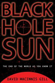
This is the hardcover for Black Hole Sun. I actually kind of like this cover-it's simple, but I think I can tell this is a science fiction book.
And here's the paperback. I like and I don't like it at the same time. I like that this one looks more action packed than the hardcover and I like that it really looks like a science fiction book-I know from the cover what to expect from the book. I do think the guy is brooding a little too much, although I guess I can see him as Durango-he can be somewhat moody.
This cover is OK, but it really doesn't say anything about secret societies or justice. It looks a bit like a generic mystery novel instead. So I can understand why the covers changed before book two was released.
But as much as I like this cover in general, I don't like it for this series. This looks like a 1940s noir murder mystery, which the book is not. I think it's even more misleading than the original cover.
5 Comments on Judge a Book By It's Cover, last added: 4/23/2012
Thanks to all the children who participated in Ammi-Joan Paquette’s THE TIPTOE GUIDE cover contest! We asked you to draw the cover of what you imagined could be the next book in the series, and we received some very creative entries. Since they were all so good, we randomly selected a winner. So…
Congratulations, Annika, age 9!

Annika wins a signed copy of THE TIPTOE GUIDE TO TRACKING MERMAIDS! And who knows, maybe sometime soon we’ll see a TIPTOE GUIDE TO TRACKING PEGASUSES! (PEGASI? PEGASU? Just what *is* the plural?!)
And here are the runners up…
Grace, age 9!

Katie, age 5! (With my personal favorite, MONSTERS!)

Lili, age 4! (Wow, nice lettering, Lili!)

And Julie’s daughter* with a very colorful entry! *name and age to come

Thanks to all the kids who entered! It’s so much fun to see your creativity at work.
I promise to have more cover contests soon, including one for my upcoming book, THE MONSTORE!


Check out this photo of some of our new books on the shelf at a local (Edina) Barnes and Noble store. There's Zeke Meeks at the top and Kylie Jean on the third shelf down.
We love to see our books out and about!
by Teri TerryIt has been a year with a lot to smile about: the last twelve months have seen an agent, and not just any agent but Caroline Sheldon; a publishing deal for Slated with Megan Larkin and Orchard Books; and finally: a long-awaited moment. An actual book cover!!Read on, and there just might be a chance to read Slated before the 3rd May publication date...One of the most exciting moments

By:
Kay Fraser, Art Director,
on 10/13/2011
Blog:
Stone Arch Books
(
Login to Add to MyJacketFlap)
JacketFlap tags:
design,
Beth,
new releases,
Book Covers,
book development,
Book Design Fun Stuff,
Kay Fraser,
Fairieground,
Beth Bracken,
Odessa Sawyer,
spring12,
Add a tag
During every book production season, there are moments you will always remember and treasure until the end of time. Certain "Je n'est-ce pas" that make you hold your breath, like the moment before sending a cover to print, or even the day before you start designing a book you love. The excitement builds up and makes you push the project to a higher level. You are guided by so much conviction and truth that it gives you chills to work on it. Yes, I know it sounds funny, but I know people out there understand what I'm talking about.
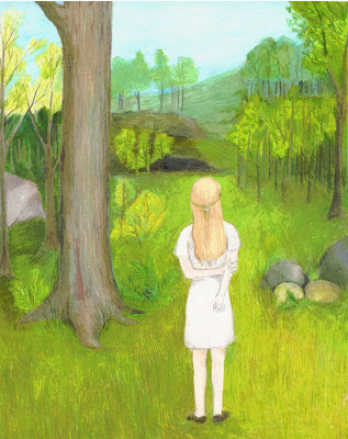
This season, I had these sort of experiences while designing Fairieground, a series co-written by Beth and me. I've never had to design anything I've written before. This was a first, and it was definitely a challenge. It took many drafts, many hours of research, and many trials and errors. Yet, Beth and I are very proud with the outcome. It was a joint effort. Odessa Sawyer, our super talented illustrator, influenced the design and the book narratives with her gorgeous realistic illustrations.
The books come out this spring, but here is a little sneak peak of what the fairies in the Willow Forest are hiding from all of us. Enjoy!


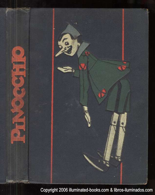
Carol sent me this adorable cover and suggested I do a spread on Pinocchio jackets. As a result, this week's JacketKnack post will be eleven and a half pages long because there are soooooo many Pinocchio covers to choose from. I found dozens upon dozens of renditions of this little wooden boy. Without further ado, here's Pinocchio...
...circa 1926.
...with Robin Williams as Gepetto!
(Sterling Publishing,February 2008)
...as a pop-up book...
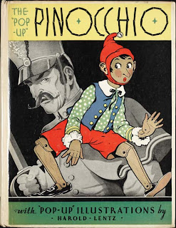 (Blue Ribbon Books, c1932)
 ...in the UK...

(Penguin UK, 2011)
and ... en francais!
 |
| Laurent listening to the voices in his head. They are talking about monkeys. In fact, the voices ARE of monkey origin. |
|
|
 |
| What Laurent looks like when the monkey voices tell him to do a cover titled in Comic Sans. |
Lovely lovely Laurent Linn says the cover of your book can make or break it. And the important voices that decide what a final cover will look like are:
- The author
- The editor
- The sales and marketing team (they are your friends!)
- The publisher
- The art director, in this case, Laurent Linn
- The voices in Laurent's head
First cover evolution story:
Lottie Paris Lives Here
by Angela Johnson, illustrated by Scott Fisher, publishing in a few months.
One of Scott's first cover sketches:
Not only is this cover for the first book, but for establishing what may potentially be the branding of an entire series. The character is important, but so is the setting and some of the props and the question was whether to have all of these non-main character elements on the front cover, or wrapping around from the spine onto the back, or anywhere near the cover. This sketch has elements of props and Lottie's house, and the VOICES decide it should just be Lottie interacting with the type. So Laurent asks Scott for something different.
One of Scott's character-focused cover sketches with type interaction:
Laurent likes this, but rather than explain the tweaks he wants, he can just mock something up in Photoshop and show Scott. Laurent asks Scott to do tons of posture and pose sketches of Lottie. Scott did! And the mock-up below is based on pose #18 from a group of 25 and Laurent's Photoshop mock-up:
Cover content and updated design at JamesPreller.com

By: James Preller,
on 8/4/2011
Blog:
James Preller's Blog
(
Login to Add to MyJacketFlap)
JacketFlap tags:
Uncategorized,
ALA Notables,
Linda Sue Park,
Book Covers,
Keeping Score,
Chris Sheban,
Six Innings Preller,
best baseball books,
cover change from hardcover to paperback,
Feiwel & Friends,
Six Innings Paperback,
Add a tag
In 2008, Feiwel & Friends published my first hardcover novel, Six Innings, a book that was eventually named An ALA Notable. The cover was fabulous, featuring the work of gifted illustrator Chris Sheban, whose style you might recognize from the covers of Because of Winn-Dixie, Brooklyn Bridge, Punished, The Tiger Rising, and more.

Six Innings sold reasonably okay, earned some kind reviews (and a Judy Blume comparison!), and nobody got rich; we were happy. When it was time for the book to go to paper, my publisher had to make a decision. Come up with a new cover, or simply reproduce the existing cover in a paperback format, which is what they did.
And the paperback edition did not sell. Understatement. It struck out, looking.
This could be for a variety reasons, but one line of thought was that we were dealing with two different markets. The hardcover, with awards and good reviews, sold well in the institutional market. Paperback was a different animal, targeted more directly to the reader. I want to say the less sophisticated consumer, but that’s not right. Children these days are plenty sophisticated, it’s just that their tastes are their own. To them, these days, the photographic approach seems to hold more immediacy. At least that’s the current thinking.
So check out the new look (the original is up top in the header):

While I’ve got you (as my dad used to say), Linda Sue Park’s Keeping Score was another baseball-themed book that came out at the same time. And I confess: I hated the cover. That poor book, I thought. It just struck me, a former 10-year-old boy, as all kinds of wrong.

Someone must have agreed. Take a gander at the paperback.

Quite a difference, huh? It doesn’t look remotely like the same book. Curiously, in this case, the publisher went from a photographic to an illustrative approach, but more significantly re-thought the cover content and updated the design. A successful change, I think, though a dog and a fire hydrant makes me think of only one thing. Was that the idea? Dog pee? Maybe dog pee figures into the book somehow (I have not read it). The ex-boy in me wouldn’t have picked up that cover, either.
It’s also possible that the book was rewritten, with the girl character replaced by a black lab.
And so it comes after all that waiting, the book cover. Via jpg these days, that’s how you get the first glimpse of it, clicking on a file attached to an email.
And it comes with caveats, apologies, explanations, assurances. The idea is not to get too literal (and they say this to writers, the most literal of all).
You wrote the book what seems a lifetime ago. Revised it, revised it again, and again, to the point where you’ve moved past it. You’ve gone from loving it to sick of it to almost forgetting what it’s about anyway. Curious, you might even read it again one day.
In the meantime, an art director, Rich Deas, reads the manuscript, searching for ideas, hoping images will come unbidden. It’s an opening-up process, where all possibilities are invited, explored, played with, ridiculed, winnowed down. Meetings are taken, editors opine, directions are discussed and discarded. The sales folks has their say and everybody listens because, lest you forget, we’re all in the business of selling books. As the author, you’re out of the loop. A million miles away. It’s time for other people to do their jobs, time for their talents to shine.
You cross your fingers and hope.
All preamble: Today I received an electronic file for the cover of my first Young Adult novel, Before You Go, to be published in Spring, 2012. What you see here, please understand, is a rough version. My editor, (the fabulous) Liz Szabla, told me, more or less, ‘It’s too this, it’s too that, and possibly not enough of something else. The type isn’t final — we’re still thinking about the type — none of it is final — but don’t you love it? We all love it. Rich is still tweaking it. He wants to make changes, I’m not sure what. He’s tweaking right now. I can practically hear the tweaking going on across the hall. You know Rich. He sees it all in his head. Tell me what you think. Don’t you love it?”
Here it is, folks. The first glance at the art director’s first draft, the rough cover treatment for my new book.

Some days it really is fun to be an author. Yes, Liz, I do love it.
I wonder what the final will look like.
There was some interest in a previous blog I wrote on creating the book cover for Melissa Kline's young adult sci-fi novel, My Beginning. So, I decided to repost this article, which originally appeared on Lucky Press's blog.
* * *
I love creating illustrations for book covers, but there are some interesting common moments that happen in nearly every case. First, I have a vague idea of what the cover might look like. This idea germinates with the input of the publisher and author (In this case, Lucky Press is the publisher, so I wore two hats, publisher and designer. Cynthia Neale's input regarding historical costume and Norah's personality was vital.)
Second, I am sure that implementing that vision will be too difficult for me to accomplish. Three, I figure out (well, okay, I wake up one morning and have a good guess) how I might be able to create the cover. Four, I begin the process and worry again that it's not what I want it to be. Five, everything clicks and I finish it (which usually coincides with arrival of deadline).
1. You can read a
synopsis of Norah at this link, but basically it is about an Irish immigrant, Norah McCabe, whose family lives in Five Points in New York City in the second half of the 1800s. Norah is in her early twenties, strong-minded and creative. She owns her own used-clothing shop, and takes cast-offs from wealthy women and resells them. She also dreams of being a journalist -- there is no stopping Norah from reaching her dreams.
We wanted a cover that would capture Norah's strength, her love of fine clothes, and the "feeling" of that period in NYC's history. I asked the author, Cynthia Neale, to send me any documentation she might have on dresses Norah might have worn (though Norah is a fictional character, accurate historical details were most important to the author as she wrote her book). Cynthia sent me a book of historical costumes, noting the images correlating to Norah's generation; I also found some costume images, from museums, online (see photo at left).
2. In the meantime, I also looked at photographs available from stock photo agencies. There was one photo that I liked very much, but the woman's face was not right for Norah. I also looked at images of women in period costumes, but they all looked very posed. Here are some images we came across (available from Superstock Images):
0 Comments on Birth of a Book Cover: Norah as of 1/1/1900

By: Laura,
on 7/26/2011
Blog:
the pageturn
(
Login to Add to MyJacketFlap)
JacketFlap tags:
ALA,
Libraries,
Books,
food,
Reviews,
Authors,
Picture Books,
summer,
American Library Association,
cover art,
YA Books,
Illustrators,
book covers,
Kevin Henkes,
Chris Crutcher,
summer reading,
Bliss,
Greenwillow,
Emerging Leaders,
Candace Bushnell,
New Voices,
Kenneth Oppel,
Greenwillow Books,
twentybyjenny,
Lou Fancher,
Balzer+Bray,
Katherine Tegen,
Reading Rants,
Jennifer Hubert Swan,
Blogs and bloggers,
Summer and the City,
Jenny Brown,
Junonia,
P.J. Converse,
Allan Jones,
Kathryn Littlewood,
Melissa Rabey,
Six Crowns,
Steve Johnson,
Add a tag
It’s Vacation Time around the office lately, especially now that ALA is over. But one of the delights of being offline is getting to catch up once you’re back online: it’s always fun to see that the electronic world has continued to spin even in your absence. Here are some of the posts I’ve read and loved since being back in the office:
- From Abby the Librarian: first, I loved her discussion of summer reading clubs – she’s had a phenomenal turn-out for hers…further evidence that libraries and librarians provide vital and popular services. I also enjoyed her post on ALA’s Emerging Leaders program. I was an ALA Emerging Leader (Class of 2008) and agree with everything Abby had to say – it really is a great program and I encourage librarians who meet the qualifications to apply (you still have a little time left – the deadline is August 1st!).
- Jenny Brown (of Shelf Awareness fame) over at twentybyjenny wrote a lovely reflection of Kevin Henkes’ JUNONIA: “For a child, sometimes the small shifts can feel like tectonic plates realigning their world. That’s certainly the case for Alice. And with Alice as a companion, children know that if she can survive all these changes, they can, too.“
- The Reclusive Bibliophile created a booklist “if you like cooking, baking, and candy making…” Some of my favorite foodie books are on there, and I’d love to add THE KING’S TASTER by Kenneth Oppel, illustrated by Steve Johnson and Lou Fancher, and just wait until you read our upcoming BLISS by Kathryn Littlewood (February 2012)!
- Jennifer Hubert Swan over at Reading Rants reviews Candace Bushnell’s SUMMER AND THE CITY, the sequel to THE CARRIE DIARIES. It’s the perfect summer beach read (both Jen’s blog and SUMMER AND THE CITY)!
- Melissa Rabey at librarian by day has a fun cover comparison post that involves Chris Crutcher’s DEADLINE, and she also posted a review of P.J. Converse’s SUBWAY GIRL.
- A lovely review of
Yesterday, Hollywood Crush revealed Tahereh Mafi's (I still don't know how to pronounce her name!) debut book's cover! And it is quite stunning! Take a look:

Juliette hasn't touched anyone in exactly 264 days. The last time she did, it was an accident, but The Reestablishment locked her up for murder. No one knows why Juliette's touch is fatal. As long as she doesn't hurt anyone else, no one really cares. The world is too busy crumbling to pieces to pay attention to a 17-year-old-girl. Diseases are destroying the population, food is hard to find, birds don't fly anymore, and the clouds are the wrong color.
The Reestablishment said their way was the only way to fix things, so they threw Juliette in a cell. Now so many people are dead that the survivors are whispering war- and The Reestablishment has changed its mind. Maybe Juliette is more than a tortured soul stuffed into a poisonous body. Maybe she's exactly what they need right now.
Juliette has to make a choice: Be a weapon. Or be a warrior.
In this electrifying debut, Tahereh Mafi presents a world as riveting as The Hunger Games and a superhero story as thrilling as The X-Men. Full of pulse-pounding romance, intoxicating villainy, and high-stakes choices, Shatter Me is a fresh and original dystopian novel—with a paranormal twist—that will leave readers anxiously awaiting its sequel. (from Goodreads)
Isn't that an awesome cover! And the summary, so cool. A mix of dystopia and paranormal. Something fresh and interesting, can't wait!
And WOAH! Isn't it a beautiful cover?
I'm in awe. Love that they've kept the theme of the Special Edition's cover :)
These covers have something that make me want to keep staring at them, they possibly are among the best-looking covers I've ever seen, and I'm not just saying it because I love the books.
xo,
Ella
The very best part of the work I do is creating book covers…there's nothing I love more than this part of the publishing process. Today, I'd like to share with you the steps to creating the paperback cover for My Beginning, a young adult novel (sci-fi) by Melissa Kline, published July 1, 2011 by Lucky Press, LLC.
Melissa is a very creative person, not just with words but also with art and craft materials. She is a miniature artist and has displays in the Denver Museum of Miniatures, Dolls, and Toys, coinciding with the release of My Beginning. Melissa's enthusiasm for all things creative made creating the cover of My Beginning even more fun.
My Beginning tells the story of 16-year-old Ivory, a blonde-haired girl who lives confined in an "institution" -- a place where many children live under the watchful eyes of mother-nurses. The children are not allowed to go outside, for they are told that if they
This is possibly the question I get asked most often about my books. Many people assume that the girls on the cover are my daughters (in fact I have sons) or friends of mine. Or that at very least I've met them and chosen them.
The truth is very different. Many people are genuinely surprised to hear that authors aren't involved in cover design. It's the publishers choice, and as an author you hope and assume they are more expert in selecting a face than the author would be. If your publisher is nice, you are consulted along the way. Occasionally they'll even listen if you don't think it's right. But ultimately I know almost nothing about design or sales and marketing and they have trained experts.
What about the title then? Do authors choose titles? Well, that is far more likely than choosing the cover. I've only chosen one out of five of my titles, but that's because I'm not very good at thinking catchy titles up. Many authors do come up with their own titles and I'm sure publishers are pleased to be saved the work.
And the cover copy or blurb? Do we write that? Generally, no we don't. It's harder than you might think to make your own story sound enticing. I've sometimes collaborated on the cover copy or made suggestions, but I've also sometimes only changed one word. It's something I'm more than happy NOT to do if there's no need.
I'd far rather get on with the next story. That's the part I do best.

Well, it’s been another one of those times where my blog has hit a bit of a lag! My life these days is crazy busy, personally and professionally, so I really can’t complain. Unfortunately, it doesn’t leave a lot of room for writing about my experiences or keeping up with my social media presence. So now that I’m comfy on the recliner on vacation in Bemidji, it’s time to play a little Walking In Public catch-up…
First off, if you haven’t headed over to my new gig as a columnist on the blog, Publishing Trendsetter, you want to go to there! The site is full of great advice and insight from young professionals on those either in their first few years, or looking to get into the industry. As for me, I’ll be bringing the visual inspiration with the column, Design Candy.
A few weeks ago, I kicked it off on Trendsetter with my favorite design finds, head-to-head, from the publishing extravaganza of the year, BEA. But I had a lot of favorite moments that didn’t make it onto that post. For some reason, most of the Big 6 publishers disappoint – their large space isn’t utilized with books, but posters/video screens that don’t make an impact. It’s the indie publishers (plus the usual suspects in Chronicle, Candlewick and Abrams) that make up the best exhibits.
Missed BEA the first time around? Check out my highlights now:
Chronicle Books: Is designer heaven – no one even comes close to these guys in my book.


Abrams: They always pull out all the stops, this time with a giant snowglobe.


International: Saudi Arabia is by far the friendliest, but I love looking through all the foreign-language books.
 0 Comments on Belated BEA Busyness as of 1/1/1900
View Next 25 Posts


.jpeg?picon=3678)
.jpeg?picon=3680)


.jpeg?picon=893)


 3 Comments on No Lies, last added: 9/20/2011


.jpeg?picon=2287)


.jpg?picon=1806)


Sometimes the character in the BOOK doesn't match the depiction on the cover either. Being a fantasy lover, I prefer covers that present the mood or feel of the story, a setting, artifact or structure, etc.
There is a trend in YA, and I am glad the flowing dresses one is going out. A lot of the book covers look similar and, sadly, the plots are very similar too.
My favorite cover is this:
http://www.goodreads.com/book/show/8537327-inside-out-back-again
It matches the story completely. Sometimes covers don't do the story justice, and others, I acknowledge I've read a book because of its gorgeous cover and been deeply disappointed. It's kind of the same with titles, don't you think?
I liked Unspoken cover.
What will your cover look like, Julie? What do you WANT it to look like?
Taffy, I know what I want, and I'm dying to find out what they come up with. Fingers crossed that it's awesome!
Now you have to tell us what you have in mind! I can't wait to have your book!!!
thanks for sharing.