new posts in all blogs
Viewing: Blog Posts Tagged with: Book covers, Most Recent at Top [Help]
Results 1 - 25 of 184
How to use this Page
You are viewing the most recent posts tagged with the words: Book covers in the JacketFlap blog reader. What is a tag? Think of a tag as a keyword or category label. Tags can both help you find posts on JacketFlap.com as well as provide an easy way for you to "remember" and classify posts for later recall. Try adding a tag yourself by clicking "Add a tag" below a post's header. Scroll down through the list of Recent Posts in the left column and click on a post title that sounds interesting. You can view all posts from a specific blog by clicking the Blog name in the right column, or you can click a 'More Posts from this Blog' link in any individual post.

By: Lizzie Furey,
on 9/26/2016
Blog:
OUPblog
(
Login to Add to MyJacketFlap)
JacketFlap tags:
design,
Books,
covers,
graphic design,
Book Covers,
OWC,
Oxford World's Classics,
War of the Worlds,
*Featured,
book jacket,
jacket design,
book jacket design,
Life at Oxford,
Add a tag
Judging a book by its cover has turned out to be a necessity in life. We've all perused book shops and been seduced by a particularly intriguing cover--perhaps we have even been convinced to buy a book because of its cover. And, truly, there is no shame in that. It takes skill and artistry to craft a successful book cover, and that should be acknowledged.
The post Five questions for Oxford World’s Classics cover designer Alex Walker appeared first on OUPblog.
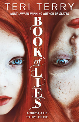 |
My latest: Book of Lies,
published by Orchard Books 24 March! |
by Teri TerryI'm taking a break from blogging about writing this time, and moving on to something that can strike hope, fear, joy and despair into the heart of all authors... sometimes at the same time. Yes, you guessed it: book covers.
Covers are so critical to the success of a book. The most amazing book with the wrong cover will struggle; the most average book with the most amazing cover will do well. Them's the facts. When I first saw the cover for Book of Lies, I was still writing the story. It was love at first sight for me: an amazing cover! Actually possibly the most amazing cover in the history of covers! Though instead of thinking, ok, average insides will do the job, it somehow turned the pressure up a notch to get the story just right.
Considering how important they are, there is very little out there about the shadowy figures behind cover design.
So introducing Thy Bui, YA and middle-grade Art Director for Orion and Orchard:Thy started her design career at Warner Music UK. The three years on sleeve design gave her a unique insight into the visual world of teens and young adults; the move from music to books was an obvious transition. She joined Orchard Books as senior fiction designer at an exciting time – Orchard were building their middle-grade, teen and YA lists, having acquired incredible talent like Ally Carter, Teri Terry and Jonathan Meres .
At the beginning of 2015 Thy began her role as Art Director for middle-grade to YA fiction, working across the Orion and Orchard list. It was an unique opportunity to work on two distinctly different imprints, and to work with amazing debut and prizewinning talent including Annabel Pitcher, Dawn Kurtagich and Leo Hunt.
I decided to do this blog recently when a reader, Carina, asked me about how you become a cover designer. I emailed Thy, and her reply was so generous and detailed that I asked her if I could blog it. Here it is:
Thy on becoming a cover designer:
 I went to university in Australia and did a Design degree focusing on Visual Communication – graphic design, illustration and typography. The following are known for being good for those graphic design (2 dimensional design as opposed to product and industrial design) focused:
- London College of Communication
- Central St Martins
- Kingston University
- University of Brighton
- Cambridge School of Art
 My advice is to completely immerse yourself in book design and design in popular culture – music, fashion, games, film, food, interiors/furniture…everything – as design, and good examples of design and inspiration, crosses all arenas.
And also to bear in mind the importance of type. Keep an eye out for good use of type, and if the degree chosen offers a typography elective, take it.
Design talks and events are also great, I've yet to go to a GLUG event, but they are meant to be inspirational and good for networking. There's also OFFSET in Dublin.
 Below are a handful of book cover related sites to check out. There is so much out there, independent designers, design agencies, illustrators etc…so this is just a starting point:
 And also follow publishers' instagram/pinterest boards. A lot of them are set-up by the designers and they're a little more inspirational than the actual websites which are set-up by the corporate bods as a business tool rather than celebrating the design side of publishing.
And finally, let her/him know to expect to work VERY hard, you need a good portfolio to get into a Design degree. Design is challenging work and not just about making something look pretty. Fantastic design is almost always about a creative concept/approach, followed by great execution.
 ...and a final word from the author who shamelessly put all her Thy-designed-covers down the side of the blog:
I know how lucky I've been to have Thy as my cover designer for all my covers, from Slated to Book of Lies. I wrote this in the acknowledgements at the back of Book of Lies:  ...thanks to Thy Bui, the very amazing cover designer who has done all my Orchard Books covers. I kept looking at the cover for Book of Lies while I was editing it, and thinking, I have to make this good enough to live up to this cover.
Very true. All I can say is that I hope the insides have lived up to the outsides.
And now for a giveaway with a difference! A copy of Book of Lies, signed by both designer (Thy) and Author, me (Teri):
To enter, please leave a comment to this blog - say hello or ask a question, and then tell us what is your favourite ever book cover and why.
A winner will be chosen at random at noon on 28th March (UK time), using a random number generator.
Open internationally.
Here is Thy holding up two of her creations at my launch event at Waterstones Islington on Saturday.
Thanks, Thy! For being there - both then and now.
 |
| Thanks to Candy Gourlay for the photo |
AND here is most of the Notes from the Slushpile Team at the same party:
 |
From left: Kathryn, Candy, Jo, Teri (me!), and Addy. Missing are Nick and Maureen.
I'd say photo by Candy, as it is in her photos, yet - strangely - she is in the photo... |

By: Brian Bowes,
on 9/29/2015
Blog:
Studio Bowes Art
(
Login to Add to MyJacketFlap)
JacketFlap tags:
children's books,
fantasy,
drawing,
video,
Characters,
Process,
ink,
Technique,
Children's Book,
Book Covers,
Brian Bowes,
*Client Work,
client work,
Black & White,
Add a tag
Summary: This blog post covers a book project that I worked on from the end of 2014 to the beginning of 2105. I was hired to create a cover illustration and a number of black and white interior illustrations for the book The Hole Story of Kirby the Sneak and Arlo the True.
via Studio Bowes Art Blog at http://ift.tt/1h8AfKg
.jpeg?picon=2450)
By:
Sherrie Petersen,
on 6/23/2015
Blog:
Write About Now
(
Login to Add to MyJacketFlap)
JacketFlap tags:
interview,
book review,
bloggers,
book giveaway,
author interview,
book covers,
astronomy,
cover design,
outer space,
unique stories,
Book Country,
blogger friends,
Wish You Weren't,
amazing teenagers,
disvovering a planet,
Fabián Cobos,
The Secret Files of Fairday Morrow,
WASP-142b,
Add a tag
Headline news can be depressing. Which is why it makes me happy to find news stories like this one: This Teenager Discovered a New Planet on his Third Day of Work. Seriously. At 15, this kid shows up for day three of his “work experience” project, they’ve assigned him the task of wading through all […]
Guys, blogging with a baby is hard. Really hard. I have so many blog posts written in my head that I just need to sit down and actually take the time to write out, which is so much easier said than done. I don't know what it is about blogging that just seems to take up so much more energy, but man, it drains me.
But becoming a mom hasn't changed my reading. I still read-A LOT. I listen to books and I read books and there are books all over my house, probably more than usual if you count the amount of board books all over the floor at any given moment. Reading isn't hard, it's just finding the time to write the reviews. Sigh. I'll get there.
The fun thing is I have a great reading buddy. Baby GreenBean loves to read which makes this librarian mama very happy. But what really interests me is his fascination and interest in certain books. He judges my books by their covers on a regular basis and I find it so interesting what books he's drawn to. I've tried to snap pictures when I can, so I thought I'd share some of the books Baby GreenBean has most interested in:
I like to think that he has fantastic taste in books and knew this one was getting award buzz which is why he tried to grab it every time he saw it anywhere in the house. I'm not sure what he found so appealing-maybe the colors were calming? But anywhere the book was, Baby GreenBean was sure to find it!
I think it was the bright colors and smiling face that got his attention. Plus, it's a graphic novel-what's not to love?
Really, who wouldn't want to read a book about dragons? Baby GreenBean was all about this book and would never let me read it because he wanted it for himself! He loved flipping through the pages of this one and even decided to try napping/reading it at one point. I guess thick books make good pillows.
Ok, I admit, this one might be cheating. He wasn't feeling well this day and snuggling together and reading books for committee prep might have been more my choosing than mine, but he still picked up the book!
Other books he's been interested in, but I didn't get pictures of:
He likes big books! He's been very interested in getting his hands on my ARC of
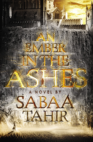
An Ember in the Ashes by Sabaa Tahir lately.
Mr. GreenBeanSexyMan has been re-reading
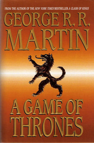
Game of Thrones by George R.R. Martin and left his large hardcover laying around. Baby GreenBean opened it up and was very intrigued by the maps on the first page. I think he's going to be a fantasy reader.
.jpeg?picon=2450)
By:
Sherrie Petersen,
on 3/30/2015
Blog:
Write About Now
(
Login to Add to MyJacketFlap)
JacketFlap tags:
YA author,
Los Angeles Times Festival of Books,
middle grade author,
Wish You Weren't,
book festival,
books,
writing,
celebrity authors,
cover art,
book signing,
book covers,
author appearances,
SCBWI-LA,
middle grade novel,
Add a tag
Last year when Wish You Weren’t came out, I was happy with the cover and hopeful that it represented the story well. I still love the cover, but I also started to realize that the static image implied a “quiet” type of story. If you’ve read Wish You Weren’t, you know that’s not the case. […]
Here's a little something I heard at Goodreads this week:

 The striking cover of The FitzOsbornes at War by Michelle Cooper uses a 1932 photograph of Loretta Young taken by Edward Steichen.
This is an incredible cover, IMHO, reflecting the era of the book (WWII, which is close to the '30s) and the character of the protagonist. Sophie is not the smartest, the bravest, the most charming of the FitzOsbornes. She is merely the one who wrote down everything that happened to the other members of the family.
Michelle Cooper refers to the photo and cover at her blog.
I'm guessing that this cover was created by the art department of Cooper's American publisher, Knopf. If I'm right, then I think it's a powerful example of what a traditional publisher can do for an author. Finding that particular photograph and getting the rights to use it is amazing.
Anyone who knows me (and a fair few who don't as well) will know that my first YA novel Read Me Like A Book comes out this year. I've been shouting about this for a little while now, and have been super-excited about it for lots of reasons, one of them being the fact that I originally wrote this book fifteen years ago, so it's been a long time in the making.
But the same people might not know about the other book that's coming out this year and which in many ways I am JUST as excited about. This book, Emily Windsnap and the Ship of Lost Souls, is the latest in my series about a girl who accidentally found out in a school swimming lesson that when she goes in water, she becomes a mermaid.
Emily and I have had lots of adventures together. She has a tendency to get herself into scary, exciting adventures. [WARNING: Spoilers coming...] Emily has rescued her father from a prison out at sea; she's been nearly squeezed to death by a giant Kraken; she's explored mysterious castles, discovered banished sirens in underwater caves and very nearly been turned to ice by an evil man with too much magic at his disposal.
In August, Emily has her sixth adventure. I can't tell you too much about it yet, as it's still a closely-guarded secret. But what I can tell you is that, in typical Emily style, what starts off as an innocent Geography field trip turns into an adventure involving life and death decisions, a spooky ship and a trip to possibly the most magical place she's ever visited.
For me, one of the most exciting things about this book is that for the first time ever, it's coming out on both sides of the Atlantic at the same time. My UK and US publishers are working together to make this happen, and TODAY, between us, right here, right now, I am very excited to be using the wonderful ABBA blog (thanks ABBA!) to reveal the cover!
So, without further ado, ladies and gentlemen, children and mer-kids, I give you, Emily Windsnap and the Ship of Lost Souls - the cover. I think it might be my favourite Emily Windsnap cover ever (by the wonderful artist Sarah Gibb). Hope you think it's as beautiful as I do! :) :) :)

PS If you need to catch up with the rest of the series before reading the new one (or you know someone who does) check out the giveaway on
my Facebook page. :)
Follow Liz on Twitter
Join Liz's Facebook page
Check out Liz's Website
Last week at the book festival was so much fun. The venue was gorgeous – one of the best libraries I’ve ever visited – and the organizers were so thoughtful and generous. It was definitely my favorite festival so far. Plus, I got to meet some awesome authors who’ve written some great books. Thanks to […]
Neta has only been at her new job for one week and three days! So welcome her to Klutz, where she is now the Vice President of Product Development. If you were never a child, then you missed out on all of the great Klutz cooking, drawing, gardening, joke, activity, craft and magic books.
Two of the four things Neta says you want a cover to do:
"Ha, made you look!": If you see it on a shelf with lots of other face out covers, does your eye stray to your cover first?
Clarity of content: Who is the buyer? Can you tell from the cover if the book is for three-year-olds or eight-year-olds? Boys and girls, or just girls? Just lawyers?
Neta walks us through the evolution of the cover of
HOW DO YOU FEED A HUNGRY GIANT?
The first sketches were very similar to what you see above, but with a tighter crop in, with no sign, just the legs of the giant... which meant the only actual blank space for the title was between the giant's legs... Neta went back and forth with the artist over how to incorporate the title into the cover image (adding a little more of the giant's body, putting the title on a sign that the giant could hold, which nicely echoes action happening in the book).
ILLUSTRATOR TIP! Neta says being able to do hand lettering is a great thing for an illustrator to have in their back pocket. Neta roughed in the sizes of the words for the title, and Shaw used that as a guide to handletter the title to its final style.
Remember when Neta told us that the cover should make it clear from the get-go what sort of a book it is, what sort of buyer will know this is the book for them? WELL, How Do you Feed a Hungry Giant? is a POP-UP BOOK! Yeah, I know! And the brilliant thing is that the cover has a pop-up element, look at this cool piece that you can pull out of the top of the cover:
 |
| HOW COOL IS THIS?!?!?!? |
Neta shared more cover tips, some examples of favorite covers and what they have in common, and took time for Q&A, good stuff, guys!
Attention Writers: We are running a web special! The FIRST 25 CUSTOMERS get $55 OFF a CUSTOM COVER DESIGN for their next novel!
That's as low as $60 for a professional custom front cover — cheaper than most premade book covers! Get one for your upcoming book, or get extras for works-in-progress!
No coupon necessary — Discount appears in your cart! Expires once we reach 25 customers, or on 6/20/14, whichever comes first. You snooze, you lose!
Price good through DontTouchBaby.com only. Contact us via Live Chat if you have questions! Thank you & happy writing!
SPECIAL OFFER for Indie Authors! Get a CUSTOM FRONT COVER for your next book or novel designed for a super great price! How great? Under 100 bucks great! View portfolio and **Contact us** for details!
Hope you liked my post on my first day at the London Book Fair 2014. If you haven’t read it, then click First Day at the London Book Fair 2014 to read all about it.
Marketing Your Book
Day Two began with a workshop that had about 8 people sat round a table with a moderator. The topic of the workshop was selling and marketing your book internationally. While the workshop didn’t address the international aspect of marketing your book, there was still a lot of good stuff to take home.
Some of the words of wisdom shared included making sure your book cover sizzles. Don’t check your book sales every day, instead use that time to find bloggers who can promote your book. Everyone at the table was encouraged to share what was working for them.
With regard to social media, I learned we have to tweet about hot topics that are in the social consciousness. He gave the example about football and how you can win new followers by talking about a recent game. To this end, if you follow me on @davidchuka you’ll see me begin to share more about my football team and the challenges of parenting.
The moderator said that Twitter works but you just have to be committed to tweeting every day. At this juncture, I feel it’s necessary to interject that our primary focus as writers is to write so if you’ve not fulfilled your main calling, then don’t sweat the small stuff i.e. social media.
To improve your brand name across social media, make sure you’re using the same username/tag across your profiles. I think you’ll agree that I have a consistent brand name across my profiles apart from Pinterest.
Blog – http://www.davidchuka.com
Facebook – https://www.facebook.com/Author.David.Chuka
Twitter – @davidchuka
YouTube – https://www.youtube.com/channel/UCKbSJqQe5FQaJHvj-n5R4Gw
Pinterest – http://www.pinterest.com/boldtrends/
We were encouraged to try paid PR as they can get you into newspapers and also help with press releases. Make sure to haggle on price if you want to go this route as there are always deals to be struck. Ideally before the deadline for advert submissions as they have last minute deals. I’ve never used this method before and would be interested to know if you’ve had any success with it.
Cross promoting helps so try to get to know other authors in your genre. I have to say that I have personally found Facebook groups and Twitter plus GoodReads to be a great place to find fellow authors in my niche. A great man once said that iron sharpens iron and when it comes into getting into an alliance of like-minded authors, the power that we can give each other is huge.
After the workshop, I went to another workshop that I have to admit was pretty boring. Not because of the content but more the delivery of the content. The subject had to do with legal matters. I’m glad I took the business card of the moderator as it’s something I know I’ll definitely need help with in the future.
Self-Publishing and Traditional Publishing in the same Bed
For the afternoon session, I went to possibly my best seminar of the day titled ‘Eating the Cake Too: The New Breed of Hybrid Authors have the Best of Both Worlds.’ This session was moderated by Diego Marano who is the head of Kobo in the UK and the special guest was Hugh Howey.
Hugh stressed that writing comes first and should reign supreme above everything else. He talked about how when he first began, his idea of success would be to sell his books to 5000 people over the course of his lifetime. Hugh was asked how he managed to balance all his responsibilities in addition to writing. While he wasn’t ungrateful for all the success that has come his way, I got the distinct impression he missed the old days when his life was purely centred on writing. He made a statement to the effect that we should write as much as we can now and hope our 10th book is the breakaway success before other commitments took us away from writing.
He shared how he believed we’re going back to how stories used to be told which involved a direct engagement between the storyteller and his audience who could give him instant feedback on what part of his story was working and which wasn’t. He gave the analogy of people in the music world who played live and used the audience feedback to gauge where they needed an improvement on their performance. With social media, we can begin to engage once again directly with our audience and involve them in the storytelling.
This reminded me of how the father of a student at a Primary school I did a reading at reached out to me on Twitter and said how his daughter liked my books and reading. I replied back and said it was a pleasure to read to her and her school friends. In light of Hugh’s advice, I should have taken this a step further and asked him if I could send him a copy of my next book or asked him which character his daughter liked the best. I believe the keyword here is Engagement.
Below is a short video I shot from the second row with Hugh talking about a deal he recently struck.
Book Marketing Tips from 7-Figure Indy Warriors
The final seminar which I attended was chaired by Indy trailblazers Bella Andre and Barbara Freethy. They were both once upon a time traditionally published but switched to Self-Publishing a few years ago. Bella recently signed a 7-figure print only deal with Harlequin MIRA.
Bella kicked it off by talking about branding. She showed us a slide of all her book covers and said being that she came from a traditionally published background where the author didn’t have a lot of input in the marketing of their books, she wanted to get it right with her covers when she switched. She said she wasn’t hung up on people knowing the title of her books but wanted to build the Bella Andre brand and that’s why they’re always so BIG on her covers.
A great brand should be instantly recognisable and consistent. She advised that we need to fulfil the promise we make to the reader with our book cover. So the images and title should be a reflection on what’s on the inside of the book. She said something she had noticed with a lot of fiction authors is that we only think about the title but the sub title is equally as important.
Think about the holes in the market. What holes/gaps are there in your market that you can exploit? She gave the example of writing under the pseudonym ‘Lucy Kevin’ to capture a segment of the contemporary romance market she felt was being served since the Bridget Jones books.
Readers love knowing that they have more books to look forward to so give it to them and make sure the story in your series is open-ended. People discover you with each new book so aim to write more books in your series. She personally aims to release a book every 2-4 months.
You can maximise the income from your published books by doing one of the following
- Converting them to audiobooks
- Having print books
- Film and TV
- Selling/licensing the foreign rights
- Translating them into foreign language
With regard to book translations, she advised to make sure that your translator has experience in translating books and you need to get a proof-reader to check what they’ve done. Your book could live or die on the strength of your translator. The major languages she said we should target are German, Portuguese (with the Brazilian market in mind), Spanish and Italian. You can convert your published books to audio by using the Amazon service acx.com which will not only upload it to Amazon but other retail channels as well.
Barbara drew our attention to the fact that we could draw attention to our latest published books by having a Facebook party. You can also boost your posts on Facebook. She said something you could do is along with the creation of your Facebook page is to create a Facebook group. This is so fans of your books have a place to congregate and discuss your books. This way, the onus isn’t on you to keep the conversation going.
She mentioned something about the fact that she only had about two thousand plus fans on her Facebook page but had a friend who had more than twenty thousand but wasn’t selling much. Her conclusion from this is you can’t equate the success of an author to the amount of fans they had on Facebook.
Something she said that caught my attention and I’ve never tried is that you can update your status on GoodReads the way you could leave a post on Facebook. Use Ereadernews.com to advertise your book as you only pay for clicks. This is another channel I will be exploring. I’ve used them for free days but not for paid promos.
Another thing she said was to always think about keywords and have them in your description and author profile as this is a way people find you on Amazon and the other retail platforms.
Have a 5 year plan. I think this is very important as we sometimes tend to get discouraged if we don’t see sales or just a few sales when we click into our KDP account. Speaking of KDP accounts, she advised us not to check it too often as it could either make you depressed or over-excited.
Have your name big on the cover. The perception is that if your name is big on the cover then you must be BIG. I have to say this was another aha moment and looking through Bella and Barbara’s Amazon author page and viewing all their book titles, I could see they really were practising what they preach. You might not be big at the moment but you have to Fake it, till you BECOME it!
We all need to think like publishers and play with price, covers, description etc. This reminds me of a one on one talk I had with Stephanie Bond on Day One and she said she brought it to the attention of a friend that one of her books wasn’t doing so well in the UK market. They went through a couple of things and her friend pointed out that she began the description to that book with the phrase ‘Welcome back to Lexington, Kentucky.’ They both agreed that Lexington might not be a place familiar to an international audience. As soon as she changed this, an hour later, she began seeing sales on this book. Amazing! This just goes to show that if you’re experiencing mediocre sales on a book you know should be doing better, then something can be done to boost sales.
If there’s one thing that all the Indy superstar writers were in consensus about and which Barbara said again, it was that we should all keep writing. Content is King. Bella said how at the start of each week she had to remind herself that it’s all about the book. Write more than one book. Spend more time writing than promoting.
Network with other authors and cross promote each other’s work. I’m all for this and if you need my help, simply shoot me an email via my Contact Us page.
Get to know retailers – how they work, their platforms, latest trends etc.
Hire professionals to do your cover, edit, proofread, write your description etc. write what you love and think BIG!
There was a big round of applause from the audience at the end of this seminar.
I’d really love to know your thoughts, comments, questions etc. regarding my two days at the London Book Fair. It really was a life changing experience and I hope to see you at London Book Fair 2015 which will be held at The Olympia from April 14 -16th. Hope to see you there!
 Last week I wrote about hybrid authors, authors who publish both traditionally and as self-publishers. Among other things, self-publishing means being responsible for your own covers, something I found difficult with Saving the Planet & Stuff. I knew what kind of feel I wanted in the illustration, but I had trouble hunting around on-line for illustrators who projected what I was looking for. I also realized that there was a difference between an illustration and a book design. I found book design mystifying. Fortunately, I found someone within our family's circle who was able to take care of both the illustration and the design. (Someone who appears to have taken down his website.)
 In the March/April issue of the SCBWI Bulletin, author Chris Eboch has an article Cover Design in which she discusses for self-published authors the very issues I was dealing with. She describes pulling together a couple of other authors to help study recent fantasy covers in order to pinpoint the elements she wanted for her book, The Genie's Gift. In her case, she found both an illustrator, Marlo Garnsworthy, and a designer, Alan Erickson. And Chris explains how design differs from illustration. Design involves "choosing and placing text elements," which includes fonts. Fonts are important in terms of their appearance and their placement. And as I learned, some of them are copyrighted. You can't use just any font.
Chris points out that self-publishing can be expensive, something I think many inexperienced writers don't realize or consider. Editing and covers are the two big expenses. They're the two elements of a book that show big time, if they're not well done. Chris says to expect to spend several hundred dollars if you need to hire an artist for an illustration. I've seen the price range of $600 to $2500 in a couple of different places. And then, remember, that that might not include design.
So, writers, once you get the book written, you have a whole new task ahead of you.
My husband, Adam, decided that he's going to add ebook cover design to his growing list of art/business/design ventures in the making. After throwing some ideas around, I started to take him seriously and began to see how realistically viable this would be for us both to take on as a team. We both work jobs as web/print designers, and with our combined skills and areas of interest I think we could totally do this thing.
We are currently in the process of pinning down a name for this emerging ebook cover business and have begun to put together some sample cover designs. Thankfully, there's no shortage of public domain stories ripe for the picking. Adam's been pulling references and inspiration and knocking out the first round of designs. I'm then taking his designs/ideas and bringing them to finish. Our goal is to get at least eight covers mocked up and then build a simple SEO website that can start catching client leads. Over just a couple nights we've created six sample eye-catching ebook covers that I think rather successfully scale down so that they can be read easily on websites like Amazon or in the App Store.
I've requested to be the company Art Director and Adam the designer. He's definitely an idea man and I love tweaking and refining other people's hard work. Haha.
...but seriously. I love it.
The six on the left are the finished versions, those on the right are Adam's first passes.
As a child, I was completely captivated by the John Sayles film The Secret of Roan Inish. It was somber, moody, atmospheric, mysterious, moving, charming, and oh-so-very IRISH. It was beautiful in both its mythic fable-like story, as well as its muted, lustrous cinematography. Essentially everything I loved in a story then and even more so now. As an adult I discovered the book upon which it is based, the Scotland-set The Secret of the Ron Mor Skerry. The story concerns a young girl, Fiona McConville, who returns from the city to live with her grandparents on the coast of Scotland. All of her family had been living on the nearby small rocky island of Ron Mor for generations until they all evacuated four years prior. On that day, Fiona's baby brother Jamie was tragically swept out to sea in his little cradle boat, never to be seen again. But Fiona believes her brother may still be on Ron Mor, and begins to suspect he's been protected by the seals that inhabit the island.
Originally published in 1950s, it has been out of print for a long time, apart from the straggling copies of the 1993 movie-tie in book, which is what I have. But this version of the book has always bothered me. It's the exact same text as the original Ron Mor, but just its title on the cover has been changed to Roan Inish. The original book also featured lovely black and white line illustrations by the author herself. For such a magical story, my lackluster printed copy simply won't do.
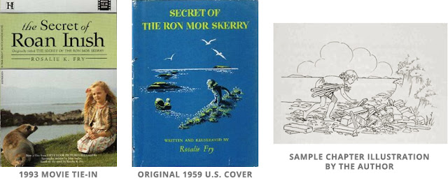
For several years (ever since I tracked down my own copy of the book via Ebay), I've wanted to revisit the story with my own images. 20 years after seeing the film, I'm finally doing it! I've begun here with the cover and would like to continue on with creating black and white chapter illustrations as well. I plan to play direct homage to Rosalie Fry's original vignettes in addition to adding some of my own imaginings.
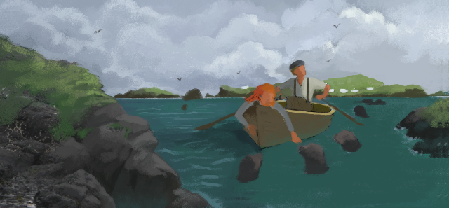
But for now, here is the cover in process form.
1. Quick color/compositional sketch.2. Black and white drawing.
3. Refining color sketch to align with drawing.
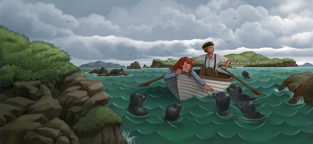
4. Black and white rendering.5. Color version. 6. Final color version, adjusting placement of elements and position of figures.
7. Overlay of book jacket elements.
I love looking at book covers, especially when they change from hardcover to paperback. I think the cover evolution and marketing directions books take is interesting! Here are some recent changes I've seen:
Hardcover
-Simple, yet it gets the story across-I like it
Paperback:
-This one is much more simple, but it works and I really like it. I also think it adds an element of humor the first cover is missing.
Hardcover:
-I don't know what I think of this cover. I like how she's coming through the book and entering the story, which gets the plot across,but it just looks a bit odd at the same time-not sure why.
Paperback:
-I really like the look of this cover, but at the same time it feels a bit historical.
Hardcover:
-It's simple, but I like it. I also like how the girl doesn't look too nerdy.
Paperback:
-This one changes the look of the book to a romance Sarah Dessen-esque cover. I like the cover, just not for this book.
Hardcover:
-I thought I had talked about this one before, I guess not. I love this cover-so cute, I love the text and the Eiffel Tower in the back.
Paperback:
-This is an OK cover, but it feels like the book is trying to become "new adult" and being marketed to adults more than teens. It also looks a bit more serious to me than the original cover.
-I really like this cover-simple and just the right amount of scary. It flies off my library shelves.
Paperback:
-I really like the paperback version too. It's a different take than the hardcover, but I think it still manages to get across the mystery of the book. I do think the cover model looks a bit like Kristen Stewart in that photo and I wonder if that will turn off readers thinking this is a Twilight readalike.
I really like the other two covers in the series:
What covers do you like and dislike?
A few years ago the children’s book world learned a new word, or a new use for an old one: whitewashing.
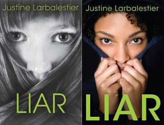
Whitewashing is the term used for the practice of putting a white model on the jacket of a book about a black or other non-white protagonist, in the presumed hope of not "putting off" potential white readers. As one striking and well-known instance, let’s take the case of Justine Larbalestier’s 2009 novel, Liar. The heroine of Liar, Micah, is biracial, and described as having “nappy” hair; but advance copies of Bloomsbury’s US edition showed her as a white girl with straight hair – a move that drew such loud protests (including from Larbalestier herself) that the publisher hastily replaced the cover with one more representative of the book’s contents, as this before-and-after picture shows:
The case of
Liar is far from isolated, and you can read a recent article about the whitewashing phenomenon, with many more examples,
here. The problem isn’t confined to race, however. More recently, an edition of
Anne of Green Gables drew the wrath of many by its portrayal of the red-headed Anne Shirley (whose hair colour is a major plot point) as blonde:
Why did the publishers of this edition give us a blonde Anne? Was it because they believe blondes sell more books than redheads? Was it a fiendish attempt to gain notoriety on the internet, on the principle that there’s no such thing as bad publicity? Possibly, possibly, although in this case another factor may have been lack of a design budget and ignorance of the book’s content: the offending edition of
Anne was self-published, and self-publishing (for all its virtues) has in some cases made badly-designed jackets
a new art form.
So far we’ve had whitewashing and blonde-washing – but there are other wash cycles out there, and not only for jackets. There’s straight-washing, for example. This goes back a long way: as early as 1640 John Benson published an edition of Shakespeare's sonnets with the pronouns changed to make them look as if they were all addressed to a woman. A mere 371 years later, Sherwood Smith and Rachel Manija Brown’s YA novel
Stranger was taken on by a major agent, but
only on condition that one of the main characters, who happened to be gay, was made straight. In a book market where LGBT people, like black people, are
woefully underrepresented compared to their numbers in the real world, especially as protagonists or major characters, this attempt to suppress their appearance was seen by many as pernicious – for society as a whole, but particularly for young LGBT readers.
Being behind the times, I discovered only recently the extent to which some popular Japanese anime cartoons have been straight-washed in the process of being adapted for American viewers. In Japanese manga (comics) and the children’s anime that are based on them, romantic feelings between people of the same sex are frequent, and not generally seen as problematic. For example, in the manga Cardcaptor Sakuraand in the anime of the same name, ten-year-old Sakura (female) has a crush on her older brother’s friend, Yukito (male) – but so does her classmate, a boy named Li. In addition, Sakura’s own female best friend, Tomoyo, is in love with her. When the anime was adapted for American television under the name Cardcaptors, Sakura’s crush on Yukito (now called Julian) was preserved, but Li’s was erased; and Tomoyo’s (now Madison’s) love for Sakura was transformed into non-romantic friendship. So integral were both these threads to the original story that the American censors had to go to great lengths to achieve the change, deleting many scenes in the process (and filling the gaps with irrelevant flashbacks to previous episodes), while making innumerable smaller cuts and changes to dialogue. Even so, Cardcaptors still retains traces of what has been ripped from it, in the form of inexplicable blushes and plot lines that no longer quite make sense. These were a sacrifice apparently seen as worth making on the altar of heteronormativity. Cardcaptor Sakura is not a unique case, either: the adaptors of the anime Sailor Moon went so far as to change the sex of one of the characters (Zoisite) in the English version, so as to render him (now her) acceptably straight.
Are things getting better, or worse? It's hard to say. The story of Sherwood Smith's and Rachel Manija Brown’s rejection provoked understandable outrage, and perhaps as a result appears to have acquired
a happy ending: their book is now after all to be published as written. As for anime, the examples I've cited are over a decade old, and I'm told by people more knowledgeable than I that there haven't been any recent cases of straight-washed English-language versions of Japanese anime. That doesn't mean that same-sex romance has found its way onto English-speaking children's cartoons, however. If we wish to increase the representation of LGBT characters, perhaps that's not such a huge amount of progress, after all? Meanwhile, cases of whitewashing (and its variants) continue to crop up regularly; girls are featured less prominently on book jackets than boys (even when equally prominent in the story); fat characters are portrayed as thin - and so on, and on. Editorial and marketing decisions will always tend to drift in the direction of safety and perceived "norms". If that's to change, it's up to writers and readers to pull hard in the other direction.
Sometimes paperback covers can be for the better and sometimes they can be for the worse. Here are some recent cover changes I've seen:
First up, Code Name Verity, a book that is near and dear to my heart.
That shiny sticker looks so pretty, doesn't it? I like this cover, but the paperback is really growing on me:
I'll admit at first I hated it, but the more I look at it the more I like it. There's just something so beautiful about this cover.
Here's another one I really like. The hardcover for The Catastrophic History of You and Me makes sense with the book, but I just don't like the way it looks as a whole and I'm not sure why. I think it's the fact that I don't like the dress.
But I really like this paperback cover, even if it does look a bit like other covers. It's just simple and beautiful
Here's one I really dislike. I love the hardcover for Keeping the Castle:
But the paperback looks so childish!
It really looks more like a middle grade novel now and the main character looks so young and a bit Disney character-ish. It's a cute cover, just not for this book.
Here's another cover change I'm not a huge fan of. I really liked the hardcover for Throne of Glass:
It looks like it's got a cool kick butt girl on the cover.
And now here's the new paperback:
I guess she still looks pretty kick butt, but she looks like a cross between Lara Croft and an anime character. I almost expect the content inside to be a graphic novel.
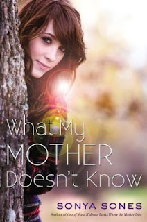
Ok, let's talk about the evolution of a cover over the years. What My Mother Doesn't Know was one of the first books I read when I started reading YA lit and it remains one of my favorites. Here's the original cover from 2001 that I checked out from my library:
The cover got a makeover in 2003 in paperback:
And here's the latest cover makeover for 2013:
I have to say I like all three covers, even if the last one does look a bit like all the other contemporary YA covers that are coming out right now. I do like how it looks with the sequel, What My Girlfriend Doesn't Know:
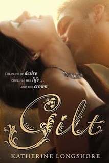
Now for a book that's new but that has still undergone a complete makeover. Here's the original hardcover for Gilt:
Now, the paperback that was supposed to be:
But that paperback isn't happening and it's had yet another makeover. Here's the newest paperback cover:
Author Katherine Longshore has a great blog post about the evolution of her covers and why they changed.I think all three covers are great and really like the new paperback look.
So what do you think of these cover changes? Good or bad?
In honor of my family's first community theatre experience (not counting the letter I earned in high school for painting sets....)
Have a wonderful day !
While I was at ALA, I heard rumors of a horrible Anne of Green Gables covers that was making Anne fans angry all over the internet. And then I found it:
Anne of Green Gables is one of my favorite books and this cover might be the worst cover in the world. Everyone knows that Anne is a redhead NOT blonde. And what's with the "Hey, Gilbert, I'm suddenly sexy farm girl Anne" look that she has going on? Plus it's way too modern looking! I'm sorry-Anne would not wear that shirt. She wants puff sleeves!!
Anyway, as I was fuming over the horrible Anne cover, it got me thinking about recovering classics. Some work well and others not so much.
Matilda is getting an anniversary reissue this year and I have to say I like the new cover:
It reminds me of A Wrinkle In Time anniversary reissue which I also liked:
Another anniversary occuring this year is Amelia Bedelia. While she doesn't have a cover reissue exactly, she has a spinoff chapter book series that takes a new approach to the covers:
It's cute and updated but still feels like the original Amelia I grew up with.
Another childhood favorite of mine, Pippi Longstocking, is getting a new cover this year:
I'm not sure what I think of this one. It's cute but almost seems a bit too understated for Pippi.
What do you think of these reissues? Any other classic recoverings you've seen recently? Are they good or bad?
I've got more hardcover to paperback changes! What do you think of these?
Hardcover
Paperback
-I think both of these are well done and reflect the bleakness of the landscape in the story.
Hardcover
Paperback
-As fun as I think the paperback is, I think it's marketing more to an adult audience. It looks like your typical adult mystery bestseller. The hardcover looks like lots of fun and like the book will have lots of action (which it does)
Hardcover
Paperback
-I'm not a big fan of either covers, but I gotta got with the hardcover because it's creepier.
Hardcover
Paperback
-I like the hardcover on this one. The paperback is too simple and I think the hardcover has a cool computer/techy/time travel feel to it which matches the book.
Hardcover
Paperback
-The paperback for this one changes the entire look of the book! Now it looks like a steamy romance novel instead of historical fiction about Catherine Howard. I'm sure the paperback will get people to pick it up, and there is a lot of intrigue in the book, I'm just not sure it matches the steaminess on the cover.
I love looking at covers! And I think we all judge books by their covers to some extent. Here are some recent hardcover to paperback changes:
Hardcover:
Paperback:
-I gotta got with the paperback on this one. It just looks more appealing to me.
Hardcover:
Paperback:
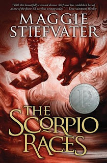
-I think both covers are appealing. I think the paperback has more action and the hardcover is more subtle, but both fit the book well. I think I still like the hardcover better.
Hardcover:
Paperback:
-The paperback looks like a comic book. It's still really cool and I think this cover change is interesting because I think each cover markets to a different group. The first looks like fun and fluffy and the second looks more serious. I'm not sure which one I like more.
Hardcover:
Paperback:
-I love both of these covers, but I think I like the darkness of the paperback. I do think the hardcover has more of a Sleeping Beauty feel which matches the book.
So which ones do you like or dislike?
I'm covering for Karen King, who should have been writing this post. Instead, she's getting married. That seems like a much more important thing to do. Congratulations Karen!
So this is a cover version of a blog post. To make sure I've got everything covered, I'm going to talk about covers.
Book covers.
It's a little-known fact, but every now and then people ask me to design a book cover for them. Here is the most recent one:
Most of them are books for grown-ups. But earlier this year I did one for young adult girls. Here it is:
I really enjoy designing book covers.
Surfing Through Minefields is a realistic story (no vampires) about a young girl who moves to an old coalmining area and gets into a spot of trouble.
You could say that there's trouble at t'pit, but I won't because that's corny.
Bel was very specific about what she wanted. There had to be a dog, the girl, and a coal mine.
Oh yes, and she had to have a skateboard, hence the title.
How do you aim a book at a particular kind of reader? How do you attract their attention and make them pick it up?
My approach was to think: if I put a really cool girl on the cover, then it looks like the book is aimed at that type of reader.
I made her sassy and confident, too: she's got attitude. Just, I hope, like a lot of girls aged 11 to 13 like to think they are.
Bel said she was really pleased with it anyway.
How did I do it? Sorry, that's a trade secret. I'll have to keep it under cover.
There was a print version and an e-book version. For the print version I had to design the spine and the back cover as well.
I also copy edited the blurb for her and the publisher.
Doing something like this makes me think a lot more about writing the content of my own books, and how they are aimed at particular kinds of readers.
But I wouldn't design covers for my own books. It's hard enough writing them.
Working like mad, really enjoying every moment. Finally settling into the new routine with Henry at school. In fact it's proving to be a lot easier than over the Summer where I could get interrupted any moment. I think the pencils will all be done within 3 weeks, hoping less!
View Next 25 Posts

















[…] Click to read Day 2 ====> My London Book Fair 2014 Experience Day 2 […]