
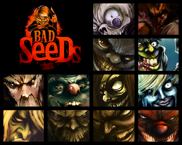
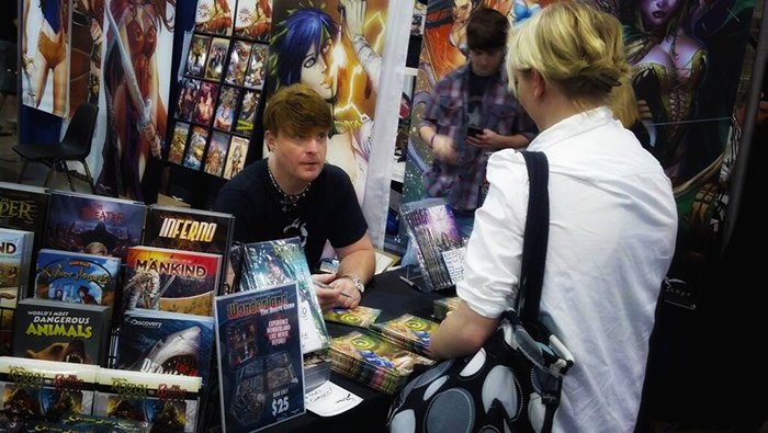
What a way to celebrate Halloween! Starting October 29th Gregbo Watson’s “Bad Seeds” collectible card set is available to help you usher in All Hallow’s Eve in style. This haunting set is exclusively available through NeonMob as part of their #NeonMonsters month. This exclusive collector’s set is filled with enough ghastly ghouls, malicious miscreants, terrifying troublemakers, and horrific hooligans to make even the bravest of souls shiver with fright. Bad Seeds is a creaky, open door into the dark, twisted imagination of artist Gregbo Watson!
NeonMob Hosts Halloween Hangout with Gregbo Watson – LIVE – October 31st
In celebration of the release of “Bad Seeds“, NeonMob will be hosting “Halloween Hang Out with Gregbo Watson” LIVE on Halloween. The event will be a live multimedia chat via Google Hangouts where Gregbo will talk about his work and answer questions. So light your scariest jack-o-lanterns, pull up a tombstone, and join us for this spook-tacular event.
NeonMob Hosts Halloween Hangout with Gregbo Watson
Free Live Event
Thursday, October 31st, 2013
1:00pm – 1:50pm EST
RSVP: http://neon.mn/gregbo-bad-seeds
Visit www.NeonMob.com to find out more.
The post Gregbo Watson’s “Bad Seeds” Available at NeonMob 10/29 appeared first on The Illustration Art of Gregbo Watson.


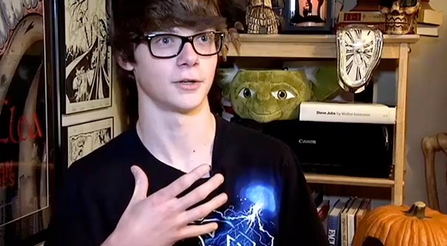
Its been a long time since I painted a self-portrait. The last one that I did was probably way back in Art School. So I felt that it was time to do a new one that reflects my dark, scary self. I’ve always felt that painting a self-portrait is an excellent exercise for artists and illustrators, and is arguably one of the more difficult subjects for us to tackle.
For this portrait, I chose to paint myself during a moment of drifting off, elsewhere into deep thought (which I am often known to do). And, as those who know me well can attest to, I am probably lost in the creative zone thinking about my work. This is why I chose to incorporate some of my unfinished character sketches surrounding me in the background. I also chose to portray myself wearing my Ozzy Osbournesque dark sunglasses, skull earrings, and a t-shirt featuring some sort of creature, which is how I am most often dressed.
The post Gregbo Watson – Self Portrait appeared first on The Illustration Art of Gregbo Watson.
Related posts:
- Dark Oz Character Sketch
- Hillbilly Moonshine | Illustration by Gregbo Watson
- Rat Boy | Illustration by Gregbo Watson


“Hat’s Off” Digital Painting Process
Hi everyone! Recently I have been getting requests for tutorials and/or an overview on the process I use to create my artwork. While I do have a “formal background” in traditional painting and illustration, I am a self-taught digital artist. While training myself to move my traditional methods into the digital realm, I read many great tutorials from fellow artists, illustrators, and designers. I have always felt that an important part of growing one’s art involves sharing with and learning from each other, and am always thankful to those busy artists who have taken the time to share their knowledge.
While working on my recent illustration “Hat’s Off”, I decided to document and share my process with you. I really hope that this helps by either showing you a different approach, or by simply inspiring you to create art. Well I’ve rattled on way too much already, lol, let’s paint something scary…
Used in the Creation of “Hat’s Off“…
Equipment: Apple MacBook Pro, Dual Monitors, Wacom Intuos
Software: Sketchbook Pro 6*, Adobe Creative Suite / Photoshop CS6*
(*Software version at the time of this writing)
Step 1 – Creating the Sketch & Priming the “Digital Canvas”
I always start by creating my sketch in Sketchbook Pro. This is where I can really workout the composition of the illustration. How detailed my sketch ends up usually depends upon how clear the concept is in my mind. I work on the sketch until I feel that its right and time to begin painting. Once my final sketch is ready, I move into Photoshop where I create a new canvas at the required resolution and dimensions. (I usually try to work in at least 300dpi and slightly larger dimensions than what the final dimensions call for.)

Next, I create a New “Canvas Layer” and using a variety of textured brushes, begin laying in some color and texture to the canvas. This step is much like priming a canvas using traditional painting media. As my painting progresses, this layer will show through adding a richness and texture to the final illustration. Once I am satisfied with my working canvas layer, I import the sketch into a new layer directly above. I darken the sketch against the canvas by using the “Multiply” Layer Mode. I refer to this as my “Sketch Layer“.

Working within my “canvas layer”, I use Photoshop’s Dodge and Burn tools to help strengthen highlights and deepen shadows to further define form in my image. This step reminds me of the “takeout technique” used in traditional media where you lift out areas of a wash to build and emphasize highlights.

Step 2 – Underpainting the Illustration
At this stage, I begin the underpainting. I do this by creating a new “underpainting layer” directly below the “sketch layer” and above the “canvas layer”. Again, I use Photoshop’s Layer Modes to adjust how this underpainting layer reacts with the layer beneath it. I tend to use “Multiply” in most cases, but others can be used to achieve different results depending on the painting you are creating. Laying in flat blocks of color is all that I am concentrating on in this stage.

Step 3 – Deepening Shadows, Lifting Highlights, and Adding Some Tombstones
With my base colors blocked in, I now begin deepening the shadows with color and try and further define the painting’s form. All of this is being done while still in my “underpainting layer”. At this stage, I also want to begin noting and accentuating my light source. I accomplish this by creating a new “highlights layer” directly above my “underpainting layer” and setting its Layer Mode to “Overlay”. Again, you can use other Layer Modes (such as Screen, Color Dodge, Soft/Hard Light, etc.) for this step depending on the look you are trying to achieve. The key is to experiment. In some cases, when working on an illustration I have used a certain Layer Mode, but had to tone it back quite a bit by lowering that layer’s transparency or making other such adjustments.

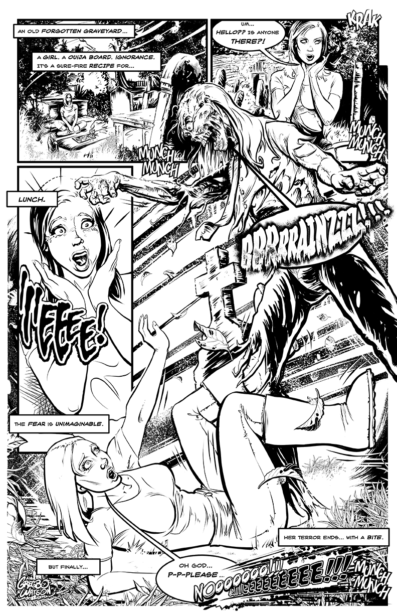
In my “highlights layer”, I rough in the light source and add some directional rays to help remind me of the light source’s direction as I work. As usual I am illustrating something dark and creepy, which is my favorite genre and kinda what I’ve become known for. This scary skeleton character is rising from the grave to welcome visitors to his graveyard. He is the focal point of this illustration, but in order to effectively tell the story, I need to establish to the viewer where this is taking place. I make the decision to do this by adding some tombstones in the background. I decide to paint a faint outline of the tombstones to establish story setting and mood without making them the “star”.

Illustration is about telling and enhancing a story! Its very easy to get carried away when painting the background in a piece like this, but I do not want to take focus away from the main character or confuse the viewer’s eye. I feel hinting the tombstones gives the viewer the necessary information while allowing their imagination to dream up and “fill in” the rest of the graveyard. I place the tombstones in a way which also helps me to strengthen the composition and guide the viewer’s eye.

[NOTE: If you are new to creating art, the above diagram will give you a fairly good idea just how much thought and planning goes into (or should!) an effective illustration. As a professional illustrator, this much planning and fore-thought is essential. This is because illustration is about visually telling a story. Whether it is a short children's book, full-length graphic novel, one page pin-up, or a logo representing someone's brand, our job as illustrators is to tell the story! For that reason, it never matters how well we can draw/paint or how many "tricks" we know in Photoshop... If our composition is poorly designed and causes the viewer to misunderstand or lose interest in the story, we have failed. So when composing each illustration, Design with Purpose.]
Step 4 – Beginning to Define Details and Refine the Overall Painting
Now I begin adding detail work to the painting with an emphasis on the main, creepy character. I have a great many custom brushes which I have either downloaded, or created myself, however I tend to use mostly a simple, generic round Photoshop brush. My custom brushes are mainly used only when creating the texture for my “primed canvas layer”, or on the rare occasion of some unusual special effect that a particular painting may require. My favorite set of custom downloadable brushes were created by artist Chris Wahl and can be freely downloaded from his site.

Painting the details, I now am focusing on really bringing out various areas of interest within the painting. For example, I decided to do a skull and bones pattern for the patch on his jacket. If you follow my work, you’ve probably noticed that I enjoy adding a bit of dark humor within my illustrations. Also notice that although we are painting details and nearing the completion of this illustration, the background texture of my “primed canvas layer” (created way back in Step 1) still shows through, adding the richness of texture I mentioned. This is also because I build up my painting in glazes, just as I would using traditional painting methods, which helps achieve a transparent luminance while still allowing parts of the canvas texture and pencil sketch to show through. (Hey! I worked hard on that sketch so why not allow it to be seen, lol.)


Step 5 – Refine and Emphasize the Light Source
With my detail work in place, I decide to turn my focus back to the lighting. I begin adding more defined light rays which I lightly erode in areas (using the eraser tool) to portray the illusion of light mixing with the foggy mist of the creepy old graveyard. Since this is set in a graveyard, I choose to glaze varying shades of muted greens into the lighted areas, further conveying the musty tone and feel of “old cemetery air”. I mean really, what’s the fun of visiting an old, forgotten graveyard on a bright Spring morning, right?

Step 6 – Deepening and Accentuating the Color
In order to bring added drama and a better illusion of spatial depth, I begin deepening the foreground colors. This begins to really advance our decaying friend into the foreground of the illustration. I also accentuate the vibrance of some focal points in further attempts to guide the viewers eye and draw them into the painting.

Step 7 – Adding Final Details and Focusing Areas of Interest
At this phase, I add various final details and sharpen those added earlier in the process. Adding hints of dirt and debris in the foreground gives the impression of movement (implying action) with earth being scattered as our “undead pal” rises from the grave. To enhance the story of his rising to greet those entering the cemetery, I loosely paint the reflection of a young woman raising her hands to her mouth in horror into the lens of his eyeglass. It is a small detail, but one I believe adds a bit of fun and furthers the idea of the scene. I also add and refine reflected highlights to pop the character out of the background a bit more and emphasize the rays of directional light.


Step 8 – Finishing the Painting with a Final Glaze to Balance the Color
As with my painting method using traditional painting media, I finish the illustration by applying an overall color glaze. This helps to unify and balance the colors used throughout the painting. In Photoshop, I accomplish this by creating an “Adjustment Layer” and choosing “Photo Filter” as my adjustment method. In the adjustment layer palette, I choose my glazing color (in this case a bright orange) and raise the strength to a desirable level. Much like a traditional final glaze, this step visually ties in and enhances the painting’s color to really enhance the drama. Now the painted illustration is complete… All that’s left to do is add my signature.

Conclusion:
Again, I hope that documenting my process from start to finish helps you with your own art in some small way. Whether you paint bright floral imagery, or illustrate scary creatures that go “bump” in the night, the most important thing is to never stop learning, growing, and creating your art. And if you keep doing that, I take my creepy, twisted hat off to you.
If you haven’t already, take a moment to follow Gregbo Watson (Me) on Twitter and Facebook.
The post “Hat’s Off” – My Digital Painting Process from Start to Finish appeared first on The Illustration Art of Gregbo Watson.
Related posts:
- Wakin’ The Dead | Illustration by Gregbo Watson
- The Easter Bunny | Illustration by Gregbo Watson
- Rat Boy | Illustration by Gregbo Watson


Gregbo gets a Starbucks Iced Mocha Venti at the newly opened Coffee Corner in at Robinson Funeral Home in Easley, SC.
Today the new Coffee Corner opened at Robinson Funeral Home in Easley, SC. This is the first and only coffee shop in Easley that serves the Starbucks brand. The place is absolutely gorgeous and obviously the coffee is fantastic! While there has been no “Grand Opening” yet, the shop is open and serving. This is awesome for me because my studio is located just down the road, so I can now grab a Starbucks whenever the mood hits without having to drive out of the city. After all of the world-wide media attention this received, I have been anxiously waiting for Coffee Corner to open. This morning, I met my father at the shop and bought him a cup of coffee while we both checked the place out. It really is quite amazing. If you grew up in Easley, you will notice that the entrance faces Main Street and the parking lot was once used by the “historic” Colony Theater… Which brings back some great memories from my youth.
Along with coffee, they are serving other goodies such as cookies and muffins. The Robinson’s are good friends of mine and I think they have a huge hit on their hands. (Way to go Chris and Rebecca!!) I wish them continued success and am really going to enjoy having easy access to Starbucks in my home town.
Pictured left-to-right below are Chris Robinson, Gregbo Watson, and H. Dean Watson (Gregbo’s Dad). 
Coffee Corner is now open and located in Downtown Easley, SC at Robinson Funeral Home.
You can also visit them online at www.EasleyCoffee.com
or follow them on Facebook and/or Twitter.
The post Gregbo Visits Coffee Corner at Robinson Funeral Home appeared first on The Illustration Art of Gregbo Watson.
Related posts:
- Gregbo Watson’s Facebook Fan Page Launched Today
- Lu Bagwell Interiors
- Gregbo Teaching Kids Cartooning at EFBC Arts Camp 2011


")


