new posts in all blogs
Viewing Blog: Lyn Stone - Illustrator, Most Recent at Top
Results 1 - 25 of 304
This is where I publish updates on what I am illustrating and for whom, and also any funny anecdotes about things children say - I also work a few hours a week in a library with children, who say the most extraordinary things at times!
Statistics for Lyn Stone - Illustrator
Number of Readers that added this blog to their MyJacketFlap: 1
A peek o boo book can be both rewarding and having worked on two now I can say they are quite hard to illustrate. I have also tweeted with other illustrators who have worked on similar projects, who have also confirmed they are challenging! Great fun though too.
I recently completed a peek o boo book for a publisher. The story is set on a farm. The heroin was a pony, called Rosie. The story was fairly simple, but illustrating it was tough, as the illustration on each spread is happening on three separate layers, with peek through sections revealing further detail. Working with templates can be quite hard, especially when you cannot put artwork in certain places and other areas need lots of detail. You may be thinking, "well what's wrong with that?", but what if the artwork doesn't quite work within those constraints? At the same time your artwork has to be telling the story. The rewarding part is when you get it right and it looks good too (well hopefully).
I already have some of the artwork from this project on my website, but as composite layers. In the this post I thought I would show them as separate layers. So below is spread 1 with it's three separate layers. If you want to ask me any questions about this sort of project, then please tweet me @stone_lyn
Here's the bottom layer first:
Here's the middle layer. The blank area is cut away to reveal the bottom layer:
Here's the top layer, which also includes the left-hand side of the spread, where the text is placed.
Again the blank areas are cut away to reveal the middle layer and bottom layer:
Finally here is a composite of all three layers as they appear in the book:
Sorry it has taken me a shameful amount of time to post a blog, but I have been very busy with commissions - hurrah, which means I get behind on everything else!
How I work is something I have been asked in the past many times and as I was recently interviewed on-line on that very subject I thought I would share an example with you today. Here’s is a link to that very on-line interview – a first for me - yikes!
So without further delay, here is a step by step guide to how I created an illustration using inks and watercolour paints.
How I work: The following shows how I created my illustration of a boy riding a dragon for last year’s iPad skin competition run by my Australian agent.
Step 1 – I place the sketch or enlarged thumbnail onto a lightbox. The watercolour paper is placed on top and using an acrylic-based ink I begin inking the drawing, without following the sketch too carefully.
Step 2 – Here is the finished inked artwork. I then stretch the paper using traditional methods.
Step 3 – Once dry. I flood the paper with clear water and begin adding the first colour, which spreads and pools in the water in nice unpredictable ways.
Step 4 – Start building the colours up a little. Again I am using the wet-in-wet technique. While everything is still very wet, I like to ‘push’ the colours around a little so they merge.
Step 5 – Now I begin adding colours in a more controlled way with the paper dry but mixing the watercolour over the paper by adding clear water to it.
Step 6 – With this particular picture I added the background colours at a later stage
Step 7 – Now I can start adding some texture and pattern by flicking the paintbrush, loaded with paint across the picture – this is great fun!
Step 8 – Once dry I then scan the artwork and this instance dropped it into a template for an iPAD skin using Photoshop.
This post about step by step illustration was inspired by my being approached by a fellow blogger who would like to publish a post about me. She obviously loves illustration and likes to promote it and show insights into the world of illustration. The post will consist I think of an on-line interview and a step by step illustration.
So my post today is inspired by this idea and I thought I would share with you one of my storyboards showing step by step illustration. This I completed a few years ago for videojug.com. The videos comprised of step by step illustration or ‘how to draw’ various things. All of which were based one what people actually Google search for on-line.
One I haven’t shared with you is how to draw a peacock! So the following shows step by step sketches! Good luck!
Step 1 – sketch some basic shapes to form the skeleton of your drawing:
Step 2 – Start to add smaller basic shapes that will become feet, facial details, etc
Step 3 – Now you can start to add finer detailing on feet, crest, and tail.
Step 4 – Now start to sketch out very lightly the shapes within the fan of feathers
Step 5 – At this point finer detail to these shapes can be added.
Step 6 – Now that you’re really comfortable with the shape, you can finish off with much finer detail and maybe give a sense of where or what the peacock is standing.
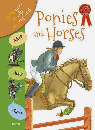
I'm pleased to announce that two more of the 'Who what when' books that I illustrated have been published and are available!
What is even better for me is that they have used my illustrations on both of the new books, which are called 'Knights and castles', and 'Ponies and horses'. They are actually available to purchase on Amazon already, which is pretty fast!
All the books are aimed at a younger age range and have lift the flap pages and layouts designed to be fun for a younger audience.
All the artwork had to be painted on white with absolutely no background, so that they could be dropped into the layout with backgrounds and work with flaps, etc.
All mind were created using nib pen, permanent sepia ink and watercolours on a very smooth, pure white watercolour paper.
Here are the two news jacket covers for the latest published!
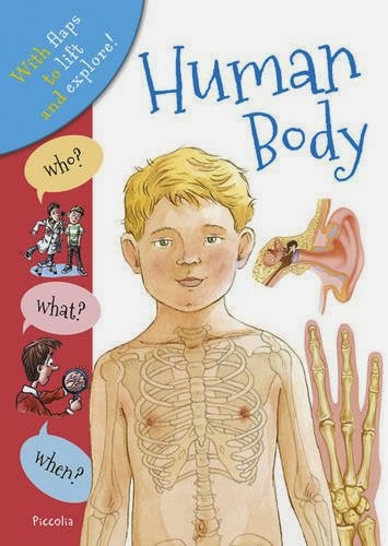
Human Body is part of a new series of reference books for young children entitled, Who What When and published by Templar Publishing. They are all lift the flap books and so will be great fun for young children. I am the main illustrator in all four books.
This time last year I was one of the illustrators working on the first four books in what is hoped will be a twenty-four book series. The first four cover the following subjects: the human body, horses and ponies, dinosaurs, and the always popular knights and castles. At the moment they have published Human Body and Dinosaurs. If they do well then hopefully more ‘who what when’ will follow. It will be interesting see what they want illustrated next?
They are now on Amazon - already! I am delighted that they have chosen my artwork for the cover too, which is very nice and totally unexpected. Here is the cover of Human Body with my artwork on it (the little boy).
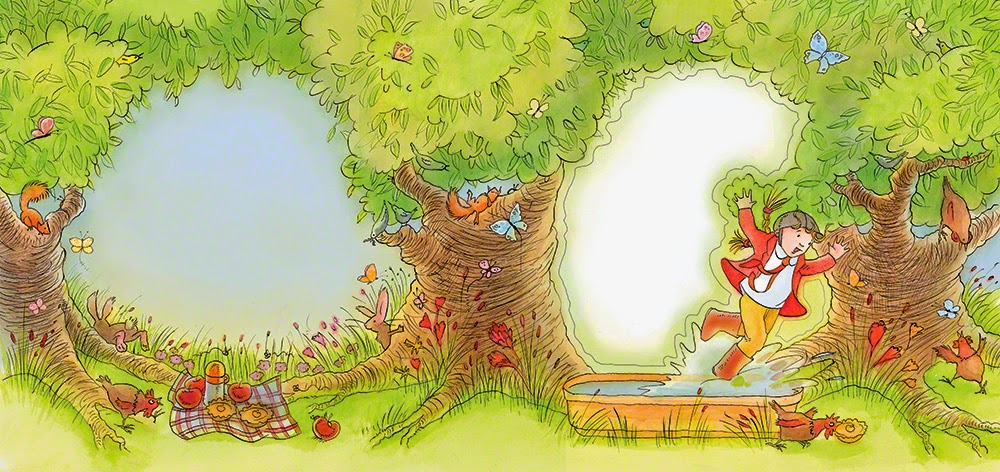
For the last few weeks I have been developing my own picture books - three in fact that work together. I wrote them some time ago, but have only recently got around to putting together a submission for a publisher.
For the submission I created two samples spreads, and all three jacket covers! Quite a lot of work, but hopefully it will lead to a sell. I am now playing the waiting game. I have worked as an illustrator for a couple of decades now and this is the first time I have written and illustrated a picture book and so I am both very nervous and excited. The idea for all three came to me from my many nursery storytime visits, which sadly I no longer have the time to do. They used to be both stressful and great fun. Taming a room of twenty-five to thirty, three to four year old children has its challenges and rewards.
Obviously I don't want to give too much away, but thought I could share some of the artwork with you today without sharing specific details.
All the artwork has been drawn using nib pen and sepia ink. I have then painted the artwork using French and German watercolour paints and the paper I have painted on is Italian - very pro-european of me! I think my brushes are British though...
The illustrations below show my two main characters: a boy exploring with his pet puffin!
How to draw clouds is one of the many video tutorials I completed for video jug.com a few years ago, but I have never shared it on my blog and so thought I would!
This video was one of twenty produced at the same time from the first set I did for video jug. For the first set of videos I had to mainly draw and so only needed a minimum amount of art equipment. This meant I was able to go to their TV studio in central London, to film all twenty videos.
I basically had to sit and ignore the cameraman completely and talk through, step by step how to paint and draw various subjects. Not easy and so I did do a little bit of preparation in advance, but in the videos I do start with a plain piece of paper!
If you want to have a go at following this video, you will need either stretched watercolour paper or strong cartridge paper, watercolour paint, a fine brush, some water of course (I use an old jam jar), and finally patience.
This is a video that shows you how to paint an eye. It's amazing at the amount of different colours that it takes to paint an eye in order to make it beautifully realistic, yet it really is simple to do. Good luck!
I feel it's time to share some more dinosaur colour illustrations with you that I completed last year for a UK based publisher. The book is a reference book aimed at five to seven year old children with lift-the-flaps and a fun layout!
All the artwork was created using nib pen and sepia ink and then painted using colour inks but watered down considerably, so that I could control the results better.
I was the main artist, but it is one of those books that has many illustrators contributing to it, and some of the illustrations I did look a little odd, but in context work really well. For instance the ones I am going to share with you today I more like portraits. These illustrations demonstrate the differences between a certain species of dinosaur - hence they look a little bit like mug shots!
Here are some of the mug shots for you! I am sorry but I cannot find the original information on these and so cannot remember their names...
I have been working on a picture book submission – three picture books in fact! Can't say too much just yet, as it is all a bit hush, hush still. However I think I can share some of the illustrations created for the submission.
All three books are aimed at pre-school children and I got the idea from my many story time sessions at local nurseries. When you have a room of around twenty five, three to four year old toddlers to control, you have to find fun and playful ways to do it or chaos ensues! A game I play with them that works really well I suddenly realised may work as a picture book. A sort of eureka moment.
I decided to use the same style I recently used for my iPAD skin design for the agency's competition – a mixture of nib pen and ink, and watercolours. I had so much fun creating the dragon illustration I just thought that it would be great to develop the style a bit.
Anyway, here are the results – wish me luck!
Here's my inspiration for the style of the artwork...
Here's one of the illustrations
How to paint eyes is one of the many video tutorials I completed for video jug.com a few years ago, but I have never shared it on my blog and so thought I would!
This video was one of twenty produced at the same time and a second set I did for video jug. As the second set involved more painting, they had to come to me and turn my home into a TV studio for a day, which was fun. Although my neighbours must have thought all a bit odd with the curtains drawn too and lots of lights being brought in...
I basically had to sit and ignore the cameraman completely and talk through, step by step how to paint and draw various subjects. Not easy and so I did do a little bit of preparation in advance, but in the videos I do start with a plain piece of paper!
If you want to have a go at following this video, you will need either stretched watercolour paper or strong cartridge paper, watercolour paint, a fine brush, some water of course (I use an old jam jar), and finally patience.
This is a video that shows you how to paint an eye. It's amazing at the amount of different colours that it takes to paint an eye in order to make it beautifully realistic, yet it really is simple to do. Good luck!
I have drawn lots of fairies, gardens and flowers over the years and so thought it might be nice to do a post about flower illustrations and maybe share some sketches and finished artwork with you, just on flowers! A lot of this is really old stuff, but it is nice to look again at work every now and then. If nothing else you can see whether you have progressed as an artist, which is hopefully reassuring!
Flower illustrations: Where possible I like to do a bit of research work and use real species of flowers in my artwork. The illustrations I completed for Ivy Press contained many varieties of British Wild flowers, and there are some spectacular ones out there. For Templar Publishing, I added wild flowers, clematis and dandelions, which are not weeds! in actual fact bees love them, so let them grow. Mind you not in your lawn!
I have drawn them using pencil, inks, coloured inks and more recently watercolour, which I think works best. Watercolour can convey the delicacy of petals and leaves with layering and soft translucent colours.
Here are some old sketches for both Templar Publishing and Ivy Press, taken from photographs of wild flowers:
Among the many different subjects that I covered for videojug, one which they said was popular with surfers was information on how to paint a rose.
This video was filmed in the second round of videos I worked on with videojug. For the first set of twenty I went up to their tiny studio in Central London. However for the second set of videos they wanted me to do quite a bit of painting, and that would have meant lugging lots of art equipment on the train and tube. So, they offered to come to me, and turned my living room into a TV studio - quite literally. They brought in lights and other equipment. Goodness knows what my neighbours thought of the whole thing - especially as the curtains and blinds had to be drawn...
Anyway, today I would like to share with the video on how to paint a rose. I do hope it is helpful and now that I've sorted out my comments notifications I will receive any messages or questions you send and will do my best to answer them.
Gift books non-fiction may sound an odd combination. Usually most people associate pop-up books and lift-the-flap books with the gift book market, but there are now many pop-up and lift-the-flap reference books for children.
Gift books non-fiction: Earlier this year I illustrated four non-fiction, lift-the-flap books covering, the human body, horses and ponies, Castles and Knights, and lastly DINOSAURS! There are meant to be twenty more, but all has gone quite with the publisher for now, and so it's case of being patient and hoping that they will go ahead with the whole series. I hope they do because I want to the Egyptians, the Vikings, and Pirates of course! They are aimed at five to seven year olds, and so have elements of fun about them - hence the lift-the-flap elements.
Anyway, here is some illustrations from the Castles and Knights book. If you want to see more check out my other blog posts and my non-fiction portfolio, by clicking on non-fiction above.
Sorry about how murky these look, but it is blogspot not me! They seem to be uploading images and then making them look grey and sludgy!
It would appear that I have been receiving loads of messages from people reading my posts and for some reason they haven't been getting to me. I am so very sorry. I have not answered any because I did not know they were there. I will now attempt to reply to you all.
Apparently my comments notification by email was set-up incorrectly, and so I should now be getting everyone's comments, and I will answer all of them! So keep them coming, please...
My sincere apologies!
Lyn Stone
I have been inspired today after attending an 'arts award discover' training course, which will enable me to become an arts award advisor. Sounds very important and I suppose it is really, but not from my point of view. It is all about encouraging children to engage in the arts and have a better understanding of art all around them. That is what is important.
Arts award discover: The Arts Award is managed by Trinity College London in association with Arts Council England.
The Arts Award mission is to support children and young people to enjoy arts, develop creative and leadership skills, and achieve a national qualification. Arts Award reflects many different interests and ambitions, respects individual development and helps young people to define their creative futures.
Attending the course were a fantastic mix of creative people with different perspectives on creativity. We had poets, an illustrator (me), librarians, performing artists, and other very interesting people.
The course is aimed at making those attending arts awards advisors, but only for the entry level called ‘discover’. The idea is that it is a course for children and young people, ranging from 5 years up to 25! There are three parts, which are called ‘discover’, ‘find out’ and ‘share’. Beyond the entry level there are courses that will provide a qualification for the child or young person. They are called ‘explore’, ‘bronze’, ‘silver’, and ‘gold’.
The whole point is that you as an advisor can be as creative as you possibly can be to achieve all this - what fun for me!
We had an excellent tutor who not only works as a freelancer but is also an actress, and so she made the whole course highly entertaining with her hot pink nails!
Having attended the course today, I would definitely recommend creative people to become involved in this inspiring award for young people.
If you’d like more information, then I would suggest going to www.artsaward.org.uk. Good luck - get creative!
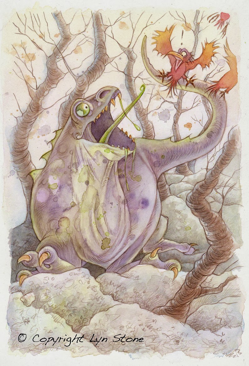
Hobbledown's 'Rumpletump' is a character from the book 'Hobbledown' that I illustrated last year for Kids Space Adventures Ltd.
Hobbledown's Rumpletump is one of many wonderful characters in this novel. The book was created to not only work as a novel in it's own right, but also as a promotional device for the newly opened adventure park also called 'Hobbledown'. 'Rumpletump' is a monster that everyone is fearful of for many reasons. However he comes in very handy when the 'Hobblers' need to rid their world of the ghastly 'skibblers' that have invaded and kidnapped Fern the fairy. They lure the monster with his favourite food, custard pie right into the path of the 'skibblers'.
All the book illustrations were created using graphite pencil. I have been meaning to turn some into full colour for a while. At the moment I have a little time to do that and so recreated the illustration of 'Rumpletump' in his lair, scaring all the birds and everyone else!
For this artwork I didn't use any ink at all but chose to do the line work using a sepia colouring pencil. I then used the same watercolour technique I used for my recent dragon illustration. I am quite pleased with the subtle colouring and the overall effect...
Movie Mania is the title of a play for children I recently illustrated for an Australian publisher. The play is based around an African American family. A series of funny events unfold, involving a camera, a crazy cat and a boy. Movie mania strikes!
Movie Mania strikes: For this book I decided to experiment with my watercolour technique a bit. I used a similar way of painting that I had used for my boy riding a dragon. So I worked quite a lot in wet-in-wet using a smooth watercolour paper, so I could use a nib pen and ink. This avoids the nib catching on the texture of the watercolour paper and splatting the ink where you don’t want it.
This technique uses a lot of water and so I find it easier to stretch the paper first, so that I can control what I am doing far easier and have a flat and manageable piece of artwork to scan at the end. Everyone works differently, Quentin Blake and my friend Peter Kavanagh both work on un-stretched paper, which is great for them, but that just doesn’t suit me.
Today I thought I’d share a visual and finished artwork with you…
This visual is the revised drawing. The original didn't have a foot appearing in it at the bottom, which I am still unhappy about. The publishers wanted me to add a foot, but at the angle the camera this would be physically impossible. You would not see the holder of the camera’s foot, unless they were goose-stepping or performing some sort of weird gymnastics. Sometimes you have to bite your tongue and just do something even when you know it’s wrong!
© Lyn Stone
Pencil illustrations just using graphite pencil is something I enjoy doing immensely. Today I thought I would share some illustrations that I haven’t posted about before from the book 'Hobbledown' that I illustrated for Kidspace Adventures Ltd.
Pencil illustrations: They plan to publish more and so hopefully I will get to illustrate those too!
The book itself has been published in hardback and paperback, and is available on amazon! The book was designed to promote the new 'Hobbledown' adventure park, but like many things it has become very much an entity on it’s own. In many ways it has inspired and fed back into the 'Hobbledown' site. Many of the characters in the book have their homes built within the park, and my artwork featuring the characters can be found all over the adventure park.
For the book I had to create a whole world of fantasy creatures from 'Hobblers' and 'Skibbler's, through to 'Rumpletump' – a particularly sinister monster. 'Rumpletump' actually ends up being rather useful to the Hobblers in getting rid of the nasty, smelly Skibblers who invade Hobbledown.
Anyway here is one you haven’t seen before. I would have posted more but the upload software on my website has just gone kaput! Maybe in my next post...
© Lyn Stone
Hand tinting pencil drawings is something I have experimented with this week. Rather than risk experimenting with one of my pencil drawings that may have taken hours to do I printed one instead.
Hand tinting pencil drawings: It worked surprisingly well. I printed the illustration straight onto a sheet of A3 watercolour paper. I then stretched it by soaking it in water and then placing it on a board. I then tapped it down with gum tape and waited for it to dry. The ink didn’t bleed at all. So at least that part of the experiment worked!
I then applied watercolour paint in washes. Not sure that the end result really works but it’s interesting to compare the original grey pencil drawing and the colour version. I feel though that it doesn’t look fresh and the colours look a little muddy. This is caused by the grey of the pencil influencing and changing the colour on top. I think a better option would be to do the pencil work using coloured pencils with less line work and ‘shading’ and then use watercolour paint.
Anyway I thought I would share the results with you and so below are the before and after results, just like the makeovers they used to do in women’s magazines!
By the way please do follow me on twitter if you can, cheers!
Before
After
Editing illustrations once they are completed is a rare occurrence, but I have just finished working on a brief where the client then wanted to edit all the colours in the finished artwork, which is thankfully rare and a little odd too.
Editing illustrations: As you can imagine this can involve a great deal of extra work, which you are not being paid for really. This is especially true if you work conventionally. However this is where Photoshop can come to the rescue to all conventional artists. This of course is based in the assumption that you supply a client with digital versions of your work.
In Photoshop with a bit of effort there are several different ways you can isolate an area of artwork and then alter the colours completely. This can be done by either using the magic wand on a low percentage setting or using the lasso. You can then use colour balance options, photo filter, hue, etc to then alter the colour completely. Thus saving you from having to redraw the illustration from scratch. This is also useful when they want the changes within 24 hours or less, which happens.
Anyway to show you what I mean, here is a piece of artwork that has not only had it's colour range changed, but the size of the bed the child is sleeping on. All achieved digitally, using Photoshop.
Before
After
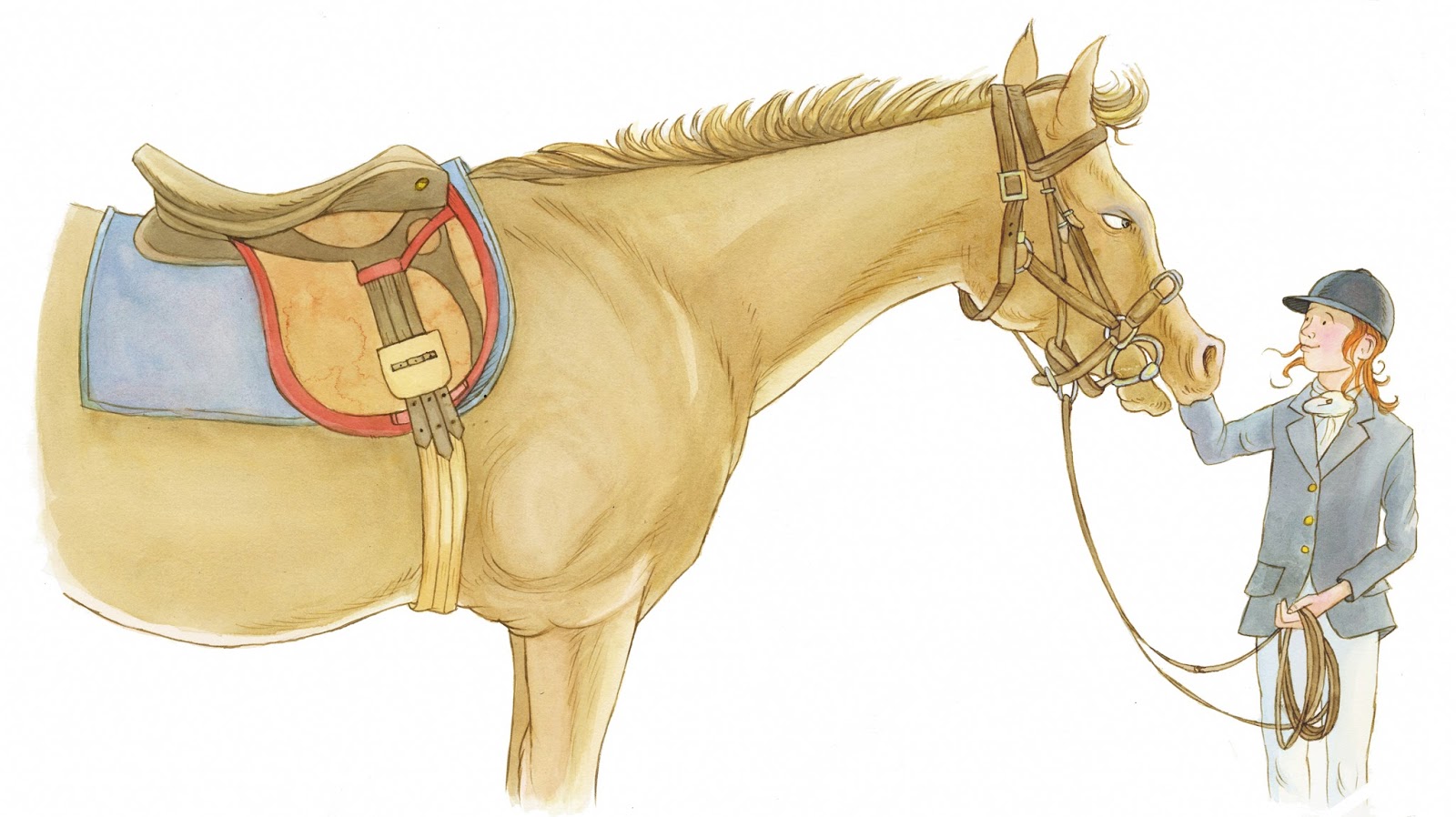
Illustrations of horses and ponies seemed to be popular with publishers and earlier this year I worked on four nonfiction lift-the-flap books. Horses and ponies was one those four books.
Illustrations of horses and ponies: I'm afraid I cannot mention the publisher just yet, because the book is one of a series of twenty-four that I am going to be working on. Once the first four are published I can reveal a little more, but only a little!
The work is all rendered in nib pen and coloured inks, used in soft washes that I build up gradually. I work this way so that I can judge better the build up of colour and have greater control over the end result. The deadline for this book I would classify as 'Mission Impossible', even the client was apologetic. It all boiled down to the fact that the buyer of the series, wanted the first four books yesterday! So I had quite a challenge on my hands, as a book on horses and ponies requires quite a bit of research, before you can even start sketching out ideas.
All the artwork had to be cut to white, as the book is lift the flap and the layouts just work better with artwork cut to white. The age range for the series is five to seven years, which is why I think I was chosen to work on them. I am not strictly speaking a reference illustrator, but my style does work with this age range.
I hope to share with you artwork from the first four books over the next few posts, and so here today are two pieces of artwork from this book...
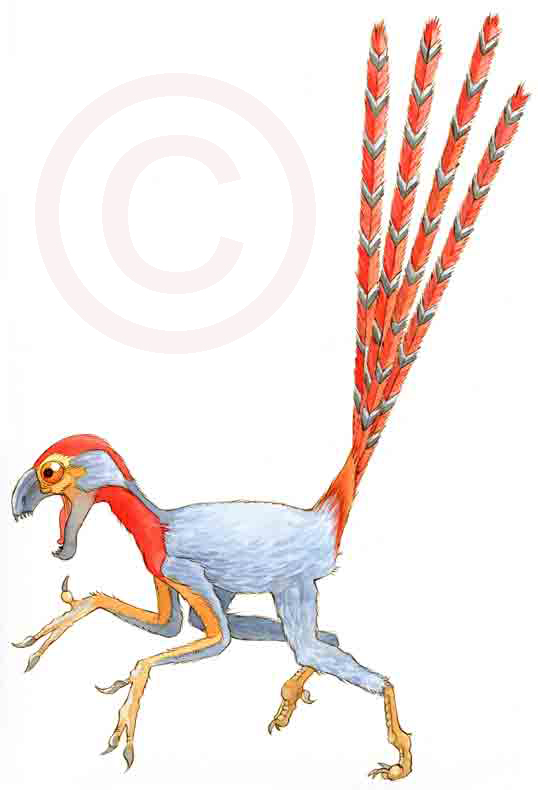
Dinosaur illustrations in colour is something I would like to share with you today. Last week I showed everyone some visuals from a book on dinosaurs I illustrated earlier this year. Here are some of the finished pieces artwork!
Dinosaur illustrations in colour: Appropriately this post coincides with BBC 2's Horizon, which broadcasted a show entitled 'Dinosaurs - the hunt for life' very recently. Watch it on bbc iplayer if it is still on the site. It was very good.
It discussed new biological discoveries found within the fossils of one of the most infamous dinosaurs, the T-Rex. Namely blood cells and they even managed to extract soft tissue from the fossil too. They did this by leaving a fossilised bone in hydrochloric acid over night, and what was left in the morning was a very bendy fossil of soft tissue. Apparently there is substantial evidence to suggest it was a very mean big bird with teeth! So here are some mean big bird dinosaurs for you today, which will all be appearing in the forthcoming lift-the-flap book for five to seven year olds. I'm afraid I don't know the publishing date for this book - sorry! As soon as I do, I will post about it for everyone.
If you want to see more of my work then please visit my website www.lynstone.com.
Oviraptor
Epidexiptery
Human body illustrations can be tricky, as they require good references to start with, as it is very important that the illustrations are accurate. The illustrations I completed for a new non-fiction, lift the flap book certainly required that.
Human body: Today’s illustrations are from one of twenty-four books I have been commissioned to illustrate. It is a great project to work on for me, because the age range for the books is five to seven year olds, and so it has lift the flaps and fun layouts.
There are many illustrators in each book, but I’m lucky enough to be the main illustrator featured in all twenty-four! So, lots of work to do.
These illustrations have been created using a nib pen and coloured inks, used in light washes to build up the colours. I also use a completely smooth watercolour paper, which works well with the nib pen.
My brief for this book ranged from the skeleton of a six year old boy to an illustration of the digestive system. I have to say not my usual area of expertise, but a fun challenge.
I had to do a whole series of artwork based on a boy standing forward. The idea being you lift many flaps to strip the body back to the skeleton. On each layer you see something different, like the nervous system, the heart and lungs, etc.
I hope it’s pirates next…see my other blog for more posts on pirates: here
I’ve been doing dinosaur illustrations for a book recently for a publisher. Never really illustrated dinosaurs in a big way before and so thoroughly enjoyed working on this project.
Dinosaur illustrations: The book is aimed at five to seven year olds, and is a lift-the-flap book. It features more than one illustrator, but I am the illustrator that will be featuring in all twenty-four books! So four down, twenty to go! So far I have illustrated the Human Body, Horses and Ponies, Knights and Castles, and of course Dinosaurs.
Inspired by Régis Loisel’s Facebook page, who I think is an extremely good draftsmen. This site shows lots of his wonderful sketches and roughs, I thought I would show a combination of sketches for this project and the finished artwork too! One thing I did enjoy doing was a series of heads. Yes, heads of dinosaurs! Sort of dinosaur portraits and so this meant I was able to add a little personality too, within reason! Here are some of the sketches for my dinosaur heads and dinosaur birds!
Knights and squires are today's subject!
Knights and squires: In my last blog I posted artwork from a recent project I completed on a book about knights and castles, a lift-the-flap book for five to seven year olds. It is one book in a series of twenty four I am working on, which is why I cannot share too much information, including the publisher commissioning me.
Today I thought i would share some more illustrations with you. The artwork is all rendered in nib pen and coloured inks, used in washes, and the paper I like to use is a hand made Italian paper, which is beautiful to work on and allows for a great deal of detail and accuracy as it is completely smooth and pure white.
The following illustrations shows a baggage train, consisting of a squire, a knight, archers, soldiers, and oxen pulling a cart carrying a cannon. These are all going to be reproduced in the book really quite small, which I why they are quite simple illustrations.
The last illustration represents Richard Lionheart and Saladin fighting on horseback. Great composition to work on. I had quite restricted dimensions to work with on this one, and so it had to fit a particular space and still have lots of drama!

- Squire on horseback

- Knight on horseback

- Archers

- Oxon pulling cart with cannon
View Next 25 Posts