new posts in all blogs
Viewing Blog: Lyn Stone - Illustrator, Most Recent at Top
Results 26 - 50 of 304
This is where I publish updates on what I am illustrating and for whom, and also any funny anecdotes about things children say - I also work a few hours a week in a library with children, who say the most extraordinary things at times!
Statistics for Lyn Stone - Illustrator
Number of Readers that added this blog to their MyJacketFlap: 1
Castles and knights is an ever popular subject with publishers and a project I have just completed for a client I have worked with before...
Castles and knights: I'm afraid I cannot mention the publisher just yet, because the book is one of a series of twenty-four that I am going to be working on. Once the first four are published I can reveal a little more, but only a little!
The work is all rendered in nib pen and coloured inks, used in soft washes that I build up gradually. I work this way so that I can judge better the build up of colour and have greater control over the end result. The deadline for this book I would classify as 'Mission Impossible', even the client was apologetic. It all boiled down to the fact that the buyer of the series, wanted the first four books yesterday! So I had quite a challenge on my hands, as a book on castles and knights requires quite a bit of research, before you can even start sketching out ideas. I have to say the Royal Armouries were very helpful indeed.
All the artwork had to be cut to white, as the book is lift the flap and the layouts just work better with artwork cut to white. The age range for the series is five to seven years, which is why I think I was chosen to work on them. I am not strictly speaking a reference illustrator, but my style does work with this age range.
I hope to share with you artwork from the first four books over the next few posts, and so here today are two pieces of artwork from this book...

- knight practising jousting, Castles and knights
Régis Loisel, Peter Pan: Today I went to the Institut Français in South Kensington to hear him speak about one of his adult comic books, which has just been publised in English. I actually got to chat to the artist, who speaks very little English and so I had to use my French, which is still quite basic at present. He is a multi-award winning artist, who happens to write and illustrate beautiful comic books.
The book took Loisel fourteen years to create, which is why it is so important to him. His take on Peter Pan is as far removed from the sugar-coated Disney version that it could possibly be. The first book in the series is set in the seedy, dark and grimy world of Victorian London. Peter's mother is an alcoholic prostitute, who hates Peter and shows him no love at all. So he is really nothing more than a street urchin, an orphan. An orphan with, to use Régis Loisel's description, a psychological crack. Jack the Ripper also features in this book, along with his infamous murders. Throughout it is implied that Peter could be Jack the Ripper. Is he? Or isn't he? Loisel says it is up to the reader to decide for themselves, but only he knows the real answer. The story in this first book leads up to the point where Scottish novelist and playwright J. M. Barrie starts his tale. So a very dark Peter Pan indeed.
The book like so many French comic books is aimed at adults and not children, and it is a respected and thriving industry in France. So much so that when the Institut held a comic strip competition for a local French-speaking school, it was the French ambassador that got involved! It was once thriving here, but alas died many years ago. However there are publishers around trying to revive the industry, and one in particular that is publishing volumes of French comic books, painstakingly translated beautifully into English. They are called Cinebook and talking to a Aldous, a representative of the publisher today, I found out that it takes around two years to produce a new bande dessinée album, the original work to write and draw it in French. Wow - how about that for perfection? The Managing Director, Olivier is French, and was at todays event, but was busily deep in conversation, so the last thing I wanted to do was to butt in! If you would like to find out more about Cinebook, then check them out by clicking Cinebook right here.
Rather than my work today here are two covers taken from Cinebook's latest catalogues! Worth taking a look at them. There are some truly spectacular French comic artists out there!
Watch out for my next post all about my upcoming lecture at Sidcup Library. Quentin Blake is lecturing too - can't believe I have been billed alongside the great man - humbled I am!

- © Cinebook
I had five minutes today to have a quick look at any lecture publicity on the Internet for Quentin Blake’s lecture that might also mention and have advertised mine. Most include me in their publicity and I have to say I am pleasantly surprised and delighted!
Lecture publicity: My lecture has now happened and I shared blogs about on my Facebook page and website. I was advertised as speaking for two hours and so created varied and animated presentation, but intended to break it up a bit. I showed original pieces of artwork too, some of my published books and some paper maquettes. These are created by paper engineers specifically for pop-up books and gift books.
I divided up my lecture into three areas:
- From concept to book
- Other illustration projects I have worked on, which includes an adventure park, editorial and a pub sign
- My process of working.
I thought I’d share some of the links with you of places Quentin and my lecture are being advertised:
Here's an illustration that featured in my talk:
All illustrations are owned by Lyn Stone ©
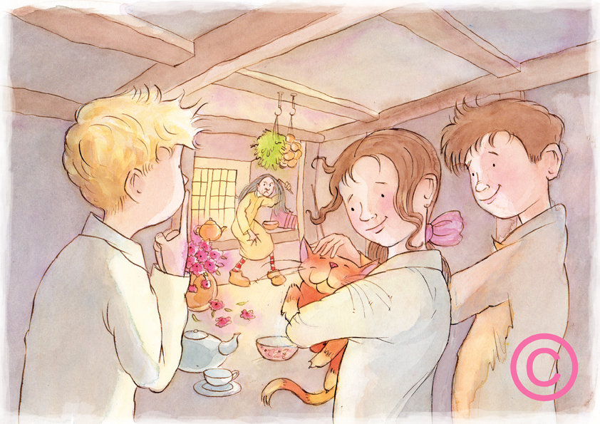
Laurie Lee was a writer who wrote the story The two grannies, which I have just illustrated for a publisher. This illustration shows the three children visiting Granny Trill’s home.
The two grannies: This story is included as an excerpt in a much larger English Language publication, as a teaching aid. The illustration has been created using sepia ink with a nib, and then very wet-in-wet water colours to create the softly blended colour effect. I was trying to find a way to emulate the soft effect I am able to achieve in my pencil greyscale work, but using watercolour. It’s nearly there but I think I can push it further!
All images are owned by the Illustrator Lyn Stone ©
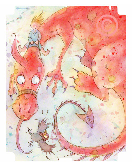
Dragon iPAD skin is here! This is an illustration I completed this morning for myAustralian agent. It’s so hot today that it dried very quickly and so I was able to scan it!
Dragon iPAD skin: It’s my illustration concept for a competition being run to illustrate an iPAD 4 skin. I just got this idea of a comical dragon rather quickly and so decided to run with it.
I did a series of thumbnails first (final version below), to quickly get the composition right. I wanted an illustration that would work both portrait and landscape – hence the startled looking bird in mid-flight. I also wanted to add a bit of humour and fun.
I used inks and watercolours. Because it wasn’t for a client I felt free to experiment and so decided to splash the watercolour paint around. I also used layers of wet-in-wet, which created interesting areas where the colours bled and merged. I wanted to create an interesting and colourful background. Well at least I hope I have anyway!
If you would like to see more dragons and fantasy illustration, please click on my ‘subject’ link at the top and then select ‘fantasy’. I have quite a few illustrations from my Hobbledown project on this section too.
Literacy fiction is something that is good to do as an illustrator, as it is a precursor to picture book illustration. Nosey saves the day is a children’s fiction book I recently illustrated for Eleanor Curtain Publishing, as part of their Flying Start to Literacy range.
Literacy fiction: I experimented with working a little differently on this project. I chose a heavy not watercolour paper, which has quite a good texture and instead of coloured inks I chose to use watercolours. In places I flooded the watercolour with water to force the pigment out to the edges, which you can see really well in the jacket artwork below. I am not entirely sure I would use such a heavy not watercolour paper in future, as it was quite hard to ink, but it was fun.
The main character, Nosey is actually a pet dog. In the story the youngest boy goes missing in the park, and mum and his big sister set-out to find him. Nosey uses his doggy good nose to sniff him out, and they find him frightened but safe stuck up a tree.
Jacket illustration
Agatha Christie Nemesis is one of Christie's novels that I recently illustrated for The Agatha Book Collection. Today I am going to share with your some of the preliminary sketches and final artwork.
Agatha Christie Nemesis: Before I proceed a very belated happy new year! This is shamefully my first post of 2013! I have just been so busy with commissions that all my time has been swallowed up. Well that's my excuse, but it is probably closer to the truth to say I am not organised enough! However, busy I have been and over the next few months I hope to share lots of new work with you for some new clients. These include two children's books.
Back to Agatha Christie: Nemesis was first published in the UK by the Collins Crime Club in November 1971 and is a Miss Marple mystery. Miss Marple receives a post card from the recently deceased Mr Jason Rafiel, a millionaire whom she had met during a holiday on which she had encountered a murder, which asks her to look into an unspecified crime; if she succeeds in solving the crime, she will inherit £20,000, and there the plot begins. Miss Marple's first clue is a tour of famous houses and gardens of Great Britain, arranged for her by Mr. Rafiel prior to his death.
For this project I was keen to include the tour bus, which had to circa 1966. The coaches and buses of this period are really quite beautiful and often brightly coloured in creams, greens and reds.
Here are some of my initial sketches of suspects and that coach! My apologies for the copyright symbols over the top, but I recently had a theft of seven pieces of artwork by an unscrupulous client.
Drawing graffiti creatively can be a challenge, and I don't mean hanging off dangerous buildings just to show off you can create a bit of vandalism over railway bridges! This is not something I would encourage at all. However the art of graffiti can be used to create interesting graphic effects, maybe towards a design for a poster to promote something, or an album cover?
Drawing graffiti creatively: As some of you may know I am trying to get into the habit of sharing my 'how to draw' videos with you! I do not profess to be an expert on graffiti at all, but this tutorial is aimed at helping you to improve your drawing skills mainly. A bit of an odd one, but apparently something people want to know and Google about. Obviously I have done it from the perspective of an illustrator and have broken it down into simple, easy to follow shapes that everyone can have a go at!
If you would like to follow this video and learn about drawing elephants, you'll need a sharpened pencil, or better still a technical pencil, which never needs to be sharpened, a good eraser, a range of coloured pencils and a sheet of cartridge paper to draw on. The advantage of watching and following this video is that you can hit 'pause' whenever you like or even go back over something again if you need to! Once you've had a go in pencil, maybe try stretching some watercolour paper, do it again and this time try some colour and paint it using watercolors or maybe coloured inks? If you draw it more than once, you can experiment with a range of colour mediums, just for fun! For instructions on how to stretch paper, see my blogspot blog.
I would love to get feedback from and you so by all means use the message box on this page to send me your thoughts on this video. If you would like to see more videos I have worked on, just got to www.videojug.com here! Or visit my blogspot blog page, where you can find many more tutorials and tips, click here!
Here is some artwork I haven’t shared with anyone on my website to date, and is a combination of conventional pen and ink, which has then been digitally coloured. It was a commission for The French Horn pub in Steppingley, Bedfordshire.
The French Horn pub: They wanted an illustration of a character that could become their logo and a sort guide on their website. As the name might suggest they wanted it to include a French Horn. They also wanted the character to be dressed in early nineteenth century, which for me was great fun, as I love doing period artwork.
The final image was to be used on their letter headed paper, leaflets, posters and of course their website. Therefore the final image really needed to be digital. However because it was an early nineteenth century character we wanted it to have a traditional quality too. I therefore did the black and white line work using a traditional mapping pen and black ink. This was then scanned and digitally coloured, using flat colour to give a quite graphic feel. I ended up doing the character in cool and warm colours to give the client maximum choice when using the logo. If you want to see my logo in use, please visit the pub’s website, which is lovely and very tempting: The French Horn Here are the results. He’s quite a fun character I feel, and a touch Dickensian, wouldn’t you say?
It's the season to be merry and so I thought I'd share some my Christmas illustrations with you this week. Some of these can be found elsewhere on this website, but today's selection can only be found in this post!
Christmas illustrations: I have created Christmas illustrations for Heritage Art Papers and for the last few years I have been creating my own Christmas cards with a range of different themes. Last year it was Christmas mice and the year before a dragon dressed as Santa (yes you read correctly). However this year I have been so busy with freelance work that I have not had the time, which is good news for me, but not so good for all my friends expecting a Lyn Stone original.
Today I thought I would share with you my reindeer Christmas cards that I created for Heritage Art Papers. I had produced them for my own use and HAP loved them so much they paid for the set to use themselves and sell through shops throughout the United Kingdom. If you want to see more Christmas illustrations, try some of my links above or why not visit Heritage Art Paper.
The following illustrations were created using pen and coloured inks. I used a mixture or wet in wet and dry.
Now for something different – drawing elephants. I am trying to get into the habit of sharing my ‘how to draw’ videos with you! This tutorial is aimed at helping you to improve your drawings skills and produce a really good drawing of an elephant. A bit of an odd one, but apparently something people want to know and Google about. Obviously I have done it from the perspective of an illustrator and have broken it down into simple, easy to follow shapes that everyone can have a go at! The same technique can be applied to many animals.
Drawing elephants: If you would like to follow this video and learn about drawing elephants, you’ll need a sharpened pencil, or better still a technical pencil, which never needs to be sharpened, a good eraser, and a sheet of cartridge paper to draw on. The advantage of watching and following this video is that you can hit ‘pause’ whenever you like or even go back over something again if you need to! Once you’ve had a go in pencil, maybe try stretching some watercolour paper, do it again and this time try some colour and paint it using watercolors or maybe coloured inks? If you draw it more than once, you can experiment with a range of colour mediums, just for fun!I would love to get feedback from and you so by all means use the message box on this page to send me your thoughts on this video. If you would like to see more videos I have worked on, just got to www.videojug.com here!
How to stretch paper
A few notes on stretching paper. You will need a sturdy board, maybe ply wood, or MDF. If you use MDF it will need to be fairly thick, as it is quite bendy and paper is surprisingly strong! You will also need paper tape. A container with water in it - to be honest a bath is ideal. Cut the paper tape into lengths a little longer than the paper size (by about three inches each end). Place the paper into the water and submerge. This only needs to be in the water for no more than about forty seconds to a minute. Take it out and hold by one corner allowing the excess water to drain off. Place the paper on your board and then with a cloth, take off the excess water. I find a towel works well, placed over the paper and 'padded' down. Then very quickly soak your paper tape strips in water and lay it down swiftly along each edge of the paper. This will tape the paper down to the board. Then allow to dry thoroughly before working on it.
Writing picture books is far harder than you’d think and very multi-layered! I came up with an idea a few months ago for a picture book and am still working on it. Firstly it has grown into three books. Secondly just coming up with a great idea is not enough at all it would seem.
Writing picture books: I’m afraid I cannot share my picture book idea with you, because that would be daft beyond belief, but as my blog is a bit like a diary, I can at least share my thoughts. Luckily my agent also happens to be one of life’s natural teachers – in fact he can’t help himself, but he is very good at it! Having successfully published a number of picture books himself that he wrote and illustrated, he is the ideal person to guide me through this minefield! Just coming up with idea is not enough, because immediately you’ve just got a two-dimensional storyline that lacks any real depth, and there is a danger that your great idea can end up being flat and go out with a whimper. I have discovered that just like a cake, you’ve got to layer your ideas and give your story substance and a more three-dimensional feel. The more you put in, the better it gets!
Having battled with adding an extra layer to my original idea, I am now going to have a bash at doing some thumbnail sketches, to thrash out some ideas. This will no doubt feed back into the original manuscript and result in changes to wording and possibly characters. It’s exciting for me to be working on the words as well as the pictures for a change. Hopefully at some stage in the rather distant future, if this project goes ahead I may be able to share some actual artwork with you. However if you want to see more updates on what I am doing these days, and writing picture books you can also visit my blogspot blog right here!
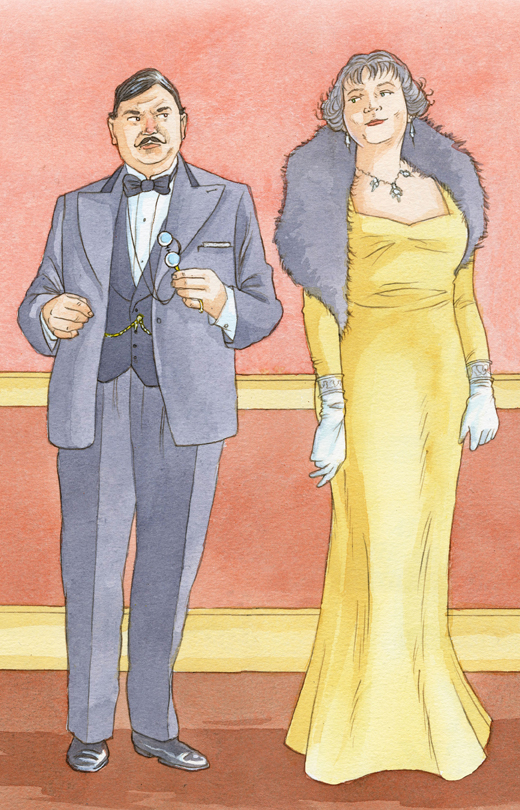
Agatha Christie 1920s – a decade in which we are introduced to so many of her most famous characters: Tommy and Tuppence, and of course Poirot to name, but a few!
Agatha Christie 1920s: So having done quite a few spreads, which are set in the 1920s, I thought it would be nice to share some of the artwork with you. Some of the early novels I have illustrated for The Agatha Christie Book Collection include The Secret Adversary, Poirot’s Early Cases, The Mysterious Mr Quin, and my favourite Five Little Pigs. For all of these I had to research costume styles for both men and women, hairstyles, shoes and accessories. Vitally this needed to be combined with what a character would wear. For instance let’s say a novel is set in 1926, but one of the characters is a bit of a stuffed shirt and very out of fashion. I would probably dress them in something from 1923 with an out-moded hairstyle too. All these things have to be considered when researching the period. Another consideration is the decor too. Luckily I have a very useful collection of magazines from the 1980s, called Times Past, which covers quite a few of the decades I have been illustrating. It was a weekly magazine, much like The Agatha Christie Book Collection and featured interiors, furniture and objet d’art from the Victorian, Edwardian, 1920s, 1930s and 1940s periods.
Heres are a few pieces of artwork from the 1920s books I have illustrated:
Tommy and Tuppence
The Mysterious Mr Quin
Let's learn about drawing nature. I am trying to get into the habit of sharing my 'how to draw' videos with you! This week's tutorial is aimed at helping you to improve your drawings skills and produce a really good drawing of nature. A bit of an obscure one, but apparently something people want to know and Google about. Obviously I have done it from the perspective of an illustrator. An artist would probably go outside with an easel or sketchpad and draw what they could see - some fantastic landscape. I would also liked to have done that, but was restricted to demonstrating in a studio. In this case my living room actually!
Drawing nature: If you would like to follow this video and learning about drawing nature, you'll need a sharpened pencil, or better still a technical pencil, which never needs to be sharpened, a good eraser, and a sheet of cartridge paper to draw on. The advantage of watching and following this video is that you can hit 'pause' whenever you like or even go back over something again if you need to!
I would love to get feedback from and you so by all means use the message box on this page to send me your thoughts on this video. If you would like to see more videos I have worked on, just got to www.videojug.com here! Or visit my blogspot blog page, where you can find many more tutorials and tips, click here!
Latest illustration news is here! Rather than talk about recently published projects I thought I would give you an update on the projects I am currently working on – without giving too much away!
Latest illustration news: Firstly I have been busy working on a reading scheme book. They are a bit like picture books, because they tell a story with lots of pictures, but the reading levels in them get harder. They are a really good for runner of the picture book format and so are good to illustrate. They are usually published at different reading levels and are very popular with publishers. Having submitted the roughs for one, I nervously waited for a response from the client. Luckily for me the client liked the roughs so much they’ve given me a second one to work on, before I’ve even finished the first! So at the moment I am just waiting for the manuscript to arrive in PDF form. Here was me thinking I’d have December off – hah!
I have also been as busy as ever working on the Agatha Christie Book Collection, drawing more dodgy vicars, wicked barmaids and stroppy majors. The magazine series seems to be doing very well indeed! Here is some artwork from a recent brief:
Finally, I have at last finished writing the first drafts of three pictures books. All three books work as a set and so hence three rather than one! If my agent thinks they’re OK the next stage will be to produce some sample spreads. He has already said he likes the idea, and so fingers crossed here. Once that is done to everyone’s satisfaction, they will then be shown to a publisher. Fingers crossed the publisher will think they’re wonderful (please, please), and go ahead and commission me for all three! Obviously I cannot give too much away at this stage, as it is all ‘need to know’. Only my parents have seen the manuscripts so far…
Drawing snowflakes: I am trying to get into the habit of sharing my ‘how to draw’ videos with you! This week’s tutorial is aimed at helping you to improve your drawings skills and produce a really good drawing of a snowflake. As it is nearly Christmas I thought it an appropriate one to share with you all! In this video I am just concentrating on the structure of a snowflake.
If you would like to follow this video and learning about drawing snowflakes, you’ll need a sharpened pencil, or better still a technical pencil, which never needs to be sharpened, a good eraser, and a sheet of cartridge paper to draw on. The advantage of watching and following this video is that you can hit ‘pause’ whenever you like or even go back over something again if you need to!
I would love to get feedback from and you so by all means use the message box on this page to send me your thoughts on this video. If you would like to see more videos I have worked on, just got to www.videojug.com here! Or visit my blogspot blog page, where you can find many more tutorials and tips, click here!
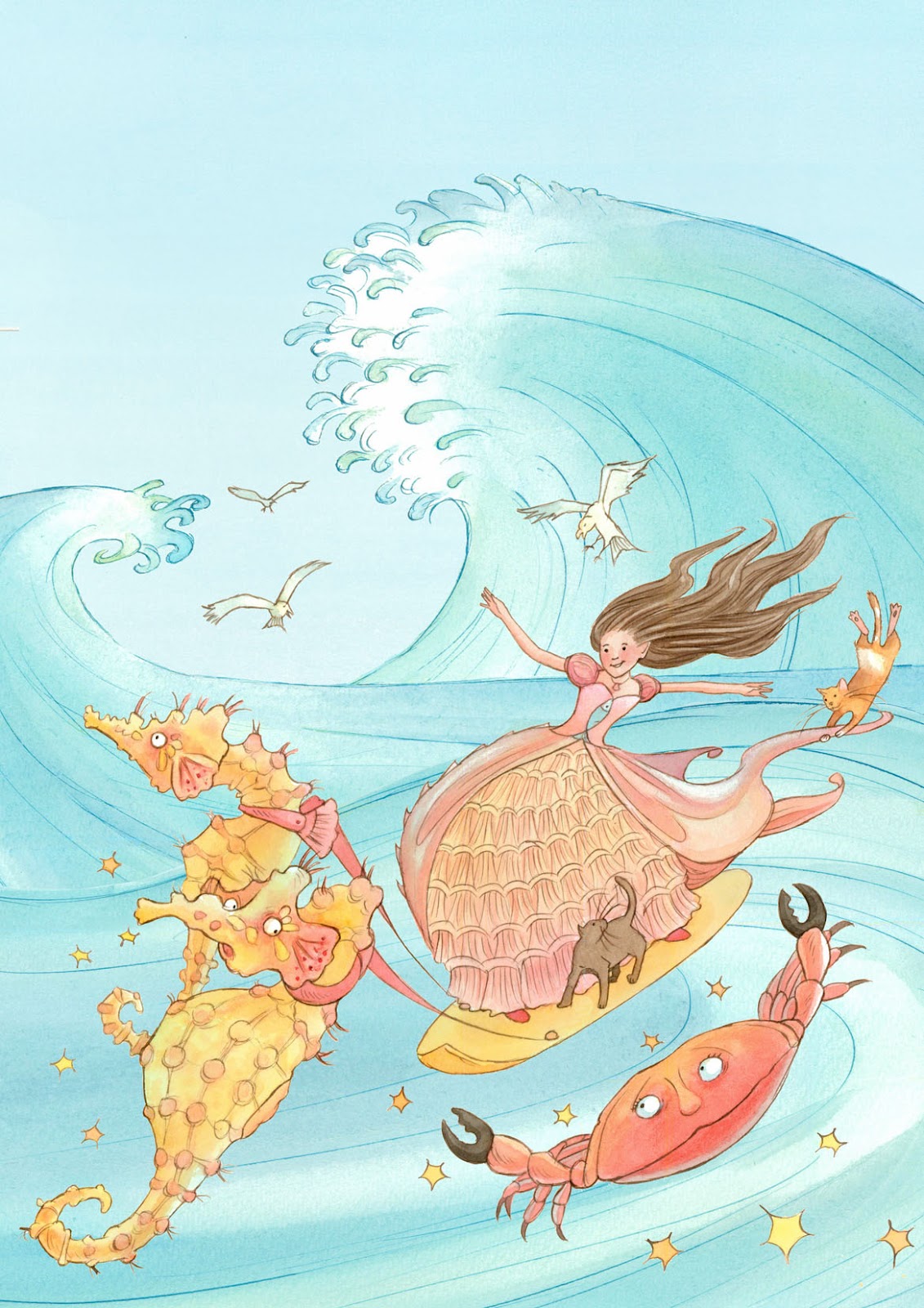
The Cinderella pantomime posters are out and all over Scarborough advertising the Stephen Joseph Theatre’s pantomime this year! I said I would share the poster designs with you as soon as I could, and the designer very obligingly sent me the PDFs yesterday!
Cinderella pantomime posters: As I mentioned on Monday the artwork was actually done on several layers, which consisted of two sets of Japanese inspired waves, Cinderella on a surf board, her cat, giant seahorses and a fairy Crabmother! This way they could fit the artwork into any size or shape they wanted, including Monday’s YouTube video I shared with you.
They are so pleased with the artwork that they are definitely going to commission me in the future to do more poster artwork for them and so goodness knows what I’ll be working on next!
If you would like to see the artwork, please view some of my portfolios listed above in my site menu. If you want to know more about the Pantomime, then please visit the Stephen Joseph Theatre website here. Here’s the poster! I think the logo is great and works well with the artwork. I would love to do Jack and the Beanstalk and so hopefully they’ll be doing a maritime version of that next year!
I know I've already posted about this on my website, but I seem to have a different audience on blogger, so I thought I'd share it with you too!Cinderella animated using my illustrations! I did this artwork in the summer for the Stephen Joseph Theatre in Scarborough for the Winter Pantomime, and as well as appearing on posters, leaflets and in the foyer area, they have made a mini video out of it, which is very impressive!
Cinderella animated: This of course is a Pantomime with a huge twist and unlike the more traditional story has a maritime theme to suit the theatre’s seaside location of Scarborough.
This is what they are saying about this year’s Panto on the theatre’s website: Who knew that Cinderella came from Scarborough? This year the world’s most popular fairytale is given a seaside twist.
Cinderella’s happy life capsizes when a storm washes her Mum out to sea and her Dad remarries a strange widow from Bridlington. Thrust into a life of drudgery in her Stepmother’s hotel, her only relief lies in gazing out to sea and watching the surfers soar over the waves.
The handsomest surfer has his own problem. Heir to the Slot Machine Kingdom, he’s too shy to talk to girls! When the Slot Machine King throws a Grand Beach Ball for the eligible lasses of Scarborough, Cinders knows she’ll never be able to go…until her Fairy Crab Mother intervenes. But her Stepmother and malicious Stepsister have other ideas and it will take all Cinders’ strength and bravery to finally be free. Will she make it to the Beach Ball? Set sail in our sparkling, surfing story to find out!
The illustration was actually drawn in sections to give the client maximum flexibility when it came to layouts. Some of their posters are landscape and others portrait, and so there were about five layers. It also meant they could animate it all far more easily.
Just watch this video…
I have been very busy - hence my lack of blogging! I have worked on lots of spreads for the Agatha Christie Book Collection, I have written three picture books, am in the process of illustrating an English learner fiction book. Probably some other stuff too, but I can't remember! O_o!
Anyway today I thought I'd share with you some of the work I have completed for Agatha Christie's suspects, red herrings and some of the heroes! Heroes later this week, and so watch this blog!
Books I've worked on recently are They do it with mirrors, The moving finger, Passengers to Frankfurt and the current one, which involves a mysterious man and is set in 1926. For all those aficionados out there, I'm sure you can guess the title of that one?
Anyway here is some artwork from a selection of these briefs. A mixture of sketches and final artwork...
This is a sketch of the left hand side of the spread for They do it with mirrors. I usually do the background separately, once the editor knows what he wants.
This is the colour version. The novel is set in 1950s and so I have tried to give the artwork a slight 1950s feel, within the constraints of the brief and layout.
Here's a character sketch from Passengers to Frankfurt. Had quite a lot of fun with some of the characters from this book! Absolutely full of eccentrics!
Here's a closure look at his face. I put quite a lot of detail into the roughs for this particular project, as so much detail is given in the briefs and I want to make sure I've got it right for the editor and the Agatha Christie team!
Later this week, I'll share the colour artwork from this spread with you - be prepared for some truly odd characters!
It is Monday and I am trying to get into the habit of sharing my 'how to draw' videos with you! This is a slightly more unusual one, but apparently a lot of people want to know more about drawing camouflage! How about that? This week's tutorial is aimed at helping you to improve your drawings skills. In this video I am just concentrating on how to do camouflage, because it's quite hard if you haven't got a technique to work from and develop.
Drawing camouflage: If you would like to follow this video and learn about drawing camouflage, you'll need a sharpened pencil, or better still a technical pencil, which never needs to be sharpened, a good eraser, and a sheet of cartridge paper to draw on. Also select some appropriate camouflage colours, some greens, browns and lighter colours, like maybe a yellow-green? The advantage of watching and following this video is that you can hit 'pause' whenever you like or even go back over something again if you need to! So anyone can learn and have a go at drawing camouflage. The only drawback is that you do have to put up with looking at me for about two minutes at the beginning - I can only apologise for the director's decision!
I would love to get feedback from and you so by all means go to my 'contact' page and send me your thoughts on this video. If you would like to see more videos I have worked on, just got to www.videojug.com here! Or visit my blogspot blog page, where you can find many more tutorials and tips, click here!
If you would like see more of my 'how to draw videos' on this site. Go to my link labelled 'videos' in the top menu. You'll find it on the far right. All that's left to say is 'good luck and happy drawing'!
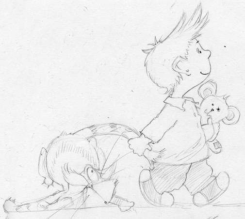
Today I thought I would share with you some sketches that eventually led to one finished piece of artwork, so you can see the evolution an artist goes through to get something right. In this instance we are talking about drawing children, and in particular little boys!
Drawing children: Prior to these sketches I had never drawn a young child in much detail before and so it was a real learning curve for me, and you can see from the sketches that some work, and some just miss the mark for all sorts of reasons! It is very brave of me to share what I can consider my less than successful pieces, but I wanted to illustrate a point really.
Often the sketching phase of any project is where the most fun, work and brain power are used. It is often when I am doing sketches and roughs that I prefer to work in complete silence, so that I can concentrate more on what I am trying to achieve.
All the sketches below are just drawn using a soft leaded technical pen. I prefer to use technical pens, because they never need sharpening and so you can concentrate more with out interruptions. Also I am absolutely useless at sharpening pencils, and end up whittling away most of the implement! You can see more of my artwork of children by visiting this website
here!Now this sketch has humour, but needs more work….?
This one is getting closure and it a better drawing all round, but the dog isn’t quite working…?
This one works. He’ s a little older, which is OK. It’s funny and lively and the dog is interacting more with the little boy. You may recognise this one? It's on my main website!
Poule de luxe is a company that specialises in luxury house-hold goods and in particular lingerie and ladies nightwear! Earlier this year I worked on updating their logo, which is to be used on some future products!
Poule de luxe: As their name might suggest their logo is a chicken, a rather beautiful chicken, but they wanted it updated a bit with the addition of a globe, a painterly style globe that would draw on some of the colours they are currently using in their lingerie! This was a very different project to what I normally do, but quite enjoyable. I had lots of fun coming up with different colour combinations and in the end they had over twenty to choose from. To be honest the colour combinations were endless and so I forced myself to stop at twenty.
The artwork was created digitally in Photoshop Elements, which was the quickest way to produce lots of different colour combinations for them, and allowed me an easy way to change individual colours if the combination did not suit their needs.
All in all it was a great way to use Photoshop and made a change for me from working conventionally, and hopefully they will come back with more work for me in the near future.
Here is the final colour range they chose – hope you like it?
Well as you can see it has been over a month since I lost blogged. That is because I have been experiencing technical problems with blogspot.com, which I am hoping are now resolved!
Drawing Chinese dragons: It is Tuesday afternoon and I am trying to get into the habit of sharing my ‘how to draw’ videos with you! This week’s tutorial is aimed at helping you to improve your drawings skills and producing a really good drawing of a Chinese dragon. In this video I am just concentrating on how to do a really good dragon sketch, because it’s quite hard if you haven’t got a technique to work from and develop.
If you would like to follow this video and learning about drawing Chinese dragons, you’ll need a sharpened pencil, or better still a technical pencil, which never needs to be sharpened, a good eraser, and a sheet of cartridge paper to draw on. The advantage of watching and following this video is that you can hit ‘pause’ whenever you like or even go back over something again if you need to! So anyone can learn and have a go at drawing wonderful dragons!
I would love to get feedback from and you so by all means use the message box on this page to send me your thoughts on this video. If you would like to see more videos I have worked on, just got to www.videojug.com here! Or visit my blogspot blog page, where you can find many more tutorials and tips, click here!
I am sorry I haven't blogged here for a while, but I have been having terrible problems uploading images to blogspot, which put me off for a while, but I'm back for another go!
Watercolour painting can be very rewarding, as I have recently discovered. Yesterday I shared with you a re-working of an illustration of a little girl. It was originally created in inks, but I think it now works better in watercolour.
Today I want to share with you the rest of the illustration – the surrounding artwork that in essence, framed the little girl.Watercolour painting: The original went to three of the major annual international book fairs, but I always wanted to try it in watercolour in a sligthly loser style too, which I am planning to push even further! In the artwork below, I outlined everything in nib and coloured inks. I then used a combination of wet-in-wet and another technique, which helps push the pigment towards the edge of a painted area. The second technique helps to make the flower petals illustrated more delicate.
What I would like to try next will be very different from anything I have done before. I would like to try outlining in nib and ink, as usual but then totally use wet-in-wet, so that everything is blurred, suggested. I want colours to bleed into each other and overlap, creating a soft effect. The only structure will be the line work. This could be a total disaster or it could be something quite special. I will share my disasters and triumphs with you here and so watch this space! To view similar subjects, surf my site or maybe click
here!Here’s the artwork itself:
Cinderella, but with a huge twist - this one surfs! Every now and then you get the opportunity to work on a project a little different to what you normally get asked to do. I recently finished a commission for The Stephen Joseph Theatre They saw my ink artwork on my website and decided to approach me to work on the poster for them. I was very pleased to win this commission, as I have never done a poster before and so it was something different for me to work on. They have three very different poster formats and so all the artwork had to be separated into different layers. This gave them maximum flexibility when producing the different layouts. Hopefully I will be receiving PDFs of my artwork on their main poster, flyers and smaller posters. I hope to share these with you here in a future post.
They saw my ink artwork on my website and decided to approach me to work on the poster for them. I was very pleased to win this commission, as I have never done a poster before and so it was something different for me to work on. They have three very different poster formats and so all the artwork had to be separated into different layers. This gave them maximum flexibility when producing the different layouts. Hopefully I will be receiving PDFs of my artwork on their main poster, flyers and smaller posters. I hope to share these with you here in a future post.
Here’s the artwork. I have the artwork below, all in one layer and an example of the separate layers below:
View Next 25 Posts


Hello Lyn it's that girl you met at the craft fair at Orpington (the one that was helping out her mum with the bags)! I watched your videos and I really took in the advice and techniques (especially the one about foreshortening!). I also saw the picture of the dragon in the smoking jacket :)!
Thanks for being such an inspiration!
Rebekah P-L