new posts in all blogs
Viewing Blog: Gurney Journey, Most Recent at Top
Results 601 - 625 of 3,392
.jpg)
Creator of "Dinotopia"!
This daily weblog by James Gurney is for illustrators, comic artists, plein-air painters, sketchers, animators, art students, and writers.
Statistics for Gurney Journey
Number of Readers that added this blog to their MyJacketFlap: 31
.jpg?picon=1009)
By: James Gurney,
on 12/19/2014
Blog:
Gurney Journey
(
Login to Add to MyJacketFlap)
JacketFlap tags:
Add a tag
The Voices of the Wilderness is an art residency program that pairs intrepid artists with wilderness rangers. Participants not only fill sketchbooks, but they also get a chance to learn about research, monitoring, and education.
Over the years, several GurneyJourneyers have seized the opportunity, including Robin Peterson who went to Tebenkof Bay Wilderness last summer (left).
According to Barbara Lydon of the US Forest Service, who helps organize it, "The program continues to grow—and is really gaining momentum and support."
More info about how to sign up
By: James Gurney,
on 12/19/2014
Blog:
Gurney Journey
(
Login to Add to MyJacketFlap)
JacketFlap tags:
Animals,
Add a tag
Together with a company of dedicated wildlife artists, Spanish paleoartist Mauricio Antón has been leading sketching safaris to northern Botswana in search of the big cats.
Mr. Antón also makes splendid videos of the experience. In this one, he talks about the structure of the lion's head and what it's like to see lions in the wild. "In order to get a different view of the cats," he says, "we need to see them moving and behaving naturally in the wild." (link to YouTube).
There's information about joining the next safari at the end of the video.
-----
"Chasing Sabretooths" blog
This small study of armor by Adolph Menzel sold at auction last month for two million Euros. The pre-sale estimate was estimated between €100,000 and €150,000.
Menzel did several studies of armor in the 1860s, and they all have a lifelike quality, as if they're animated and looking at you.
Link to articleThanks, Christian

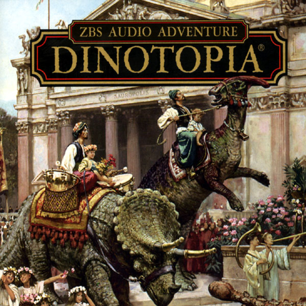
Today we continue with Episode Six of the serialized podcast of Dinotopia: A Land Apart from Time. To listen, click the orange play button below, or follow the link to the Soundcloud file.
Are there meateaters in Dinotopia? You bet! And in this episode we see what happens when you encounter them.
Arthur learns about the sabertooth cats that once lived in Waterfall City.
They outfit a convoy for a journey across the Rainy Basin, where tyrannosaurs present a constant threat.
And we witness Bix bravely face off against a T. rex.
The Podcast SeriesThis acoustic adventure was produced by Tom Lopez, mastermind of the ZBS Foundation, with an original music track by composer Tim Clark.
Episode 7 arrives in a week. Each short episode will only be live online for one week, and then it will disappear.
If you'd like to purchase the full two-hour Dinotopia podcast right now and hear all twelve episodes back to back in a feature-length production, check out
Dinotopia at ZBS Foundation website for the MP3 download.
----
You can also order the original book from my web store and I'll sign it for you. It's the ultimate holiday gift for the imaginative person in your life. (Ships via Media Mail within 24 hours of your order, so it may or may not arrive in time for Christmas. US orders only for the book, please).
The Dinotopia book is also available from Amazon
.
----
There will be an exhibit of
Dinotopia originals at the Stamford Museum and Nature Center in Connecticut from February 14 - May 25, 2015. I'll be giving an illustrated lecture there on Sunday, February 22.

Great schools are made up of great teachers, and one of them is
Gary Geraths, who teaches animal drawing at
Otis College of Art and Design in Los Angeles. He has brought in camels (and belly dancers) to his class so that students can draw them directly from life.

Understanding what's going on beneath the surface is not always obvious, so Gary does demonstration drawings of the skeleton and the surface features.
He brings the students to the
Page Museum, where they can sketch from articulated skeletons of animals that fell into the nearby La Brea Tar Pits.
Gary works with students of all ages, and he has taught other things, like rock climbing.
His knowledge of animals is extensive, and his demos cover sea creatures and invertebrates.
For students wishing to get jobs in animation or illustration, having a deep knowledge of animal drawing is extremely valuable, and a good way to set your portfolio apart from the competition.
Here's a
video of Gary's animal drawing in action.
Because of the logistics of bringing in live animals, or bringing students on field trips, there aren't many schools who can offer such a thorough study of animals as Otis does, and there aren't many teachers like Gary.
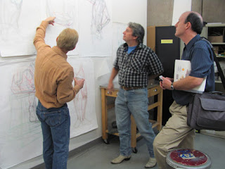 |
| James Gurney visits Gary Geraths (center) and Bill Eckert at Otis in 2010 |
-------

Let's take a look at the watercolor "Escutcheon of Charles V of Spain" by John Singer Sargent (1856–1925) compared to a photo of the actual thing. Here are a few of my takeaways:

|
The heraldic insignia or escutcheon of Charles V of Spain,
part of a sixteenth century fountain at the Alhambra in Granada.
1. Take your time on the drawing. Comparing the painting a photo of the actual subject Sargent was looking at, it's clear he was very careful and patient with his preliminary drawing. Since the shallow raking light must have lasted a very short time, he might have done the drawing on one day, and painted it on another day, or drawn it in the morning, waiting for the light to be perfect to paint it.
 2. Flatten the lights, open the shadows 2. Flatten the lights, open the shadowsFor a feeling of brilliance, unify the areas directly lit by sunlight. Limit the range of modeling and tonal value to keep the light areas very light. Instead, put the variation and chroma in the shadows.
3. Keep cast shadow edge dark, cool, and sharp. Note the darkness and coolness of the area of cast shadow right as it turns to light, especially in the upper left of the picture. The step from that cast shadow to the adjacent light should be striking enough to be very noticeable. As long as this value relationship is held at the cast shadow edge, the inner areas of shadow can be considerably lightened.
4. Push the warm and cool variations. Down-facing planes, or planes receiving reflected light from illuminated stonework are warm. Up-facing or open front-facing planes are cool, suggesting that they're receiving mostly blue skylight. The soft blending between warm and cool requires having pools of each color on the palette and work wet into wet. Watercolor is very fast and ideally suited to such rendering.
5. Put the detail only where you want it. Use the biggest brushes possible but vary the touch. The outer areas are stated very broadly with a big brush. Much smaller touches are used for the details of the coat of arms, and might have been done with a smaller brush.
I'd love to hear what you take away from looking at the picture. ------- The painting is called "Escutcheon of Charles V of Spain" by John Singer Sargent (1856–1925)Date: 1912, Medium: Watercolor and graphite on white wove paper. Dimensions: 12 x 18 in. (30.5 x 45.7 cm) in the collection of the Metropolitan Museum. |

Hugh Ferriss was an architectural illustrator known for his dramatic renderings of early skyscraper designs. He sketched from observation, but he also worked from imagination when commissioned to visualize proposed structures.
Here's an example of a rendering of a proposed building, the Convocation Tower designed by Goodhue in 1924. The building rises up like a rocket ship into the night from a flood of light at the base.
How did he achieve such accurate perspective, but also such a sense of drama and atmosphere?
"The first stage is a rough layout of the streetscape and the foreground traffic." (According to
Drafting Room Practice by Eugene Clute, 1928, quoted in the
blog Beyond Illustration). Note that important details of the building at far left are still unresolved.
"The second image shows a general defining of the forms by establishing values throughout."
"The third image shows the final rendering with the various tonal areas detailed. The rendering was produced with carbon pencil on a fairly smooth drawing board. As you can see he drew and erased as needed to get the needed effect."
Ferriss made this drawing of an existing building, the magnificent Venetian-styled Madison Square Garden, before it was
torn down in 1925. Note the unified dark tones of the foreground, and the
counterchange from light-against-dark at the base of the tower to dark-against-light at the top.

By: James Gurney,
on 12/14/2014
Blog:
Gurney Journey
(
Login to Add to MyJacketFlap)
JacketFlap tags:
Add a tag
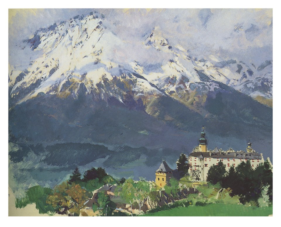
Yesterday, an exhibition of John Howe's artwork opened at the
Maison d' Ailleurs museum in Yverdon, Switzerland. John Howe is a Canadian artist living in Neuchâtel who has worked alongside Alan Lee as the main concept artist on Peter Jackson's films The Lord of the Rings and The Hobbit.
For more information, visit
Maison d' Ailleurs.

Scott Lloyd Anderson, who was visiting from his home in Minnesota, joined us to paint the train station earlier this week, and here's what he painted that day.
Scott says, "Jim and Jeanette were painting the long views of the interior, so I opted for this vignette. As always, painting from life is often about the play of light. This time it was the overall cool light around the room vs. the warm bulb vs. the vending machine."
Scott continues, "I rammed this one out in and hour after I realized what I was really interested in was the light inside the vending machine, and the reflective wrappers around these glories to high fructose corn syrup."

Hi, folks. Jeanette here. I was standing next to Jim while he was painting the
gouache study of the train station last week. I liked the cool light coming in from the west window on the rainy day, and the contrasts on the terra cotta tile floor. I spent about an hour on the pencil underdrawing before starting the transparent watercolor.
The scene needed a figure so I added
Scott Anderson and his French easel. Later, though, a passenger with the perfect silhouette walked through my scene, so I put her in as well. She stopped for just a second and looked around, and then kept going. I quickly penciled her in and then painted her from memory.
I was using a Stillman and Birn hot-press
Zeta Hardbound Sketchbook
(5.5 x 8.5 inches) watercolor sketchbook. I love the heavy 180 lb. non-buckling paper and the vertical format, but it's a challenge for me to get smooth washes on that surface. The rougher
Beta watercolor book
gives me smoother washes.

By: James Gurney,
on 12/12/2014
Blog:
Gurney Journey
(
Login to Add to MyJacketFlap)
JacketFlap tags:
Portraits,
Add a tag
Ostap Kostyuk is a singer from a village in the Carpathian Mountains. I sketched him in watercolor last night during a performance at Bard College in New York.
He and his group recreated the Koliada, an ancient mid-winter ritual still practiced in their villages of Kryvorivnia and Verkhovyna, high in the mountains of western Ukraine.
In the tradition, musicians enter every household of the village, ringing bells, blowing long mountain horns, and playing a hammer dulcimer. The Koliadnyky sing a separate song to every member of the household, both living and recently deceased. If the songs are not sung properly, the spring and the harvest will not arrive.
-----

By: James Gurney,
on 12/11/2014
Blog:
Gurney Journey
(
Login to Add to MyJacketFlap)
JacketFlap tags:
Gouache,
Add a tag
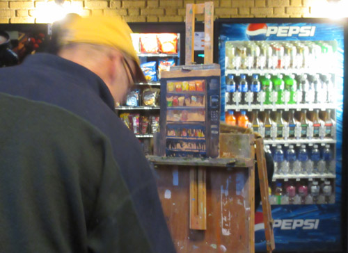
This week, a painter friend named
Scott Lloyd Anderson is here in the Hudson Valley, and we decide to go out sketching together. But it's freezing cold and raining all day, so we need to find an indoor subject.
 |
| Amtrak Station, Rhinecliff, New York by James Gurney, gouache, 5x8 inches. |
We find a perfect spot at the Rhinecliff train station. It's warm and dry, with bathrooms and a bunch of coin-op machines. I want my view to include the ticket booth and the benches, as if it is a stage set built for a dramatic production.
I love train stations because they're the setting for a thousand little human dramas of arrival and departure, greeting and saying good-bye. People do a lot of waiting, looking at cellphones.
The day before our session, I email the regional operations manager to ask permission to paint there, and he graciously allows us, as long as we are neat and safe and don't get in the way of passenger traffic. Fortunately the landing where Jeanette and I are painting is unused. Scott finds a place on the main floor near the ticket window.
We invite curious passengers and station agents to come by and take a look. One station agent sees the painting and says it sends chills down her spine. A musician pulls out a mandolin and strums it a little. The mood in the room is pure magic.
Here's what my line drawing looks like. It's fairly simple one point perspective, but it takes an hour. The eye level or horizon is even with the lower crossbar on the window, and the vanishing point is the little circle at the right hand edge of the window.
With a half inch flat brush, I block in the far wall and the gradation on the floor. Even though the paint is fairly opaque, I can see my construction lines through thin washes.
I am going for a quick overall statement of the values, with broadly stated warm and cool areas. The blue light is reflecting off the red tile floor and also off much of the woodwork on the ticket counter at right, so I drop in that blue color early in the lay-in.
The cluttered details on the counter are made up of a series of light and dark strokes overlapping like confetti. Any kind of gouache paint lends itself to such rapid impressionistic handling.
The paint I'm trying out is called
Acryla Gouache
, made by Holbein. They sent me a sample set to try out (thanks guys). In this painting I'm using only titanium white, jet black, burnt sienna, deep yellow, and ultramarine blue.
Mini review: The pigment density and opacity are comparable to regular gouache paints. Because of the acrylic medium in the paint formulation, I can glaze over previously stated passages without picking up those earlier layers. But I've got to be sure to keep the brushes wet until I have a chance to really clean them because the acrylic medium would wreck a brush if it dried in it. The paint surface dries matte, which allows me to draw over the top with colored pencils, something that doesn't always work in casein. Acryla gouache comes out of the tube slightly more liquidy than casein paint, so if I want impasto whites I have to wait for it to start to dry up.
The whole painting takes about four hours (scroll up to see the finish), and it's painted with just two brushes: the half inch flat and a smaller round.
Tomorrow: What Jeanette painted.
Materials used:

By: James Gurney,
on 12/10/2014
Blog:
Gurney Journey
(
Login to Add to MyJacketFlap)
JacketFlap tags:
Add a tag
The new edition of
Spectrum 21: The Best in Contemporary Fantastic Art
is now available.
Spectrum was begun more than two decades ago by Cathy and Arnie Fenner as a place to showcase the best in imaginative art. The annual juried selection includes a wide variety of settings for fantastic art, including comics, concept art, book, editorial, advertising, and institutional.
Book on Amazon:
Spectrum 21: The Best in Contemporary Fantastic ArtThe entry deadline for Spectrum 22 is January 26.
Here's more entry info.
My friend David Starrett is the son of Charlie Starrett, the great cowboy actor. A few years ago I sketched David and one of his dad's old holsters.
And that's David's loyal dog Randy, a sweet bear of a dog. Jeanette and I got to take Randy on a walk around the block. Randy passed on last week, so so we send our sympathies to David on the loss of his best friend.

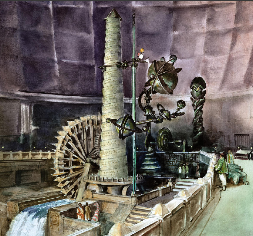
Today we continue with episode 5 of the serialized podcast of Dinotopia: A Land Apart from Time. To listen, click the orange play button below, or follow the link to the SoundCloud file.
The episode opens in the helicoid geochronograph, a water-powered machine that keeps track of time.
We meet Nallab and Enit, librarians of Dinotopia, who show Arthur their scroll-reading machine.
In Dinotopia, dinosaurs write messages in a sandbox using a unique footprint alphabet.
The Podcast SeriesThis acoustic adventure was produced by Tom Lopez, mastermind of the ZBS Foundation, with an original music track by composer Tim Clark.
Episode 6 arrives one week from today— Tuesday, December 16. Each 10-minute episode will only be live online for one week, and then it will vaporize.
If you'd like to purchase the full two-hour Dinotopia podcast right now and hear all twelve episodes back to back in a feature-length production, check out
Dinotopia at ZBS Foundation website for the MP3 download.
If you missed last week's episode #4, I'll leave it up through the rest of today. Here's the
link to that SoundCloud file for Episode 4.You can also order the original book from my web store and I'll sign it for you. It's the ultimate holiday gift for the imaginative person in your life. (US orders only for the book, please).

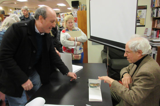
In the 1970's he was taking pictures of things that no one else was. He took a trip across country with the goal of documenting everything: including every meal he ate and every toilet he used.
A formative influence was hanging out at Andy Warhol's Factory. By age 23 he had a show at the Metropolitan Museum.
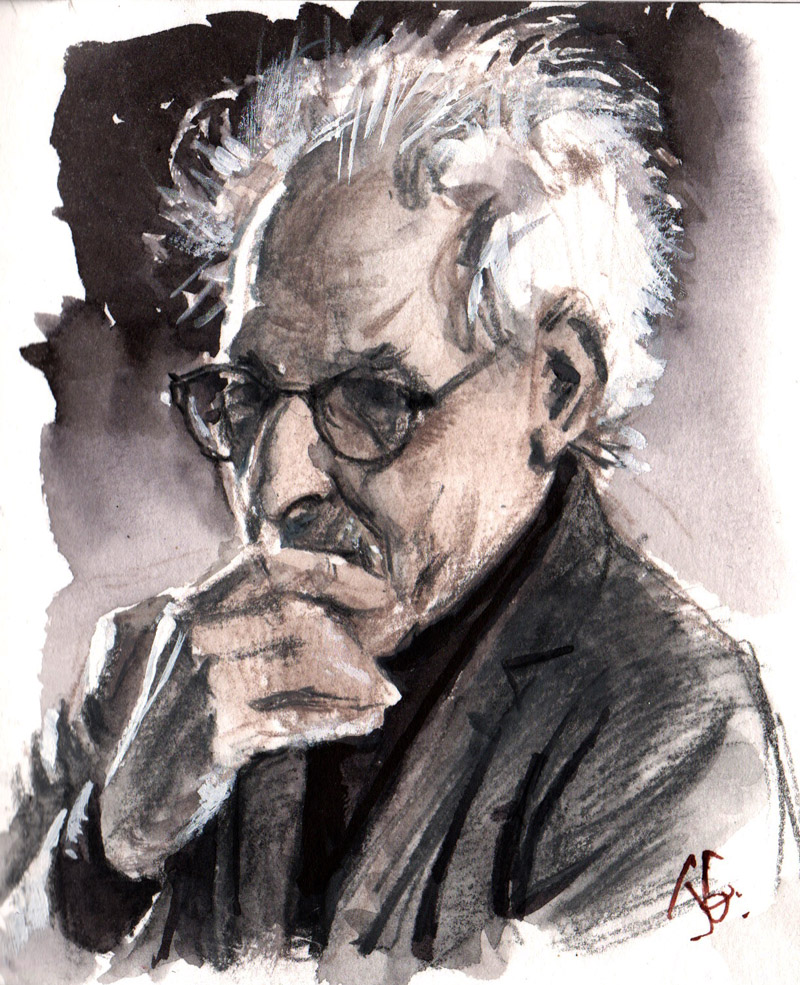 |
| Portrait of Stephen Shore, photographer, drawn from life by James Gurney |
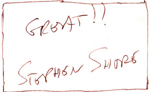
Last night Stephen Shore gave a slide show of his work in Rhinebeck, New York, and I drew his portrait as he spoke. He briefly struck a pose with a hand to his mouth, both pensive and guarded. The lecture gig had somehow slipped his mind, and he drifted in a half hour late after a few nervous phone calls from the bookstore owners.
His wild nimbus of white hair was rim-lit from the fluorescents of the bookstore. The projection screen lit him with soft light from the other side. I chose to portray him in grays, anticipating that he might talk about color vs. black and white.
He said:
"When I started this work, no art photography was in color. Paul Strand told me, 'Higher emotions couldn't be communicated in color.' Mind boggling! What would Kandinsky think of that? I see the world in color. It's what it's like to see. Color gives cultural information. By 1990 almost all art photography was in color. Then in contrariness I started working in black and white."
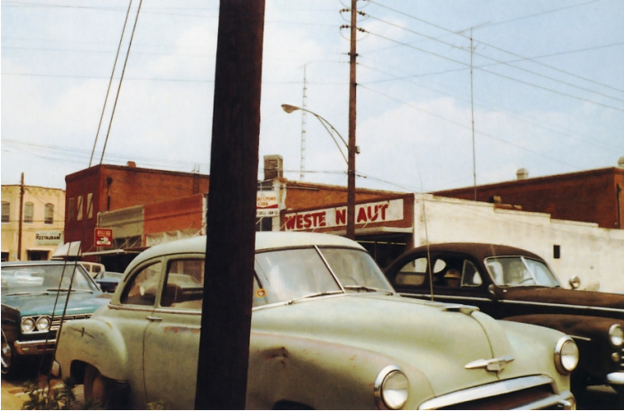 |
Stephen Shore, Columbia South Carolina June 1972 |
Shore said, "I was interested in the immediacy that some snapshots have. I wanted to use repeated motifs, to capture some aspects of our culture. I was taking what we would now call screenshots of our field of vision."

By: James Gurney,
on 12/7/2014
Blog:
Gurney Journey
(
Login to Add to MyJacketFlap)
JacketFlap tags:
Add a tag
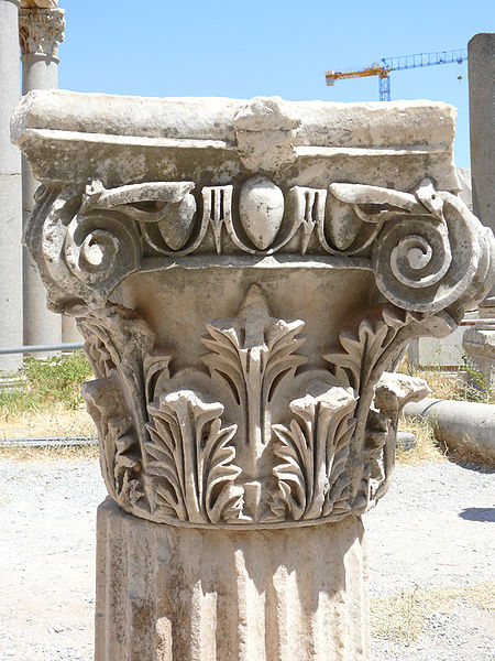
The acanthus leaf has been a favorite design element for millenia. The leaf shapes appear on many Roman and Greek capitals.
Here is an acanthus leaf motif on a Corinthian capital in the Doge's Palace in Venice. The leaf shapes are more naturalistic and profuse, wrapping over the shapes and making them organic.
William Morris used the acanthus for this 1875 wallpaper design. The leaves overlap each other in sinuous curves, and are grouped by color to suggest layers of depth.
Here's an example of how the leaf was adapted for a 19th century manual on lettering. The leaf shapes have graceful S-curves that grow in close parallel curves, and then terminate in spiral finials or flare out into lobed leaf shapes. Vestigial fragments of these leaf shapes appear on the back of the US dollar bill.
Here's what the actual leaf looks like. The two main species that inspired the designers are the Acanthus spinosus and the Acanthus mollis (above), and they grow in the Mediterranean region.
The tips of the leaf are spikier than they appear in the design configuration. Most of the design adaptations have convex lobes. There's a strong single midrib with smaller side veins and secondary leaflets branching off the main midrib.
William Morris's version retains the structure of the single midrib and side-veins, but he elongates and spirals the leaf shape. The pen-and-ink version deviates from the actual acanthus by replacing the single midrib with a series of parallel rib lines, more like a plantain leaf.
------
Read more:
Wikipedia:
Acanthus in Ornament"
It's all in the Details -- Acanthus Leaves"

These are all watercolor sketches made while waiting. Waiting for my wife to buy vegetables at a farm market, waiting at a Mexican restaurant, and waiting for an oil change.
They're small, about the size of a business card. And the subjects are insignificant, just screenshots taken at random from an average day.

Two recent art-of books have presented fascinating glimpses of the artistry behind a couple of recent animated films.
The Art of The Boxtrolls
chronicles the making of Laika's most recent stop motion feature, about a group of quirky creatures who raise a human boy beneath the streets of a city named Cheesebridge.
The text is written by key members of the staff of the film, including Philip Brotherton, art director at Laika, Travis Knight, Laika's president and lead animator, and Anthony Stacchi, director of the film, each of whom describes how the animation studio altered the material of the source novel to work in their unusual stop-motion medium.
The artwork shown in the book includes character designs, architectural plans, and color keys. These digital paintings by Paul Lasaine helped to work out the shot compositions, color, and lighting.
There are a lot of character design sketches, both black-and-white and color, 2D and 3D. Much of the work is hand painted or hand sculpted, something of a rarity in concept art these days.
Armaturist Nick Smalley-Ramsdale described how difficult it was to make the flexible armature for the character Fish (center), to allow the character to be able to fold up completely inside the box for one scene.
The genesis of each of the characters is followed from sketch to maquette to finished animatronic puppet, featuring many of the handcraft skills, such as hair and costume.
However, I wish there had been more explanation of the specific processes used in creating the armature, casting the foam body, and 3D-printing (and storing) the thousands of facial expressions used in Laika's unique process. One feels that they're holding back trade secrets in the realm of their most important innovations, but they don't need to since they're always moving forward, and a book like this could have offered a more informative record of how they made the film.
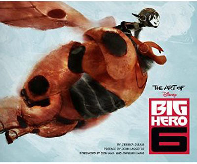
The Art of Big Hero 6
showcases the artistry that the Disney studios brought to the challenge of interpreting a Marvel comic universe in terms of Disney Animation, rather than live action. The movie had to have plenty of fighting action, but also a focus on character and charm.
Almost all of the concept art in this book is painted digitally, including this one by Paul Felix showing Hiro and his inflatable robot companion Baymax.
In addition to crediting the artists by name, (something overlooked in many
previous "art-of" books
), the book includes their comments about the specific challenges they faced and the methods they used.
For example, Adolph Lusinsky, director of Cinematography and Lighting, says, "We knew Baymax was going to have projection inside his vinyl so, to test how it would look, we cut a hole in a beach ball, put in a piece of glass, blew it back up and put a projector behind it. The light bleeds through his legs and arms and feels really believable."
Jeff Turley created this digital rendering to help imagine the portmanteau urbanscape of San Fransokyo. Everything in the city had to be designed, from signs to vehicles to interiors, and there's a good mix of examples.
In comparison to other art-of books, this one devotes more attention to the architecture and environments, though character designs are well covered in the second half of the book.
When planning the home of the main character, a Victorian home over a bakery/cafe, Scott Watanabe said that he "researched extensively how old Victorians were built and would have been remodeled." He had to thoroughly understand how the roof framing worked inside the tower, because the structure would be seen in the interior shots in the final film.
The book does a good job of showing the range of artistry and expertise that goes into making a major animated feature, and it presents the thinking behind the art in a way that's fun and inspiring to read.
Both books are 9.5 x 11 inches, 160 pages, full color, hardback, and they retail for $40.00 each (or between $26-$31 new on
Amazon).
More info:
The Art of The Boxtrolls
Last night, James Bagwell conducted the Bard College Chamber Singers and the Symphonic Chorus in a performance of G. F. Handel's oratorio Esther.
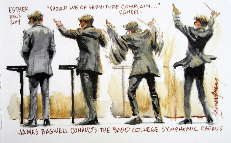 |
| James Bagwell, conductor, Bard College Symphonic Chorus |
Bagwell spent most of the time in a resting position (leftmost pose), as the chorus waited for their parts, between the arias and recitatives, which were directed from the keyboard by Alexander Bonus.
Then he flew into action. As he lifted his arms in precisely measured movements, his fitted jacket reflected the pull of his shoulders. When the chorus declared "Pour our vengeance on our foes," he leapt up in great animation, the tails of his coat lifting up like the flounces of a lady's skirt.
I sketched from the third row, using water-soluble colored pencils and a black and a clear-water brush pen. To record these faster motions I had to blink my eyes shut and try to hold the poses in short-term memory.
---
Previously on GurneyJourney:Maestro BagwellJames Bagwell at a RehearsalPrevious posts on concert sketching:The "Flash-Glance" MethodGouache portrait of an Irish whistle playerSketching a vocal concert Violinist in ink washHorn PlayerMirko ListeningClub Passim GigShapewelding Sketching The Cello and the PencilConcertgoerMass in CHandel's Messiah

Madame Tussauds created this video about how they create a wax portrait figure. They had the benefit of having the subject, Benedict Cumberbatch, available for measurements and color matches. (link to video)
One of the readers of this blog is Jethro Crabb, a painter and sculptor who has worked at Madame Tussauds. I asked him a few questions prompted by the video.
James Gurney: Who sculpted the head in the video?
Jethro Crabb: "My friend John Cormican, a lovely fellow and a veteran of Jim Henson's creature shop amongst other places, sculpted the head for the Benedict Cumberbatch figure."
JG: Where is Madame Tussauds based, and what did you do there?Jethro Crabb: "The studios are based in Acton, West London and produce wax figures for all the worldwide attractions. Each figure normally has two sculptors working on it, one to sculpt the body and one the head. I specialised in head sculpts during my time there."
JG: Do you ever use 3D scanners?
J. Crabb: "Tussauds to me is fascinating because most of the techniques involved in the production of the figures are exactly the same as they were 200 years ago. In the last couple of years 3D scanning and printing has become a part of the process, but the 3D prints are currently only used as another reference tool for sculpting in clay by hand."
JG: Do you always have a living celebrity available to pose?
J. Crabb: "In the case that the celebrity was free and willing to meet us, we would travel to them and take hundreds of photographs and measurements of them. For the head we used an eyebrow pencil to draw a matrix of dots on their faces which became points to measure from. As we built the clay head up using the photographic reference we established these points in the clay using metal pins and carefully measured between them with calipers. We would compare these measurements with our chart of measurements taken in the sitting and adjust them until correct. Two of the photographs we took were a 'front on' and a 'profile' shot in the right facial expression from 5 meters away (to minimize the distortion)."
"These were printed out 2% larger than life size and we used this to directly take measurements in a very specific way. The clay head was built 2% larger to compensate for shrinkage in the wax cast. In the case that the celebrity didn't want to be involved or was unavailable we would work from photographs alone. Each portrait would normally take 5 weeks to sculpt. All these techniques and processes were tinkered with and added to over the years and the results produced could be quite remarkable."
JG: What elements are key to getting a likeness?J. Crabb: "One of the things I learned as an artist working at Tussauds was that in order to create a convincing likeness of someone it was crucial that all the elements were correct and had the correct relationship with each other. Humans are so expert in recognising faces, or more accurately 'heads' since the shape and silhouette of the cranium, neck and jaw play an important role in this recognition, that any minor mistake or mismatch of forms creates a disproportionately disastrous result."
"I also learned more and more that it is the big simple shapes in a sculpture which are the most important to establish correctly. There is always a tendency to be distracted by an alluring nostril shape or mouth corner, but even if this small stuff is correct it is useless unless it is laying over a correctly sculpted larger form. Perhaps a similar thing can be said of painting."
JG: When it comes to recognizing a particular face, I have always been under the impression that the great portrait painters engage in subtle caricature (see post on "Caricature and Likeness") or at least are selective about downplaying certain features or qualities that are not particularly characteristic. Am I right in understanding that there's none of that going on with Madame Tussauds sculptures? Are you going for a metrically exact mirror image with no attempt to exaggerate characteristic details? Jethro Crabb: "
This subject of 'caricature vs exact copy' that you bring up is one that absolutely fascinates me. Your question and original blog post has hit upon an issue that I have spent a lot of time thinking about and experiencing through my sculpture. Please excuse my lengthy response. It should be an easy question to answer, but it is not."
"At Madame Tussauds, the sculptors are aiming to produce an exact copy of the person. So that you could stand the celebrity next to their sculpture and it would be impossible to spot any differences in size, proportion, form or colour between the two, (By the way this aim is rarely if ever 100% achieved no matter how meticulously the wax figure is made)."
"But in order to get to that point I think it is helpful to have a caricaturist's eye. To have the ability and inclination to notice what specific characteristics are key in making someone look the way they do. This skill is particularly important when we have been unable to meet the celebrity in question and are just working from photographs without the aid of measurements taken from the subject. In this case it is useful to observe which characteristics of their head shape and features and they way they fit together are distinctive and might be exaggerated if we were to make a caricature. By noticing these characteristics we can make sure they are stated clearly enough in the sculpture. Better that they are slightly overstated than understated."
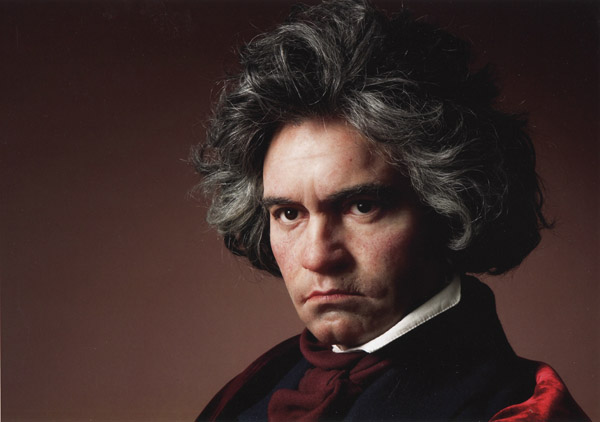 |
| Wax portrait of Beethoven by Jethro Crabb |
JG: With movie celebrities or larger-than-life historical figures, our notions of what they look like is influenced by a certain amount of myth-making via film or painting. Sometimes the screen persona of a movie actor is kind of artificial, and different from the real flesh-and-blood human being. How do you factor that in?J. Crabb: "A good wax figure should look like how people expect that celebrity to look. This can often be subtly different to the reality. Think about having your photo taken and having a feeling that it didn't quite capture how you really look. This could easily be the case with a wax figure as well. We could create a sculpture that measures correctly and adds up with all the photographs from the sitting, but just doesn't look like how we expect Johnny Depp, for instance, to look. So sometimes we have to choose photographic reference which tallies with our expectations. On top of this some of the best portrait sculptors at Tussauds use elements of subtle exaggeration in their modelling to define the characteristics of the forms and shapes in the face. Two of the principal sculptors used to work as caricaturists for the British television political caricature programme "Spitting Image" and I think this has helped with their realistic work."
Thanks so much, Jethro!Jethro Crabb's sculpture work Celebrity Tussaud images are from
FanPop 
It's Tuesday, time for the new episode of the Dinotopia audio podcast adventure. Just click below or follow this link.
Descending the flanks of Volcaneum, Arthur and Will Denison hear Bix's vocal talents, and witness the hadrosaur swamp symphony. For this sequence, producer Tom Lopez drew on his stereo recordings of jungles in India and Bali, and composer Tim Clark created deep rumbling sounds.
As they approach Waterfall City, they hear the roar of the falls.
They fly across the gorge on a glider and make their first entrance to Waterfall City.
Malik, the timekeeper, explains to Arthur how Dinotopians visualize the passage of time, using a combination of circular and linear geometry, resulting in the spiral and the helix. I love the immersive quality of the audio in this whole episode, and it's not surprising that AudioFile Magazine called it “A masterpiece of audio production.”
 The Podcast Series
This acoustic adventure was produced by Tom Lopez, mastermind of the ZBS Foundation, with an original music track by composer Tim Clark.
Episode 5 arrives in one week— Tuesday, December 9. Each 10-minute episode will only be live online for one week, and then it will disappear. So tell your friends, and be sure to check in to this blog each week. That way you'll be able to hear the whole production for free.
If you'd like to purchase the full two-hour Dinotopia podcast right now and hear all twelve episodes back to back in a feature-length production, check out
Dinotopia at ZBS Foundation website for the
MP3 download.You can also order the original book from my web store and I'll sign it for you. It's the ultimate holiday gift for the imaginative person in your life. (US orders only for the book, please).

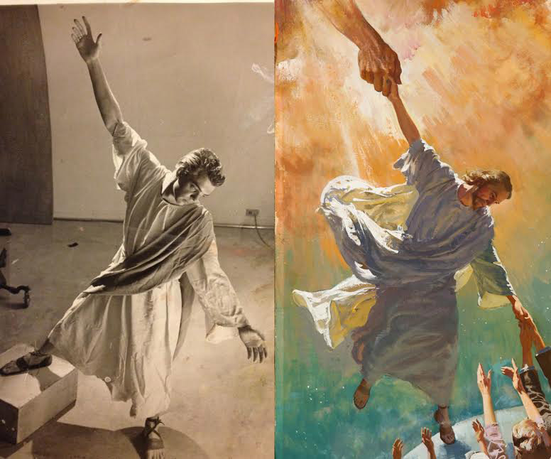
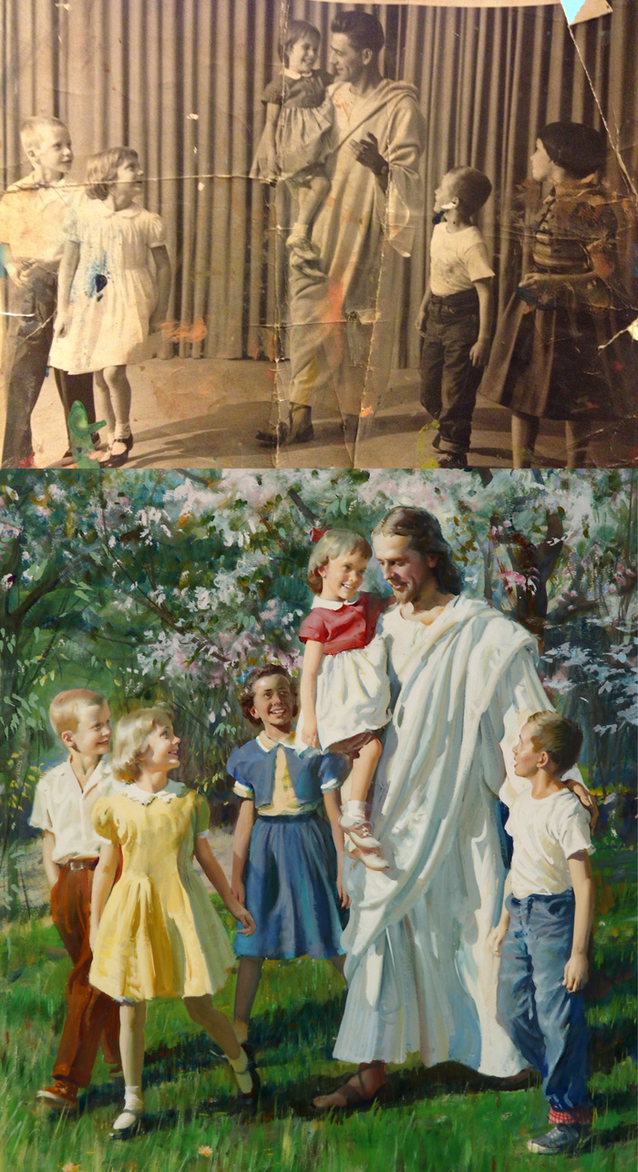
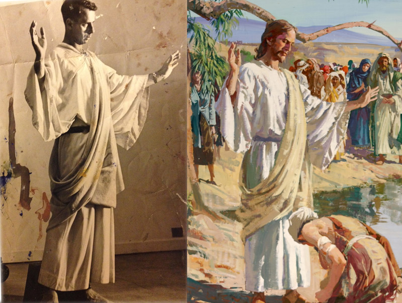
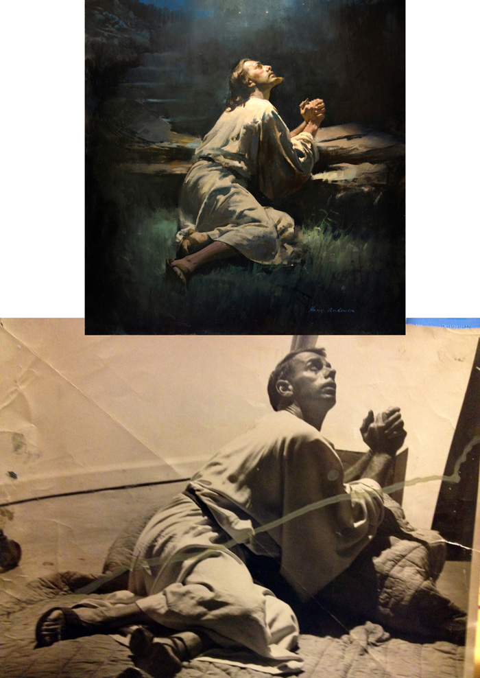
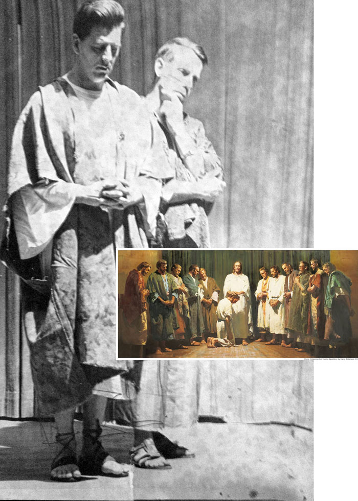
When
Harry Anderson (1906-1996) set out to illustrate images from his 7th Day Adventist religious faith, he turned to photo reference to give him added realism.
Here are the photos next to the finished paintings. It's interesting to compare the changes he made as he went from the reference to the painting.
Here, Jesus is lowered from heaven to outreached human hands. The painting invents the sweep of the garment, and the warm reflected light from the back of the figure to the encircling white fabric.
This is one of Anderson's most famous religious paintings. Much of the spontaneous action and accurate eyelines came from posing the whole grouping together and actually having them walk.
Norman Rockwell didn't shoot reference this way, and would instead generally pose models separately and would
set up walking poses somewhat artificially.
The potential pitfall of shooting photo reference, especially for religious paintings, is that one can get caught up in the commonplace and random details of the photo and lose sight of the mental image of the scene.
Anderson certainly didn't copy the reference, instead redrawing it, and controlling the values. Note how he downplayed the reflected light on the shadow side of the chest.
Like many other illustrators of his day, Anderson used black and white photos, not wanting to be influenced by the colors. He spared no expense or effort to get good scrap. According to his
biography, a large percentage of his commission went to model expenses and photography fees.
Most of the photos he used he took and developed himself in a bedroom that he converted into a photo studio and darkroom. He used professional models—who even 50 years ago charged as much as sixty dollars an hour—but he also used neighbors and friends.
The biography says: "By posing his models in approximately the right costume and photographing them, Harry could obtain what he needed—the proper foreshortening of limbs, inclination of head, relationship of light and shadow."
Additional resources:
Previous posts:

Today we'll be fondly remembering Joe Fusillo, one of my uncles on Jeanette's side, who passed away earlier this week. I knew him as a fun-loving, larger-than-life person who organized the kids' games at family parties and he always had everybody laughing.
He was a great builder and restorer, and always had ambitious projects in the works. I did this sketch at a family party a while ago, and I remember that even when his hair was white, his eyebrows were always dramatic and dark.

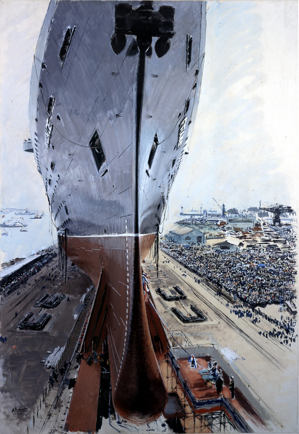
Albert Brenet (1903-2005) was a French artist who painted primarily in gouache.

As a child he loved to paint pictures of ships in port. Ships remained a favorite theme all his life.
In 1921 he studied at the École des Beaux-Arts in Paris.
For seven months he sailed the Antilles on the
Bonchamp, one of the last French sailing merchant ships.
He traveled widely and painted scenes of colorful locations around the world, including equatorial Africa and the West Indies.
His gouache paintings were relatively large, requiring a big board and easel.
He worked for many years for the magazine
L’illustration, and he painted many posters depicting railroads, aircraft, ships, and architecture for the travel trade.
These subjects require accurate perspective and confident handling of detail.
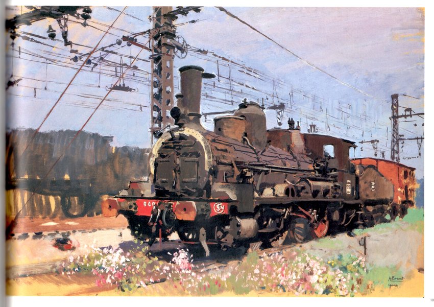
In the painting above, note how he simplifies the far silhouette and the foreground textures to put the focus on the middle-ground train and the overhead wires.
He delighted in tight cropping, active foregrounds, and immense scale. He achieved scale by alternating big and little strokes, choosing unusual viewpoints, and setting figures back in space.
Look how he blurred the feet of the walking figures, and parked that sales wagon right in the foreground.
-----
Read more about Albert Victor Eugene Brenet:
Do you know these other artists?
Eugène Burnand
View Next 25 Posts