Viewing: Blog Posts Tagged with: ballpoint, Most Recent at Top [Help]
Results 1 - 4 of 4
How to use this Page
You are viewing the most recent posts tagged with the words: ballpoint in the JacketFlap blog reader. What is a tag? Think of a tag as a keyword or category label. Tags can both help you find posts on JacketFlap.com as well as provide an easy way for you to "remember" and classify posts for later recall. Try adding a tag yourself by clicking "Add a tag" below a post's header. Scroll down through the list of Recent Posts in the left column and click on a post title that sounds interesting. You can view all posts from a specific blog by clicking the Blog name in the right column, or you can click a 'More Posts from this Blog' link in any individual post.
 Hi I'm new to this group and new to blogging, I hope I didn't accidentally flag the blog in all my clicking around.
This image is for a bug book I'm working on. I'm painting the illustrations in Painter IX using the oils. I'm trying to keep it looking painterly and not too slick and digital, but maybe I'm using the blender too much?
Diane Lucas
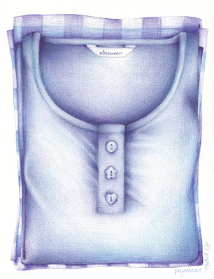 I can't believe that in all this time of blogging I've never drawn, or mentioned, pyjamas. Pyjamas are without doubt my favourite item of clothing. Nothing comes close on my 'favourite item of clothing' list. And, I didn't even know I had a 'favourite item of clothing list' until now. But seriously (?!), I'm never happier than when I'm in pyjamas. I've got loads of pairs and so this could very well be the start of a new series.
I'm not happy with the creases, on the sides, in this one. I never noticed them until I uploaded it. Why do things always look so different when you see them on screen? Lots of reasons, of course. Why am I asking stupid questions?
 I take it that this is obvious? Sometimes you wonder. It's obvious to me -but then it would be. Does everybody see what you see? Does anybody see what I see? Hmmmm.
 A quickie. Not much time for drawing this week...again. I did this whilst listening to a very interesting BBC documentary on intelligence last night. I really overworked it; far too heavy with the pen. Oh well, I just needed a ballpoint fix. I feel like I've been neglecting my favourite medium of late.
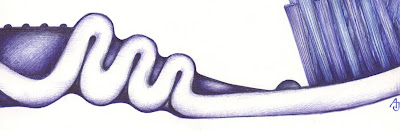
Oh yeah, just in case you can't tell, it's a pair of socks! Very old stripey socks.


 Hi I'm new to this group and new to blogging, I hope I didn't accidentally flag the blog in all my clicking around.
.jpg?picon=572)


I really enjoy your illustration. I don't think it looks too slick...but then I'm not a painter. I think your composition is great, details and expressions wonderful...the only nitpicky thing is maybe more detail in the purple flowers...but even that doesn't really bother me all that much since I'm more focused on the worms.
Great job!
I love this. You did a wonderful job painting it. I don't think it looks to slick and to me it does not look digital at all. It is great. I don't work in Painter IX as I usually do the freehand work so I am always impressed with people who can do it this way.
I am looking forward to seeing more of your work.
Becky
www.pooka-art.com
Nice composition, great expressions on the worms. Looking forward to seeing more of your work.
Great work Diane! It is so fun and full of life and energy. Great composition and characters.
To my eye the leaves in the very foreground need a bit more detail and less blending - they should have as much detail and sharpness as you have given to the caterpillars as they are closest to the viewer.
You could also perhaps slightly fade out the leaves that are more in the background to make the foreground pop out more, but that's being a bit picky.
Look forward to seeing more, and welcome!
This is great. I do think you have blended too much. I learned something the other day about Painter. I was looking for depth in color and thought that paper texture and blending might help but realize that if I just make the texture in my strokes and mix-up the colors a
To make the background fade away but not look blended away use your strokes to blend between plant and background especially on the edges. Take a look at Jan Dolby's blog images to see what strokes can do.
I do really like these worms though.