


They always run over time and then three arrive at once.
What is it with my local buses? Yesterday the bus into town was 15 minutes late, then I waited nearly an hour with my daughter in the rain for a homebound bus back again. Why can't they keep to timetables? What is it that holds them up?
 |
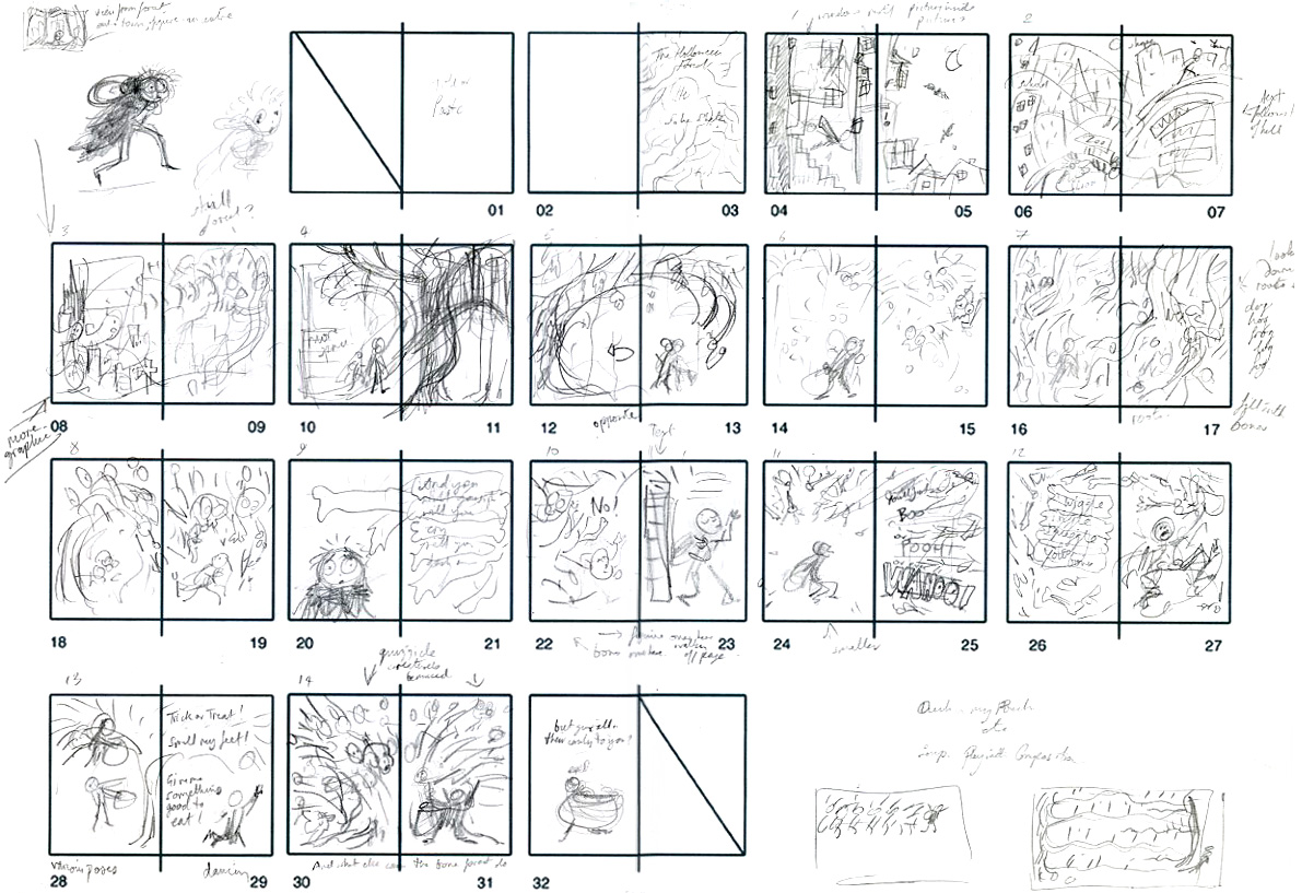
| From Michael Rosen's Nasty (Barn Owl Books edition, UK) |
Well I shouldn't complain too much, I'm hardly one to point the finger at other people running late. This year has been demanding, illustrating books can take up a very large chunk of time, and I've been very, very late with all my projects, hence my limited online activity for much of this year.
I wish I could anticipate production time for books more accurately, it's so much easier when you only have one or two images to create, e.g. for editorial (magazines) or other non-book work. I wouldn't say I prefer 'other' illustration over books, they're two entirely different types of work, but editorial is a lot more straightforward and easier to calculate schedules for. You read the commission, bash out some idea sketches which the editor quickly evaluates (in the case of Tokyo's Wingspan magazine it's within a matter of hours), do the artwork, and it's done! An editorial drawing might take just a couple of days including sketches, or at the most a week to turn around.
 |
| Idea sketches for a recent editorial feature in Wingspan magazine, about an environmental exhibition featuring the biggest paper ball in the world. |
 |
| The finished illustration |
For a start my technique and style of working is very different for books, the artwork for which is usually non-digital, in ink and watercolour. Books pull you into the 'world' of the text, you have to absorb the tone of the writing, to plan and compose the pages with a coherent narrative, to tell the story visually over succeeding spreads with strong characters and compelling compositions. It takes a great deal of contemplation and experiment to get into the skin of the text. Picture books usually have at least 20 images, often more, and always evolve and develop between concept to final book, whether self-penned or illustrating a commissioned text. At every stage of a book's production there are tweaks, re-writes/re-draws, adjustments and revisions, especially in the case of non-fiction where research is such a crucial aspect of the process. Books are complicated things with a whole manner of challenges that can potentially upset your carefully laid plans, even before you get to final drawing and painting the artwork. Despite the assumptions of a recent TV programme, you can't turn a book around in a day.
 |
| Early pencil sketch for Yozora o Miage-yo. A great deal changed between this and the final book. |
All this planning and tweaking is okey if you take just plan one commission at a time, but if you've more than one project in the pipeline the pressure is on. You might find a relatively small unanticipated delay with book 1 causes a major re-scheduling of book 2, and complete postponement for book 3, if the publishers can't wait you find yourself in a mad dash to meet multiple deadlines all landing at the same time. It's exactly comparable to how ripple effects of minor delays cause major traffic jams, or buses to arrive late and bunched together.
This has been the case for me this year, which has been filled with two non-fiction picture books involving a lot of research and revision, one, Will's Words being a history of Shakespeare and the original Globe theatre, written by Jane Sutcliffe, and the other Yozora o Miage-yo (Let's Look at the Night Sky), written by Yuriko Matsumoto, on the subject of star-gazing.
 |
| It's finished! Completed artwork for Yozora o Miage-yo |
These were exciting but very involved projects, requiring much more time than initially anticipated. Both will see publication in 2016 - Will's Words by Charlesbridge publishers in the USA, and Yozora by Fukuinkan Shoten in Japan.
There are certain ways you can speed things up - cut down time off, spend less time in front of a computer screen, work to more stringent daily routines etc., there are ways to cut down procrastination. But finding the correct balance is important, it's all very well working into the early hours, but with longer commissions what you gain from over-working on one day you tend to lose the next day due to fatigue.
However, with the artwork for these titles now completed things will get a lot easier now (touch wood!) - I've other delayed book commissions waiting in the wings, thankfully fiction!
To all my long-suffering publishers and editors, my deepest apologies.
Now, onwards!
0 Comments on Why are children's book deadlines like buses? as of 1/1/1900
Add a Comment


Wonderful showing of progression of your latest book! The illustrations are so well thought out with the poem. Great halloween book!
What a fantastic post! I love seeing how you developed the book. Brilliant!
Really interesting john, thanks for posting.
Amazing - just loved seeing you at work - your drawings are captivating
What a lot of fascinating information! Thanks, John, for putting this all together and putting it out there. I look forward to going through it all, the artwork is beautiful. Congrats!
Fantastic Work John! It looks incredible - can't wait to see it in the stores!
In total awe, John. What a fabulous, fabulous Halloween book!
I don't like halloween but I LOVE your illustrations, John.
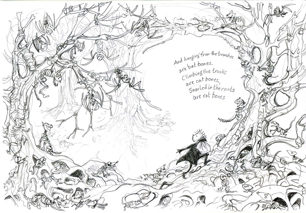
Especially the sketch for the spread of 'the town to the forest' and your tunnel of trees from Halloween Forest was one of my favourites from the juried exhibition last year (they were all fabulous of course).
It's also very interesting to read about your process and how you always 'try to match your work to the tone of the text' avoiding a 'branded style'.
I like your styles very much!
Hi, John. Just adding my praise to the rest. These are lovely and alive. Hope you don't mind my linking to your blog from mine! Take care.