new posts in all blogs
Viewing: Blog Posts Tagged with: Map, Most Recent at Top [Help]
Results 1 - 25 of 50
How to use this Page
You are viewing the most recent posts tagged with the words: Map in the JacketFlap blog reader. What is a tag? Think of a tag as a keyword or category label. Tags can both help you find posts on JacketFlap.com as well as provide an easy way for you to "remember" and classify posts for later recall. Try adding a tag yourself by clicking "Add a tag" below a post's header. Scroll down through the list of Recent Posts in the left column and click on a post title that sounds interesting. You can view all posts from a specific blog by clicking the Blog name in the right column, or you can click a 'More Posts from this Blog' link in any individual post.

By: Hannah Charters,
on 7/27/2016
Blog:
OUPblog
(
Login to Add to MyJacketFlap)
JacketFlap tags:
food and drink,
cooking,
gardening,
Maps,
Multimedia,
herbs,
spices,
plants,
map,
Food & Drink,
Oxford Reference,
ingredients,
OR,
*Featured,
food facts,
Health & Medicine,
Online products,
seasoning,
Arts & Humanities,
oxford online,
floriography,
national herbs and spices day,
Add a tag
On supermarket shelves, we are given a mind-numbing array of choices to select from. Shall we have some peppercorns on our macaroni, some cinnamon for baking, or a bit of rosemary with roast pork? Five hundred years ago, however, cooking with herbs and spices was a much simpler choice.
The post Around the world in spices and herbs appeared first on OUPblog.

By:
Patrick Girouard,
on 6/13/2015
Blog:
drawboy's cigar box
(
Login to Add to MyJacketFlap)
JacketFlap tags:
family,
vacation,
dog,
pet,
illustration friday,
car,
trip,
map,
luggage,
Patrick Girouard,
Drawboy,
Add a tag
By: Ellie Gregory,
on 4/20/2015
Blog:
OUPblog
(
Login to Add to MyJacketFlap)
JacketFlap tags:
Politics,
Maps,
map,
British politics,
david cameron,
*Featured,
who's who,
ed miliband,
British Parliament,
Online products,
UK General Election 2015,
British politicians,
general election 2015,
Add a tag
In anticipation of the imminent General Election on 7 May 2015, we pulled together information from Who’s Who to take a closer look at the major players bidding for our votes. We’ve mapped nine party leaders and deputy leaders to their constituencies.
The post Mapping out the General Election appeared first on OUPblog.
By: AlyssaB,
on 2/6/2015
Blog:
OUPblog
(
Login to Add to MyJacketFlap)
JacketFlap tags:
Books,
Religion,
Politics,
Maps,
map,
*Featured,
Ani Sarkissian,
authoritarian government,
mapbox,
nondemocratic rule,
religious repression,
The Varieties of Religious Repression,
Why Governments Restrict Religion,
Add a tag
Religious repression—the nonviolent suppression of civil and political rights associated with religion—is a growing and global phenomenon. Though it is most often practiced in authoritarian countries, it nevertheless varies greatly across nondemocratic regimes. In my work, I’ve collected data from more than 100 nondemocratic states to explore the varieties of repression that they impose on religious expression, association, and political activities, describing the obstacles these actions present for democratization, pluralism, and the development of an independent civil society.
The nondemocratic countries of the world can be divided into four categories based on the number of religious groups they target with religious repression (All, All But One, Some, and None). Knowing how many and which groups states target helps us to understand how rulers in countries with different levels of political competition and religious divisions use regulations on religion to repress, co-opt, and prevent potential political opposition from challenging their rule.
The color-coded map below shows the degree to which nondemocratic countries repress religions. Click on the larger markers with a symbol for more detail on that particular country.
Featured image credit: Photo by Saint-Petersburg Orthodox Theological Academy. CC BY-ND 2.0 via Flickr.
The post Using religious repression to preserve nondemocratic rule appeared first on OUPblog.


By: Kim Sponaugle,
on 12/16/2014
Blog:
Illustrator Kim Sponaugle's Picture Kitchen Studio
(
Login to Add to MyJacketFlap)
JacketFlap tags:
children's book illustrator,
Picture Kitchen Studio,
illustrator Kim Sponaugle,
picture book artist,
Nickerbacher,
Terry J. Barto,
Dragon,
map,
picture book illustrator,
Add a tag
Nickerbacher the dragon decides to leave his position as a sentry for Princess Gwendelyn, and go for his big dream in Metropolis.....
Written by Terry J. Barto for children ages 5-8. Coming Winter 2015.
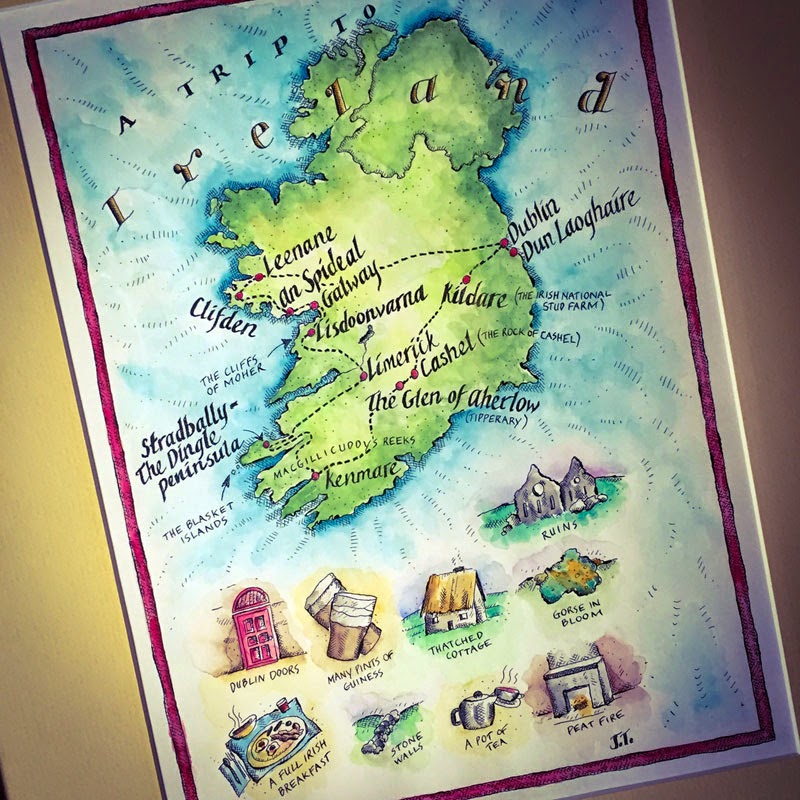
This is one of the very first maps I ever did, back when I was starting out as an illustrator. It was inspired by a TOO long ago trip to Ireland. Time to go back!
By: Barney Cox,
on 12/4/2014
Blog:
OUPblog
(
Login to Add to MyJacketFlap)
JacketFlap tags:
Books,
Politics,
political science,
Maps,
map,
African Union Mission to Somalia,
international relations,
nuclear disarmament,
Social Sciences,
*Featured,
Iran nuclear crisis,
nuclear missiles,
foreign relations,
united nations security council,
Online products,
Syrian civil war,
disarmament,
global peace index,
military expenditure,
SIPRI Yearbook Online,
UN arms trade treaty,
Add a tag
The world today is a very complex place. Events such as the Afghanistan and Iraq wars, the devastating conflict erupting in Syria, and the often-fraught relations between the world’s superpowers highlight an intricate and interconnecting web of international relations and national interests. The SIPRI Yearbook, published every year, keeps track of these global developments around issues of security, and analyses the data and implications behind the headlines you’ve been reading in the past year – from conflicts and armaments to peace negotiations and treaties.
Did you know, for example, that in 2013, the Arms Trade Treaty was opened for signature in the UN HQ in New York City? This treaty, when it comes into force, will roll out international arms regulation for trading in arms, and prohibit the sale of any arms by a state party which will be used in genocide or crimes against humanity. Or that throughout 2013 the Democratic Republic of Congo, combined with international assistance, made considerable gains in stabilizing troubled regions of the country, bringing the state one step closer to security and safety?
With snippets taken from the SIPRI Yearbook 2014, which analyses significant events across the globe in the previous year, the map below helps you explore the global state of affairs, as they happened in 2013:
Headline image credit: Two destroyed tanks in front of a mosque in Azaz, Syria after the 2012 Battle of Azaz. Photo by Christian Triebert. CC BY 2.0 via Wikimedia Commons
The post Charting events in international security in 2013 appeared first on OUPblog.

By: Connie Ngo,
on 10/27/2014
Blog:
OUPblog
(
Login to Add to MyJacketFlap)
JacketFlap tags:
International,
Books,
Food,
food and drink,
cooking,
Multimedia,
eating,
map,
Food & Drink,
Cuisine,
oxford companion,
*Featured,
Oxford Companion to Food,
alan davidson,
OxCompFood,
tom jaine,
Companion to Food,
Add a tag
With nearly 200 countries in the world, the vast number and variety of dishes is staggering, which goes to show just how diverse your food can get. Which countries’ foods do you enjoy the most? Is there a particular characteristic of your favorite food that can’t be found anywhere else in the world? Do you know how national dishes vary by region? Explore (just some) of the world’s different cuisines discussed in The Oxford Companion to Food, from Afghanistan to Yemen, with our interactive map below:
Feeling hungry for more facts about food? Why not discover some less common types of meat, or test your knowledge in our food quiz? Bon appétit!
Featured image credit: Olives, photo by Dominique Godbout. CC-BY-2.0 via Flickr.
The post A map of the world’s cuisine appeared first on OUPblog.

By: PennyF,
on 8/5/2014
Blog:
OUPblog
(
Login to Add to MyJacketFlap)
JacketFlap tags:
Books,
History,
World,
world war I,
map,
month,
diplomacy,
gordon,
july,
first world war,
1914,
*Featured,
Images & Slideshows,
changed,
Archduke Franz Ferdinand,
gordon martel,
july 1914,
the month that changed the world,
martel,
Gottlieb von Jagow,
Sir Edward Grey,
Raymond Poincaré,
Tsar Nicholas II,
Herbert Asquith,
Kaiser Wilhelm II,
King George V,
contributed,
Add a tag
Over the last few weeks, historian Gordon Martel, author of The Month That Changed The World: July 1914, has been blogging regularly for us, giving a week-by-week and day-by-day account of the events leading up to the First World War. July 1914 was the month that changed the world, but who were the people that contributed to that change? We wrap up the series with a Who’s Who of World War I below. Key countries have been highlighted with the corresponding figures and leaders that contributed to the outbreak of war.
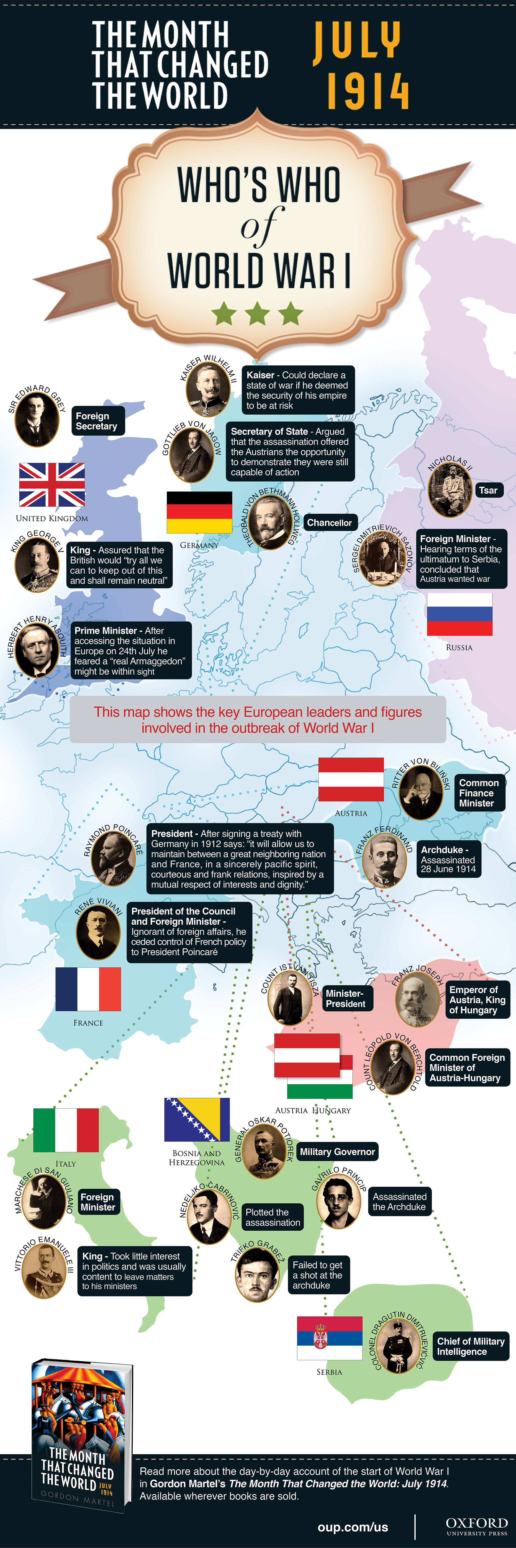
Download a jpeg or PDF of the map.
Gordon Martel is a leading authority on war, empire, and diplomacy in the modern age. His numerous publications include studies of the origins of the first and second world wars, modern imperialism, and the nature of diplomacy. A founding editor of The International History Review, he has taught at a number of Canadian universities, and has been a visiting professor or fellow in England, Ireland and Australia. Editor-in-chief of the five-volume Encyclopedia of War, he is also joint editor of the longstanding Seminar Studies in History series. His new book is The Month That Changed The World: July 1914.
Subscribe to the OUPblog via email or RSS.
Subscribe to only history articles on the OUPblog via email or RSS.
The post Political map of Who’s Who in World War I [infographic] appeared first on OUPblog.

By: Daniella Frangione,
on 7/2/2014
Blog:
OUPblog
(
Login to Add to MyJacketFlap)
JacketFlap tags:
Books,
History,
american history,
American Revolution,
America,
Multimedia,
map,
kennedy,
frances,
independence day,
revolution,
sites,
interactive map,
cornfields,
*Featured,
Images & Slideshows,
bunker hill,
The American Revolution: A Historical Guidebook,
Valley Forge national historical park,
Frances H. Kennedy,
guidebook,
1768,
fraunces,
Add a tag
By Frances H. Kennedy
From the rocky coast of Maine to the shores of northern Florida to the cornfields of Indiana, there are hundreds of sites and landmarks in the eastern United States that are connected to the American Revolution. Some of these sites, such as Bunker Hill and Valley Forge, are better known, and others are more obscure, but all are integral to learning about where and how American independence was fought for, and eventually secured. Beginning with the Boston Common, first occupied by British troops in 1768, and closing with Fraunces Tavern in New York, where George Washington bid farewell to his officers on 4 December 1783, this map plots the locations of these sites and uses The American Revolution: A Historical Guidebook to explain why they were important.
Frances H. Kennedy is a conservationist and historian. Her books include The Civil War Battlefield Guide, American Indian Places, and, most recently, The American Revolution: A Historical Guidebook.
Subscribe to the OUPblog via email or RSS.
Subscribe to only American history articles on the OUPblog via email or RSS.
The post Mapping the American Revolution appeared first on OUPblog.

By: Alice,
on 6/26/2014
Blog:
OUPblog
(
Login to Add to MyJacketFlap)
JacketFlap tags:
*Featured,
Images & Slideshows,
Classics & Archaeology,
mediterranean,
Barry B. Powell,
OUP HE USA,
plotted,
htpmv,
lq9e,
phaeacians,
Books,
odyssey,
Multimedia,
marker,
trojan war,
map,
Ithaca,
iliad,
higher ed,
the odyssey,
powell,
Humanities,
Odysseus,
Troy,
Add a tag
Homer’s epic poem The Odyssey is a classic adventure filled with shipwrecks, feuds, obstacles, mythical creatures, and divine interventions. But how to visualize the thrilling voyage?
The map below traces Odysseus’s travel as recounted to the Phaeacians near the end of his wandering across the Mediterranean. Odysseus’s ten-year trek began in Asia Minor at the fallen city of Troy (the green marker) following the end of the Trojan War. His ultimate destination: his home in Ithaca (the red marker). Click the markers for information on each step of his journey. It is important to note that the 14 locations plotted on this map have been widely debated by both ancient and modern scholars.
Barry Powell, translator of a new edition of The Odyssey, asserts that the currently agreed upon location of the Island of the Sun (#11) is in fact modern-day Sicily. However, the characters in The Odyssey are in “never-never land,” and consequently, the locations plotted cannot be deemed entirely accurate.
Click here to view the embedded video.
Barry B. Powell is Halls-Bascom Professor of Classics Emeritus at the University of Wisconsin, Madison. His new free verse translation of The Odyssey was published by Oxford University Press in 2014. His translation of The Iliad was published by Oxford University Press in 2013.
Subscribe to the OUPblog via email or RSS.
Subscribe to only classics and archaeology articles on the OUPblog via email or RSS.
The post A map of Odysseus’s journey appeared first on OUPblog.

Some months ago, I began to see information about Aaron Carapella's map, "Native American Nations - Our Own Names & Locations." It is an admirable and ambitious project, and it held a great deal of promise... But.
The ways in which Carapella writes about the project is a bit off-putting. For example, he writes that "We also honor the Indigenous Nations of this land by giving them ownership of their own names for themselves." I don't know who "we" is (Carapella and his team?) but how do they have the power to give any nation ownership of its own name? Doesn't that sound a bit silly? It is not a small point. The whole point of the map, as I understand it, is to make it clear that Native Nations had concepts of nationhood prior to European contact. That included the names they used--and use--for themselves. Saying that he gives them ownership of their own names does the same thing outsiders did.
The map itself, he tells us, has the "original names" that a nation used (Numuunu instead of Comanche), but that sometimes, the name on Carapella's map is a "given name" because the original one is not known. As far as I can tell, the map itself does not tell us which ones are original and which ones are given.
Because of the massive amount of inaccurate information about American Indians that circulates in a wide range of media, it is especially important that a map such as Carapella's be accurate. I took a look at the part of the map that has Pueblo Indians on it. Carapella shows the current pueblos (some of them are not in what I deem "accurate" locations), but he's also got one on there (Piro) that he would probably put in his "numberless" category -- which I take to be no longer in existence. I think that Piro ought to be in a different font so that we know it is "numberless."
I cross checked the spellings he used for the pueblos and found several errors. That's too bad. That information is easy to get from the Indian Pueblo Cultural Center. In my cross-check, it looks like it may have been Carapella's source, but I could be wrong. Still, those spelling errors make me wonder about the spelling of other Indian nations on the map. From a colleague, I learned that Carapella made similar errors with tribes in California.
If you bought a map already and want to make corrections to the errors for the Pueblo Nations, you can do this as a learning activity with students. First, get out Carapella's map. Second, look at the spreadsheet below (downloadable from Carapella's site). The right column is what Carapella calls "given" names. Third, find that given name on the website for the Indian Pueblo Cultural Center and see what is listed there as the "traditional" name for that tribe. Fourth, see if it matches what Carapella has on his map. If not, make a correction.
You could also look at the tribal seal. For example, on the page for Nambe, the traditional name is listed as "Nambe" but our complete name is on the tribal seal: "Nambe O'Ween'Ge."
As noted above, Carapella's project is ambitious and has a great deal of potential but I think it needs some visual way of conveying important information ("given" versus "original" names; existing versus "numberless" tribes) and I also think it needs to be sourced.
.jpg?picon=572)
By:
andrea joseph,
on 5/12/2014
Blog:
andrea joseph's sketchblog
(
Login to Add to MyJacketFlap)
JacketFlap tags:
London,
ink,
cafe,
map,
book bench,
andrea joseph,
Derbyshire,
Andrea Joseph drawings,
Derbyshire Open Arts,
Whaley Bridge,
Sketchbook Skool,
Books About Town,
Add a tag
So here's another thing I have on this month; I am exhibiting, as part of the
Derbyshire Open Arts weekend, on the 24th-26th, at
Pear Tree Café in Whaley Bridge. That's if I have anything to put on the walls. I've never had so much work on. I'm not complaining. I just can't quite keep up.
I'm off to Amsterdam shortly to film my classes for next semester's
Sketchbook Skool. And then there's the little issue of the
MASSIVE book/bench, in my living room, that I have to start, I mean finish, by the end of this month. That'll then be making it's way down to the streets of London ready for the
Books About Town trail which begins in July.
I'm exhausted just thinking about it all. Coffee! Please!! Make mine a quadruple espresso.
.jpeg?picon=3281)
By: Dain Fagerholm,
on 2/24/2013
Blog:
Art & Drawings by Dain Fagerholm
(
Login to Add to MyJacketFlap)
JacketFlap tags:
2d,
technique,
3d,
map,
wiggle,
diamond,
depth,
gif,
dain fagerholm,
displacement,
Add a tag
3D object state
©2013 Dain Fagerholm
depth map with displacement on horizontal axis
depth map
original 2D drawing
(ink pen and color dye marker on paper)

By:
Roberta Baird,
on 10/8/2012
Blog:
A Mouse in the House
(
Login to Add to MyJacketFlap)
JacketFlap tags:
artwork,
map,
houston,
a mouse in the house,
children's book art,
columbus,
www.robertabaird.com,
scholastic news,
illustration,
journey,
children's illustration,
Texas,
holiday,
digital art,
roberta baird,
Add a tag

In fourteen hundred ninety-two
Columbus sailed the ocean blue.
Scholastic News 2011

By:
Roberta Baird,
on 7/13/2012
Blog:
A Mouse in the House
(
Login to Add to MyJacketFlap)
JacketFlap tags:
columbus journey,
illustration,
Illustration Friday,
IF,
lost,
children's illustration,
digital art,
roberta baird,
portfolio,
artwork,
map,
houston,
a mouse in the house,
children's book art,
www.robertabaird.com,
Add a tag
Not all who wander are lost.
~J.R.R.Tolkien

Scholastic News, October 2011

The Fourth of July is a big event in a former hometown of mine, Seward Alaska. Every year, the little town of approx 3000 expands to approx. 30,000 to celebrate this holiday. The main reason for this is the annual running of one of America’s oldest footraces, The Mount Marathon Race®.

Mount Marathon Seward Alaska ©2012 Patricia Foldager
Runners from all over the world participate in the running up and down of the 3022 foot mountain. As a former racer, I can tell you that it is one of the most exhilarating things I have experienced in my life.
Here is a map I did of Seward for They Draw & Travel:

Good luck to my sister, brother-in-law, twin nieces, and friends as the race this year! Be safe and have a happy 4th!
*Note* for those that would like to view the race via livestream check out Ktuu.com’s site for full coverage of the race which starts at 930 am Alaska time, July 4th. To learn more about the Mount Marathon race, visit the Seward.com website.


A Print Work section has been added in the portfolio and a new illustration from a recent project.
I've been working on a leaflet for a local heritage/wildlife walk organized by various local...
[[ This is a content summary only. Visit my website for full links, other content, and more! ]]

By:
Ellis Nadler,
on 10/15/2011
Blog:
Ellis Nadler's Sketchbook
(
Login to Add to MyJacketFlap)
JacketFlap tags:
animals,
people,
watercolour,
ink,
bird,
words,
pen,
Nadler,
hat,
architecture,
Turkey,
map,
ear,
Add a tag
A postcard to
Kim Murton which I must get round to sending.
Pen and ink with watercolour. 15cm x 21cm. Click to enlarge.
By:
Ellis Nadler,
on 9/20/2011
Blog:
Ellis Nadler's Sketchbook
(
Login to Add to MyJacketFlap)
JacketFlap tags:
animals,
car,
cartoon,
machine,
graphite,
Nadler,
glasses,
fish,
hat,
sculpture,
moon,
wheels,
transport,
nose,
chair,
map,
man,
Add a tag
I'm redesigning the look and feel of Google Maps.
Pencil sketch 19cm x 18cm. Click to enlarge.
My latest project is an illustrated map of my home town that I've submitted to the site
They Draw and Travel. I love that site – check it out!
Hi again my lovelies, I'm back again to interrupt your summer with something SUMMERY.
During our New York trip, Piper of Lingdren & Smith told me that I'd probably draw beautiful maps. I had to concede the point, so I'm working on a series of maps. The series starts naturally with home, Falmouth!
I wanted to do a map that concentrated on the Falmouth I love rather than a very factual one, as I feel like I owe a huge amount to the town I felt it should be personal, but still be commercial enough to work in my folder.
First I decided my favourite things about Fal are the sea & it's exotic foliage, so my map would have a lot of water & flowers. Owing to the student population Fal isn't a lot like other Cornish seaside towns; the creativity the university draws means it's all a bit quirky on top of the usual slow Cornish pace, so I used a seaside colour scheme that's a bit more modern & a lot brighter. Fally is always cheerful & chirpy, even when it's grey & wet, which is a lot despite how many sunshines I drew on this. When the sun DOES shine it's so lovely. I'm lucky to live so close to Swanpool beach that all I see is blue & green. Swanpool is too far away from everything else to make it onto my map though, so just imagine it's much like Gylly, without the skyscraper-sized cocktail, but with a skyscraper-sized ice-cream covered in clotted-cream & pieces of chocolate.
And if THAT didn't make you want to stay in England for your summer holiday, I don't know what will.
Stats about oil, climate change & planes, perhaps. But hey! It's a Friday night, you crazy kids should be out enjoying yourselves! Go on. Just try not to wake me up when you get in.
xxx
View Next 24 Posts


.jpg?picon=1734)


2+(1).gif)
2.jpg)

.png.jpg?picon=3765)


Awww, dreamy. Please tell me she is wearing a pomegranate skirt. Just beautiful!
Hello, Linda! I haven’t been here for a while. This poem made me sad… Hope you are O.K.!!
From the other hand – here’s what I wrote for you – just to say how much I like your art…
How I’ve missed these posts of yours?
Have no answer. But of course
I’m so happy to be there -
in you world so sweet and rare!
I’m again so glad to see
flying dogs, cute birds and bees,
stars and hearts that dance together,
funny creatures in love forever,
notes and violins, leaves and flowers…
I can spend here lots of hours!:))
and I agree
totally
with Rossi!!!