If you’re a book reviewer, chances are you’ve heard about the new FTC (Federal Trade Commission) regulations concerning bloggers who review products online.
What’s going on and what do their new guidelines mean for you, the book blogger/reviewer who writes reviews? Is the FTC keeping records of who’s doing what online? Can the reviewers be fined for accepting books for review if they don’t have a disclosure posted on their blogs stating how they got their books, and whether or not they bought them themselves or were provided by authors or publishers?
The truth is, the FTC has been struggling with how to deal with bloggers for a long time. The FTC doesn’t see book bloggers as journalists, so the guidelines that apply to, say, The New York Times, wouldn’t apply to an independent book blogger. The people at the FTC see blogs as a new type of communication so blogs must be treated in a different way.
What’s the difference between a reviewer who works for a newspaper or magazine and a book blogger?
Basically, their reasoning is that in the case of a newspaper reviewer, it’s the newspaper that gets the compensation, not the book reviewer, whereas in the case of the blogger, she gets to keep the book. So there’s a direct connection between the compensation and the review. Many people think this is silly. After all, there’s nothing stopping a newspaper reviewer from keeping a book. There’s no one at the newspaper making sure all review copies are stored in a secured shelf once reviewers have read the books.
How do you deal with this new regulation if you don’t want to get into trouble and want to come across as an ethical reviewer?
The FTC has made it pretty clear: A disclosure is required.
In order to meet the standard, all you have to do is put a disclosure on your blog, a brief, clear message prominently displayed on your sidebar or on the ‘About the Blogger’ or ‘Review Policy’ pages. Your disclosure could be something like this: “Review copies are provided by authors and publishers. I don’t receive monetary compensation for my reviews.” (If you receive monetary compensation or, let’s say, a gift such an Amazon gift certificate, you must state this clearly). The clearer and more straight forward the disclosure, the more you’ll come across as an honest, ethical reviewer. It’s all about integrity and good practice behavior.
If you go to my blog, www.mayrassecretbookcase.blogspot.com, and scroll down a bit, you’ll see my disclosure on the right sidebar. As you can see, it’s pretty short.
Here is an example of a longer disclosure from a mom blogger: http://www.theclothdiaperreport.com/2009/07/disclosure.html.
Though the degree of prominence isn’t spelled out (as far as I know), some bloggers are including this disclosure at the bottom of every review they post, but this isn’t really necessary, not as long as the disclosure is easy to find somewhere on your blog.
The FTC regulation is a good thing for the consumer. If you’re a reviewer with Amazon Affiliate purchase buttons all over your blog, I want to know if you’ve accepted monetary compensation in exchange for your reviews. Granted, most bloggers earn only pennies from their affiliate buttons, but I still want to know.
The FTC guidelines also put responsibility on the authors, publishers and other marketing people (such as publicists) who are trying to promote a book. For example, if you’re an author looking for bloggers to review your book (as in the case of virtual book tours), you should make sure those bloggers you send your book to have that disclosure. Or at least, this is what the guidelines suggest.
But to go back to one of my initial questions: Can reviewers be fined for accepting books for review if they don’t have a disclosure poste
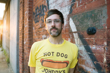
(Photo by Anna Wolf)
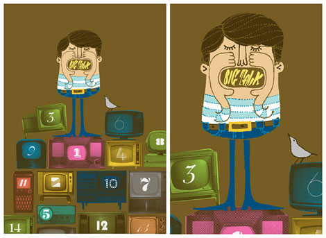
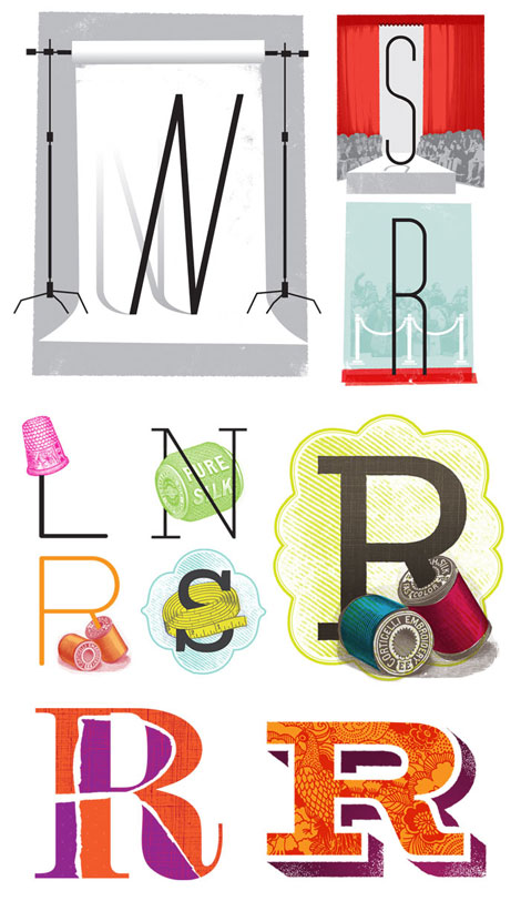
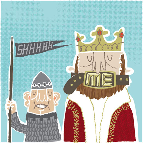
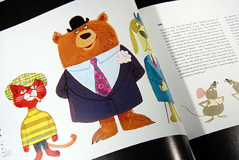
Let’s travel to the boogie down borough of Brooklyn, New York — home to the colossal rides and hot dogs at Coney Island, the beautiful Central Library, and one of my favorite illustrators Jim Datz.
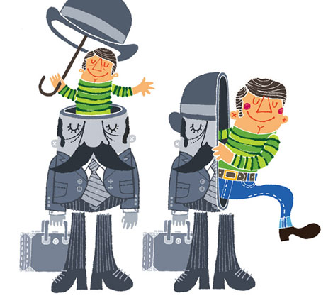
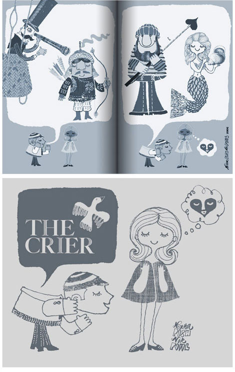
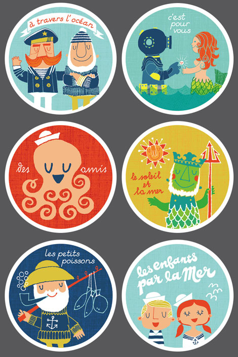
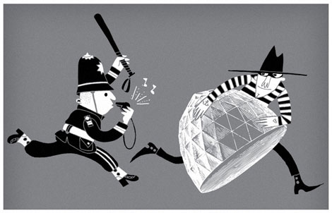
For those who are in the know, Jim goes by the moniker Neither Fish Nor Fowl. His work is reminiscent of olden times, with images of sailors, explorers, keystone cops, and mustached men in bowler caps.
In this interview, he discusses his transition from architecture to illustration, dapper gents and hippies, his creative process, and reveals something that most folks don’t know about him.
Let’s dive right in, shall we?
What’s the story behind “Neither Fish Nor Fowl?”
I’ve always been drawn to the shapes of letters & words and the slipperiness of language. I also tend to lose most of my better ideas (words AND images) if I don’t record them immediately. They get muddled if I try to reconstitute them later. So most of the time, I walk around with pocketfuls of paper shards, scribbled post-its and dog-eared notebooks containing words & phrases that bubble up from my subconscious. When it came time to name my fledgling practice (founded after a long meandering path through the applied arts), I consulted that pile of ideas and Neither Fish Nor Fowl seemed appropriate for my many-hat-wearing business. I also like the shape it makes!

Where are you from originally and how did you end up in Brooklyn?
I grew up in South Jersey and spent most of my time on a skinny sandbar lined with tidy little suburban houses and a slew of very odd things like shipwrecks, spaceship-shaped water towers with smiley faces, buildings shaped like elephants and devil children that supposedly haunted the nearby pine forest. My family history includes water ski pyramids, diving horses, tightrope walkers, lifeguards, and kangaroo pugilists. And all of these things were arranged primly at the edge of the Atlantic, ready to be erased overnight by one ill-behaved tide.
After a while, I wound up in Philadelphia studying Architecture at the University of Pennsylvania, spent too many years determining it was not the best career path for me, then took a very fortunate sideways leap into Graphic Design. I stayed in Philly for another decade, working at Urban Outfitters for most of it (where I eventually managed to shoehorn Mike Perry, Damien Correll and Daniel Keenan into a tiny little room where we churned out piles of really enjoyable things–and went to A LOT of meetings).
I began Neither Fish Nor Fowl in July of 2006, just after leaving UO. I needed to clear my brain and regroup after so much time spent in service of one brand, so I spent most of my savings on a lengthy sabbatical in London. I definitely wanted illustration to be a large part of my new business, and my goal was to use the self-subsidized free time to build up my book. I did a good portion of the independent work on my site while sitting in my little London flat hoping that it’d be good enough to attract clients when I returned to the States. After 6 months, I flipped a coin (literally), and it chose Brooklyn over Portland. This was a very good thing because many of my dearest friends have migrated here, and I’m lucky to have fallen back in with all of them.
What are some of your favorite things about Brooklyn?
Brooklyn has its ups and downs, but the ups are much more “up” than most places I’ve lived. Some days, everything comes together and it occurs to you how special it is here. There’s an energy that fuels the making of things. There’s also an unusual concentration of immensely talented and motivated people, which is a really good cure for laziness (lazy people tend to get left in the dust here). And the epic social, cultural and economic diversity tends to produce some fantastic hybrids. When given the option, I prefer to avoid monoculture. More options keep things more interesting. And because everyone consents to live with the little daily frustrations of the place, there’s an unspoken sense of “we’re all in this together and so I’ll help you out.” That’s another thing I love—everyone helping everyone.
Would you ever move back to London or relocate to the West Coast?
Oh absolutely. My heart belongs in so many places now that there’s little left to go around. But having the option to roam around while still making a living is a tremendous privilege. Fortunately (for my generation), it’s getting easier—not bureaucratically (especially to move somewhere for an extended period)—but it’s so much more in reach than it was for my parents’ generation. On one hand, it feels liberating, but on the other it’s frustrating to have something so close that you can’t write it off as impossible. Still, I’d like to keep moving. Someone make it easier for me and I’ll hit the road right away!
It’s imperative to leave your context and culture behind for a while. There’s a tremendous expansion that you experience—a suppression of the ego and a reawakened sensitivity to the tiny details that make up everyday life. These are the things you tend to erase from your conscious mind when you’ve slipped into a groove at home. Returning from a long trip with your mind and eyes primed for sponging up new things always results in a renewed understanding of where you live. I’ve learned more about America by leaving it than I ever learned by looking it in the face. It’s hard to see things accurately when you’re inside them. So whether I’m actually traveling, or devising some compensatory strategy at home to induce a similar sensation, I try to get out of my context as much as possible. It yields the best ideas.
When did you first become interested in illustration/design?
Image making has been a constant from as early as I can remember. But the gradual realization that it could be used in service of a career was a much more organic process, usually characterized by moments where i randomly crossed paths with someone awesome who was doing something MUCH more interesting than me, and thinking “oh, so I can do THAT for a job?” I’m painfully slow at figuring these things out. But I’ve learned a lot about a lot of things along the way. It all gets used eventually.
What was the first drawing you remember making and how old were you?
When I was really little I was taking asthma medication regularly, and one day managed to shazam my chin on the asphalt at recess. The subsequent stitches required a few shots of Novocain, and that reacted with the asthma stuff…and basically I turned blue and pretty much croaked. Somehow I managed to document the resulting hospital visit in the form of an illustrated book—essentially a comic book about trauma. Fun! So maybe boredom, easy access to crayons, and lots of free time was the beginning of everything for me.

Did you attend a traditional art school? If so, what was your experience like?
I went to school for Architecture (a fact that will probably seem obvious to anyone who’s a stickler for proper typography) and loved it enough to work my butt off for a Masters Degree. The curriculum was heavy on theory and light on technical stuff, and because I liked living in an idea bubble, it was fantastic. I gorged myself on art history, urbanism, philosophy and sociology, and tried every chance I could to avoid inconvenient earthly limitations like gravity and budget. Thankfully, a great deal of architectural education is portable and not product-specific. A similar process of investigation, problem solving and presentation can yield buildings, toasters, websites, and printed matter…and ultimately this saved my butt when I decided to leave the profession.
The deal-breaker was the amount of time it took to express ideas in brick and steel and glass, versus paper or pixels or some other more immediate means. The complexity of the architectural process, its lengthy documentation of nuts and bolts and endless negotiations with people (and their respective egos) began to wear on me, especially since I was more interested in the IDEA of the building (or urban project) than how it was going to get maneuvered into existence. And anyway it was far less combative to work with printers than with contractors. In the course of stumbling through some sloppy graphic design projects for very patient “clients” (i.e. friends), I realized that I found a medium I could love more. I’m fortunate that I had the option to switch.
How was the transition between architecture and design/illustration? Was it difficult?
The initial decision was totally nerve-wracking, mainly because I was deciding to leave a career behind with no guarantee that I’d find success in the new one. I had already committed a great deal of time, money and effort to Architecture. But luckily conditions in this country were such that a lateral move was not only possible, but in my case quite beneficial.
I love that now, after a decade of doing graphic design, I am finally coming back around to thinking about urbanism and built structures. The past several years have seen an incredible concentration of thought and output from architects and urban designers all over the world, and while I don’t think I’ll ever go back to making buildings, I’ll certainly enjoy thinking about them!
What was your first design job?
Everything I learned about graphic design happened through a few lucky job opportunities:
When I was finishing graduate school, a toy company posted an ad for a summer job on one of the job boards in my studio. The assignment was to sit in a roomful of knockoff Lego parts, concocting new ideas for play sets. I jumped on it. A year later, the same company opted to build an in-house art department to manage the design and marketing of there new hit product: Super Soaker water pistols. So I managed to learn the rudiments of graphic, product and packaging design on the job (heavy on the drop shadows - haha).
My second break came during an interview at a company that designs interiors, custom furniture and fixtures for progressive retail boutiques. They approached me to be their first official in-house architect, but I basically blew the meeting by saying I was considering leaving the profession and the job was probably not for me…at which point the owner said “Wait, let me call my wife at Urban Outfitters. I think they’re looking for a graphic designer over there.” So I pressed on: an optimistic ignoramus with a portfolio of abysmal work (that I would have NEVER hired me with), and for some reason the outgoing Art Director liked me and I squeezed my way in there. I essentially owe my design career to them, at least as far as having a well-padded portfolio and a ton of experience gained from working with many gifted folks.
What was your experience like at UO? How has it shaped you as a person and your work?
I matured as a designer there, so it was a thoroughly rewarding experience both creatively and professionally. It allowed me to slide safely away from architecture, provided a very rapid portfolio-inflating environment and gave me a substantial education in how fashion retail—and business in general—functions. When I switched over to working as Art Director of the Web and Catalog division, there were only 12 people on staff in the department. When I left 5 years later, there were 60 or so. Anyone who’s worked in a start-up environment has endured a similar rapid expansion of responsibility, initially from doing everything themselves, to managing a bunch of people while at the same time trying to insulate their own creative skills from atrophy. Working at UO taught me how to function in a much larger context than sole practitioner image-maker. And I learned how to finesse my way through the politics of a large organization. Now that I’m swinging back (deliberately) to a smaller, simpler operation, I’m using what I learned to help make my own business more efficient.
Who or what are some of your influences?
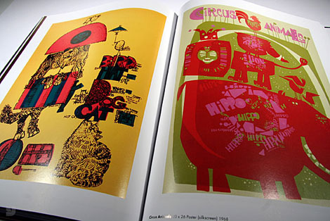
My sweet spot for the Applied Arts lies between 1954 and 1968, which seems to have been a period that—while full of experimentation—still managed to generate mass-produced cultural artifacts with impeccable aesthetics. In later decades, that sense of proportion, line, color, attention to detail and economy of materials has rarely been topped. My proclivity for this period has definitely bled into my drawing style. It’s a very conscious thing.
Method-wise, I tend to devour older things, stop looking at them for a while, then sit down and what comes out of my hand is hopefully influenced by (but not directly derivative of) my favorites, some of whom are listed here: Naiad and Walter Einsel, Jerry Smath, John Clappison, Mary Blair, Daphne Padden, Dorrit Dekk, Anne-Marie Odegaard, Ryohei Yanagihara, John Alcorn, Abner Graboff, Martin Provensen, David Weidman, Ed Emberley, the UPA Animators, Alexander Girard, Marilyn Neuhart, Grete Jalk, Hans Brattrud, Ib Kofod Larsen, Warren Platner, Eva Zeisel, and George Nelson
There’s a lifetime of design and illustration education to be had just by studying the products of those people’s hands and minds.
What contemporary illustrators do you admire?
Jeez, there are so many people out there making beautiful things every day. It’s pretty hard for me to come up with a list that’s not a hundred pages long.
Here are a few makers in my neighborhood that I admire and gain tremendous motivation from being around: Mike Perry, Damien Correll, Mario Hugo, Garrett Morin, Justin Fines, and Naomi Reis
And elsewhere, these folks regularly blow my mind, set the bar higher than I’ll ever reach, and all seem to share an affinity for mid-century culture, each absorbing and advancing it in their own way:
Shinzi Katoh, Rica Takada, Toru Fukuda, Jonas Bergstrand, Esther Aarts, Frank Chimero, Adrian Johnson, S.britt, Lab Partners, Invisible Creature
Outside the MCM circle, I’m in awe of the deceptively simple work of Raymond Biesinger the “hello, here’s the inside of my head” maximalism of Jim Stoten, and the lovely precision of Jessica Hische’s typography.
What is a typical day for you like?
I wish I could offer a romantic description of early rising, thoughtful tea-drinking, inspiration-gathering and effortless creation, but usually it goes like this:
- wake up later than intended
- run to the studio while eating a bagel
- answer emails & make some phone calls
- bid on new projects, forget to bill for old projects
- get distracted online for a while (ugh)
- panic, shove the unfiled piles aside
- make stuff until late in the evening
Pretty much the same as everyone, I guess. Someday I hope to find a more elegant process. One of the other challenges of living in NY is suppressing the constant feeling that you’re missing something important elsewhere in the city…because there IS something important happening pretty much every minute.
How would you describe your creative process?
It depends on the project, but every assignment usually involves preliminary research—during which I try to sponge up as much relevant material as I can—to get in the appropriate headspace (similar to acting, I assume). Then, a period of editing and distillation (to prepare my mind and studio for work). Somewhere along the way a few directions will begin bouncing around in my head, so I’ll jot them down on the aforementioned shards of paper.
If I get stuck, I can always jump start new ideas by digging into old sketches or doing some busywork. I’ve also found that many of my best ideas come when I’m working on some other project, when my brain isn’t supposed to be solving the first assignment (and it misbehaves by conjuring something amazing). Business meetings are also excellent opportunities for doodling in the margins of your notes, allowing your subconscious to solve everything. Many times I’ll look back and wonder how the heck I came up with half my stuff.
Once I get rolling, I focus and drill down really deeply and begin executing the piece. Usually this involves taking a teeny scribble from one of the paper piles, scaling it, tracing it, and iterating until I get a final clean sketch. Then I’ll redraw the entire thing in pieces on crappy paper towels and napkins, trying to squeeze a ton of variety and life into the line work. Once I have all of the parts gathered (some hand-drawn and some sampled), I scan everything and do the layout and coloring on the computer. I’m not super confident in my color sense, so usually it takes a lengthy trial-and-error process to arrive at something that looks good to me. I also make some happy accidents along the way, many of which tag along in the final piece.
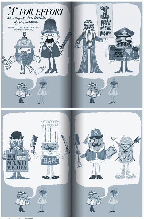
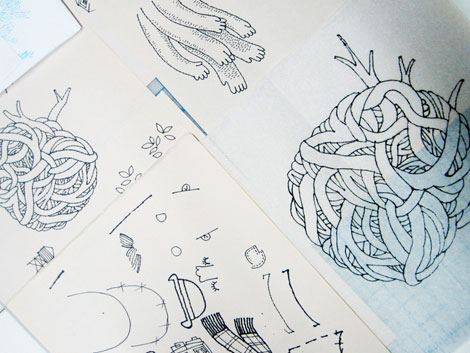
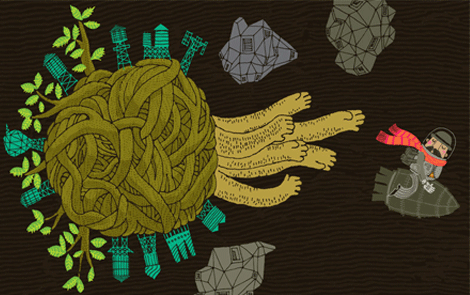
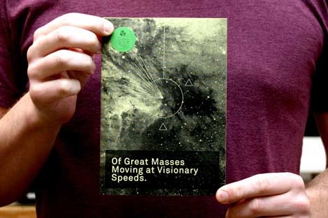
Jim was kind enough to show us process images for one of his illustrations titled “Asteroid Rage.”
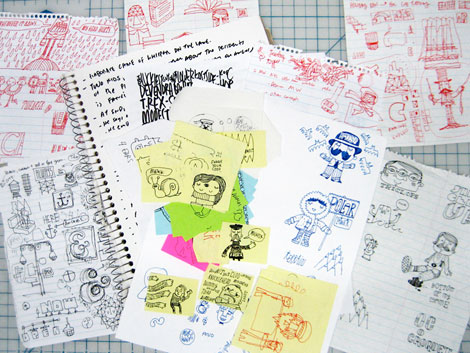
The shreds of ideas I mentioned, documented before I forget them. This is where everything begins. In the case of this example, it’s an unassigned piece on a day that I felt like making something new.
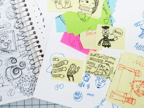

Details of the pile.
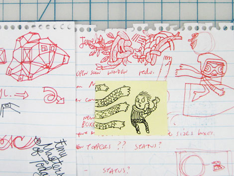
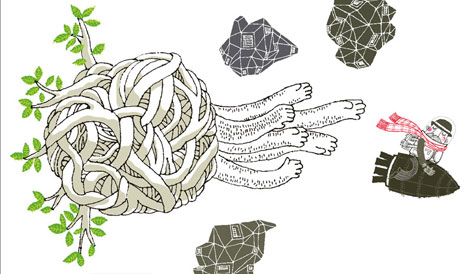
So, at some point a few of the scribbles will start to separate from the mess. I’ll hook onto something, and I’ll get an idea about a larger image. In this case it was a combination of several: the bullet-riding guy, the menacing arms, the architectural asteroid and the twisty tree branch knot.
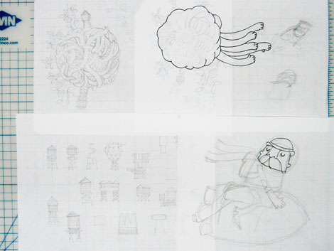
I’ll begin by sketching more resolved versions of the doodles, trying to work out another level of detail and overall composition at the same time. How to bring these elements together?
Then I’ll do some tracing, to tighten up the initial sketches and revise details on the fly.
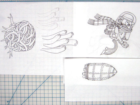
OK, now a critical point for the piece. I will redraw the simple contour drawings using different pens on a variety of materials (newsprint, napkins, watercolor paper, paper towels—each chosen to result in a particular quality of bleedy line. I like processes that result in controlled accidents.
Next comes a boring phase of scanning all the fragments and prepping them in Photoshop. I make little tweaks to line density during this period. Since I’ve decided to make this particular drawing in InDesign, I save all the linked files in a way that will make it easy for me to place them later. This is not always how I work. Lately I’ve been doing a lot of Live tracing in Illustrator, for speed and flexibility. But for certain pieces I prefer to work in InD, so there’s no loss of quality in the lines themselves. Anyway, after the scanning is complete, I start placing everything to get the overall composition locked in. I also throw some preliminary color on them to figure out a palette.

Then I clickety-click my mouse for a while, creating the vector color fills that will sit behind the scanned line drawing elements. I do quite a bit of experimentation with color during this phase.
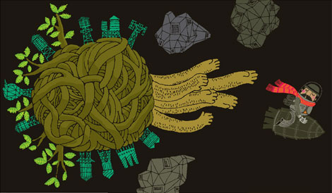
Then I switch on both layers to see how the piece is progressing. In this case, it’s nearly done, but I want to add more texture, especially in the background because it’s looking too flat to me.
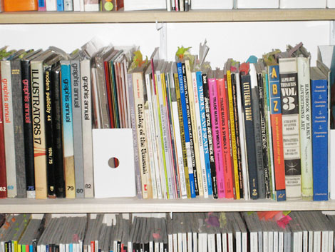
Most of my textures are sampled from old clipart and advertising books. I especially love using bits of old etchings. So I go to the trusty bookshelf to grab something appropriate, scan it and drop it in.
And at some point everything clicks and I decide “OK it’s done”. If this were a print piece, I’d have probably limited my palette more, to keep it manageable as a screenprint, but for this one I wanted to work unencumbered by those constraints. Time for a tea and some cookies!
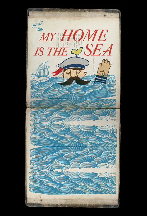
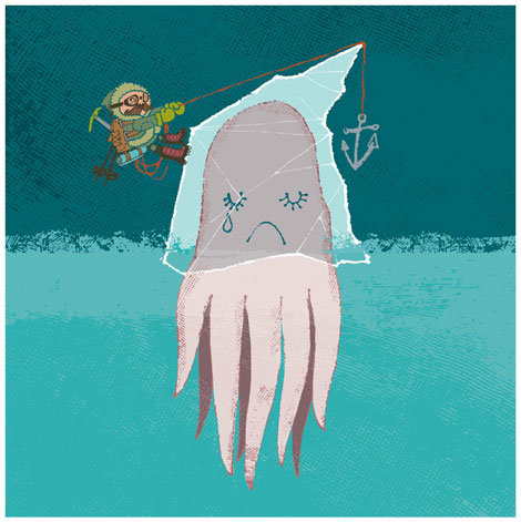
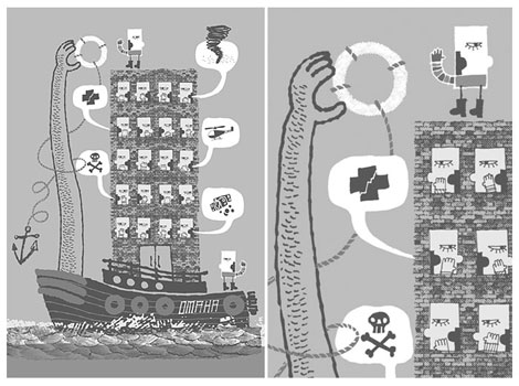
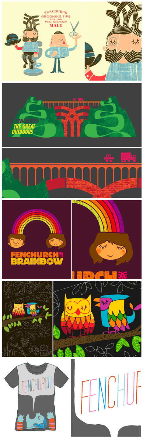
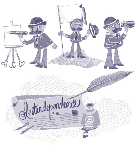
I notice a lot of reoccurring images in your work. What’s up with all of the mustached gentlemen in top hats, the sea, and hippies?
It’s tough to answer that because, to be honest I don’t think much in advance about it. I tend to indulge in whatever motifs are pushing against the roof of my subconscious, and that’s usually what comes out. It’ll change over time, though. I’m only interested in hippies in a tongue-in-cheek way these days. I suppose if I had to ascribe some “meaning” to it, all of those things embody a certain romantic notion of freedom and looking into the unknown. In the case of the mustachioed chaps, it’s really because they’re more fun to draw. Mustaches, monocles, etc.
Sometimes they become trendy and overused. Sometimes not. Sometimes I’m ahead of that. Sometimes not.

Well said. I was looking at your latest contribution to Owen Gildersleeve’s zine, and I thought the image of the hippie vs. dapper man had to do with your wanting to move to the West Coast.
Hehe yes! That was one instance where I got a bit autobiographical. It had to do with deciding where to relocate after London. turned out to be Brooklyn. But not dissing west coast hippies. They’re my favorite of that species.
Haha, I take it you wouldn’t want to move out here then?
No I’d love to move out there. I think with that little Owen thing I was trying to articulate that the hippy probably represents the west coast that i temporarily put on pause—a west coast that in my mind (at the time) would have involved a major life deceleration. Hopefully when I move out there someday, it’ll be to move forward and embrace newness, not to settle down too much.


I’ve noticed you’ve collaborated quite a bit with Mike Perry and a few other artists. What has that experience been like? Who would you like to collaborate with next and what would the project be?
It’s something I don’t get to do nearly enough. I love the “conversations” that occur while doing a team drawing, etc. I always learn a lot about my own work by surrendering a chunk of it to someone else’s hand. Mike and I work on things from time to time because we share a studio space, so it can be pretty spur-of-the-moment, although lately our collaborations tend to manifest more as critiques of each others’ work-in-progress. I rely on him a lot when I get stuck on a piece (and vice-versa, I assume he’d say).
Since leaving UO, I haven’t had time to work with a lot of my old friends, so hypothetically it’d be great to do hand-paint a driftwood shack with Justin Krietemeyer and Steven Harrington. I also think it’d be great to collaborate across disciplines — with an architect or scientist or…someone moving society forward.
How do you pair a concept with your distinct style?
Do I have a “style?” I suppose I do for the vintage-inflected illustrations. But my design work (especially at Urban) was all over the map style-wise. We always tried to embody a certain sensibility, but the style was malleable. Seems to me that style is assigned by viewers of the work more than it is by the maker.
But I know what you mean—I’ve done enough self-initiated projects in “my own style” that clients ask me to produce work in that mode. Which is nice because I don’t have to invent a new visual language for every assignment. The challenge is to avoid self-pigeonholing, because eventually the market will move on to new things. That’s why i still use my personal work as a proving ground for future projects. There’s more room to innovate when I do it for myself. More often than not, I am contacted because of one of those pieces.
Occasionally I’m approached by a potential client to make something that lies outside what I believe I can draw well. Given enough time, I could probably draw anything, but it wouldn’t be sustainable budget-wise. The more I work, the more I realize that initial conversations with clients are key to assessing the quality of the collaboration. Recently I talked someone out of working with me (even though it would have been a well-paying project!). Midway into the conversation, I realized they called because they were responding emotionally to my work, but the assignment they had in mind would have precluded that style of drawing. It’s hard to separate your emotional reaction to a piece from its viability as a strategic solution to a problem. (even for creative directors).
How do you know when a project is finished?
I work a lot—but I work really slowly—so most of the time it’s “finished” 30 seconds before the deadline. When I’m not working under someone else’s time line, there’s a point where a drawing “clicks” and FEELS complete. Because I obsess so much over little details and the specific quality of line, that click moment doesn’t usually happen until I’m well over my budgeted time for the piece. I struggle with this every day, because i always feel like I’m handing off unfinished, rushed work. My posters take like a month apiece and don’t earn much money if you add up the hours. I try not to add up the hours. ☺

What’s next for Sir Jim Datz? Do you have any neat projects coming up?
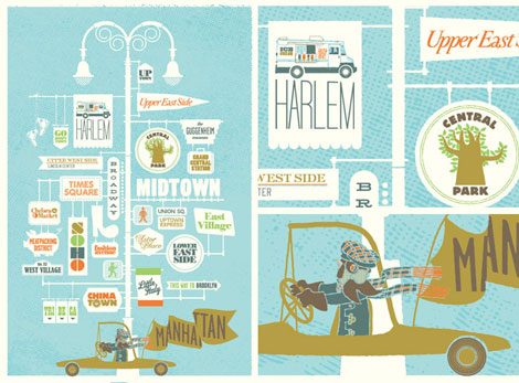
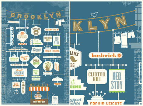
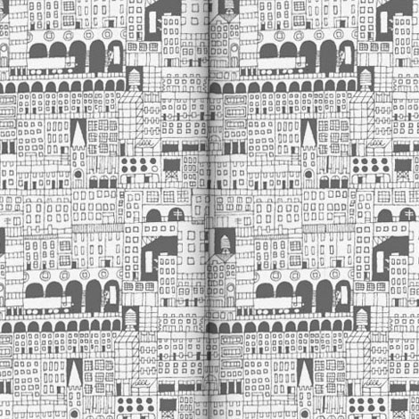
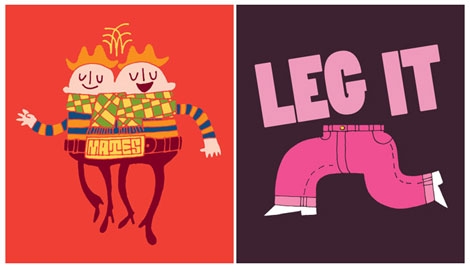
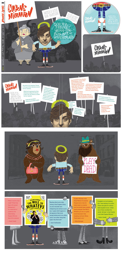
The next in a series of typographic city posters (can’t tell you which one yet) produced thanks to the brilliant merchant-curators at Three Potato Four, Eugene Mirman’s new CD for Sub Pop (under the amazing direction of Jeff Kleinsmith), a new small run tee shirt for Collective Edition in Australia, a series of little prints for one of my favorite London shops, and a hand-painted skate deck for Contributor—a lovely Canadian organization that connects low-income kids with new skateboards.
If you could recommend 3 books and albums, what would they be?
Argh. That’s even harder than picking a short list of illustrators!
Books — Vurt by Jeff Noon, Fishboy by Mark Richard, and Invisible Cities by Italo Calvino
Albums — Parklife by Blur, The Lemon of Pink by The Books, and Return to the Sea by Islands
What’s one thing most people don’t know about you?
I once had a pet raccoon that was rather fond of potato chips and silverware.

Here’s a big interweb hug and thanks to Jim for taking the time to answer A LOT of questions and making this interview happen! Without him, we wouldn’t have known that raccoons like silverware, nor would I have found out about the best lobster sandwich ever. To see more work, check out his website, Neither Fish Nor Fowl . Be sure to have a gander at his ephemera section for little found treasures such as his glittery money.
———————-
Enjoy reading this interview? Please leave a note in the comments and consider signing up for our tasty free grain edit RSS feed.
Also worth checking: Adrian Johnson interview.
———————-
No Tags
Share This
Congrats to MCHL of Sacramento. You are the winner of the Incase HunterGatherer laptop sleeve.
Grain Edit recommended reading: A Russian Diary
©2009 Grain Edit - catch us on Facebook and twitter


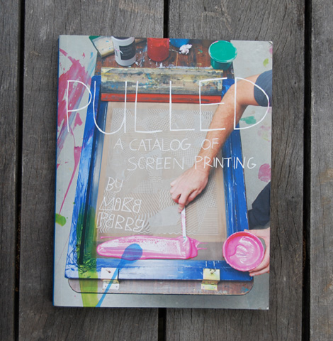
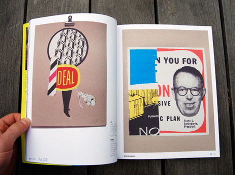
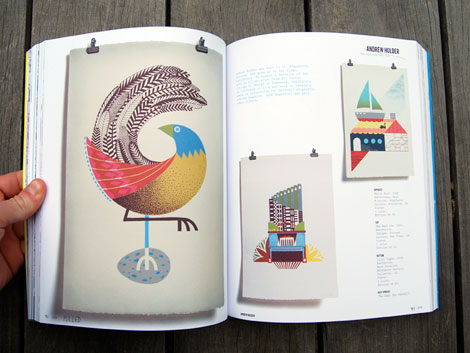
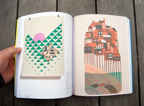
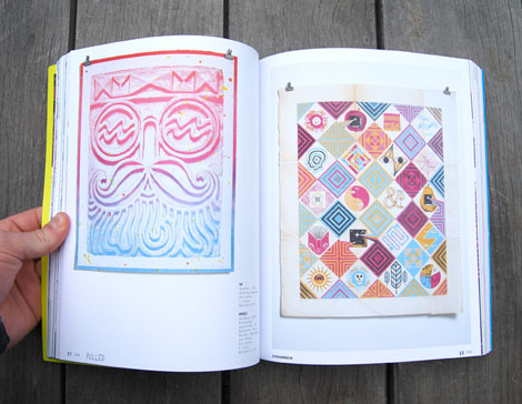
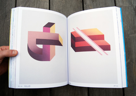
Back in Febuary we featured John Foster’s work for the So-Cal Fire Poster Project . Recently John contacted us regarding his latest project, a book on packaging design entitled FOR SALE: Over 200 Innovative Solutions in Packaging Design. The book features many of the designers we’ve featured on Grain Edit including: Invisible Creature, Wink, Jason Munn of The Small Stakes and Burlesque of North America. In the exchange below John shares some of his thoughts on the book for Grain Edit Readers.

Your last book, “New Masters of Poster Design,” really captured a worldwide return of an important application of design (you might have noticed we enjoy a poster or two around here) - what made you turn your focus to packaging design?
Well, poster design is still my one true love and always will be. However, the point of that book was to curate a collection that would turn the world on to this amazing movement going on under their noses. With “For Sale,” I saw something similar; this amazing wave of packaging design we are experiencing. Only this time the renaissance is so close to the consumer that they don’t even realize it. Selling products in a fragmented marketplace is more and more challenging and I wanted to show the designers who were up to the task.

Besides seeing so many of my favorite folks included, the first thing I noticed was the broad range of firms featured.
Yeah yeah yeah! That was vital to me. I wanted to profile huge global corporate work from the likes of Sterling and Wink (two totally different approaches) as well as cutting edge music packaging like Seripop to everything in-between.
Speaking of music packaging, the book features a good bit but doesn’t overwhelm, what was the deciding factor on including certain firms in this field?
A few folks are just making breath-taking work but really the designer had to be offering more in the experience with the consumer. Folks like Sub Pop and Invisible Creature are pushing for ways to make the CD vital in an itunes world - and succeeding! Other folks like Sleep Op or BankerWessel or Jewboy just make painfully thoughtful designs that speak directly to the audience in ways only they can.
That also touches on the range notion. The balance between new guns and the old guard.
The caveat is to be making important work. Sharon Werner made Target’s cleaning goods section a joy to be in. Sagmeister still sells clients on producing his concepts to the fullest like no one else in the industry, Art Chantry will always be Art Chantry and it tickles me (and is an important distinction) that he still doesn’t use a computer in his work. The “kids” are just catching my eye with mind-blowing work.
It seems like a sense of humor caught your eye as well.
Guilty as charged. Some of the pieces from Modern Dog like I”m Not Gay, I jUst Like Rainbows and Methane’s barrage of gum packaging just crack me up. I also don’t care much for pretension in design for the most part. Pentagram’s Saks packaging is here because it is so playful and witty in the way it deconstructs the black and white brand.

You not only wrote the book but designed it as well. Sounds like doing double duty.
It certainly magnifies the work. My first book was designed by the publisher and I won’t ever do that again with a collection like this. Having had my own work featured in books or catalogs that left me scratching my head, I really strive to create an environment where the work itself gets to sing.
Any ultra secret behind the scenes items we can be let in on before you go?
Ha ha - no. If I let you in on my super double secret curating process than my publishing career will be over! I will tell you that I actually took a lot of photographs for this book myself so that I could retain a consistent airiness in the design and give the proper perspective in a comprehensive shot whenever possible. (Thats a mouthful!) Thank goodness for the natural lighting in the alley next to my office. Not that I wasn’t already busy enough playing writer and designer but I thought it important enough to go the extra mile to get it right. I hope I at least have that in common with the stellar designers shown within.
We’d like to thank John for taking the time to share with us. For those interested, You can purchase a copy of FOR SALE: Over 200 Innovative Solutions in Packaging Design here.
No Tags
Share This
New giveaways coming soon at Grain Edit ©2008 Grain Edit


.jpeg?picon=3496)


Thanks for explaining this! I don't do reviews on my blog at this point, but I might in the future and it is good to understand how it all works and what kinds of disclosures are necessary. I appreciate you doing the research and sharing it with all of us!
Great info! Thanks!
I get lots of product reviews on my blog but I'd like to receive more book,dvd & tech reviews when they are available. Haven't figured out how to get them yet.