new posts in all blogs
Viewing: Blog Posts Tagged with: one and done, Most Recent at Top [Help]
Results 1 - 6 of 6
How to use this Page
You are viewing the most recent posts tagged with the words: one and done in the JacketFlap blog reader. What is a tag? Think of a tag as a keyword or category label. Tags can both help you find posts on JacketFlap.com as well as provide an easy way for you to "remember" and classify posts for later recall. Try adding a tag yourself by clicking "Add a tag" below a post's header. Scroll down through the list of Recent Posts in the left column and click on a post title that sounds interesting. You can view all posts from a specific blog by clicking the Blog name in the right column, or you can click a 'More Posts from this Blog' link in any individual post.
Sometimes, it’s just not fair to judge a book by its first issue. They’re just so different from what you’ll end up getting on a monthly basis. First issues have an incredible amount of work to do, work that’s extremely hard to do well in 22 pages–in fact, a lot of first issues are a longer than those that will follow.
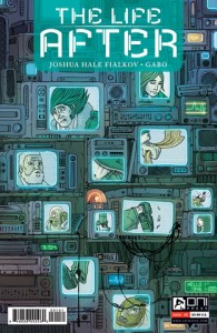
I say this because, while The Life After #1–written by Joshua Hale Fialkov and illustrated by Gabo–is a well-executed comic book, with great art and deft storytelling that rewards multiple reads, I am far more interested in what might lie ahead than what actually happened. But more on that later.
The Life After #1 begins with Jude, a young man who leads a terribly monotonous life. It’s pretty standard sad-sack stuff, but really well depicted by Gabo, who chooses to convey Jude’s static life in a meticulously composed fifty-panel grid. It’s one of my favorite things about the book, and it’s the first double-page spread.
But something is off about Jude’s life, and we’re clued in right from the start. He’s being monitored. Everyone is. And when he finally decides to break his routine, to break everyone’s routine, he realizes the truth–he’s in purgatory, and so are the people around him. He lives in a mundane afterlife for people who committed suicide. And now that he’s awake, whoever’s in charge isn’t going to be happy.
At this point, my only real gripe with The Life After is all the comparisons I want to make–not to something like The Matrix, although it did come to mind–but to a little-seen 2006 film called Wristcutters: A Love Story. It’s a black comedy about purgatory for suicides that hits a lot of the same beats. Having seen that film, it sort of robbed me of that thrill you get when discovering something entirely new, and I was worried that The Life After wouldn’t be all I hoped it would.
That’s not to say it isn’t good–there is very deep, somber stuff being explored here, and it’s well worth your time. It just felt familiar to me, and I had trouble adjusting to that.
And then Ernest Hemingway showed up, and I think everything is going to be alright.
I’m serious. Hemingway is going to be a big part of the book. Ask the author, he’ll tell you.
It’s not so much Hemingway’s inclusion that excites me, but what it represents. It was that spark I was looking for, that flash of something new and exciting and full of possibility. It suggests that this world, this story, is only going to get weirder and more whimsical, that there might be more afterlifes to explore than this one, that there are interesting questions and ideas to wrestle with here.
The Life After is off to a slow start, but I’m extremely hopeful for the ride that lies ahead. It could be a good one.
As always, support your local comic shop if you can, patronize your local library if you have one, and say hi on Twitter if you like.
 You ever see The Raid? It’s this Indonesian action movie. It (and its sequel) is probably one of the best action movies in recent memory.
The plot of The Raid is ridiculously simple. One cop, in one building, against an army of criminals. It is an hour and a half of dudes wrecking shit. It’s eighty minutes of brutal martial arts. It’s something that’s been done lots–you can describe a ridiculous number of movies that way, thanks to Die Hard–but that doesn’t change the fact that it’s absolutely thrilling, a marvel of craft and assured filmmaking.
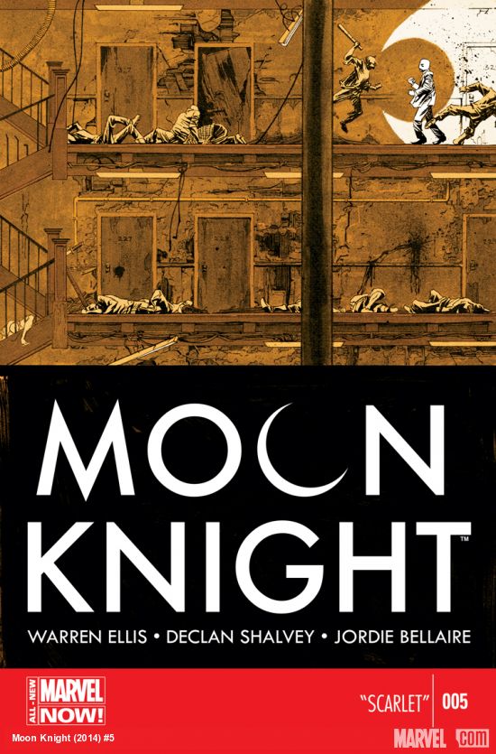
Moon Knight #5 is pretty much The Raid, but as a comic book.
A gang has kidnapped a girl who was on her way home from a school event at night. They hold her hostage on the fifth floor of a building. Moon Knight spends all twenty-two pages wrecking dudes on his way to the girl.
That’s it. That’s all that happens. It’s not much.
But it is so, so good.
How much you’ll agree with that will depend on your attitude towards plot. As I hinted at by opening this column by talking about an Indonesian martial arts film, a film or comic doesn’t necessarily live or die by how clever its plot is. Tired or thin plots can still result in an exciting story–you’ve just got to make damn sure your execution is stunning.
And Ellis, Shalvey, and Belliare continue to impress. Warren Ellis’ continues his less-is-more approach to story, with almost no dialogue outside of the opening and closing pages. He doesn’t really need much in the way of words, anyway–Moon Knight #5 is a lean, violent, action story that’s mostly carried by Declan Shalvey’s art, which gives Marc Spector’s Mr. Knight persona a slow relentlessness as he tears through thugs. He doesn’t use stealth, nor is he built like a truck. Shalvey draws Mr. Knight in a way that conveys pure surgical finesse, taking on people who can clearly see him coming–just the way he likes it.
That last bit warrants circling back to Ellis’ script. Spare as it may be, it effectively reinforces the notion of who Moon Knight is in this series. He’s a protector of those who travel by night, a hero whom the bad guys can see coming. There’s not too much in the way of new insight into the titular character, but a brief scene towards the end does give readers a bit to mull over and wonder just what exactly Ellis, Shalvey, and Bellaire will choose to explore for their final issue before the book changes hands with #7.
Color artist Jordie Belliare brings just as much to the table as she always has , working with a tight color palate that never strays too far from the cover’s rusty gold, expanding to include the browns and greens of a dilapidated tenement. Also striking is the color work on Mr. Knight himself–close ups on his biker-gloved hands and exposed forearms give a peek at the man beneath the mask, highlighting how inspired a decision it was to portray the whites of his costume by leaving them devoid of any color.
Last week, I was pretty hard on Superman #32, and comics like Moon Knight are the reason why. While Moon Knight has the luxury of not having to be too heavily serial in its storytelling and is more or less continuity free, it isn’t really doing anything groundbreaking either. It’s just a good story well told.
One commenter last week pointed out that last week’s Superman had a lot of work to do–that what I had seen as a drag was in fact some necessary housekeeping, clearing out poor story decisions made in prior runs. And that’s fine. It doesn’t change my criticism all that much–which is that the book hardly bothered to tell a story.
That, in essence, is why I wanted to do this column in this specific way. I happen to believe that a comic book should tell a story. However spare, however short–it can even be a subplot. Not trying to tell a story is a cardinal sin, something I can’t look past. I buy the comics I review in this column with my own money because I think reviewing comics you get for free makes it easy to forget how damn expensive they are, and makes you more prone to be forgiving of creators content to ship a book that only has the slightest suggestion of a story.
I review single issue comics here, not arcs or trades. And in short, I don’t want to settle for less.
A good story well told. That’s all I want for me, and for you.

By:
Heidi MacDonald,
on 6/27/2014
Blog:
PW -The Beat
(
Login to Add to MyJacketFlap)
JacketFlap tags:
Big Two Comics,
Geoff Johns,
Top News,
John Romita Jr,
one and done,
review,
Reviews,
Comics,
DC,
Superman,
DC Comics,
Add a tag
Keeping up with comics is ridiculously expensive if you want to keep up with a number of titles that come out every month. Not everyone can do that–I definitely can’t. So welcome to One and Done, a weekly column where I go to a comics shop and try to find one good book that’s worth the exorbitant price. It’s not easy.
I really didn’t want to spend four dollars on a comic book this time. June has been an expensive month for me, and I didn’t have a lot of leeway this week. Which is a shame, because Simon Spurrier and Jeff Stokely’s Six-Gun Gorilla finally came out in trade paperback, and as someone who loved Spurrier’s work on X-Men: Legacy I would love to be reading and writing about that right now. But I could only spend four dollars at the shop, not twenty.
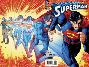
Instead, I bought Superman #32. I almost didn’t. Money’s tight, and I know how the vast majority of cape comics work: a dash of plot, a load of action, and a cliffhanger for dessert. Not to mention the fact that publishers are absolutely trigger happy with “events” and “crossovers,” which is pretty coercive and stupid but also has worked for literally ten straight years so of course they’re not going to stop.
Anyway, I should tell you why I bought Superman #32, instead of, say, Trees #2 (which is worth getting, Trees #1 might still be free when you read this. If it isn’t, let me know. I will tweet you a very entertaining plot summary) or Flash Gordon #3 (which I hear is Very Fun Comics). Some of you probably know why, because if you pay even the slightest attention to mainstream comics online, it’s painfully obvious why Superman #32 is A Big Deal. But bear with me for a paragraph or two while I address The Casuals.
On the Hype Scale, Superman #32 lies somewhere between “New J.K. Rowling Book (Non-Harry Potter Division)” and “Apple Releases New iPhone.” This is because Superman–despite bearing the name of and being about the oldest, most famous superhero in the whole world–has not been a very good book for about three years straight. And this week’s issue #32 marks the introduction of an Acclaimed New Creative Team, which makes it the Perfect Jumping On Point. The hope, then, is that this book will stop sucking.
But that’s a very general explanation for the hype. There’s an equally specific one, and its name is John Romita Jr.
Superman #32 is Romita’s first DC Comics work, after a legendary 30-year career of working almost exclusively for Marvel. That’s like Derek Jeter leaving the Yankees to play some games for the Red Sox, to use a sports analogy. He’s joined by writer Geoff Johns, who had an acclaimed tenure telling Superman stories in Action Comics a while back, and has spent much of the last decade remaking the DC Universe in his own image.
He’s a smaller part of the hype, but only because LOOK AT THE TALENT WE POACHED is a much better headline than GUY WHO DID GREAT STUFF HERE ONCE RETURNS TO HOPEFULLY DO GREAT STUFF AGAIN.
They’re joined by Klaus Janson, an inker who a good enough artist in his own right to get people excited about him drawing a book by himself, and Laura Martin, an award-winning colorist. So, the reasons to buy this book are stacked up right there in the credits.
So is it any good? No. Not if you paid four dollars for it.
That qualification is important, and should be adjusted based on how you feel about the reason we’re all here: John Romita Jr.’s art.
I, for one, really enjoy JRJR. He has a distinctive, blocky style that often feels refreshingly blue collar. Sure, his faces tend to all look similar and he can get really weird with anatomy–Superman’s head completely disappears in the fourth figure of that cover illustration up top–but there’s a lot to love about how he portrays things like physique. His Superman–and Clark Kent–is built like a truck, but not bulging with muscles made of marble. This Kal-El is less Greek god, more caped linebacker. It really helps to convey a sense of might, not just strength.
But man, the story on this thing. Let’s start with this. Here is the solicit (that’s comic speak for ad, I suppose) for Superman #32:
““THE MEN OF TOMORROW” chapter 1! A NEW ERA for SUPERMAN begins as Geoff Johns takes the reigns – and he’s joined by the legendary super-talent of John Romita, Jr. in his first-ever work for DC Comics as they introduce Ulysses, the Man of Tomorrow, into the Man of Steel’s life. This strange visitor shares many of Kal-El’s experiences, including having been rocketed from a world with no future. Prepare yourself for a run full of new heroes, new villains and new mysteries! Plus, Perry White offers Clark a chance to return to The Daily Planet!”
There are two plot points mentioned in that solicit. They are the only two things that happen in the book. There is nothing I could spoil for you if I wanted to. There’s some stuff in there about Clark not having much of a personal life and Jimmy Olsen not knowing what to do with his fortune, but they literally don’t go anywhere, as they’re most likely B-story stuff to check in on throughout the run whenever we need a break from Superman punching giant robot gorillas.
Oh, and Superman also punches a giant robot gorilla, but there’s no reason for it other than giving JRJR something dope to draw. That’s something I take issue with. I mean, if you’ve got it, use it, but use it in a justified way. If you want to have a giant robot gorilla fight (and there’s nothing wrong with that, those are awesome), then make it amazing, make it happen for a reason, make the script earn the art it asks for. Don’t waste an artist’s talent or a reader’s time.
One of the things I don’t really understand about how comics are critiqued and received are the standards that we hold creator-owned books like Saga or Fatale or Mind Mgmt to, and the ones that we judge mainstream superhero comics by. Cape comics get a pass on a lot of things: bad dialogue, barely any plot, and a near-sociopathic insistence on buying multiple titles to get a “full story,” as if they still cost ten cents a pop.
You’re going to read a lot of reviews saying how great Superman #32 is. A lot of those reviews will likely be written by people who also adored books like The Wicked + The Divine #1, a book absolutely full of great ideas and hidden meanings and lots of potential energy. Superman #32 has none of these things. So why would we call it good?
Superman #32 is a bad comic book. But ‘The Men of Tomorrow,’ the larger story of which Superman #32 is the first part, could be absolutely fantastic whenever it’s done. Everyone working on it is top notch.
But there are ways to make a good comic book, to tell a good serialized story twenty-two pages at a time. The stands are full of good examples, and we read them every week.
This is not one of them.
As always, support your local comic shop if you can, patronize your local library if you have one, and say hi on Twitter if you like.
Be back in a week.

Most of the time, trying to find a comic or two to buy in a given week is very hard. This week, it wasn’t at all. I’ve been looking forward to The Wicked + The Divine ever since it was announced. And now that it’s finally on shelves, I can tell you why.
One of the pleasures of getting into comics–and any medium, really–is identifying creators whose work most resonates with you. It’s the fun part, where you go to your library and scour its hopefully well-stocked comics section, checking everything you can out and requesting more from other branches.
You learn what you like and what you don’t. You gain an appreciation for how comics are different from any other medium. You delight in all the radically different kinds of stories that can be told by them. You remember the names of the people who told them.
If you’re lucky, you’ll find a creative team that you love, one that works together frequently and consistently tells stories that you enjoy. For me, one of those teams is that of writer Kieron Gillen and artist Jamie McKelvie.
Gillen and McKelvie are often described–by themselves and by others–as a pair that makes comics like pop songs. Their stories, from Phonogram to Young Avengers to this weeks The Wicked + The Divine #1, are ones that are boldly, helplessly, passionately about exactly what they say they’re about. They’re stories that don’t care for subtlety as much as they do about feeling alive, if only for one dance.
They don’t give a damn about being remembered, but while they’re here, you’re not going to ignore them.
The Wicked + The Divine is both the purest form of that ethos they’ve built up over nearly a decade of collaboration, and it’s also weirdly restrained in a way that feels mature and measured. It’s a title that knows it won’t be ignored, and it’s settling in to tell an assured story in its own way.
A lot of that comes from the contributions of the rest of the creative team–the colors from Matthew Wilson are remarkable, and the work of designer Hannah Donovan has done a lot to give the whole venture a strong visual identity–the reading experience starts with the front cover and ends with the back one. It’s elegance makes most books on the stands look sloppy.
There’s been a lot of hype for this book, and all of it is deserved. If you go into a comics shop and only have cash for one book, your $3.50 will be well spent on The Wicked + The Divine.
However.
Sex Criminals #6 also came out today. Now, there’s not much I can say about Sex Criminals that hasn’t already been said (and if no one’s told you about it go buy the first trade or borrow it from a friend. It’s fantastic), but I want to take a moment to talk about why you should buy this particular book as it comes out and not wait for a trade.

It’s the letters page. The Sex Criminals letters page is one of my favorite things in comics right now, for lots of reasons. The obvious one is that it’s absolutely hilarious–mostly because it shows how truly essential Chip Zdarksy is to the book’s sense of humor–but the other is because that’s where the book walks the walk.
Sex Criminals is lauded not just for being a great story well told, but for being a thoughtful, mature, look at sex and sexuality, a safe place in an industry that is often a mess of problematic sexual politics. When it hit stands, the response was overwhelming. People wrote Fraction and Zdarsky in droves.
Readers were connecting with the story in a very real way, and wrote in to share and laugh and confirm the one great truth the story is anchored in: we’re all alone together.
Every issue of Sex Criminals comes with pages and pages of letters. They’re a joy to read, and they don’t get published in the trade paperbacks (they are included on the digital versions if you buy from Comixology, though). Sex Criminals is a comic that’s worth buying; anyone will tell you that.
But there’s this extra reason that makes making a monthly trip to the comics shop or download on Comixology worth the higher expense: it’s that wonderful reminder that there are people like you out there. People who love comics, and love seeing that they’re full of stories that are a little bit like their own.
As always, support your local comic shop if you can, patronize your local library if you have one, and say hi on Twitter if you like.
Be back in a week.
One of my favorite things about monthly comics is the intro page. It has taken on special significance in recent years–I’d say it’s thanks to the wild success of Hawkeye. But I can’t say that authoritatively, mostly because I’m the guy who only buys one comic per week. But it’s a good example.
Every issue of Hawkeye tells you that Clint Barton is the greatest sharpshooter alive, that he’s an Avenger, and that this book is about what he does when he isn’t an Avenger.
Then there’s a dumb joke. It’s the best part.
The practice is far from new–superhero comics have a long tradition of slapping a boilerplate paragraph on the title page describing the hero’s whole deal in brief. But recently, with Marvel titles like Hawkeye and Moon Knight and All-New Ghost Rider, these pages have taken on a bigger role than just a reminder of who this book’s about.
They’re a mission statement. A reassurance that All You Need To Know can be summed up in a few lines above the credits. It’s very polite of them.
‘Polite’ really is the best word to describe it. See one of those intro pages in a comic book, and it’s easy to see that the book is doing you a courtesy, making a conscious effort to remain accessible and friendly to the curious (and cash-strapped). The hope is that you can jump right in and be ready to go.
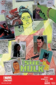
With She-Hulk #5, I absolutely did.
She-Hulk’s intro page isn’t like any of the aforementioned ones. There’s little in the way of style or design to it. It’s mostly just She-Hulk, breaking the fourth wall and telling the reader everything they need to know to appreciate the story they’re about to read–The Blue File. She also says that the currently absent letters page will be back soon.
It’s not very striking at all. In fact, it feels like a throwback. But it gets the job done, and doesn’t tip it’s hand toward the biggest surprise: Ron Wimberly’s art.
Part of the fun of all this, of buying comics off the shelf one issue at a time, is the feeling of discovery you can get. Not of just worlds or stories or characters, but of all the wonderful and diverse work that all occupies the same shelf space. Until this week, I’ve never seen Wimberly’s art before. Now I wish I had.
It’s playful, vibrant, and doesn’t give a damn about what you think. Wimberly plays with perspective, making frequent use of the foreground in panels and rarely elects to settle at eye-level, instead framing his subjects from above or below. Anatomy and proportion are more suggestions than hard and fast rules, with limbs dynamically filling up space to highlight sound effects and make the action pop off the page.
And the color work from Rico Renzi is just as bold. Day-Glo pinks and purples and oranges fill the pages, adding to Wimberly’s visual dynamism. It’s all such cool stuff, and feels more akin to a punk indie comic than a mainstream title.
Charles Soule’s script isn’t as bold and ballsy as the art, unfortunately. That’s not to say it’s bad–it’s clever and funny, with only a few beats that seem to refer back to earlier events that a new reader would be in the dark about. There’s a cliffhanger, and it’s a smart and organic one that holds promise for the rest of the arc, whether it be two more issues or six.
But man, if only it had the stones the art did.
Now comes the tricky part–how do you decide if a book you picked up on a lark is one you’re going to keep picking up or just wait for other options. I’m not disappointed by She-Hulk #5 on the whole–I’m actually very satisfied (it’s also one of the few Marvel books still selling for $2.99, so maybe that helps). But the story isn’t really one I’ll be turning over in my head much–and now that I’ve seen Wimberly’s work, I’ll be inclined to seek it out more than I’ll probably want to reread this issue.
Or maybe I won’t really know for sure until #6 is on the stands and I find myself compelled to jump back in. Sometimes you don’t have an answer right away. That’s okay. I’ve got time.
As always, support your local comic shop if you can, patronize your local library if you have one, and say hi on Twitter if you like.
Be back in a week.
What makes a comic ‘worth it?’
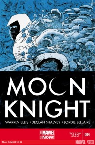
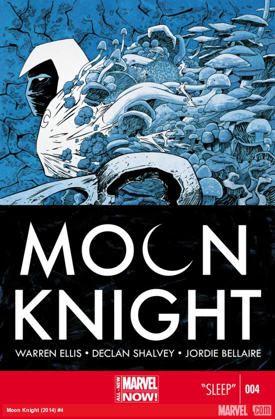
In the comments to my introductory column, a lot of readers seem to gauge the value of a comic by dividing the time spent consuming by the amount of money spent. There’s nothing wrong with that formula; it’s one that I use all the time myself. Under that formula, the comic I decided to purchase this week–Warren Ellis, Declan Shalvey, and Jordie Bellaire’s Moon Knight #4–is a terrible value proposition.
It’s also possibly the best book you could spend four dollars on.
Reading this month’s issue of Moon Knight–or really any of the current (and sadly soon-to-be-concluded) creative team’s run will not take you much time. Like a lot of books on the stands, if there’s a line for the register, you can probably read all of it before the end.
But comics aren’t just words to be read. They’re visual, and how much value we place on those visuals are where the cracks in the aforementioned formula start to show.
The subjective nature of art makes it impossible to have a definitive answer–and I have no aspirations to be definitive about anything–but is there anything all that different between an illustration hanging in a gallery that people will pay hundreds of dollars for and the art in every panel and page of a comic book? It’s a tough question, but the art team on Moon Knight is worth every penny.
Shalvey and Bellaire’s work has been a consistent delight to pour over, and they’re bolstered by Ellis’ spare scripting, which leans on the artwork to tell the story–previous issues would often barely make sense if the reader only gave the art a cursory glance. Like a song with intentionally obscured lyrics, the book’s visuals hide layers of story in its lines and colors.
It also helps that writer Warren Ellis has been using the book to show off his mastery of the short story–you’d be hard pressed to find a more satisfying collection of one-and-done stories on the stands right now. And this month’s story, a psychedelic mystery about a recurring nightmare pushing the patients of a sleep clinic to madness, is Ellis’ best yet.
Part of it has to do with the story potential opened up by the revamp–by brilliantly repositioning Marc Spektor as a literal white light in darkness, the series has opened up a story direction that is surreal and unique unto itself.
“Dreamers are people who travel at night,” says Spektor. “That is my specialist subject.”
And much like dreams, which are fleeting yet heavy with meaning, Moon Knight shows just how much you can hide away in twenty-two brief pages.
Addendum: Why I Left Out Webcomics
A lot of commenters brought up something that I probably should have addressed from the start: why no webcomics?
Make no mistake, if you’re someone who just likes sequential art as a medium and aren’t attached to paper or characters, publishers, or creators that have brand recognition, webcomics are where you want to be. The amount of incredible work available for you to read for free is absolutely stunning, and if you want to find people to talk about them with, they’re usually only a scroll or click away from the strip you just read.
Don’t let money keep you from comics. The good folks at io9 compiled this list of 51 excellent webcomics worth checking out–of them, I can personally recommend Evan Dahm’s Overside stories in general and Rice Boy in particular.
If you’re craving something more substantial, Si Spurrier, writer of the recently-concluded, extremely idiosyncratic X-Men Legacy (one of the best books Marvel put out over the last two years) has been working on Disenchanted, a weekly webcomic with a whole wiki of supplemental materials to mull over.
Also, I’ll occasionally talk about digital exclusives, as most of them run for 99 cents, a much more fair price for a serial publication. But I’ll rarely go into the same depth with a digital comic, since the agreeable price point negates the kind of approach I take for these reviews. If, for example, an issue of the absolutely excellent High Crimes isn’t friendly to new readers or doesn’t necessarily tell a complete story given its intensely serial nature, I won’t care as much. My criteria for what’s ‘worth it’ changes, and the sort of review I’d give it is the kind you could probably read anywhere else.
This column–by design–heavily prefers print comics. Print comics are a perfect storm of bad economics that most comics media doesn’t deal with. I want to wrestle with that problem here. I don’t get review copies of anything. Every comic discussed here is paid for with my own money. I’m not sure that I’ll always be happy with what I get, but making impossible choices is part of the deal. My goal isn’t just to discuss comics, but the difficulties of being a comics consumer.
So help me out: before next Wednesday, June 11th, tweet me @jmrivera02 with the most satisfying single issue purchase you made this month–and why. Tag your responses #OneAndDone, and I’ll select four winners who will receive a free digital copies of one of the four Moon Knight issues I’ve purchased so far. I’ll include your recommendations in next week’s column.
As always, support your local comic shop if you can, patronize your local library if you have one, and say hi on Twitter if you like. See you next week.


” . . . . . my only real gripe with The Life After is all the comparisons I want to make . . . to a little-seen 2006 film called Wristcutters: A Love Story. It’s a black comedy about purgatory for suicides that hits a lot of the same beats. Having seen that film, it sort of robbed me of that thrill you get when discovering something entirely new . . . . . ”
Well, if the film is “little-seen,” then it seems to me that not too many people will be deprived of the thrill of discovering something new.
I dug the first issue as well, though I too thought of Wristcutters (or rather the comic it was based on Pizzeria Kamikaze by Asaf Hanuka and Etger Keret).
Looking forward to see what Fialkov has in store though because the similarities only seem to encompass a purgatory for suicides.