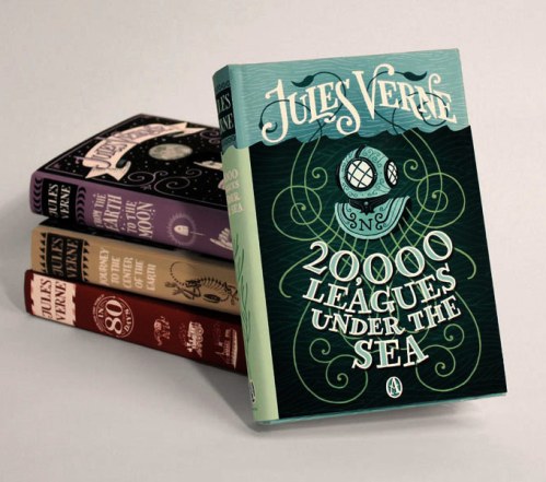
While going through the slush mail today, I came across a pair of standout illustrators in a pile of recent UArts grads. Jim Tierney and Sara Wood, a young Brooklyn couple, have a fantastic approach to book cover design. Their masterful combination of type, hand-lettering and drawing makes both of their portfolios equally impressive.
Check out Sara’s D. H. Lawrence book cover series, and Jim’s interactive Jules Verne thesis (there’s a video too!). 
 I put the cards up on the “Wall Of Stuff I Like” in my cube, right next to our other favorite hand-drawn type designer, Kristine Lombardi. Lombardi’s cards have been up on our wall for ages. While her cards have more of a feminine, fashion style (although I do like her Kids page!), they are the first thing that designers walking by are ALWAYS drawn to. Check out a great interview (including the below image of her promo card) here.
 These designers got me to thinking: where’s the place for hand-lettered type in children’s books? Before the age of thousands of freebie fonts on the internet (hey, it wasn’t that long ago!), hand-lettered display type was commissioned for book covers all the time. I recently worked on the anniversary edition for Jacqueline Woodson’s The Other Side, and I was so impressed to discover that the handsome title was calligraphed by the original in-house designer.
 And while I’m sure it took a lot more effort than downloading a font, there’s something careful, purposeful and yet whimsical to hand-drawn type. So it’s no surprise that it is experiencing a rebirth of magnificently hip proportions. Now, type everywhere looks like this:

 I put the cards up on the “Wall Of Stuff I Like” in my cube, right next to our other favorite hand-drawn type designer, Kristine Lombardi. Lombardi’s cards have been up on our wall for ages. While her cards have more of a feminine, fashion style (although I do like her Kids page!), they are the first thing that designers walking by are ALWAYS drawn to. Check out a great interview (including the below image of her promo card) here.
 These designers got me to thinking: where’s the place for hand-lettered type in children’s books? Before the age of thousands of freebie fonts on the internet (hey, it wasn’t that long ago!), hand-lettered display type was commissioned for book covers all the time. I recently worked on the anniversary edition for Jacqueline Woodson’s The Other Side, and I was so impressed to discover that the handsome title was calligraphed by the original in-house designer.
 And while I’m sure it took a lot more effort than downloading a font, there’s something careful, purposeful and yet whimsical to hand-drawn type. So it’s no surprise that it is experiencing a rebirth of magnificently hip proportions. Now, type everywhere looks like this:
0 Comments on From The Slush Pile: Hand-Lettered Type as of 1/1/1900
Add a Comment


