new posts in all blogs
Viewing: Blog Posts Tagged with: design finds, Most Recent at Top [Help]
Results 1 - 10 of 10
How to use this Page
You are viewing the most recent posts tagged with the words: design finds in the JacketFlap blog reader. What is a tag? Think of a tag as a keyword or category label. Tags can both help you find posts on JacketFlap.com as well as provide an easy way for you to "remember" and classify posts for later recall. Try adding a tag yourself by clicking "Add a tag" below a post's header. Scroll down through the list of Recent Posts in the left column and click on a post title that sounds interesting. You can view all posts from a specific blog by clicking the Blog name in the right column, or you can click a 'More Posts from this Blog' link in any individual post.

By:
Annie Beth Ericsson,
on 2/29/2012
Blog:
Walking In Public
(
Login to Add to MyJacketFlap)
JacketFlap tags:
book sale,
slow food,
park slope,
design finds,
dumplings,
a book of garden flowers,
edith f johnston,
flower books,
margaret mckenny,
nitty gritty cookbooks,
book reviews,
happenings,
chronicle books,
gardening,
cookbooks,
Add a tag

This weekend was one of my favorite annual Park Slope traditions: the Park Slope Methodist book sale! Every year, this neighborhood church collects thousands of book donations (and CDs, and records) of every kind, and the BK literati flock to pick up hardcovers and paperbacks for just a dollar or two.
This year, I tried to exercise some restraint – after all, I’ve got books spilling out of the shelves in my room as it is! But I did manage to pick up a few art and home-related titles (I was in a non-fiction mood), that are really fun!
My favorite book of the day is A Book Of Garden Flowers by Margaret McKenny and Edith F. Johnston (Macmillan, 1940). Margaret McKenny turns out to be a renowned Washington State naturalist, and I later found some of her enthusiastic letters about mushroom hunting. But the piece de resistance is Edith Johnston’s GORGEOUS lithographs of flowers! Each one is more beautiful than the next (so much so that I almost scanned the whole book!). Take a look . . .

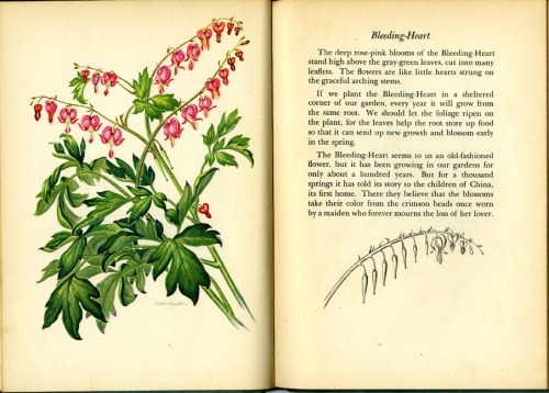
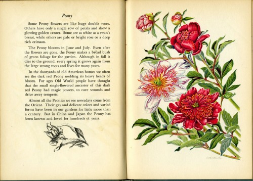


Truly lovely, no?
I also picked up a couple of cookbooks that I’m really digging:
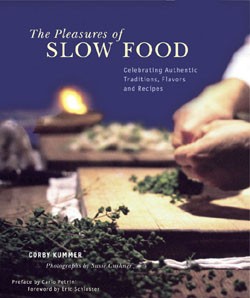 The Pleasures of Slow Food by Corby Kummer (Chronicle Books, 2002). – This glamorous coffee-table volume takes a warm glimpse into the “slow food” movement – where hand-crafted cooking methods enjoyed among company take the place of modern American fast-food cu

Well, it’s been another one of those times where my blog has hit a bit of a lag! My life these days is crazy busy, personally and professionally, so I really can’t complain. Unfortunately, it doesn’t leave a lot of room for writing about my experiences or keeping up with my social media presence. So now that I’m comfy on the recliner on vacation in Bemidji, it’s time to play a little Walking In Public catch-up…
First off, if you haven’t headed over to my new gig as a columnist on the blog, Publishing Trendsetter, you want to go to there! The site is full of great advice and insight from young professionals on those either in their first few years, or looking to get into the industry. As for me, I’ll be bringing the visual inspiration with the column, Design Candy.
A few weeks ago, I kicked it off on Trendsetter with my favorite design finds, head-to-head, from the publishing extravaganza of the year, BEA. But I had a lot of favorite moments that didn’t make it onto that post. For some reason, most of the Big 6 publishers disappoint – their large space isn’t utilized with books, but posters/video screens that don’t make an impact. It’s the indie publishers (plus the usual suspects in Chronicle, Candlewick and Abrams) that make up the best exhibits.
Missed BEA the first time around? Check out my highlights now:
Chronicle Books: Is designer heaven – no one even comes close to these guys in my book.


Abrams: They always pull out all the stops, this time with a giant snowglobe.


International: Saudi Arabia is by far the friendliest, but I love looking through all the foreign-language books.
 0 Comments on Belated BEA Busyness as of 1/1/1900

On Monday, the Art Department took a field trip to see the AIGA’s 50 Books/50 Covers of 2009 exhibit. It was a worthwhile show to attend, but I had mixed feelings about it. For one, the non-traditional gallery presentation (above) brought both advantages and challenges. I loved the low bleacher set-up for books, because I could sit and relax while browsing heavier volumes. But the bleachers did the covers a huge disservice; not only did you have to bend down repeatedly to pick up each individual cover, you had to flip the card over to even see the image.
But the main reason that I left ambivalent over the 50/50 exhibit encompassed more of my greater feelings about design in general. Without a doubt, the books on display were creatively inspiring. I loved thumbing through the photos and art, the lavish paper stocks, and the 3-dimensionality of a beautifully-presented package. Books like these make me want to go home, stay up all night and make ART. It makes me feel a little inferior that I’m not doing that kind of work already.
At the same time, though, many of these books get right to the heart of one of my greatest pet peeves: design for design’s sake. Design should always serve a purpose, complement its material, and make content accessible to its consumer. I love design because it places equal importance on being functional AND visually pleasing. But many of the 50/50 books suggest the opposite. Type running into more type, or scattered across the page, or written in tiny Helvetica Bold . . . these things appeal to the hipster art-design community, but aren’t the best solution for the general reader. Go ahead and be as artsy as you want, but please, let it make sense.
That being said, I’ve composed some highlights of the exhibit to present my case. I’ll showcase my favorites, as well as some titles that really made my blood boil.
A perfect example to explain my point? Two books, no type on the cover:
Afrodesiac (AdHouse Books) – Perfectly captures the 1970s exploitation and comic book crazes. The interior contains pictures, not words. Generally all-around badass.
vs.
Manuale Zaphicum (Jerry Kelly LLC) – Yes, the letterpressed interior is absolutely gorgeous, but I found a blank cover for a book about a type designer to be annoying-ironic, not funny-ironic.
See what I mean? Okay, now on to some favorites:
 Pictorial Webster’s (Chronicle Books) – Gimme gimme gi

By:
Annie Beth Ericsson,
on 3/4/2011
Blog:
Walking In Public
(
Login to Add to MyJacketFlap)
JacketFlap tags:
classics,
fashion,
happenings,
book design,
reading is fundamental,
book covers,
ceramics,
jewelry,
maira kalman,
design finds,
good for you,
planned parenthood,
penguin classics,
penguin uk,
coralie bickford-smith,
david pearson,
Add a tag
Since the week has been so crazy for me preparing the Spring 2012 picture books at work, here are a few announcements/discoveries to keep y’all busy:
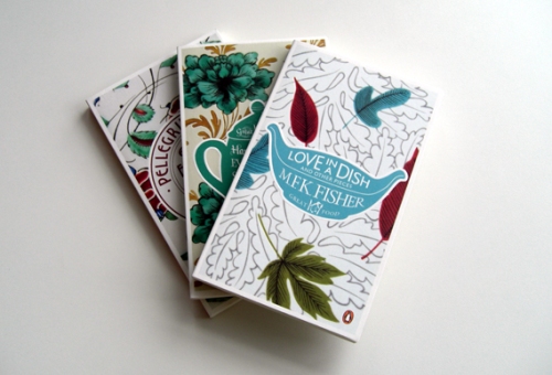
1. Seems that Coralie Bickford-Smith, senior cover designer over at the UK’s Penguin Books, has been on everyone’s brains lately . . . I received two links to her in the past few days! I have always been a huge fan of her Clothbound Classics series, but I hadn’t seen her full site.
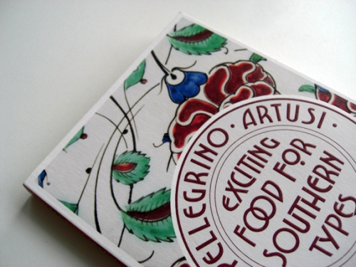
And, my goodness, take a look at her newest work! I’m getting giddy looking at this Penguin Great Food series (link courtesy of Creative Review, via Ryan, extremely cool fellow designer/cubicle neighbor). Each plate is based on vintage ceramic patterns, and I seriously can’t get over how gorgeous they are.
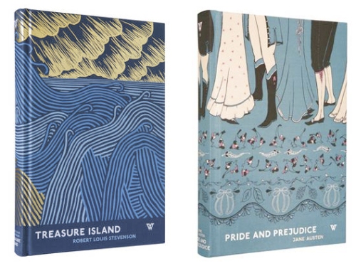
2. Speaking of how the UK dominates beautiful patterned covers, let’s move along to White’s Books, a small London publisher directed by David Pearson (a former Penguin Books designer himself). In a different way, these patterns draw the reader into other imagery and bring visually potent symbolism to distinguished classics. Thanks to Kevin Stanton, amazing paper-cut illustrator from the Illustration Week extravaganza, for referring me to Jessica Vendsen’s blog!
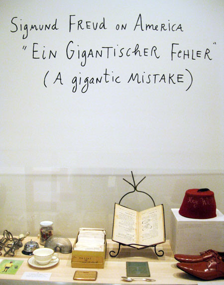
3. On a local level, I have to give a shout-out to a new show opening up in town: Maira Kalman: Various Illuminations (of a Crazy World). I’ve mentioned before my infatuation with Maira’s work, and since she’s a Nancy Paulsen Books author/illustrator, I get to drool over her new children’s books on a regular basis. Can’t wait to check out this exhibit of many of her best-known works, as I know it’ll be as original and out-of-the-box as ever.

Maira Kalman: Various Illuminations (of a Crazy World) is on display at The Jewish Museum from

By:
Annie Beth Ericsson,
on 10/28/2010
Blog:
Walking In Public
(
Login to Add to MyJacketFlap)
JacketFlap tags:
book design,
typefaces,
slush,
book covers,
design finds,
illustration sensations,
from the slush pile,
hand-made,
hand-drawn type,
Add a tag

While going through the slush mail today, I came across a pair of standout illustrators in a pile of recent UArts grads. Jim Tierney and Sara Wood, a young Brooklyn couple, have a fantastic approach to book cover design. Their masterful combination of type, hand-lettering and drawing makes both of their portfolios equally impressive.
Check out Sara’s D. H. Lawrence book cover series, and Jim’s interactive Jules Verne thesis (there’s a
video too!).

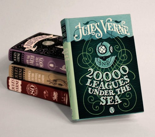
I put the cards up on the “Wall Of Stuff I Like” in my cube, right next to our other favorite hand-drawn type designer,
Kristine Lombardi. Lombardi’s cards have been up on our wall for ages. While her cards have more of a feminine, fashion style (although I do like her
Kids page!), they are the first thing that designers walking by are ALWAYS drawn to. Check out a great interview (including the below image of her promo card)
here.

These designers got me to thinking: where’s the place for hand-lettered type in children’s books? Before the age of thousands of freebie fonts on the internet (hey, it wasn’t that long ago!), hand-lettered display type was commissioned for book covers all the time. I recently worked on the anniversary edition for Jacqueline Woodson’s
The Other Side, and I was so impressed to discover that the handsome title was calligraphed by the original in-house designer.

And while I’m sure it took a lot more effort than downloading a font, there’s something careful, purposeful and yet whimsical to hand-drawn type. So it’s no surprise that it is experiencing a rebirth of magnificently hip proportions. Now, type everywhere looks like this:


By:
Annie Beth Ericsson,
on 10/8/2010
Blog:
Walking In Public
(
Login to Add to MyJacketFlap)
JacketFlap tags:
new york times,
picture books,
parenting,
david catrow,
product design,
design finds,
tall girls,
growth charts,
patty lovell,
stand tall,
Add a tag
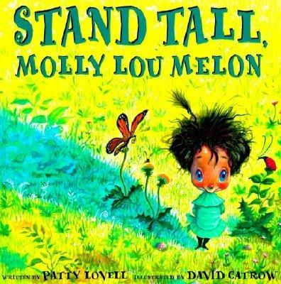
Anyone that knows me is aware that height is, um, sort of an issue for me. Don’t get me wrong, I’m not generally insecure about my looks, but I think everyone has that one “sensitive subject” they’re not comfortable about themselves, and at 5’10″, being tall is mine. And no annoying “But being tall is so great!” comments are going to change that.
So I could appreciate the levity and message of the latest book I’ve come across at work: Stand Tall, Molly Lou Melon by Patty Lovell, and illustrated by David Catrow. Molly Lou, the shortest, buck-toothiest, bullfrog-iest new girl in class, shines because she follows her grandmother’s advice to always, “Walk as proudly as you can and the world will look up to you.” She’s got confidence that (literally) bowls over the school bully, and it’s fantastic. This is the kind of both entertaining and meaningful read that makes me want to shove it in the New York Times’ snotty face and say, “THIS IS WHY PICTURE BOOKS ARE SO GREAT!” Phew! Anywho… moving on…
Designing “extras” for Molly Lou’s 10th anniversary got me to thinking about those handmade growth charts scrawled up the doorframes of classic American households. Remember those? Well, I wanted to see if there were some pre-made growth charts with a bit of design flair. Turns out, you can pretty much find a colorful growth chart for kids on any theme – no matter how tall or small!
Here were some of my favorites:
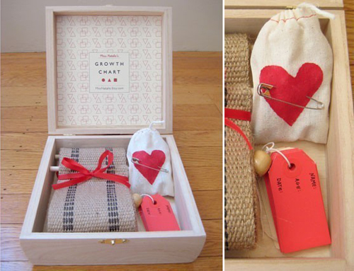
Heirloom Boxed Set Growth Chart – via Design Mom
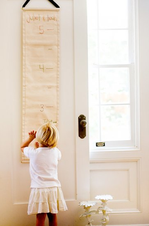
Grow-With-Me Scroll Chart – via Family Style
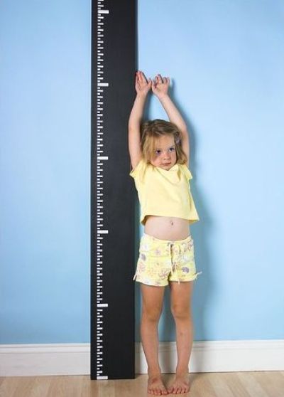
Chalkboard Paint DIY Growth Chart – via OhDeeOh
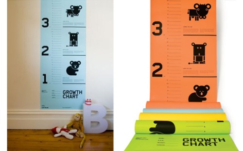
Basic Shapes Growth Chart –
1 Comments on Stand Tall! Growth Charts, last added: 10/8/2010

By:
Annie Beth Ericsson,
on 10/5/2010
Blog:
Walking In Public
(
Login to Add to MyJacketFlap)
JacketFlap tags:
book design,
pattern,
letterpress,
design sponge,
design finds,
geoff mcfetridge,
marian bantjes,
rebecca kutys,
design,
Add a tag
Today, I’m obsessing over…
 My first “find”, which I snagged from a take shelf (read: free books) on my way in to work, made up for everything that was hideous about the slush pile this morning. I have no idea why this profile on McFetridge (published as part of a series of designers by Gas As Interface) was in the office, but we are absolutely lovin’ it. While this L.A.-based designer with Champion Graphics creates everything from graphic posters to motion graphics/titles for films, I’m particularly loving his original wallpaper prints.
 McFetridge’s book might be a bit overboard on the Helvetica, but his projects were so intriguing that I had to find out more. Pick it up here!
 Ooooooh la la… if someone took every fancy trapping and visual treat and put it all in one book, it would be Bantjes’ I Wonder, which came out in gilded hardcover this month! The exquisite integration of text and art brings to mind that this is probably the single modern book that 15th-centrury monks would still be proud of. The price may be steep for a starving artist ($40), but all those elaborately designed pages look priceless.


Check out the rest of her projects as well… I can’t get enough of her seamless mix of materials and both old and new world design.
Thanks to Book By Its Cover for the link!

I’m not the kind of girl who has been planning her wedding since the age of 6. In fact,
6. This Wallpaper
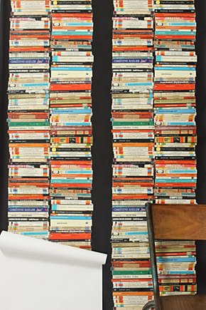
Anthropologie has the hottest book wallpaper… so in case you can’t get enough real books to stack, you can plaster your walls with Penguin paperbacks!!
Happy Friday, everyone… I’m going to be artsy tonight with some gallery openings, then forgo the cool people at Fashion Week to get my nerd on at the Brooklyn Book Festival instead. I love Fall!
Filed under:
design finds Tagged:
anthropologie,
home design,
paperbacks,
penguin classics,
penguin uk,
wallpaper 


By:
Annie Beth Ericsson,
on 9/9/2010
Blog:
Walking In Public
(
Login to Add to MyJacketFlap)
JacketFlap tags:
design finds,
book petters,
home design,
pinhole camera,
books,
classics,
diy,
digital,
hardcover,
Add a tag
 image source
Behind the boom of new technology and the digital e-book revolution, there is a lingering panicky mantra among longtime book lovers that goes, But what about my pretty hardcovers?? And although I’m excited about the possibilities that the future holds, I’m right there with them – it makes me instinctively sick to think of a world where ITunes replaces bookstores and children grow up staring at screens. Those who agree will argue that there is something wonderfully tactile about the physical book: the cover design, flipping the pages, and oh, that smell… some things are just irreplacable.
But now that more and more readers are in favor of Kindles and IPads over stuffed bookshelves, what’s to become of the precious physical books? Well, these designers have found some pretty creative ways to celebrate the spirit of the book as an object – by finding a different use for it.
1. The Shelf

What better way to display books than on a shelf of MORE books? Like the designers of this inventive shelf, I totally feel the pangs of abandonment when I see books thrown out instead of “repurposed” in some way. Plus, this feeds right into my instinct to hoard books… long after I’ve read or have space for them.
2. The Laptop Case

Technology and traditional materials finally go hand-in-hand with these leather laptop cases, appropriately named the BookBook. For only $80-100, you can swath your MacBook Pro in a hand-crafted faux hardback book. So not only do you seem really intelligent to that cutie in the coffee shop, but no one has to know that you’re researching your paper on Google instead of at the library. Go you.
3. The Camera

Pinhole cameras were always a fun experimental diversion in high school photo class, but these made of books, by Erin Paysse at Engrained Works, take the process to a whole new level beyond the average coffee can. The pinholes even take and advance a roll of 35 mm film, just like a real camera… but so much classier! I just can’t get over how gorgeous these are.
4. The Flower Pot
 0 Comments on It’s A Book (and Also Something Else…) as of 9/10/2010 12:44:00 AM
This past Saturday and Sunday was the kind of weekend that makes living in Brooklyn so picturesque – sun-dappled brownstones, bustling farmer’s markets, and a diverse mix of people enjoying the beach or the park – this is why I usually never want to leave my dreamy and romantic borough.
And the weekend was made even better because, everywhere I turned, I was discovering something new and free (or at least super-cheap)! A woodcut of Puffins that matches the other art in my room perfectly and an adorable round, white-glass bowl sitting abandoned on a stoop are just a few of the pieces I picked up on my travels.
And my favorite discoveries this weekend go to:
1.

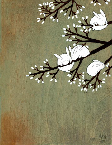
The first is not technically a physical “find”, but I am completely enamored with illustrator Kristiana Parn, whose work I passed by at Grand Army Plaza on Saturday. Can someone please, please get this woman a children’s book, stat?! Because her animal paintings and prints are just fantastic.


2.

One of the best things about being poor in Brooklyn is that richer folk often leave perfectly good furniture and other items lying around on the street… especially in Park Slope/Windsor Terrace. But this little book of children’s sayings is easily the most hilarious street find I’ve ever encountered.
I’m not sure what the story is behind the 1974 book Lots Of Love, compiled by British actress Nanette Newman, but it is essentially a visual representation of “Kids Say The Darndest Things” – an uncensored take on anything from religion and romance to war and world peace. The quotes and accompanying illustrations, all done in the hands of real children, are surprising, insightful and would keep anyone rolling on the floor laughing.
Most of the sayings take a pretty critical look at families…
 0 Comments on Recent Finds as of 1/1/1900
 The Pleasures of Slow Food by Corby Kummer (Chronicle Books, 2002). – This glamorous coffee-table volume takes a warm glimpse into the “slow food” movement – where hand-crafted cooking methods enjoyed among company take the place of modern American fast-food cu


 0 Comments on It’s A Book (and Also Something Else…) as of 9/10/2010 12:44:00 AM


Annie-
I’d love you lots if you could send me a high res scan of the snapdragons! They’re my favorite! Plus one other you’d suggest to go with it. I’m thinking some wall art is in its future.
Thanks.
Also I have a snazzy plan for a stuffed naan. Using naan as the dough and a good chicken potato curry as the filling. Pocket foods are the best!
Absolutely!! I will email you a couple of choices. They’re all so beautiful it’s hard to pick!
P.S. Stuffed naan sounds DELISH. I hope that’s in my “pocket book” of recipes…