The Occult Activism of 1960s Group WITCH is Still Relevant
This article popped up on the feed the other day, and I was reminded about the presence of and representation of witches throughout time, in a society that has pretty much commodified witchcraft into a visual and figurative only culture, i.e. Halloween, rather than a metaphoric one. The W.I.T.C.H. group was collective performance, an agitation and ripple to the world of conventionality. They aligned their ideals through direct actions, mailings, printed matter, and spoken activism. Like many other political aggregates of the time, we are fortunate to have propaganda ephemera validating action and disruption:

W.I.T.C.H. Women’s Liberation [Women’s International Terrorist Conspiracy from Hell], c. 1969, mailing list card [#9011]
”
My goodness the last two weeks have simply flown past. Books and ephemeral items are selling at such a rate I’m having trouble keeping up. Thank you to everyone for the numerous messages of support and love. Thank you for the orders, the cards and the sweet words. I thought March House Books would be missed by a few people now I know it will be missed by many. The doors will be closing for good on the 1st August, so if there is something you want don't delay.
I promised Terry I would look and not buy but how could I resist these treasures? Some will go into my collection (how could I sell the Muffin the Mule Christmas card?) and others will be listed on eBay. I might keep a couple of the Little Grey Rabbit books too.
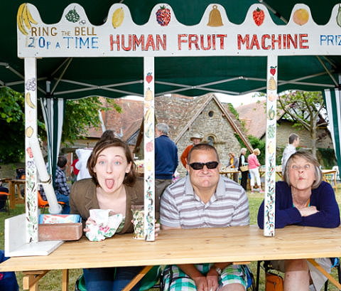
Last weekend we visited the annual
St. John's Church Fete at Milborne PortOne of the most popular attractions was the 'human fruit machine'
The book stall was doing a brisk trade
According to the local paper, over 200 people attended and between them raised more than £2,000 towards the upkeep of the church. Pretty impressive considering the fete was competing with Yeovilton air Day and Wimbledon.
I'm toying with the idea of modifying/changing the name of my blog. My cousin John came up with March of Time Books which I really like but what do you think?
I read a great quote on Facebook a couple of days ago... If a door closes, open it, that’s what doors are for!
Have a wonderful week
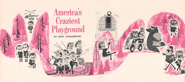
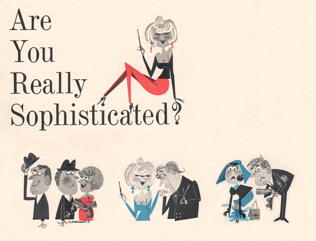 Here are some fun characters by a mysterious "Greenwald R." They're from Pageant Magazine, a smaller, "digest" size magazine for the "gentleman." Bordering on the cheesecake from time to time, the magazine actually has an interesting connection to Mad Magazine. Well, I wish I knew more about "Greenwald R." I've seen similar work done by this artist, but never have been able to find anything more about him/her.

Italian postage stamps designed by E. Consolazione, R. Cuzzani, and A. de Stefani in 1967 to commemorate the 50th anniversary of the Giro d’Italia cycling championship.

Ciclisti in volata - Racing cyclists in the general classification of the Giro. The overall winner of the Giro d’Italia wears the maglia rosa (”pink jersey”)

Ciclisti in salita - Cyclists climbing uphill in the mountains classification of the Giro. The best climber in the mountain stages wears the maglia verde (”green jersey”).
*Huge thanks to Wes for the scans!
Also worth viewing…
1962 Denmark Christmas Seals
Portugal 1981 Census Stamps
Hong Kong Festivals 1975 Stamps
Like what you see?
Sign up for our Grain Edit RSS feed. It’s free and yummy! YUM!
No Tags
Share This
Congrats to our winners in the Bike Print giveaway: Gianluigi Farnetti, Brian_HF, brianjbarron, Adrienne Wu
Grain Edit recommends: Karel Martens: Printed Matter. Check it out here.
©2009 Grain Edit - catch us on Facebook and twitter

Fresh stamps from our good friend Wes, this time from Cuba commemorating the 1970 World Expo in Osaka, Japan.

Towards better understanding

To the better enjoyment of life

Planning a more satisfying life
Also worth viewing…
1962 Denmark Christmas Seals
Portugal 1981 Census Stamps
Hong Kong Festivals 1975 Stamps
Like what you see?
Sign up for our Grain Edit RSS feed. It’s free and yummy! YUM!
No Tags
Share This
Congrats to our winners in the Bike Print giveaway: Gianluigi Farnetti, Brian_HF, brianjbarron, Adrienne Wu
Grain Edit recommends: Karel Martens: Printed Matter. Check it out here.
©2009 Grain Edit - catch us on Facebook and twitter

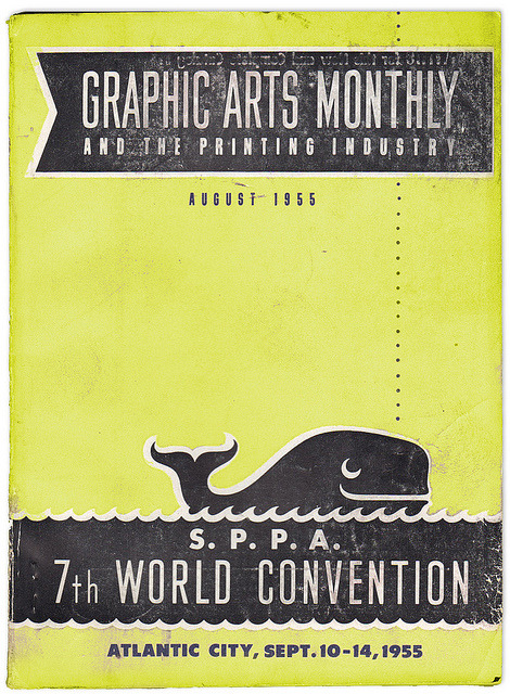
“Whale of a Convention” (by K. James+ Add Contact)
The clean graphics, type choices, and faded, distressed ink on this 1955 periodical are a beautiful combination.


4CP | Four Color Process - adventures deep inside the comic book
4CP is a blog that romanticizes the dot-pattern world of old comic books. Don’t miss the heady love letter to ink and pulp, In Defense of Dots:
Dots emit radiation. As you get closer to them, they begin to vibrate and pulse. Moving closer still, the color separations become dramatically separate: Solids become very solid and the black ink holds together, while the CMY dots fly apart. Foreground and background, positive and negative space, reverse unexpectedly. Orange, green, brown, and fake gray give up their secrets, and the basic building blocks of a universe reveal themselves. Unstable molecules, built of primary colored atoms, buzz at different frequencies. Vectors of visual force, experienced implicitly at original size, become intense. Behind everything is wood pulp paper, a still deeper layer of creation, with its own unstable properties.
(Good to know purple prose is still purple, even if it’s made up of tiny magenta and cyan dots)


Tom Schifanella is Senior VP/Executive Creative Director for The Robin Shepherd Group and a passionate collector of hotel luggage labels. I highly recommend his Flickr stream which is filled with amazing examples of these labels and other travel-related ephemera. Tom also handles the collection of the late Gyorgy Razso, a Hungarian who amassed one of the biggest luggage label collections in the world. Many of the labels from the collection are available for purchase here.


(via the excellent Aqua-Velvet)
——
If you like this, check out: Istanbul Luggage Label, Swiss Luggage Label
Not signed up for the Grain Edit RSS Feed yet? Give it a try. Its free and yummy.
——
No Tags
Share This
Only a few grain edit shirts left.Get yours now!
Grain Edit recommends: Born Modern: The Life and Design of Alvin Lustig. Check it out here.
©2009 Grain Edit - catch us on Facebook and twitter
By: Dave,
on 10/12/2010
Blog:
inspiration from vintage kids books and timeless modern graphic design
(
Login to Add to MyJacketFlap)
JacketFlap tags:
swissair,
1950s,
posters,
1960s,
1970s,
Found design,
ephemera,
swiss,
switzerland,
Add a tag

Patrick Eberhard has amassed an amazing collection of Swissair-related material. His website, Sr692 which is named after the flight number from Zürich to Lisbon, is filled with vintage posters, flyers, logos, stamps, route maps, tickets and books, as well as a detailed history of the airline. This is an absolute goldmine for those interested in Swiss design.
A hat tip to Shelby at Wanken for discovering this amazing resource.


(via iso50 + Delicious Industries)
——————–
Recommended Reading:
Airworld: Design And Architecture For Air Travel - Published by Vitra
This book focuses on the corporate design of airlines, uniform fashion, the graphics of air travel posters and the significant role that aviation played as an inspiration for architecture, design and art up to the present day.
Copies are available at Amazon.
——————–
Also worth viewing: Swiss Graphic Design by Geigy, Jorg Hamburger, Publicity and Graphic Design in the Chemical Industry.
Not signed up for the Grain Edit RSS Feed yet? Give it a try. Its free and yummy.
——————–
No Tags
Share This
Only a few grain edit shirts left.Get yours now!
Grain Edit recommends: Born Modern: The Life and Design of Alvin Lustig. Check it out here.
©2009 Grain Edit - catch us on Facebook and twitter

Peter Stuyvesant matchbook from Finland.


—–
Also available for your viewing pleasure: Matchboxes designed by Cruz Novillo + Olmos
Enjoy this post? Sign up for our tasty free grain edit RSS feed.
—–
No Tags
Share This
Only a few grain edit shirts left.Get yours now!
Grain Edit recommends Buffet Script A font designed by Sudtipos. Check it out here.
©2009 Grain Edit - catch us on Facebook and twitter

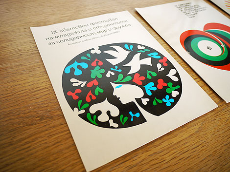
Fresh discovery from a recent road trip. Beautiful prints/postcards from the World Festival of Youth and Students for Solidarity, Peace and Friendship 1968 held in Bulgaria. On the back there is a small paragraph that pleads for world peace for future generations.
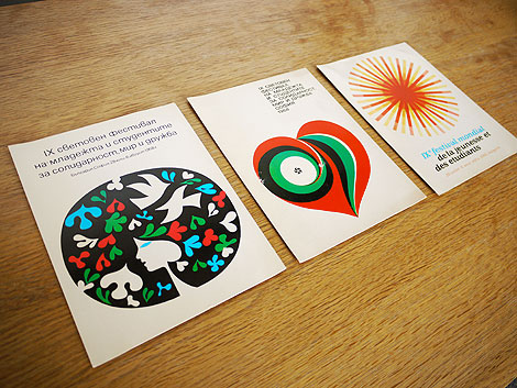
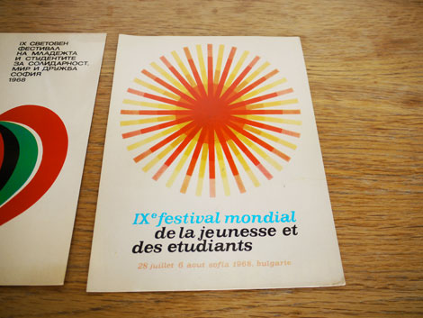
festival mondial de la jeunesse et des etudiants July 6th, 1968 Sofia, Bulgaria
——————–
Also worth viewing: Bulgarian designer Stefan Kanchev
Not signed up for the Grain Edit RSS Feed yet? Give it a try. Its free and yummy.
——————–
No Tags
Share This
Vintage kids book Mi Diccionario is in the Grain Edit Shop
Grain Edit recommends Buffet Script A font designed by Sudtipos. Check it out here.
©2009 Grain Edit - catch us on Facebook and twitter


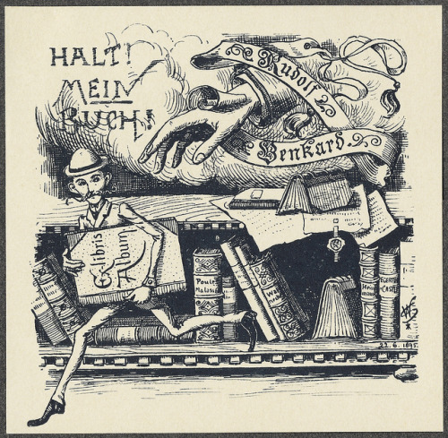
EphemeraStudies.org is a useful, intimate website for those of us with a love on for obscure printed matter of bygone days. Saul Zalesch, proprietor, is posting samples from his own collection – and in high resolution.
Ephemera is beginning to get more attention from academics these days, so I’m sure this site is going to become pretty popular soon. Saul says in his mission statement that he wants to help historians study this stuff, and as a historian of popular print, I am very grateful for his contribution.
Seen here: cover of a booklet issued in the 1920s, when the fad for painting old furniture took off with the increasing availability of premixed paints.
Posted by Jaleen Grove on Drawn! The Illustration and Cartooning Blog |
Permalink |
No comments
Tags: ephemera, graphic design, print, Typography, vintage
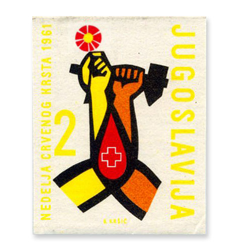
Yugoslavia (Jugoslavija) stamp -1961
A little stamp love to start off the week.
——————–
Also worth checking: Portugal 1981 Census Stamps, 70s Modern Stamps from Israel
Not signed up for the Grain Edit RSS Feed yet? Give it a try. Its free and yummy.
——————–
No Tags
Share This
Vintage kids book Mi Diccionario is in the Grain Edit Shop
Grain Edit recommends Colo Pro A font designed by Font Fabric. Check it out here.
©2009 Grain Edit - catch us on Facebook and twitter

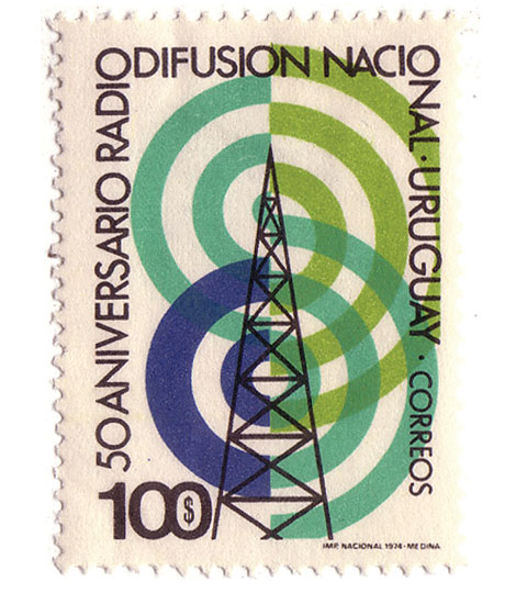
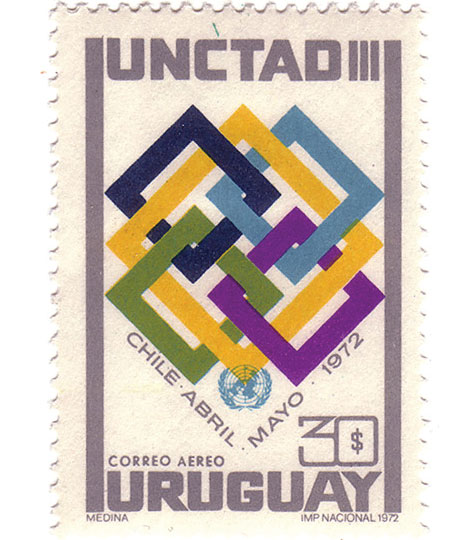
Beautiful stamps from Uruguay via Mike at So Much Pileup.
—–
Also worth checking: Denmark Stamps
Portugal Census Stamps
Enjoy this story? Sign up for our tasty free grain edit RSS feed.
—–
No Tags
Share This
Vintage kids book Mi Diccionario is in the Grain Edit Shop
Grain Edit recommends Colo Pro A font designed by Font Fabric. Check it out here.
©2009 Grain Edit - catch us on Facebook and twitter

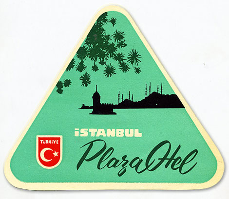
Really stunning luggage label from Istanbul.
——
If you like this, check out: Vintage Swiss Luggage Label , Portuguese Luggage Label.
Not signed up for the Grain Edit RSS Feed yet? Give it a try. Its free and yummy.
——
No Tags
Share This
Vintage kids book Mi Diccionario is in the Grain Edit Shop
Grain Edit recommends Colo Pro A font designed by Font Fabric. Check it out here.
©2009 Grain Edit - catch us on Facebook and twitter

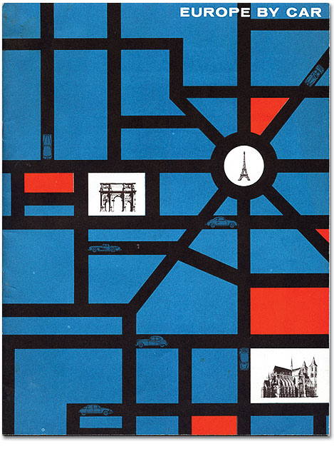
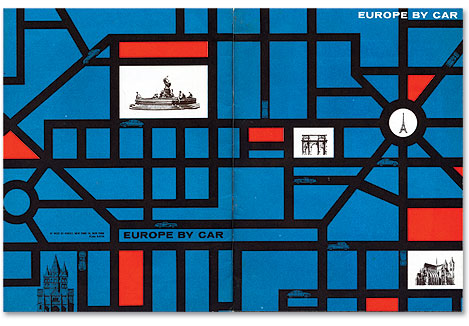
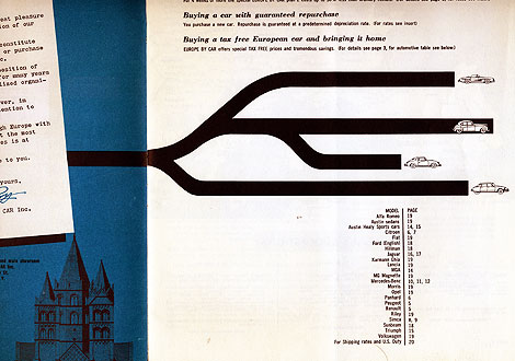
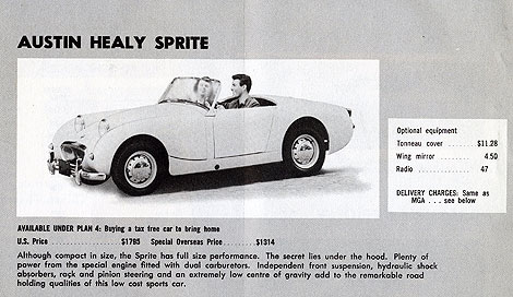
I love the cover of this Europe by Car brochure. The roads make for a nice grid structure and give the piece a Mondrian-esque quality. The business model for the company was pretty interesting as well. Europe by Car offered services for Americans interested in traveling around Europe for extended periods of time. Using their services you could purchase a European car to use on your travels. At the end of your vacation, Europe by Car would also help ship your new car back to the U.S.
The brochure includes prices for cars from Porsche, Austin Healy, Citroen, Jaguar etc. I just wish their price sheet was still valid. A Porsche for $3700? sign me up!
——————–
Also worth checking: Vintage Porsche Posters & Vintage Travel Posters.
Not signed up for the Grain Edit RSS Feed yet? Give it a try. Its free and yummy.
——————–
No Tags
Share This
Congrats to our 2009 Grain Edit Holiday Giveaway Bash Winners - /Grand Prize - Christopher E from Ferndale, Mi/ 1st Prize - Kristina M - Oakland, CA/ 3rd Prize - Samantha W - North Vernon, IN/ 4th Prize - Nicholas L. - Brooklyn,NY/ 5th Prize - Barbra - Brooklyn,NY
Grain Edit recommends Colo Pro A font designed by Font Fabric. Check it out here.
©2009 Grain Edit - catch us on Facebook and twitter

Searching for some retro logo inspiration, I stumbled upon Depression Press’s Flickr stream, which has retro logos in spades along with other old printed goodies, including plenty of illustration:

Posted by John Martz on Drawn! The Illustration and Cartooning Blog |
Permalink |
No comments
Tags: Design, ephemera, logos, retro

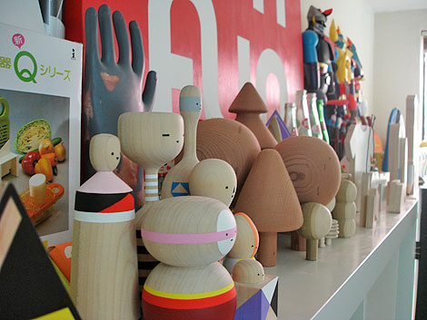
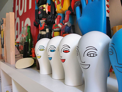
Pen Pencil Stencil is the online home and physical workspace of Mark Giglio. Mark is an amazing illustrator/ designer who’s worked on projects with a diverse mix of companies including: 2k by Gingham, Apple, Dwell, GSP, Nike, Tolleson Design, and others. Recently I had the pleasure of hanging out with Mark at his Oakland based studio.
How do you like working in Oakland?
I really like working in Oakland. I like the slower pace is has to San
Francisco and the weather is warmer too. I’ve been here for 17 years now
so I’m kind of attached to it.
What do you like most about your space?
Having my own space to work in. Being at my studio is my favorite place to
be. All my favorite objects, books and personal projects are there. It’s
my place to experiment and think. If I have to work outside my studio on a
project for someone it is always the best feeling to return to it again.

What are some of your favorite objects in your studio?
My favorite things hands down in my studio are my books. I love books and
love the books I’ve collected. I can go to public libraries for hours and
search for things. Then the best thing on my bookshelf that isn’t a book
would have to be my La Fonda Del Sol menu designed by Alexander Girard.
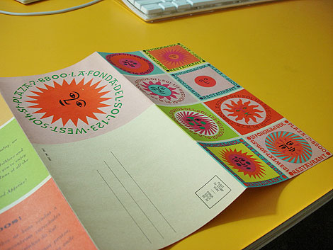
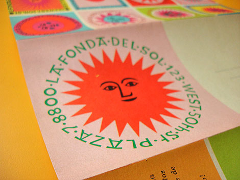
La Fonda Del Sol Menu - Designed by Alexander Girard
What are so
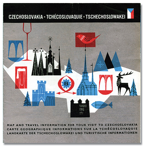
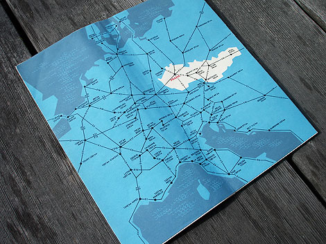
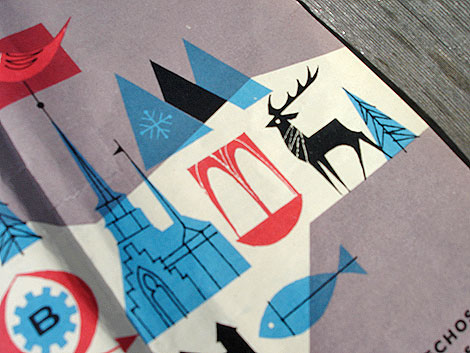
Beautiful tourist map from Czechoslovakia (now the Czech Republic) dating back 1966. I love the bold colors and simple line work. I’m guessing that the illustration inside the red square on the left side is a beer. Look at that foamy top! Sweet mother of beverages!
The inside of the map includes info on transportation, Czechoslovak Travel Bureau (CEDOK), natural resources and mountain ranges. No info on that giant beer though.
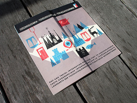
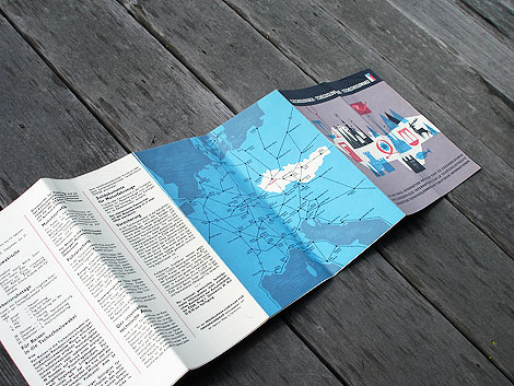
This post was inspired by a post I found at Amy Cartwright’s awesome Stickers and Stuff blog. She found an image of this map in Bonito club’s wonderful Flickr account. The post was missing images of the inside of the map, so I decided to grab some photos from the copy I own.
——————–
Also worth checking: Czech street map & Designers bookshelf with Amy Cartwright.
Not signed up for the Grain Edit RSS Feed yet? Give it a try. Its free and yummy.
——————–
No Tags
Share This
Congrats to B. Rane! She is the winner in the Photo-Lettering giveaway.
Grain Edit recommends Annonce. A font designed by Canada Type. Check it out here.
©2009 Grain Edit - catch us on Facebook and twitter
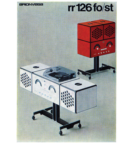
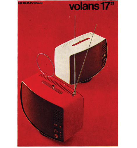
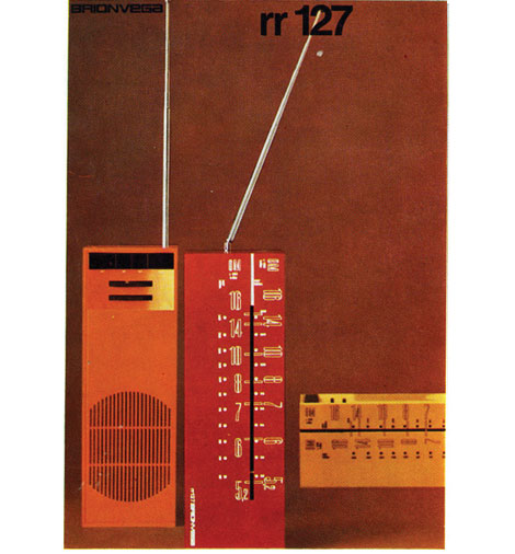
Brionvega rr126 Turntable/ radio brochure c1970
Beautiful brochure covers for the Milan based electronic company Brionvega. Design by Bob Noorda.
——————–
Also worth checking: music concrete booklet.
Not signed up for the Grain Edit RSS Feed yet? Give it a try. Its free and yummy.
——————–
No Tags
Share This
Congrats to B. Rane! She is the winner in the Photo-Lettering giveaway.
Grain Edit recommended reading: A Russian Diary
©2009 Grain Edit - catch us on Facebook and twitter

View Next 25 Posts


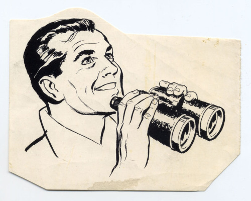
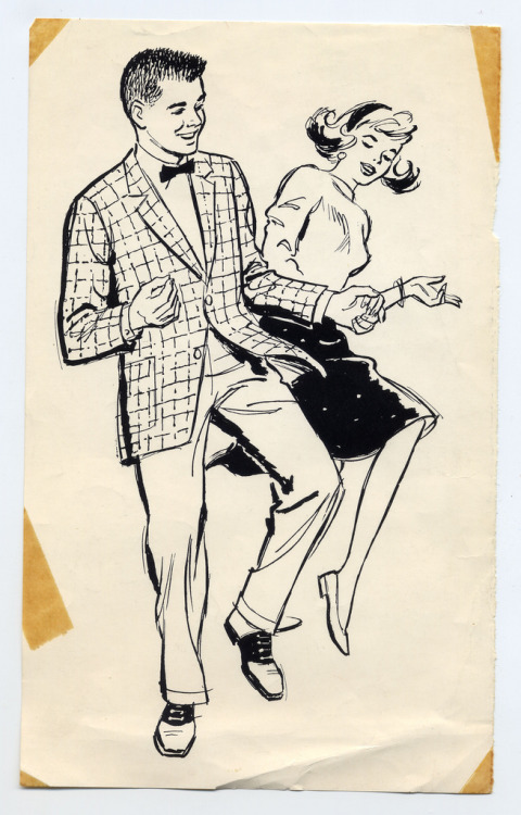


Thanks for sharing Ward. I like the mysterious Greenwald R's style. The colors and composition are great.