
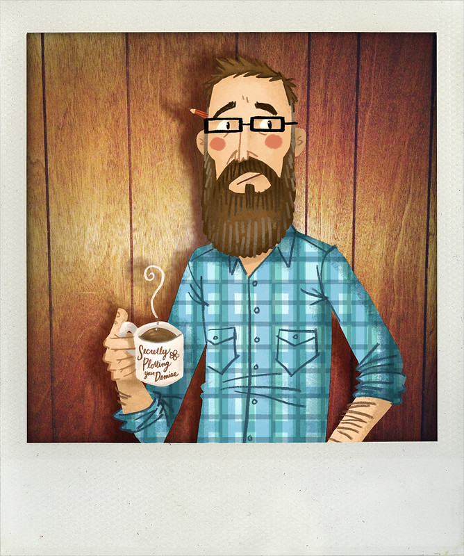
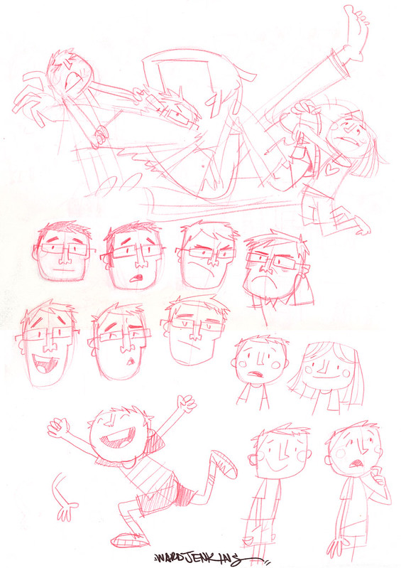
Ladies and gentlemen, my revamped, redesigned and renewed website: www.wardjenkins.com. ENJOY! 
0 Comments on New Website as of 10/25/2014 11:42:00 AM
Add a Comment


 By: Ward Jenkins,
on 10/25/2014
By: Ward Jenkins,
on 10/25/2014
Ladies and gentlemen, my revamped, redesigned and renewed website: www.wardjenkins.com. ENJOY!
By: Ward Jenkins,
on 5/18/2014
 I am not going to compare myself to others as much. Or at all. I am embracing the struggle, accepting the mistakes I've made and pushing through. I am learning. I am trying. I am not going to let it get to me. Everything. It is going to be okay. I know it will. I am going to finish that one project I've been working on for some time now. I will not put it aside and forget it. I will keep it up front and center. Because I know that that's my spark. I know that it will keep me whole. I know that I can call it my own. I am going to draw when I don't want to. I am going to draw when I'm tired. I am going to draw when I need to. Because I am losing my identity when I don't. I am going to draw more and erase even more than that. I am going to organize my thoughts and ideas. For once. And I am going to listen to my wife. Because she knows me best. Even when I think she doesn't, she does. Always. And I am going to give in to the uncertainty of this year. Because I know I can't control it. I am not going to forget things and I am not going to give up. I am going to remember and I am going to keep going. I am not letting my weaknesses take root. I am not letting my insecurities envelope me. I am not listening to my doubt. I am not letting my negativity control me. I am not letting it win. I am not losing this year. I am not. I am not. I am going to win. I am. I am.
By: Ward Jenkins,
on 1/8/2014
Let's start 2014 off with a bang, shall we? Enjoy.
By: Ward Jenkins,
on 7/22/2013
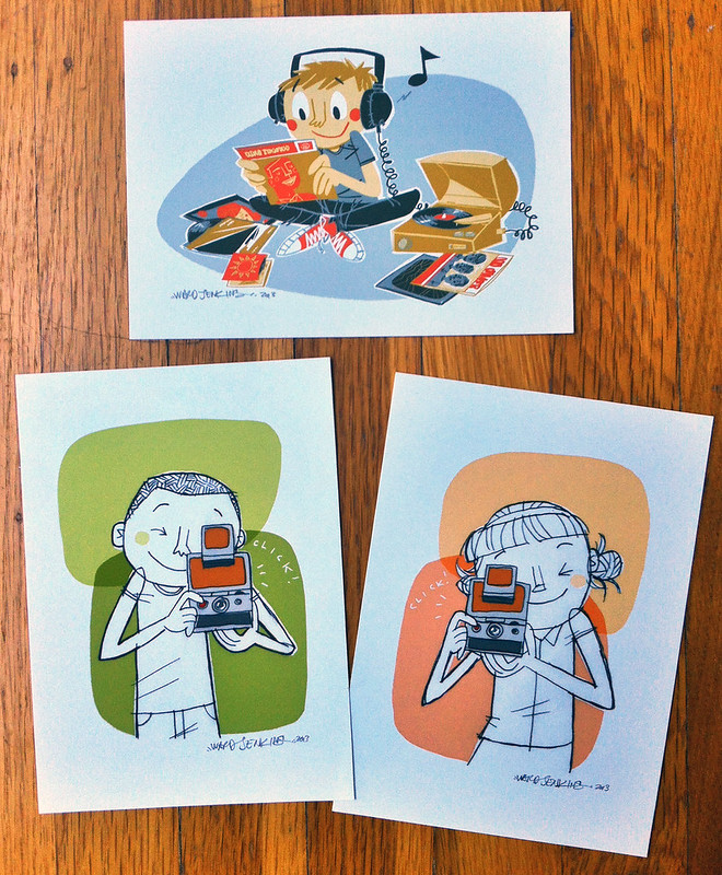
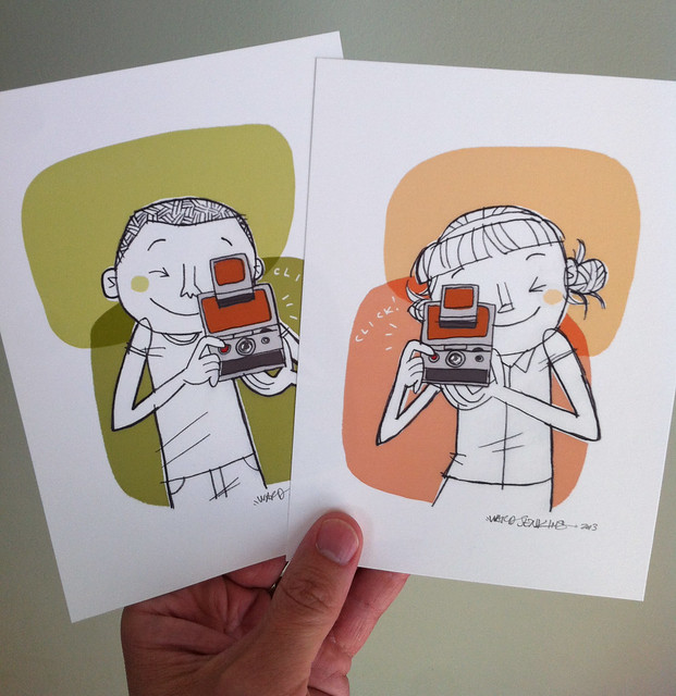
Yes, it's finally happened: an actual update to my Ward-O-Matic Etsy Shop with NEW prints! Amazing! Here are the three prints that are now available (top to bottom, L to R): Vinyl Kid, SX-70 Camera Boy, SX-70 Camera Girl.
Prints shown above are the 5" x 7" size. All three are available in 8.5" x 11" as well. Yay!
Here, let me hold them for all of you to see (again, these are the 5 x 7" size):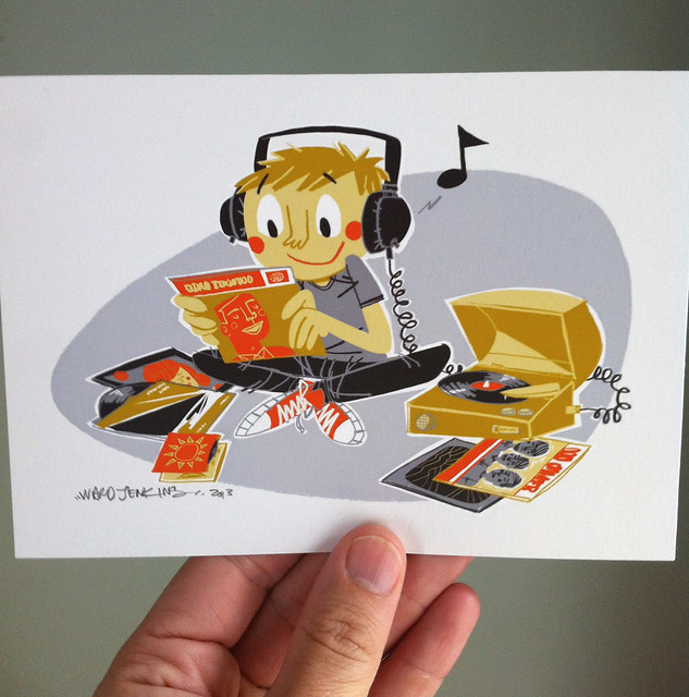
The link: The Ward-O-Matic Shop
By: Ward Jenkins,
on 2/16/2013
It's always nice to break out the ink and gouache. Trying some things out with my Calico Elly character. Although the calico pattern is a little difficult to convey in paint. But hey, it's always worth playing around here: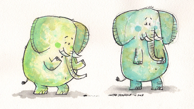
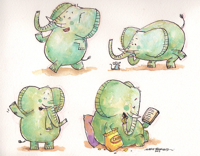
And who wouldn't want an extra appendage for eating chips out of the bag while reading? I mean, c'mon.
By: Ward Jenkins,
on 2/4/2013
New year, new promo postcard. Here's the back of the card, complete with all the important information that you'd need to ever get a hold of me:
Jennifer Laughran of Andrea Brown Literary Agency is my agent and she's been great. She's sitting by the phone, waiting for your call - er, well, she's sitting by her computer, waiting for your email. Yes, that's it. She's ready for anything.
The elephant is a character I've named Calico Elly. You might've seen her before. I've got a story idea for her I've been working on - a picture book idea that would involve Elly and some classmates. Looking forward to seeing where the story process takes me on that one.
Anyway, the front to the postcard is actually detail of a spread from San Francisco, Baby! - the Lombard Street one: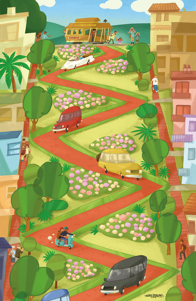
Fun!
By: Ward Jenkins,
on 1/3/2013
Happy 2013! Here's the last illustration job I did for 2012: a piece for The Phoenix (again!) of Portlandia's Carrie Brownstein.
Since I was out of town for the holidays and I didn't have my trusty light table (well, my animation disc), I had to improvise: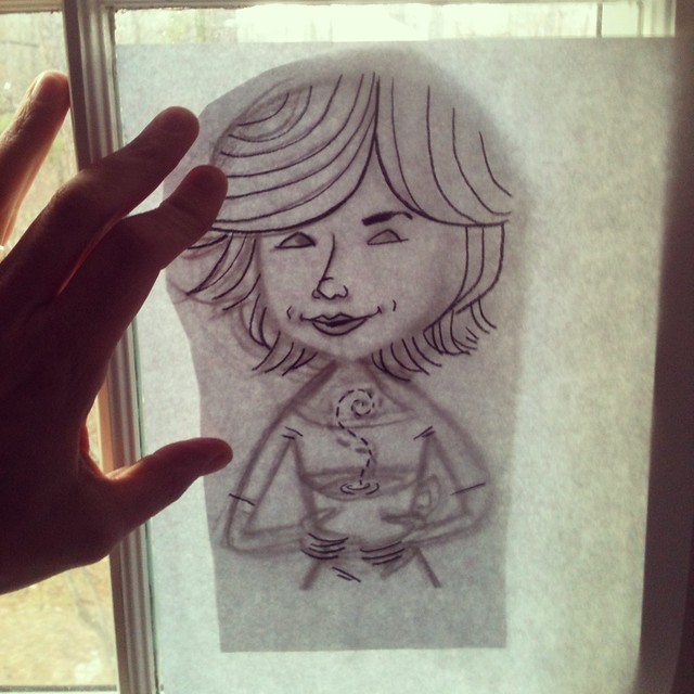
Here's the rough sketch I sent the client: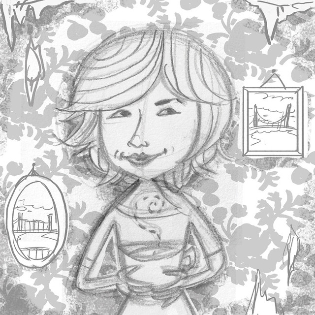
And now, the final. Portlanders will catch the bridges references (extra points for those who know which bridges these are) and the green heart Oregon logo on the coffee mug:
So, yeah - a good way to end the year! The people of The Phoenix are awesome.
Coming up: some good news! More details later.
Again, if you like what you see here and want to share it (Tumblr, Pinterest, blogs, Twitter, etc.) please, please, PLEASE give credit to who did this! Many thanks.
By: Ward Jenkins,
on 12/25/2012
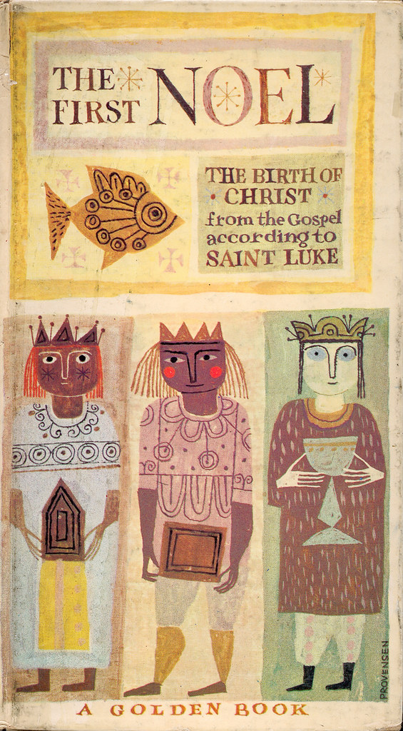
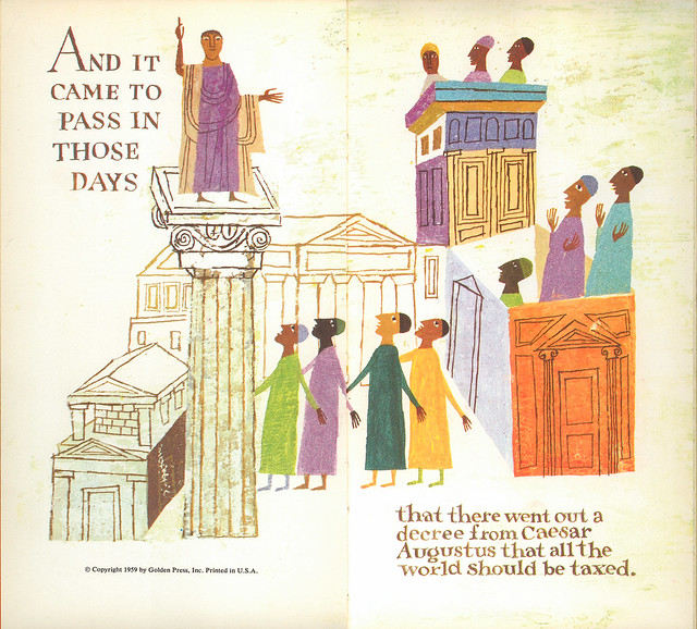
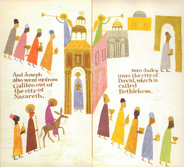
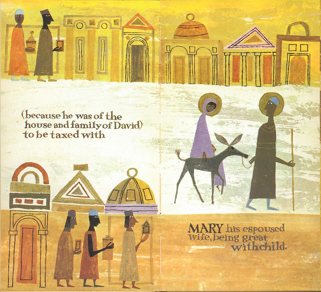
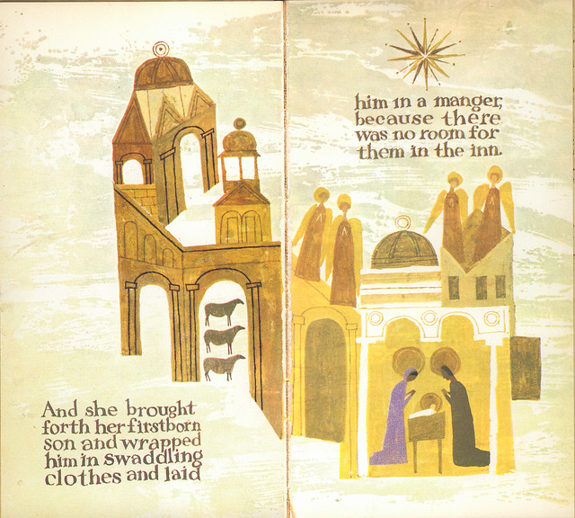
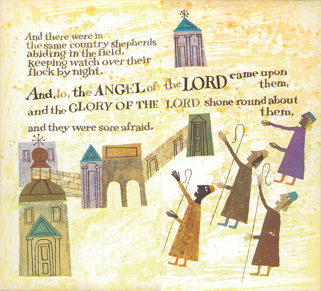
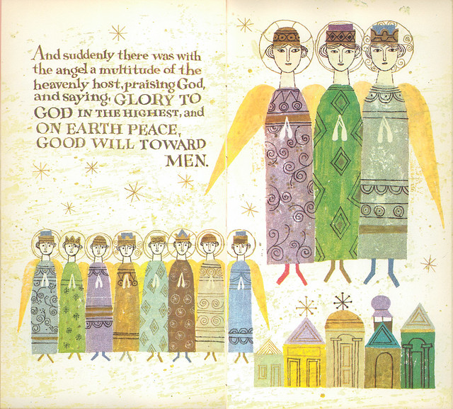
The First Noel illustrated by Alice & Martin Provensen. 1959. This is my staple Christmas post - I absolutely love the illustrations in this book and will share this with you, my readers annually because they are so worth sharing. Enjoy.
Merry Christmas to you and yours, people.
With much love, peace & happiness,
Ward Jenkins aka Ward-O-Matic.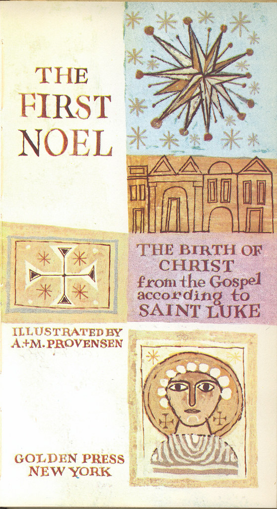
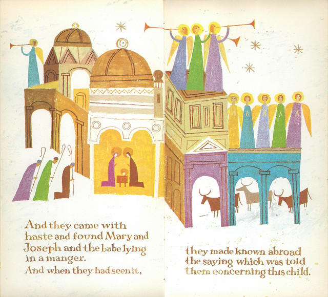
And finally, the back cover: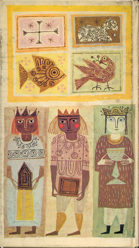
By: Ward Jenkins,
on 12/24/2012
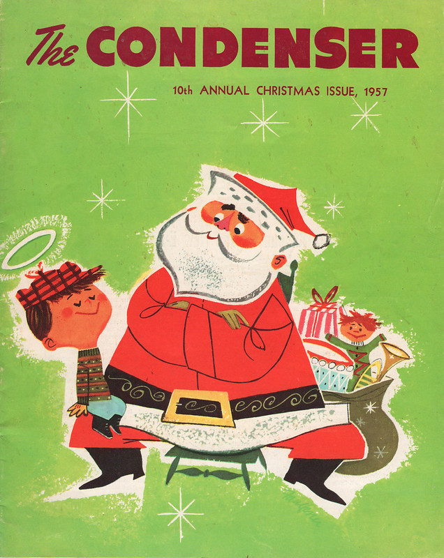
A wonderful gift from a good friend of mine, Brad Ross-McCloud aka The King of Jingaling. Thanks, Brad! You know me so well.
A great illustration by "Faulkner," from 1957.
By: Ward Jenkins,
on 12/20/2012
I've always wanted to do editorial illustrations for magazines and newspapers and I've done some here and there, but never of any celebrities or important people in the news. Until recently. The Phoenix in Boston asked me to do a few illustrations of people to accompany interviews, and boy, was I thrilled.
The first was of documentary filmmaker and author Errol Morris, who was interviewed for the November 9th, 2012 issue. Here's the rough sketch first:
I drew this with my Cintiq in Photoshop - I have a pencil brush I use for the black lines, and a chalk brush for the brushy, pastel-y effect for the grays. I decided to abandon the ribbon encircling Errol with all the interviewers and cameramen because I thought it seemed cliché.
As I was working on the various different shades of gray on his face, I liked the effect that gave me, so I decided to take it further in the color stage:
My concept with the multi-hued color treatment here was that I liked the idea of how Errol approaches his subjects - viewing them through a multi-faceted lens, so to speak. Trying to look at any and all aspects of a particular event that might've affected a subject, like the Jeffery MacDonald case from 1972 - of which he's written a book about the case and why he was being interviewed by the Phoenix in the first place.
The next illustration I did was of political statistician Nate Silver for the November 5th, 2012 issue. (I actually drew the Errol Morris one first, but the interview was held until after this one was published.) Below is the rough sketch, again drawn in Photoshop on my Cintiq: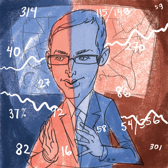
For both illustrations, I had already drawn several pencil sketches in my sketchbook leading up to the digital sketching, as a way of trying to get the subject right. For Nate, I felt that I got his appearance right away. Errol was a bit more difficult to capture. (I'm not a caricaturist by heart - but I do my best.)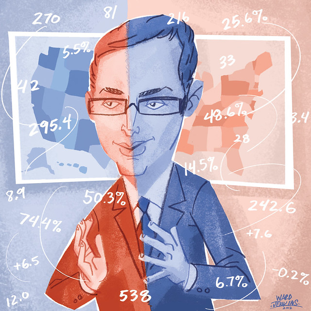
I really had fun drawing this one of Nate. I went with the obvious red/blue for the two opposing political parties - splitting Nate right down the middle, so as not to give any preference for him (since he's just stating facts & figures on his blog and not offering any opinions). Notice that his left is blue, his right is red. AND, notice that in the background, the left side is blue, the right is red. Worked out perfectly, I think! Nate's blog on the NYTimes site is called FiveThirtyEight Blog, hence the number "538" in the illustration.
Been really enjoying working on these illustrations, even with a quick turnaround. I'm happy to say that I'm currently working on a third piece for the Phoenix - of an actress/musician who's in one of my favorite current TV shows. Very much looking forward to working on that one!
By: Ward Jenkins,
on 12/7/2012
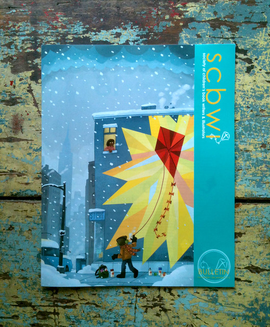
You probably have heard me talk about SCBWI here from time to time. It's the Society of Children's Book Writers and Illustrators, and they are dedicated in helping people who are writers and illustrators to better hone their craft with the hope of getting published. I've attended several of the conferences they've put out, including one national and several local chapters. This past May I was honored to be a part of the faculty for our local chapter's annual gathering, SCBWI-Oregon's Spring Conference. One of the highlights during the 2-day event was sitting next to Lin Oliver during the faculty panel. I mean, really? C'mon, the Lin Oliver? Executive Director of SCBWI? Sitting next to me? It was a bizarre moment.
At one point, Lin leaned over to me and said how much she loved my work. She'd been looking at my postcards and portfolio and liked what she saw. She then asked if I'd be willing to illustrate a future Bulletin cover. After picking up my jaw from my lap, I said "uh, HECK YEAH!" No, actually I think I was a bit more subtle, but I was definitely floored and flabbergasted that she'd consider me as a future cover artist for them. I told her yes, it would be quite an honor.
So, fast-forward several months and I'm doing sketches for the cover. I had an idea that stemmed from talking with Andrea about what to illustrate. See, each issue has a kite for its theme - the SCBWI logo features a kite, therefore every issue has had a kite featured either prominently or not so prominent on the cover. I wanted to do something vastly different, and not go any typical route, like flying kites up on a hill or something. After brainstorming with me for several minutes, Andrea at one point said, "Well, what about doing a mural?" That's it. Something clicked in my head and I started sketching right away. Out of that session, I ended up with two main roughs that I sent to SCBWI for approval: 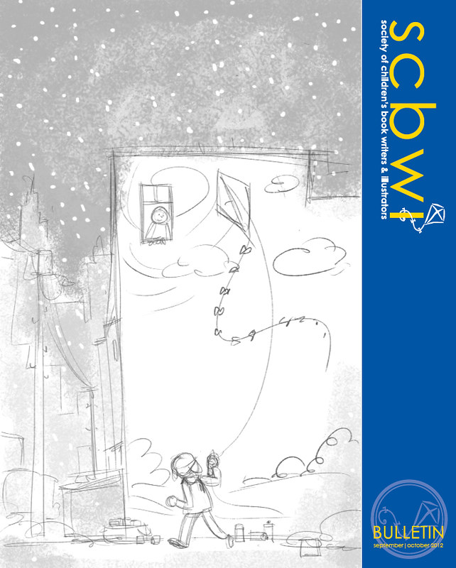
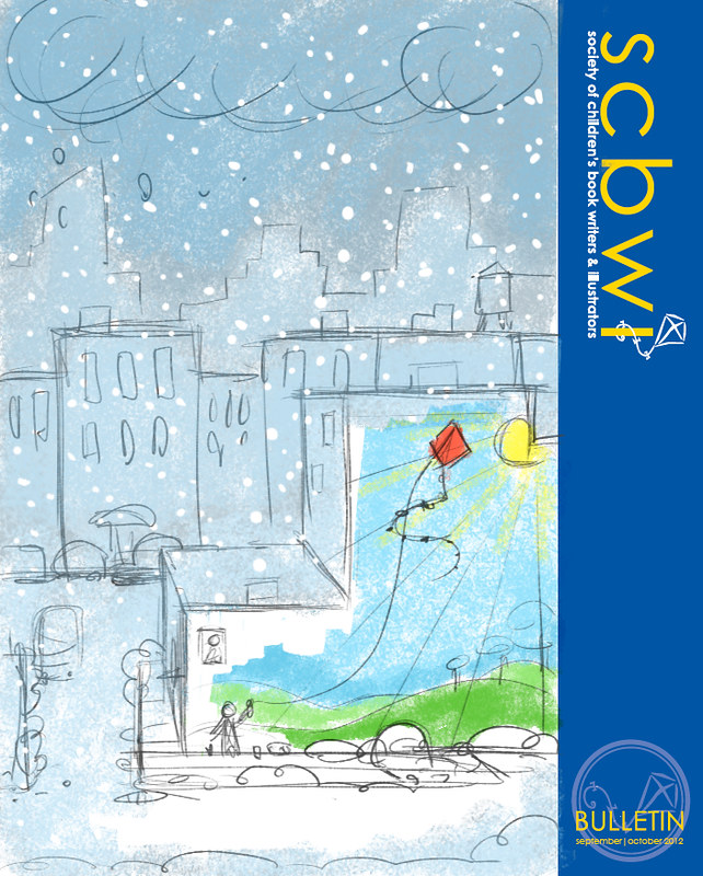
So, the idea would be that the mural would serve as a beacon of warmth and light in the midst of a blustery, wintery, snowy day, right in the throes of winter. Much like graffiti does in the middle of blighted areas: pops of color blooming like poppy blossoms in a stark, vast field. I was excited about this idea and was extra excited to work out a little visual play with the boy spray painting the kite's string, making it look like he was actually pulling the kite.
The version that was chosen was the top one - the lower point of view made it easier to see the large mural, as the other version felt less intimate. I thought that the impact of this colorful mural was getting lost. My SCBWI contact felt so, too.
So, here's the final for you to check out, in all its brilliantly loud glory:
(By the way, please be sure to give credit if you decide to share with your peoples - many thanks!)
The Christmas season is upon us and I'm slowly but surely getting into the spirit of things here. Hope this gives you a little jolt of happiness, just in time for the weekend. Enjoy!
By: Ward Jenkins,
on 10/20/2012
NRDC NBA Adds Up PSA - Ward Jenkins/Paul Golden from FFAKE Animation on Vimeo.
It's been a while since I'd directed anything lately, so it was a welcome pleasure for Paul Golden of Ffake to contact me about co-directing this fun public service announcement for the NBA and NRDC. That's National Basketball Association (of course) and the National Resources Defense Council - they're all about going green and recycling, etc. The PSA was a simple walk through of all the ways that the NBA has been working with the NRDC to make sure the league is going green - mostly through the basketball arenas and facilities.Paul wanted to emulate the look and feel of M. Sasek and his "This Is..." children's book series, and I - of course, couldn't say no to that. It was quite a fun adventure working on this spot. Below are some of the first sketches I did of the NBA player and the NRDC scientist guy: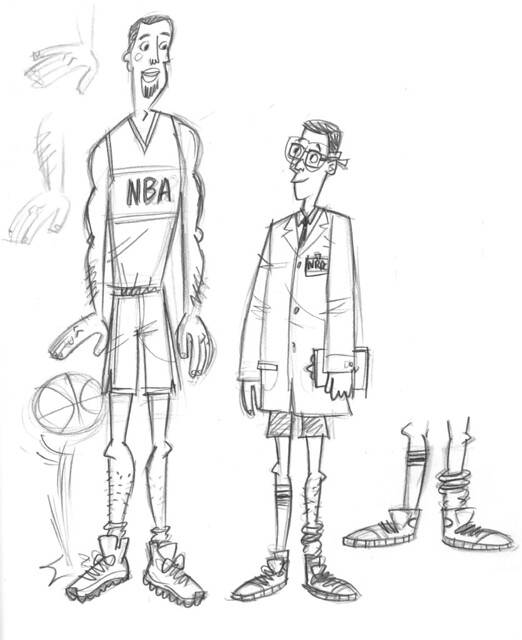
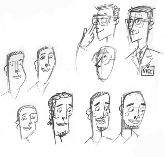
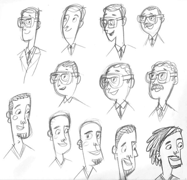 After some more sketches, finally got it down to a decent look for the scientist - more of a goofy guy who's a little behind the times with his basketball outfit:
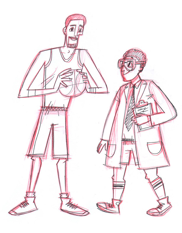
 Of course, we ended up having to change the gender of the scientist, which is perfectly fine with me. Just meant there was more work to do, while the deadline never changed.Here are some of the rough, penciled layouts:
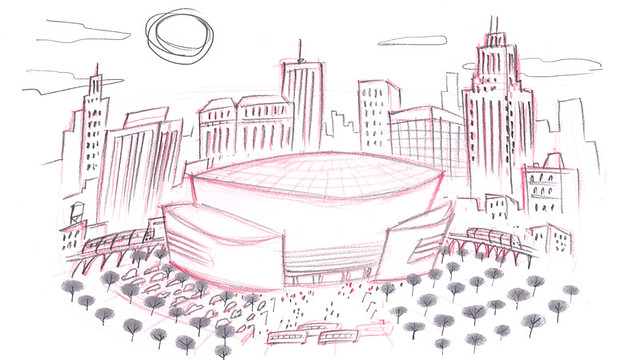
 And now, here are the final backgrounds with final color treatments for the characters (they were all eventually reworked and animated in Flash).Scene 01:
 Scene 02: This scene required the most work. I referred to a lot of Sasek's books that had lots of downtown buildings to get the look right. Here's the regular version of the arena scene:
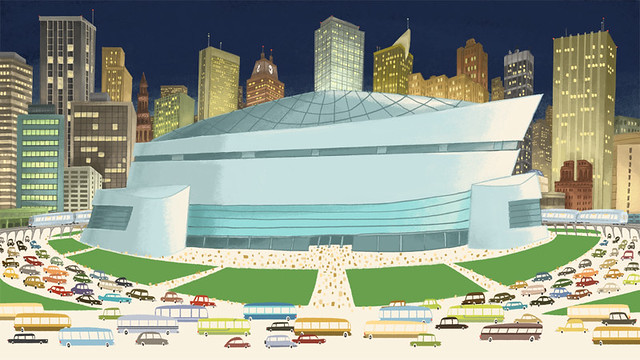 And here's the same shot, but with a cutaway of the arena:
 Scene 03:
 Scene 04 with the characters:
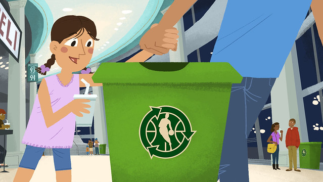 And here's Scene 04 background only:
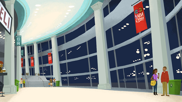 Scene 05 with characters:
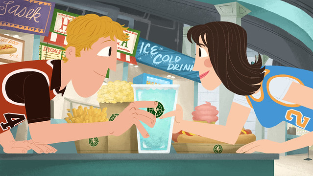 And here's Scene 05 background only:
 Scene 06:
 Scene 08, wherein we have to put all the appropriate logos at the end tag:
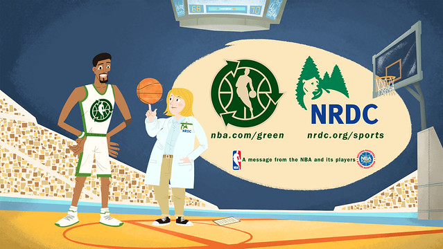 I know that I've shared a lot of images here, but you can see all these as well as a few more in this Flickr set: NBA/NRDC PSA.Enjoy!
By: Ward Jenkins,
on 8/20/2012
I know that I've shared a lot of images here, but you can see all these as well as a few more in this Flickr set: NBA/NRDC PSA.Enjoy!
By: Ward Jenkins,
on 8/20/2012
Been working on a picture book idea for a while now, and so I thought I'd share with you some of the character designs and a spread from the book. It's mostly in rough form - a book dummy, actually - with a few color treatments. Here are the main characters:  A Dad and his disapproving twins.
 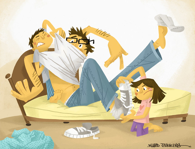 At one point, the kids have to get Daddy up since he doesn't want to. Both have to put their backs into it! Of course, I'm in the midst of changing a big portion of the story around. As typical in creating stories, what sounded perfect one minute might sound completely ridiculous the next. Or, it's just not working. That happens in making books. The hard part is to be open and honest with yourself. And not get too married to certain aspects of the story. Because more often than not, you'll find yourself exorcising those parts in order to make the best possible story for your readers. It's been a learning experience for me, which is always a good thing. Below are some rough sketches of the characters:
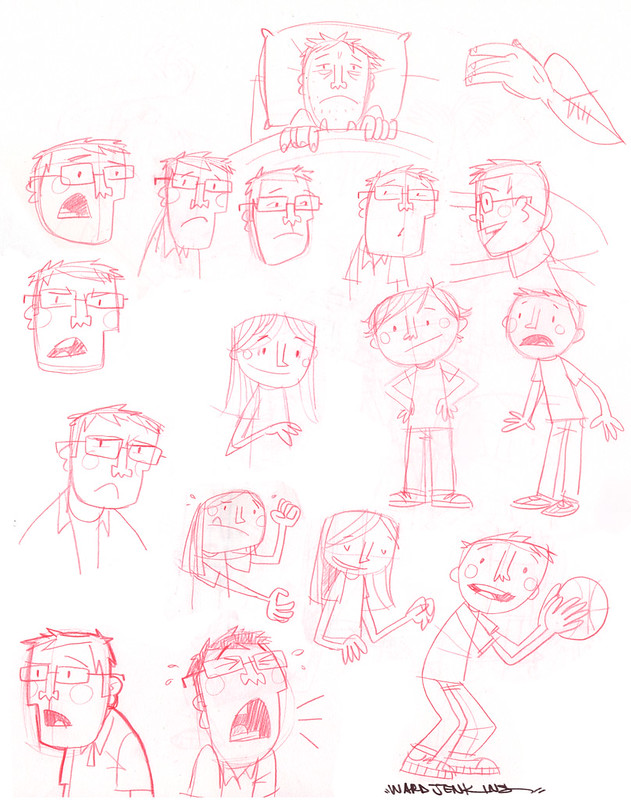
 So, it'll be interesting to see where this takes me. I'm excited about the possibility of reworking the story and seeing how all the pieces will fit. I love the process. It's not an easy thing, writing a children's book - that's for sure. Don't let anyone tell you that it's a cinch. It's not. Just ask any successful children's book writer out there - they'll be the first to let you know that it's a very difficult thing to master. So, yeah - it's going to be difficult, but I know it'll be fun going through the process.
By: Ward Jenkins,
on 7/31/2012
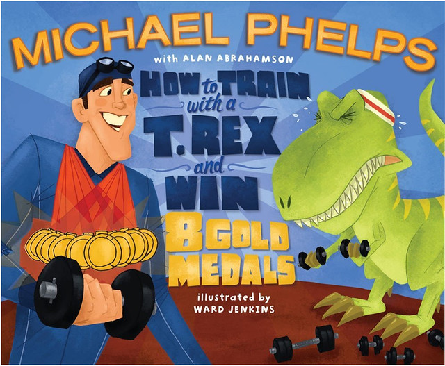 The 2012 London Olympics are in full swish and so I thought I'd showcase the first picture book I illustrated for Simon & Schuster, How To Train With a T. Rex and Win 8 Gold Medals, which came out in 2009 - a year after Michael Phelps made Olympic history by winning 8 gold medals during one Olympics. Quite an incredible feat, and one that might not be ever duplicated. The book was a challenge for me - not as challenging as what Mr. Phelps had to endure of course, but it definitely required endurance and stamina on my part - pulling all-nighters and working on re-dos and do-overs. And honestly, I enjoyed working on it. Being my first book, I wanted to prove to both myself and my publishers that I could do it. All the hard work was worth it.
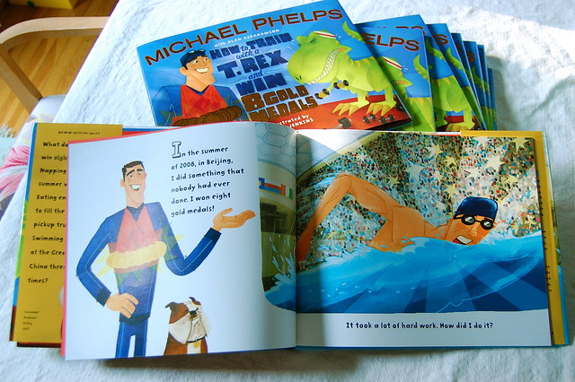

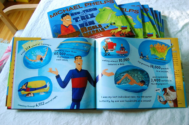 I know that Michael is not doing as well in London as he did in Beijing, but that's okay. The book puts into perspective the crazy amount of training Michael went through for the six years leading up to the 2008 Olympics - maybe after achieving such a tremendous goal, his training wasn't as strong for the four years leading up to the current Olympics. Who knows? I wish him well. I've never met the guy (it's not typical for artists to actually meet the author/co-author of the picture books that they're working on), but I will definitely be rooting for the guy when he swims tonight. He may reach another record: winning the most medals ever for an Olympic athlete.
 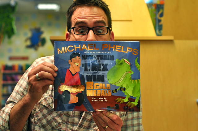 Here's a page on my site about the book: How To Train With a T.Rex And Win 8 Gold MedalsAnd here's some more photos of the book in my Flickr set: How To Train With a T.Rex And Win 8 Gold Medals Flickr setLook! Michael went on Conan (back when he was still on NBC) to promote the book:
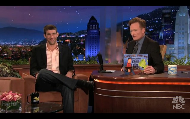
By: Ward Jenkins,
on 5/20/2012
Heads up - today is the last day that my t-shirt design Vinyl Kid will be available to order. After that, it's gone! Hurry! Hurry! (No pressure, but HURRY.) For show & tell, here's the rough sketch of Vinyl Kid: 
After that, I did final pencil lines using regular graphite pencil and a Prismacolor black pencil, which has a thicker, blacker line: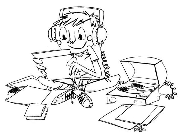
And here's the final with color added:

End of day today! Go and get it!
By: Ward Jenkins,
on 5/14/2012
Oh yay! My very first t-shirt design for Shirt.Woot is now available! Titled, Vinyl Kid, it's part of a special sale on the site called Jukebox Heroes, featuring all music-related designs. The shirt will be available for ONE WEEK ONLY! Sale ends Sunday, May 20th.
If you love vinyl (and I know you do, since you're reading this blog), then go and buy a shirt (or 2, or 3) for yourself - or for your favorite crate-digger.
By: Ward Jenkins,
on 5/11/2012
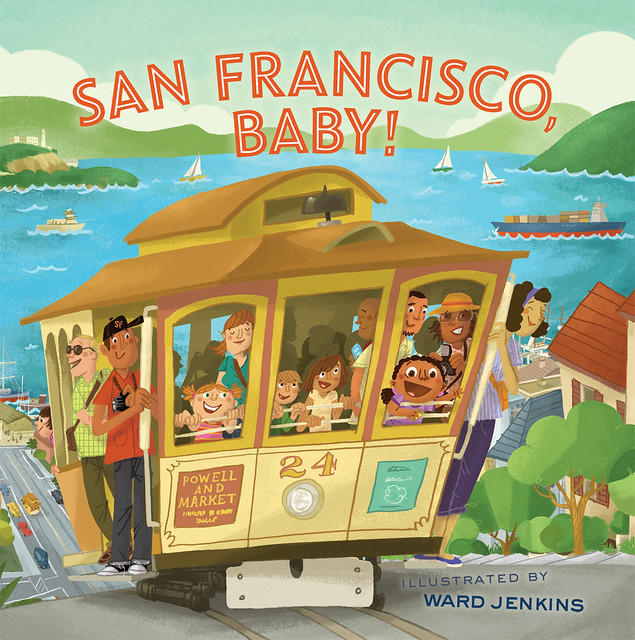
I guess you could say that it's a soft release, but I'll have you know that my two newest books are now out! Behold, the covers: 

 By: Ward Jenkins,
on 5/7/2012
By: Ward Jenkins,
on 5/7/2012
I am sitting here in a mad scramble to finish up these notes for my very first class I'll be teaching tomorrow. Yes, that's correct. I'll be teaching a class on children's book illustration for Portland State University for the second half of this semester. I'm scrambling to get these notes together, to make sure I don't sound like an idiot and what am I doing? Posting something for the blog? I know, it doesn't make sense, but I don't care. I need a little bit of a break from all this note-taking and image-gathering, just to somehow gather my thoughts somehow. It's been a long time coming, some folks have said. I agree. To a point. I've always enjoyed talking to students about what I do (I've done several appearances wherein I talk about my career, show a few tricks of the trade & how I work, and show off some of my vintage book collection), but it's an entirely different thing to actually teach. The more I think about it, the more nervous I get.
I hope I'm up for it. I guess I better be, huh? After all, it's only the potential careers of 11 some odd art & design students that're on the line here, right?
Many thanks (or blame) to Kate Bingaman Burt for roping me into doing this. She & her co-horts got a good thing going on at the Graphic Design department at PSU. Looking forward to being a part of the mix.
By: Ward Jenkins,
on 5/2/2012
 When Andrea & I vacationed in Italy back in 1999, we checked out this cool flea market in Rome with lots of fun old stuff. Found this 45 record (above) in a record bin. Love the design. I've always cherished it.
 One of these days I'm gonna listen to this record. It's imperative that I do.
By: Ward Jenkins,
on 5/1/2012
 Here are some fun characters by a mysterious "Greenwald R." They're from Pageant Magazine, a smaller, "digest" size magazine for the "gentleman." Bordering on the cheesecake from time to time, the magazine actually has an interesting connection to Mad Magazine. Well, I wish I knew more about "Greenwald R." I've seen similar work done by this artist, but never have been able to find anything more about him/her.
By: Ward Jenkins,
on 4/30/2012
Well, would you look at that! A new look for this here blog. It's as if someone turned on the lights and opened up the curtains to let the sun shine in. Lots has happened since 2008, which was the last time I redesigned The Ward-O-Matic. I was working off a tweaked and re-tweaked Blogger template that I was sure wouldn't be a burden for me in the long run. But alas, Blogger introduced the "New Blogger" interface with a vast assortment of bells and whistles to design your own look for your blog. I refused to budge because I liked how my blog looked at the time. I mean, I didn't mind that the images I posted for each post were only 400 pixels wide. That is, until Andrea wanted to cook up a new look for her blog. She wanted big images and a simple, clean look. After many weeks of tinkering we finally got it looking like the way she had envisioned and I must say, I was impressed by how easy it was to change things around in the New Blogger interface. And I loved how Andrea's images filled the screen. Whenever I'd visit my own blog, I'd realize just how constricted and "small" everything was on it. So, here we are. A new banner (which I'll probably change again soon), white background, and simpler layout. After the switchover, I lost all the links and various what-nots over in the right column, but I'll put some things back in once I get the chance. In the meantime, enjoy the bigger, wider images here on The Ward-O-Matic. Perfect for all you image-hungry readers who'll want to share on your various Tumblrs and/or Pinterest boards.
Which, by the way, I have both:
The Ward-O-Matic Tumblr
My Pinterest
By: Ward Jenkins,
on 4/16/2012
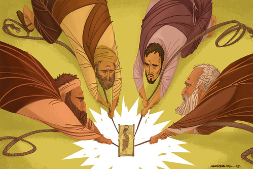
"Dropped Through The Ceiling" - my submission for the very cool Old & New Project. Different interpretations of various passages from the Bible, from a wide variety of artists (Christian, agnostic, atheist, etc.), Old & New Project has set it up so that proceeds from the sales of the prints will go to the non-profit organization Blood: Water Mission.
Old & New Project was conceived by designers Jim LePage and Troy Deshano. I'm honored to be a part of this fine project. Be sure to check out the other designs.
By: Ward Jenkins,
on 3/2/2012
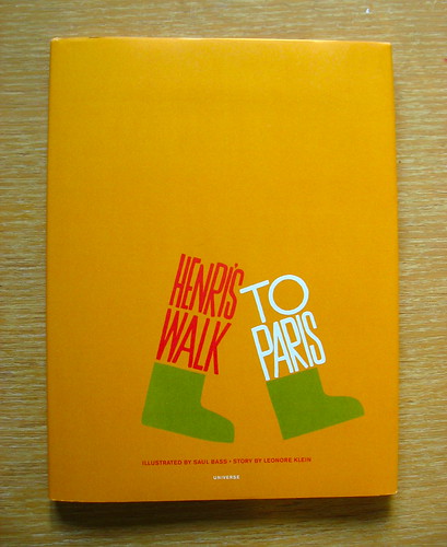
Henri's Walk To Paris, Illustrations © 1962, 2012 by Saul Bass and text by Leonore Klein, Universe Publishing, 2012.
A full 50 years later, Bass's only children's book that he illustrated is finally being reissued after being a sort of white whale for many a book collector and designer. I never owned an original printing of the book, but thumbed through a copy of one owned by a good friend of mine. (Is that the equivalent of having a girlfriend in Canada that your friends never seem to meet in person?) 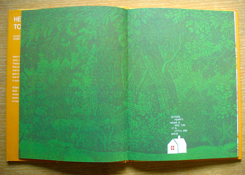
As you might've expected, it's heavy on graphic design brilliance. Bass uses the layout of each spread to evoke a particular mood - whether it's filled with foliage from some unknown source (I can't imagine Bass doing the actual drawings of the trees and bushes in the background here), or with a single sentence. 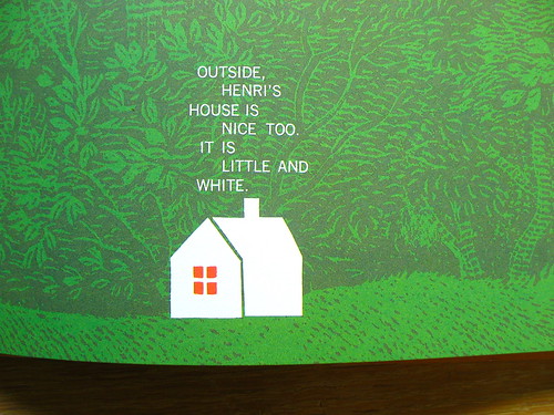
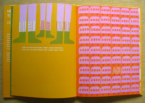
Bass utilizes repetition a lot in the book to signify the bustling of the city: trees, churches, buses...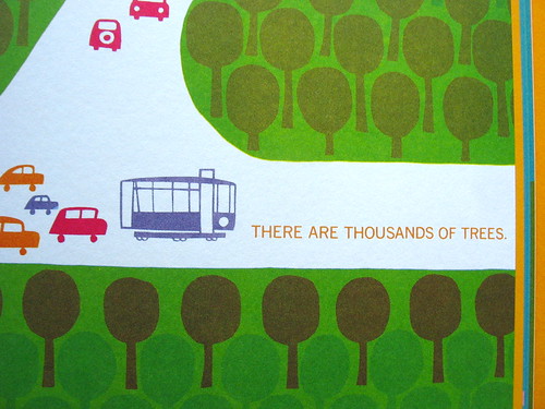
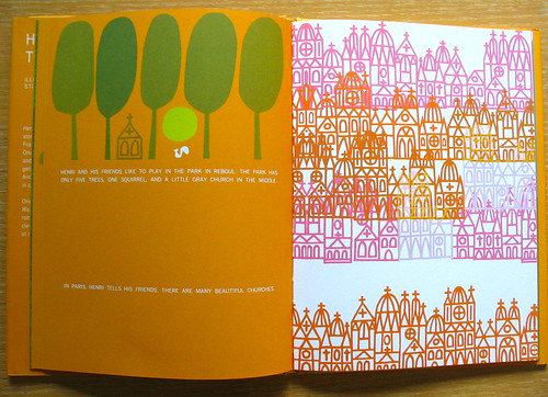
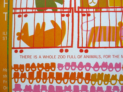
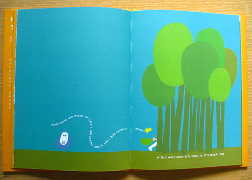
But one thing stuck out in my mind as I read through the book several times: there are no people. Well, there are "characters," but Bass doesn't actually depict a real human being aside from a crowd featuring circles with hats, a few well-placed arms and feet, and a couple of cropped legs. 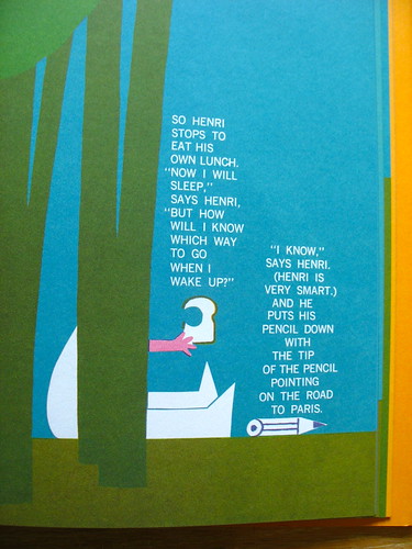
Saul Bass does what he's good at: he simplifies elements to their basic shapes and symbols. What we know to be a little boy is simply an arm and two legs. He allows the story to fill in the blanks when it comes to the true character of Henri. 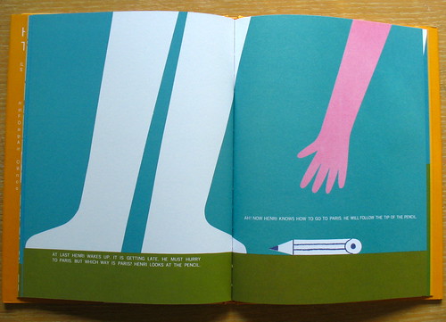 0 Comments on Henri's Walk To Paris as of 1/1/1900
By: Ward Jenkins,
on 2/21/2012
While I'm still working on this lengthy (oh boy) post about working on children's books, thought I'd share with you some recent stuff I did for a few friends of mine for Valentines Day. (Click on each to view a bit larger in Flickr.)
First one was a commission for my pals Martin & Carrie Gee for their anniversary. They're both really into sharks and rays (well, who isn't?) and Carrie told me that it would be awesome if I could put their 2 cats in the piece somehow. Done! See below: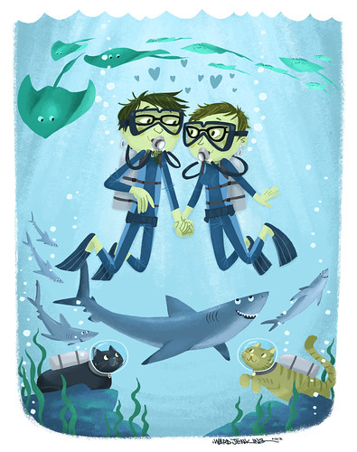
The second piece I did for my agent Jennifer Laughran. Each year she sends out a Valentines Day postcard to her friends and colleagues and asked me to illustrate this year's card. I was honored! Plus, I'm a sucker for Valentines Day anyway, especially if beatniks are involved: 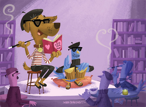
On a more personal note, I thought I'd give my own Valentine a special message this year. Click here to see just how much love I gots for my woman. ;)
By: Ward Jenkins,
on 1/17/2012
I thought for sure I had shared this here, but apparently the craziness of the holidays took its toll on me and I completely forgot. Better now than never, right? Well, I had the wonderful opportunity to illustrate the annual holiday card for the Andrea Brown Literary Agency. My agent, Jennifer, is of course, one of the agents and she asked if I could offer my talents for such an honor. I immediately said yes. Here's a little step-by-step of my process working on the card (click on each to view larger in Flickr): 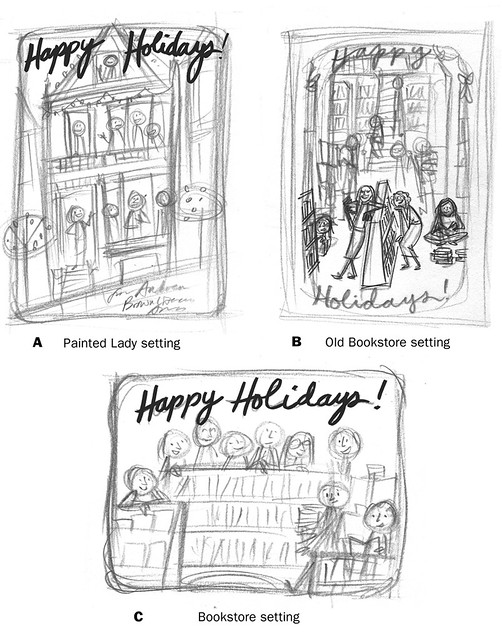
Here are my first initial ideas put together and presented to the powers that be at the agency. Idea A was too similar to an earlier card that was done several years ago (and I think that I might've remembered my agent mentioning the idea to me and just had it in the back of my mind - by the way, the agency is based out of San Francisco, hence the 'painted lady' reference). Idea B would've been too involved, considering that our time was of the essence at the time (trying to get it out before the holidays, of course!). They went for Idea C, which I thought would work best anyway. 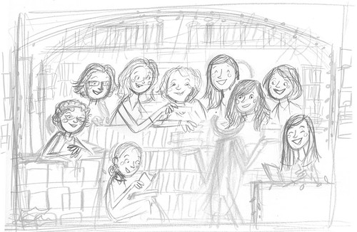
After getting all the reference photos of the agents together and doing some rough sketching in my sketchbook, I then scanned what I thought were the best rendition of each agent and put them together to see how it would all look. As you can see, the background was a separate drawing and I just shifted and moved around the faces until I liked what I saw.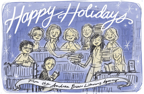
After getting the composition down and all the agents in place, I drew over the rough pencil sketches on my Cintiq a more refined sketch - this was then printed out in greyscale and I drew over that (on my animation disc) the final pencil lines for each of the agents. They are all drawn separately, in order for me to have the freedom of moving them around, just in case.
If you look at the final, you can see that I changed the hair for two of the agents, as they had since changed their hairstyles. No biggie!
And violá! The end result: 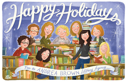
I had such a great time working on this card! It's always a pleasure for me to do something Christmas-y or wintry - the ribbon-like lettering was really fun for me to work on as well.
Hope you enjoyed this process post! If you have any questions as to how I work or my thoughts on what I did here, feel free to ask away in the comments.
ooooh lovely <3