


 Diana Kizlauskas says she knew she was in trouble early on. Drawing Barbie was more fun than playing with her. Drawing a poster of the Beatles was more appealing than buying one. A high school mural project meant more than ACT scores. By senior year, I made peace with my art addiction and chose it as my professional path…
With help from above and a little caffeine, I earned B.A. degrees in Art Education (UIC, 1974) and Illustration (Ray College of Design/ Illinois Institute of Art, 1991), supplementing those with drawing workshops at the School of the Art Institute of Chicago. My portfolio landed me in the freelance world of advertising and editorial illustration. Then with a new millennium, came a new direction: greeting cards and children’s educational publishing. Throughout this time, I exhibited work in the Chicago area, including at Gallery 400/UIC, Hyde Park Art Center, North Lakeside Cultural Center, and had a solo show at the Beverly Arts Center. In Indiana, my work was displayed at the Anderson Fine Arts Center, the John G. Blank Center for the Arts and Purdue University.
My work, family and faith community make up my rather simple universe. A native Chicagoan, my heart is anchored to the Midwest. However, I often go beyond the familiar to work with ethnic and historical themes. Through books, various other media and travel, I enjoy learning about different eras and cultures. I’ve amassed a wealth of visual reference materials which help me render physical characteristics, geographic features and design elements of various places and times. My background in education helps me translate those images to young readers in ways they can best understand.
TECHNIQUES
The illustrations presented here are created digitally or are hybrids of traditional acrylic on canvas or colored pencil on board combined with digital media.
Here is Diana talking about her process:
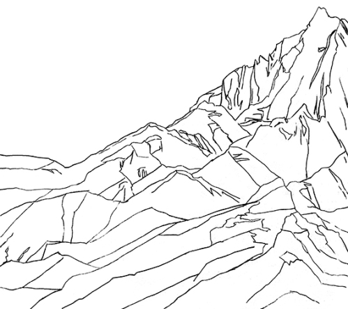
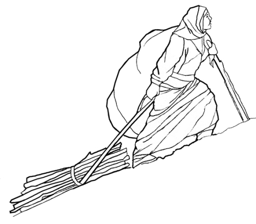
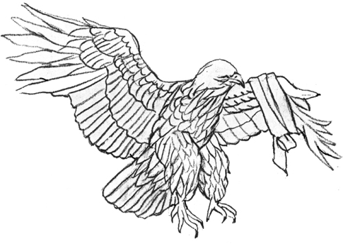
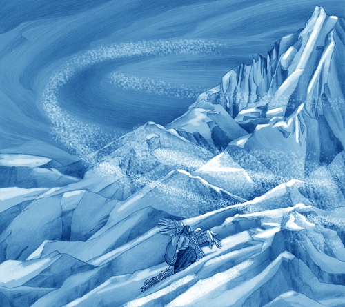
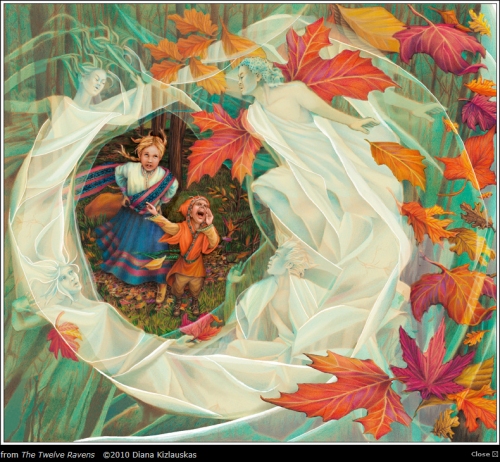
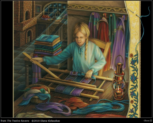
When I start an illustration I first break down the image to its most essential components. In the case of “The Climb” from my The Twelve Ravens book project, these are: the mountain, the stormy sky, girl protagonist and the injured eagle.
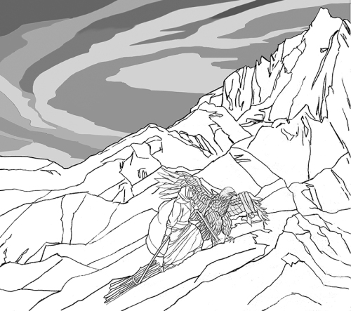
I then scan the images into Photoshop, placing each on a separate layer so that I can manipulate them independently. I play with size, cropping, etc., until I’m satisfied with the arrangement.
Since an odd number of objects make for a more interesting composition, I’ll eventually add in a fifth element, the “swoosh” of a blizzard.
Next, I add tones to the drawing. I do this digitally or by printing out the line art and adding shading by hand and rescanning. The prior picture is an example where I have done both to achieve the result.
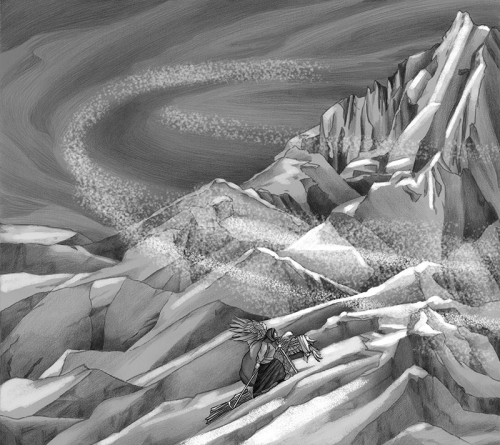
I start “painting” by duplicating my black and white tonal image and adjusting its color to umber (Figure 7). This layer lies atop the original tonal art.
I again replicate the image to create a blue layer, which lies atop the umber. Then, using various percentages of opacity in my eraser tool, I remove sections of blue to expose umber and umber to expose black and greys. This results in a balanced warm-cool color underlayment.
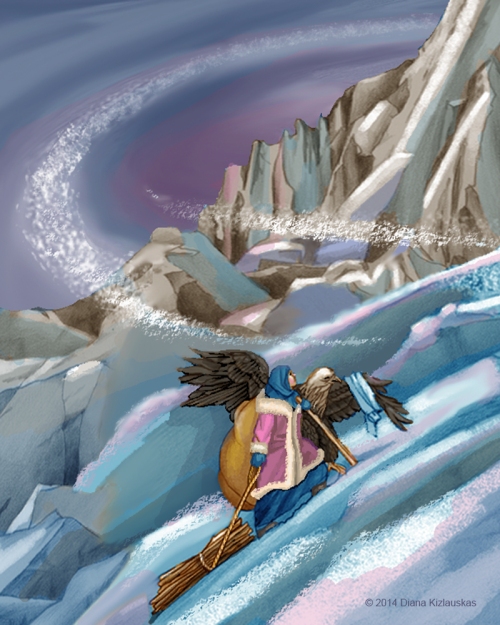
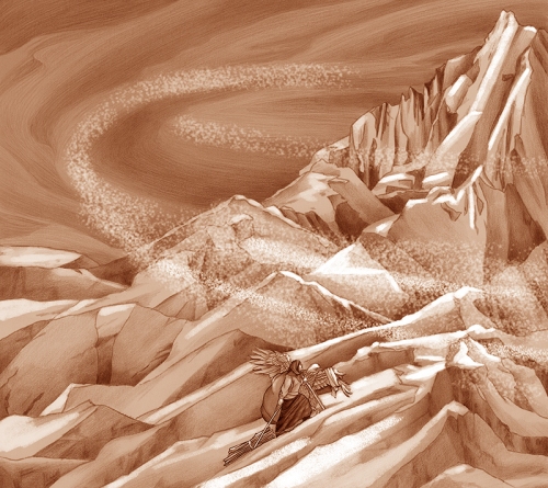
I go to finish by brushing on an entire spectrum of colors, working out details, depth, drama, texture. I give myself creative license to cut, crop, chop and drop, until—voila, it’s done!
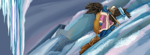
Even as I’m working on the final art, I like to keep each key component of the piece in a separate layer so that I can continue to scale it, move it or manipulate its brightness and color. This is particularly helpful when the format of the illustration needs to be changed from print edition to eBook or if you need to “repurpose” images for a promotional spot. For example, I adapted the scene from “The Climb” to use as my Facebook masthead last winter.
How long have you been illustrating?
I’ve been drawing since I could clutch a crayon in my chubby little hands; I’ve been paid for it since 1991.
How did you end up going to University of California, Irvine?
I received a BA degree in Art Education from the College of Art and Architecture, University of Illinois at Chicago, known around these parts as UIC. (I have never studied in California; perhaps your question is based on a typo in one of my bio pages.)
Since you received a BA in Art Education, did you teach after you graduated?
After completing my student teaching, I opted to stay home with my two children until they started grammar school. However, I do have about a decade of experience teaching part-time extracurricular classes to 3-7 year olds, including crafts, science and religious education.
What types of classes did you take that really helped you to develop as an illustrator?
Because a successful illustration is the result of craft, composition and creative communication, I think that Life drawing, Basic Design and Illustration Concepts courses were all indispensable.

When did you get involved in Freelance Art?
I began getting professional free-lance projects immediately upon graduating from Ray College of Design. Their job placement services were quite helpful in getting me those initial interviews and portfolio showings.
What was the first thing you created where someone paid you for your work?
As a kid, I sold poster-size portraits of the Beatles to classmates. My first job as a “bone fide” illustrator was an editorial piece for the Chicago Daily Southtown newspaper.
What made you decide to study illustration at Ray College of Design/ Illinois Institute of Art in 1991?
Ray College was a small vocational school providing a lot of individual attention to its students and geared toward getting them into the working world. At this point in my life, I felt I had had enough theoretical background and needed to jump into action.
How long did you take drawing workshops at the School of the Art Institute of Chicago?
I attended Advanced Drawing Workshop for about a year.
Do you think taking those workshops helped improve your drawing skills?
They certainly did. But more importantly, they impressed upon me the importance of surrender to the mystery of creative process, experimentation with images, as well as pushing techniques and materials to their limits. Oddly enough, I also came away from my experience at SAIC with a personal resolve to avoid conformity to non-conformity.
When did you go digital?
I was dragged into the Digital Age in the late 2000’s by clients and agents who wanted a project done quicker, cleaner, and cheaper. I went kicking and screaming, but it was one of the best things that ever happened to me professionally.
How many children’s books have you illustrated?
If we count leveled readers, I have illustrated 14 books in traditional print and 4 eBooks.
Do you still do freelance art?
All my work is done on a free-lance basis.
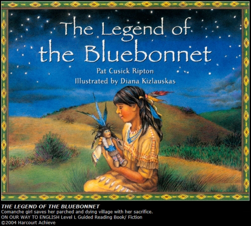
What was the first picture book that you illustrated? When did that happen?
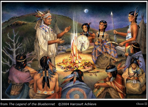
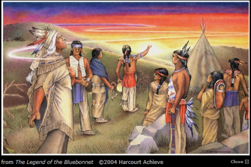
I illustrated The Legend of the Bluebonnet in 2004.
How did that contract come about?
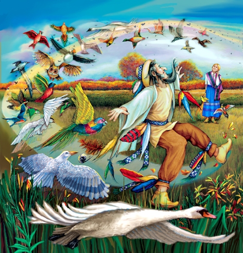
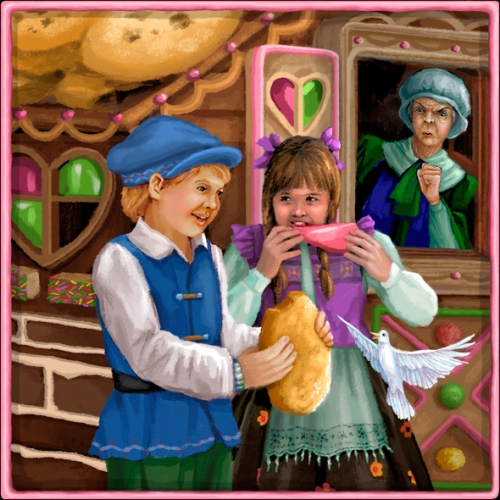
I was approached by Steven Edsey Sons artists’ reps to do the project. They had seen a piece in my samples portfolio which matched the needs of the client very closely—a Plains’ Indian family preparing a meal. The rest was, as they say, history.
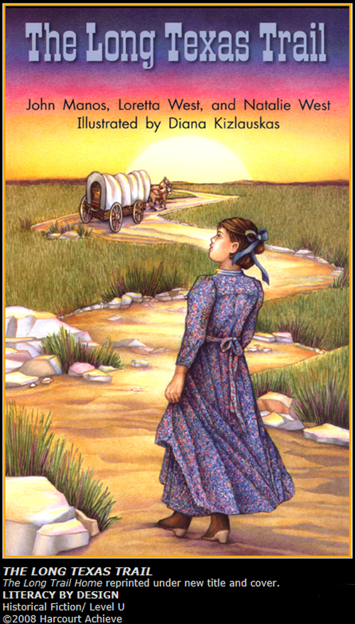
Was the Legend of the Bluebonnet the first book you did with Houghton Mifflin Harcourt?
The publisher of the Legend of the Bluebonnet was Rigby/ Harcourt Achieve. I’m unclear as to what its relation to Houghton Mifflin Harcourt was at that time.
How many books have you done with Harcourt?
I have illustrated four leveled readers for Rigby/ Harcourt Achieve and one for Harcourt School Publishers.
Would you consider working with an author who wants to self publish?
I would base my decision on the strength of the author’s credentials and the quality of the material.
Can you tell us a little bit about EDCO/Ireland? How did they find you and what type of work did they have you do?
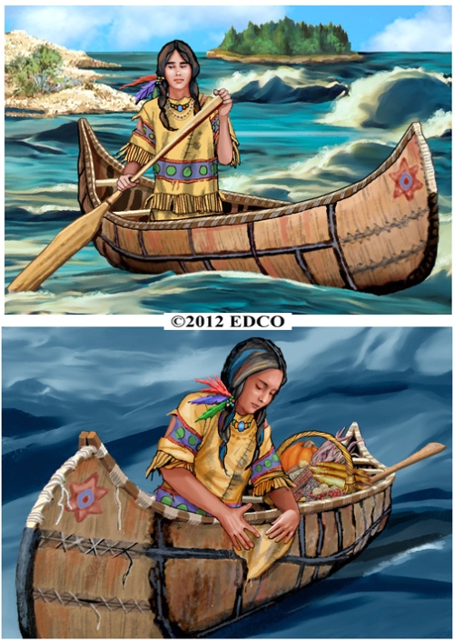
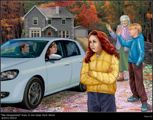
EDCO is an educational publisher in Ireland. I believe their art directors saw my work on childrensillustrators.com and then contacted my current artist reps. I illustrated several stories (“In the Deep Dark Wood,” and “The Island of the Blue Dolphins”) and a poem (“The North Wind”) for them. One of these illustrations was then adapted as a cover for By The North Star, a book in their Big Box Library series.
Have you worked with educational publishers? Which one’s?
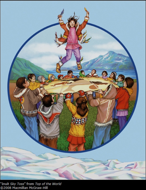
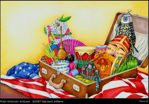
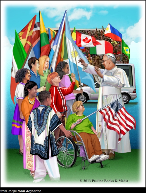
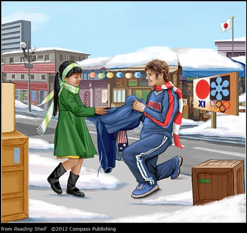
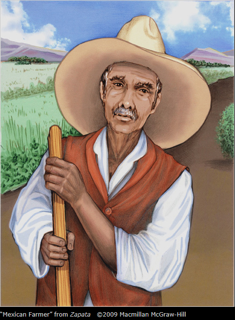
Besides the aforementioned Rigby/Harcourt Achieve, Harcourt School Publishers and EDCO/Ireland, I have worked with Macmillan/McGrawHill, Pearson/Scott Foresman, Pearson Education, Compass Publishing and Quarasan, Inc. Though they might also be considered a trade or religious publisher, Pauline Books and Media contracted me to illustrate Jorge of Argentina: The Story of Pope Francis for Children (2014).
How did those books come your way?
Nearly all of them came through artists’ reps with whom I was associated at the time of the project’s inception.
Have you ever tried to write and illustrate a children’s book?
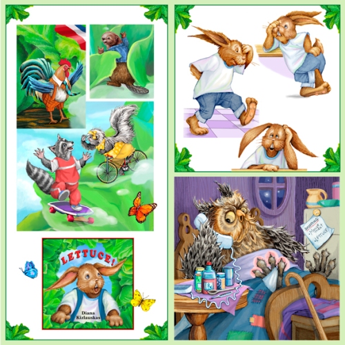
Yes, I have. LETTUCE! , my tall tale about a rabbit and his rampant good fortune, is on the eBook market right now. Parents and teachers of preschoolers have given it a 5-star rating and I’m very excited about making it available in a traditional print version this spring.
Do you have an agent? If so, who and how long have the represented you? If not, would you like one?
Over the years I have been represented by several agencies, but since 2010 by WendyLynn&Co.
What types of things do you do to get your work seen by publishing professionals?
I supply my artist reps with promotional material and advertise on childrensillustrators.com (http://www.childrensillustrators.com/illustrator-details/DKizlauskas/id=2110/). I maintain gallery and bookstore spaces on the Society of Children’s Book Writers and Illustrators website (http://www.scbwi.org/members-public/diana-kizlauskas) and I maintain an author/illustrator page on amazon.com. Also, I post regularly to my business Facebook page (www.facebook.com/DKIllustration). Most importantly, I keep my DKI Children’s Illustration website (www.dianakizlauskas.com ) updated and functioning.
Have you seen your style change since you first started illustrating?
Absolutely. My work is increasingly softer edged, more painterly, and close to 100% digital.
Have you gotten any work through networking or the Internet?
Almost exclusively so. As I described above, nearly all my marketing revolves around websites and on-line portfolio displays.
Do you use software for painting besides Photoshop?
So far, only Photoshop.
Do you own a graphic tablet? If so, how do you use it?
Yes, indeed. To reduce a complicated explanation to bare basics: I scan hand-drawn and photo-reference images into Photoshop, then use both a mouse and stylus to create layers, lines, colors, textures and draw additional images directly onto the tablet—whatever it takes to bring the illustration to finish.
How much time do you spend illustrating?
When working on a client project, I keep a very strict 10-hour, 6 day per week schedule. When creating promotional samples or working on my own books, I loosen it up to 6-hours per 5 days weekly. (This fall a family medical crisis put my work on temporary “hold,” but I’m slowly getting back on track.)
Do you have a studio set up in your house?
Yes, I do. I’m very fortunate to have a large room and loft area that accommodate a drawing table,easel, computer, printer, scanner, copier, a 8’x3.5’ work counter with horizontal storage, and 3 file cabinets full of reference clippings (some dating back to grammar school). Scads of shelves house more reference, paints, brushes , pencils and pens—not to mention a potpourri of chachkies. The closet full of dusty portfolio cases and canvases bears witness to a time before computers took over.
Any picture books on the horizon?
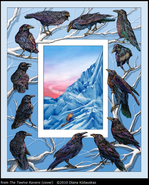
The Twelve Ravens , a Lithuanuian folktale which I have adapted, retold and illustrated, is a project I hope to have out by Fall, 2015. The eBook version is almost done, the print format awaits revision.
What are your career goals?
Beautiful books for beautiful children! I want to continue communicating to children of all colors and backgrounds through positive, bright and inspiring images. Whether my illustrations attain the stature of being published by the top trade publishers in the country or are independently made and distributed, my goal is to make each one better than the one before. I believe that concentrating on the work itself and not the fame or fortune it may bring is the only way an artist can maintain sanity in an ever-changing business world and culture.
What are you working on now?
As I mentioned, LETTUCE! and The Twelve Ravens are on my mind, but they may have to simmer on a back burner if my agent drafts me for a McGraw-Hill Education project for which I’ve recently been approved.
Are there any painting tips (materials, paper, etc.) you can share that work well for you? Technique tips?
Since I do all my “painting “ in Photoshop these days, there’s not much in the way of materials that I need to think about. But when working with colored pencils on paper or creating a “hybrid” piece where I draw onto a printed digital image, I like to use a wonderfully smooth paper called Mohawk Superfine. It is a 100 lb. “ultra white” cover stock used by the printing industry. It is receptive to the toner inks in my printer and is a perfect surface for multiple layers of Prismacolor pencils.
Any words of wisdom you can share with the illustrators who are trying to develop their career?
Like a man walking a tight rope, look straight ahead, never down. In creative, competitive fields, people who remain positive, patient, and intrinsically motivated—eventually prevail. Or as a colleague once remarked, “I can’t NOT do this…” Really, what other choice does a true artist have? So, KEEP AT IT!
Thank you Diana for sharing your journey and process with us and helping us kick off 2015. You can visit Diana at her website: http://www.dianakizlauskas.com to see more of her work.
If you have a moment I am sure Leeza would love to read your comments. I enjoy them too. Thanks!
Talk tomorrow,
Kathy
Filed under: Advice, authors and illustrators, demystify, illustrating, Illustrator Sites, Illustrator's Saturday, inspiration, Interview, Process Tagged: Diana Kizlauskas, Digital Art, Ray College of Design, University of California

What a fantastic interview! Your encouraging advice is viable for all kinds of artists, Diana. And your beautiful artwork is breathtaking! Thank you for providing complicated, detail-enriched artwork for children to return to, again and again. It is inspiring!
Thank you, Elizabeth! So glad my “two cents” was helpful… Diana K
I’m in awe.
Thank you for such a flattering comment, Penny! You make me want to dance– better yet, to draw like I was dancing…
Diana, thank you for sharing your process and your beautiful art. Such wonderful colors! :-)
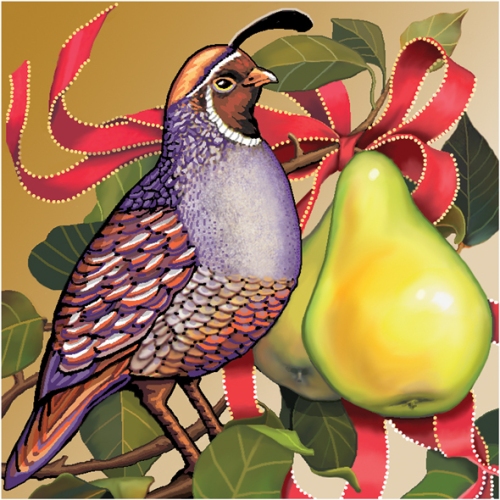
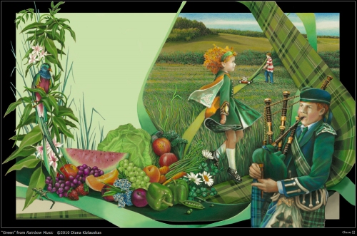
Simply lovely…my favorite is the partridge in a pear tree; that was spectacular!
Thanks, Tracy. Hope you’ll stay in touch on Facebook and my website. New artwork from HOWL OF THE MISSION OWL, which I illustrated last summer, will be going up this week…
So nice when someone appreciates my obsession with detail– thanks, Teresa!
I love details. I don’t have the patience for it myself so I always appreciate it when others put in the work and make great details. :)