new posts in all blogs
Viewing: Blog Posts Tagged with: Illustrator Sites, Most Recent at Top [Help]
Results 1 - 25 of 38
How to use this Page
You are viewing the most recent posts tagged with the words: Illustrator Sites in the JacketFlap blog reader. What is a tag? Think of a tag as a keyword or category label. Tags can both help you find posts on JacketFlap.com as well as provide an easy way for you to "remember" and classify posts for later recall. Try adding a tag yourself by clicking "Add a tag" below a post's header. Scroll down through the list of Recent Posts in the left column and click on a post title that sounds interesting. You can view all posts from a specific blog by clicking the Blog name in the right column, or you can click a 'More Posts from this Blog' link in any individual post.

By: Kathy Temean,
on 1/2/2015
Blog:
Writing and Illustrating
(
Login to Add to MyJacketFlap)
JacketFlap tags:
Interview,
inspiration,
Advice,
Process,
Digital Art,
illustrating,
authors and illustrators,
University of California,
demystify,
Illustrator Sites,
Illustrator's Saturday,
Diana Kizlauskas,
Ray College of Design,
Add a tag
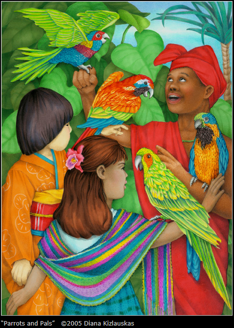
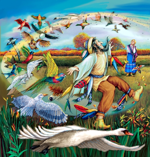
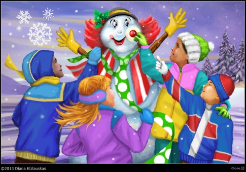
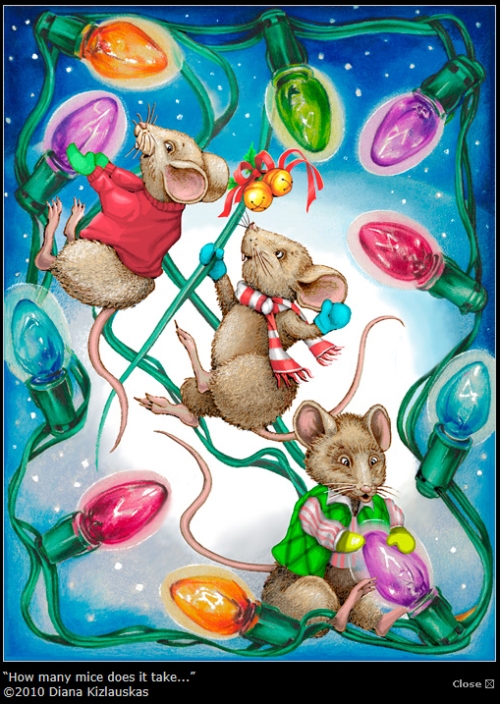
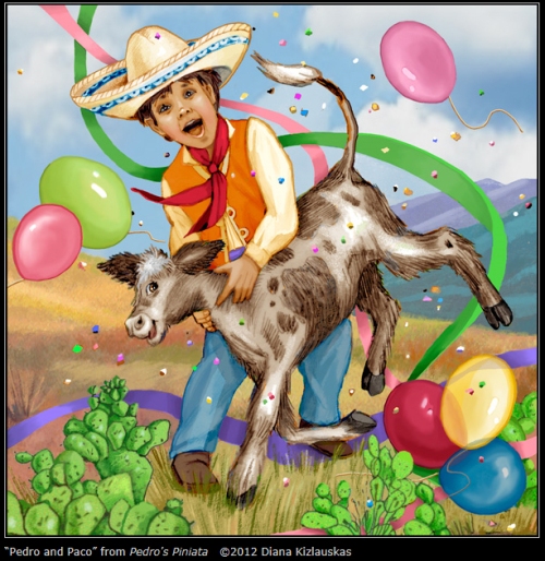
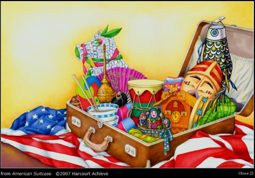
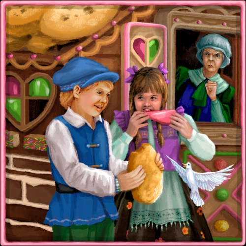
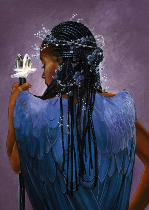
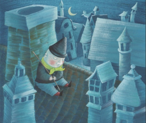
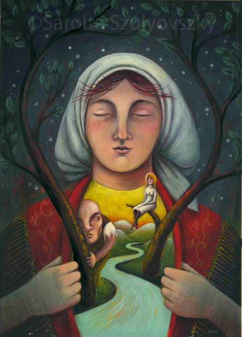
 Diana Kizlauskas says she knew she was in trouble early on. Drawing Barbie was more fun than playing with her. Drawing a poster of the Beatles was more appealing than buying one. A high school mural project meant more than ACT scores. By senior year, I made peace with my art addiction and chose it as my professional path…
With help from above and a little caffeine, I earned B.A. degrees in Art Education (UIC, 1974) and Illustration (Ray College of Design/ Illinois Institute of Art, 1991), supplementing those with drawing workshops at the School of the Art Institute of Chicago. My portfolio landed me in the freelance world of advertising and editorial illustration. Then with a new millennium, came a new direction: greeting cards and children’s educational publishing. Throughout this time, I exhibited work in the Chicago area, including at Gallery 400/UIC, Hyde Park Art Center, North Lakeside Cultural Center, and had a solo show at the Beverly Arts Center. In Indiana, my work was displayed at the Anderson Fine Arts Center, the John G. Blank Center for the Arts and Purdue University.
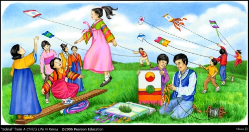
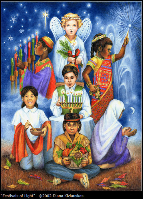
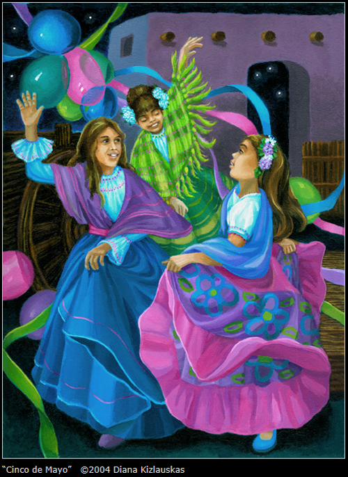
My work, family and faith community make up my rather simple universe. A native Chicagoan, my heart is anchored to the Midwest. However, I often go beyond the familiar to work with ethnic and historical themes. Through books, various other media and travel, I enjoy learning about different eras and cultures. I’ve amassed a wealth of visual reference materials which help me render physical characteristics, geographic features and design elements of various places and times. My background in education helps me translate those images to young readers in ways they can best understand.
TECHNIQUES
The illustrations presented here are created digitally or are hybrids of traditional acrylic on canvas or colored pencil on board combined with digital media.
Here is Diana talking about her process:
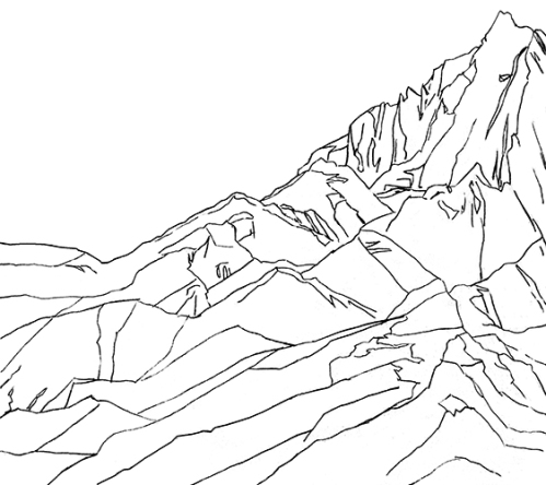
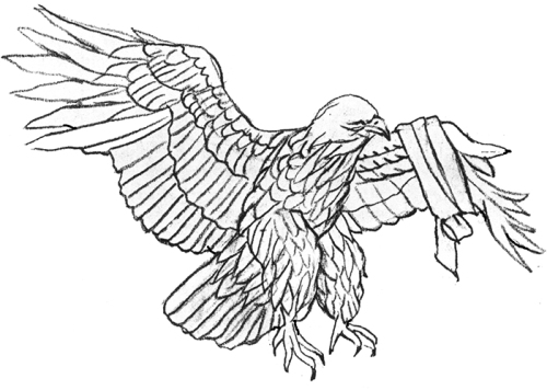
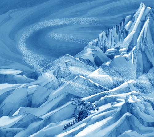
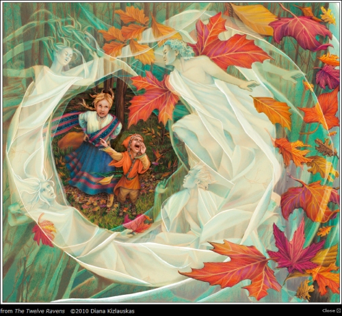
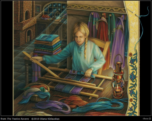
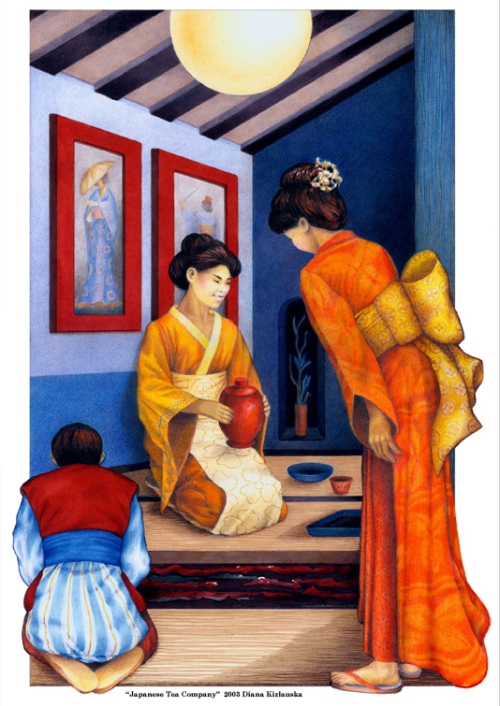
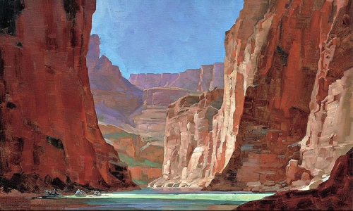
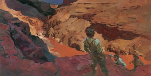
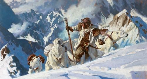
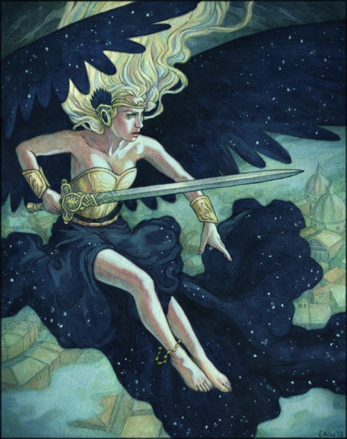
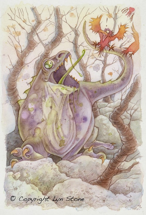
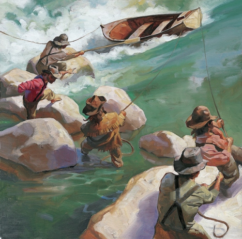
When I start an illustration I first break down the image to its most essential components. In the case of “The Climb” from my The Twelve Ravens book project, these are: the mountain, the stormy sky, girl protagonist and the injured eagle.
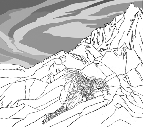
I then scan the images into Photoshop, placing each on a separate layer so that I can manipulate them independently. I play with size, cropping, etc., until I’m satisfied with the arrangement.
Since an odd number of objects make for a more interesting composition, I’ll eventually add in a fifth element, the “swoosh” of a blizzard.
Next, I add tones to the drawing. I do this digitally or by printing out the line art and adding shading by hand and rescanning. The prior picture is an example where I have done both to achieve the result.
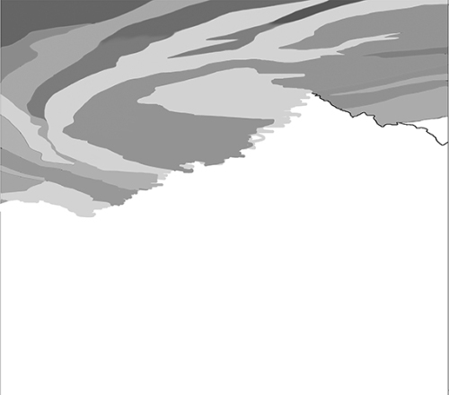
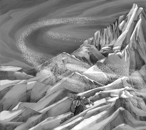
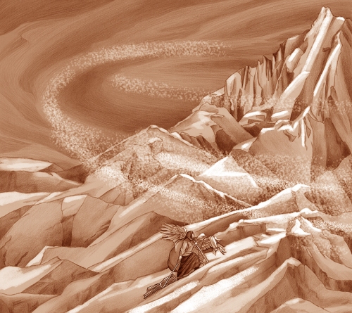
I start “painting” by duplicating my black and white tonal image and adjusting its color to umber (Figure 7). This layer lies atop the original tonal art.
I again replicate the image to create a blue layer, which lies atop the umber. Then, using various percentages of opacity in my eraser tool, I remove sections of blue to expose umber and umber to expose black and greys. This results in a balanced warm-cool color underlayment.
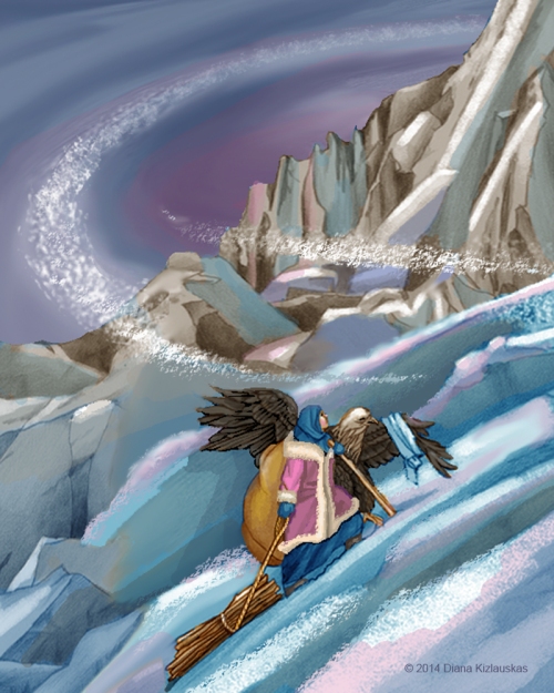
I go to finish by brushing on an entire spectrum of colors, working out details, depth, drama, texture. I give myself creative license to cut, crop, chop and drop, until—voila, it’s done!
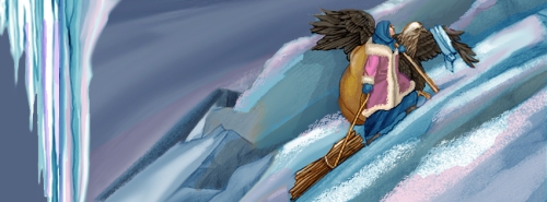
Even as I’m working on the final art, I like to keep each key component of the piece in a separate layer so that I can continue to scale it, move it or manipulate its brightness and color. This is particularly helpful when the format of the illustration needs to be changed from print edition to eBook or if you need to “repurpose” images for a promotional spot. For example, I adapted the scene from “The Climb” to use as my Facebook masthead last winter.
How long have you been illustrating?
I’ve been drawing since I could clutch a crayon in my chubby little hands; I’ve been paid for it since 1991.
How did you end up going to University of California, Irvine?
I received a BA degree in Art Education from the College of Art and Architecture, University of Illinois at Chicago, known around these parts as UIC. (I have never studied in California; perhaps your question is based on a typo in one of my bio pages.)
Since you received a BA in Art Education, did you teach after you graduated?
After completing my student teaching, I opted to stay home with my two children until they started grammar school. However, I do have about a decade of experience teaching part-time extracurricular classes to 3-7 year olds, including crafts, science and religious education.
What types of classes did you take that really helped you to develop as an illustrator?
Because a successful illustration is the result of craft, composition and creative communication, I think that Life drawing, Basic Design and Illustration Concepts courses were all indispensable.

When did you get involved in Freelance Art?
I began getting professional free-lance projects immediately upon graduating from Ray College of Design. Their job placement services were quite helpful in getting me those initial interviews and portfolio showings.
What was the first thing you created where someone paid you for your work?
As a kid, I sold poster-size portraits of the Beatles to classmates. My first job as a “bone fide” illustrator was an editorial piece for the Chicago Daily Southtown newspaper.
What made you decide to study illustration at Ray College of Design/ Illinois Institute of Art in 1991?
Ray College was a small vocational school providing a lot of individual attention to its students and geared toward getting them into the working world. At this point in my life, I felt I had had enough theoretical background and needed to jump into action.
How long did you take drawing workshops at the School of the Art Institute of Chicago?
I attended Advanced Drawing Workshop for about a year.
Do you think taking those workshops helped improve your drawing skills?
They certainly did. But more importantly, they impressed upon me the importance of surrender to the mystery of creative process, experimentation with images, as well as pushing techniques and materials to their limits. Oddly enough, I also came away from my experience at SAIC with a personal resolve to avoid conformity to non-conformity.
When did you go digital?
I was dragged into the Digital Age in the late 2000’s by clients and agents who wanted a project done quicker, cleaner, and cheaper. I went kicking and screaming, but it was one of the best things that ever happened to me professionally.
How many children’s books have you illustrated?
If we count leveled readers, I have illustrated 14 books in traditional print and 4 eBooks.
Do you still do freelance art?
All my work is done on a free-lance basis.
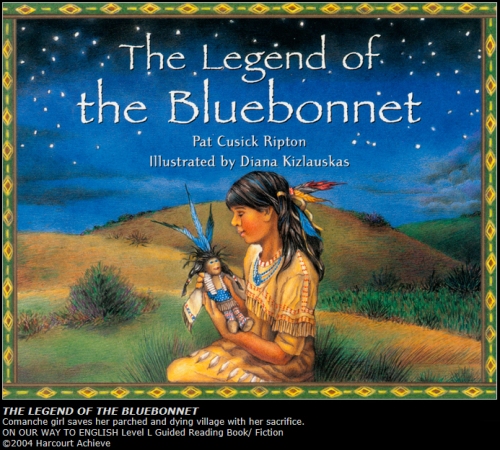
What was the first picture book that you illustrated? When did that happen?
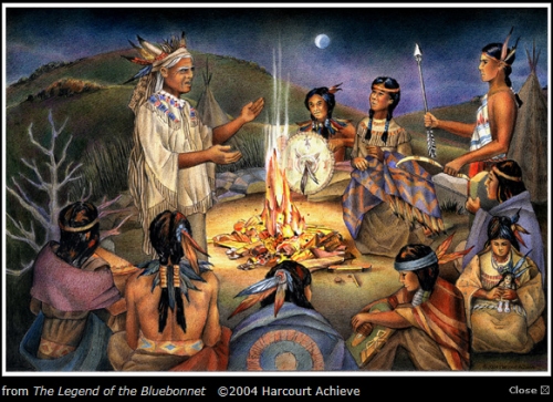
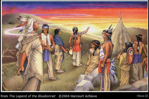
I illustrated The Legend of the Bluebonnet in 2004.
How did that contract come about?
I was approached by Steven Edsey Sons artists’ reps to do the project. They had seen a piece in my samples portfolio which matched the needs of the client very closely—a Plains’ Indian family preparing a meal. The rest was, as they say, history.
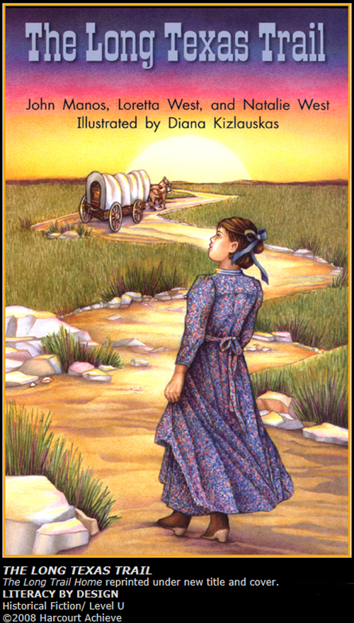
Was the Legend of the Bluebonnet the first book you did with Houghton Mifflin Harcourt?
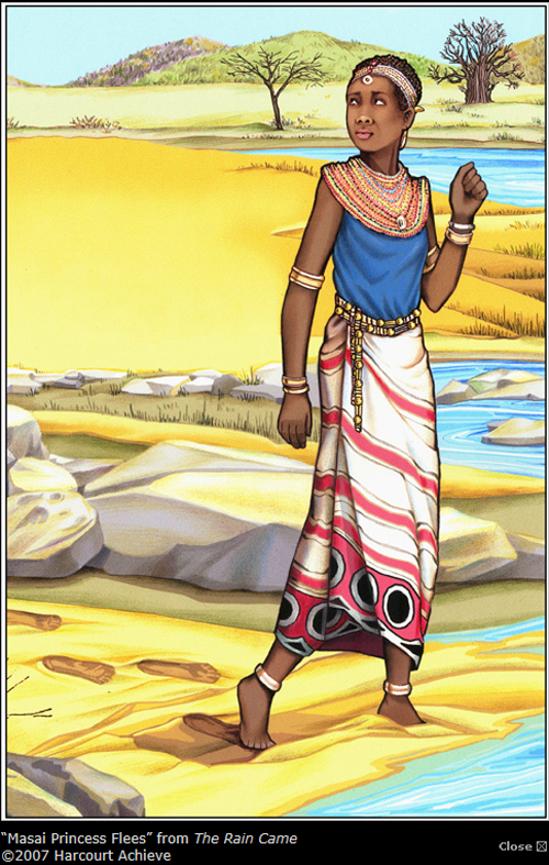
The publisher of the Legend of the Bluebonnet was Rigby/ Harcourt Achieve. I’m unclear as to what its relation to Houghton Mifflin Harcourt was at that time.
How many books have you done with Harcourt?
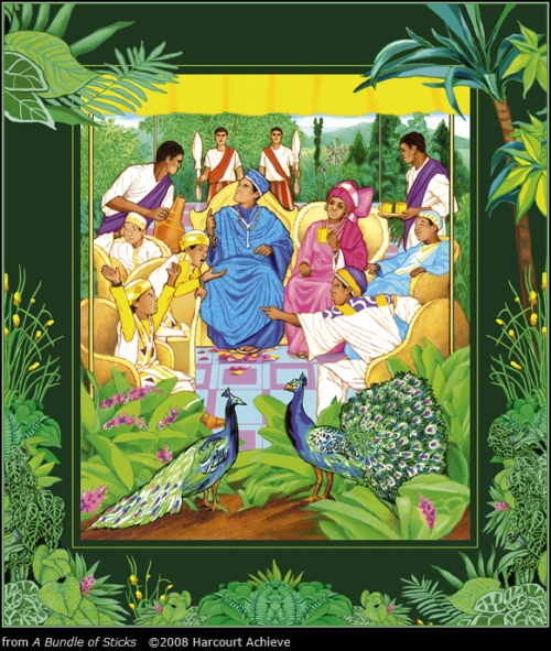
I have illustrated four leveled readers for Rigby/ Harcourt Achieve and one for Harcourt School Publishers.
Would you consider working with an author who wants to self publish?
I would base my decision on the strength of the author’s credentials and the quality of the material.
Can you tell us a little bit about EDCO/Ireland? How did they find you and what type of work did they have you do?
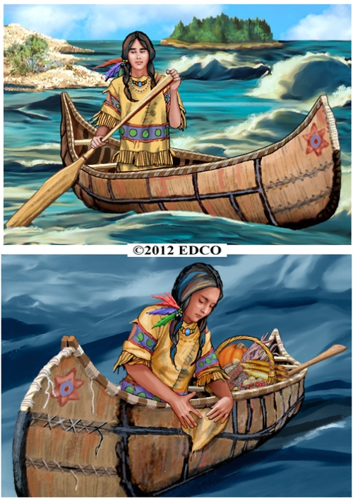
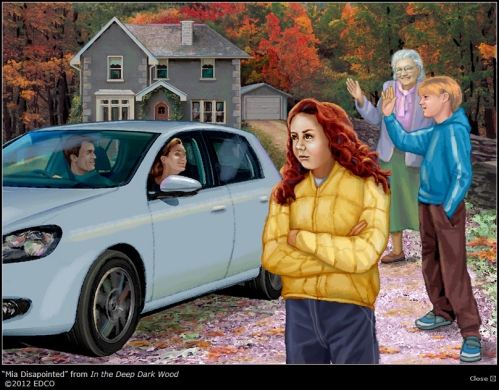
EDCO is an educational publisher in Ireland. I believe their art directors saw my work on childrensillustrators.com and then contacted my current artist reps. I illustrated several stories (“In the Deep Dark Wood,” and “The Island of the Blue Dolphins”) and a poem (“The North Wind”) for them. One of these illustrations was then adapted as a cover for By The North Star, a book in their Big Box Library series.
Have you worked with educational publishers? Which one’s?
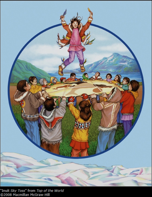
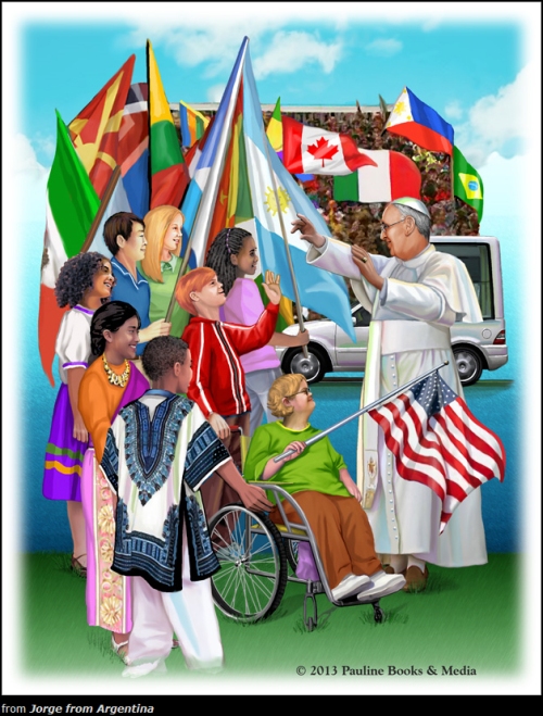
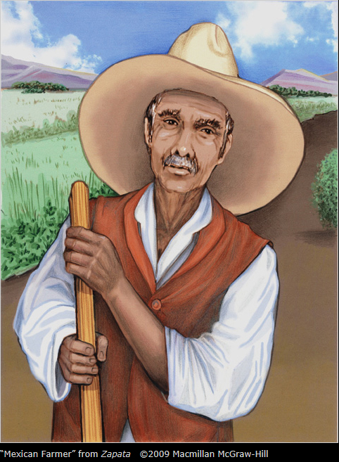
Besides the aforementioned Rigby/Harcourt Achieve, Harcourt School Publishers and EDCO/Ireland, I have worked with Macmillan/McGrawHill, Pearson/Scott Foresman, Pearson Education, Compass Publishing and Quarasan, Inc. Though they might also be considered a trade or religious publisher, Pauline Books and Media contracted me to illustrate Jorge of Argentina: The Story of Pope Francis for Children (2014).
How did those books come your way?
Nearly all of them came through artists’ reps with whom I was associated at the time of the project’s inception.
Have you ever tried to write and illustrate a children’s book?
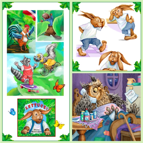
Yes, I have. LETTUCE! , my tall tale about a rabbit and his rampant good fortune, is on the eBook market right now. Parents and teachers of preschoolers have given it a 5-star rating and I’m very excited about making it available in a traditional print version this spring.
Do you have an agent? If so, who and how long have the represented you? If not, would you like one?
Over the years I have been represented by several agencies, but since 2010 by WendyLynn&Co.
What types of things do you do to get your work seen by publishing professionals?
I supply my artist reps with promotional material and advertise on childrensillustrators.com (http://www.childrensillustrators.com/illustrator-details/DKizlauskas/id=2110/). I maintain gallery and bookstore spaces on the Society of Children’s Book Writers and Illustrators website (http://www.scbwi.org/members-public/diana-kizlauskas) and I maintain an author/illustrator page on amazon.com. Also, I post regularly to my business Facebook page (www.facebook.com/DKIllustration). Most importantly, I keep my DKI Children’s Illustration website (www.dianakizlauskas.com ) updated and functioning.
Have you seen your style change since you first started illustrating?
Absolutely. My work is increasingly softer edged, more painterly, and close to 100% digital.
Have you gotten any work through networking or the Internet?
Almost exclusively so. As I described above, nearly all my marketing revolves around websites and on-line portfolio displays.
Do you use software for painting besides Photoshop?
So far, only Photoshop.
Do you own a graphic tablet? If so, how do you use it?
Yes, indeed. To reduce a complicated explanation to bare basics: I scan hand-drawn and photo-reference images into Photoshop, then use both a mouse and stylus to create layers, lines, colors, textures and draw additional images directly onto the tablet—whatever it takes to bring the illustration to finish.
How much time do you spend illustrating?
When working on a client project, I keep a very strict 10-hour, 6 day per week schedule. When creating promotional samples or working on my own books, I loosen it up to 6-hours per 5 days weekly. (This fall a family medical crisis put my work on temporary “hold,” but I’m slowly getting back on track.)
Do you have a studio set up in your house?
Yes, I do. I’m very fortunate to have a large room and loft area that accommodate a drawing table,easel, computer, printer, scanner, copier, a 8’x3.5’ work counter with horizontal storage, and 3 file cabinets full of reference clippings (some dating back to grammar school). Scads of shelves house more reference, paints, brushes , pencils and pens—not to mention a potpourri of chachkies. The closet full of dusty portfolio cases and canvases bears witness to a time before computers took over.
Any picture books on the horizon?
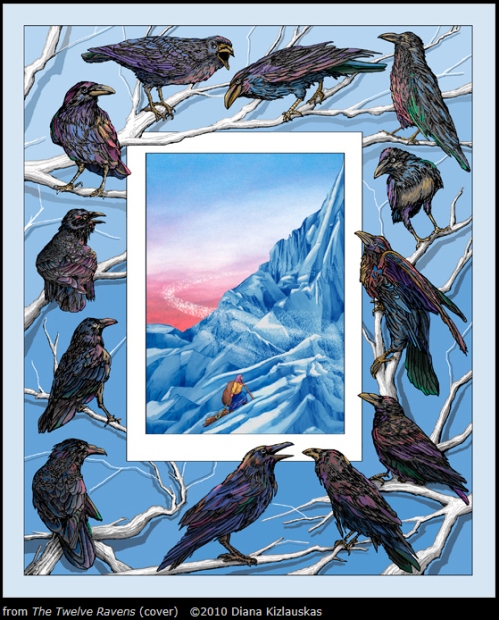
The Twelve Ravens , a Lithuanuian folktale which I have adapted, retold and illustrated, is a project I hope to have out by Fall, 2015. The eBook version is almost done, the print format awaits revision.
What are your career goals?
Beautiful books for beautiful children! I want to continue communicating to children of all colors and backgrounds through positive, bright and inspiring images. Whether my illustrations attain the stature of being published by the top trade publishers in the country or are independently made and distributed, my goal is to make each one better than the one before. I believe that concentrating on the work itself and not the fame or fortune it may bring is the only way an artist can maintain sanity in an ever-changing business world and culture.
What are you working on now?
As I mentioned, LETTUCE! and The Twelve Ravens are on my mind, but they may have to simmer on a back burner if my agent drafts me for a McGraw-Hill Education project for which I’ve recently been approved.
Are there any painting tips (materials, paper, etc.) you can share that work well for you? Technique tips?
Since I do all my “painting “ in Photoshop these days, there’s not much in the way of materials that I need to think about. But when working with colored pencils on paper or creating a “hybrid” piece where I draw onto a printed digital image, I like to use a wonderfully smooth paper called Mohawk Superfine. It is a 100 lb. “ultra white” cover stock used by the printing industry. It is receptive to the toner inks in my printer and is a perfect surface for multiple layers of Prismacolor pencils.
Any words of wisdom you can share with the illustrators who are trying to develop their career?
Like a man walking a tight rope, look straight ahead, never down. In creative, competitive fields, people who remain positive, patient, and intrinsically motivated—eventually prevail. Or as a colleague once remarked, “I can’t NOT do this…” Really, what other choice does a true artist have? So, KEEP AT IT!
Thank you Diana for sharing your journey and process with us and helping us kick off 2015. You can visit Diana at her website: http://www.dianakizlauskas.com to see more of her work.
If you have a moment I am sure Leeza would love to read your comments. I enjoy them too. Thanks!
Talk tomorrow,
Kathy
Filed under:
Advice,
authors and illustrators,
demystify,
illustrating,
Illustrator Sites,
Illustrator's Saturday,
inspiration,
Interview,
Process Tagged:
Diana Kizlauskas,
Digital Art,
Ray College of Design,
University of California 

By: Kathy Temean,
on 12/5/2014
Blog:
Writing and Illustrating
(
Login to Add to MyJacketFlap)
JacketFlap tags:
Illoustrator Saturday Favorites,
Which is your favorite?,
inspiration,
submissions,
illustrating,
authors and illustrators,
opportunity,
Illustrator Sites,
Illustrator's Saturday,
Add a tag
By: Kathy Temean,
on 11/28/2014
Blog:
Writing and Illustrating
(
Login to Add to MyJacketFlap)
JacketFlap tags:
Advice,
illustrating,
How to,
Gregory Manchess,
Smithsonian,
Illustrator Sites,
Illustrator's Saturday,
Illustrated USPS Stamps,
NYC MURAL,
Time Magazine,
Add a tag
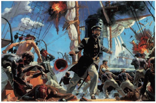
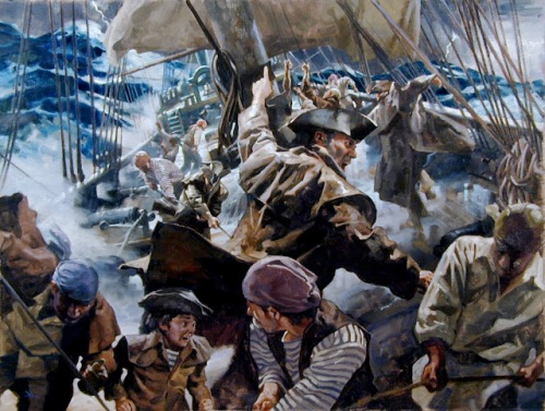
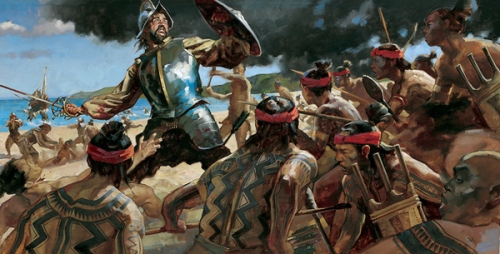
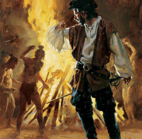
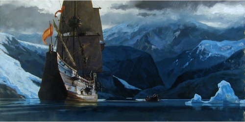
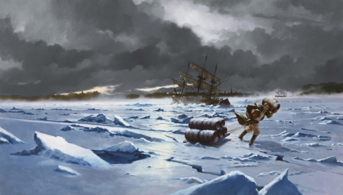
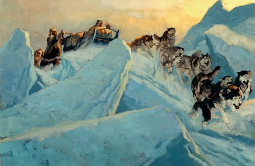
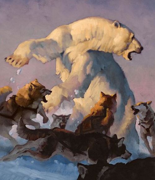
I have been trying to share Gregory Manchess’s art for most of this year. He is a very talented artist, but a very busy artist. He exhibits all over the world, teaches workshops, lectures at universities, plus everyone is trying to bang down his door for a little piece of his genius talent. I gave up on getting the answers to my too many interview questions and showing him off without the interview. But there is a lot of meat to this post with a lot of tips for illustrators, so take a look and don’t miss the link to his two hour “How to” video.
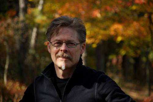
Creating a moment that communicates emotionally with the viewer is the essence of Gregory Manchess’ artwork. A native of Kentucky, he spent two years as a studio illustrator with Hellman Design Associates before striking out on his own in 1979.
He combined his love for fine art and science fiction and began his freelance career painting for OMNI magazine. His versatility and broad range of interests allowed him to crossover to mainstream illustration. There he was able to expand his client work to include covers for Time, Atlantic Monthly, spreads for Playboy, Omni, Newsweek, and Smithsonian, and numerous book covers.
Manchess’ interest in history and his excellent figure work has made his paintings a favorite choice of the National Geographic Society on many occasions, including an expedition down the Fond du Lac river in Canada for the 1996 article David Thomson: The Man Who Measured Canada.
Widely awarded within the industry, Manchess exhibits frequently at the Society of Illustrators in New York. His peers at the Society presented him with their highest honor, the coveted Hamilton King Award in 1999, and a year later, the Stephan Dohanos Award.
Manchess’ work has also been recognized in the children’s book market. His latest children’s book illustrations narrate the story Cheyenne Medicine Hat about wild mustangs. A lavishly illustrated limited edition of Robt. E. Howard CONAN stories with over 60 paintings, is due out in 2010. He has recently finished 10 murals for a traveling exhibition on the Pirate ship, Whydah, for the Nat’l Geographic Society. His painting of the Oregon coast was used for the 2009 Oregon Statehood Stamp by the USPS.
Gregory is included in Walt Reed’s latest edition of “The Illustrator in America, 1860-2000.” He lectures frequently at universities and colleges nationwide and gives workshops in painting at the Norman Rockwell Museum in Stockbridge, MA, and the Illustration Master Class in Amherst, MA.
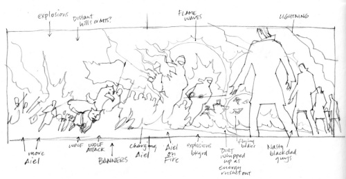
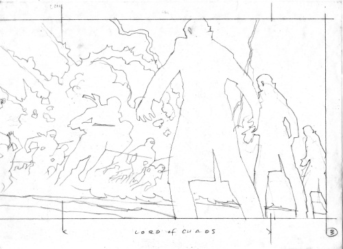
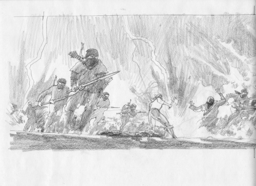
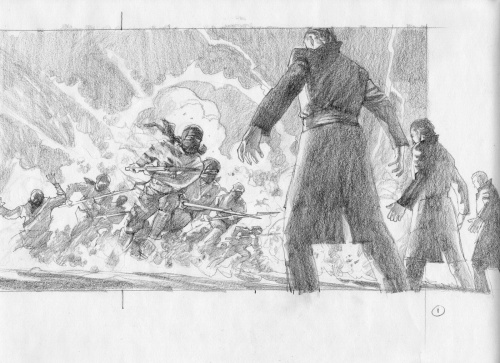
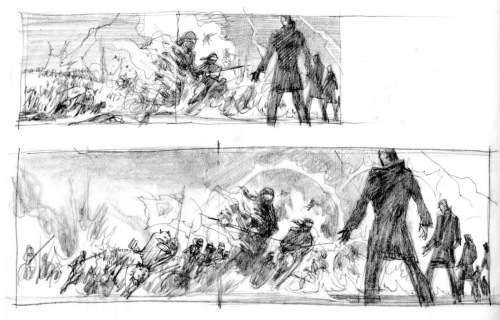
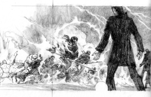
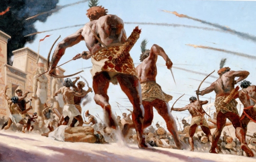
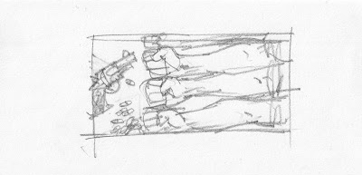
Here are a few pictures showing Gregory’s process:
Thumbnail sketch for layout.
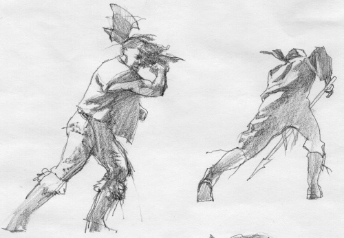
Character sketches
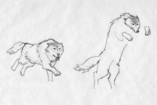
Sketches for the wolves
Cleaned up sketch
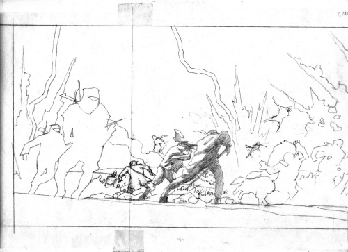
Sketching in more detail.
Adding Shadows
Adding foreground characters
Continuing to develop sketch.
Final Sketch
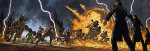
Final Painting done in oil.
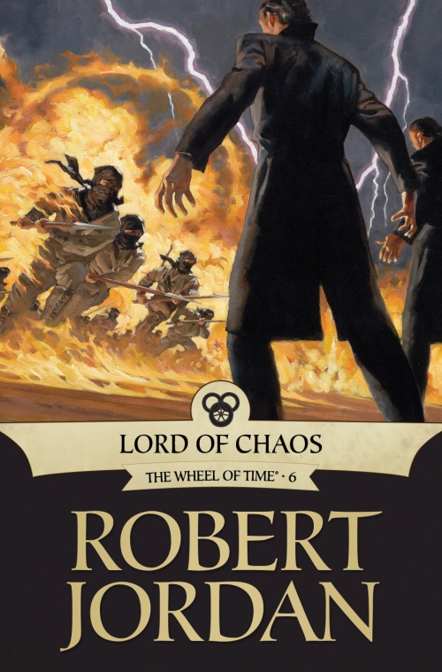
This is the final cover for LORD OF CHAOS published by Tor.
Gregory’s artist rep is Richard Solomon located in NYC. http://www.richardsolomon.com/
You can view a two hour video of Gregory’s painting process available as a download from http://Conceptart.org

One of Gregory’s many murals. Must have been fun to see it on the top of a NYC building.
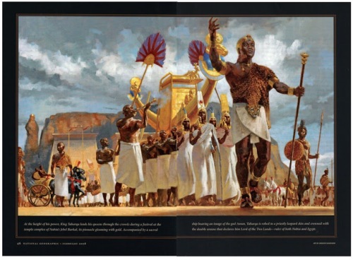
ABOVE and BELOW: Gregory’s illustrations have been in National Geographic Magazine.

Gregory also was chosen to do a few postal stamps.
The Society of Illustrators exhibited 50 of Gregory’s illustrations in 2013.

ELEVEN GREGORY TIPS:
Value range.
I start with darks first, to get the deep shadows laid in. Obvious places: nostrils, eyelids and eyebrows, mouth line. Next, I’ll put in broader, but slightly lighter shadow shapes like under the nose, under the eye sockets, under the bottom lip, chin, deep cheek bones, hair. I place the boldest shapes to establish deeper values, then work my way up through the darker values of color to the lighter values placed on top.
Avoid highlights.
Until the last bits of painting, I avoid the highlights as long as I can. Two reasons. One, I need to work my way up, so putting them in too soon will defeat that effort. Two, I leave something fun for the last. I delay gratification as long as I can. The best part of painting in oils occurs within the last few layers and strokes.
Vary forms.
Hair is a bold shape, not individual hairs. I study folds and constantly vary them. Repeating the same folds will kill a painting as dead as an assassin’s shot through a pillow. I don’t think about the object I’m painting. I separate myself from the subject and only paint the form. I won’t ‘follow’ the form either. I cut my strokes across the surface of the forms. This adds dimension and lets objects feel sculptured.
New painters: Avoid primary colors.
Ultramarine Blue. It’s deadly. It’ll make mud faster than 35 school kids running for the bus. And no, Cadmium Yellow Light is not a miracle color. Get over it. Using it straight from the tube does not show how brilliant one is at mixing paint. Same is true for Ultramarine. New painters seem to think they are phenomenal because they used Ultramarine Blue straight from the dang tube. They step back and declare, ‘look at me, The Genius. I have explained the essence of pure painting by opening a paint tube and using yellow next to blue. Admire me.’
Using primary colors as a statement of painting brilliance screams ‘AMATEUR.’
Amount of pigment.
I trained to know just how much pigment is on the end of my brush. No matter how large or small, my awareness of the amount is paramount to good layers, good coverage, good overall effect in any painting.
I studied calligraphy. It taught me how to make letterforms with a brush or pen. Knowing the amount of ink held on an instrument for calligraphy is critical to achieve a skilled work.
Brush angle.
Calligraphy also taught me how to angle a pen or brush. Making letterforms is a key factor in learning to paint. I know many great painters who also started by copying letter shapes, making signs, copying comics (bang! zoom! pow!). They learned to handle the brush and at what angle AT ALL TIMES.
The angle of the brush helps lay down the right amount of pigment, at the right angle, in the right direction, with the right pressure to achieve a free and confident stroke.

Brush size.
I start with the largest brush for as long as I can and work my way down to the smaller brushes. Many times, as I near the end of a painting, or even slightly before, I switch back and forth. It’s a good, general idea to keep things from getting too focused too early.
Stroke speed.
Painting fast and loose comes the same way as anything else: with time. I painted very slowly in the beginning, placing my strokes deliberately, to look as if they were painted fast. Once down, it’s usually hard to tell the speed the stroke was laid. Over the years, I built up speed through confidence. It’s just plain ol’ experience. And LOADS of training.
Patient strokes.
I don’t judge my strokes too quickly. I lay it down, and press on. I come back to that area after a bit to judge whether it was the correct feeling, size, color, etc. I don’t lay one down, hate it, and take it off. Or worse, try to keep changing it.
At this point in my career, I lay strokes down that don’t make sense, but I let them sit. I find that they are just fine once I come back to judge them in context, against other strokes that are adding to the whole piece. Judging too early destroys spontaneity.

Scale.
I decide how I want the paint to feel once a piece is finished. I scale the brush size to fit the scale of the painting. If it’s a small painting in a magazine, I have to decide how clearly the strokes will be seen and what feeling they project to a reader.
If it’s a large painting and I want it to feel loose, I have to decide on the size that feels best. Paint it too large with small brushes, and when it comes down in reproduction, it can look too detailed. Too small with large brushes, and the piece can look too loose, too unfocused.
New painters can make the mistake of painting too small with too large of a brush and vice versa.
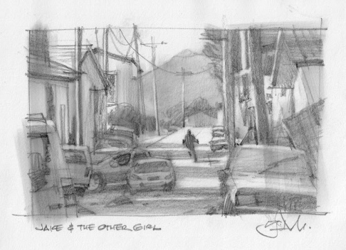
Below is Gregory explaining his thought processes for Jake and the Other Girl.
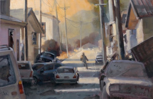
There’s another way to make successful thumbnails that can lead to a final sketch.
Get right to the research first. Instead of exploring small thumbnails on the page, searching for the right image design, there are times where I know that the assignment demands a clearer knowledge of the setting before an idea takes hold.
I read this short story for Tor.com, a follow-up for a previous story, “Dress Your Marines in White,” by Emmy Laybourne. I toyed with a short-lived idea that might connect with my illustration for the first story, based on a set of men’s arms.
But I had a clearer idea that I needed to know & show the environment for the piece. The mood needed to be established instantly. The story is post-apocalyptic. I quickly rejected that early approach after researching, at length, war-torn cities, destroyed cities, hurricane, tornado, and earthquake damaged city streets. There is only a brief scene where the main character is outdoors, but it gives the tale a sense of place and I wanted the reader to feel that.
I gathered abandoned cars, some parked, some wrecked, some neglected. I used the status of the cars to reflect the status of the story. I researched shots of broken buildings, street scenes, and abandoned towns. I put all of these images up on my computer and freehanded a large scale thumbnail as the main sketch.
With that much information, I only needed to hit it one time. Most times, you have to create your own luck.
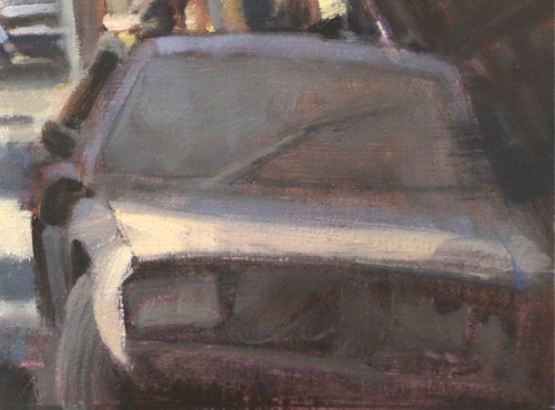
But the challenge after getting the idea was to pull it off. It must read fast and it must feel factual. Rendering cars is not so fun, but discovering and simplifying their shapes to read quickly was very gratifying. But I had to show more than just shiny cars parked. I wanted some to feel like they had just been abandoned, while others had been there for some time.Again, getting the value correct meant the difference here. Capturing that feeling meant I had to forget what it felt like, and pay more attention to exactly what it looked like. By doing that, I managed to capture the feeling of a dust covered car.
Not so intuitive. I had to study and mix the difference in value range to get shiny vs dusty. I wasn’t surprised to find out how much I learned from this painting about simplifying detail.
As painters, we must sometimes compartmentalize our feelings to actually capture those same feelings in the image. We start with the impression of feeling, reverse-engineer it methodically through observation and application that then re-communicates the feeling we were after originally. Using contrast was another way of projecting that feeling. I decided to have someone leave a cryptic message on the windshield, like a “wash me” note. The difference between the soft values of the dusty windshield and the crisp, hand drawn letters brought this across. To get that affect, I had to pay attention to exactly what value would be revealed if someone had haphazardly wiped away some dirt.
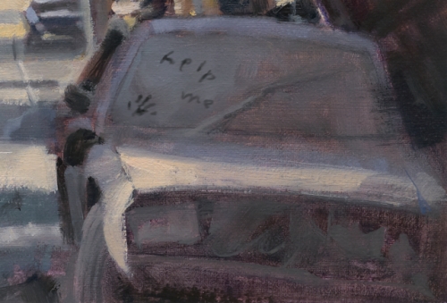
I could’ve added that passage after the oil was dry, but instead, I painted it digitally. This allowed me to give the art director, Irene Gallo, the choice to keep it or not.
This is yet another way in which digital is informing my analog painting development.
Click this link to read Gregory’s Ten Things About Painting in Oils: http://muddycolors.blogspot.com/2013/03/10-things-about-painting-in-oils.html
You can find Gregory Manchess on his website http://www.manchess.com and his facebook page: https://www.facebook.com/pages/Gregory-Manchess-Art/180916225410035
I would love to hear what you think about Gregory’s illustrations. Maybe you have taken a class with him or got to see his illustrations when he exhibited in NYC or for that matter in one of the many places he has exhibited around the world.
Talk tomorrow,
Kathy
Filed under:
Advice,
How to,
illustrating,
Illustrator Sites,
Illustrator's Saturday Tagged:
Gregory Manchess,
Illustrated USPS Stamps,
NYC MURAL,
Smithsonian,
Time Magazine 

N
N
NN
N
N
N
N
N
N
N
N
N
N
N
N
N
N
NN N
N
N
N
N
N
N
NN
NN
N
N
NN
N
N
N
NNNNNNNNNNNNNNNNNNNNNNNNNNNNNNNNNNNNNNN
Filed under:
illustrating,
Illustrator Sites,
Illustrator's Saturday Tagged:
Gregory Manchess
By: Kathy Temean,
on 7/24/2014
Blog:
Writing and Illustrating
(
Login to Add to MyJacketFlap)
JacketFlap tags:
authors and illustrators,
opportunity,
Kudos,
Conferences and Workshops,
Illustrator Sites,
Free Fall Friday,
Amal Karzai,
Christopher Behrens,
Schoolwide.com,
Sheila Fuller,
Add a tag
Another wonderful illustration by Amal Karzai. Thought it showed the feeling of this post. Website: http://www.amalillustration.com Blog: http://amalimages.blogspot.co.uk/
There might be a spot opening up at the Avalon Full Manuscript Critique Writer’s Retreat. If you are one of the people who have been kicking yourself for not getting in for this opportunity to get a critique with Agent Ammi-Joan Pacquette from Erin Murphy Agency or Agent Heather Alexander from Pippin Properties, send me an email and I will get back with you.
WOO HOO! It seems like a number of you jumped on the post where I told you about Schoolwide.com had a call out for submissions, because I’ve heard from a number of writers this week who have heard back from them. Most have received very nice letters showing interest in their manuscript and asking for revisions, which is great and could be a start of something big, but Sheila Fuller had her book ALL NIGHT SINGING accepted. Congratulations Sheila!
Christopher Behrens’ finished his book, found an illustrator whose work has been on The Today Show, used Jim Whiting and Writer’s Digest for editing, then self-published his book Savanna’s Treasure this past spring.
Kirkus gave him a good review in June and now The Community Life Newspaper wrote an article the book. If you would like to read the article, here is the link: http://www.northjersey.com/arts-and-entertainment/books/longtime-dpw-employee-pens-first-children-s-book-1.1052358
Savanna’s Treasure is available everywhere online and in all formats, including the ebook.
Two of the comments from Kirkus:
“…story enriched by an inspiring animal alliance….a good fit for early readers.” —Kirkus Reviews
Good job Chris!
Check back next Friday for the First Page Results.
Talk tomorrow,
Kathy
Filed under:
authors and illustrators,
Conferences and Workshops,
Illustrator Sites,
Kudos,
opportunity Tagged:
Amal Karzai,
Christopher Behrens,
Free Fall Friday,
Schoolwide.com,
Sheila Fuller 

By: Kathy Temean,
on 4/19/2014
Blog:
Writing and Illustrating
(
Login to Add to MyJacketFlap)
JacketFlap tags:
inspiration,
illustrating,
authors and illustrators,
Happy Easter,
Joanne Friar,
Illustrator Sites,
Lisa Falkenstern,
Illustrator's Saturday,
Ana Ochoa,
Susan Detwiller,
Add a tag
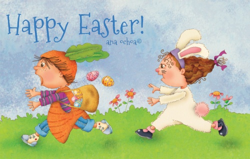
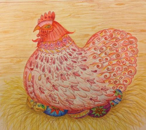
Ana Ochoa sent in this cute Happy Easter illustration to help me wish all of you a Happy Easter. Ana’s illustrations have been exhibited in many countries around the world. Her art is represented by Chris Tugeau and she was featured on January 11th 2014 on Illustrator Saturday. Click here to see her feature.
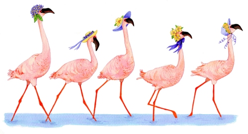
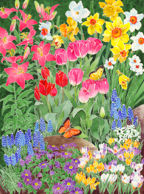
This Easter Parade illustration was sent in by Joanne Friar. She has been creating art for children’s books for over 18 years, researching history and nature from ancient civilizations to the Great Depression, from wetlands conservation to endangered species. Her books have won awards such as the CBC Notable Social Studies Book, the CBC Outstanding Science Book, and John Burroughs Nature Books for Young Readers. Joanne is represented by Christina Tugeau and was featured on Illustrator Saturday on March 10th, 2012 - Click here for the link.
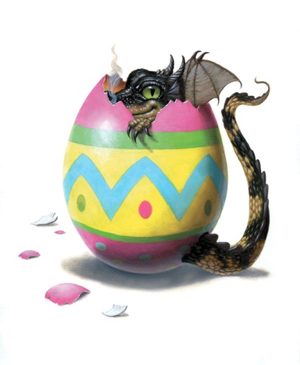
You never know what is in those Easter Eggs, but Lisa Falkenstern used her imagination to show us in this illustration. Lisa has been a professional illustrator for more than thirty years. She’s illustrated The Busy Tree, published by Marshall Cavendish, and My VeryOwn Pirate Story, published by I See Me, written and illustrated A Dragon Moves. You can read about her new book, “Professor Whiskerton Presents Steampunk ABC”. Here is the link to Thursday’s Post about the book, which includes illustrations. Lisa was also featured on Illustrator Saturday on October 2, 2010. Here is the link to visit her feature.
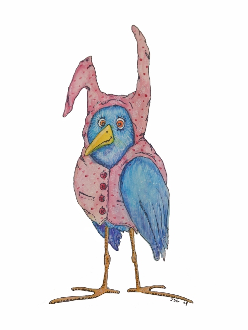
This cute Bird in bunny pajamas was sent in by Jennifer Geldard from one of her series illustrations in watercolor, black fine-tip marker and white gel pen. She is a glass artist by trade, and new to the world of illustration. I’m still getting my bearings, and learning the business end of things, but she says, “painting is pure joy for me, and I’m enjoying every minute of my education.” Her website is www.glassgirl.com
Susan Detwiler is the Illustrator Coordinator MD/DE/WV SCBWI illustrator of several picture books including On The Move and One Wolf Howls. She is the author/illustrator of Fine Life For A Country Mouse, which will be published by Penguin in September. Susan was featured on Illustrator Saturday March 9, 2013. www.susandetwiler.com
Katia Bulbenko has been drawing ever since she can remember. After studying printmaking andpainting at Tyler School of Art, she pursued her interests in sculpture and silk painting, then worked as a freelance textile designer for many years, her specialty being “conversationals”—paintings of things like coffee cups and hats, mostly for pajamas ortable linens. In addition to spending her time teaching art to grades pre-k through 8 and creating beaded fiber pieces, Katia is an aspiring children’s book illustrator. Her favorite mediums are watercolor, colored pencil, and gouache.
I want to thank everyone who sent in an illustration. I loved them all and will be using the rest with my posts in the next few weeks. Please keep sending me your illustrations. They add so much interest to this blog.
Talk tomorrow,
Kathy
Filed under:
authors and illustrators,
illustrating,
Illustrator Sites,
Illustrator's Saturday,
inspiration Tagged:
Ana Ochoa,
Happy Easter,
Joanne Friar,
Lisa Falkenstern,
Susan Detwiller 

Merry Christmas!
Wishing you, your family, and friends a wonderful day filled with love and joy.
This illustration was done by Dorris Ettlinger. She has opened an Itsy Shop, that is stocked with watercolors and prints of some of her children’s book illustrations. Take a look. You might see something you like. It is a nice way to support the arts.
Talk tomorrow,
Kathy
Filed under:
authors and illustrators,
Holiday,
Illustrator Sites,
inspiration Tagged:
Doris Ettlinger,
Merry Christmas 

By: Kathy Temean,
on 6/15/2012
Blog:
Writing and Illustrating
(
Login to Add to MyJacketFlap)
JacketFlap tags:
Interview,
inspiration,
Marshall Cavendish,
authors and illustrators,
How to,
Illustrator Sites,
Illustrator Saturday,
Illustrator's Saturday,
Alik Arzoumanian,
Tunjur! Tunjur! Tunjur!,
Add a tag
 This week we have illustrator Alik Arzoumanian. She received my BFA in Illustration from the Massachusetts College of Art and Design in Boston in 2004. The first children’s book she illustrated was “Tunjur! Tunjur! Tunjur! A Palestinian Folktale” , a retold folktale by Margaret Read MacDonald and published by Marshall Cavendish Children. The book received an ALA Notable Book Award in 2007.
She has also illustrated “So Many Houses” written by Hester Bass and published by Scholastic Library Publishing. “Grateful Animals” by Sona Zeitlian, and “Where are you Little Frog?”, written by Kayleigh Rhatigan and was published by Lark Books. Her illustrations have appeared in “Christmas Carols” and “Christmas Songs” published by Ladybird Books. Her most recent work appeared in Archbishop Desmond Tutu’s Children of God Storybook Bible, that was published in July 2010 by Lux Verbi.

Here is Alik: I was commissioned by Lux Verbi, a publisher in South Africa, to illustrate three stories in the Children of God Storybook Bible, retold by Desmond Tutu. The one I am presenting here is called “Naboth’s Vineyard”, and it tells the story of a King called Ahab and his wife Jezebel who have Naboth killed in order to take his vineyard. Prophet Elijah is sent to punish King Ahab for what he has done, but Ahab is truly sorry so he is forgiven.

Sketchbook 1, 2, 3 I first created the characters in the story. Visualizing them first helps me understand the narrative better, and results in more successful thumbnails, because instead of generic figures, I have characters I can rely on to bring the story to life.

For this story, I researched historic middle eastern costumes and looked at illustrations of King Ahab and Jezebel for inspiration. I also wanted King Ahab to look not so kingly and a little embarrassed.

Thumbnails 1, 2, 3, 4 The next step was to come up with a composition that would convey the whole narrative at once. The various s
By: Kathy Temean,
on 3/28/2012
Blog:
Writing and Illustrating
(
Login to Add to MyJacketFlap)
JacketFlap tags:
illustrating,
Jennifer Thermes,
Nicole Tadgell,
Illustrator Sites,
Kim Wood,
Bonnie Branson,
Marcy C. King,
Phyllis Mignard,
Vesper Stamper,
Add a tag
Here are the Illustrations sent in for the Month of March. Did it come in like a lion and go out like a lamb where you live?

Vesper Stamper works as an illustrator in a wide range of subjects from children’s books to album covers. Her work is inspired by her parallel career as a singer and musician in the band Ben + Vesper, on the Sounds Familyre label. Her book with fellow musician Stephen Roach (Songs of Water), Satchel Willoughby and the Realm of Lost Things (2010), is a top five finalist in the NAESP Book of the Year contest. Her e-book with LuAnn Kern, The Night the Tooth Fairy Didn’t Come (MeeGenius), was published earlier this year under the direction of Eve Adler. She lives in New Jersey with her husband, filmmaker Ben Stamper, and her two kids, who are experts in taking a backyard full of dirt and making it a world of wonders. http://www.vespersongs.com

Bonnie Branson is an Illustrator living in Newton MA. She is a graduate of the School of Visual Arts, and a member of the Society of Children’s Book Writers and Illustrators. Using Photoshop, Bonnie creates colorful, and whimsical illustrations for the children’s book market and focuses on cool stuff like HISTORY, COSTUMING, and NON-FICTION.
Website: http://www.artbonnie.com

Jennifer Thermes is a children’s book author and illustrator. Recent projects include illustrations for Maggie & Oliver, or A Bone of One’s Own, a middle grade novel by Valerie Hobbs. Jennifer’s art was also chosen for inclusion in this year’s SCBWI Bologna 2012 Illustrator’s Portfolio Display. Jennifer loves taking her pup for a walk on windy March days! Please see more work at: http://www.jenniferthermes.com .

Kim Wood is an aspiring children’s book author and illustrator with a background in toy design. Samples of her work are on view at her website, kimwoodstudio.com. Kim’s favorite spring time activities include tuning into the early morning chatter of the many birds outside her window and backyard wiffleball games with her three kids. http://kimwoodstudio.com/

Geeky Gecko illustration by Phyllis Mignard:
Creating illustrations and stories for picture books is an art form to me just like clay is to a sculptor or a piano to a musician. It appeals to both my practical and artistic nature. I draw to please myself and write because I can’t bear to part with my characters with their stories untold. http://www.phyllismignard.com/
 7 Comments on March Illustrations, last added: 3/29/2012


 Mike Moran:


 This week I have the pleasure of introducing you to Nina Mata. You may recognize her first piece of art, since it is one that she sent in to be shown off with the other February Illustrations. Nina has been drawing for as long as she can remember. In 1996, she attended the High School of Art & Design where she concentrated in Commercial Arts minored in cheerleading, film, and boys. In 2004, she switched from Fine Arts and majored in Illustration at The Fashion Institute of Technology.


 5 Comments on Mark Your Calendars Newbery Book Signings, last added: 2/28/2012


 Dahlia Broul was born in Manhattan in 1983. As the daughter of 2 New York City yellow taxi drivers, she spent most of her childhood drawing in the passenger seat. Watching the city pass by, she recalled, “Everything was about color and light”.


 Vesper means “evening prayer”, but my parents named me after a James Bond girl–the original Bond girl, Vesper Lynd, who was James’ first love, and maybe his only love, from Casino Royale. She was loyal to Bond even to death. Well, I suppose both namesakes are worth pursuing.


 This week I found Jersey boy, amazing illustrator and college teacher, Adam Gustavson. If you are an illustrator, please make sure you don’t miss reading everything. Adam was very generous with the technical information about his process. He also, has
 ")

")


 12 Comments on Leeza Hernandez Wins at SCBWI Conference, last added: 2/1/2011


 Illustrator Lena Shiffman was born and raised in Sweden, a country rich in story-telling.


What a fantastic interview! Your encouraging advice is viable for all kinds of artists, Diana. And your beautiful artwork is breathtaking! Thank you for providing complicated, detail-enriched artwork for children to return to, again and again. It is inspiring!
Thank you, Elizabeth! So glad my “two cents” was helpful… Diana K
I’m in awe.
Thank you for such a flattering comment, Penny! You make me want to dance– better yet, to draw like I was dancing…
Diana, thank you for sharing your process and your beautiful art. Such wonderful colors! :-)
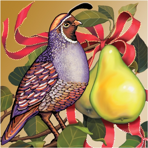
Simply lovely…my favorite is the partridge in a pear tree; that was spectacular!
Thanks, Tracy. Hope you’ll stay in touch on Facebook and my website. New artwork from HOWL OF THE MISSION OWL, which I illustrated last summer, will be going up this week…
So nice when someone appreciates my obsession with detail– thanks, Teresa!
I love details. I don’t have the patience for it myself so I always appreciate it when others put in the work and make great details. :)