


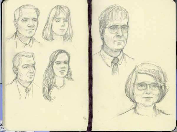
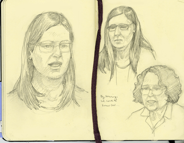
Two minute heads.
In the teensy purse Moleskine balanced upon my knee....
In the teensy purse Moleskine balanced upon my knee....
0 Comments on Sunday Sketching as of 1/1/1900
Add a Comment

 By: Tara Chang,
on 5/1/2016
By: Tara Chang,
on 5/1/2016
 By: Melissa Wiley,
on 3/10/2016
By: Melissa Wiley,
on 3/10/2016
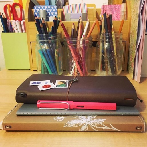
My everyday favorites. After a year of experimenting, I’ve got my system figured out. Top to bottom:
• Midori Travelers Notebook for my monthly calendar, weekly journal, and a scribble notebook;
• Moleskine Cahier for daily to-lists (bullet journal);
• Wild Simplicity Daybook for homeschooling notes and records (including our weekly Shakespeare lines—we learn monologues two lines at a time); and
• the Lamy Safari fountain pen my family gave me for my birthday. (LOVE.) (That’s an Amazon affiliate link but if you’re buying pens in the U.S., you should order from the nice people at Goulet Pen Company. Their instructional videos are invaluable, their customer service is top notch, and they offer inexpensive ink samples so you can try out all sorts of gorgeous colors. And that is not an affiliate link. I’m just a happy customer.)
I still keep the family appointments on Google Calendar, but I enjoy writing everything out in the TN monthly calendar (#017) as well. I use the horizontal weekly TN insert (#019) for chronicling the day after it happens—just a few notes about highlights. For the last several months I’ve used a blank TN insert (#003) for my bullet journal but came to realize I need a separate space for scrawling, sketching, doodling, working things out on paper. If I do that in the bullet, things get messy. WAY messy. So I’ve gone back to my old (cheaper) Moleskine grids for task lists.
The Midori travels with me everywhere; the bullet journal lives on my desk where I do most of my work; and the Daybook has a home in a basket by my rocking chair in the living room.
I’m laughing at how complicated this must seem if you aren’t a pen-and-paper fanatic…but I juggle a lot of roles (and kids) and I find having different paper spaces helps me keep things straight.
More nitty gritty:
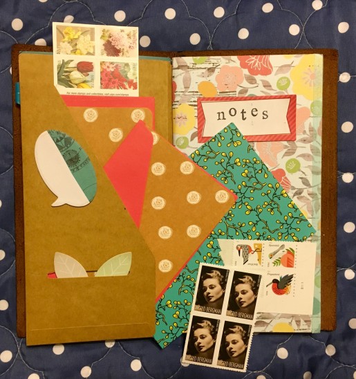
I also have a kraft folder (#020) in my Midori to tuck ephemera and snail-mail supplies into. Since I started carrying notecards and stamps around, I’ve gotten much more prompt with my thank-you notes.
• I love the feel of Prismacolor colored pencils on the paper Lesley Austin uses in the Wild Simplicity Daybook. I’m sure I’ve raved about this before—the lovely creamy pencil on this recycled paper with just the right amount of tooth.
• Prismacolor pencils also delight me in the bullet journal: I like ’em for filling in my checkboxes.
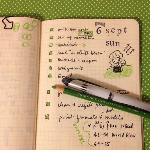
• This pic, which I’ve shared here before, shows my favorite way to organize a task list: to-do items on the right, and the verso is for related notes and numbers. I also keep a running “Nag List” on a sticky note that travels from spread to spread. It’s for important tasks that I might not get done today but I gotta deal with soon—like finishing my taxes or booking a doctor appointment. I consult it each evening when making out my bullet list for the next day.
• Sometimes I’ll tuck another insert into the Midori to be used for a specific purpose. For example, I keep a log of incoming and outgoing snail mail. I don’t like a superfat Midori, though, so more often that insert lives in my stationery pouch.
• As I mentioned, I do a lot of casual sketching in my blank Midori insert. I find I’m often more comfortable there than in my proper sketchbook, because it feels more casual. But I do have a couple of sketchbooks going and I try to work in at least one of them daily. One is a spiral-bound 7×10 Canson Mixed Media pad, which gets lukewarm reviews from real artists but I quite like its toothy paper—not to mention its price point when Michael’s has a good sale + coupon combo. You have to watch for it, but now and then they’ll give you a 20% off including sale items coupon during a buy-one-get-one-free sketchbook sale. My other sketchbook is a Moleskine Art Plus, and it’s…okay? I love its size and shape (fits nicely in my bag), but the paper is too smooth for my liking. I much prefer the feel of Moleskine’s watercolor sketchbook—a lovely texture to that paper. But so far I’ve mostly just used that for color charts.
• For sketching pens, I like Sakura Pigma Microns or my Pilot Metropolitan fountain pen (check out all the groovy colors at Goulet Pens) with Platinum Carbon ink, which is waterproof so it plays nice under watercolors. However, lately I’ve come to realize that what I enjoy most of all is sketching in pencil. I love the look of black or brown ink drawings, and most of the sketchbook artists I admire work directly in ink, but I really love the way a pencil feels on the paper. I keep hitting that point over and over, don’t I—the tactile experience matters more to me than how it looks.
Ha, this got long! Would you believe it was just going to be a quick copy-paste of something I tossed on Instagram today?
By: Tara Chang,
on 2/21/2016


The sketch that led to the flowers I finally placed in my HOPE design for January. I'm still in the midst of reorganising my work and my life and have to confess to a bit of a dilemma here as it looks like I'm going to have to decide whether to carry on with the newsletter or place it aside for the moment. The idea of cutting it out hurts quite a bit but, well, I'm having to prioritise, and the illustrations for the children's books that I'm working on tops that list.
Work for college comes next, and the fact that my children's book illustration work has been accepted as part of my course (work-related project yay) helps tons. Floating Lemons seems to be doing rather well despite being mostly ignored recently, but I doubt if I can keep up the monthly commitment to illustrating free printables for the newsletter. I may continue to do so on an erratic basis whenever I find the time (ha ha I'm hilarious) ... we shall see how it goes. Excuses, excuses, I know. But sometimes we just have to give up some of the things we love -- temporarily at least. Perhaps I can work on it once every two months instead, this year ... hmmm that's an idea.
I shall have a good think about it, and hope that meanwhile you'll enjoy the fancy flowers sketch and that you'll pop over to my children's book illustration (and college) blog to see what it is that's been taking up so much of my time lately (beware of panda bears!): Mariana Black Illustration
By: Tara Chang,
on 1/24/2016
 By: Tara Chang,
on 1/18/2016
By: Tara Chang,
on 1/18/2016
 By: Tara Chang,
on 1/10/2016
By: Tara Chang,
on 1/10/2016

.jpg?picon=572) By: andrea joseph,
on 1/2/2016
By: andrea joseph,
on 1/2/2016
 By: Tara Chang,
on 12/27/2015
By: Tara Chang,
on 12/27/2015
 By: Tara Chang,
on 12/20/2015
By: Tara Chang,
on 12/20/2015

 By: Tara Chang,
on 12/13/2015
By: Tara Chang,
on 12/13/2015
 By: andrea joseph,
on 10/30/2015
By: andrea joseph,
on 10/30/2015


 By: Tara Chang,
on 8/16/2015
By: Tara Chang,
on 8/16/2015
 By: andrea joseph,
on 8/6/2015
By: andrea joseph,
on 8/6/2015


 By: Tara Chang,
on 7/19/2015
By: Tara Chang,
on 7/19/2015
 By: Tara Chang,
on 7/12/2015
By: Tara Chang,
on 7/12/2015
 By: Tara Chang,
on 7/5/2015
By: Tara Chang,
on 7/5/2015
 By: Tara Chang,
on 6/29/2015
By: Tara Chang,
on 6/29/2015
 By: Tara Chang,
on 6/21/2015
By: Tara Chang,
on 6/21/2015


 By: Tara Chang,
on 5/17/2015
By: Tara Chang,
on 5/17/2015
 By: Tara Chang,
on 5/3/2015
By: Tara Chang,
on 5/3/2015
 By: Tara Chang,
on 4/19/2015
By: Tara Chang,
on 4/19/2015

 By: Dianna Dilworth,
on 4/16/2015
By: Dianna Dilworth,
on 4/16/2015
Lewis Carroll’s “Alice’s Adventures in Wonderland” is turning 150 and to celebrate, notebook maker Moleskine has created a limited edition notebook collection.
Moleskine worked with The British Library to incorporate original artwork into the notebook series. There are four different covers, which include reproductions of original drawings by John Tenniel, the artist who drew Alice. And inside the cover of these notebooks, readers will find a page from Carroll’s original handwritten manuscript.
To promote the new series, Moleskine collaborated with Dutch paper cut artist Rogier Wieland to make a short video down the rabbit hole. Check it out after the jump.
By: Tara Chang,
on 3/29/2015
 By: andrea joseph,
on 2/2/2015
By: andrea joseph,
on 2/2/2015


