new posts in all blogs
Viewing: Blog Posts Tagged with: Korea, Most Recent at Top [Help]
Results 1 - 25 of 28
How to use this Page
You are viewing the most recent posts tagged with the words: Korea in the JacketFlap blog reader. What is a tag? Think of a tag as a keyword or category label. Tags can both help you find posts on JacketFlap.com as well as provide an easy way for you to "remember" and classify posts for later recall. Try adding a tag yourself by clicking "Add a tag" below a post's header. Scroll down through the list of Recent Posts in the left column and click on a post title that sounds interesting. You can view all posts from a specific blog by clicking the Blog name in the right column, or you can click a 'More Posts from this Blog' link in any individual post.

By: Sara Pinotti,
on 10/19/2014
Blog:
OUPblog
(
Login to Add to MyJacketFlap)
JacketFlap tags:
Books,
Language,
old,
German,
english,
Dutch,
Linguistics,
Scandinavian,
Latin,
necromancy,
reconstruction,
*Featured,
linguistic,
george walkden,
linguistic necromancy: a guide for the uninitiated,
proto,
Add a tag
It’s fairly common knowledge that languages, like people, have families. English, for instance, is a member of the Germanic family, with sister languages including Dutch, German, and the Scandinavian languages. Germanic, in turn, is a branch of a larger family, Indo-European, whose other members include the Romance languages (French, Italian, Spanish, and more), Russian, Greek, and Persian.
Being part of a family of course means that you share a common ancestor. For the Romance languages, that mother language is Latin; with the spread and then fall of the Roman empire, Latin split into a number of distinct daughter languages. But what did the Germanic mother language look like? Here there’s a problem, because, although we know that language must have existed, we don’t have any direct record of it.
The earliest Old English written texts date from the 7th century AD, and the earliest Germanic text of any length is a 4th-century translation of the Bible into Gothic, a now-extinct Germanic language. Though impressively old, this text still dates from long after the breakup of the Germanic mother language into its daughters.
How does one go about recovering the features of a language that is dead and gone, and which has left no records of itself in spoken or written form? This is the subject matter of linguistic necromancy – or linguistic reconstruction, as it is more conventionally known.
The enterprise, dubbed “darkest of the dark arts” and “the only means to conjure up the ghosts of vanished centuries” in the epigraph to a chapter of Campbell’s historical linguistics textbook, really got off the ground in the 1900s due to a development of a toolkit of techniques known as the comparative method.
Crucial to the comparative method was a revolutionary empirical finding: the regularity of sound change. Though it has wide-reaching implications, the basic finding is simple to grasp. In a nutshell: it’s sounds that change, not words, and when they change, all words which include those sounds are affected.
Let’s take an example. Lots of English words beginning with a p sound have a German counterpart that begins with pf. Here are some of them:
- English path: German Pfad
- English pepper: German Pfeffer
- English pipe: German Pfeife
- English pan: German Pfanne
- English post: German Pfoste
If the forms of words simply changed at random, these systematic correspondences would be a miraculous coincidence. However, in the light of the regularity of sound change they make perfect sense. Specifically, at some point in the early history of German, the language sounded a lot more like (Old) English. But then the sound p underwent a change to pf at the beginning of words, and all words starting with p were affected.
There’s much more to be said about the regularity of sound change, since it underlies pretty much everything we know about language family groupings. (If you’re interested in finding out more, Guy Deutscher’s book The Unfolding of Language provides an accessible summary.) But for now let’s concentrate on its implications for necromantic purposes, which are immense.
If we want to invoke the words and sounds of a long-dead language like the mother language Proto-Germanic (the ‘proto-’ indicates that the language is reconstructed, rather than directly evidenced in texts), we just need to figure out what changes have happened to the sounds of the daughter languages, and to peel them back one by one like the layers of an onion. Eventually we’ll reach a point where all the daughter languages sound the same; and voilà, we’ve conjured up a proto-language.
There’s more to living languages than just sounds and words though. Living languages have syntax: a structure, a skeleton. By contrast, reconstructed protolanguages tend to look more like ghosts: hauntingly amorphous clouds of words and sounds. There are practical reasons why the reconstruction of proto-syntax has lagged behind. One is simply that our understanding of syntax, in general, has come a long way since the work of the reconstruction pioneers in the 19th century.
Another is that there is nothing quite like the regularity of syntactic change in syntax: how can we tell which syntactic structures correspond to each other across languages? These problems have led some to be sceptical about the possibility of syntactic reconstruction, or at any rate about its fruitfulness. Nevertheless, progress is being made. To take one example, English is a language that doesn’t like to leave out the subject of a sentence. We say “He speaks Swahili” or “It is raining”, not “Speaks Swahili” or “Is raining”. Though most of the modern Germanic languages behave the same, many other languages, like Italian and Japanese, have no such requirement; speakers can include or omit the subject of the sentence as the fancy takes them. Was Proto-Germanic like English, or like Italian or Japanese, in this respect? Doing a bit of necromancy based on the earliest Germanic written records suggests that Proto-Germanic was, like the latter, quite happy to omit the subject, at least under certain circumstances.Of course the issue is more complex than that – Italian and Japanese themselves differ with regard to the circumstances under which subjects can be omitted.
Slowly but surely, though, historical linguists are starting to add skeletons to the reanimated spectres of proto-languages.
The post Linguistic necromancy: a guide for the uninitiated appeared first on OUPblog.

By: PennyF,
on 7/12/2014
Blog:
OUPblog
(
Login to Add to MyJacketFlap)
JacketFlap tags:
Geography,
World,
Netherlands,
dutch,
atlas,
Europe,
World Cup,
Oxford Atlas of the World,
Atlas of the World,
FIFA,
Social Sciences,
*Featured,
friesland,
oxford’s atlas,
Sports & Games,
country facts,
meuse,
catarinella,
Books,
History,
Add a tag
As we gear up for the third place finalist match of the 2014 FIFA World Cup today — the Netherlands face the host country Brazil — we’re highlighting some interesting facts about one of the competing nations with information pulled right from the pages of the latest edition of Oxford’s Atlas of the World. Germany (tomorrow’s country highlight) and Argentina go head-to-head on Sunday, 13 July to determine the champion.
The Netherlands, located in the western end of Northern Europe is widely known for its rich Dutch culture. The population is 83% Dutch, with a smaller percentage made up of Indonesian, Turkish, and Moroccan ethnicities. The nation has two official languages: Frisian, spoken mainly by inhabitants of the northern province of Friesland, and Dutch.
The country has a vast history, dating back earlier than the 16th century when it saw a multitude of foreign rulers including the Romans, the Germanic Franks, the French, and the Spanish. After building up a great overseas empire, the Dutch lost control of the seas to England in the 18th century, and were under French control until 1815. After remaining neutral through World War I, and being occupied by Germany in World War II, they went on after the wars to become active in West European affairs.
In 1957, the Netherlands became a founding member of the European Economic Community, now known as the European Union, and continues to be a leader in industry and commerce. Exports currently account for over 50% of the country’s GDP and include natural gas, machinery and electronic equipment, and chemicals. A highly industrialized country, it is also a major trading nation as it imports many of the materials their industries require.
With a constitutional monarchy, the Netherlands saw its Queen Beatrix abdicate the thrown in 2013 in favor of her son Prince Willem Alexander. She had served a 33-year reign.
Oxford’s Atlas of the World — the only world atlas updated annually, guaranteeing that users will find the most current geographic information — is the most authoritative resource on the market. The milestone Twentieth Edition is full of crisp, clear cartography of urban areas and virtually uninhabited landscapes around the globe, maps of cities and regions at carefully selected scales that give a striking view of the Earth’s surface, and the most up-to-date census information. The acclaimed resource is not only the best-selling volume of its size and price, but also the benchmark by which all other atlases are measured.
Subscribe to the OUPblog via email or RSS.
Subscribe to only geography articles on the OUPblog via email or RSS.
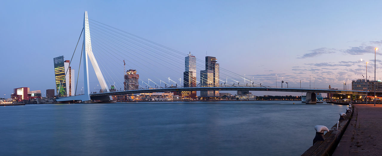
Image credit: A panorama of the Erasmus Bridge and the River Meuse in the Dutch city of Rotterdam. Photo by Massimo Catarinella. CC BY 3.0 via Wikimedia Commons.
The post Countries of the World Cup: Netherlands appeared first on OUPblog.


 Departure Time Truus Matti, translated from the Dutch by Nancy Forest-Flier
There is the girl who remembers nothing and finds herself in the abandoned hotel with the Fox and the Rat and the mysterious piano music.
Then there is the girl who has moved and carries the guilt of the letter she wrote to her father last year-- a letter of anger that ended up being the last one he would receive before he dies in a swimming accident.
The book alternates between the two stories and it's not overly difficult to figure out how they are related, although it doesn't fully come together until the end.
I wasn't a huge fan of the story with the girl in the hotel. It drags. There's a lot of mystery as to what's going on, but not a lot of suspense, and I ended up not really caring. It also had talking animals, which aren't really my thing, except that they didn't really do animal things and could have been humans so it didn't bother me as much as it could have.
I did, however, enjoy the story of the girl dealing with her father's death. The short chapters cover her life before he died and what's going on now, a year later, plus some of the in-between. Due to their brevity (and present tense voice) they're almost like snapshots of life. They move quickly and her anger and grief and remorse are palpable.
It was this second story that kept me slogging through the first story. As much as I ended up liking the book, the unevenness was hard to get through.
Book Provided by... my local library
Links to Amazon are an affiliate link. You can help support Biblio File by purchasing any item (not just the one linked to!) through these links. Read my full disclosure statement.
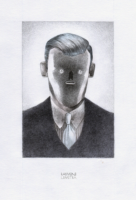
PORTRET (by Raymond Lemstra)
Suitably unsettling work from Dutch artist Raymond Lemstra. Flickr and website.
(via Metahaus)


Superoboturbo is Jordy van den Nieuwendijk. Almost more than the work itself, I want to call attention to the Dutch illustrator’s website. I have a tendency to moan about Flash websites for their shortcomings in accessibility, bookmarking, and searching, but Jordy’s horizontal-scrolling portfolio uses Flash rather smartly; his portfolio is a highly interactive experience that showcases not just his work, but his personality.
Posted by John Martz on Drawn! The Illustration and Cartooning Blog |
Permalink |
No comments
Tags: Dutch, Illustration, Jordy van den Nieuwendijk


Beautiful choices of colour from Dutch illustrator Maaike Verwijs. See more of her work on DeviantART as KissMyShades, and also on Flickr.
(via Meathaus)
Iris Berger is Professor of History, Africana Studies, and Women’s Studies at the University of Albany, State University of New York. In her book, South Africa in World  History, Berger offers the first general survey of South African history to fully integrate social history and women’s history and the first to emphasize connections between the United States and South Africa. In the excerpt below we look at the beginning of European settlements through the experience of one young woman, Krotoa who was later renamed Eva. To read excerpts from other books in this series click here.
In December 1651, the Dutch East India Company (VOC) appointed the merchant Jan Van Riebeeck to establish and command a permanent settlement on the southern tip of Africa. After sailing for nearly four months, he arrived at the Cape of Good Hope on April 6, 1652 with his wife and son, eighty-two men, and seven women. While concerned primarily with the valuable spices from its colonial outpost at Batavia in the East Indies, the Company had to supply sailors with fresh fruits and vegetables midway through the long journey from the Netherlands to keep them from dying of scurvy. In the interests of trade, the new commander was instructed to keep the peace with the area’s indigenous population.
Soon after Van Riebeeck arrived, a twelve-year-old Khoekhoe girl named Krotoa came to live with his family. Initially a servant, once she had learned to speak Dutch fluently she became a valued interpreter between the two cultures. Renamed Eva, she provided Van Riebeeck with valuable inside information about Khoekhoe politics and plans, contributing to the cross-cultural communication that enable the Dutch to acquire livestock in exchange for tobacco, copper, beads and drink.
This period of peaceful exchange lasted only briefly. As conflicts escalated over runaway slaves and Dutch confiscation of cattle and land, Eva found herself in the middle of these disputes. To salvage her position, she tried to encourage alliances and trade between the colonial intruders and local rulers, in one case persuading the Dutch to send violinists and a clown to entertain a potential ally. When Eva married a Danish physician, Pieter van Meerhof, who became a high-ranking solider in the Dutch East India Company, they sought together to expand Dutch trade with outlying areas. But van Meerhof’s death on an expedition to Mauritius in 1667, following Van Riebeeck’s transfer to Malacca in the East Indies five years earlier, intensified Eva’s ambivalent position as an indigenous woman trying to live in European society. Despite her conversion to Christianity and her linguistic fluency, her two protectors, Van Riebeeck and Pieter, were gone. From then on, the Dutch comanders accused Eva of drunkenness, prostitution, and abandoning her three children; on several occasions they imprisoned her on Robben Island, seven and a half miles from Cape Town. Cold and windswept, with a dangerous rocky coastline that caused frequent shipwrecks over the years, the island would later house South Africa’s most famous political prisoners. There Eva died a lonely death in 1674.
The tragic ending of Eva’s life reflects the divisions of the early colonial era - a period of initial cordiality, followed by constantly shifting alliances, all in the context of continually widening discord between the Dutch and local societies. Within another century, stripped of livestock and grazing land and ravaged by disease, Khoekhoe society itself would be destroyed. Symbolic of these divisions, during the 1660’s the Dutch East India Company planted a bitter almond hedge around its settlement in Cape Town. The “enormous intertwined branches” of these trees and “a tendency to grow horizontally as much as vertically” provided an effective boundary between the colonists and the Cape’s indigenous people.
The Dutch were not the first Europeans to round the Cape of Good Hope. Their settlement followed 164 years of sporadic contact between Europeans and various Khoekhoe and San groups near the coast. During the seventeenth century, when the Netherlands replaced Portugal as Europe’s strongest maritime nation, Dutch and British ships sailing to Asia began to use the Cape as a convenient stopping point. Sailors took in cattle and sheep from those Khoekhoe willing to trade with them and offered iron, copper, and tobacco in exchange. Though mutual suspicion was high and violence was frequent, the trade became important to both sides, allowing Europeans to resupply their ships and giving the Khoekhoe a steady supply of iron that made their spears more deadly. Because the primary interest of the trading companies lay in the spice-rich possessions of the India, the Khoe had no reason to question their assumption that Europeans were temporary sojourners on their shores.
When the Dutch arrived, foraging and herding societies were closely linked through trade and intermarriage. Eva’s father came from a group of hunter-gatherers who lived by collecting shellfish; her mother’s family were pastoralists. The Dutch described the herders as swift runners who kept large numbers of oxen and fat-tailed sheep. They dressed in skins and decorated themselves with beads and ornaments of copper, iron, ivory, and brass; some inhabited makeshift housing that could be moved with ease, wheras others lived in villages with houses laid out in a circle. Seventeenth-century Dutch geographic writer Olfert Sapper, who painstakingly compiled contemporary existing knowledge of Africa, reflected the common derogatory judgment of his contemporaries when he described the people now known as Khoekhoe: “All the Kafirs or Hottentots are people bereft of all science and literature, very uncouth, and in intellect more like beasts than men.” Yet Dapper also reported contradictions in these attitudes and stated that many observers had commented favorably on their “liberality and hospitality” and noted that as “dull-witted and coarse as these people are” when asked why they were stealing European cattle “they replied that they were doing so for no other reason than to avenge the suffering and injustive they had experienced at our taking away and sowing their lands.”


By: Dave,
on 4/2/2009
Blog:
inspiration from vintage kids books and timeless modern graphic design
(
Login to Add to MyJacketFlap)
JacketFlap tags:
fonts,
Typography,
Off our book shelves,
vintage,
netherlands,
1960s,
dutch,
type-specimens,
rare,
Add a tag
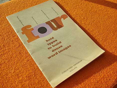
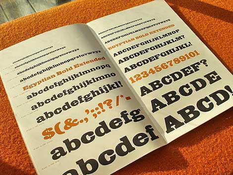
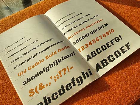
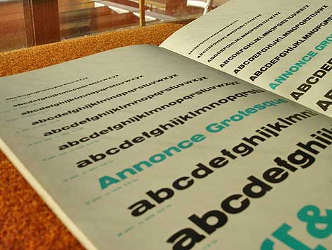
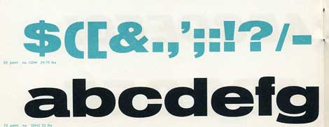
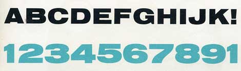
Four bold types to build dense word images c. early 60s?
Beautiful type specimen booklet produced by Typefoundry Amsterdam and imported by Amsterdam Continental. Includes samples of Egyptian Bold Extended, Annonce Grotesque, Egyptian Bold Condensed and Old Gothic Bold Italic.
From the intro of the Booklet:
In this specimen booklet, we have grouped four bold, decisive display type faces. Based on design modes which became classics of the midnineteenth century style, they have in common the power to create a dense , highly integrated word image, with the effect of a broad band or ribbon. A wide diversity is offered within this overall unity of effect: Egyptian and Gothic, roman and italic, condensed and extended. Where strong impact is required, these faces achieve dramatic solutions. They create an advanced, modern accent when maxium contrast with the even tone of text material is the designer’s aim.


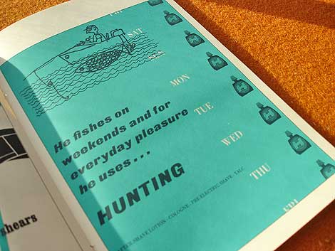
Who writes this stuff? This is great. He fishes on weekends and for everyday pleasure he uses hunting. Killing furry meat in the week and doodle socking on the weekend.. nice!
*Note-I googled fishing slang. I’m not actually this cool.
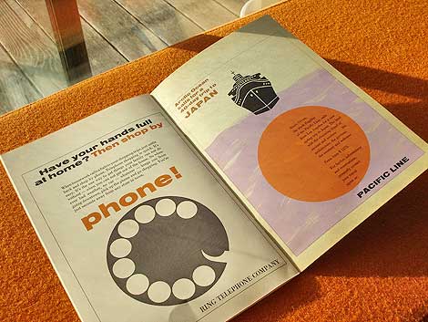
Ring telephone company..clever.

Also worth checking: Vette Annonce
Not signed up for the Grain Edit RSS yet? Give it a try. Its free and yummy.
No Tags
Share This
Congratulations to our winners in the Grain Edit Design Stimulus Giveaway!.
Grand Prize goes to Tim Kim - 1st pick of the 4 prize options goes to Vertigo Andy - 2nd pick of prizes goes to Jory Dayne- 3rd pick of prizes goes to Tim Kim - 4th prize goes to Celiajoy our winner from twitter - We will contact all of you directly.
©2009 Grain Edit


By: Sevensheaven.nl,
on 1/11/2009
Blog:
Sugar Frosted Goodness
(
Login to Add to MyJacketFlap)
JacketFlap tags:
illustration,
illustrations,
portrait,
metin seven,
sevensheaven,
illustratie,
fire,
dutch,
europe,
dessin,
illustrierung,
illustracion,
illustraties,
nederland,
david lynch,
Add a tag

Portrait of one of my greatest heroes, the multi-talented filmmaker, painter and musician David Lynch. The title is a wink to a music album by Lynch, named The air is on fire.
More at Sevensheaven.nl
By: Sevensheaven.nl,
on 11/26/2008
Blog:
Sugar Frosted Goodness
(
Login to Add to MyJacketFlap)
JacketFlap tags:
illustration,
Santa,
Christmas,
global warming,
illustrations,
cartoon,
metin seven,
sevensheaven,
santa claus,
illustratie,
north pole,
dutch,
illustraties,
nederland,
x-mas,
northpole,
Add a tag

A globally warm X-Mas and New Year greeting from Sevensheaven.nl and Artylicious.com. A bit on the early side, I know. :)
By: Sevensheaven.nl,
on 11/11/2008
Blog:
Sugar Frosted Goodness
(
Login to Add to MyJacketFlap)
JacketFlap tags:
illustration,
illustrations,
metin seven,
sevensheaven,
future,
illustratie,
dutch,
europe,
dessin,
illustrierung,
illustracion,
illustraties,
construction,
nederland,
engineer,
Add a tag

Stylized 3D illustration about the engineer of the future.
More at Sevensheaven.nl
By: Sevensheaven.nl,
on 11/11/2008
Blog:
Sugar Frosted Goodness
(
Login to Add to MyJacketFlap)
JacketFlap tags:
illustration,
illustrations,
metin seven,
sevensheaven,
future,
illustratie,
dutch,
europe,
dessin,
illustrierung,
illustracion,
illustraties,
construction,
nederland,
engineer,
Add a tag
Stylized 3D illustration about the engineer of the future.
More at Sevensheaven.nl
By: Sevensheaven.nl,
on 10/26/2008
Blog:
Sugar Frosted Goodness
(
Login to Add to MyJacketFlap)
JacketFlap tags:
illustratie,
experiment,
dutch,
europe,
dessin,
illustrierung,
illustracion,
illustraties,
nederland,
illustration,
man,
illustrations,
style,
metin seven,
sevensheaven,
Add a tag

Style experiment.
More at Sevensheaven.nl
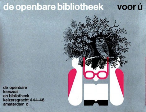
de openbare bibliotheek poster, amsterdam 1968
This is absolutely one of my favorite posters of all time. Design by Harry Sierman.
Harry studied at the Amsterdam Institute for Arts Education and later the Gerrit Rietveld Academy. After graduation he got a job with the Dutch publishing house: Querido He worked there for many years and became well known for his book design skills.
Back in January I had the chance to trade a few emails with Harry’s daughter in law. She was nice enough to send me a copy of a small book that focuses on Harry’s graphic design and typography work from the 1940s till 2003. I’ve attached a few scans from the book below.
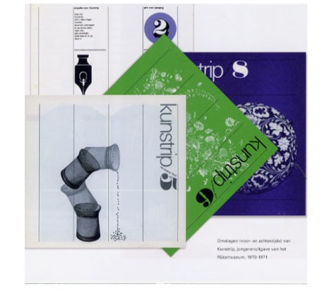
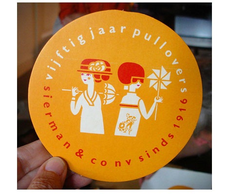
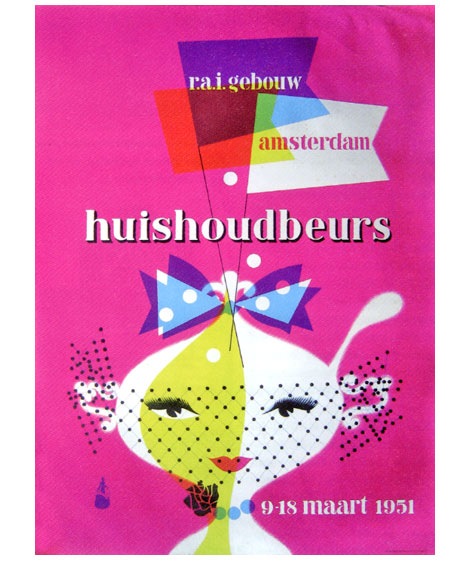
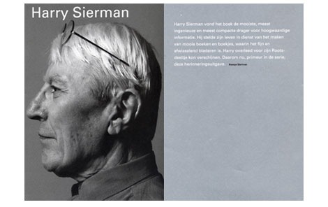
From top to bottom: Issues of kunstrip for Riijksmuseum 1970-1971, Sierman & Co. label for vijftig jaar pullovers-1966, Affiche for Huishoudbeurs-1951, Harry Sierman book
Image credits - very top image via Van Sabben Auctions, vijftig jaar pullovers image via hier houd ik van
Also worth seeing:
317 dutch posters - Heck yea!
dutch typography
No Tags
Share This
Congrats to JAN D you won the Raymond Savignac poster. Please email us to claim your prize. ©2008 -Visit us at Grain Edit.com for more goodies.

By: Sevensheaven.nl,
on 9/21/2008
Blog:
Sugar Frosted Goodness
(
Login to Add to MyJacketFlap)
JacketFlap tags:
europe,
dessin,
illustrierung,
illustracion,
illustraties,
nederland,
illustration,
Monster,
illustrations,
character design,
vector,
metin seven,
sevensheaven,
illustratie,
dutch,
Add a tag


Whenever I find the time I love to go 2D, as a break from my usual 3D stuff.
More at Sevensheaven.nl
By: Sevensheaven.nl,
on 9/2/2008
Blog:
Sugar Frosted Goodness
(
Login to Add to MyJacketFlap)
JacketFlap tags:
illustrations,
metin seven,
sevensheaven,
illustratie,
dutch,
europe,
dessin,
illustrierung,
illustracion,
illustraties,
nederland,
freddy krueger,
a nightmare on elm street,
movies,
illustration,
Add a tag

Freddy Krueger from the Nightmare on Elm Street movies.
More at Sevensheaven.nl
By: Sevensheaven.nl,
on 9/1/2008
Blog:
Sugar Frosted Goodness
(
Login to Add to MyJacketFlap)
JacketFlap tags:
illustrations,
vector,
metin seven,
sevensheaven,
batman,
illustratie,
dutch,
the dark knight,
europe,
dessin,
illustrierung,
illustracion,
illustraties,
nederland,
illustration,
Add a tag
By: Sevensheaven.nl,
on 8/15/2008
Blog:
Sugar Frosted Goodness
(
Login to Add to MyJacketFlap)
JacketFlap tags:
metin seven,
sevensheaven,
illustratie,
dutch,
europe,
dessin,
illustrierung,
illustracion,
illustraties,
nederland,
illustration,
Girl,
illustrations,
gothic,
sketch,
Add a tag

2D pixel sketch.
More at Sevensheaven.nl
By: Sevensheaven.nl,
on 8/3/2008
Blog:
Sugar Frosted Goodness
(
Login to Add to MyJacketFlap)
JacketFlap tags:
heath ledger,
dutch,
the dark knight,
europe,
joker,
dessin,
illustrierung,
illustracion,
illustraties,
nederland,
illustration,
illustrations,
metin seven,
sevensheaven,
batman,
illustratie,
Add a tag


A drawing I created as a tribute to the late Heath Ledger's magnificent Joker in The Dark Knight.
I've also written a review of The Dark Knight (no spoilers, don't worry).
By: Dave,
on 7/31/2008
Blog:
inspiration from vintage kids books and timeless modern graphic design
(
Login to Add to MyJacketFlap)
JacketFlap tags:
Off our book shelves,
retro,
vintage,
netherlands,
1960s,
dutch,
ephemera,
analog,
booklets,
interfaces,
Add a tag
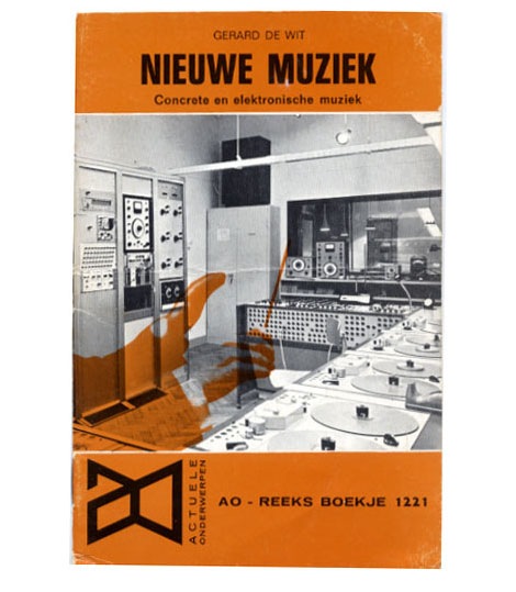
Nieuwe Muziek - Concrete en elektonische muziek by Gerard de Wit c1968
Great cover photo of a dutch recording studio from the 1960s. Check out all the vintage analog recording equipment! So many buttons, switches, knobs, reel to reels and dials. If your into 60s computer interfaces, tape machines and old mixing boards, I highly recommend you check out Stewf’s amazing Control Panel Flickr group.
Mucho thanks to Chris at Groove Merchant for hooking me up with the booklet.
No Tags
Share This
©2007 -Visit us at Grain Edit.com for more goodies. 
By: Sevensheaven.nl,
on 7/18/2008
Blog:
Sugar Frosted Goodness
(
Login to Add to MyJacketFlap)
JacketFlap tags:
illustration,
illustrations,
metin seven,
sevensheaven,
designs,
logo,
butterfly,
illustratie,
dutch,
europe,
dessin,
illustrierung,
illustracion,
illustraties,
nederland,
vlinder,
Add a tag

Variations upon a stylized butterfly logo design for a customer.
More at Sevensheaven.nl
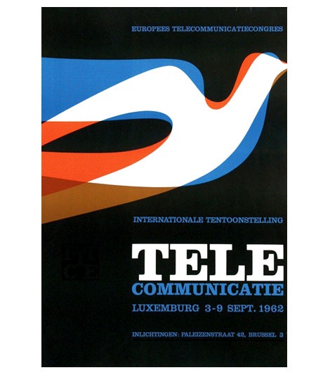
Tele Communicate poster for an event in Luxembourg, 1962
I love the layering of color within the bird. If you were to isolate the blue shape, the bird would look similar to Alexander Girard’s design for the Braniff Airlines logo in 1965.
also worth checking:
317 Dutch posters
1960s,
dutch,
modern,
netherlands,
out of print,
postersShare This
©2007 -Visit us at Grain Edit.com for more goodies. 
By: Dave,
on 3/5/2008
Blog:
inspiration from vintage kids books and timeless modern graphic design
(
Login to Add to MyJacketFlap)
JacketFlap tags:
Off our book shelves,
out of print,
posters,
netherlands,
1970s,
dutch,
Wim crouwel,
Typography,
posters,
out of print,
dutch,
netherlands,
1970s,
Off our book shelves,
Wim crouwel,
Add a tag
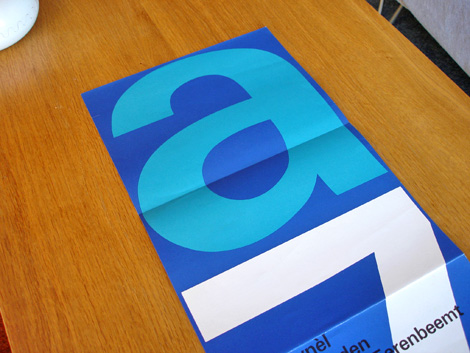
Stedelijk Museum program / poster c1970 - Wim Crouwel - designer
Total Design was responsible for designing many of the catalogs/ programs for the Stedelijk Museum in Amsterdam during the late 1960s and early 1970s. The program above was created by Wim Crouwel and Jolijn van de Wouw (of Total Design) for an exhibition in 1970. The program folds out to a full size poster that reveals a huge letter “A” and the number “7″ which stands for Atelier 7. Atelier translates to “work shop” in English so, this might be referencing a gallery number or possibly the name of the exhibition. On the other side of the poster, it lists the artists and their artwork featured in the gallery.
(more…)
1970s,
dutch,
netherlands,
out of print,
posters,
Typography,
Wim crouwelShare This
©2007 -Visit us at Grain Edit.com for more goodies. 
View Next 2 Posts


His web site and illustrations are rad.
Jordy is going to New York! You can see him live on stage during the Cut&Paste firstever Global Championship on the 16th of october 2009! See for more information cutandpaste.com
I hate to bring some negativity to the conversation – and I *do* like his artwork and his sense of fun – but horizontally scrolling websites are vile to use.
For reasons beyond my ken, the most talented artists are often the most prone to vile website design – and the horizontal scroller is one of the chief offenders.
Please, all you wonderful talented illustrators and designers out there – just say no to horizontally scrolling galleries. And while you’re at it, you might want to say no to annoying bloody javascript based popup galleries where you can’t open a picture in another tab. Please.
Ok – that’s enough grumping for one night. Carry on with the wonderfulness.
lovely illustrations