


 King and Finch's second outing keeps up the momentum of the first with some key reveals
new posts in all blogs
 By: Heidi MacDonald,
on 7/6/2016
By: Heidi MacDonald,
on 7/6/2016
Blog: PW -The Beat (Login to Add to MyJacketFlap)
JacketFlap tags: Reviews, Batman, rebirth, DC Comics, Top News, Jordie Bellaire, Tom King, David Finch, Danny Miki, Matt Banning, Add a tag
By: Heidi MacDonald,
on 11/9/2015
Blog: PW -The Beat (Login to Add to MyJacketFlap)
JacketFlap tags: Interviews, Comics, Image, Warren Ellis, Injection, Declan Shalvey, Jordie Bellaire, artist credit, Fonografiks, Add a tag
By: Heidi MacDonald,
on 11/2/2015
Blog: PW -The Beat (Login to Add to MyJacketFlap)
JacketFlap tags: Image, Dave Taylor, Top News, eric stephenson, Emi Lenox, Image Comics, Jordie Bellaire, Fonographiks, Nate Bellegarde, Nowhere Men, Announcements, Add a tag
By: Heidi MacDonald,
on 3/12/2015
Blog: PW -The Beat (Login to Add to MyJacketFlap)
JacketFlap tags: Brian Wood, Andrea Mutti, Jordie Bellaire, advance review, jared fletcher, Limited Series, Reviews, Comics, Dark Horse, Rebels, Add a tag
By: Heidi MacDonald,
on 7/7/2014
Blog: PW -The Beat (Login to Add to MyJacketFlap)
JacketFlap tags: review, Marvel, Warren Ellis, Declan Shalvey, Top News, Jordie Bellaire, Moon Knight, one and done, Add a tag
By: Heidi MacDonald,
on 9/13/2013
Blog: PW -The Beat (Login to Add to MyJacketFlap)
JacketFlap tags: Previews, Titan, Top News, Si Spurrier, Jordie Bellaire, PJ Holden, Add a tag
 By: Heidi MacDonald,
on 3/28/2013
By: Heidi MacDonald,
on 3/28/2013
Blog: PW -The Beat (Login to Add to MyJacketFlap)
JacketFlap tags: News, science fiction, Reviews, Comics, DC, Todd Klein, time travel, Vertigo, Jeff Lemire, Dan Abnett, DC Comics, Mark Buckingham, Jose Villarubia, Gail Simone, Tom Fowler, Top News, Ray Fawkes, Simon Spurrier, Peter Milligan, Damon Lindelof, Jordie Bellaire, Andy MacDonald, Dead Boy Detectives, Gael Bertrand, I.N.J. Culbard, Lee Loughridge, M.K. Perker, Matt Kindt, Michael Dowling, Neil Gamain, Time Warp, Toby Litt, Tom King, Travis Lanham, Victor Santos, Add a tag
By: Heidi MacDonald,
on 3/26/2013
Blog: PW -The Beat (Login to Add to MyJacketFlap)
JacketFlap tags: HYPE!, James Asmus, Jordie Bellaire, Breaking News, 90s Comics, Top News, Tom Fowler, Quantum & Woody, Valiant, Future Comics, Add a tag
By: Heidi MacDonald,
on 3/21/2013
Blog: PW -The Beat (Login to Add to MyJacketFlap)
JacketFlap tags: Comics, Marvel, Captain Marvel, Top News, Marvel Now, Kelly Sue DeConnick, Jordie Bellaire, Filipe Andrade, Reviews, Add a tag
By: Heidi MacDonald,
on 3/5/2013
Blog: PW -The Beat (Login to Add to MyJacketFlap)
JacketFlap tags: Becky Cloonan, Francesco Francavilla, Annie Wu, Top News, Ming Doyle, Thought Bubble, fiona staples, Leeds Thought Bubble, Emma Rios, Jordie Bellaire, Conventions, Hope Larson, Add a tag
Viewing: Blog Posts Tagged with: Jordie Bellaire, Most Recent at Top [Help]
Results 1 - 10 of 10
Blog: PW -The Beat (Login to Add to MyJacketFlap)
JacketFlap tags: Reviews, Batman, rebirth, DC Comics, Top News, Jordie Bellaire, Tom King, David Finch, Danny Miki, Matt Banning, Add a tag
Blog: PW -The Beat (Login to Add to MyJacketFlap)
JacketFlap tags: Interviews, Comics, Image, Warren Ellis, Injection, Declan Shalvey, Jordie Bellaire, artist credit, Fonografiks, Add a tag
After making his presence in the comic book industry felt in a big way on a run with Warren Ellis on Moon Knight, Declan Shaley moved over to creator-owned with the writer. They set off on a series more complex and less marketable than one about a white-caped crusader, to great results. I spoke to […]
1 Comments on MATT CHATS: Declan Shalvey on Injecting Himself into the World of Creator-Owned, last added: 11/10/2015
Display Comments
Add a Comment
Blog: PW -The Beat (Login to Add to MyJacketFlap)
JacketFlap tags: Image, Dave Taylor, Top News, eric stephenson, Emi Lenox, Image Comics, Jordie Bellaire, Fonographiks, Nate Bellegarde, Nowhere Men, Announcements, Add a tag
We're all getting starry-eyed
0 Comments on REVEAL: The Cover to NOWHERE MEN #8 as of 11/2/2015 7:21:00 PM
Add a Comment
Blog: PW -The Beat (Login to Add to MyJacketFlap)
JacketFlap tags: Brian Wood, Andrea Mutti, Jordie Bellaire, advance review, jared fletcher, Limited Series, Reviews, Comics, Dark Horse, Rebels, Add a tag
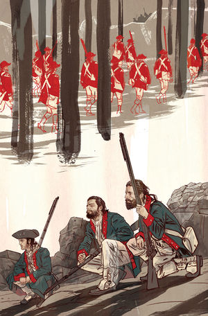
by Alexander Lu
Art: Andrea Mutti
Colors: Jordie Bellaire
Letters: Jared K. Fletcher
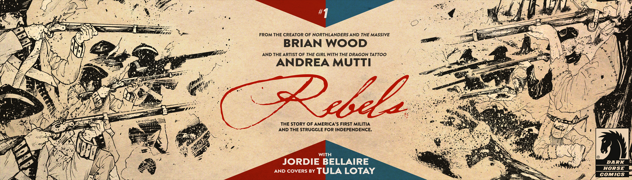
New Hampshire’s state motto, “Live Free or Die,” has always captivated me. It’s raw and aggressive. It’s frenetic and energetic in a way that captures the revolutionary feel of a newborn nation struggling to find its footing. While Breaking Bad may recently brought the slogan back into the modern cultural discourse, Brian Wood’s (The Massive) and Andrea Mutti’s (Star Wars) historical narrative, Rebels, sets out to explore the history behind those four powerful words.
In its first issue, Wood and Mutti successfully lay the groundwork for a gripping historically-based narrative that explores the origin of The Green Mountain Boys, an American militia that captured Fort Ticonderoga during the American Revolutionary War. The story is told through the eyes of Seth Abbott, who is introduced to us in a beautifully scripted and drawn opening sequence where Seth, under the guidance of his generally distant father, finds the courage to open fire on a group of British soldiers attempting to take over farmers’ land in the Albany territory and thus blossoms into adulthood just as America begins to emerge an independent nation. The story then cuts to show us Seth as an adult, quelling a conflict between British militiamen and disgruntled American farmers at a Pennsylvania courthouse.
Rebels is not an unbiased comic. At one point, the team shows British soldiers opening fire on unarmed American protesters, clearly aiming to cast the Americans as martyrs and the redcoats as ruthless villains. As the lead protagonist and a native resident of the colonies, Seth is definitely portrayed as an American patriot through and through. At the same time, however, Wood’s script does a good job of making sure Seth doesn’t turn into a gun toting all-American “hero” who is out for British blood. In the opening scene, Seth takes a long time to find his courage, and as an adult, even ends up becoming best friends with a former British army runner named Ezekiel. Even after the British soldiers at the American protesters, Seth encourages peace. He says: “Have patience. They’ve lost the day. Soon enough they’ll realize it. Wouldn’t you rather they dig their own graves, rather than have your loved ones dig yours?”
Great, chilling stuff.
Mutti’s art in Rebels contributes a lot to the story. His panels are filled to the brim with details. The trees of the New Hampshire forests are rendered with great care, and when the action moves to the courthouse in Pennsylvania, Mutti fills every panel with countless Americans and British in meticulously illustrated period garb. His linework particularly shines when it comes to faces, which express emotion with energy and zeal.
While Mutti’s work is fantastic in Rebels, Jordie Bellaire’s (Moon Knight) colors take this comic to the next level. Most of the book uses muted earth tone pastels, creating a color scheme that unifies the American people with the American landscape. The British Redcoats, staying true to their name, are what stand out from the rest of the color scheme. Their bright red uniforms clash with the browns, blues, and greens of the American people, and really make them feel like invaders in the landscape of America and the comic page.
Ultimately, Rebels #1 lays out a solid foundation for what is sure to be a thrilling dive into a part of American Revolutionary history that isn’t often told. Choosing to focus on a more localized topic that doesn’t span the entire nation or the entire war allows the team to focus on building characters, which is what makes Rebels more than just an illustrated history textbook— it’s a comic with heart.
0 Comments on Advance Review- Rebels #1 gives new meaning to “Live Free or Die” as of 3/12/2015 6:24:00 PM
Add a Comment
Blog: PW -The Beat (Login to Add to MyJacketFlap)
JacketFlap tags: review, Marvel, Warren Ellis, Declan Shalvey, Top News, Jordie Bellaire, Moon Knight, one and done, Add a tag
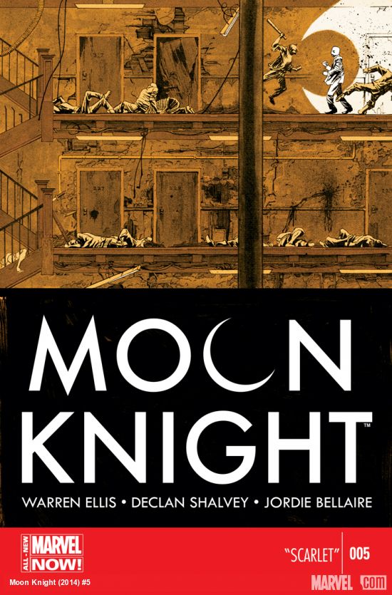 You ever see The Raid? It’s this Indonesian action movie. It (and its sequel) is probably one of the best action movies in recent memory.
The plot of The Raid is ridiculously simple. One cop, in one building, against an army of criminals. It is an hour and a half of dudes wrecking shit. It’s eighty minutes of brutal martial arts. It’s something that’s been done lots–you can describe a ridiculous number of movies that way, thanks to Die Hard–but that doesn’t change the fact that it’s absolutely thrilling, a marvel of craft and assured filmmaking.
Moon Knight #5 is pretty much The Raid, but as a comic book.
A gang has kidnapped a girl who was on her way home from a school event at night. They hold her hostage on the fifth floor of a building. Moon Knight spends all twenty-two pages wrecking dudes on his way to the girl.
That’s it. That’s all that happens. It’s not much.
But it is so, so good.
How much you’ll agree with that will depend on your attitude towards plot. As I hinted at by opening this column by talking about an Indonesian martial arts film, a film or comic doesn’t necessarily live or die by how clever its plot is. Tired or thin plots can still result in an exciting story–you’ve just got to make damn sure your execution is stunning.
And Ellis, Shalvey, and Belliare continue to impress. Warren Ellis’ continues his less-is-more approach to story, with almost no dialogue outside of the opening and closing pages. He doesn’t really need much in the way of words, anyway–Moon Knight #5 is a lean, violent, action story that’s mostly carried by Declan Shalvey’s art, which gives Marc Spector’s Mr. Knight persona a slow relentlessness as he tears through thugs. He doesn’t use stealth, nor is he built like a truck. Shalvey draws Mr. Knight in a way that conveys pure surgical finesse, taking on people who can clearly see him coming–just the way he likes it.
That last bit warrants circling back to Ellis’ script. Spare as it may be, it effectively reinforces the notion of who Moon Knight is in this series. He’s a protector of those who travel by night, a hero whom the bad guys can see coming. There’s not too much in the way of new insight into the titular character, but a brief scene towards the end does give readers a bit to mull over and wonder just what exactly Ellis, Shalvey, and Bellaire will choose to explore for their final issue before the book changes hands with #7.
Color artist Jordie Belliare brings just as much to the table as she always has , working with a tight color palate that never strays too far from the cover’s rusty gold, expanding to include the browns and greens of a dilapidated tenement. Also striking is the color work on Mr. Knight himself–close ups on his biker-gloved hands and exposed forearms give a peek at the man beneath the mask, highlighting how inspired a decision it was to portray the whites of his costume by leaving them devoid of any color.
Last week, I was pretty hard on Superman #32, and comics like Moon Knight are the reason why. While Moon Knight has the luxury of not having to be too heavily serial in its storytelling and is more or less continuity free, it isn’t really doing anything groundbreaking either. It’s just a good story well told.
One commenter last week pointed out that last week’s Superman had a lot of work to do–that what I had seen as a drag was in fact some necessary housekeeping, clearing out poor story decisions made in prior runs. And that’s fine. It doesn’t change my criticism all that much–which is that the book hardly bothered to tell a story.
That, in essence, is why I wanted to do this column in this specific way. I happen to believe that a comic book should tell a story. However spare, however short–it can even be a subplot. Not trying to tell a story is a cardinal sin, something I can’t look past. I buy the comics I review in this column with my own money because I think reviewing comics you get for free makes it easy to forget how damn expensive they are, and makes you more prone to be forgiving of creators content to ship a book that only has the slightest suggestion of a story.
I review single issue comics here, not arcs or trades. And in short, I don’t want to settle for less.
A good story well told. That’s all I want for me, and for you.
1 Comments on ONE AND DONE: Moon Knight—It Doesn’t Take Much, last added: 7/8/2014
Display Comments
Add a Comment
Blog: PW -The Beat (Login to Add to MyJacketFlap)
JacketFlap tags: Previews, Titan, Top News, Si Spurrier, Jordie Bellaire, PJ Holden, Add a tag
Titan Comics, hearing about Tharg’s earlier visit, decided to also pop round for some tea and biscuits, and also handed me some paper. This time though, the paper was a first look – nobody else in the bally WORLD has seen these yet – at the preview for Numbercruncher #3 from Si Spurrier, PJ Holden, Jordie Bellaire and Simon Bowland!
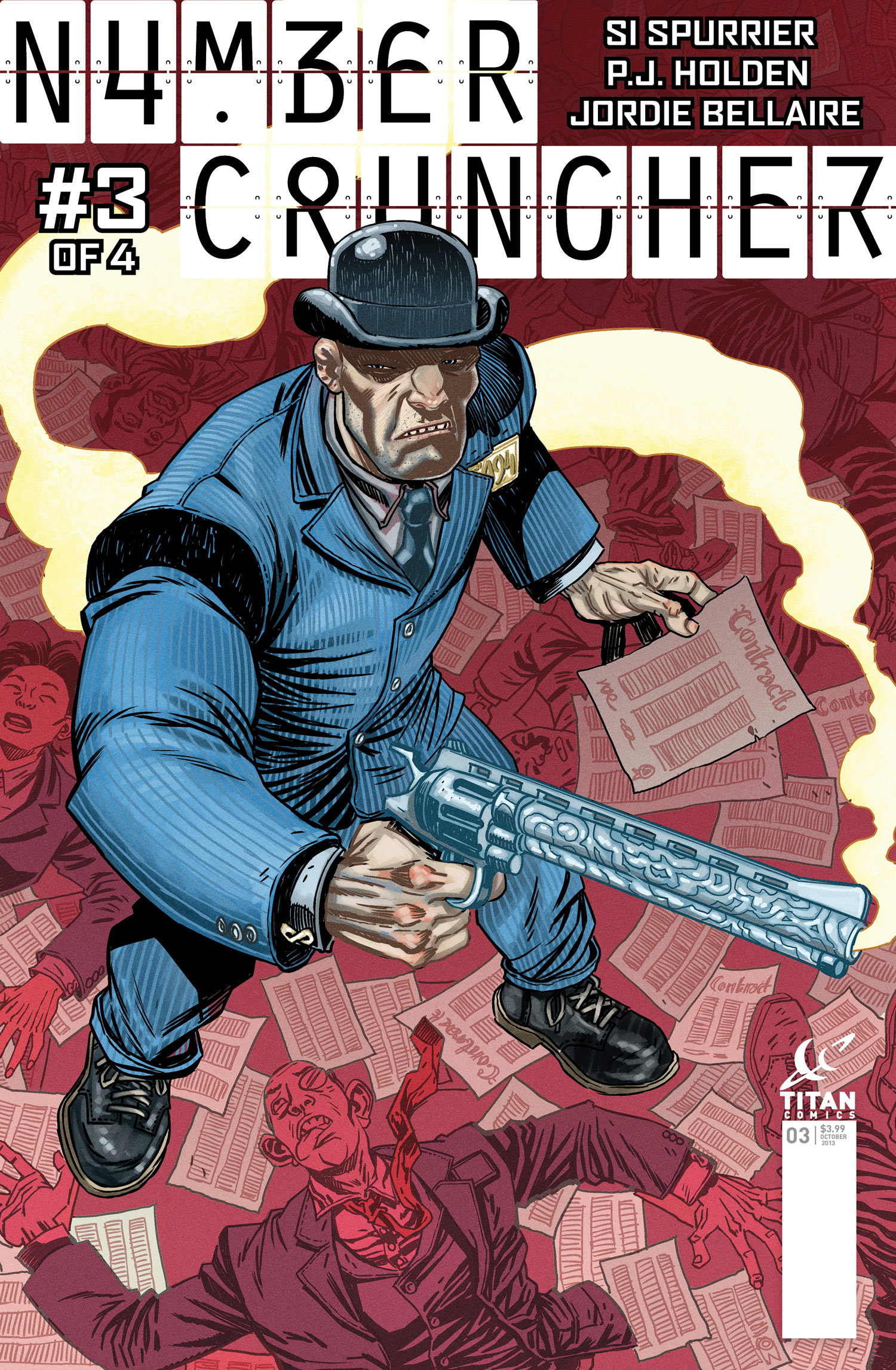

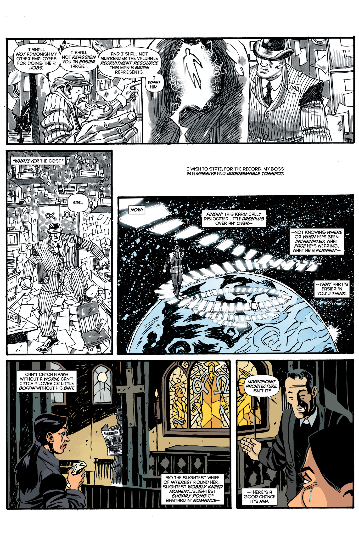
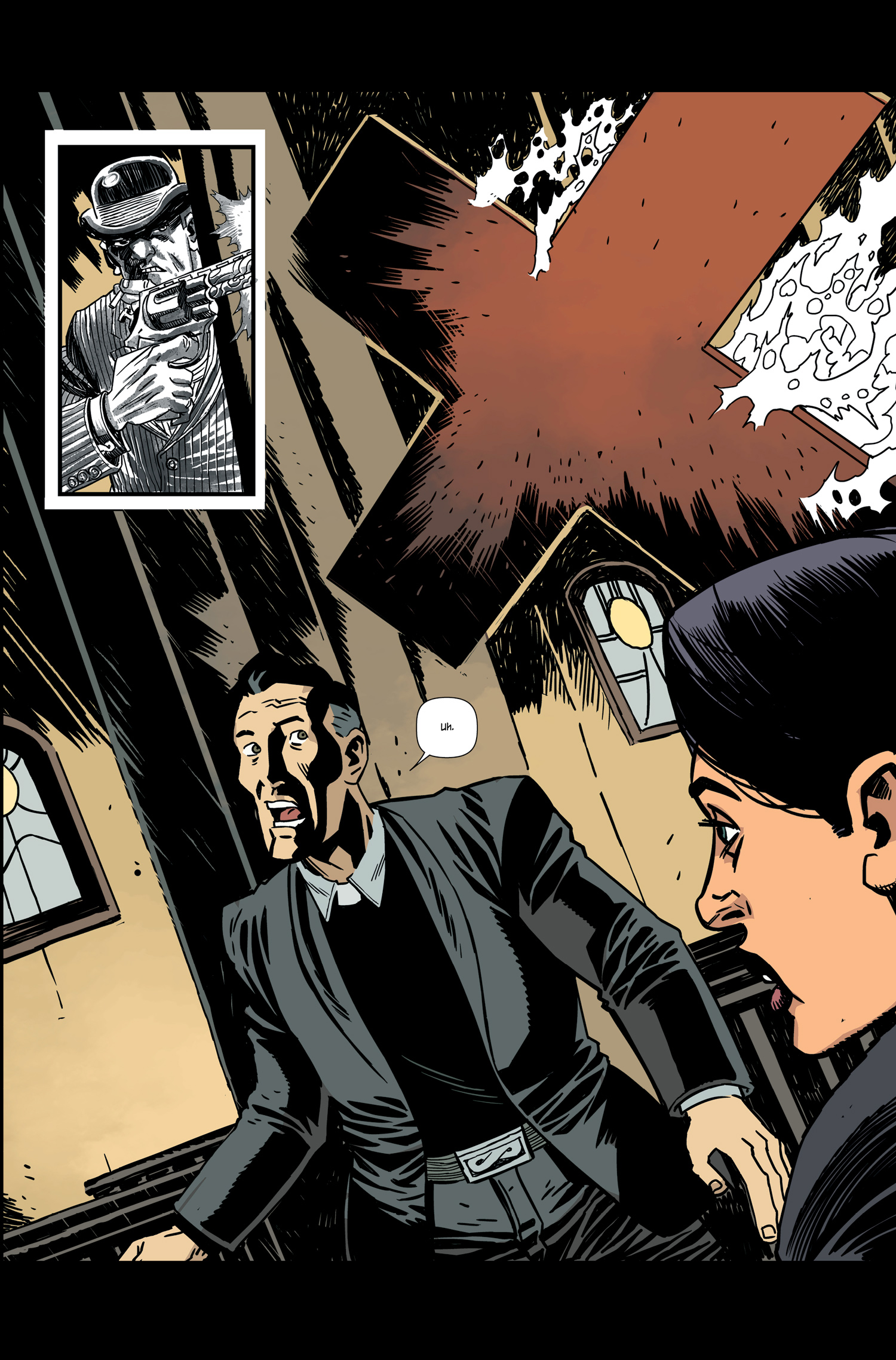
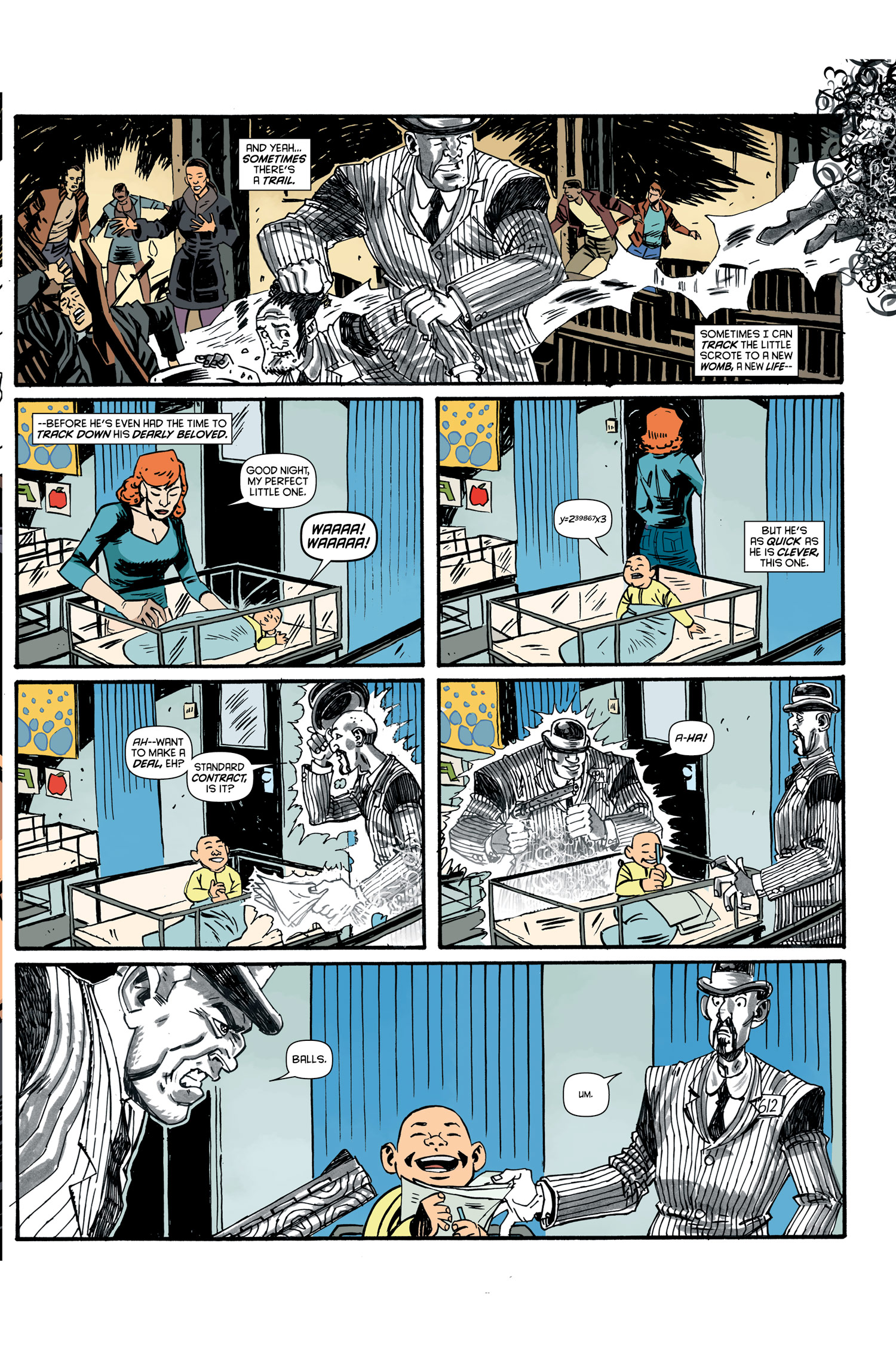
0 Comments on FIRST LOOK: Numbercruncher #3 from Titan Comics as of 9/13/2013 7:04:00 PM
Add a Comment
Blog: PW -The Beat (Login to Add to MyJacketFlap)
JacketFlap tags: News, science fiction, Reviews, Comics, DC, Todd Klein, time travel, Vertigo, Jeff Lemire, Dan Abnett, DC Comics, Mark Buckingham, Jose Villarubia, Gail Simone, Tom Fowler, Top News, Ray Fawkes, Simon Spurrier, Peter Milligan, Damon Lindelof, Jordie Bellaire, Andy MacDonald, Dead Boy Detectives, Gael Bertrand, I.N.J. Culbard, Lee Loughridge, M.K. Perker, Matt Kindt, Michael Dowling, Neil Gamain, Time Warp, Toby Litt, Tom King, Travis Lanham, Victor Santos, Add a tag
Publishers seem increasingly willing to roll the dice on anthology formats recently. Maybe it’s the success of things like Dark Horse Presents, and the model they’ve followed of introducing new works and then successfully spinning them off into new story titles like BLACK BEETLE. There’s an inherently approachable aspect to anthologies—new readers can pick them up and take a tour of many ideas and art styles without feeling out of the loop, and creators themselves aren’t subjected to the high-wire act of telling fresh tales while balancing the necessities of continuity. It’s also a chance to bring on new talent and give readers a chance to play a role in selecting what appeals to them. Vertigo, however, has a long history of valuing the anthology format to engage with new readers, from its FIRST CUT to FIRST OFFENSES, which readers still pick up when trying to get a handle on what the line has to offer in terms of genre and content.
 TIME WARP, a revival of a late 1970’s anthology format, presents nine stories by a variety of well known and new creators following a loose theme that may not be as loose as it appears at first glance. The key word “time” stands out as a recurring (literally) factor in these stories. On the whole, because the anthology contains so many varied story-telling techniques and art styles, its appealing and gives the reader a sense of time and money well spent based on its “something for everyone” approach. As a one-shot, it also reads like a graphic novel in disparate parts that comments on the potential of science fiction in the comics medium with capacity to challenge our concepts of humanity, technology, and their often troubled relationship.
[Caution: Mild spoilers on content, but no plot-twist revelations ahead]
“R.I.P” , written by Damon Lindelof, with evocative art by Jeff Lemire and fluid colors by Jose Villarubia, is a strong start to the collection. What could be more basic, pulpy, and attractive than a time-travel tale with dinosaurs and multiple attempts to escape death? The story’s variations on a theme, however, get complex quickly, with satisfying results. All the kinds of questions about the implications of time travel that kids grew up with watching Star Trek: The Next Generation take a bite out of the story and lead the reader in logical loops. Lemire’s energetic, chaos-controlling line-work, combined with Travis Lanham’s quirky lettering, suggest an undercurrent of the haphazard about all human endeavors. The message seems to be, despite all our planning, when we deal with factors essentially bigger than us, we might get by, but only by the skin of our teeth. The suspension of belief necessary for the story isn’t overbearing since it points out all the problems and difficulties of handling big themes in its plot structure.
 “It’s Full of Demons” is a particularly challenging story, one might almost call a mystery despite its early introduction of a possibly alien time traveller in turn of the century Austria. After reading the complete story, you might have a Memento-like experience of reconstructing the details of the story backward along the lines provided by a full revelation of their significance. This is engaging for the reader. Tom King’s writing is clever in providing just enough detail to make this backward reading possible while not revealing too much about why the increasing madness of a little girl growing up after her brother’s death might be important to readers. The themes of the story are, in fact, heavier the more you examine them, commenting on how fear and the “demonizing” of figures and groups may be an even greater threat than the shocking intrusion of the vastly unknown into daily life. Tom Fowler’s artwork suggests history well without rendering it ponderous, and in particular conveys emotional states in its main character with great empathy.
Gail Simone writes “I Have What You Need”, with upbeat and somewhat eerie art by Gael Bertrand, and vibrant colors by Jordie Bellaire. Simone isn’t afraid to get complicated, either, about the implications of time travel, even within one’s own mind, and delves pretty deeply into human nature by exploring the idea that a drug could enable you to revisit the best ten minutes of your life. Her kindly shopkeeper holds this god-like key to a “product” that everyone wants, and also provides commentary on what humans deserve, and what they get out of life. Twist endings are a common feature of many of the stories in TIME WARP, and though the stories might have been intriguing without them, it’s a pattern that gives the reader a sense of the value of each particular story as a unit of entertainment and harks back to the genre features of early pulp sci-fi.

“The Grudge” is an intelligent and very human tale of rivalry between two scientists, the kind of rivalry we’ve seen in techno pop culture between Steve Jobs and Bill Gates. Written by Simon Spurrier, with art and color by Michael Dowling, its compressed storytelling gives you a sense of having read a whole comic or perhaps a graphic novel, again presenting an entirely different, detailed world within the anthology. It spans the life of these scientists, their tragedies, and the tension between public demand for spectacle in scientific discoveries and the real needs of scientific advancement to look toward greater future building. Dowling’s near photo-realistic art style easily conveys the sense that this could be our twenty-first century future, still governed by the baser, and higher impulses of the human beings involved in advancement. But the story infuses even tragedy with humor, and most importantly, believing in the reality of the characters helps convey the messages of the narrative.
 One of the most surprising additions to TIME WARP is a Dead Boy Detectives story. Originally created by Neil Gaiman as a spin-off from SANDMAN, the Dead Boy Detectives seem to veer pretty far from science fiction in their investigation of the occult. However, Gaiman was never one to draw a firm line between the occult and the scientific, and neither has pulp tradition, a borderland other comics in TIME WARP also explore. This episode, “Run Ragged”, written by Toby Litt, with layouts by Mark Buckingham, finishing work by Victor Santos, and letters by the great Todd Klein, reads like a sudden glimpse of a return to a favorite world, and indeed it’s described as a lead-up to a continuing storyline in THE WITCHING HOUR ANTHOLOGY. The artwork, and also the colors by Lee Loughridge are accomplished and appealing, particularly successful at conveying motion and action while creating a sense of the haunted atmosphere of the material.
“She’s Not There” may remind readers of the more psychological aspects of good science fiction, with more than a dash of the noir emphasis on intense relationships. The premise, that a company in the future can charge vast amounts of money to resurrect ghosts as “information” gleaned from loved ones, hits one of the many common themes in TIME WARP, the general neediness of human beings and the lengths they’ll go to in order to seek comfort from their pasts. Another “mystery” aspect of the story, written by Peter Milligan, with art and colors by M.K. Perker, is the reason for the resurrected wife Angel’s death, and the lingering problems that might have comprised her relationship with her husband in the first place. The story poses a unique question, “Can you own a ghost?”. In a technological world where everything’s a commodity, it seems like a singularly dark possibility. The artwork suggests a blend of the familiar and the unknown in equal proportions, keeping readers guessing, just like the plot.
 The unusually titled story “00:00:03” places human beings under another kind of microscope under the pressure of extreme situations. During vast interstellar wars, we follow the decisions of Helene as she attempts to perform her military duties under the influence of a unique “molasses” protocol that extends perception of time. Written by Ray Fawkes and drawn by Andy MacDonald, this is the kind of story that sci-fi readers will be particularly attracted to. It offers sweeping conflicts on a large stage, space battles, and remarkably deep characterization of a central figure in action. The age old question posed by sci-fi, “Are we still human inside our technology?”, is both addressed and answered in a poignant way.
If you’re all about the art of sci-fi comics, then you’ll have quite a few surprises to look forward to in TIME WARP, but it’s likely that Matt Kindt’s “Warning: Danger” will be top of the list. With Kindt’s sketchy outlines, and splashy use of watercolor tones, the story breaks from many of the common assumptions of what traditional sci-fi art should look like. How do you convey the crisp lines of spectacular technology in such an idiosyncratic style? Kindt’s answer is to render technology, and its premises in the story, organic, and therefore a little more alarming. By breaking with what readers may recognize, Kindt presents an unrecognizable, and very compelling vision of the future. His diagrams of the armor and accoutrements of two civilization-representing soldiers locked in single combat schematize the ingenuity and determination of one-upmanship in  technological advancement. There’s a downbeat sense of recurring time that’s featured in a number of TIME WARP stories, providing the opportunity for humans to relive their obsessions and failures, or get it right when given another chance.
The final piece in TIME WARP gathers together the thematic threads of recurring time, human decision-making, and the bizarre responsibilities that power over technology entails. When technology becomes somewhat monstrous, who’s really in control? Is the humanity inside the machine enough to guide progress away from disaster? “The Principle” is written with a key focus on two main characters by Dan Abnett, and presented rather beautifully with colors and art by I.N.J. Culbard. The trope of presenting a guy new to his job as an identifying character for the readers is here completely necessary to add tension to the gradual revelation of plot. The attempt to prevent an assassination of the “principle” figure through staging the same moment in time over and over again gives characters repeated chances to get things right, and also humorously comments on some historical mysteries as time-travel screw ups. Culbard’s inks, particularly, have a certain noir sensibility, too, though infused with a sci-fi eye toward motion, and seem appropriate when grounding the future in the past. Abnett doesn’t hold off on the sci-fi theme of responsibility, either, and closes the collection with a final message about the tendencies of  humanity to abuse power in banal ways, and the responsibilities, often dire, we face in trying to keep that kind of potential chaos under control.
In fact, looking back through TIME WARP, the overarching implication of these stories seems to be Time=Responsibility. The further we push technological advancement, and the more we tinker with our humanity, the more work we generate for ourselves monitoring our trajectory. But with concepts and artwork like the kind contained in TIME WARP, the spectacle of those sci-fi heights never ceases to be attractive, even when it’s pointing out the potential pitfalls that almost certainly lie ahead. TIME WARP contains a miscellany of energetic science fiction, and its hard not to find the sheer breadth of material and the talent behind it a selling point. Nine worlds, and compact story-telling that often spans lifetimes in one volume? It’s both entertaining and consistently thought-provoking, marking a worthy return of the TIME WARP title.
Title: TIME WARP #1/Publisher: Vertigo, DC Comics/Creative Teams:
“R.I.P”: Damon Lindelof, writer, Jeff Lemire, artist/“It’s Full of Demons”: Tom King, writer, Tom Fowler, artist/“I Have What You Need”: Gail Simone, writer, Gael Bertrand, artist/“The Grudge”: Simon Spurrier, writer, Michael Dowling, artists/“Dead Boy Detectives”: Toby Litt, writer, Mark Buckingham, layouts, Victor Santos, finishing/“She’s Not There”: Peter Milligan, writer, M.K. Perker, artist/“00:00:03”: Ray Fawkes, writer, Andy MacDonald, artist/“Warning: Danger”: Matt Kindt, story and art/“The Principle”: Dan Abnett, writer, I.N.J. Culbard, colors and art
Hannah Means-Shannon writes and blogs about comics for TRIP CITY and Sequart.org and is currently working on books about Neil Gaiman and Alan Moore for Sequart. She is @hannahmenzies on Twitter and hannahmenziesblog on WordPress.
4 Comments on REVIEW: TIME WARP #1, Putting the Vertigo in Sci-Fi, last added: 4/18/2013
Display Comments
Add a Comment
Blog: PW -The Beat (Login to Add to MyJacketFlap)
JacketFlap tags: HYPE!, James Asmus, Jordie Bellaire, Breaking News, 90s Comics, Top News, Tom Fowler, Quantum & Woody, Valiant, Future Comics, Add a tag
As predicted, Valiant’s teaser from earlier in the week was for a relaunch of their massively popular duo Quantum and Woody, who will be returning in July flanked by James Asmus, Tom Fowler, and Jordie Bellaire. And a goat.

The first issue of the series, which was originally launched all the way back in 1997 when I was still in primary school, will be out on July 10th, with a variety of variant covers from the likes of Fowler, Marcos Martin, Ryan Sook and Andrew Robinson. The Tom Fowler cover will have an interactive ‘talking cover’, with a goat that growls at you. Here’s Martin’s cover:

Talking about the series, Asmus says:
In all of comics, there’s no other book that mixed style and substance quite like Quantum and Woody. I was willing to literally kill someone for the chance to write the relaunch for the new Valiant Universe. I might have. Those first days after I got the call are a blur. But Quantum and Woody isn’t (just) a superhero book – it’s action-comedy, it’s family drama, it’s a boys-meet-goat tale that tugs at the heartstrings.
Valiant also released some preview pages from the first issue, c’est la vie:


11 Comments on James Asmus, Tom Fowler and Jordie Bellaire relaunch Quantum and Woody in July, last added: 3/27/2013
Display Comments
Add a Comment
Blog: PW -The Beat (Login to Add to MyJacketFlap)
JacketFlap tags: Comics, Marvel, Captain Marvel, Top News, Marvel Now, Kelly Sue DeConnick, Jordie Bellaire, Filipe Andrade, Reviews, Add a tag
The relaunch of Captain Marvel, with Carol Danvers in the title role, started off very shakily. The first six-issues told a time-travel story which eventually teased together parts of the character’s origin in a way which wasn’t particularly as entertaining or dynamic as was hoped. Writer Kelly Sue DeConnick had previously proven herself to have a great voice and sense of humour in her work – but the first arc of this book didn’t give her much chance to do that. It felt like a side-story, blocking us from getting to the real adventures.

Which is why I’m delighted that ever since issue #6, the book has picked up massively. Taking the character back to present-day gives her a chance to be far more contemporary, and build up a far stronger individual voice. She can be funnier, because there’s more for her to react to, and she can build up a lasting supporting cast. Issue #11, out this week, shows just what the book should’ve been from the start. It’s immediately likeable, with instinctive art and a freeform story which segues between multiple interesting sub-plots.
The best of these storylines is one which sees Captain Marvel grounded. If she uses her power of flight, then she’ll start to build up permanant brain damage – which gives a twist which the character has needed for a long time. There’s nothing inherently interesting about a character who can fly, who also works as a pilot. If they crash the plane, it doesn’t matter, because they can always step out the cockpit and FLOAT AWAY. But giving her this twist means the character suddenly lives a much more high-stakes lifestyle. There’s a more immediate tension now we know she’s not safe at all times.
There’s a line in the issue – which is scripted by Christopher Sebala – in which somebody asks Cap “what’s it like to not be good at something for once?” That line captures the issue, and gives readers further motivation to root for the hero. Her frustration at not being able to get in the air also leads to many of the funniest moments of the issue. It feels like the book has now got a real grip on the voice of the lead character, giving her a lightness of tone that makes her more relatable and entertaining than before (she has previously had a tendency to be a little boring).
Filipe Andrade’s artwork – boosted, as everything is, by Jordie Bellaire’s colour, is a brilliant fit for the book. He’s quirky and left of centre without sacrificing storytelling ability. There’s a much more sudden sense of motion in the pages, but I also really like his refusal to cop out for easy spectacle. The sequencing in the pages works fantastically because he doesn’t use gigantic splashes and overwrought hero poses in each panel. In fact, he keeps the action sequences very tight, with smaller panels which keep an eye on the lead.
There’s a sequence where Captain Marvel blasts a group of guards with her energy, but Andrade doesn’t decide to have this take up half the page. Instead, he sets it in a small page-width panel at the top of, and sets the action at a distance from the reader. Whilst we still get to see Captain Marvel wipe out a group of goons, Andrade’s decision to keep the move locked within a single panel emphasises how normal and unexpected a day this is for the lead character. Even during sequences where Cap is on a flying motorbike and racing round like a lunatic, Andrade refuses to make this into a spectacle – you could replace the bike with a transit van and the pages would still work. It’s a small touch, and perhaps not something Andrade is consciously doing, but it adds to the relatability of the main character.
The narrative as a whole is very well constructed, too. Some of the supporting characters could come across as bringing a little too whimsy to proceedings – Cap makes friends with a young girl who is slightly too bluntly inspired by living next door to a superhero – but this is alrgely averted. The subplots are handled directly, by having Danvers walk between them – again, there’s an emphasis on how she’s having to live a very normalised life, and when put in a normalised setting her power and personality come through far more strongly. It’s all handled very nicely indeed.
Captain Marvel is rapidly rising in quality, emphasising the normalcy of the character’s life whilst also pushing the idea of her as inspirational and good fun. DeConnick’s voice comes through more strongly, and the whole thing feels a lot more natural and warm. Assisted by an excellent creative team, including Sebala, whose dialogue is witty and light, she’s set up a new dynamic which will hopefully stick with the character for a long time to come.
Steve Morris writes, tweets, and comics. Follow his epic journey!
3 Comments on Review: Captain Marvel #11 – Warp Speed, last added: 3/23/2013
Display Comments
Add a Comment
Blog: PW -The Beat (Login to Add to MyJacketFlap)
JacketFlap tags: Becky Cloonan, Francesco Francavilla, Annie Wu, Top News, Ming Doyle, Thought Bubble, fiona staples, Leeds Thought Bubble, Emma Rios, Jordie Bellaire, Conventions, Hope Larson, Add a tag
Thought Bubble 2013 have announced a second list of guests for their convention this year, which, I notice, means the convention has a brilliant gender parity. Of the 21 guests so far announced, 10 are female!

That might not sound like much, but British conventions have struggled with this in the past – last year’s Kapow Comic Convention was widely criticised for not having any females on the guest-list, to which Mark Millar at the time responded:
“The reason the comic guests are mostly male is because the biggest names in UK comics are male.”
Well, this year’s Thought Bubble Convention currently has a guestlist of ten female creators and eleven males (with that slight disparity being caused by Paul Cornell, ironically!) in total. And joining the previously announced Ming Doyle, Emma Rios, Robin Furth, Annie Wu, Isabel Greenberg, Becky Cloonan, Fiona Staples, will be Jordie Bellaire (a colourist, at a convention?!), Hope Larson, and Emma Vieceli.
So… I think that pretty effectively shuts down Millar’s argument, eh?
Also just announced are Paul Duffield, Declan Shalvey, Antony Johnston, and Francesco Francavilla. A full guest list can be found here.
2 Comments on Thought Bubble 2013′s Guest Line Up So Far – 10 girls, 11 guys, last added: 3/6/2013
Display Comments
Add a Comment
Trivia: Shouldn’t the Statue of Justice be holding a sword, not a torch? At least she has her shield.