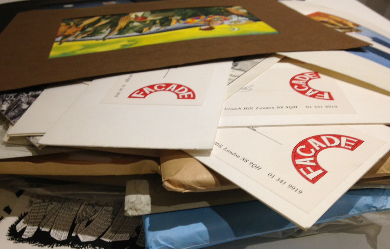
The penultimate item in this series of 10 objects from my dad's loft is a bag of unpublished portfolio material from circa 1984.
There was a
lot of material from London in my dad's loft, when I left my studio just before I flew off to Japan it was the natural place to just shove everything, my entire output from 1983-1986, and it's pretty well all been preserved, waiting for me to reclaim thirty years later.
I moved to London in 1983, encouraged by two children's book commissions, but finding more work wasn't easy, a miserable, barren year went by with precious little work before I eventually reconnected with an old friend from Manchester Andy and eventually joined a couple of other illustrators and designers to set up Façade Art Studios in Crouch End, N.8.
I've blogged about Façade Studios before (
here, and
here). The aisles of an old church on Crouch Hill had been converted into studio space and were rented to us by animators
Bob Bura and John Hardwick (of Camberwick Green/Trumpton fame), whose studio was in the adjacent church hall. On the other side of the church New Statesman cartoonist
John Minnion had a studio, while the old nave between the two sides was renovated and used for Sunday services by the Eternal Sacred Order of Seraphim and Cherubim. Bob and John retired soon after we set up the studio, selling the old church hall to Dave Stewart and Annie Lennox (The Eurythmics), who converted it into their recording studio. Cherubim and Seraphim then became our landlords. With such a hotbed of activity all around I found myself spending most of my time in Façade, the studio was my second home, it seemed to turn me into a full time illustrator almost overnight.
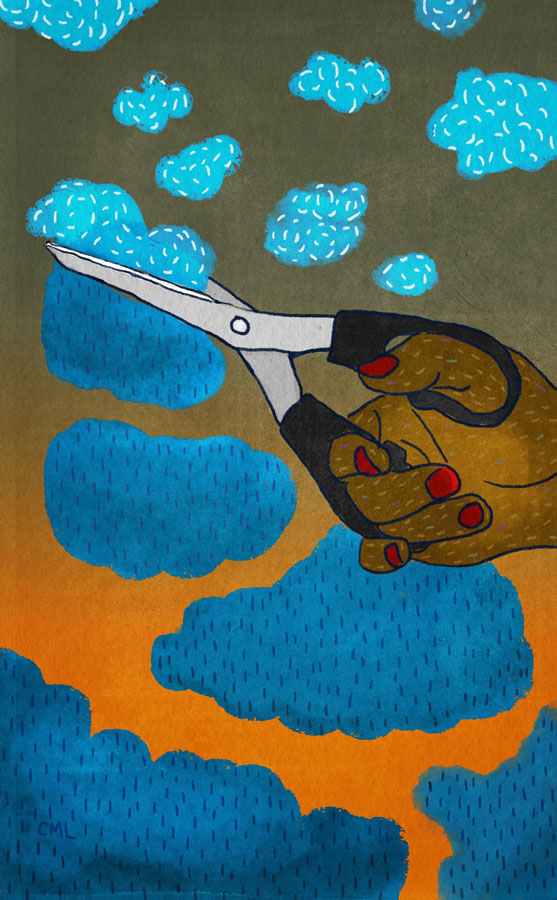
When I look through the piles of old artwork now there's so much material it's hard to choose any particular piece, but this bag of unpublished portfolio images from the very early days of the studio sums up the renewed focus I had on illustration. It was a very productive period, especially for editorial work, I experimented in all kinds of directions, from very tight to cartoons, though my ultimate target was always children's books. These were all aimed to grab real paying jobs, I was hungry for commissions and had nothing to lose - no back up plan, no more signing on, it was either make it in London or run back to Norwich and get a day job, and I was certain
that wasn't going to happen. I was still gunning for children's book commissions, but magazine work paid the rent. Here's a few.....
 |
| Saxon versus Viking, A drawing aimed at the historical non-fiction niche, circa 1983 |
 |
| This drawing and the one above are the oldest from this era, I realised very quickly that there was a limited market for tight penwork, and quickly changed tack. |
 |
| Two early experiments aimed at picture books |
 |
| Bloody Mary - Part of a series on visualising cocktails |
 |
| Make-up. |
 |
| Give us a job! Self portrait in desperation - it probably wasn't such a good idea to show this to potential clients! |
Number 8 in this series of ten archive items from my dad's loft are some surviving copies of The Blue Blanket fanzine, which briefly flared on the streets of Norwich from 1981 to 1982.

Three years in Manchester may have seen a mixed development with my artwork, but it had a profound effect on other aspects of my life - especially through music. It was a fabulous time to be in Manchester - I moved there at the height of punk, and left just before the Haçienda opened. I saw all the iconic bands of the era, from Buzzcocks to The Fall to Joy Division, and all their touring contemporaries. Despite poverty as a student I loved Manchester and often wonder why I didn't just stay in the city after graduating, but I was penniless and disillusioned with my artwork, there were no potential clients for my drawings and the prospect of looking for a job or signing on in Manchester filled me with dread, I couldn't see any reason to stay in the city. A temporary return to the family home was inevitable, however while I was in Manchester my parents had decided to leave the West Midlands and move to a village outside Norwich. It was an entirely alien world to me, from the gritty streets of Manchester to a hamlet in the Norfolk countriside, which I'd only visited there on holiday once. What was I going to do now?
My head was full of musical and creative frustration, I needed some outlet for this energy, I was angry, disillusioned, full of post-grad angst and resentment. I needed to get something off my chest....
 |
| Cut from Blue Blanket issue 4, 1982 |
Musical ambitions were never to be fulfilled, so I did the next best thing - I started a fanzine.
Why
The Blue Blanket? The first thing my parents did after I returned to the family flock, after throwing away my entire wardrobe of arty (to my eyes) second hand rags (in theirs), was to tag me along on a short holiday in Brittany. I was really not in the mood, but there was a large blue blanket at the place we stayed, and blue fluff seemed to attach itself to everything - long after the holiday we were picking bits of blue out of things. I wanted a magazine that would get into the crannies of Norwich, a blanket coverage that would stick everywhere. The name was a joke, but it also reminded me of
Der Blau Reiter art movement started by Kandinsky and others.... this was to be a magazine about art as well as music (or so I hoped). Hence
The Blue Blanket. The fact that I knew absolutely
nothing whatsoever about Norwich, it's music or art scene didn't seem to matter, in fact I saw it as an advantage as everything came to me fresh, and to my eyes there really didn't seem to be that much of a scene to discuss anyway. Today, Norwich has several venues and numerous galleries, but in 1981 it was more of a city of antiques and second-hand bookshops, there were only a handful of pub venues and two small clubs that put on indie bands -
The Gala (a former ballroom) on St.Stephens, and
The Jacquard on Magdalen Street, plus occasional gigs at the University of East Anglia (UEA). Nevertheless there was an energy in the city, with some ambitious local bands, an energy which I soon connected with.
The first issue of
The Blue Blanket extended to 16 sides of A4, printed (extremely badly) by the Freewheel Anarchist Bookshop in Norwich. It consisted of a manifesto, a news page, a band interview (the non-band Sans Culottes), some gig reviews and lots of opinionated noises from me (under various aliases) questioning whether Norwich was a creative cul-de-sac, a diatribe against the media, jokes, cartoons, an unplayable song and some truly awful poetry. I think the first edition stretched to 200 copies, some of which were stocked by HMV and other local outlets, Rough Trade in London offered to take some, and to my immense pride John Peel at the BBC gave it a shout out on his Radio 1 programme.
 |
| Spread from Blue Blanket #2, 1981 |
To my amazement it sold out, so I upped the price and print run and produced another one, followed by another, and another. My fanzine wasn't alone in Norwich (there was another
Is It Fish?, produced by Farmers Boys compatriot Kid Brian), but my policy was staunchly to focus on the whole of the local indie music scene rather than promote any particular band or cover touring acts. Succeeding issues ran features and interviews on Norwich bands The Vital Disorders, Carl Gustav and the 84's, Zod & the Universe, The Suspects, After Dark, The Higsons (author & comedian Charlie Higson's band!) and Popular Voice, though plans to include the local art scene as well as indie music never really materialised. By Issue Four the print quality had greatly improved and it still regularly sold out of it's much increased print run, it was actually turning over a small profit, but the job of writing, compiling, designing and selling it was becoming a burden, though by that stage I had a few contributors and the distribution was much easier. John Peel's encouragement kept me at it for a quite a while (he announced the release of every issue and phoned me up once to talk about the Norwich scene on air, tragically I was out!), but my energy was being pulled back towards my illustration career. The focus and self-discipline of running the magazine was giving me a more professional attitude to my work, it gave me the determination to research the market and produce a new portfolio of illustrations to show around London.
The decision to finally hang up ambitions of journalism and close the covers of
The Blue Blanket came when I was commissioned to illustrate my first children's book in 1982 - Jeremy Strong's
Fatbag, published by A&C Black.
I thought I'd lost all but one remaining copies of
The Blue Blanket, so was very happy to find a few surviving in my father's loft.
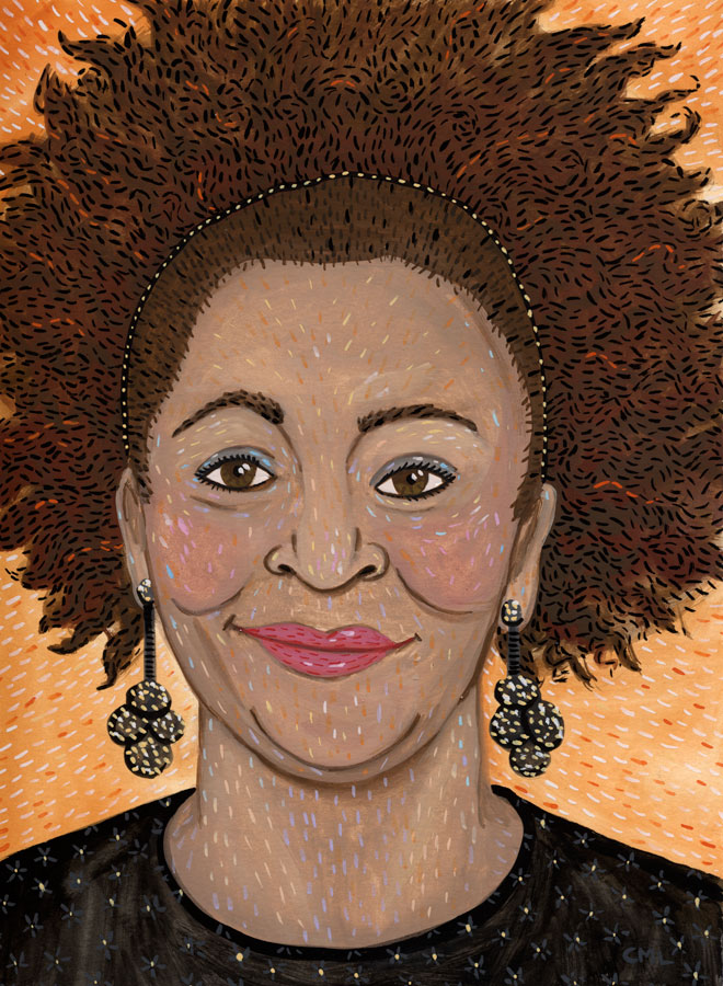
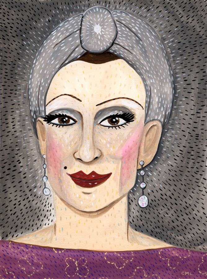
A SRoB portrait of TIME magazine correspondent Jay Newton-Small, author of Broad Influence: How Women Are Changing the Way America Works.
Post by Chloe


Lotta Nieminen’s illustrations are packed with detail, colour and narrative. The bold vector shapes combined with subtle texture and an atmospheric colour-scheme is what really brings this work to life. Lotta Nieminen’s talent doesn’t stop at illustration either. She is also a graphic designer and art director who runs her own studio based in New York.
If you would like to see more of Lotta Nieminen’s work please visit her portfolio.


karolin schnoor is a German freelance Illustrator and designer, who uses screen printing as an integral part of her illustration practice. Inspired by a love of colour and pattern her illustrations can be found in magazines, stationary, calendars and mugs with a vast array of products to purchase in her Etsy shop. Some of her clients include; Harper Collins, Creative Review and The New York Times.
To see more from this artist visit her website.
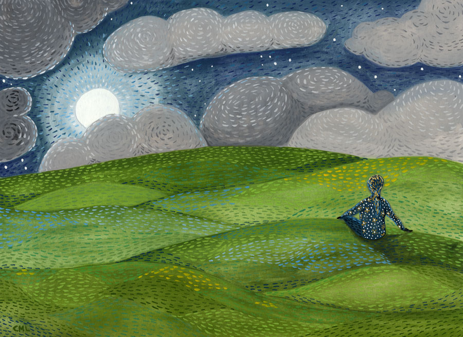
Here's a recent commissioned piece. The simple brief: a landscape of hope, meditation, emergence.
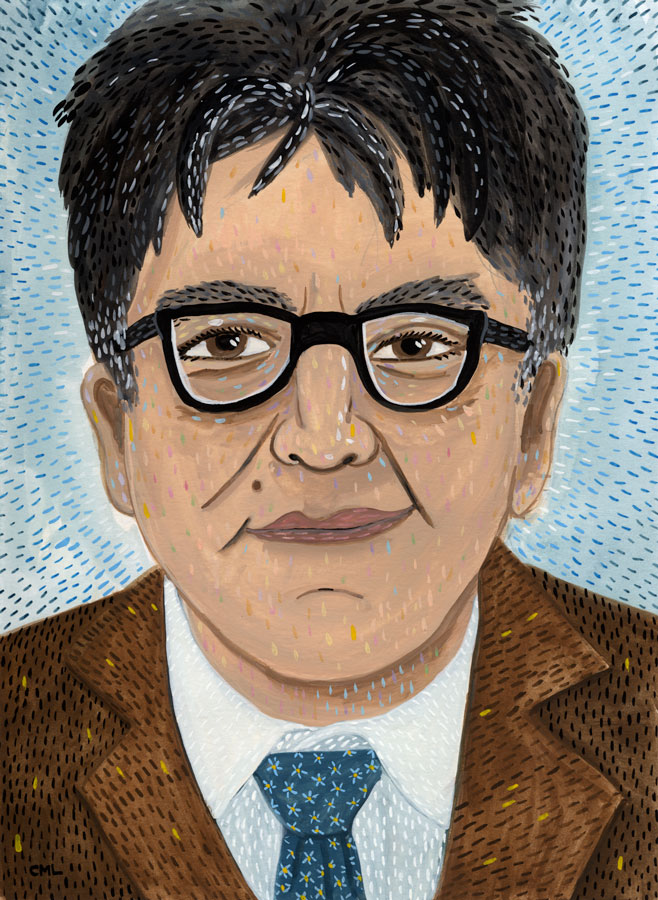
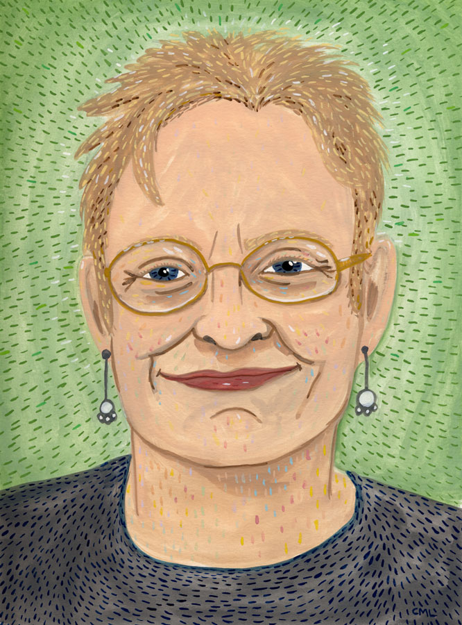
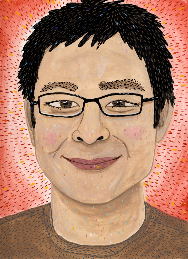
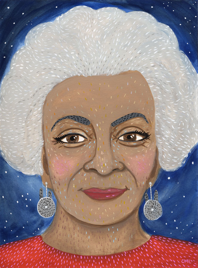
This week's portrait for the Seattle Review of Books is of Seattle icon Ivar Haglund.
By Chloe


Laura Manfre is a self-taught illustrator from France. Her work has a beautiful traditional quality to it but still remains relevant and appealing. It’s difficult not to feel hungry when looking at Laura Manfre’s work due to one of her main subjects being indulgent treats and tasty snacks. She is equally talented though at depicting other subjects such as animals and people.
If you’d like to see more of Laura’s work, please visit her portfolio.
While the advocacy for an Asian Iron Fist has positive intentions and is well reasoned, it is not the hill advocates of media representation should seek to die on.


.jpeg?picon=2456)


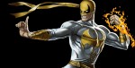 While the advocacy for an Asian Iron Fist has positive intentions and is well reasoned, it is not the hill advocates of media representation should seek to die on.


The word is Marvel is looking at Asian and white actors for the Iron fist show, but isn’t it possible that Marvel will use Iron Fist to introduce Shang Chi, just as they used the jessica joines show to introduce Luke Cage?
At this point, I think too many people have put way too much value on the decision Marvel goes. The arguments and reasoning for people’s preference (those who have one as there are fans who have none at all and are just hoping for a great actor to take on the role) are understandable and have me nodding and listening and learning.
Having said that, a lot of people are going to be unhappy with whatever is decided. This is quite a deficit for the individual who will be chosen to be Iron Fist and that’s where I find things to be rather dismal.
“When Marvel and DC Comics hear cries for diversification, their first instinct is to turn to legacy characters like Red Wolf and Shang-Chi, Master of Kung Fu.”
Marvel’s first reaction to calls for diversity was Miles Morales, black Nick Fury, Sam Wilson Cap, Lady Thor, Muslim Ms. Marvel, Korean Hulk, the list goes on. Marvel changed their entire first string team long before they fell back on 4th string nobodies like Red Wolf or Master of Kung-Fu.
DC on the other hand pulled out Flipper Dipper.
This article and writer is stupid. Having an asian american as a lead actor for Iron Fist would be a significant step forward. There is nothing wrong with perpetuating the martial arts stereotype – it’s not a negative stereotype per say. Is it wrong to cast a black man as a lead in a basketball film? I don’t think so. Having some sort of representation is better than not being represented at all. I am completely apalled at the fact that the writer would rather prefer not seeing an asian in the media than having him assume the role of a protagonist and hero.
I appreciate your thoughts in the article Alexander. I think conversations like this are important. I understand the concern of pigeonholing Asian actors into martial arts roles. I also appreciate you saying that more Asian comic book characters need to be created. However, I disagree that casting an Asian-American Iron Fist would be a negative.
There are ways to nuance an Asian-American Iron Fist. I read Ching’s article as well and I think he was reductionistic in making Danny Rand only a simple martial arts hero. An Asian-American Fist can still have depth and be more than Jackie Chan or Bruce Lee.
1. We can still have the outsider story that so many comic fanboys (of which I consider myself to be one) love. If you make Danny Rand either bi-racial or a 2nd/3rd generation Asian-American, you keep the outsider storyline, but also add layers to it. How many Asian-Americans feel the pull between American culture and Asian culture?
2. An Asian martial arts series by itself isn’t a bad thing. In Chinese cinema martial arts movies are a true art form. It’s part of the heritage of Asian cinema, just like Westerns are a big part of American cinema. Furthermore, you can add layers to the martial arts element. Go watch Rickson Gracie talk about BJJ and how it’s such a transformative tool. The constant practice and failure that goes into learning martial arts could be a great storytelling device if taken beyond the “snatch the pebble from my hand,” cliche.
3. Newer comic book characters don’t get as much pull. Ask anyone who their favorite superhero is. Iron Man? Captain America? Batman (my own favorite)? Flash? Green Lantern (another favorite thanks to Geoff Johns). What do these heroes have in common? They are all well established heroes. Simply creating another hero through comics, that does not have nearly as big an audience as movies, and hoping he or she will become popular is very hard to do. Miles Morales isn’t mainstream enough as seen in the casting of Asa Butterfield for the new Spider-Man and it will be a long time until Amadeus Cho is. Why not use a platform like the Marvel Netflix series, which hit it out of the park with Daredevil and Jessica Jones, and have an Asian Iron Fist?
4. Finally, we see white castings for Asian roles all the time. Scarlett Johannson for “Ghost in a Shell”. Emma Stone in Aloha. Tom Cruise as William Cage in “The Edge of Tomorow,” originally Kiriya Keiji in the novel that the film is based on. In the live-action “Akira” movie, Robert Pattinson was rumored to be Tetsuo and Andrew Garfield was supposed to be Kaneda. Why is the comic book community, a community I love, so abhorred by the idea of an Asian or bi-racial Danny Rand.
I agree with your final statement, that Asians should not be discouraged if Danny Rand is cast as caucasian. But I don’t think having an Asian Iron Fist is as negative as you think.
You know, I would love to see a Jimmy Woo and the Agents of ATLAS movie, or series, or whatever.