


.png.jpg?picon=4238)

 Quote: "Book covers are EXTREMELY important. The original cover of Elemental came off as very paranormal romance-y. And, unfortunately, it attracted readers who were avid paranormal romance fans. Many of them responded negatively to being surprised with a space opera with very little romance. A cover is a form of communication. It has to pique the interest of your target audience. If you pique the interest of someone who isn’t going to like what’s inside the book, you’ve just wasted your time." - bestselling Author, Emily White (LOVE her cover on the left-side)
As a writer, your job is tell a great story, but I find that when it comes to fiction marketing or book cover design, some authors don't take the same time to study it, the same as they would if they were researching aspects of their latest book.
Frustrated with low book sales?
It could a number of things, including your current cover design.
The cover should instantly let readers identify the genre, and if it catches their attention, then they will most likely read the back jacket copy and reviews, and buy the book.
But if your design is misleading, or doesn’t represent the genre, or looks unprofessional, it will almost certainly have readers skipping your book and clicking on someone else’s novel.
I know what you’re thinking…the book design shouldn’t matter. It’s what inside that counts. And maybe that’s true...
However, as an indie author the odds are stacked against you. Self-published writers do not have huge marketing departments backing them, so please consider giving your book the best chance of piquing a reader’s interest by having a design that “fits” the genre.

Sales for my own YA paranormal romance series, Spellbound had drastically declined. Each of the covers in my series had a different image and design, and it was confusing readers. I couldn't afford to hire another designer, so I decided to create my own covers and see if new branding would help boost sales. Within three weeks, my sales tripled. Then I redid the designs on all of my book covers, and again my sales jumped.
I honestly believe that book covers do help sell books!
It is NOT cliché to have a cover that represents your genre. It is an savvy marketing choice to allow readers to instantly recognize the genre of your amazing story. Many self-published authors believe a false assumption that covers should be unusual and distinctive, which is extremely risky.
Misinformed self-published writers who don’t understand the purpose of the design will make fatal mistakes in cover art selections. I'm not saying your book has to be identical, but a design should be similar to others in the same genre.
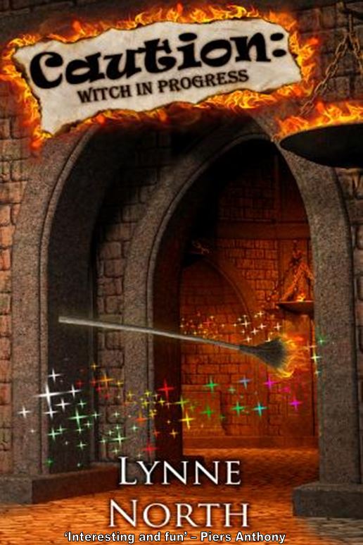
(*The covers on the left-side are published novels and I created similar designs to match the genre and as an example of design trends.)

Whatever genre you write in, I suggest studying the book covers of the bestsellers. There are trends in designs for a reason because a reader can tell at a glance what type of book it is, so I recommend having a cover similar to what is popular. It is a smart marketing strategy and guaranteed to get you results.
If your goal is to sell more novels, market your work, and appear professional—with an amazing book cover you can attain all three objectives!
The majority of self-published bestsellers all have great cover designs that correspond with the genre that they write in, and you should do the same.
For example if your book is a thriller, then study the cover art of the bestsellers in that genre.

Did you notice that all the bestsellers in "mystery / thriller" have a similar look to them?
Really look at the fonts. They are all huge and bold and eye-catching. Study the colors used. These designs all share a washed-out look.
(*The covers on the left-side are published novels and I created similar designs to match the genre and as an example of design trends.)

If your book is a New Adult Romance, browse the most popular books on places like goodreads.

Do you notice how all the covers appear to follow the same design "look"?
Readers of New Adult fiction can tell at a glance that these books are in the same genre. I recommend using the same types of fonts and colors that match the bestselling designs for whatever genre you write in, or if you're buying premade covers.
Even my own New Adult College Romance cover below matches the trend in NA designs.


Did you see how all of these PNR covers have a similar design?
Take a good long look. All of these awesome book covers below convey the genre at a glance.
(*The covers on the left-side are published novels and I created similar designs to match the genre and as an example of design trends.)

The book cover I designed below fits the PNR genre with a moon, blue color, and a spooky vibe.

(*The covers on the left-side are published novels and I created similar designs to match the genre and as an example of design trends.)

Cheers,
Sherry Soule
(*The covers on the left-side are published novels and I created similar designs to match the genre and as an example of design trends.)

The book cover I designed below fits the PNR genre with a moon, blue color, and a spooky vibe.

So choose a design that fits the genre, and the book cover will easily and effortlessly do some of the marketing for you. Having a design that doesn’t match the genre will not only impede sales, it’s essential for success. And that is your goal, right? RIGHT!
Also, it is a general advertising principle that having a face and/or people on a product (the cover) will generate more sales. The model on your cover doesn't need to look exactly like your hero or heroine, but just enough so the reader can form their own image of your characters in their mind.
(*The covers on the left-side are published novels and I created similar designs to match the genre and as an example of design trends.)

As always, I wish everyone much success on their writing journey!
Cheers,
Sherry Soule
0 Comments on 3 Surefire Ways to Start Selling More Books within 30 Days - Part 11 - #IndieAuthor #SelfPubbed as of 1/1/1900
Add a Comment


 Forensic Friday is being replaced with Freak-Out Friday.


Congrats!
Thanks! Very excited about my first adult title. Good luck in the giveaway
Oooooh a new book?!!!! Brilliant… can’t wait! I love that you call this cover the Tarantinto version… it SO is, Laura!! xx
xx
Thanks Suzy. Glad you like the cover