new posts in all blogs
Viewing: Blog Posts Tagged with: American and British Fantasy, Most Recent at Top [Help]
Results 1 - 13 of 13
How to use this Page
You are viewing the most recent posts tagged with the words: American and British Fantasy in the JacketFlap blog reader. What is a tag? Think of a tag as a keyword or category label. Tags can both help you find posts on JacketFlap.com as well as provide an easy way for you to "remember" and classify posts for later recall. Try adding a tag yourself by clicking "Add a tag" below a post's header. Scroll down through the list of Recent Posts in the left column and click on a post title that sounds interesting. You can view all posts from a specific blog by clicking the Blog name in the right column, or you can click a 'More Posts from this Blog' link in any individual post.
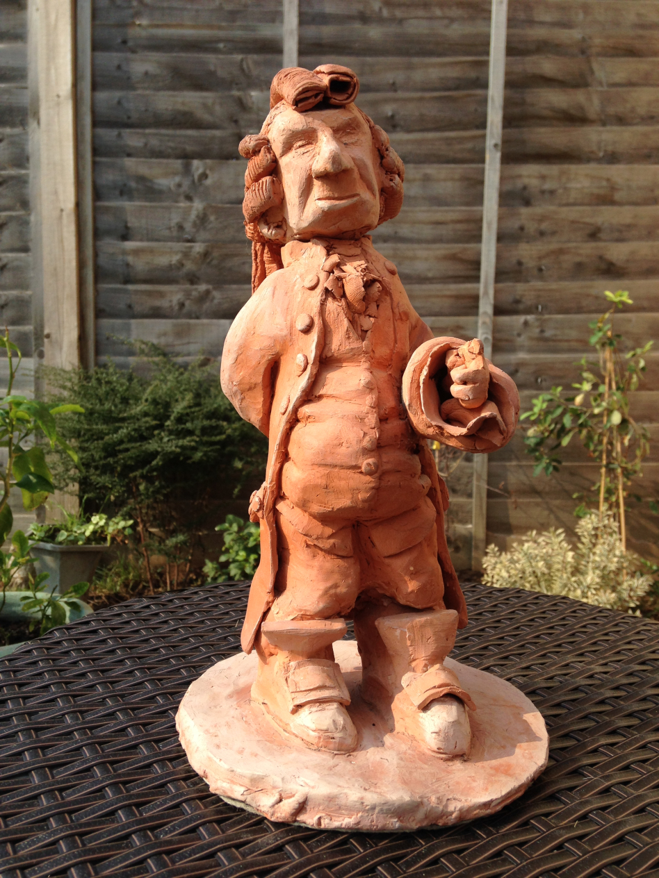
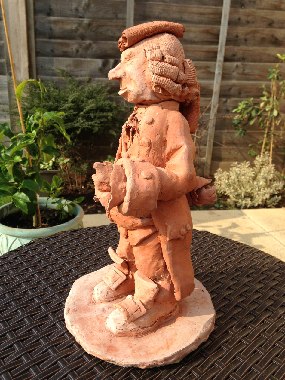
The sixth item in A History of my Archive in 10 Objects is an earthenware figure, made during my Foundation Course at Bournville School of Art early in 1978.
 |
| Old Man, earthenware figure, 31cm tall, 1978 |
Bournville School of Art was located at Ruskin Hall in the beautiful surroundings of
Bournville Village, the famously idyllic workers' community built by the Cadbury brothers next to their chocolate factory. Opened in 1903, it was purpose built as an art school by a friend of John Ruskin, and stood in that role until it's
controversial closure in 2012. The suburb was deliberately created to mirror a pastural tudor village, the college overlooked the 'village' green. It was a very straightforward commute for me, as it lay on the same train from Four Oaks to Birmingham, just on the opposite side of the city. Every morning I'd get off the train and walk past the chocolate factory to Ruskin Hall, breathing the chocolate scented air - it was almost perfect, the only downside (from a student point of view) was the lack of a pub, the Quaker Cadbury brothers being of course abstainers.
There was also a secondary studio at Steelhouse in the middle of the city, used mainly for life drawing and painting.
The year I spent at Bournville School of Art was an incredibly rewarding experience, it opened my eyes to new artists and a more directly relevant graphic business, many of the tutors were working artists and designers as well as lecturers, so had direct experience of the creative business, it was an intense, exciting course that broadened my horizons, introducing me to life drawing, etching, photography ... and ceramics.
And so to this figure, the "little old man" as my mum always called him. It's a character from my doomed novel
In Search of Summer Gold, so in many ways a last gasp of my adolescent fantasising before the maelstrom of degree course. Standing 37cm tall he's quite heavy, with a detachable head. He used to hold a clay pipe in one hand, which has now broken off and lost.
Like many of the things studied at Foundation Course, this is regretably the only thing I made in ceramics, the course was all too short - focusing all my attention on illustration thereafter, I've never been anywhere near a kiln since. Similarly I've not made etchings either, which I greatly regret.
This figure would have been familiar to anyone who visited my parent's home, as it sat in their front room window looking out onto the world for decades, it was the first thing you noticed as you approached the house.
For that reason it conjures intense memories of the family home to me, every trip back from Japan I'd wander up the drive and there he'd be, my "little man", welcoming me back to the old place. He now sits in my studio, not looking through a window onto the world, but instead glaring reproachfully at my work table. He's telling me to get back to work....
In our tiny but (dare I say it?) much-loved house, there are two bedrooms, one kitchen, one place for me to work, two rooms full of books and a basement and then again a garage where my husband does his thing.
This is a view of the basement. This is Sunday morning, 7:50 AM, as my husband prepares for his first solo clay show, opening in early June at the Show of Hands gallery on Pine Street. Bill has dozens of pieces of extraordinary originality and craftsmanship being cued up for the show. This shape is but a very early iteration (trust me when I tell you it will look nothing like this when it is done).
Meanwhile, Bill and I will be down at the Clay Studio in Old City on Friday evening, for the
Clay Studio National reception. The show, which honors "the best contemporary ceramic art being made in the United States now" features a collection of pieces culled from hundreds from across the country. One of Bill's architectural pieces will be on display.

By: Catherine,
on 3/19/2016
Blog:
OUPblog
(
Login to Add to MyJacketFlap)
JacketFlap tags:
art,
Language,
competition,
pottery,
dictionary,
ceramics,
etymology,
British,
Linguistics,
*Featured,
oxford dictionaries,
TV & Film,
oxfordwords,
OxfordWords blog,
Dictionaries & Lexicography,
The Great Pottery Throw Down,
Add a tag
The newest knockout competition on British television is The Great Pottery Throw Down (GPTD), in which an initial ten potters produce a variety of ceramic work each week, the most successful being declared Top Potter, and the least successful being ‘asked to leave’. The last four then compete in a final [...]
The post The Great Pottery Throw Down and language appeared first on OUPblog.
How proud I was this evening to accompany my husband to the Wayne Art Center (about which I have written
here), where he won a first award—a student award—for his work, "Industrial Landscape." This is an evolution of work that is exquisitely considered and well made, and a happy validation of the long hours he spends planning and building these pieces.
For a glimpse at an earlier collection, please go
here. So I got all dressed up. Wore heels for the first time in forever. Almost fell off the heels. Had fun seeing two of my own pieces on display. Which I'd entered just for fun, though, once I got there and saw the serious talent, I died a thousand deaths, then decided to stop dying and had the aforementioned (twice) fun. I don't think I'm good at this. Seriously. It's just — a community. I love the community. And sometimes the glaze does nice things.
So, hats off to my husband. I honor the originality of his vision. And the care with which he builds things.
Ceramics. Photography. Graphic Arts.
This is the work my husband does.
This summer, Bill has brought all of that together in a single web site, which I have the privilege of launching
here.
Some of our clients will recognize some of the images. Our pottery friends will recognize the pots. Our dancing friends will find themselves inside Bill's magical 3-D imagery. My niece will find herself in the image above, reading a book that is called
Small Damages.
The site is like a gathering. I hope you'll take some time to explore it.
The link, again, is
this.
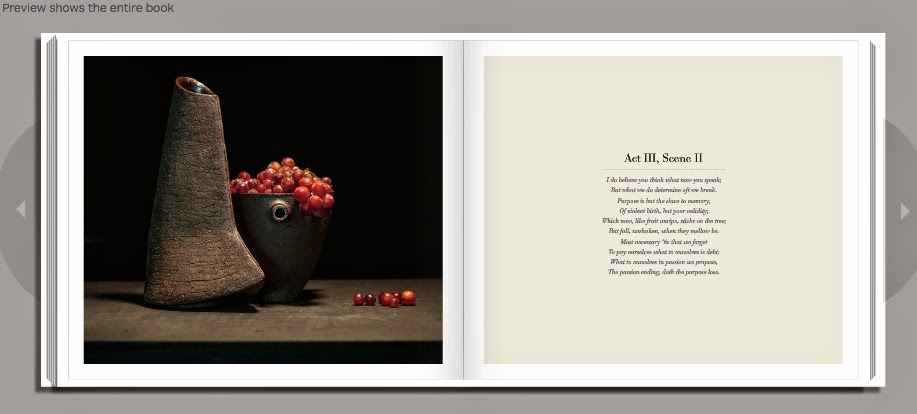
A few days ago I posted
here about my husband's work as a ceramicist and photographer.
I can now share that exquisite work here. Bill made all of the pots, arranged, lit, and took the photographs, and designed the book, which he will soon be sharing with ceramics studios.
I, however, love the work so much that I have asked if I might share it with all of you.
The link to the Blurb book preview is
here.
In a few weeks I'll be sharing Bill's new web site, which features this work, his 3D design work, and his photography.
Tonight is the Opening Reception for the Society of Illustrators Original Art Exhibit and we are proud to announce that two of our illustrators, Beth Lo and R. Gregory Christie, will have art from their Spring 2012 titles on display in the show. Below, Beth Lo shares a few shots of how her unique illustrations from Auntie Yang’s Great Soybean Picnic came to life, from a simple sketch to a ceramic plate.

black and white sketchbook image
Beth started with a black and white sketch and then formed the plates. She put a “hump” mold or an inverse shape of the plate on a potters wheel. It was then dried and ”bisque” fired to 1850°F, forming a porous mold. To make each plate, she rolled out a slab of porcelain clay about 1/2″ thick over the mold and cut around it to make the edge.

After being shaped into a squared form and slowly dried to avoid warping or cracking, Beth drew a pencil sketch of the the original image. Then the drawing was painted with black underglaze.

The colored underglazes were then painted on and each plate fired in an electric kiln at 1850°F to set the underglaze and burn the pencil off. The illustrations from Auntie Yang’s Great Soybean Picnic were photographed during this state. Finally, a light coat of glaze was sprayed on and the pieces fired again to form a glossy surface.

Jason Low holding Beth Lo’s Original Art entry
Filed under:
Art Tagged:
Auntie Yang's Great Soybean Picnic,
Beth Lo,
ceramics,
illustration,
Original Art Exhibit,
pottery,
Society of Illustrators 


By: Emily Smith Pearce,
on 6/24/2011
Blog:
Emily Smith Pearce
(
Login to Add to MyJacketFlap)
JacketFlap tags:
Europe,
Denmark,
plates,
Travel,
china,
Culture,
Germany,
vintage,
flea market,
thrifting,
ceramics,
Add a tag

I could just about feel the flea market in Copenhagen pulling me across the street. Come look! Cool bargains you won’t find anywhere else! Luckily, the family obliged for a few minutes, while I gasped over the budget prices for vintage Danish ceramics.
If you’ve ever been in Copenhagen, you know it’s not really a place for bargain shopping. So I was excited to find the blue Mother’s Day and the black/ white Bjørn Wiinblad plates. Just a few euros a piece for perfect souvenirs.

I’ve been interested in Bjørn Wiinblad since discovering his work in the pages of Holly Becker’s new book, Decorate. Jonathan Adler, whose home is featured in the book, collects Wiinblad, and I just love the zany, humorous figures. BTW, if you want some totally awesome inspiration for your home, get Holly’s book. I’m thinking about just setting up camp in its pages.
The Wiinblad plates are from a 12-month series. I got October and December.
The blue Mother’s Day plates, which are about dessert size but designed for hanging, are Royal Copenhagen from the 70′s. They made one of these plates for each year between 1971 and 1982.
The other two plates (playing children/ animals) I bought at a charity shop here in Hannover. They’re children’s china, something you find a lot more of here because children are expected to use “real” plates, not plastic, as well as real silverware and glass glasses. I just couldn’t resist the one with the children playing. So cute.

The animal plate cracks me up because the wolf is smoking a pipe—-such a taboo nowadays, especially on a product for children. This plate was made in East Germany. I’m not too worried about it turning my son into a delinquent.

The kids love their plates, and I’ve planned a spot on the wall for the Bjørn Wiinblad ones. I’m still looking for a home on the wall for the Mother’s Day plates.
The SCBWI (Society of Children’s Book Writers and Illustrators) Summer Solstice Scrawl Crawl was a lot of fun. This was an event blog where SCBWI members across Europe sketched and wrote all day on Tuesday and shared their creations on the same blog. Here’s my entry here, but make sure to check out the others. It’s really interesting to see where people were all across the continent.
I’ve been missing NPR lately and listening to a bunch of old Fresh Air interviews over the web. Favorites: Jason Schwartzman, Chloe Sevigny, Jason Segel, and Ted Danson. I guess I’m feeling like listening to actors. We’ve been watching HBO’s Bored to Death

By:
Annie Beth Ericsson,
on 3/4/2011
Blog:
Walking In Public
(
Login to Add to MyJacketFlap)
JacketFlap tags:
classics,
fashion,
happenings,
book design,
reading is fundamental,
book covers,
ceramics,
jewelry,
maira kalman,
design finds,
good for you,
planned parenthood,
penguin classics,
penguin uk,
coralie bickford-smith,
david pearson,
Add a tag
Since the week has been so crazy for me preparing the Spring 2012 picture books at work, here are a few announcements/discoveries to keep y’all busy:

1. Seems that Coralie Bickford-Smith, senior cover designer over at the UK’s Penguin Books, has been on everyone’s brains lately . . . I received two links to her in the past few days! I have always been a huge fan of her Clothbound Classics series, but I hadn’t seen her full site.

And, my goodness, take a look at her newest work! I’m getting giddy looking at this Penguin Great Food series (link courtesy of Creative Review, via Ryan, extremely cool fellow designer/cubicle neighbor). Each plate is based on vintage ceramic patterns, and I seriously can’t get over how gorgeous they are.

2. Speaking of how the UK dominates beautiful patterned covers, let’s move along to White’s Books, a small London publisher directed by David Pearson (a former Penguin Books designer himself). In a different way, these patterns draw the reader into other imagery and bring visually potent symbolism to distinguished classics. Thanks to Kevin Stanton, amazing paper-cut illustrator from the Illustration Week extravaganza, for referring me to Jessica Vendsen’s blog!

3. On a local level, I have to give a shout-out to a new show opening up in town: Maira Kalman: Various Illuminations (of a Crazy World). I’ve mentioned before my infatuation with Maira’s work, and since she’s a Nancy Paulsen Books author/illustrator, I get to drool over her new children’s books on a regular basis. Can’t wait to check out this exhibit of many of her best-known works, as I know it’ll be as original and out-of-the-box as ever.

Maira Kalman: Various Illuminations (of a Crazy World) is on display at The Jewish Museum from
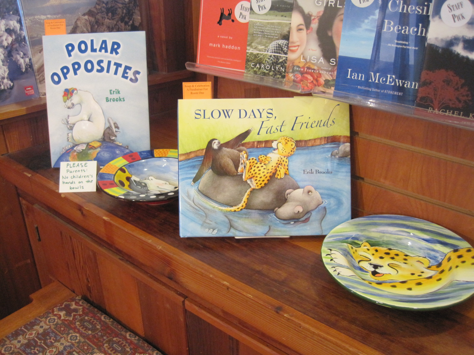
 Room One is hosting its 4th Annual Soup Dinner on Saturday, October 9th. All summer, artists, citizens, and visitors of the Methow have been painting their hearts out in preparation. 200 bowls are glazed, fired, and ready to go!
With the price of admission, you receive a bowl of your choice (they go fast of course), a wonderful meal, and a beautiful fall evening at the Winthrop Barn. There are also a number of artisan bowls that become part of a silent auction. As a extra treat, my inaugural participation includes a four-bowl set featuring characters from Polar Opposites, Slow Days, Fast Friends, and The Practically Perfect Pajamas. You will also receive signed copies of these books, AND a piece of original art for my new comic strip, Harts Pass.

 Non-valley residents can feel free to contact me with maximum bids (Erik's bowl set only). I'd be more than happy to facilitate a long-distance bidding frenzy!
Contact me at: #509-996-4345
- Erik
pottery
Originally uploaded by teachergal
I tried to focus more on the letting the writing guide me… not letting the photos lead the way, like I have the other days this week. (The writing on the left side of this layout captures the essence of my [...]
Right after work I picked up all of the letters I created for my students so they could all take-home a piece of pottery when we have the next (ticket-bidding) Pottery Auction. I was pretty happy with the glazing results:
I decided to spend the next hour or so wrapping each one in newspaper (again) [...]
Following on from yesterday's post, I was looking for a link, and wound up on a five year old post from this blog. And on rereading it it made me smile, enough that I thought I'd repost some bits of it here. All of my guesses were interestingly wrong.
(The unnamed Zemeckis project I refer to is The Fermata; the unnamed Dave McKean thing would have been the as-yet unwritten and untitled MirrorMask.)
Last night's e-mail brought Henry ("Nightmare Before Christmas") Selick's second draft script for CORALINE. Henry's first draft of the script was utterly faithful to the text of the book -- if anything, too faithful. This version was both looser and truer to the spirit of the book -- he'd added a character, made the beats in the first act slightly different, but the changes were the all kind of changes that need to exist when translating a book into a film, and the core characters -- Coraline, her parents, the Cat, the Other Mother -- and the story are still just the same. Very creepy and a great deal of fun. Apparently it was very well received by the studio.
It's weird -- there are so many movie projects out there based on stories or books of mine that I (a) lose track and (b) assume as a general rule for piece of mind that none of them will happen. But i think we're getting to the point where the probabilities are starting to suggest that something has to happen.
Really we need a tote board, with Coraline, Good Omens, Murder Mysteries, Stardust, Books of Magic, Neverwhere, Death, and (trailing way behind) Sandman on it, along with anything I've forgotten or intentionally not mentioned (like the Robert Zemeckis project, or the Dave McKean film), not to mention various of the odd projects I've collaborated on over the years, like Beowulf, or Interworld, which, just as I'm certain they're utterly dead, stir in their graves and yawn and blink and sit up and ask for coffee. I think Good Omens will probably come in first, but an outsider like Books of Magic or Murder Mysteries might come in and pip it at the post....
Proving that I was a very bad guesser. And five years later, Henry's
Coraline is in production. (If you
read this very technical blog entry you'll know a few things that haven't yet been widely announced.) Dave McKean's
MirrorMask was the first film to come out.
Stardust will be second, and
Beowulf (which I'd assumed was dead back then) is third.
Coraline will be fourth, around Hallowe'en 2008.
Books of Magic is currently in suspended animation -- as is, I guess,
Good Omens, unless someone wants to give T. Gilliam 70 million dollars.
Neverwhere, having been pretty much dead for years has recently pushed its way out of the grave and is currently lurching enthusiastically around the village terrorising villagers, or at least, I've just been asked to do a rewrite on a draft of the script I did in early 2000. And then, of course, there's still
Death.
...
While this is a question that pertains to my "homework" (my Master's thesis, to be precise), I'm not asking you to do it for me. :) Mostly, I wanted to know, in your personal opinion (mostly for a quotable quote and another person besides Ursula K. Le Guin to cite on the subject, though she's wonderful in and of herself) whether you've noticed a difference in the reception of Fantasy in Britain and in America. Le Guin thinks there is (or was; that essay was written in the 70s), but you share your time with Britain and America enough that I figured you'd have a perception of the difference--if there is one.Thanks so much! Shiloh C.I'm not sure which essay you're referring to, and I'm not really certain what you're asking. Are there differences between critics writing about fantasy in the US and the UK, or fans, or educated readers? Perhaps, but I don't really see enormous differences between them these days -- I suspect that the differences have been eroded somewhat in the last 30 years. I don't know if you surveyed Americans and got their favourite books, you'd get quite as much fantasy as you did when the BBC did it to the British(
http://www.bbc.co.uk/arts/bigread/top100.shtml) (I counted 37 fantasy titles. Your numbers may differ) but you might.
Hi Neil ; I purchased the audio collection from itunes a while back. My son just loves listening to it. His favorite is the Wolves in the Walls. The interview Maddy did was very cute. I was wondering if you plan on continuing to publish audio books, both children's stories as well as novels ? I completely agree with you that there is something special about an author reading their stories. Take care and best wishes ~ williamDefinitely. Actually today I got CDs of both
M is for Magic (read by me) and
Interworld (read by
Christopher Evan Welch and I'm listening to it as I type this. He does a lovely job). Later this year the full audio of
Neverwhere should come out.
Here's a taster for the
Interworld audio. It's tracks 1 (which is the title and copyright), 2 3 and 4 of the audio CD, in MP3 format. It's the first couple of chapters...
1-01%20Track%2001.mp31-02%20Track%2002.mp31-03%20Track%2003%204.mp31-04%20Track%2004%205.mp3


I’m so glad you posted these!!! They’re awesome!