new posts in all blogs
Viewing: Blog Posts Tagged with: postcards, Most Recent at Top [Help]
Results 26 - 42 of 42
How to use this Page
You are viewing the most recent posts tagged with the words: postcards in the JacketFlap blog reader. What is a tag? Think of a tag as a keyword or category label. Tags can both help you find posts on JacketFlap.com as well as provide an easy way for you to "remember" and classify posts for later recall. Try adding a tag yourself by clicking "Add a tag" below a post's header. Scroll down through the list of Recent Posts in the left column and click on a post title that sounds interesting. You can view all posts from a specific blog by clicking the Blog name in the right column, or you can click a 'More Posts from this Blog' link in any individual post.
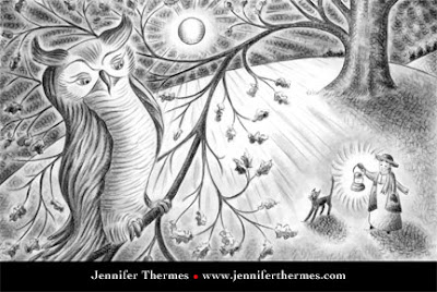
Here's another promo card, from this sketch, way back when.
It always feels like a leap of faith to send these out into the world. (How do I know the post office guy isn't just snickering and shredding them in the back room? Mwahahahaha!) But I really have had people say they've kept a card for years until the right assignment came along. You just never know where things will lead.

readers the gift of 100 4" x 6" Postcards. This is a wonderful way to promote your art, your
business and makes a great Thank you card to your clients. So please sign up and you can have some brand new postcards with your most current illustration for free with free shipping right to your door ;) Specs:
Quantity: 100
Dimension: 4x6
Paper: 14 pt. Cardstock Gloss
Color:4/4, 4/0, 4/1, 2BD
Shipping: FREE UPS Ground Shipping
Eligibility: Limited to US Residents only
You must be at least 18 years old to enter
I am receiving a set of cards for hosting this
giveaway. The winner will be announced May 27th.
Cheap Postcard PrintingPrint Postcards Online
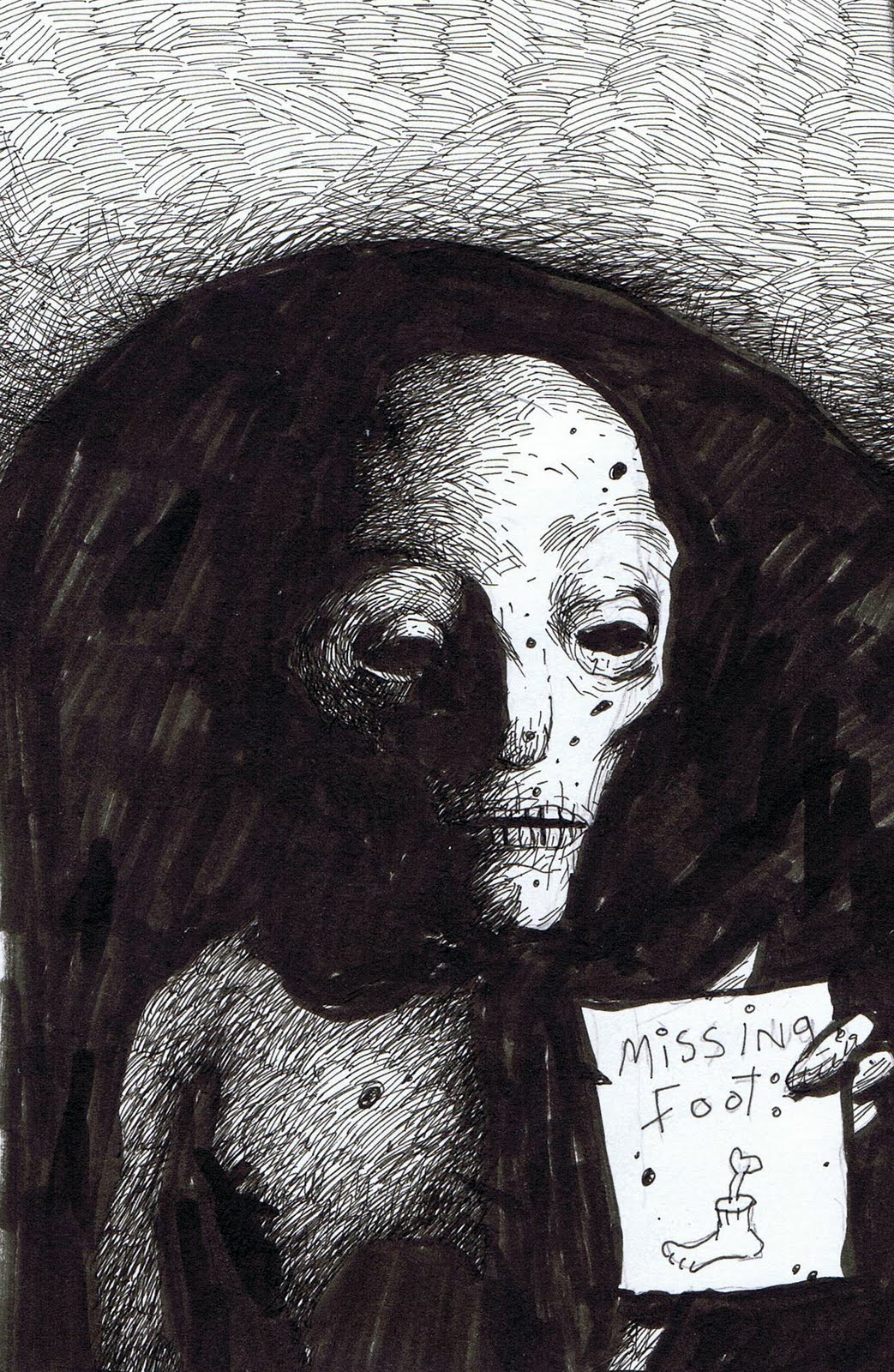
Necropolitan Postcard one: Have You Seen My Foot?
Necropolitan Postcard Two: Afraid of losing her head Abigail tied it to her wrist.
(If you're curious the Abigail picture was done in my sketchbook by covering the page in black ink and drawing in white ink.)
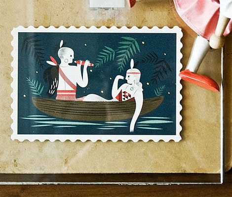
Keith-yin Sun and Judi Chan of Pigeon Post have created a wonderful set of postcards celebrating timeless stories of undying love from around the globe. Inspired by myths and folklore, the set consists of six beautifully designed cards in the shape of a stamp, honoring the tradition of sending mail. This particular postcard depicts Hinemoa & Tutanekai from Aotearoa (New Zealand).
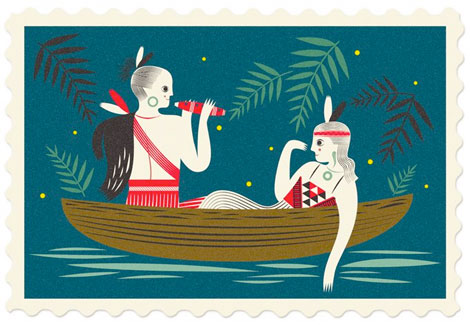
Hinemoa & Tutanekai (detail)
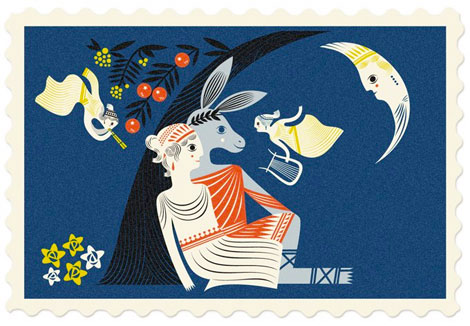
A Midsummer Night’s Dream — English / Greek
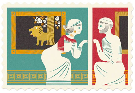
Pyramus and Thisbe — Greek / Babylonian
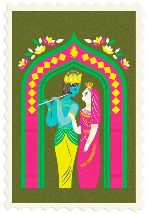
Radha & Krishna — Hindu
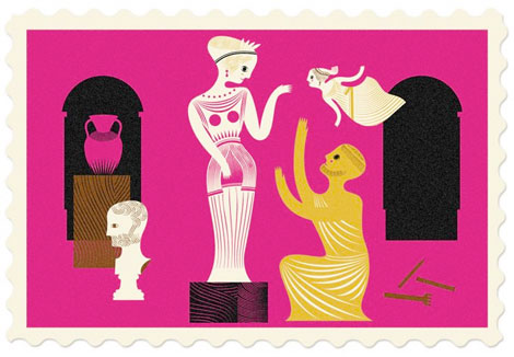
Pygmalion & Galatea — Greek

The Butterfly Lovers — Chinese
These postcards are perfect to send to that special someone for Valentine’s Day, or any day rather. Visit Pigeon Post’s website and store to have a better look and purchase these lovely gems.
No Tags
Share This
Congrats to our 2009 Grain Edit Holiday Giveaway Bash Winners - /Grand Prize - Christopher E from Ferndale, Mi/ 1st Prize - Kristina M - Oakland, CA/ 3rd Prize - Samantha W - North Vernon, IN/ 4th Prize - Nicholas L. - Brooklyn,NY/ 5th Prize - Barbra - Brooklyn,NY
Grain Edit recommends Colo Pro A font designed by Font Fabric. Check it out here.
©2009 Grain Edit - catch us on Facebook and
We just completed our 9th postcard mailer as a group. Here's a little re-cap of all we've done:
Our very first mailer for Winter '07:

We changed up the format for our Spring '07 with 5 of us on front and 2 on the back:

Summer '07:

Fall '07:

Valentine's '08:

Summer '08:

Fall '08:

Spring '09:

Fall '09 we made some changes. New logo & layout:

If you are a publishing professional that would like to be added to our mailing list, you can sign-up
here (we also do an email newsletter).
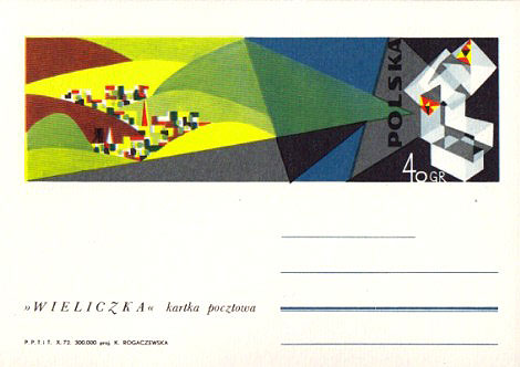
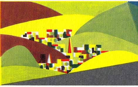
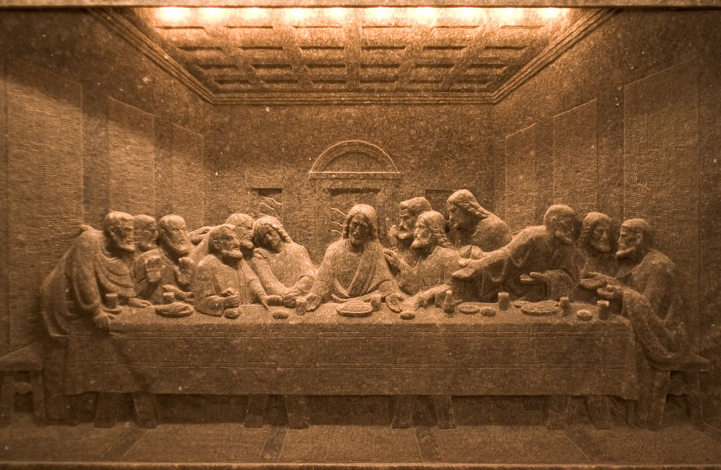
1972 Poland Wieliczka salt mine postcard designed by K. Rogaczewska.
Poland’s Wieliczka Salt Mine, in the suburbs of Kraków, produced table salt continuously for over 700 years. Although operation ceased in 2007, visitors can still tour the mine, where they can see statues and artwork carved entirely out of salt (including a chapel, complete with salt chandeliers!). In 1972, K. Rogaczewska designed this postcard, which depicts the hillside town of Wieliczka and the salt crystals of its mine.
——————–
Also worth checking: Modern Polish maps and sharp stinking teeth.
Not signed up for the Grain Edit RSS Feed yet? Give it a try. Its free and yummy.
——————–
No Tags
Share This
Congrats to MCHL of Sacramento. You are the winner of the Incase HunterGatherer laptop sleeve.
Grain Edit recommended reading: A Russian Diary
©2009 Grain Edit - catch us on Facebook and twitter


This is a watercolor painting I've done based on a story of a Little Girl and a Turtle. It was exhibited at the Society of Children's Book Illustrators 2003 conference in New York City. I was surprised and happy to find out that it won an award as one of the 10th finalist out of 250 submissions.

Overnight Prints was offering 50 free UV coated post cards. However they could only be printed on one side. Since I normally do a mailing with contact info and a small image on the reverse of the postcard, I needed a way to easily put that info on the back side of the card.
I decided to create a 2" x 4" label with all the info that I could just stick on the back along with the address label.
It took a while but it works really well, and now I have 50 extra postcards for my summer mailing.

Dangling, twirling
sheep to help you sleep.

And
postcards for mailing & keeping.
<3

After receiving a few emails from illustrators and friends asking what kind of things I did to get my recent assignments I've decided to make a blog post on the subject. I still find it very useful to read how other illustrators promote themselves or what steps they took to go from unknown to getting their foot in the door, so just thought I'd add my own story here from start to finish.
In the beginning I was terrible, and I knew it. I had been trained as a fine art painter and knew how to paint what was in front of me. Painting from the imagination is a whole different ball game. I also knew next to nothing about composition. It was just....ghastly.
So...I practiced---a lot! I have painted probably hundreds (thousands?) of paintings, many of which were done over and over to 'get it right' (and will never see the light of day). Looking back over my work, I have improved greatly - I just didn't have the chops at all when I started. And I was not a natural.
I went to the library constantly, checking out tons of books by my favorite illustrators for both inspiration and to learn from them. I accumulated some serious late fees (oops).
When I started sending my own stuff out, I got lots of rejections and only a couple notes saying they kept my work on file. This continued for a couple years more - --I didn't know that this is the norm and that I just had to hang in there and be patient. It's hard not to take rejection personally!
Finally, my illustrations started to improve. A kind illustrator friend of mine took me under her wing and told me about Cornell and McCarthy and how great an agent they were. I held my breath and sent my best pieces to them, all presented in a folder with matching cover letter etc. Weeks later, they accepted me! Hoorah! I was over the moon.
Almost another year went by and I still didn't get a whole lot of work, but this was expected. I was a new artist and there was also a slump for just about every illustrator I knew.
Finally, I began receiving a steady stream of educational work. It was an excellent way to get my foot in the door and get a feel for how the publishing world worked--and it was fun! Almost 90 percent of the projects I illustrated never got back to me in print which surprised me. I guess since edu publishers are working with so many artists at a time they would lose a lot of money sending everyone copies of their printed work. I often bought my own books if I was able to find them.
I started to set my sights on being a trade book illustrator and eventually, an author as well--but I put all my energy in the former trusting that the other would possibly follow if I was successful.
Many more years passed (for the most part, documented in this blog) of struggling to improve my art and find my style. Since I wanted trade books, I started adjusting my art to look more like trade book art and found that I was more comfortable with that direction and enjoyed it immensely. But I still needed to put in more practice. And I did--I was hard on myself, doing scenes over and over again and probably being overly critical. I kept posting to my blog on a regular basis and found the community of other blogging children's illustrators to be extremely supportive and encouraging. I would post something, see the responses, and it was sort of a ping-pong effect of bouncing ideas back and forth. I commented on other artist's work as well. We had all found a little nook away from the mostly solitary atmosphere of being an illustrator.
As my art started improving and reaching a level that I felt was 'ready' I started chomping at the bit to get my first trade book assignment. I began doing anything and everything that would get my art out there. Sure, I have an agent promoting me, and I can't begin to express how much Cornell and McCarthy have impacted my career, but you also have to do your part (I believe) and I started sending out extra postcards, updating my website often, and advertising on childrensillustrators.com (I have received many assignments through them, they are absolutely the best out there).
Still....nothing tradebook-like.
Argh! What was I to do? Then one day my agent offered to send out a Christmas card to everyone on their client list with my illustration on the front. This is something they do every year and each time, they pick an artist from their group for the job. I jumped at the chance! Coming up with a design was difficult - I was putting a lot of pressure on myself and you know how that goes. I couldn't come up with anything I liked - I filled a sketch book with ideas. Finally, with the suggestion from my very smart agents, I went back to my favorite subject--PIGS! The ideas finally flowed and I came up with the two designs in this post. The image of these two pigs was finally chosen.
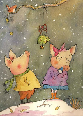
After the card was sent out, it was a quiet holiday season, then boom! January/Feb hit. I started seeing some big publishing companies on my website stats, and .......they were googling my name to find me! Wowee! Even if I had not received any assignments, this in itself was something to celebrate! They had shown interest.
A few months following this initial reaction, I received three trade books in a row and most if not all said they had seen and liked the Christmas card. It just goes to show a couple things--draw what you enjoy drawing the most and your best work will no doubt come out, and two, you never know which sample will get the attention of art directors so keep sending them out.
In the end, you have to love what you do. It was a long road of five or six years before I came to this point in my career, and had I been wishy-washy about being an illustrator, and not put everything I had into this dream, I wouldn't have made it this far. The love for your craft gets you through the hard times and the rejection letters, and the months without work. Then one day, unexpectedly, things begin to finally fall in place (and they will if your heart is in it) and it's really quite a feeling when that happens. I still have lot of hard work, learning and practice ahead of me of course - and always will, because the art of the picture book is a complicated and beautiful thing.
So that's my story and I'm sticking to it. :0)

Wondering what other illustrators’ mailers look like? Illustration Promo showcases postcards and other promotional pieces from a variety of illustrators. Here’s a postcard from our friend Meg Hunt.
You’re invited to submit your own promos as well!


By: Chris Whetzel,
on 8/7/2008
Blog:
Chris Whetzel Illustration
(
Login to Add to MyJacketFlap)
JacketFlap tags:
news,
illustrator,
illustration,
cartoon,
color,
portrait,
digital,
postcards,
graphic,
linear,
whetzel,
chris,
candle,
loomis,
burnout,
SFWeekly,
Add a tag
Hello, again. Where to begin? Well, we can re-cap the last post with a screnshot of the Dolly Parton portrait on SFWeekly.com:
Hopefully, this will be seen by someone either online or in print. "The best promotion is published work" is what I keep reading. We'll see I guess.
I'm a little bummed out as I have not gotten any responses from my end-of-July postcard mailing. I know to give it time, but I really get anxious when I'm not working on paying gigs. Plus, its been almost 10 days since I sent the invoice to SFWeekly, and that was really my last "official" freelance work. The client list and website are freshly updated so really its been the waiting game all over again. Obviously I'm working on projects for the site, but time moves so slowly here in Beacon!
The days seem twice as long as there really isn't anything exciting going on here. I am in this routine of getting up, working on projects over coffee at the local coffee shop until lunch (I love th econvenience of working digitally), and then working at home until dinner. Then I try to spend time with Aliyah and then I'll work until I'm off to bed. Errands work their way in as little distractions here and there but its really just working with bits of excercise and chores. On a positive note, I did get my fishing license :) For those who don't know I love to fish for bass. Sadly, I'm out of my element here in NY so I'll have to adjust. Still, just catching little guys feels good.
So even though its slow here, I 'm working alot and THINKING alot. Boredom either begets lethargy or creativity and I'm glad to say that so many concepts for pieces keep entering the ol' noggin. So I can defintely keep myself busy if work does slow down. But I got my fingers crossed that something comes along. I'm waiting to hear back from a dude at the ispot as I have decided to go with an online portfolio for now (as opposed to adbase which I want to do later). Hopefully, that will bring in some work too.
All four of these hardbound, out-of-print ANTIQUES cost me a whopping eight bucks! Then Aliyah noticed "The Ultimate Portfolio" on a "Free Books" cart. I insisted on paying the standard two dollars for this hardback as well as the money appears to go to a charity. I was a little too excited to really pay attention :) So I have plenty to work on, plenty to read, and plenty of visual concepts in my brainworms to weather the storm (actually, an eerie calm).
Until the calm recedes, I'm doing pieces in which I take turns with the syles (i.e. one linear, one graphic, another linear, another graphic) to keep my skills up. So here's a linear piece:

Its about burnout, something we all suffer from time to time. I really like the way this piece looks when super-big on my screen :) I am thinking I need to get archival prints of some of my favorite images at large scale. Perhaps for sale as well as for myself. If anyone has any leads on a affordable archival printing place in the New York area, please let me know!
And whats next? I think a certain "gangsta" or maybe science :)
Enjoy the Day,
Chris
The Waterstones auction happened. The J.K. Rowling Harry Potter un-prequel card went for a bit less than the $10 million that some newspapers were predicting (about $9,951,000 less), but I don't think the auction was really being run to raise money as much as to raise awareness -- of the charities and PEN and of (most importantly) the existence of the upcoming all-profits-to-charity-and-PEN 5 pound-a-pop postcard book, and I think it did that and did it well...
Read the stories at http://www.waterstoneswys.com/
(You can pre-order the postcard book here -- limit of 2 per person.)
And the answer to my puzzled wondering of how on earth did Ms Rowling squeeze a reported 800 words onto that card? I was pushing to write a legible short story in about 300 words... was revealed. She turned it over. Fair enough. (Richard Ford also cheated and used two cards.)
There's a full report over at The Guardian:
http://books.guardian.co.uk/news/articles/0,,2284857,00.html
As I said, you can read all the stories at http://www.waterstoneswys.com/. I've not read them all yet, but my favourite of the ones I've read so far was the Tom Stoppard "Idiomatic Farm" one. I was interested in the Atwood one when I read that,
Margaret Atwood appeared at the ceremony via videolink from Paris, wielding her celebrated LongPen - which reproduces handwriting remotely via sophisticated electronics - to handwrite her card "live". Her story, which she said she had struggled to condense into a form barely more capacious than a simple joke, provides a fresh spin on the Canute story, working in both domestic and ecological politics.
Which it may well do, but I found it more or less unreadable and cannot tell if this is because of her handwriting or the way the LongPen reproduces it.
Mine went for about $2500 to someone who really wanted it and was thrilled to get it, so I am happy, and most of all I like the idea of people actually sending the stories to each other through the post. (
Using, I hope, classic Hammer Horror stamps. Or better still, the Carry on Screaming stamp...)

Here’s a selection in the tradition of the naughty “French” postcard from this rich resource of antique postcards. The site includes DOZENS of categories, basically any theme you can think of from aeroplanes to Alphonse Mucha to “fantaisie”. That latter one seems kind of miscellaneous - kids’ stuff, pin-ups, oddball ones. The site is in French but that won’t stop anyone from just looking, right? But if you do read French, or translate it, there are some essays there too.

 It’s hard to believe that TEN LUCKY THINGS THAT HAVE HAPPENED TO ME SINCE I NEARLY GOT HIT BY LIGHTENING will be out in just three months, but it will. And it’s a great example of how the pre-publication time flies by and why it’s so important to stay organized and on top of your Promotional To Do List.
The bulk of promotional and marketing tasks to be accomplished this month have to do with press and promotional materials.
Now is a good time to begin putting together a full spectrum wardrobe of author bios. As we’ve talked about before, they can be devilishly hard to write, and you’ll need a variety of sizes. A very clever example of these varying-in-detail type bios can be found on Shannon Hale’s website. As we’ve said before here at SVP, it’s nice to have a 50 word, 100 word, and 300 word bio on hand for the various requirements of those who will ask you for them. But start playing with them now and trying a number of approaches and angles. If you start now, you may just have one you like in three months. Maybe.
This is also a good time to think about getting an author photo. You’d be surprised how often you’ll be asked for one, and if you give yourself enough lead time, you can wait for a good hair week to set up the photo shoot.
Another thing to begin thinking about at this three month mark is a press kit and whether or not you’ll want to put one together. A press kit, for those of you who don’t know, is a nice folder that contains information about you and your book, usually with the intention of being sent to the press so they can have all the information at their fingertips should they care to write about you or your book. A press kit might contain a short and long author bio, an author photo, a color postcard of the book cover, maybe a short interview with you answering some basic author FAQs about how you came to write the book, your path to publication, etc.
In the interest of full disclosure, I have yet to send out a press kit on myself. (Bad Violet!!) I did, however, send out many, many of them when I worked for a non-fiction publisher.
And lastly, I recommend getting some high quality, color postcards of your book cover. I know that Mary’s been researching the pricing on these, but I’m not sure if she’s ordered them yet. Usually, it’s a pretty simple and straightforward process and there isn’t much graphic designing involved, so it lends itself well to a do-it-yourself (read budget!) type production. But because it does involve graphic production and print time, it pays to get started early. Plus, you'll want to have them back in time to mail out before your launch date!
This week's theme is "process". We are working on getting our Valentine's promo out this week and here is my little piece and my process.
I start out with a sketch.
I then draw everything in Illustrator.
And then I move it over to Painter where I add more depth and texture and then jump it over to Photoshop for my final file prep. Viola! And illustration :)
Walt Disney: The Triumph of the American Imagination
Author: Neal Gabler
Publisher: Knopf
ISBN; 10: 0-679-43822-X
ISBN; 13: 978-0-679-43822-9
This massive biography – over 600 pages, plus over 200 more of notes, appendices, bibliographies, and index – is advertised as “the definitive portrait of one of the most important in twentieth-century American entertainment and cultural history. […] meticulously researched – Gabler is the first writer to be given complete access to the Disney archives […]”
It probably is definitive. It is notable that where virtually every other Disney biography since his death in 1966 has been heavily criticized by animation experts for gross factual errors and deliberate misrepresentation of his attitudes or motives (such as claiming that Disney was a spy for the FBI, encouraged anti-Semitism, or was really an illegitimate son of a Spanish dancer), the worst that Gabler’s critics have been able to accuse him of are minor errors on the level of whether serious production of Snow White and the Seven Dwarfs began in September 1936 or several months earlier. These errors may be significant to cinematic historians, but the average reader will find them trivial.
Gabler’s book, with more than 65 photographs from throughout Disney’s life plus other graphics such as a teenage life sketch and his first business card, ought to replace every popularized Disney biography previously written.
There are no big surprises here, and there is much detailed information about events glossed over in previous biographies. For example, every book has told how Disney created Mickey Mouse to replace his earlier cartoon star Oswald the Lucky Rabbit when the latter was stolen from him, but few have told exactly how this happened. Gabler devotes five pages to the event, giving names and dates. Want to know about the notorious but previously vaguely-described Disney studio strike of 1941? Gabler gives it pages 356 to 371, again going into detail. Any questions that a reader may have about Disney’s personal life or his career should be answered in this book.
To a large extent, Disney’s story is the story of the whole American animation industry. Many of the men who became famous at other studios in later years, such as Warner Bros.’ animation director Friz Freleng and music arranger Carl Stalling, got their start among Disney’s first employees.
Gabler notes how many other studios hired away some of Disney’s best men to create cartoons for them during the 1930s, or during the ‘40s made parodies of Disney’s features such as WB’s Coal Black and de Sebben Dwarfs and A Corny Concerto. It would be an exaggeration to say that Walt Disney: The Triumph of the American Imagination can serve as a one-volume history of the animation industry, but it is without doubt an essential read for every animation fan and an essential purchase for every public and academic library.


I love to look at your art. Heartwarming!
Have a good day!
your sensitive use of texture just keeps getting better and better! i adore your black and white illustrations. :] nice promo jen!
ohhhhh love it Jen! The tree branches and moonshine are dancing on that sky. Beautiful!
Lovely promo Jen! I love this illustration! :)
Thank you so much, rebee, Christine, Ali and Wendy! You all are so kind. :-)