new posts in all blogs
Viewing: Blog Posts Tagged with: pen and ink, Most Recent at Top [Help]
Results 26 - 50 of 532
How to use this Page
You are viewing the most recent posts tagged with the words: pen and ink in the JacketFlap blog reader. What is a tag? Think of a tag as a keyword or category label. Tags can both help you find posts on JacketFlap.com as well as provide an easy way for you to "remember" and classify posts for later recall. Try adding a tag yourself by clicking "Add a tag" below a post's header. Scroll down through the list of Recent Posts in the left column and click on a post title that sounds interesting. You can view all posts from a specific blog by clicking the Blog name in the right column, or you can click a 'More Posts from this Blog' link in any individual post.
Howdy friends and neighbors!
It has been a couple months since I have had time to post something here. This summer has been a busy one. I have been working hard for a new client. The style is slightly different from my usual work, so I have had to put many hours in honing "inking and coloring" skills. Usually I do pencil drawings, and light color washes in PhotoShop which resemble water colors in the final piece. This is a style I have honed for years now, and am quite comfortable with.
The style this new client is asking for is pen and ink, like comic book art. I started using Photoshop brushes (which would have been ideal if they worked right). But I was never able to achieve the same results in the computer as real ink on real paper. After a couple of days of research I decided to delve into inking with a brush. I bought the supplies, and spent literally a couple of months trying to master a skill that takes years to hone. Not surprisingly I came up short of perfection (in my opinion). After working out the cramps in my drawing hand I switched to ink pens. There is still a problem of having to clean up the lines (removing the white of the page so I can color it). It is a time consuming process. Although I was able to reduce my clean up time dramatically with some help from my friend Matt Strieby (Matt also helped provide me with the tools I have needed to keep my work going. Thanks Matt, I owe you a lot buddy).
The drawing you see here of Chip was done with Micron Pens on Pentalic Paper for Pens. Then I scanned it, and in Photoshop (using the new selection tools they have) separated the lines from the page. Then I painted underneath the lines on a separate layer. I did this drawing to test out the new Micron pens and to practice cross hatch shading. I hope in the next couple days to post a black and white coloring page version of this art to TheSearchersWorld.com, and to The Searcher by Ryan Loghry on FB.
It has been a summer of learning, and struggling, and in the end success which is what we all strive for right? I hope you have enjoyed this post, and the drawing of our hero Chip. Thank you for stopping by. God bless, and have a terrific day.
Howdy friends and neighbors!
It has been a couple months since I have had time to post something here. This summer has been a busy one. I have been working hard for a new client. The style is slightly different from my usual work, so I have had to put many hours in honing "inking and coloring" skills. Usually I do pencil drawings, and light color washes in PhotoShop which resemble water colors in the final piece. This is a style I have honed for years now, and am quite comfortable with.
The style this new client is asking for is pen and ink, like comic book art. I started using Photoshop brushes (which would have been ideal if they worked right). But I was never able to achieve the same results in the computer as real ink on real paper. After a couple of days of research I decided to delve into inking with a brush. I bought the supplies, and spent literally a couple of months trying to master a skill that takes years to hone. Not surprisingly I came up short of perfection (in my opinion). After working out the cramps in my drawing hand I switched to ink pens. There is still a problem of having to clean up the lines (removing the white of the page so I can color it). It is a time consuming process, although with some help from my friend Matt Strieby I was able to reduce my time spent cleaning up dramatically.
The drawing you see here of Chip was done with Micron Pens on Pentalic Paper for Pens. Then I scanned it, and in Photoshop (using the new selection tools they have) separated the lines from the page. Then I painted underneath the lines on a separate layer. I did this drawing to test out the new Micron pens and to practice cross hatch shading. I hope in the next couple days to post a black and white coloring page version of this art to TheSearchersWorld.com, and to The Searcher by Ryan Loghry on FB.
It has been a summer of learning, and struggling, and in the end success which is what we all strive for right? I hope you have enjoyed this post, and the drawing of our hero Chip. Thank you for stopping by. God bless, and have a terrific day.
 |
Joanne Friar
|
It was too dark to sketch during the opera workshop, which was called "
Drag me to Hell." So I sketched this guy during the intermission.
The other quote was something I overheard at the diner. It's fun to surround a drawing with random words pulled out of the air. Sometimes weird sparks fly between the notes and the sketch because of the way our brains make associations.
One person who inspires me on how to use written notes is the San-Francisco-based artist Paul Madonna, whose drawings are published in the newspaper and collected in the books
All Over Coffee
and
Everything Is Its Own Reward. He sometimes incorporates intriguing written notes into signs in the scene. His notes are often narrative fragments that don't relate directly to anything in the scene.
Other times, he combines a sketch of an unpeopled view with a longer text that describes human moments unrelated to the scene, inviting the reader to form their own images beyond the picture presented on that page.
-----

Perhaps a Christmas theme for the week. We shall see :)
My 44th post card for the the 44th President of the United States. With recent actions to stymie tar sands fracking and some vocal support for climate negotiations in Paris (among other things) President Obama is slowly but surely regaining some credibility as a President willing to act on the environment. Imagined here in the portrait pose of President Jimmy Carter - who took great strides on environmental protections in his own right - a presidential polar bear with some grit and determination to get things done in the final year of his second term.
 |
| Illustrated initial capital, brush and ink. |
I drew this illustrated capital to begin one of the chapters of
The Hand of Dinotopia
by Alan Dean Foster.
Trusting the universe I created to someone else's imagination takes a leap of faith, but this was a leap I made with a lot of confidence, knowing that Alan was accustomed to writing within established intellectual properties. Among many other projects, he ghost-wrote the novelization of Star Wars for which George Lucas took the entire credit.
 |
| James Gurney and Alan Dean Foster in Tunisia, 2008 |
He is also a friend of mine, and we traveled together to Malta, Tunisia, and Morocco in 2008.

Greg Shea asks: "Do you have experience drawing/sketching with a refillable old style fountain pen? (The kind where you draw ink into the pen to refill it, not the kind that uses cartridges). I'd like to fill a pen with walnut ink, so I can use it to to do drawings with addad watercolor. I usually use dip pens with crow quill nibs, but they can be a pain to use and to carry around."
I've tried a bunch of different systems for through-the-nib refills, including a twist-knob-piston type, the squeeze-bulb, and the lever-action on the outside of the handle. Many of the Chinese brands, such as
Jinhao
and
Baoer
are both inexpensive and refillable.
My favorite is the piston cartridge that comes as an accessory with Waterman pens, such as the low-end
Phileas brand. You can get the
converter
as a separate item if you already have a Waterman pen. You can also refill the cartridges with a
hypodermic syringe
, which is cleaner than through the nib refills.
Previously:
How to Refill a Fountain Pen
Starting October 9, the
House of Illustration in London will present an exhibition of the World War I reportorial art of E.H. Shepard.
"Best known for his drawings for Winnie the Pooh and The Wind in the Willows, as well as his regular work for Punch magazine, E.H. Shepard also produced a substantial body of work while serving as an officer in the Royal Artillery in the First World War. This exhibition is the first to explore Shepard’s illustrations drawn in the trenches on the Western Front and in Italy, and will include over a hundred original artworks - many never seen before - including technical drawings, personal sketches and unpublished correspondence. The exhibition will accompany the publication of Shepard’s War, to be published by Michael O'Mara Books on 1 October."
----

I feel like doing pen and ink again. I've been doing colored pencils for everything for so long now, its almost like I have to give myself permission to do something else. I drew this little piece while sitting on the porch with the kitties, just hanging out. It was fun. And I didn't think about it very much.
I had some printer paper and a cheap ball point pen, and had intended to make serious lists of things I need to do/draw/figure out, etc., but instead I started drawing this couch.
I added the granny square afghan, then the pillows, then the upholstery.
Next came the lamp. I had no idea where I was going with this. I drew it hanging over the couch, then decided it needed one going the other way. Next was the table, and the stuff on it.
Then the kid,
who needed something to look at, so next came the cat.
I did the chair first, and then added the cat.
Nothing profound. Just fun.
Hello~
For this weeks Illustration Friday I give you Jaxson's Room. Can you find the 2 windows in this illo?
 |
| pen and ink with watercolor pencil |
This piece was first meant for the little guys mom, Bethany. She is a friend that I work with at the library. She has a thing for mushrooms and gnomes, and she seems to really like my artwork too. So I said I would draw her a gnome. She made me a quick little sketch (darn I wish I had it to show, but I left it at work) of a gnome reading a book, by a mushroom. Simple enough. And after all we both work for a library so a "reading gnome" seemed quite fitting. As it was, time got away from me, and no gnome to show for it. More time passed, and I learned Bethany was with child. (Jax--the little guy) I then decided to alter the piece and add in a little boy gnome and give it to her for her baby shower. --On a side note the name Jax comes from the show, Sons of Anarchy. It seems Bethany and Nick (Dad) are both fans.
 |
| Bethany, Jaxson, and Nick |
I don't know why this piece hung me up so much, but I just couldn't seem to get it going. Sketch after sketch and nothing felt right. Then I lost interest in doing any art at all for over a year, one long dry spell. Needless to say the piece did not get done. Move ahead to Jax's first birthday, and I'm thinking I gotta get this going before the kid out grows gnomes! Although I know his mom won't outgrow them! So last night I was finally able to give this long overdue picture to my friend! She was happy and I was soooo glad to get it off my plate!
I also wanted to share this book with you...
I took this out of the library and decided I needed to have a copy of my own ( I couldn't keep renewing it) It has really helped me to view time differently, and how I can make better use of it in order to create on a regular basis. It's funny how "out of shape" you can get when you're not practicing your craft. I know when I'm in the mode that even if there's a struggle the struggle isn't nearly as hard as when I'm not in practice. I guess that's pretty much true for many things.
There's been some interesting things that have been happening since my recommittment to my art...
1. The manager at the Willoughby library asked if I would like be their "guest artist" for the Art Walk in downtown Willoughby (All the stores have a guest artist that evening)
2. I sold 2 pieces of Artwork after a friend saw them on FB--Thank you Cindy :)
3. My cousin asked if I would like to hang my work in her fancy hair solon--Thanks Amber!! Looking forward to making new art for that. Thinking new Tree Spirits for her shop.
So it looks like I will be busy. Plus I have 2 more kid's room pics I need to make. Feels great to be working again!
And to close with on more Illustration Friday "Window" I love this piece!!!
"Cats in Windows" from my daughter Annie. She holds my heart :)
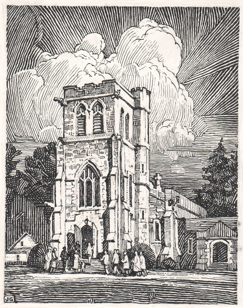
Happy Easter! Here's a drawing that I did about 30 years ago of the Church of the Messiah in Rhinebeck, NY.
I drew it with pen and ink on scratchboard. The style is an homage to
Franklin Booth (1874-1948), whose work was in turn inspired by the look of wood engraving.

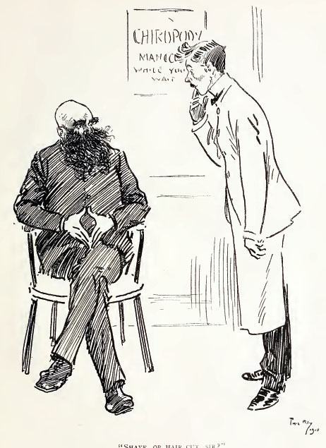 |
| "Shave, or hair cut, sir?" "Corns, you fool! |
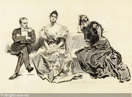
Phil May (1863-1904) was an English cartoonist known for his deft and economical pen-and-ink caricatures. He grew up around the theater, so he was familiar with music hall actors and types.
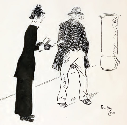 |
Benevolent Lady (distributing tract to inebriate, who has refused to accept one), "Do take one. If you read it, it will do you good." Drunk (pulling himself together), —"Madam, I writes 'em." |
He went to London and was so poor for a while that he slept on park benches, and he got to know all the varieties of gutter snipes. He portrayed them with a kindly wit and a sympathetic eye.
 |
| "Mos' 'stronary thing! a' most shertain th'was shome coffee in it." |
He was so prolific that a publication came out using just his pictures, "Phil May's Illustrated." His cartoons of drunks and street characters made him wealthy and famous.
 |
| Portrait of Phil May by J. J. Shannon |
He liked to wear colorful outfits. According to John Lavery, "The last time we met he came to his studio door wearing the loudest suit I had ever seen. Seeing my look of surprise, he smiled and said, 'Come in and listen to it, dear boy.'"
 |
ARTIST: 'My good man, may I have the honour of sketching your likeness? I am Mr. Phil May."
RUSTIC: 'Oh! are yer? Then, this time you'll be Mr. Phil Mayn't." |

The upcoming issue of Illustration magazine (Issue #46) features the work of Charles Dana Gibson.
Gibson (1867-1944) was an illustrator from the Golden Age whose portrayals of self-confident women became a style icon known as the 'Gibson Girl.'
Gibson's painterly pen-and-ink illustrations captured the attitudes and postures of the characters he portrayed, often in amusing or awkward situations.
The article by Gary Land tells the story of his life, from child prodigy to celebrity artist. It is well illustrated with 35 images, shot from original art. This issue also a feature article on pin-up illustrator George Petty.
It's not a history or a textbook, but a picture book with over 218 color illustrations by 154 different artists. The book is a 9 x 12 inch hardcover and costs $44.95. It will ship in March, and
you can preorder now.------
Illustration magazine
 |
| A.B. Frost "The Power of the Human Eye" from Stuff and Nonsense, 1913 |
The new issue of Illustration Magazine has a feature on A.B. Frost (1851-1928), known for his humorous pen-and-ink illustrations and his realistic wash drawings of the American rural scene.
I love the early days of humorous illustration, when standard cartoon conventions weren't really established, and "straight" illustrators were finding their own ways to make drawings funny.

The article contains 42 illustrations by Frost, some reproduced full page, along with a biography by Gary Land. He tells how Frost got started with his popular "Uncle Remus" illustrations, and how his studies under William Merritt Chase loosened up his painting style, even though he was color blind.
The issue also has features on Virgil Finlay, Tom Miller, and William Meade Price.
You can
order the magazine online or find it at your local newsstand.
Illustration #46Wikipedia on A.B. Frost
I guess this is officially the end of "#inktober" - sniff
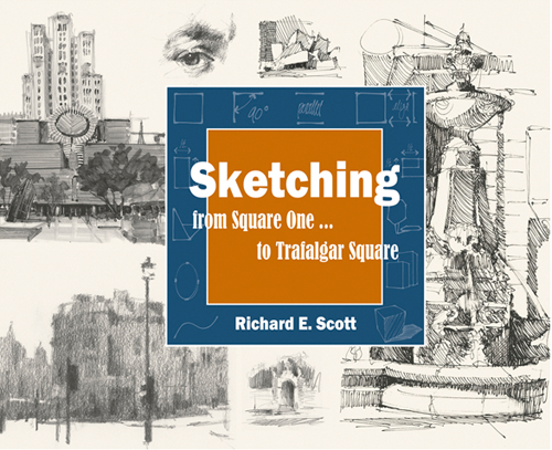
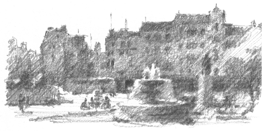
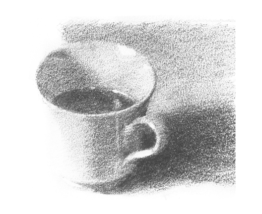
Richard Scott's new book, "Sketching - from Square One to Trafalgar Square " is a comprehensive introduction to drawing from observation.
The book presents practical advice for achieving accuracy, including measuring angles and organizing value shapes. One tip is that you can size up an appropriate cone of vision by holding your arms out at the width of your shoulders in front of you.
Scott includes a variety of excellent examples of sketch techniques, including pen and ink, marker, pencil, and wash drawing, all in black and white.
He discusses not only linear perspective, but also the simplification of a subject into tonal shapes, with fresh ideas that will appeal to painters, too. He acknowledges not only objective features of the scene, but also subjective aspects of visual perception, such as how certain edges go in and out of focus when you squint.
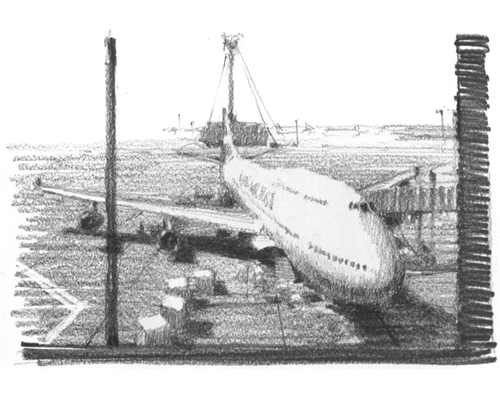
Scott's background is in architectural rendering, so he approaches subjects from the built environment with particular authority.
Although his approach is clear and analytical, it's not just technical. He has an artist's eye throughout. One of the inspiring qualities of the book is the focus on conveying feeling, and the emphasis on digging into why a subject appeals to you in the first place and how to play up that emotional quality.
The book lays out useful methods that anyone can use to see better, think better, and draw better. The result is a practical drawing manual that is a worthy successor of classic sketching books by Betty Edwards and Arthur Guptill, one that will improve the drawing skills of the beginner and master sketcher alike.
-----
Details: 192 pages, 8" x 10" (horizontal format), softcover (with covers that are a bit too thin, unfortunately). The book is organized into three parts, with 10 chapters and 419 illustrations. It is priced at $29.95.-----
Available on Amazon: Sketching - from Square One to Trafalgar Square
Official website: Sketching from Square One
Frederick Henry Townsend (1868-1920) drew this cartoon for the British humor magazine Punch.
OUR EVENING ART CLASSES HAVE COMMENCED
Mr. X. (our dear Professor, who always puts things so tellingly): "In conclusion, I can only repeat what I said last Term—'It's all light and shade, Ladies, whether you're painting a battle-piece, a bunch of grapes, or a child in prayer!'"


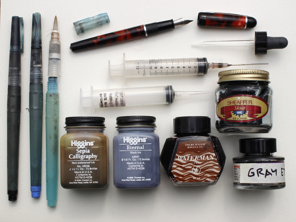
Here's a still frame from my upcoming video called "Watercolor in the Wild," which releases as a DVD and a download on August 11. The whole first section of the video covers materials and methods.
One segment shows how to fill water brushes and fountain pens with the ink colors you want.
Water Brushes I've tried several brands, but none seem as reliable as
Niji Water Brushes. I recommend the ones with
round tips
, but you can also get them with
a 12mm Flat Tip
. I normally carry between three and five water brushes. One is filled with water, which fills easily under a normal faucet by unscrewing the handle and squeezing the barrel.
The others are filled with blue, black, brown, and gray. I mix the gray myself, put it in an empty bottle, and mark the bottle. To identify which water brush is which, I paint the back end tips with acrylic (see lower left of photo above).
InkThe ink in a brush pen should be water-soluble so that it doesn't clog the brush fibers. I use
Higgins Eternal Ink
(black), and an old bottle of
Sheaffer Skrip Ink
. The color in my 30-year-old bottle is mellow blue-black, which I believe is no longer available. The
Waterman Fountain Pen Blue Bottled Ink
is a bolder blue. For a brown color, I use either the
Higgins Sepia Fountain Pen Ink
or the
Waterman Brown Ink
, the latter of which has a redder cast. If you mix two colors of ink, you should mix the same brands.
Refill ToolSeveral different tools will work for refilling water brushes. My favorite is a
Syringe with a Blunt Tip Fill Needle. You can also use a
Syringe with a Tapered Plastic Tip
(center of photo above). A
Glass Eyedropper
doesn't always work as well because the tip isn't small enough for getting inside the chamber of an empty fountain pen cartridge or water brush.
Fountain PensI use a relatively inexpensive
Waterman Phileas Fine Point Fountain Pen
(top) for written notes. In the USA, you can buy refill cartridges in black and blue, but it's not easy to find brown or gray or other colors. As with the water brushes, you can refill them with your favorite color. The pen comes with a refillable cartridge insert, or you can refill empty cartridges with the syringe.
When I need to use waterproof ink for my line work, I like
Micron Pens. They

come in many colors, and give a constant indelible line, similar to the classic Rapidograph pens. For a brush-style tip, I've used the
Pentel Pocket Brush Pen, a waterproof brush-tip pen with replacement cartridges. A caution about the Pentel: the ink can bleed through some thinner paper.

<!--[if gte mso 9]> Normal 0 false false false EN-US X-NONE X-NONE MicrosoftInternetExplorer4 <![endif]-->
Here's my new ink on paper work called Flower Garden
It was completed over a week and was inspired by my garden.
This illustration also gave me the opportunity to try out my new carbon pen. (happy dance)
Please visit my portfolio to view more work.
http://melanierenaux.com/
<!--[if gte mso 9]> Normal 0 false false false EN-US X-NONE X-NONE MicrosoftInternetExplorer4 <![endif]-->
I like anniversaries, especially when they concern my illustrations! So here's another fond memory - this year is the 30th anniversary of the publication of Elsie Locke's A Canoe in the Mist.
 |
| Cover of the 1st edition |
 |
| The Waka Wairua. Title Page vignette |
This was my third commissioned book contract, after Jeremy Strong's
Fatbag (A & C Black) and Roger Collinson's
Get Lavinia Goodbody! (Andersen Press), both first released in 1983. Like them, it was a commission for black and white text drawings to a novel. Unlike those titles however, both of which were fun, humorous books requiring comic drawings, this new commission was a dramatised narrative of real events during the
catastrophic 1886 eruption of Mount Tarawera in New Zealand.
 |
| McCrae's Rotomahana Hotel in Te Wairoa. |
 |
| Lillian meets Mattie |
Canoe in the Mist follows the story of two girls during the eruption. Lillian Perham lives in the village of
Te Wairoa with her widowed mother, where western tourists flock to view the famous
pink and white terraces, natural stairs of silica pools on Lake
Rotomahana. Set in a volcanic wonderland often described as the 8th wonder of the world, Lillian only has chance to see the terraces herself when she befriends Mattie, the daughter of visiting English tourists. But the day they set off for Rotomahana the waters of the lake are mysteriously lifted by a tidal wave, the tohunga sage of the local maori village propheses disaster, and a mysterious ghostly apparition of a canoe, waka wairua, is seen on the lake.  |
| The Terraces (unused version). This 1/2 page drawing was re-drawn as a full page illustration for the final book (artwork now lost) |
That night the volcano violently erupts, followed soon after by fissures underneath the lake that destroy the terraces and turn Lake Rotomahana into an explosion of steam and mud, burying the Maori villages of Moura and Te Ariki, killing 153 people. Caught in a deluge of debris and mud, the girls, parents and villagers struggle to escape a world that has been torn apart.
 |
| The first eruption |
The commission came at the very end of 1983 from Jonathan Cape publishers, at that time based in Bedford Square, long before they were absorbed by Random House, I think it was simply a case of showing my work in their office at the right time. It was a fortuitous commission, coming soon after I'd moved to London, I threw myself into sketches straight away.
 |
| Character studies for Lillian, Mattie and Sophia (unused) |
 |
| Visit to Hinemihi, the Maori meeting hall |
This was of course, long before the internet, so finding accurate reference material was going to be a struggle. Despite the book being a historical topic my editor was unable to provide visual references, I knew very little about New Zealand in the 1880's, and despite my suggestion Jonathan Cape wasn't about to fly me out there to do some ground research! However my
local library in Crouch End was a tremendous help, especially on information on Maori culture. The publisher also passed on my queries to the author in New Zealand, who after a short while very kindly sent me a package of photos and cuttings outlining the region today and before the earthquake.
 |
| Tuhoto, the village sage |
What I didn't realise until much later on however, was just how deeply embedded in the background of the book the author was.
Elsie Locke (1912-2001), writer, feminist, historian and peace campaigner, is today recognised as one of the most important figures of New Zealand culture of the last century. Although she passed away in 2001, the
Elsie Locke Memorial Trust continues to promote her life, work and writings, and sponsors an annual competition for young writers in New Zealand.
I was a young struggling illustrator in London, for me New Zealand seemed a very remote and exotic place at the time, and yet the correspondence I exchanged with Elsie not only brought the region to life visually, it helped greatly to spark my imagination.
 |
| Before the eruption guests discuss the unusual signs |
The drawings were largely crafted at my humble abode in London - this was just before I joined a studio so I was working on the kitchen table in a shared house. One morning in a curious parallel to the book's plot I almost lost everything. I walked into the kitchen and found it awash with water - one of my house mates had run a bath upstairs then completely forgot about it - the bath overflowed, water poured through the ceiling into the kitchen beneath, the table was drenched, my drawings were soaked. This in itself wasn't quite as much of a disaster as it sounds - indian ink is waterproof after all, but my flatmate had compounded the problem by pinning each wet drawing to the washing line with rusty old clothes pegs, which made horrible indelible brown marks and ripped the sodden paper.
 |
| The hotel ablaze |
So, many of the drawings were re-drawn from scratch, some of them several times, with time running out I finished the book in the much safer and more comfortable environment of my parent's house in Norwich. But eventually all was done, the artwork was delivered.
 |
| Rescuing a surviving horse from the mud |
This book was a major watershed for me (excuse the pun!). With the painful experience of my own little disaster in the kitchen flood I was desperate to find somewhere else to work, so straight after completing the artwork for
A Canoe in the Mist I joined with my old friend, designer Andy Royston and co-founded Facade Art Studios in Crouch End, right next to the library that had been so helpful in my research.
 |
| Sophia addresses the survivors. This was the finished version intended for the book, but a mix-up led the designer to use an inferior preparatory version instead! |
Looking back at the drawings now they're clearly an early work with some rough edges, also there were a couple of slips by the designer too - one drawing was reproduced back-to-front, in the case of another an inferior first version was printed instead of the intended drawing. Were I to illustrate the book again now I'd handle some drawings differently, and I certainly would not have given the art director more than one version of each drawing! But these were learning times, I was just beginning to find my feet as an illustrator, and to this day I'm proud of my involvement with the book, and the writer.
A Canoe in the Mist was
re-issued by Collins in their Modern Classics series in 2005, though, due to constraints of the series, sadly without any illustrations.
 |
| The families struggle through a deluge of mud |
 |
| Survivors |
Interestingly, though the Pink and White Terraces were thought to be utterly destroyed and the area left largely uninhabitable, in 2011
parts of the Pink Terraces were re-discovered still in existence, hidden under thick layers of mud.
 |
| The final illustration - escape through a devastated landscape |
And there lies a strange parallel - I assumed my old drawings for the book had also been lost long ago, but recently was amazed to discover them in my dad's loft, including some sketches and alternative versions that never made it into the final book. So for those who don't know
A Canoe in the Mist, or may only have read the unillustrated Collins Classic edition, here they are!
When realistic adventure comic strips appeared in the newspapers, it was a big change from the line-dominated cartoon style that had prevailed until then.

One of the pioneers of adventure comics was Milton Caniff (1907-1988). Caniff used dramatic blacks, applied with a brush, providing an opportunity to sink some forms into silhouette, or present mysterious lighting effects. He took some of his inspiration from work he saw in book illustrations.
Milt Caniff's studio mate was Noel Sickles (1910-1982), who had drawn an adventure strip called Scorchy Smith. Sickles was always interested in dramatic, realistic storytelling. He showed Caniff "a set of illustrations by Harold Von Schmidt for Willa Cather's Death Comes for the Archbishop —employing lush black brushwork, defining objects by shadows as much as outlines—Sickles introduced ultra-realism and impressionistic linework to the comics." The quote is from America's Great Comic-Strip Artists
 , by Richard Marschall.

When Von Schmidt (1893-1982) undertook to illustrate the lavish 1929 edition of Cather's book, he took six months off his magazine illustration career and traveled to the American southwest to see the frontier settings of Cather's book. He produced over 60 black and white illustrations, using a brush and ink style where he grouped the cast shadows with the shadow side of the form to create mysterious shapes.

Von Schmidt was very proud of the book, and it influenced not only adventure comics but pulp illustration and European comics.
More examples of Von Schmidt's work at Jim V.'s Illustrators websiteDeath Comes for the Archbishop
Happy Monday!
I was playing around with my panther sketch and here's what I ended up with:
It's been a while since my last post! In fact you may notice I've not blogged since the New Year, blimey, what's been going on?
Well the short answer is "work!". I usually write blog posts in two languages to go on separate English and Japanese language blogs, which can take up a chunk of time, so I took a tactical decision to stand back from blogging while I tackled more urgent matters. Other social media? Well, yes, to a point, but I've tried to keep my online activities short, sweet and quick. As some people read this blog from feeds on Facebook and Twitter I thought it would be quicker to just post occasional updates directly to those platforms, but it's not quite the same is it. Blogs are more personal, more of a journal, more themed. Earlier this year I posted daily sketches on Twitter and Facebook until work issues obliged me to stop that too - however sketches will return shortly!

Things have been very hectic. At the moment I'm working on a picture book for Holiday House in the US. It's my second collaboration with author Marion Dane Bauer, after the spooky
Halloween Forest. Though not a follow-up to that title at all, our new book has a somewhat complimentary rhythm.
Without giving too much away at this stage, I'll just say the book follows the journey of a bear, a child and various other animals through a late winter night, because, as the bear explains, "It is time..."
Time for what you ask? aha....
The title is
Crinkle, Crackle, CRACK! Right now I'm painting the spreads, here are some scans of the pen work before colouring.
View Next 25 Posts


.jpg?picon=1009)