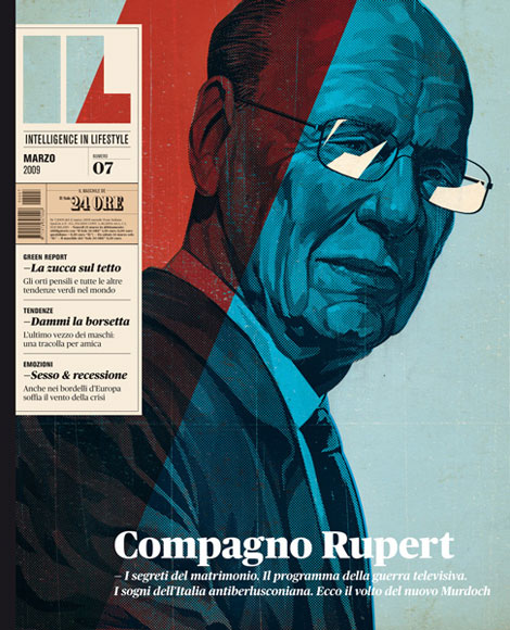
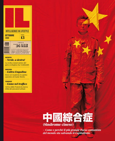
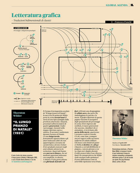
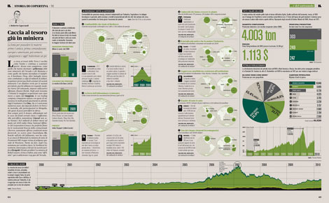
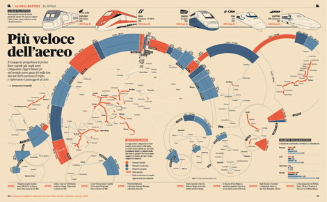
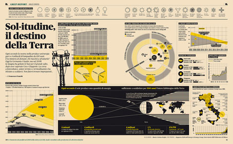
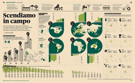
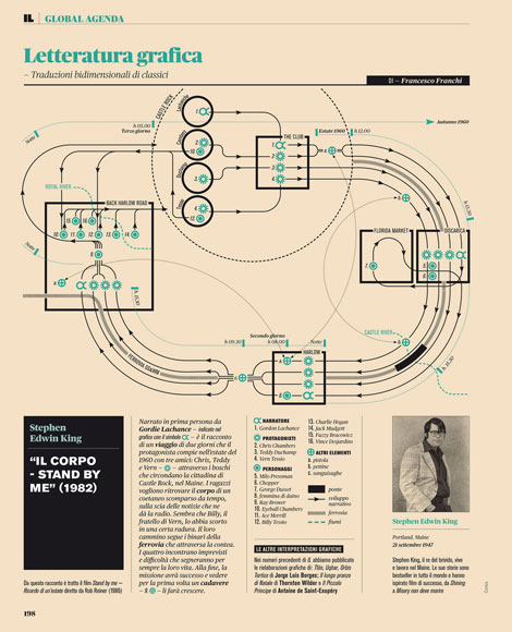
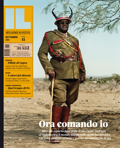
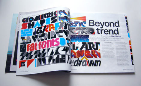
Intelligence in Lifestyle, an Italian magazine and supplement to the Il Sole 24 ORE newspaper, is one tasty piece of work. That striking cover above initially grabbed my attention, but inside is just as compelling.
Under the creative direction of Francesco Franchi, the magazine uses a strong structured grid and nicely combines illustration, logo design, typography and plenty of amazing info graphics. The entire thing leaves me wishing I could read Italian to follow along.
Francesco Franchi’s Flickr has more spreads, covers and general awesomeness.
Via the always fresh Portland-based Colorcubic.
No Tags
Share This
Vintage kids book Mi Diccionario is in the Grain Edit Shop
Grain Edit recommends Colo Pro A font designed by Font Fabric. Check it out here.
©2009 Grain Edit - catch us on Facebook and twitter

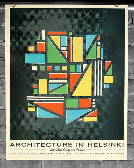
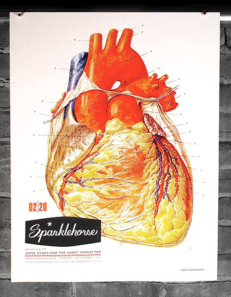
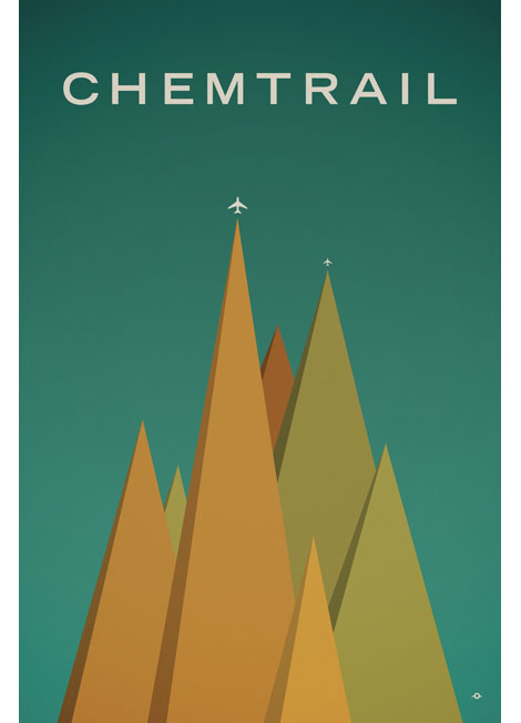
For the latest Grain Edit interview, we head to the beautiful Pacific Northwest city of Portland, Oregon. While Portland is known for it’s drizzly rain, recent influx of people, and amazing food cart scene, it is also the home of many talented designers. We here at Grain Edit had the chance to visit PDX and catch up with one of it’s very accomplished residents, Dan Stiles.
Dan is a long time designer and contributor to the comtemporary gig poster scene. His work is always very fresh, energetic, engaging and fun. Dan is very successful at creating dramatic work while using minimal colors and patterns. In this interview we chat with Dan about his history as a designer, his thoughts on running a solo studio, working in Portland, and much more.
Enjoy!
Are you from Portland originally? (If not, why did you decide to move there?)
I’m originally from Ann Arbor, Michigan. It’s a pretty cool little university town, but there was no way I was going to go to college in the same town where I grew up. I wanted to make a break with everything I knew. I used college as an excuse to move to the Northwest mostly to be part of the exploding music scene and to go snowboarding. After school I moved to Portland, then to San Francisco for 7 years, then back to Portland.
As a designer, what do you like most about living in Portland?
Portland has become a haven for people who want to do their thing. Maybe open a motorcycle shop, or design clothes, or make cheese or whatever. Most of them come from other cities where the cost of living is so outrageous that they had to work some job they hated in order to keep the lights on. Portland has most of the amenities of a big city, just on a smaller scale, plus we have mountains in our backyard. It’s also pretty accessible, not only with regards to getting around, but also with regards to getting into whatever world interests you. You can get into the bike scene, the poster scene, the food scene, the film scene etc. without having to jump over a million walls. People are very supportive and there’s less of an old guard trying to keep you out of everything. As a result there are a lot of people here doing amazing stuff, the flip side of which is that nobody has any money. I pull about 90% of my work from out of state.
You run a small studio. What do you enjoy about being on your own, as opposed to the design firm environment? Do you feel you’re missing out on anything from not being in a design studio?
I miss the scene you get at a studio. Lots of hip people turning you onto bands and clubs and whatever shoes are cool at the moment. Its nice to be part of a group, to go to happy hour together, to make out with the temp
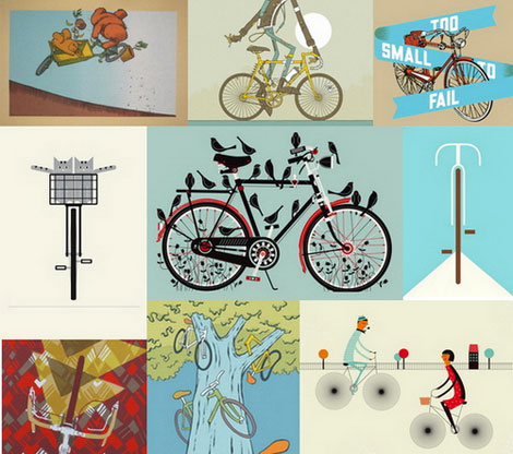
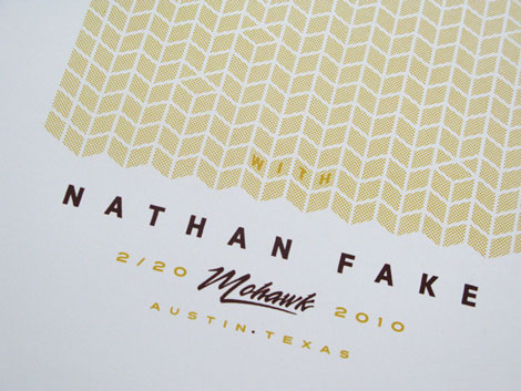
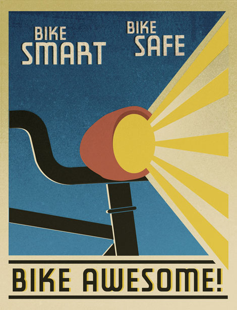
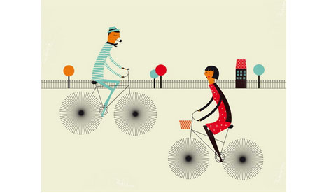
May is here which means it National Bike Month. To celebrate the occasion the Poster Cabaret teamed up with a handful of artists (make that 3 handfulls) to create an amazing collection of bike prints. The 2010 Poster Cabaret Bicycle Print Set includes contributions from: Aesthetic Apparatus, Blanca Gomez, The Cricket Press, Jay Ryan, Diana Sudyka, Tad Carpenter (Vahalla Studios), Landland, Jason Munn, Sonnenzimmer, Leandro Castelao, Methane Studios, Eleanor Grosch, Delicious Design League, Dirk Fowler and Invisible Creature. Each of the 16 prints created for the set are available for purchase here.
The Poster Cabaret has graciously offered to giveaway a complete bike print set ($400 worth of posters y’all) to one lucky grain edit reader. Click the link below for details on entering the giveaway.
————————————————
2 Ways to Win: Enter Twice to Increase Your Odds
You can enter by joining the Grain Edit Facebook Fan Page or by following us on Twitter. ( Please read the details below) You can also you use both methods of entry, giving you 2 entries into the giveaway and increasing your odds of winning.
————————————————
Enter by Joining our Facebook Page:
First, Leave a message in the comments section of this post. (let us know what your favorite print is from the bike set )
Next Join the Grain Edit Facebook Fan Page (http://www.facebook.com/grainedit). If you already a “fan” of ours on Facebook, no need to join again just leave a comment.
Please note - For one of our giveaways we had two readers that kept receiving the comments for the giveaway in their email box. Please make sure that you don’t click “subscribe to comments” when leaving a comment. If you are concerned about this, consider entering the giveaway via our Twitter account ( see below).
————————————————
Enter by Following us on Twitter
1. Follow us on twitter @grainedit
2. Tweet the following message “ hey @grainedit count me in for the bike set giveaway http://tiny.cc/grain-edit-giveaway”
————————————————
Selecting the Winner
On Friday May. 28th, 2010 we will randomly select 1 winner from all the entries.
We will announce the winner on may 28th on the Grain Edit Facebook Fan Page as well as our Twitter stream.
and now for the prizes………..
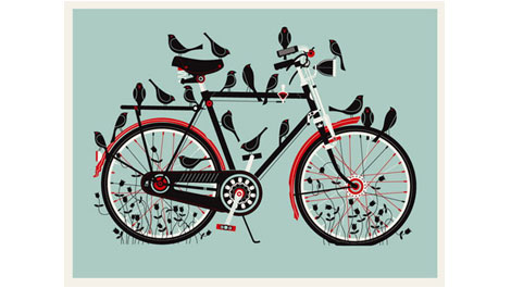
Birdcycle by Methane Studios
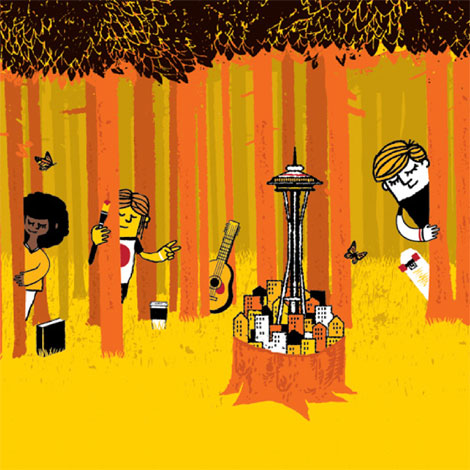
The latest installment to the Grain Edit interview series takes us to Seattle, birthplace of grunge music and home to illustrator and designer, Sasha Barr. I was first introduced to Sasha’s work a few years ago when I stumbled upon his website, positively titled “This is the New Year.” His work often employs rough textures, intricately drawn patterns featuring elements from nature and little creatures, and cool color palettes.
In this interview, Sasha discusses how he made the trek from Tennessee to Seattle, his influences and creative process, how he landed an awesome gig working at Sub Pop Records, and also shares incredible views of his awesome home.
Let’s dive on in!

What’s the story behind “This is the New Year?”
In 2001, a friend and I started making posters under the name Nocturnal Showprint, but after a while I took a break from screen-printing to learn more about photography. In 2004, some Memphis bands and good friends (Snowglobe, The Glass, The Coach and Four, etc.) convinced me to start making posters again. I started putting a website together and I needed a name. It was the beginning of a new year, and I wanted something that represented a new beginning; it was also an easy answer. I’ve always been terrible at naming things. I renamed my cat 3 times before settling on “Fatty,” if that gives you any insight to my naming abilities.
How do you like Seattle compared to Tennessee? What are some of your favorite things about Seattle?
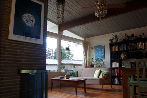
This is a big question! I moved to Seattle for no good reason, really. I wasn’t escaping the South, per se, just changing up the environment. There are plenty of things I miss about Tennessee, but I’m finding myself really happy with Seattle. Seattle has so much going on and so many opportunities; it’s a great place for creative types. I was lucky enough to come in to some great jobs, as well as a great relationship, all of which wouldn’t have happened had I not moved here!
The water, mountains, and parks (Discovery Park especially) are amazing. It’s really easy to take a walk through the neighborhood and end up on some beach or in a giant park. Every time I see the snow covered Olympics, Mt Rainier, or the Puget Sound, I feel incredibly thankful for being near such beautiful nature while living in an urban/suburban environment. I’ve been a skateboarder for some years, and Seattle has a ton of skate parks, something that was super hard to come by in Memphis. Oh, and the buses are handy. Top Pot donuts are another fantastic thing about Seattle…and no mosquitoes.
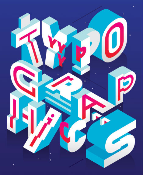
Typographics is where it’s at!
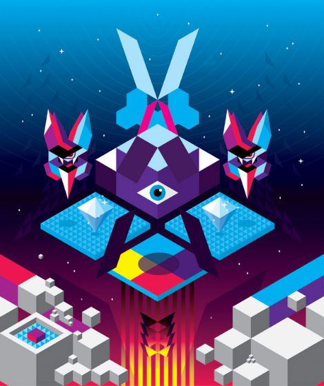
This illustration, designed for Computer Arts Projects, is by Moscow based artist Aske. Created for his personal art project titled Sicksystems, Aske playfully shows the various levels of typography…literally! He has a real knack for using interesting forms, bright colors, and celestial details in his work.
Sicksystems has evolved from initially being a graffiti crew to being the showcase of Aske’s graphic, illustration, and art work. To see more, check out his newly updated website.

——
Like what you see? Dig this: La Boca Design
Hungry for more? Sign up for our Grain Edit RSS Feed. Give it a try. Its free and yummy.
——
No Tags
Share This
Vintage kids book Mi Diccionario is in the Grain Edit Shop
Grain Edit recommends Colo Pro A font designed by Font Fabric. Check it out here.
©2009 Grain Edit - catch us on Facebook and twitter
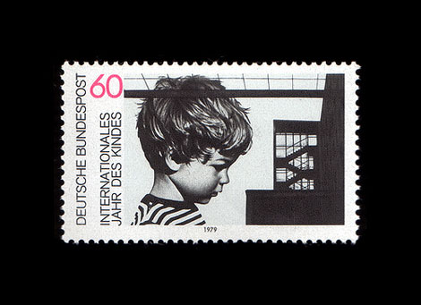
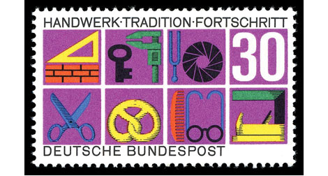
Deutsche Bundespost: Internationales Jahr Des Kindes stamp c1979 Karl Oskar Blase’s son is the boy in the image.
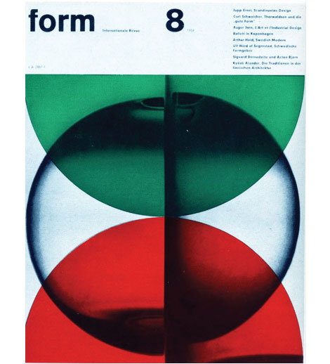
Karl Oskar Blase was born in the German city of Cologne (Koln) in 1925. At the age of 25 he attended the Wuppertal School of Industrial Art to study painting and graphic design. Around the same time he formed a design studio with Felix Muller. One of the studio’s more significant projects was to develop the layout for form magazine. Karl would go on to design almost all the covers through 1968. Karl also taught at the Kassel school of Industrial Art and designed many stamps for the Deutsche Bundespost.
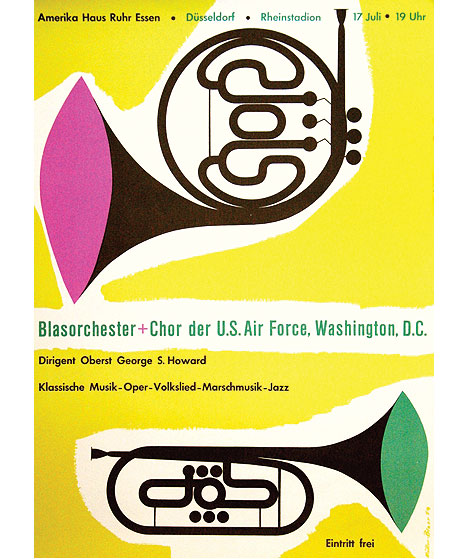
Amerikahaus Essen (Blasorchester) poster c1954
Deutsche Bundespost c1968
Images via David McFarline’s Flickr set, Wikimedia, Artists Posters
——
If you like this, check out: Herbert W Kapitzki
Robert Sessler
Not signed up for the Grain Edit RSS Feed yet? Give it a try. Its free and yummy.
——
No Tags
Share This
Vintage kids book Mi Diccionario is in the Grain Edit Shop
Grain Edit recommends Colo Pro A font designed by Font Fabric. Check it out here.
©2009 Grain Edit - catch us on Facebook and twitter
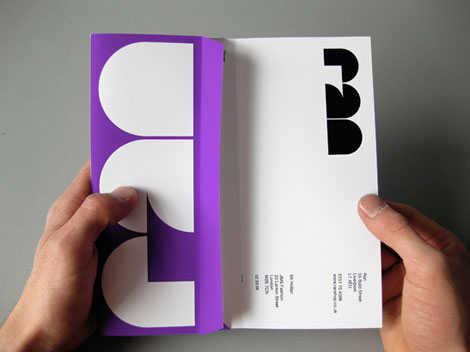
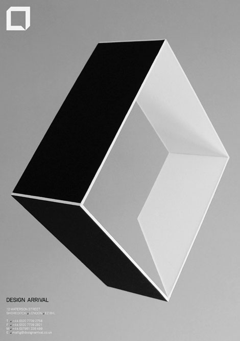
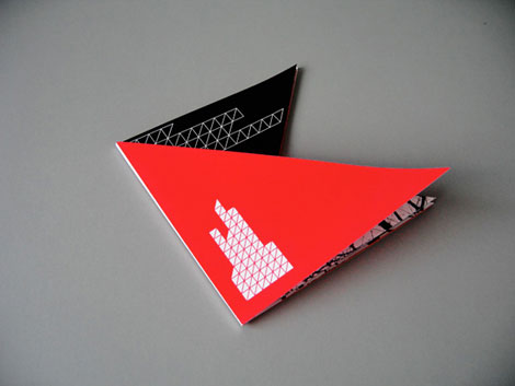
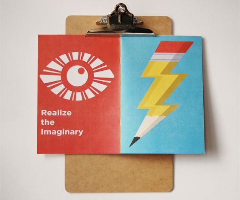
Matt Keers, the UK-based designer responsible for the above design, has a portfolio full of the same: bold, colorful, and compelling.
Like the piece shown, I appreciate Matt’s use of simplicity to make something interesting. Throughout Matt’s work there is a consistent use of scale, refreshing color palettes, and bold typography, all working toward a restrained sophistication.
Check out Matt’s site.
No Tags
Share This
Vintage kids book Mi Diccionario is in the Grain Edit Shop
Grain Edit recommends Colo Pro A font designed by Font Fabric. Check it out here.
©2009 Grain Edit - catch us on Facebook and twitter

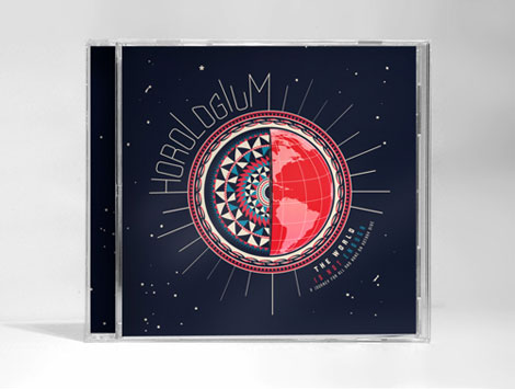
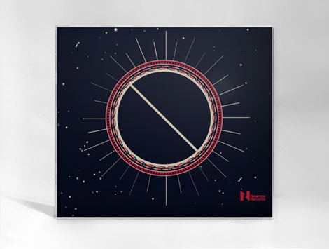
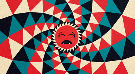
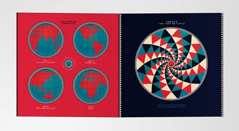
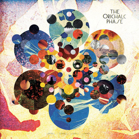
Great work from New York based designer Nikolay Saveliev. The album art shown above in one of my favorites from Nikolay’s portfolio; I love how the intricate patterns work with the map and space imagery. The graphics are fresh, but also speak to the genre and style of music.
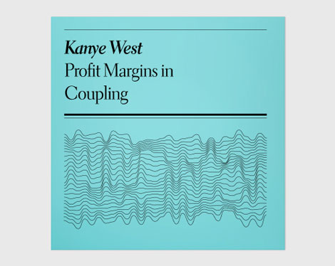
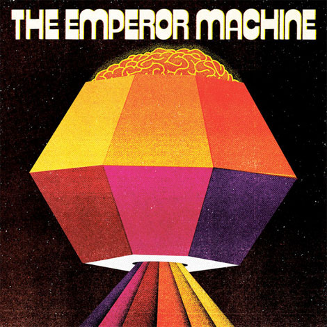
My first introduction to Nikolay’s work was Pop Matters (the Kanye West cover is shown below) — a project that combines writing with popular songs all benefiting a college radio station. This project is a good example of Nikolay’s conceptual abilities and kick butt style. I dig the minimalism in design as well as in terms of paired down lyrical meaning.
Check Nikolay’s work here.
No Tags
Share This
Vintage kids book Mi Diccionario is in the Grain Edit Shop
Grain Edit recommends Colo Pro A font designed by Font Fabric. Check it out here.
©2009 Grain Edit - catch us on Facebook and twitter
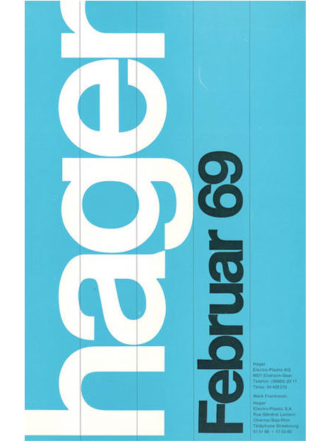
Design work for Hagar -1969
Robert Sessler was born in the Swiss city of Bern in 1914. Robert first began experimenting with design during his late 20s at the Zurich School of Arts where he was trained under the Bauhaus instructor, Johannes Itten. In 1942 he left school to open his own studio and become a member of the Swiss Werkbund. He maintained his studio until 1953 when he was offered a position as the head of the graphic design department at the Saarbrucken School of Art in Germany. He continued to teach at Saarbrucken and later at the University of Saarland until his retirement in 1979.
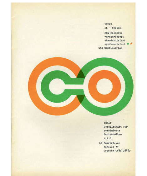
Brochure for Cobalt / Sl-System 1961 - Designed by Robert Sessler
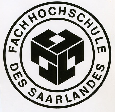
Logo for the University of Saarland - 1959
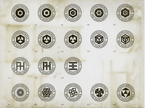
Logos for the University of Saarland - 1959

Logo for the University of Saarland - 1959
———–
Also worth checking:
Herbert Kapitzki
Swiss Graphic Design by Geigy
Not signed up for the Grain Edit RSS Feed yet? Give it a try. Its free and yummy.
———–
No Tags
Share This
Vintage kids book Mi Diccionario is in the Grain Edit Shop
Grain Edit recommends Colo Pro A font designed by Font Fabric. Check it out here.
©2009 Grain Edit - catch us on Facebook and twitter
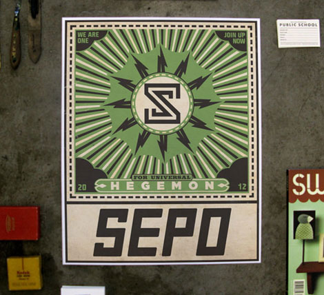
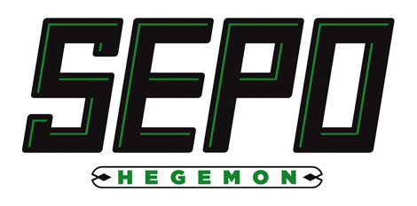
Fun work and a new site from Shaun Lind, a designer, illustrator, Austin-living person, man, and member of the esteemed design/creative collective Public School. There’s a nice balance between the fun and the useful in Shaun’s work. For example, I love amount and quality of identity alongside his interesting self-initiated projects.
Shaun’s web site is also refreshing — in a land of flat white portfolio sites, it’s nice to see something with a little pizazz. And as we know, it’s all about pizazz.
Shaun’s site / Shaun’s store

No Tags
Share This
Vintage kids book Mi Diccionario is in the Grain Edit Shop
Grain Edit recommends Colo Pro A font designed by Font Fabric. Check it out here.
©2009 Grain Edit - catch us on Facebook and twitter

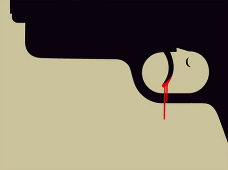
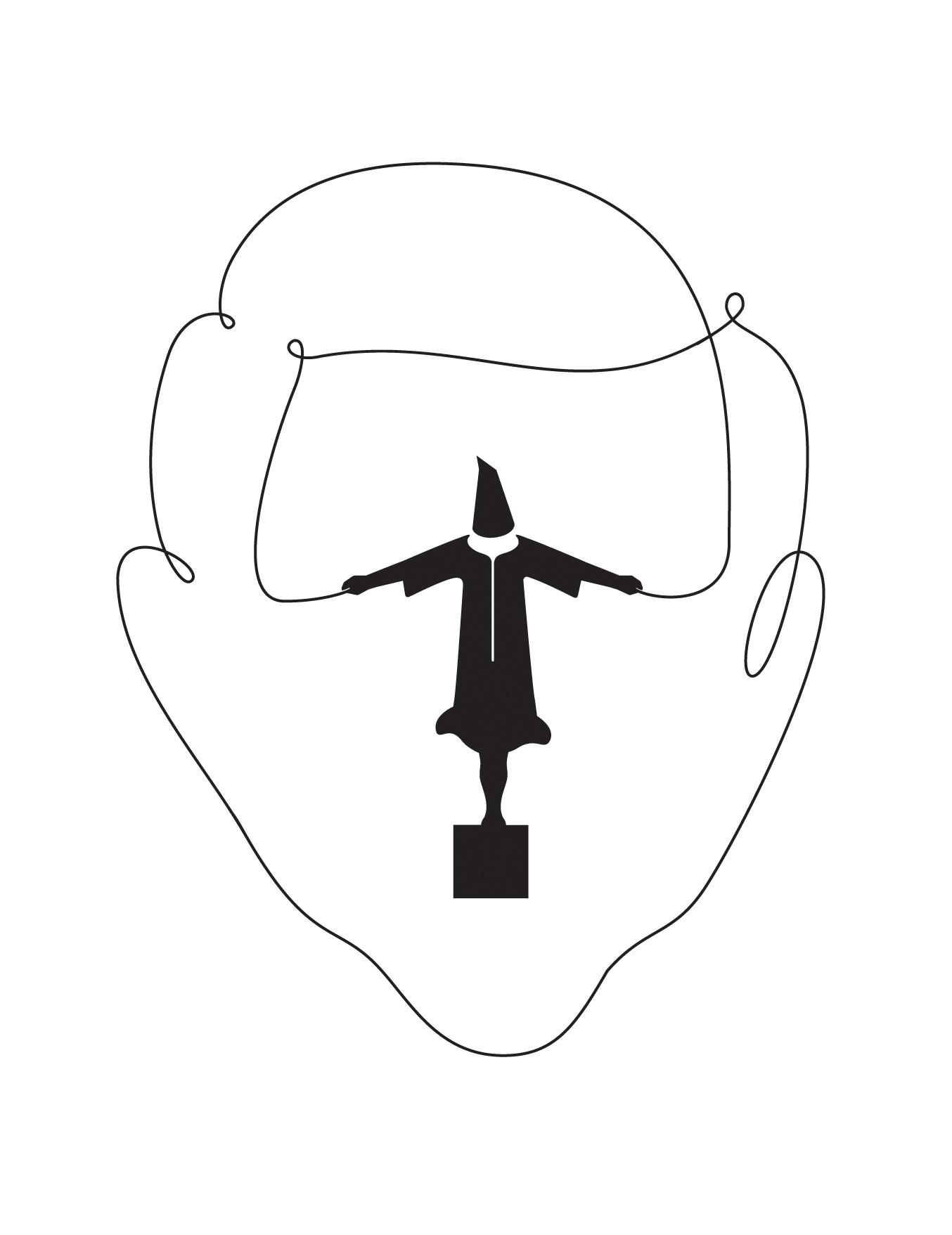
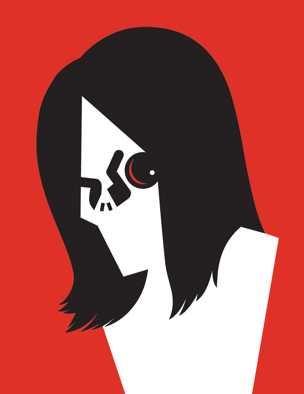
Noma Bar is a man of few strokes. But don’t let the simplicity fool you. His talent lies in his efficiency in depicting characters and social issues. With bold colors, shapes and one or two icons he captures the spirit of a person. Other times he communicates a message on a social issue with amazing clarity while adding a bit of humor to everything. Whether the message is about violence or equality, his straight-forward visual approach is refreshing.
How does your background influence your work?
I was born in the north of Israel in 1973. Israel was a young country with lots of influence from the Bauhaus school. The architecture had a lot of squares and straight lines. But there is also something else about Israel. There was the spirit of improvisation, in terms of how people create things, recycling and using ready-made.
Nevertheless it was quite sleepy and I didn’t want to stay there. Around my house there were original paintings. My mother was quite illustrative and playful. For example she made the handle of the toilet into a [silhouette of a] duck. We also had Hello Kitty things around the house.
Before I came to London I studied Hebrew typography. I was trained as a typographer, not as a illustrator. And of course there was no great demand in London for a Hebrew typographer. In my [current] work, I have typography influence. It’s like working with the elements of a letter. It’s coming to this idea, no nonsense, monumental shape.
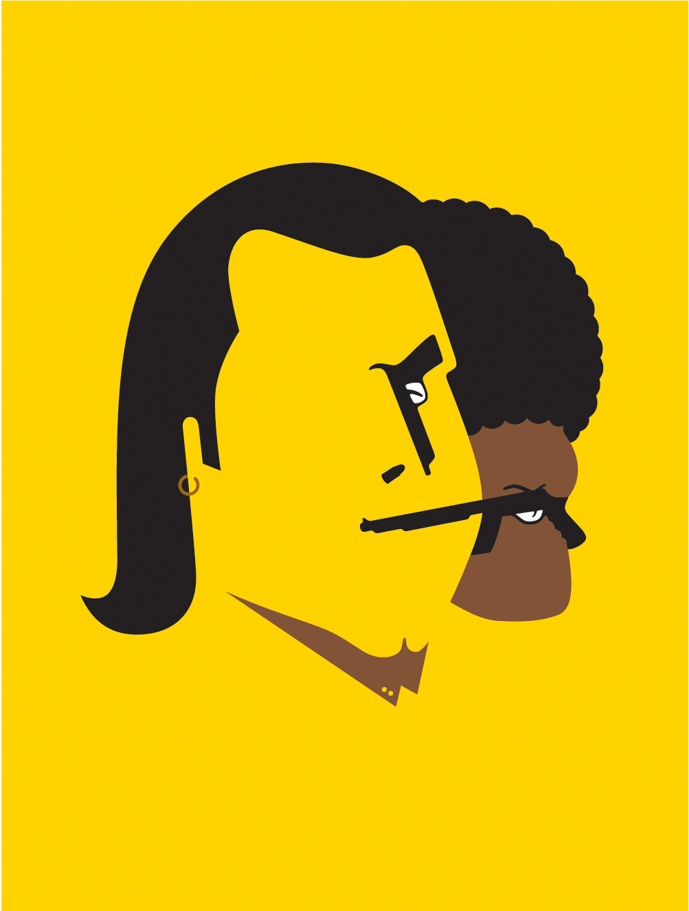
How do you describe your work?
Sometimes I would say visual communication. It is not exactly graphic design and not exactly illustration. I make brief illuminations. Putting light on the subjects and developing subjects is classic illustration. But it looks like graphic design. What I’m doing exactly, is part characterture and part politics. It is about the subjects. I’m a visual comedian, a graphic comedian. It is in a sense, less and less graphic design and more illustration. It needs to be funny. It needs to bring a smile. This kind of emotion is very important.


How did you co
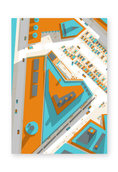
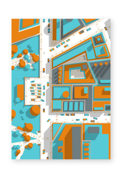
Aerial wonder! These birds-eye illustrations from Philippe Nicolas are pretty fun. Simple, colorful, and oblique—I love how angular and well composed these pieces are.
In addition to the Ground series, Phillipe also has a nice collection of typographic and design work. His portly-weighted font, bang-bang, makes an appearance in a tasty series entitled N.Y. Foods.
Check out his site, and view his Behance.


No Tags
Share This
Congrats to our 2009 Grain Edit Holiday Giveaway Bash Winners - /Grand Prize - Christopher E from Ferndale, Mi/ 1st Prize - Kristina M - Oakland, CA/ 3rd Prize - Samantha W - North Vernon, IN/ 4th Prize - Nicholas L. - Brooklyn,NY/ 5th Prize - Barbra - Brooklyn,NY
Grain Edit recommends Colo Pro A font designed by Font Fabric. Check it out here.
©2009 Grain Edit - catch us on Facebook and twitter
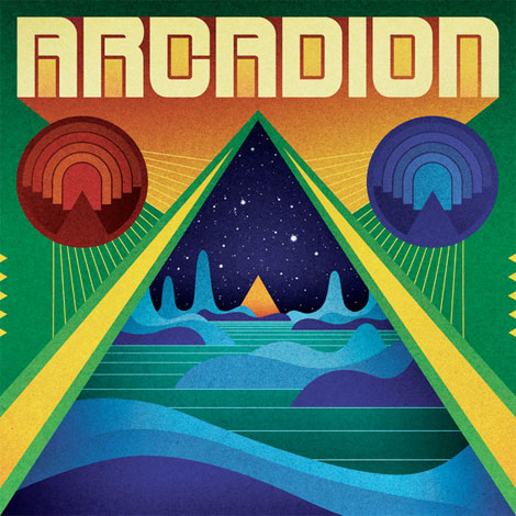
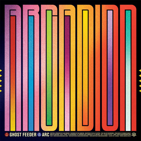
La Boca is a London based design firm specializing in transporting its viewers to places of the future by means of the past. This record sleeve, created for Arcadion, has a nice composition with the symmetry of the two magnetic looking objects on the edge of what seems like a portal into space. The warm gradient behind the bold text nicely juxtaposes the cool waves of the galactic landscape. This is where I’d like to be today.


In addition to creating record sleeves, La Boca has also created some out of this world shirts for Sixpack France. To see more of their work, check out their website. Be sure to read their blog for some neat video picks, like Len Lye’s Kaleidoscope.
———–
Also worth checking: Vintage Arcade Game Graphics
Not signed up for the Grain Edit RSS Feed yet? Give it a try. Its free and yummy.
———–
No Tags
Share This
View Next 25 Posts


