new posts in all blogs
Viewing: Blog Posts Tagged with: colors, Most Recent at Top [Help]
Results 26 - 50 of 101
How to use this Page
You are viewing the most recent posts tagged with the words: colors in the JacketFlap blog reader. What is a tag? Think of a tag as a keyword or category label. Tags can both help you find posts on JacketFlap.com as well as provide an easy way for you to "remember" and classify posts for later recall. Try adding a tag yourself by clicking "Add a tag" below a post's header. Scroll down through the list of Recent Posts in the left column and click on a post title that sounds interesting. You can view all posts from a specific blog by clicking the Blog name in the right column, or you can click a 'More Posts from this Blog' link in any individual post.
By:
Administrator,
on 2/8/2012
Blog:
Margo Dill's Read These Books and Use Them!
(
Login to Add to MyJacketFlap)
JacketFlap tags:
pirates,
Picture Book,
colors,
concept books,
Preschool to 1st grade teachers,
Shared Writing,
Rhyming Words,
shared writing activities,
Smith Danna,
picture books about pirates,
Add a tag

*Concept book for preschoolers/kindergarteners
*Little “pirates” as main characters
*Rating: Pirate Nap: A Book of Colors is so cute and perfect for the little guys and gals in our lives who are learning their colors AND fighting to take a nap!
Short, short summary:
Danna Smith tells us about the colors in our little pirates’ lives, using fun rhyme, while Valeria Petrone fills in the blanks with cute and clever illustrations! For example, let’s look at GREEN. “
Mark the spot. We must be brave! Find GREEN treasures in a cave.” The illustration is of the two boys finding green boots in the attic. The story continues as the boys enjoy being pirates, and their mother tries to round them up for a nap. Who will win this power struggle?
So, what do I do with this book?
1. Whether you are reading this to a room full of preschoolers or to your own at home, you can find pirate treasures in the room that are the same color as some of them in the book. What do you have in your room that could be considered a YELLOW treasure? What about GREEN? Make a list together.
2. What rhyming words do your little guys hear when you are reading this book to them? Ask them to raise their hands or point to the page every time they hear a pair of rhyming words. See if they can name some of the pairs when the book is over.
3. Pirate vocabulary runs rampant through this book. Many of your young pirates may know words like “mast” or “loot.” But others might not. Make a list of the words you think are pirate words before you read the book. After you read it and share the illustrations, see if children can define any of the words, using context (text and illustrations).

Purple Little Bird, by Greg Foley is ideal for young children. Purple Little Bird will surely endear himself with his bright color, oversize head, and anxious expression.
The art is simple and elegant and the story has a nice message along with the obvious introduction of colors. Very appealing!
Also Try:
WILLOUGHBY & THE MOON by Greg Foley
WILLOUGHBY & THE LION by Greg Foley
THANK YOU, BEAR by Greg Foley


By: Nicola,
on 12/8/2011
Blog:
OUPblog
(
Login to Add to MyJacketFlap)
JacketFlap tags:
sight,
color blind,
*Featured,
Science & Medicine,
Health & Medicine,
eyesight,
ultraviolet,
colour blind,
evolution's witness,
ivan schwab,
opthalmology,
pigments,
cones,
“color,
wavelengths,
dog,
pets,
science,
animals,
colors,
blindness,
color,
eye,
biology,
cat,
vision,
colour,
hummingbird,
Add a tag
By Dr Ivan R. Schwab
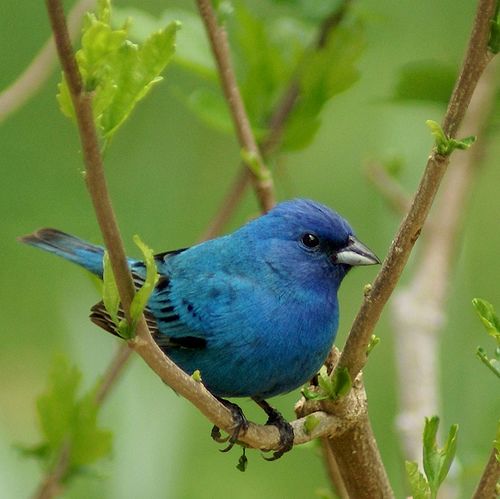
Well, yes, sort of. Dogs see colors, but their span of color vision closely resembles the array of colors seen by “color blind” males.

About 8%, or 1 out of 12 males (humans) and about 1 out of 200 females are “color blind.” We use that term to describe individuals that are color deficient, but they are not truly color blind. The eye has cells that perceive color and these are called cone photoreceptors or “cones.” We use another set of photoreceptors called “rods” for the black and white vision of dim light or nighttime. Our cones contain three visual pigments each of which responds to a different spectrum of wavelengths of light. It is these three visual pigments that combine their signals to permit us to have color vision by blending the signals, depending on the wavelengths received. Although it is an over-simplification, and misleading to some extent, we can describe our visual pigments as blue, green, and red. The brain receives the input from these three channels and then interprets the color we see. At least two different color channels are needed for color vision because the brain needs to “compare” these two different channels to determine color.

Color blindness in humans is caused by the genetic deficiency or loss of either the green or the red photopigment hence that input into the brain. So, the brain learns to see only those colors that can be interpreted or constructed by combining the input from the other two remaining visual pigments. The result is a less robust spectrum of colors, but colors are still seen. True color blindness in humans does exist when two of the three visual pigments are genetically unavailable, but it is exceedingly rare. If only one visual pigment channel is coming to the brain, say the blue cone input, it isn’t seen as blue but rather as on or off—hence that is “real” color blindness and would be a black and white world.
So, almost all color blindness in humans is not true color blindness but would be better described as color deficiency.
Now, let’s go back to your dog. Normal dogs have two different visual pigments in their cones, and much like humans afflicted with so-called “color blindness.” But they would see color. The color input would be weaker to some extent because dogs have fewer cones than we do because they are evolutionarily closer to their nocturnal ancestors. Cones are needed less, if at all, at night.
So, what about the other pets in the household? Your cat will have a similar color distribution as your dog although there are some subtle differences.

Birds, on the other hand, possess rich color vision, in many cases better than our own. Most birds have four cone visual pigments, although this varies. In general, birds have an additional ultraviolet pigment in their cones and many more cones than we have. Furthermore the visual pigments that would be similar to ours span different wavelengths. Their visual experience is richer than our own in ways impossible to describe or understand. Not o
By:
happy chinchilla,
on 9/1/2011
Blog:
.:happy chinchilla:.
(
Login to Add to MyJacketFlap)
JacketFlap tags:
illustration,
food,
colors,
monsters,
cookies,
recipe,
happy,
creature,
texture,
creatures,
digital illustration,
ilustracion digital,
ilustracion,
healthy,
feliz,
comida,
textura,
bichos,
They Draw and Cook,
receta,
galletas,
cookie recipe,
illustrated recipe,
monstruos,
receta galletas,
receta ilustrada,
saludable,
Add a tag

Its been so looong, but lost of things have been happening, good things. But now things are back to normal, almost normal. This is my latest illustration for They Draw & Cook, for the cooking 4 kids contest. Hope you enjoy it and you should really try this one, its delicious.
Ha pasado mucho tiempo, pero muchas cosas han estado pasando, cosas buenas. Pero ahora las cosas están un poquito mas normales. Esta es mi última ilustración para They Draw & Cook para el concurso de cocinando para niños. Ojalá les guste y deberían intentar esta, es deliciosa.

By: shelf-employed,
on 5/19/2011
Blog:
Shelf-employed
(
Login to Add to MyJacketFlap)
JacketFlap tags:
rhyming,
imagination,
book review,
nonfiction,
animals,
colors,
chickens,
pigs,
mothers,
bedtime stories,
storytime,
E,
participatory,
Add a tag
I am in the midst of transferring from one branch to another, and I now have two desks overflowing with great new books! Here are a few:
Gibbs, Edward. 2011. I Spy with my Little Eye. Somerville, MA: Templar. (Candlewick) That big (almost 2.5"), yellow, circular eye on the cover is actually a hole - an oh, the things we can spy through that hole! On a predominantly white spread with an eye on the left page and a circle of blue on the right, we read,
I spy with my little eye ... something that is blue. "I am the biggest animal in the world."
Turn the page to find a richly colored blue whale, which due to some artfully placed curlicues, manages to appear realistic and at the same time, fanciful.
I'm a BLUE WHALE.
Each featured animal unfolds in the same manner. The rear cover of the book features a hole for your own little eye to go spying! Colors, animals, guessing - this book has it all!
Edward Gibbs is listed as a "debut artist." What a debut! This one's dynamite!
Tusa, Tricia. 2011. Follow Me. Boston: Harcourt.
From the book jacket, here is the description of the art,
The illustrations in this book were done using an etching process with monoprinted color. The text type was set in Prin. The display type was set in Rats and Carrotflower.
(Rats and Carrotflower? - love that one!) What this means to me is a softly-colored book with fanciful drawings outlined in etched brown lines. The color sometimes spills out of its intended (?) perimeter in much the same way that the young protagonist spills out of her swing and floats and flies through the breezes, "lost in small, green, happy music." She invites the reader to follow her through all of nature's colors, "deep into brown, into the bright white of yellow, into orange that slips into red." From the illustrator of
In a Blue Room, another beautiful book!
 Johnson, Lindsay Lee. 2011. Ten Moonstruck Piglets. Ill. by Carll Cneut. Boston: Clarion.
All in a scramble,
all ready to gambol,
ten moonstruck piglets
on a midnight ramble.
Through the mud wallow,
beyond the wide hollow,
leapfrogging piglets
in turns lead and follow.
It's all fun and games until the moon goes behind a cloud! But not to worry - Mama's coming. These sleepy-eyed, wrinkly little runts are irresistible!
Where
Ten Little Piglets is filled with amusing detail, this next book features uncomplicated simplicity ... (but in both books, you can count on mom to the rescue!)
Read more »
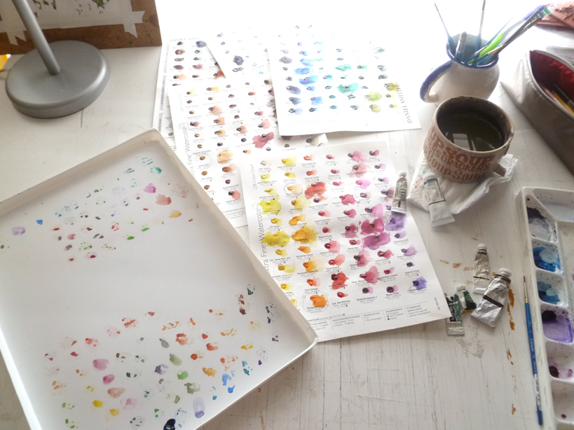
It's a large investment.
I just spent $80 on 9 tubes of watercolor paint. Nine. Seems like a small number for that price, but I believe it's worth the investment.
I have been using student grade Winsor & Newton watercolors for years, and have a few professional/artist grade tubes. The idea of spending $10 on one 5ml tube of paint just didn't compute. Until I got the
Daniel Smith Try It Dot pages. These are
AWESOME!Over 200 colors, all there to try out and use. The real deal in trial size. Genius. It is because of these sheets did I finally come to realize, as a professional, how much I needed professional grade watercolors.
They're smooth like silk, mix without a hitch, and the colors are so gorgeous! I then decided to purchase. But the price tag was still making my stomach turn. So expensive!
This led me to an entire week of studying and figuring out which colors to purchase. The DS dot sheets were key to this. They're the only professional grade paints I have right now. To help I found a great website that makes watercolor paints into science called
HandPrint.
I don't understand much in science, but he had a large section on palette color choices. All of the research was done for me, and they listed which colors were the best to have in every palette....colors that make all of the "convenience" colors (sap green, turquoise, violets, etc.).
 That's what I needed, the foundation colors.
 From there I could at least start, then purchase as needed the extra colors.
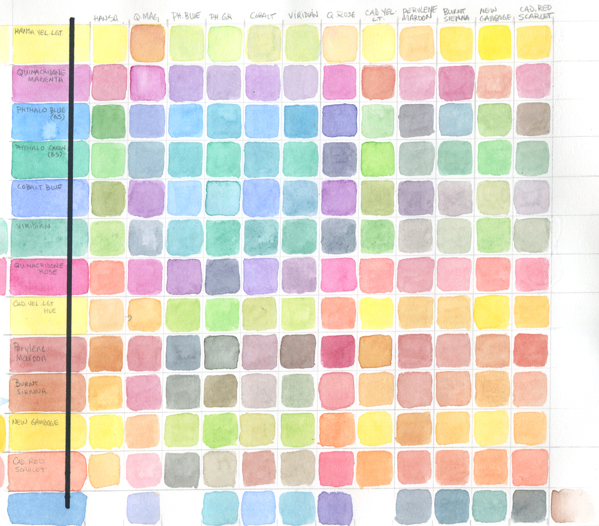
I also came upon an exercise to help decide which colors to have in your palette. A color chart. As one of my students yesterday best said "A multiplication chart but with color." Exactly!
Here's the blog link:
Ask Susie -
http://ask-susie.blogspot.com/2009/01/make-your-own-color-chart-for.htmlTho the woman who suggested the chart used only 7 colors, I ended up having 13. I wanted to see and be exactly sure what I was going to spend my money on.
This was grueling but totally surprising and fun seeing what two colors made what. I was pretty amazed at the little knowledge I had about color mixing.
Here are the colors I ended up purchasing:Phthalo Blue GS - DS
Phthalo Green BS - WN
Cobalt Blue - WN
Quinacridone Rose - DS
Perylene Maroon - DS
Burnt Sienna - WN
Cadmium Scarlet - WN
Yellow Ochre - WN
Benzimida Yellow (Winsor Yellow) - WN
* DS = Daniel Smith; WN = Winsor & Newton
 © Simona Sanfilippo
 © Simona Sanfilippo
 © Simona Sanfilippo
Valentine's Day is near... and there is nothing better than a new lovely shop: “Tissi postcards and crafts”
Simona's creations are sweet and pretty just like her. She’s an illustrator, a dreamer, a friend…
So, check it out!
♥


Je viens de terminer une planche pour une autre jolie histoire de Valérie! Mais je dois laisser un peu mon petit ami Mathurin pour reprendre Mr Bulle et Melle Filétoile: un super gentil editeur (hihih que moi je connais dejà) a nous donné la bonne nouvelle pour ce projet! Donc je vais bien m’amuser avec le cirque!
Mais mon année commence avec plein de surprises: et alors voilà encore une super nouvelle pour un autre livre qui sortira bientot en… Canada! Mais pour le moment je dis pas autres choses à ce propos. :))
Bon je vous laisse avec mon nouvel ami… moi je vais travailler.
.jpeg?picon=3007)
By: Manola,
on 1/13/2011
Blog:
Girasoli Punto e a Capo...
(
Login to Add to MyJacketFlap)
JacketFlap tags:
books,
colors,
Natale,
babbo natale,
illustrazioni,
libri,
personale,
tavoletta grafica,
divertimento,
projet,
pubblicazioni,
Add a tag


Des petits changements aux personnages mais oui, il est le meme super amusante de dessiner cette histoire-ci! Oooh dommage que vous pouvez pas la lire ;) pas encore en tout le cas.
Je croise mes doigts alors, je suis sure que vous l’aimeriez sans doute.
Ci sono dei piccoli cambiamenti ai personaggi, ma è lo stesso troppo divertente illustrare questa storia. E’ davvero un peccato che voi non possiate leggerla… beh, non ancora almeno.
Incrocio forte le dita.. sono sicurissima che voi l’amereste quanto me.


Ink and photoshop.
Just for fun, with a very hot cup of coffee and lovely music.
By:
happychinchilla,
on 8/31/2010
Blog:
.:happy chinchilla:.
(
Login to Add to MyJacketFlap)
JacketFlap tags:
feliz,
comida,
ilustracion illustration,
flores,
patterns repites,
repite,
repite continuo,
seamless pattern,
abeja,
color harmonies,
harmonias de color,
girasoles,
torta,
galletas,
nave espacias,
paisleys,
espacio exterior,
illustration,
food,
animal,
flowers,
colors,
cake,
cookies,
pattern,
te,
happy,
tea,
bee,
sunflowers,
alien,
spaceship,
digital illustration,
ilustracion digital,
ilustracion,
outerspace,
Add a tag
"YELLOW AND GREEN 2"
(click on image for larger view)
"Where flowers bloom so does hope."
--- Lady Bird Johnson


Ta daaaaa il est sorti! Ce mois çi dans Charlotte aux fraises: Un bien Curieux Personnage. Une chouette histoire ecrit par Evelyne Blandin et illustrée par moi!
Dites moi ce que vous en pensez hein! :)
Purtroppo io non l’ho ancora vista e mi devo accontentare della copertina per adesso… ma sono davvero curiosissima di vedere come è venuta, ma temo che dovrò attendere l’arrivo della mia copia direttamente dalla Francia. Spero che il postino passi presto da queste parti!
Buone vacanze a tutti voi, fortunati che potete meritatamente andarci o che ci siete già!! :)… Io intanto continuo a lavorare e mi consolo con una quantità spropositata di ghiaccioli al limone.

By:
Steve Novak,
on 7/21/2010
Blog:
Steve Draws Stuff
(
Login to Add to MyJacketFlap)
JacketFlap tags:
work,
colors,
progress,
zoo,
update,
steven,
novak,
cover,
liars,
poop,
albert,
layout,
forts,
thieves,
two,
cousin,
canonbridge,
krystoph,
Add a tag
Along with the ten-thousand other things I'm currently working on is the sequel to Paul Wood's "Cousin Albert" Series. Not only is Albert taking a trip to the zoo this time out, but he's doing it in full color. That's right, no more black and white interiors, this time it's color all the way.
While I haven't seen the full manuscript yet, I have gotten started on the cover. I'm pretty pleased with the overall design - think it'll be a quality piece when completed.
Hopefully it will...
Otherwise, as an eight year old might say, I'm in deep doo-doo.
On another note, it's only about four months or so until book 2 in the "Forts" series comes out. I'm excited. A part of me thinks it'll be the one people remember the most. It really is the "Empire Strikes Back" of the series It's a bit darker, the ending will leave you wanting more, and once it gets rolling it doesn't stop.
Then there's Krystoph...
You're going to like Krystoph.


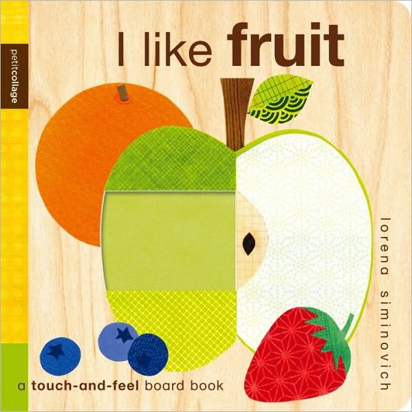
I Like Fruit. Lorena Siminovich. 2010. July 2010. Candlewick. 10 pages.
I enjoyed Lorena Siminovich's I Like Bugs. But I loved, loved, loved her I Like Fruit. Like I Like Bugs, this one is a touch-and-feel book. It offers readers a variety of textures. And it's very bright, very colorful. This book introduces colors to young ones by using fruit. For the color red, we have a strawberry, a raspberry, and cherries.

Green brings us an apple, a kiwi, and some grapes.
My favorite texture would have to be the pear or the orange.
I loved the design of this one. I do. I love the textures. The colors. The arrangement of all the different elements. It's a beautiful book. There is just something so pleasing, so appealing about it. It just works really, really well.
Definitely recommended!
© Becky Laney of Young Readers
By: Manola,
on 6/26/2010
Blog:
Girasoli Punto e a Capo...
(
Login to Add to MyJacketFlap)
JacketFlap tags:
just for fun,
sketches,
colors,
Moleskine,
foto,
illustrazioni,
personale,
scarabocchi,
divertimento,
taccuino,
Add a tag
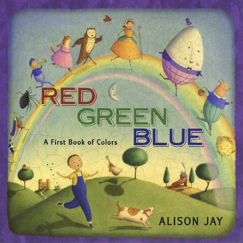
Red Green Blue: A First Book of Colors by Alison Jay
On a rainy day, a little boy escapes into a world of nursery rhymes that is filled with a rainbow of colors. He moves past icons of nursery rhymes like Little Boy Blue, Miss Muffet and her big black spider, Bo Peep’s white sheep, and five pink piggies. Keep a sharp eye out for other nursery rhyme characters in the background, because there’s a list at the end of the book to see if you spotted them. Told in a style that only Alison Jay could achieve with her vintage, crackling illustrations that maintain a modern energy, this book is sure to be a winner with preschoolers.
Jay has such a distinct and unique style that you can spot her books from afar. Just as she has with counting books and alphabet books, Jay has once again captured the timelessness of childhood here. Her exceptional illustrations bring energy and fun to the simple text which focuses on colors and characters. It is in the illustrations that the world comes to life and there is a depth that makes exploring them ever so much fun.
Make room for this one in your section on colors and in your section on nursery rhymes. Combining the two is a brilliantly colorful idea. Appropriate for ages 2-5.
Reviewed from copy received from Dutton.
Also reviewed by On My Bookshelf.
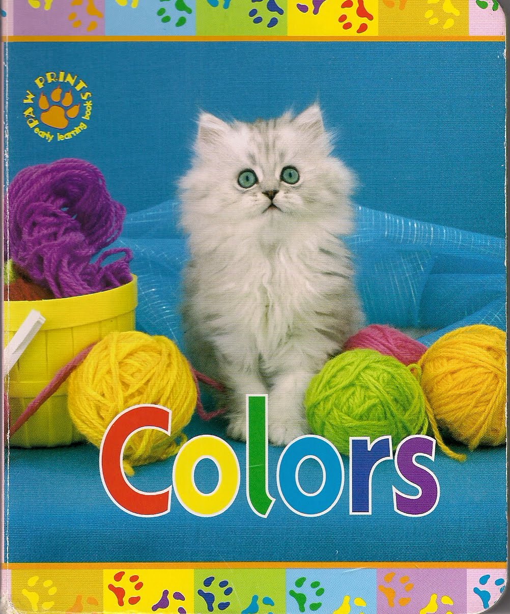
 Isn’t it funny how much we associate some people in our lives with certain colors? Keilana was born at Easter time and whenever I see groupings of pastels, I think of my Bunny Baby. My mom loves all shades of blue, especially cobalt, so dusk and those fancy glass bottles of water remind me of her. And now anything red brings my Scarlett to mind. I can’t see any of these colors without thinking of the people entwined with them in my memory. Of course, people also gravitate to colors that speak to them for some reason. I love all things pink--cotton candy, ballerina tutus, bubblegum ice cream--and would wear it every day if I didn’t think my academic credibility would suffer. Keilana formed an early and intense bond with the color purple, once even dyeing her hair a vivid lavender that suited her perfectly and made her look like some exotic alien babe from Star Trek. One of my colleagues is really, really into frogs and this naturally makes green her default color of choice. Some people
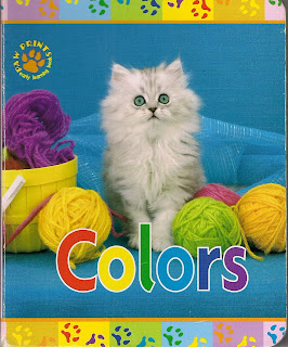 decorate their baby nurseries or reception halls to match the colors of their favorite school or sports team. And what about those crazy people who paint themselves for football games and then dance around half-naked in the freezing cold?! Color not only brightens and enlivens our world, it becomes part of our identity as well. In Keith Kimberlin’s Colors, rainbow kittens share their multi-hued treasures. What color has your name on it?
http://www.amazon.com/Colors-Paw-Prints-Early-Learning/dp/1419401130
http://www.keithkimberlin.com/
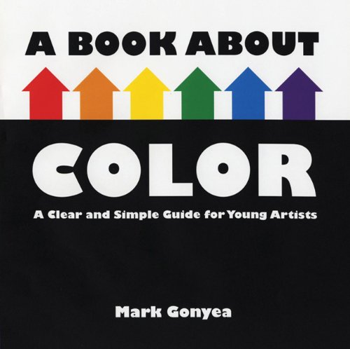
A Book about Color: A Clear and Simple Guide for Young Artists by Mark Gonyea
This book approaches color as a street with houses. The houses for the primary colors are bigger than those for the secondary colors, setting them apart. The book then goes on to talk about the meaning of colors and how one color can mean different things. Warm and cool colors are discussed along with the way they appear in a picture. Complementary colors are explained by lining the houses up on opposite sides of the street, the houses next to each other are analogous colors. The book finishes with saturation of colors, and white and black. Visually interesting and using a great analogy for learning about colors, this book is a treat.
Gonyea has created a book that really demonstrates aspects of color. His use of a street and house analogy works very well, keeping the primary houses large throughout the book, using the same street design to show complementary and analogous colors. His use of strong graphical images and clean design make this a book that children and adults will enjoy using. It goes well beyond a book for toddlers about color, making it a welcome choice for young artists.
Recommended for art rooms and library collections, this book is best in the hands of artists or those learning about art. A strong nonfiction book appropriate for ages 5-9.
Reviewed from copy received from Henry Holt.
View Next 25 Posts


.png.jpg?picon=3640)
.jpg?picon=910)


")
")


 0 Comments on Anno nuovo… as of 1/1/1900


I just upgraded my watercolors to Artist Grade, so I can completely relate!!
Thank you so much for this information. I'm just now trying out watercolor. It use to frighten me but I'm now really enjoying it's possibilities. This is so helpful.
Awesome to hear about the upgrade Amanda!
Kim, I'm so happy to hear that this helped. Those two pages are FILLED to the brim with information. I find I'm more excited about watercolor the more I learn. :) Heh, and I was terrified and totally rebel against watercolors until I began to truly play with them on my own. Careful, they can become an obsession. ;)
Oh, congrats Sara!! I think you are really going to love painting with professional grade. They are just so much richer and lay on the paper so nice. Can't wait to see what you'll paint with them!!
oh congrats! I can't wait to see what you will create with them! I love that colour chart, I never thought of doing that, now I have something new and fun to try out! anything to get to use and understand paints more:)thanks!
Great info,thanks:)