new posts in all blogs
Viewing: Blog Posts Tagged with: SFWA, Most Recent at Top [Help]
Results 26 - 50 of 54
How to use this Page
You are viewing the most recent posts tagged with the words: SFWA in the JacketFlap blog reader. What is a tag? Think of a tag as a keyword or category label. Tags can both help you find posts on JacketFlap.com as well as provide an easy way for you to "remember" and classify posts for later recall. Try adding a tag yourself by clicking "Add a tag" below a post's header. Scroll down through the list of Recent Posts in the left column and click on a post title that sounds interesting. You can view all posts from a specific blog by clicking the Blog name in the right column, or you can click a 'More Posts from this Blog' link in any individual post.
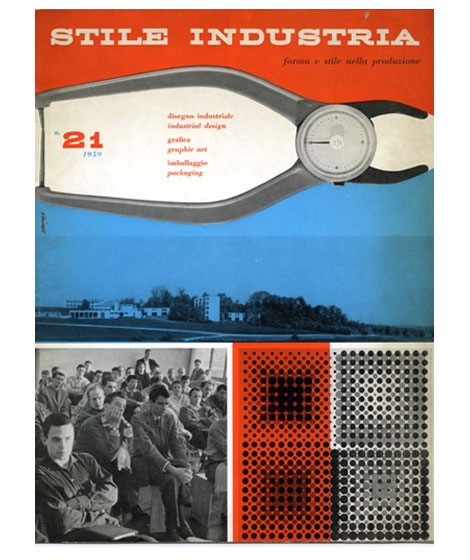
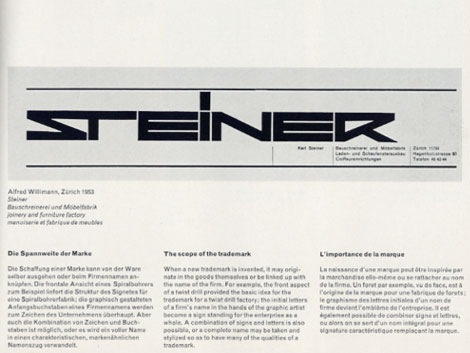
Magazine cover design for Italian industrial design magazine Stile Industria - March 1954
In 1940 Albe Steiner founded the Milan based studio Graphica Foto where he and his wife Lica experimented with Photography and design. Over the course of his career, Steiner designed for Domus, Agfa, Pirelli among others.
Cool book of his work here.
(Pictures via the Albe Steiner archive)
Also worth checking:
Aldo Novarese - Recta typeface
No Tags
Share This
©2007 -Visit us at Grain Edit.com for more goodies. 
By: Dave,
on 7/17/2008
Blog:
inspiration from vintage kids books and timeless modern graphic design
(
Login to Add to MyJacketFlap)
JacketFlap tags:
UK,
magazines,
out-of-print,
Off our book shelves,
modern,
retro,
vintage,
1960s,
graphic design. ken garland,
industrial-design,
Add a tag
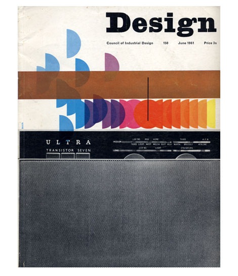
Design Magazine June 1961
Ken Garland served as art editor for UK based Design Magazine for six years. This is just one of many amazing covers that was conceived during his tenure.
also worth checking:
10 years of Vendre Magazine cover design
No Tags
Share This
©2007 -Visit us at Grain Edit.com for more goodies. 
By: Dave,
on 7/9/2008
Blog:
inspiration from vintage kids books and timeless modern graphic design
(
Login to Add to MyJacketFlap)
JacketFlap tags:
BOOKS,
Typography,
out-of-print,
Off our book shelves,
1950s,
modern,
retro,
vintage,
posters,
1960s,
italy,
Olivetti,
graphic-design,
corporate-identity,
Add a tag
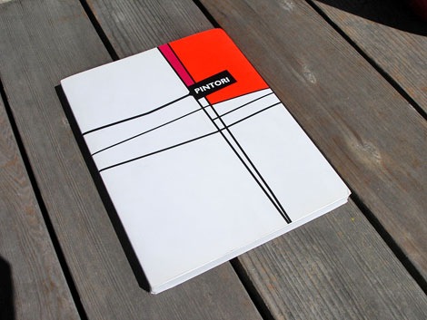
Giovanni Pintori exhibition catalog c2003
Giovanni Pintori won a scholarship in 1930 (at the age of 18) to study at the ISIA in Monza under design heavyweights like Marcello Nizzoli and Edoardo Persico. After graduation he was invited to work for Olivetti in the Development & Advertising Office located in Milan. Three years later he would become the head of the department. Over the next 27 years he created an impressive body of work for Olivetti that would earn him a lasting international reputation.
This book was made in conjunction with a 2003 exhibition that highlighted many of Pintori’s designs for Olivetti.
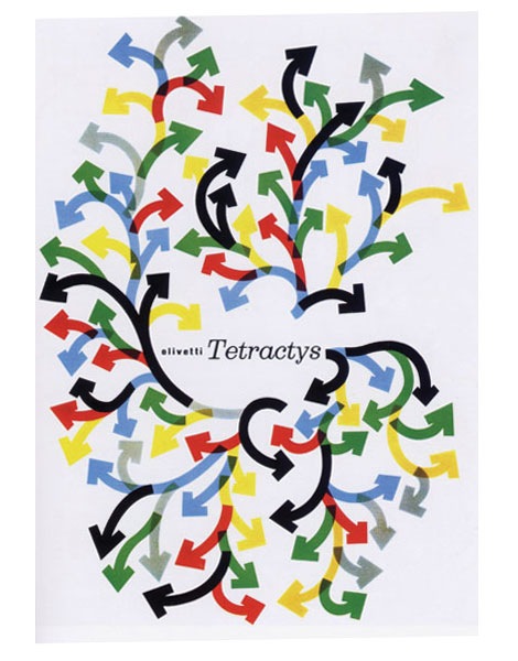
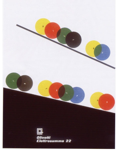
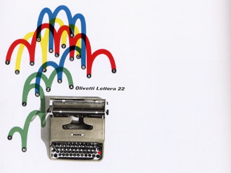
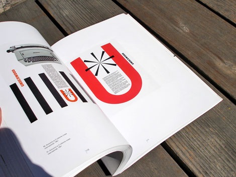
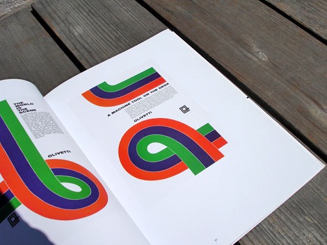
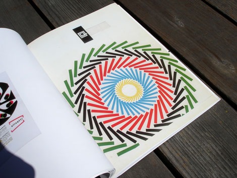
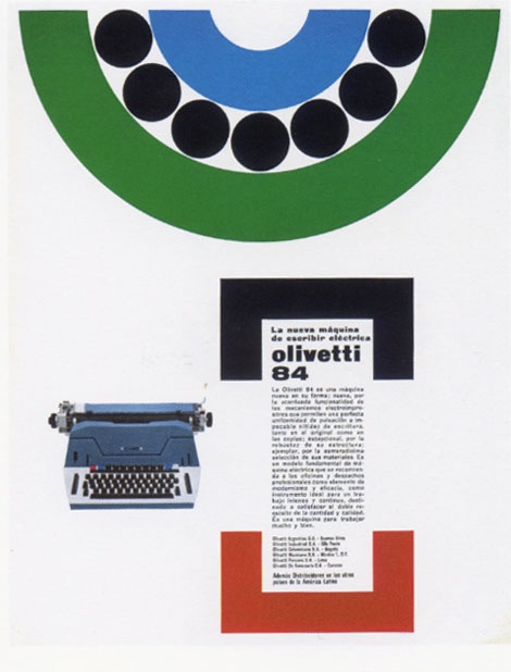
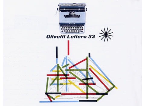
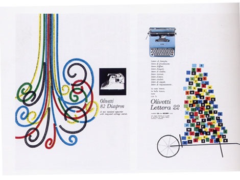
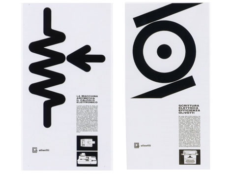
Seen above: posters and advertisements for Olivetti 84, Lettera 22, Elettrosumma 22 typewriters and the Olivetti Tetractys printing calculator
Also worth checking:
Olivetti Divisumma calculator
No Tags
Share This
©2007 -Visit us at Grain Edit.com for more goodies. 
By: Dave,
on 7/8/2008
Blog:
inspiration from vintage kids books and timeless modern graphic design
(
Login to Add to MyJacketFlap)
JacketFlap tags:
Off our book shelves,
modern,
retro,
vintage,
1960s,
ephemera,
graphic-design,
baseball,
stamps,
Add a tag
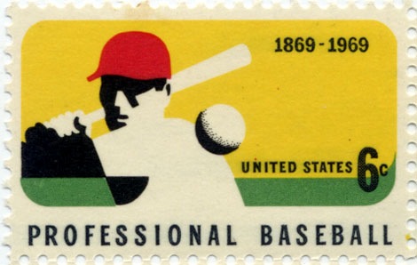
stamp commemorating 100 years of Professional Baseball c 1969 - printed on a Giori press.
One of my favorite stamps from the US. It all works for me, the use of negative space, the colors, and the 6 cent price tag. Makes me miss the days of buying big league chew at the candy store and watching TWIB.
Also worth checking:
vintage modern stamps from Israel
modern sticker, label and stamp club
No Tags
Share This
©2007 -Visit us at Grain Edit.com for more goodies. 
By: Dave,
on 7/2/2008
Blog:
inspiration from vintage kids books and timeless modern graphic design
(
Login to Add to MyJacketFlap)
JacketFlap tags:
BOOKS,
japan,
out-of-print,
exhibitions,
packaging,
Off our book shelves,
1950s,
modern,
retro,
vintage,
posters,
ephemera,
graphic-design,
Mid-century,
Add a tag
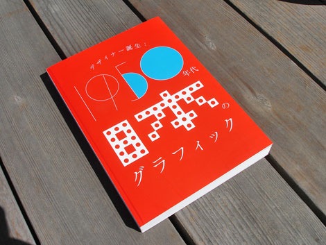
1950s Japan: The blossoming of the graphic designer exhibition book
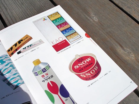
Packaging - Honen salad oil - design by Kenji Ito 1959, Snow ice cream -design by Tadashi Masuda 1959, KAO soap - design by Hideo Amano 1958
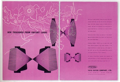
Advertisement for Toyo Rayon fiber co. - design by Yusaku Kamekura 1950
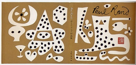
Paul Rand: His work from 1946 to 1958 - cover design by Yusaku Kamekura
Sense in Modern Design - design by Hiroshi Ochi 1959
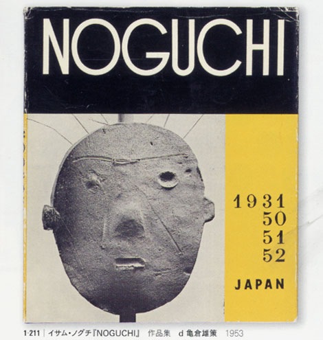
Isamu Noguchi Photography book 1953 - cover design by Yusaku Kamekura
If your planning to be in or near Tokyo within the next few days it would be worth your while to visit the Japanese graphic design in the 1950s exhibit at the printing museum. The exhibition features over 400 items, including newspaper and magazine advertisements, pamphlets, wrapping paper, packaging, and books, in an attempt to demonstrate all aspects in the development of graphic design in the 1950s as the foundations of postwar design were being laid.
I was able to get my hands on the catalog for the exhibit (seen above). I’m so sad that I won’t be to see this collection in person. The work is astounding. Lots of pieces by Yusaku Kamekura, Hara Hiromu, Takashi Kono, Ayao Yamana, Ryohei Yanagihara and others.
The exhibition runs through July 6th, 2008. You can get all the details here.
Also worth checking:
1960s Japanese book cover design
1960s Japanese magazine cover design
No Tags
Share This
©2007 -Visit us at Grain Edit.com for more goodies. 
By: Dave,
on 6/25/2008
Blog:
inspiration from vintage kids books and timeless modern graphic design
(
Login to Add to MyJacketFlap)
JacketFlap tags:
graphic-design,
magazine-design,
illustration,
Uncategorized,
out-of-print,
Designers,
modern,
retro,
vintage,
1960s,
1970s,
Found design,
USA,
Add a tag
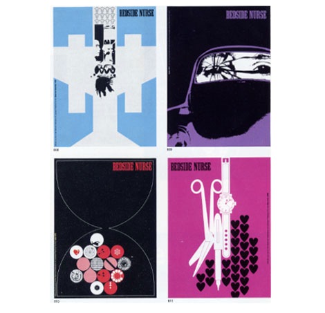
Bedside Nurse magazine design from 1968, 1969 and 1970
Charles Goslin (1932-2007) began his career at Lester Beall’s studio in 1954 and left to pursue work at corporate identity firm Lippincott & Margulies in 1958. Three years later he parted ways again, but this time to begin what would be a lengthy career as a freelance designer and illustrator. During this time he started teaching at Pratt Institute as well, where he became known for unique assignments.
For those interested in learning more about Charles Goslin, former student Scott Santoro has written lovely piece about him here.
Also of interest:
Graphic designer Clarence Lee - He worked at Lester Beall’s studio in 1958, possibly at the same time as Charles Goslin.
No Tags
Share This
©2007 -Visit us at Grain Edit.com for more goodies. 
By: Dave,
on 6/19/2008
Blog:
inspiration from vintage kids books and timeless modern graphic design
(
Login to Add to MyJacketFlap)
JacketFlap tags:
modern,
vintage,
1960s,
Found design,
USA,
graphic-design,
Mid-century,
book-covers,
out-of-print-books,
Add a tag

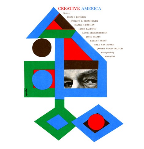
Creative America: Art director- Albert Squillace c1962
Thanks to Chad for sending this in. Looks very similar to the book cover design work of Paul Rand.
Also worth checking:
Modern Dutch book cover design
1960s Penguin books
No Tags
Share This
©2007 -Visit us at Grain Edit.com for more goodies. 
By: Dave,
on 6/18/2008
Blog:
inspiration from vintage kids books and timeless modern graphic design
(
Login to Add to MyJacketFlap)
JacketFlap tags:
records,
modern,
owls,
vintage,
1960s,
Found design,
accessories,
homes,
Mid-century,
Scandinavian,
collections,
Add a tag
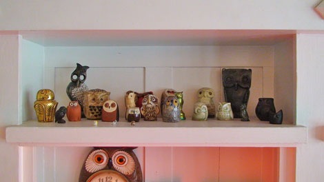
Apartment Therapy posted photos of Sam Grawe’s apartment yesterday as part of their 2008 home tour series. Sam is the Editor-in-Chief at the San Francisco based Dwell Magazine. If you are unfamiliar with Dwell, it is a magazine that focuses on modern architecture and design.
Sam has lots of goodies in his house. The place is filled with Danish modern furniture, Bertoia chairs and Scandinavian nic nacs. What did me in was the record covers and the owls. This is a man that loves owls! He has a slew of these Edvard Lindahl looking ceramic miniature birds of prey. Too be fair, it looks he holds no Owl biases. I see examples of Strigidae (Heck yea, I’m name dropping) as well as the barn yard variety. I actually know nothing about Owls. I picked all this up in a two minute search at Wikipedia. Anyways, I’m getting off track. To sum up, just check out the house tour.
No Tags
Share This
©2007 -Visit us at Grain Edit.com for more goodies. 
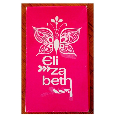
Elizabeth shoes shoebox possibly from the 1970s
I just about flipped when I found this image of an Elizabeth shoe box on flickr. I love the organic lines flowing inside the butterfly wings. Is it me or does it look like the body of the butterfly is rising from a lighter thats created when the letter “L” and letter”i” are placed next to each other? I doubt that was their intention, but its still looks cool. I can’t get enough of those branches that stem from the letters. Has anyone heard of this company? Is this a new company or is this from the 1960s or 1970s?
Many, Many thanks to Fountaineer for posting this.
No Tags
Share This
©2007 -Visit us at Grain Edit.com for more goodies. 
By: Dave,
on 6/11/2008
Blog:
inspiration from vintage kids books and timeless modern graphic design
(
Login to Add to MyJacketFlap)
JacketFlap tags:
BOOKS,
Off our book shelves,
graphic design,
modern,
out of print,
vintage,
swiss,
switzerland,
Karl-Gerstner,
modernism,
Add a tag
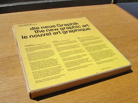
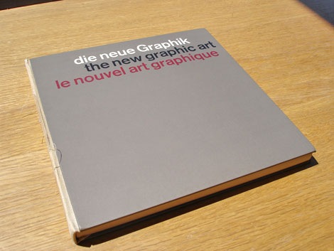
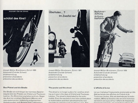
Karl Gerstner and Markus Kutter - the new graphic art - c1959 published by Arthur Niggli Ltd.
Classic book that surveys modern graphic design from its origins up till the late 1950s. Filled with advertisements, posters, packages, lettering, logos and displays. Lots of Swiss design to drool over. I just wish there were more color images.
I love the clean type and the 3 column grid on the cover. The modern day remake of the cover would be exactly the same except someone would replace the header “die neue graphik” with “this is a design book”. Ha
Includes work from: Hans Neuburg, Joseph Muller Brockmann, Richard Paul Lohse, Ladislav Sutnar and many others.
Also be sure to see Karl Gerstner’s work for Geigy in this book:
Publicity and graphic design in the chemical industry
No Tags
Share This
©2007 -Visit us at Grain Edit.com for more goodies. 
By: Dave,
on 6/10/2008
Blog:
inspiration from vintage kids books and timeless modern graphic design
(
Login to Add to MyJacketFlap)
JacketFlap tags:
illustration,
UK,
1950s,
graphic design,
modern,
out of print,
vintage,
posters,
Found design,
Add a tag
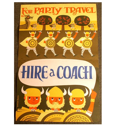
Allison at The Lark posted an amazing collection of vintage travel posters by British artist and illustrator Daphne Padden. Most of the posters in the collection were created for Royal Blue Coach Services (A Bus company located in the UK) during the1950s and 1960s. Her work is fun and filled with little men with big beards! The illustration style reminds me of Tom Eckersley and Abram Games.
Daphne was born in 1927. Her father was Percy Padden, a famous poster artist of the 1920s-1940s.
You can see the entire poster collection here.
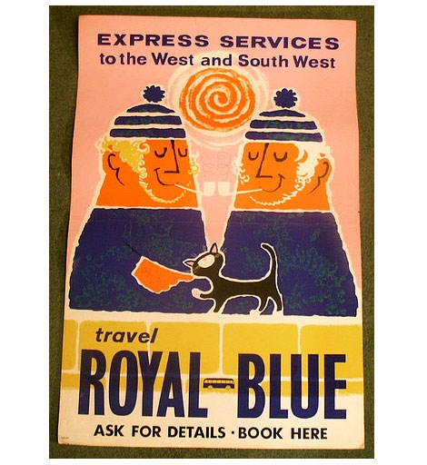
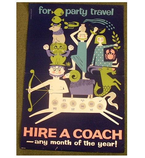
(via I Like via The Lark)
No Tags
Share This
©2007 -Visit us at Grain Edit.com for more goodies. 
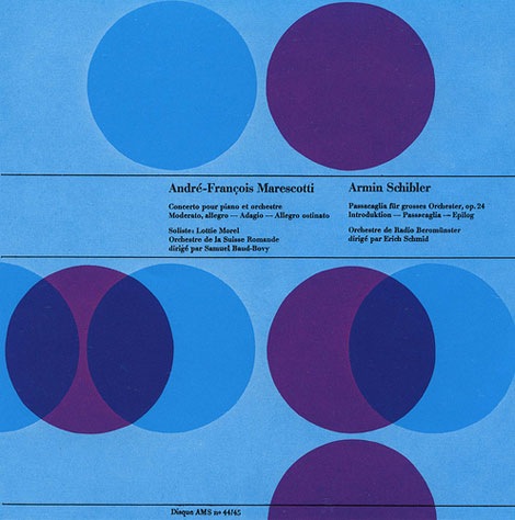
Andre-Francois Marescotti / Armin Schibler album cover - Designed by Joseph Muller Brockmann
I’m off to a late start today, I was up late last night making a few changes to the far right column. In addition, I’ve added a page dedicated to our Modern Sticker + Stamp club and Paul Rand group. Give it spin!
I hope everyone had a great weekend. Has anyone been to the Birth of Cool : California at Midcentury exhibition yet? I’m dying to go but, I haven’t had a chance yet. I’d love to hear your thoughts on the exhibit.
Up above. Beautiful example of Swiss graphic design via Alki1.
No Tags
Share This
©2007 -Visit us at Grain Edit.com for more goodies. 
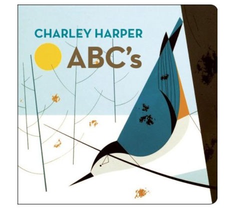
Charley Harper’s ABC’s - published by AMMO Books c2008
Greg over at daddytypes always posts top notch modern design goodies for kids and dads alike. Yesterday he posted this sweet ABC book which features Charley Harper prints. At $10 this is a must for any Charles Harper fan.
You can buy the book here.
Also worth checking:
We posted a bunch of images of the heavily sought after Giant Golden Book of Biology, written by Gerald Ames and illustrations by Charles Harper (Copies sell for $300 +!) Click the link below to see the image gallery.
Charley Harper illustrations - Giant Golden Book of Biology
also see:
Charley Harper Ford Times
No Tags
Share This
©2007 -Visit us at Grain Edit.com for more goodies. 
By: Dave,
on 5/27/2008
Blog:
inspiration from vintage kids books and timeless modern graphic design
(
Login to Add to MyJacketFlap)
JacketFlap tags:
Off our book shelves,
modern,
out of print,
1960s,
ephemera,
czechoslovakia,
bikes,
matchbox labels,
labels,
Add a tag
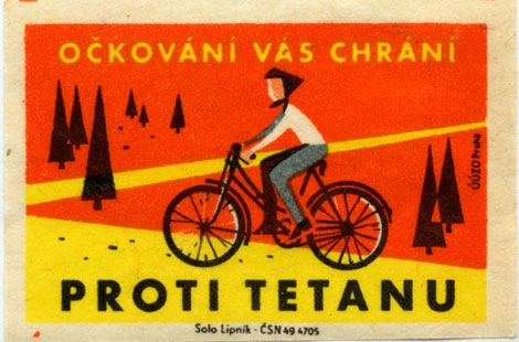
Solo Lipnik - UUZO Praha - Pronti Tetanu label - 1960s?
Super cool matchbox label from Czechoslovakia. Pretty intense colors. Nothing like taking a bike ride through a field of ketchup. Can anyone translate the text?
1960s,
bikes,
czechoslovakia,
ephemera,
labels,
matchbox labels,
modern,
out of printShare This
©2007 -Visit us at Grain Edit.com for more goodies. 
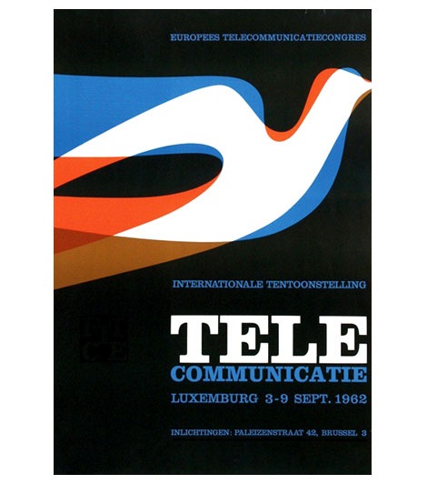
Tele Communicate poster for an event in Luxembourg, 1962
I love the layering of color within the bird. If you were to isolate the blue shape, the bird would look similar to Alexander Girard’s design for the Braniff Airlines logo in 1965.
also worth checking:
317 Dutch posters
1960s,
dutch,
modern,
netherlands,
out of print,
postersShare This
©2007 -Visit us at Grain Edit.com for more goodies. 
By: Dave,
on 5/12/2008
Blog:
inspiration from vintage kids books and timeless modern graphic design
(
Login to Add to MyJacketFlap)
JacketFlap tags:
magazines,
1950s,
modern,
book covers,
1960s,
1970s,
Found design,
Mid century,
Latvia,
Add a tag
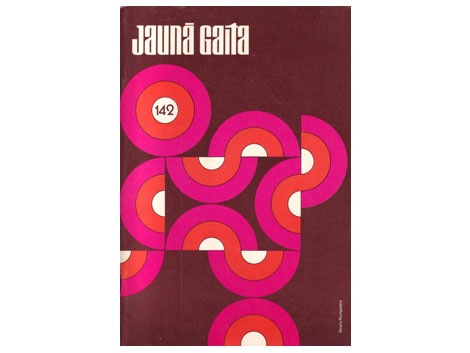
After the second World War many Latvian writers were relocated to different areas of the world. Many ended up in Great Britain, Canada and the USA. Living in these new lands they began their own periodicals and publication houses. A new generation of writers emerged. “Living in foreign lands and surrounded by other cultures, these writers strove to capture the influences of modernism.” * One of the magazines that surfaced during this time period was Jauna Gaita (the new course). Ilmārs Rumpēters who designed many of the covers of Jauna Gaita during the 1950s-1970s, wonderfully captured the spirit of this era.
(more…)
1950s,
1960s,
1970s,
book covers,
Latvia,
magazines,
Mid century,
modernShare This
©2007 -Visit us at Grain Edit.com for more goodies. 
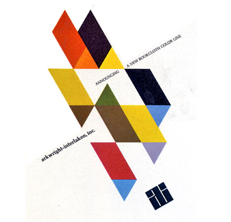
Beautiful advertisement for Arkwright-Interlaken, Inc designed by Malcolm Grear Designers. Dates back to the early 1960s.
1960s,
advertisements,
Designers,
modern,
out of print,
USAShare This
©2007 -Visit us at Grain Edit.com for more goodies. 

By: Kirsty,
on 4/30/2008
Blog:
OUPblog
(
Login to Add to MyJacketFlap)
JacketFlap tags:
rana,
mitter,
china,
UK,
Politics,
Current Events,
A-Featured,
modern,
beijing,
World History,
VSI,
very short introduction,
Add a tag

As much as I love being able to speak to the blogosphere through OUPblog, whenever I can bring the author straight to you I jump at the chance. Hurrah, then, for the good people of Meet the Author, who recently filmed several of our authors talking briefly about their books. Today I bring you Rana Mitter, author of Modern China: A Very Short Introduction, who tells us a few fascinating facts about Modern China that you may not already know. Over to Rana…
ShareThis
By: Dave,
on 4/20/2008
Blog:
inspiration from vintage kids books and timeless modern graphic design
(
Login to Add to MyJacketFlap)
JacketFlap tags:
stamps,
Off our book shelves,
graphic design,
modern,
1970s,
israel,
ephemera,
illustration,
pollution,
Add a tag
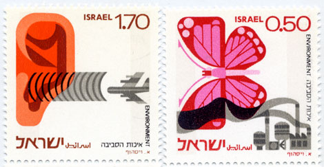
Israeli environment stamps - 1975
Beautiful stamps addressing both noise and industrial pollution.
Be sure to check out this modern stamp from Israel as well.
1970s,
ephemera,
graphic design,
illustration,
israel,
modern,
pollution,
stampsShare This
©2007 -Visit us at Grain Edit.com for more goodies. 
By: Dave,
on 4/15/2008
Blog:
inspiration from vintage kids books and timeless modern graphic design
(
Login to Add to MyJacketFlap)
JacketFlap tags:
graphic design,
modern,
out of print,
posters,
1960s,
Found design,
Mid century,
swiss,
switzerland,
Add a tag
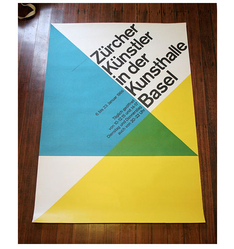
Zurcher Kunstler in der Kunsthalle Basel, Switzerland- c1966
Beautiful poster by Swiss graphic designer and author Hans Neuburg.
(via Crabstick’s killer Flickr photostream)
1960s,
graphic design,
Mid century,
modern,
out of print,
posters,
swiss,
switzerlandShare This
©2007 -Visit us at Grain Edit.com for more goodies. 
By: Dave,
on 4/14/2008
Blog:
inspiration from vintage kids books and timeless modern graphic design
(
Login to Add to MyJacketFlap)
JacketFlap tags:
japan,
birds,
magazines,
Off our book shelves,
graphic design,
modern,
out of print,
1960s,
Mid century,
Add a tag
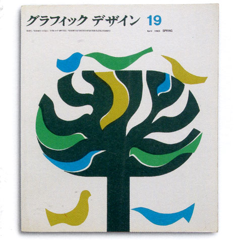
Graphic design magazine - japan 1965
Running with a Japanese theme today. Can’t stop thinking about those flicks I caught this past weekend. Great cover for a Japanese graphic design magazine from the sixties.
Also worth checking out, is this Japanese poster we posted.
1960s,
birds,
graphic design,
japan,
magazines,
Mid century,
modern,
out of printShare This
©2007 -Visit us at Grain Edit.com for more goodies. 
By: Dave,
on 4/10/2008
Blog:
inspiration from vintage kids books and timeless modern graphic design
(
Login to Add to MyJacketFlap)
JacketFlap tags:
Off our book shelves,
1960s,
BOOKS,
japan,
graphic design,
modern,
out of print,
Mid century,
arrows,
Add a tag
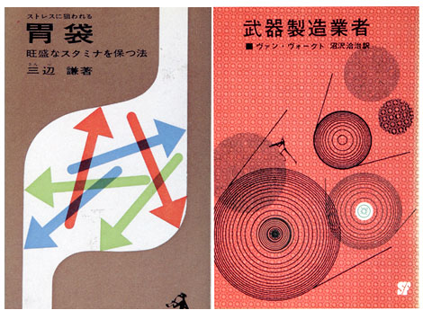
1960s Japanese book cover designs
I don’t know much about the company that published the book on the right, but the book on the left was published by Kappa in 1963. Keep your eyes out for Kappa, they have other cool covers.
1960s,
arrows,
BOOKS,
graphic design,
japan,
Mid century,
modern,
out of printShare This
©2007 -Visit us at Grain Edit.com for more goodies. 
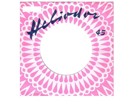
Slick 45 record sleeve with a nice modern pattern for the German label Heliodor. Anyone know what typeface that is?
(Via Kavel’s awesome record envelope)
1960s,
ephemera,
germany,
modern,
out of print,
recordsShare This
©2007 -Visit us at Grain Edit.com for more goodies. 
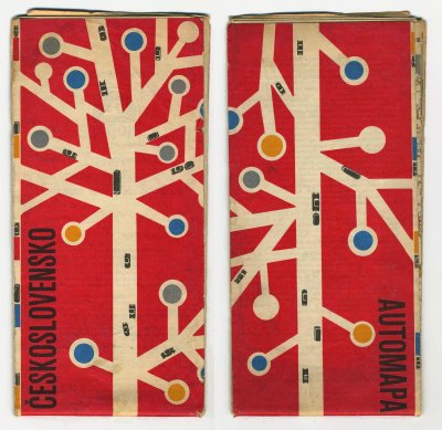

road map of Czechoslovakia from 1962
Obviously the design work of a mad genius who is addicted to lollipop trees.
(Via the really good Kris’s color stripe blog)
czechoslovakia,
graphic design,
maps,
Mid century,
modern,
out of printShare This
©2007 -Visit us at Grain Edit.com for more goodies. 
By: Rebecca,
on 3/21/2008
Blog:
OUPblog
(
Login to Add to MyJacketFlap)
JacketFlap tags:
Music,
literature,
cinderella,
the,
fairy,
Art,
Blogs,
western,
oxford,
woods,
myth,
folklore,
rapunzel,
witch,
A-Featured,
modern,
oupblog,
play,
broadway,
to,
jack,
Prose,
Leisure,
prince,
giant,
companion,
tales,
traditional,
medieval,
zipes,
into,
musical,
Add a tag
One of the best things about working at Oxford University Press is finding older books you didn’t know about. A couple of days ago I came across The Oxford Companion to Fairy Tales: The Western Fairy Tale Tradition from Medieval to Modern, edited by Jack Zipes. I decided to put the volume to the test. Would it have the modern musical interpretation of fairy tales? It did! Below is the entry about one of my favorite shows, Into the Woods.
(more…)
Share This
View Next 3 Posts